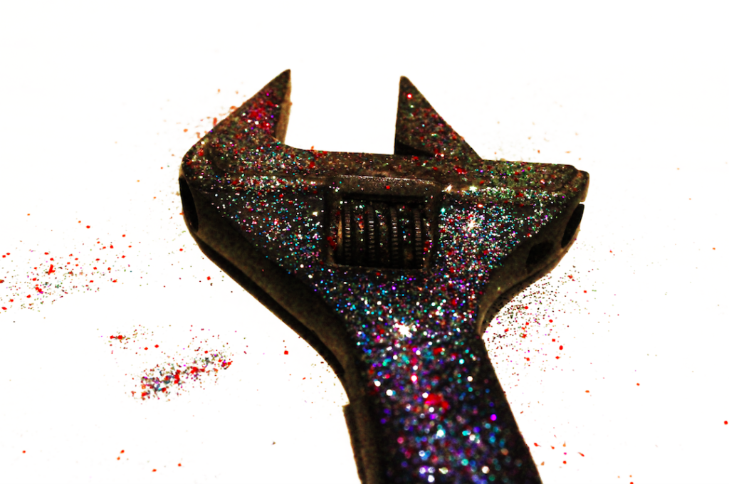
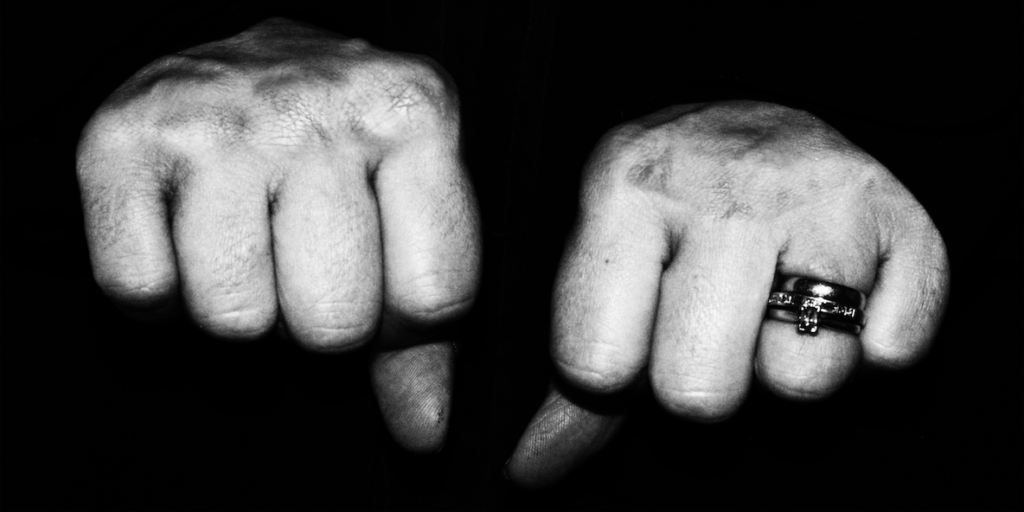
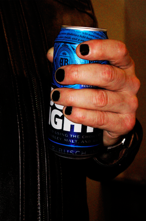
After editing the images from my 5th photo-shoot, I was able to come up with the following images as final results:


After editing my final images and comparing them with the images that I had already included in my book, I came to the conclusion that both the second and 3rd image (above) do not match the colour scheme of my book. I was unable to find a place that these two images would fit in, as especially regarding the 3rd image, my photo-book has a theme of cool colours, black and with imagery, with a theme of deep red continuing throughout the book. I felt like the 3rd image from my 5th photo-shoot was too warm to be included in the book, and so after editing, I decided to reject this image. Furthermore, I felt that the first image (of the spanner) was not strong enough to be presented on its own (on a single page with a blank page next, or on a double page spread), and yet I could not find a place where the image would fit next to another image. I felt like forcing this image to be included would disrupt the narrative of the book, and so I rejected both of these images, and kept the 2nd image (fists) in the book. I found that the 2 images that I rejected were valuable experimentation, but did not work in my final book.
