
For my 4th photo-shoot, I have decided to directly respond to my artists Cindy Sherman and Phoebe-Jane Barrett, by creating photography that overtly have their influence in them. My previous photo-shoots have all contained influence from these artists, however I felt that in order to best reflect the influence I have gained, I should attempt to recreate their imagery and concepts in my own way. In order to do this, I used a subject for the 2 different styles of shoot, conducted in the same place. The contact sheet can be seen below:
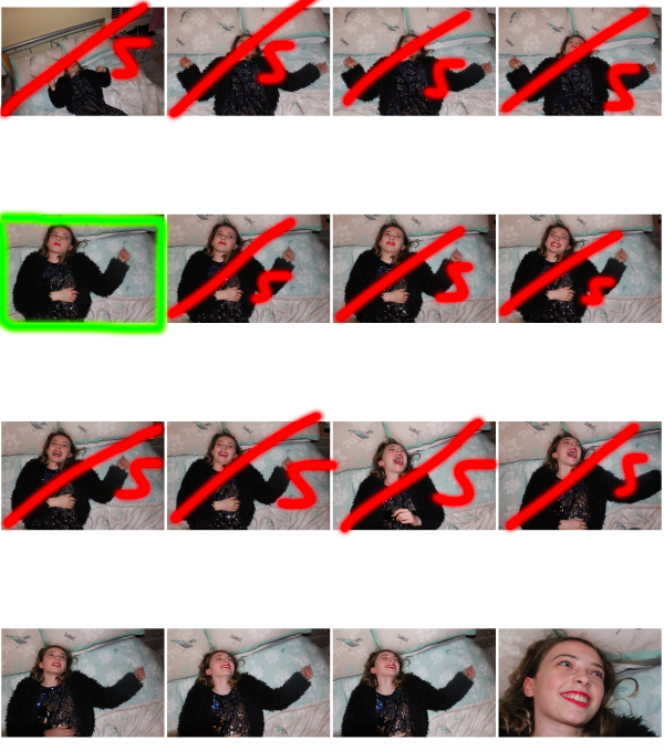
GREEN: tick: possible final image, box: final image
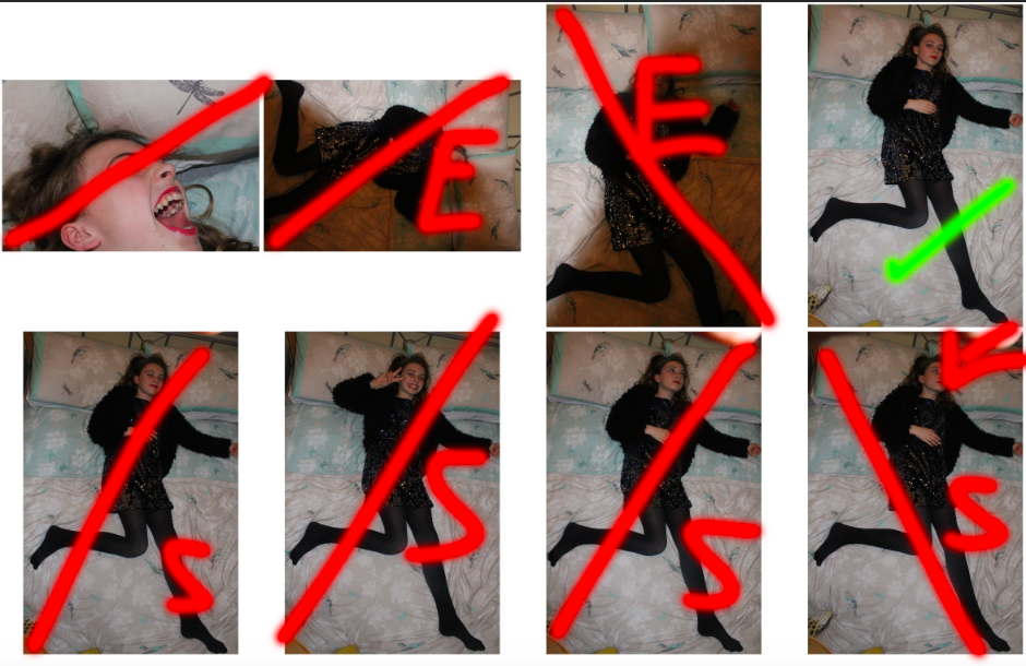
GREEN: tick: possible final image, box: final image
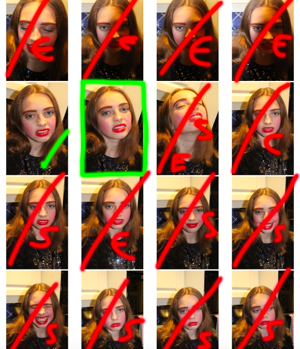
GREEN: tick: possible final image, box: final image
Both of the above contact sheets were created with the intention of developing images that reflected the overall style and concept of both Sherman and Barrett’s work, with the first sheet representing an approach to Barrett’s more emotionally driven, soft focus work that reflects the hardships of expressing the same gender identity as the one that is expected of you, and the second sheet making reference to Sherman’s bold, brash approach to gender stereotypes and the exaggeration of feminine features.
After selecting my final images from the contact sheets, I moved on to editing the images:
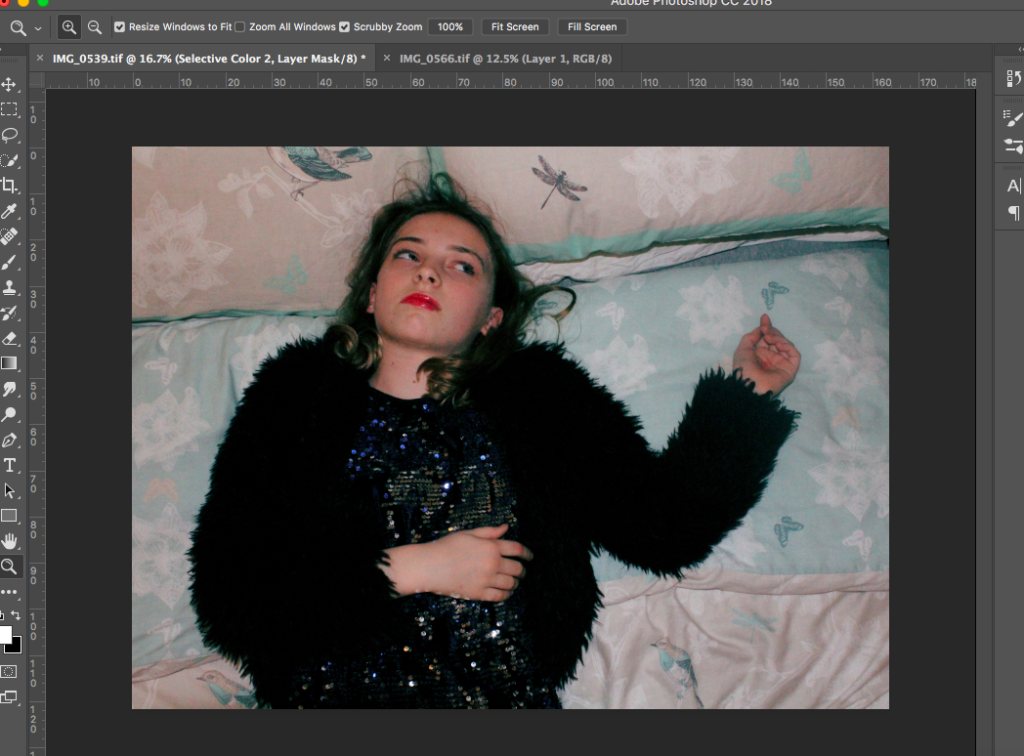
For my image in which I took inspiration from Phoebe Barrett, I initially cropped the image to place the subject as the centre focus, and to remove the edge of the image which captured the bedside table (I found that the darkness of this corner removed attention from the subject in the centre of the frame).
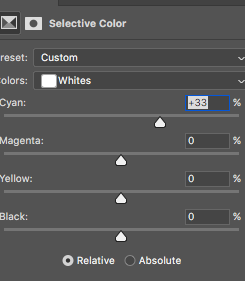
The above images show the ways in which I edited the colours of the image in order to give a overall blue/cyan hue to then image in order to soften the image and its harshness. Although Barrett focuses on black and white imagery in her masculinity work, I decided that the image would look better in colour, but still made efforts to stick to the overall soft theme of Barrett’s work.

Above is the final image from this part of the photo-shoot. I feel like it accurately reflects the concept of Barrett’s work, while not copying it directly. I have used this photograph to convey emotion to the viewer, with the bright, sparkly and outgoing attire of the subject contrasting their solemn, fed up look, as if to convey that their emotions and personality does not match the way in which they convey themselves to the world. I feel like this is an example of what the pressure of conforming to gender stereotypes can do to a person, removing their ability to express themselves freely, and thus they develop an emotionless, solemn outer shell, protecting them from society’s judgement. I feel like this is a very important aspect of Barrett’s work, and therefore I attempted to recreate this concept in my own photo-shoot.
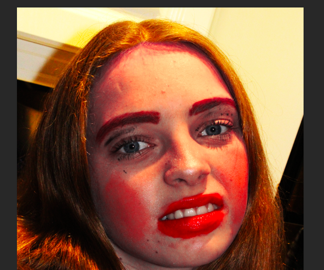
I then made edits to the other part of the photo-shot, in which I recreated an image made by Sherman, reflecting the bold and brash gender stereotypes of women I the media, and making a satirical comment on how these features actually look. Below is the process of how I edited my final image:
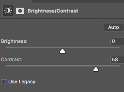
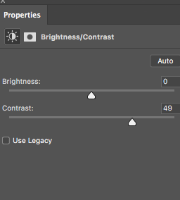
Initially, I increased the contrast of my image in order to copy the very bold, striking colours of Sherman’s work, in which the high contrast oranges, blues, reds and yellows make her work recognisable and eye-catching.
In order to individually increase the contrast and tone of the hair (so that the hair did not come off in the same pink hue as the face), I used the lasso tool to copy and paste the hair of the subject onto a different layer, and increased the contrast separately to stop this from happening.
The above image has a background that did not match the subject in the foreground, therefore I covered the background with black, and cut the subject out in the foreground, below was the final result:

I feel like this final image accurately reflects the concept and theme of Cindy Sherman’s work. I feel like the pose of the subject is over exaggerated and fake, giving the image an overall exaggerated and satirical feel (which follows the theme of Sherman’s work). Furthermore, I feel like the extreme contrast within the image, along with the extreme and rough make-up, gives the image a fake and heavily edited feel to it, which in turn helps to reflect the same satirical, over the top reflection of female gender presentation in the media that Sherman reflects in her own work. Altogether, I find that this image successfully conveys the concepts and themes of Sherman’s work, while not directly copying it.
On top of these two images, I also experimented with some of the images I took that did not directly reflect the work of the artists I was studying, but I felt would suit the style and concept of the book regardless. Below are 2 of the images that I also decided to use, after editing:
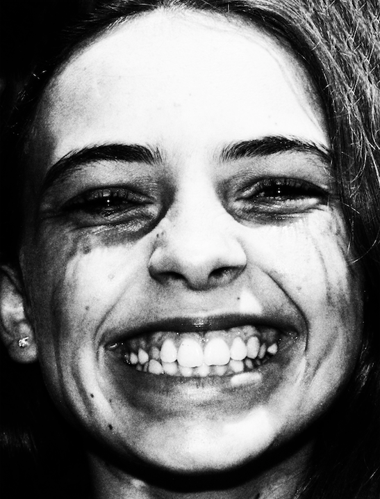
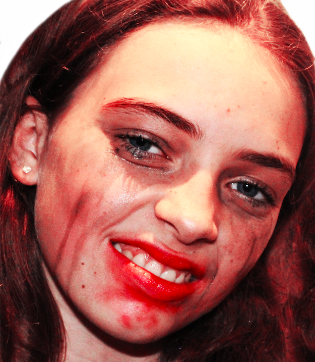
I feel like the second image above also reflects Cindy Sherman’s work and concepts very overtly, although the colour scheme and editing makes this less obvious (although the attitude/pose of the subject is closely related to Sherman’s satirical approach to photography). The first image above is, however, more conceptual its approach, as it shows a subject presenting a huge, over the top smile, while makeup runs down her face. I feel like this evokes the same raw emotion as Barrett’s work, while visually presenting in a bold way (like Sherman).