
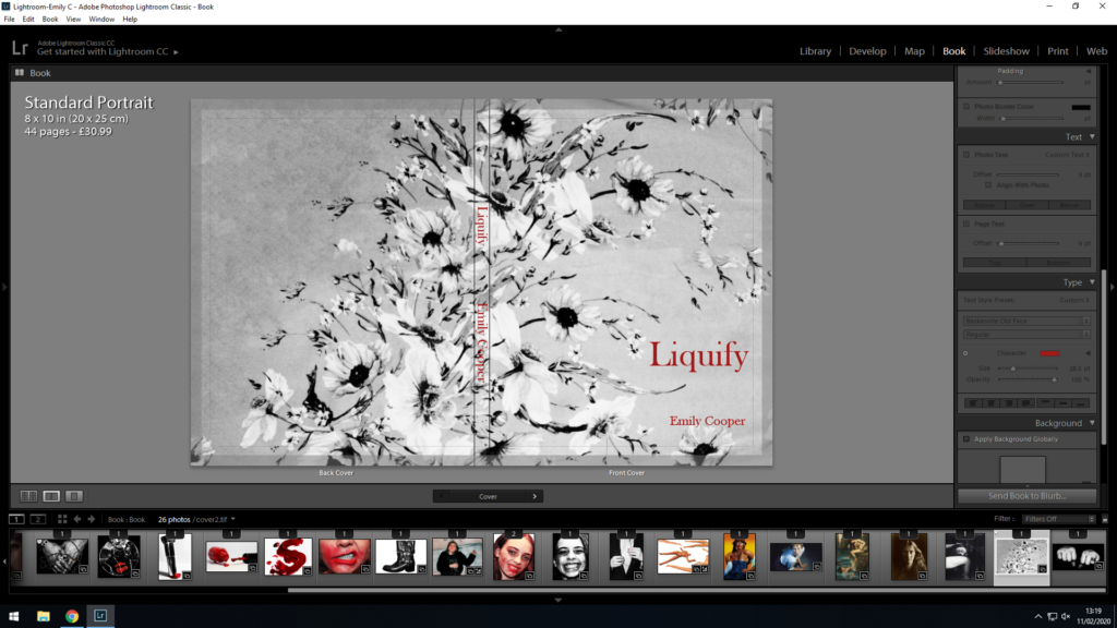
My final layout for my Photo-book (including the essay portion) can be seen below:
The sequencing of my book represents the internal conflict experienced by an individual who is attempting to navigate their gender and identity in a society where there are still strict gender roles and norms. The book shows examples of both liberation of gender, such as the destruction of makeup, the mixing of both feminine and masculine features, and the don’t-care attitude presented by those who disregard society’s norms, and present themselves without apology. However, it also presents examples of the fear and anxiety that can be cause by expressing ones own gender identity, as the pressure and judgement of society causes individuals to hide how they want to portray themselves for fear of judgement. I feel like my book presents both of these themes well with the reoccurring colour of deep-red drawing attention to the anger, frustration and boldness of those who oppose society’s gender roles and norms.
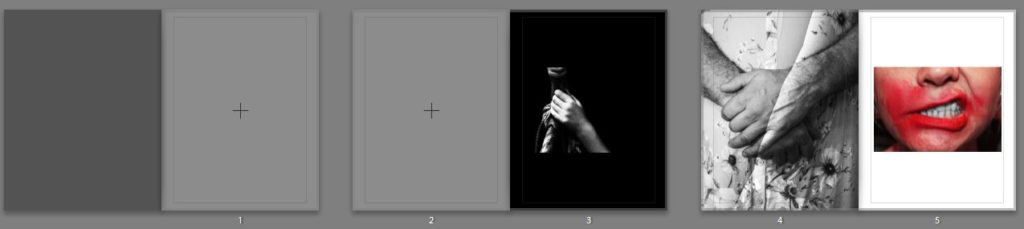
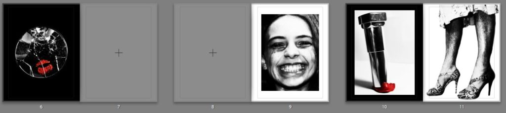
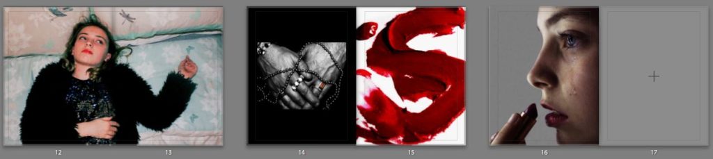
I decided on using 2 images as double page spreads, because I felt like these images required 2 pages for the level of detail that they contained, or because the concept that they conveyed needed extra space for the viewer to focus their attention on to just that singular image. I feel like my first double page spread is effective at focusing on the emotion of the subject, and draws attention to the bored, tired expression on their face. I feel like this image conveys the delicate emotion that Phoebe Jane Barrett conveys in her own work, and due to this I feel like it was more effectively placed as a double page spread. In contrast to this, I decided on placing my second double page spread further along in the book, and this image focuses more on the concept rather than its visual aspects. The image of the broken Barbie dolls conveys the concept of what society’s toxic views of femininity can do to a woman, and displays this in a visually intriguing, but also conceptual way. It is for this reason that I chose these 2 images as my double page spreads.
For some of the images I left blank pages after or before, allowing the viewer to concentrate on a singular image over a 2 page spread. I did this with the images that. fit were strong enough on their own, and by adding a second image opposite them, I would risk overcrowding the viewer. I felt that by leaving spaces between the stronger images in my book, I provided a less cramped, more visually relaxed, enjoyable experience.
Overall, I feel like my book encompasses all of the important aspects that I was originally trying to covey. The end product works with a mixture of emotional and bold imagery, both taking inspiration from Cindy Sherman’s satirical, stylised approach, and Phoebe Jane Barrett intimate, delicate approach. I feel like I have effectively conveyed the struggles and triumphs of fighting back and rebelling against gender stereotypes and norms, while presenting new examples and interpretations of how individuals may rebel against, or feel forced to adhere to, gender stereotypes and identities.
For the physical properties of the book, I have decided to go with a hard cover, premium lustre paper, with a standard portrait orientation. I believe the paper is the most important part of the book, as it allows for the images to be presented with the best possible contrast and colours, and so I have selected premium lustre in order to emphasise the contrast in my images most effectively. Furthermore, I selected portrait orientation, as many of my images are portrait, and I feel like my images as a whole work better in portrait. I have also selected hardcover for its durability factors, as well as the level of quality it adds to the front cover which I feel is necessary due to my cover being more simplistic.