Planning:
The aim of this further experimentation is to re-edit my imagery in order to convey different conceptual representations of my work. I am going to be editing the images in a simplistic and minimalistic way, in order to explore my imagery following my projects aesthetic as well as taking a more contemporary route to manipulating my photographs, using photo shop to do so. Taking the original edit will allow a comparison to be created between the old and new, and doing this will hopefully make my imagery stronger and produce outcomes to which I will want to use in my photographic book. In addition, this will allow me to showcase my ability to creatively manipulate my work in order to create an intended effect. I am planning on taking my top imagery, which I believe could look better in a different variation, from a couple of my photo shoots that I have conducted and will produce two edits of the same image.
Experiment 1:
Original Edit:
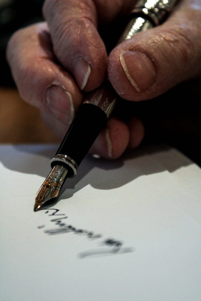
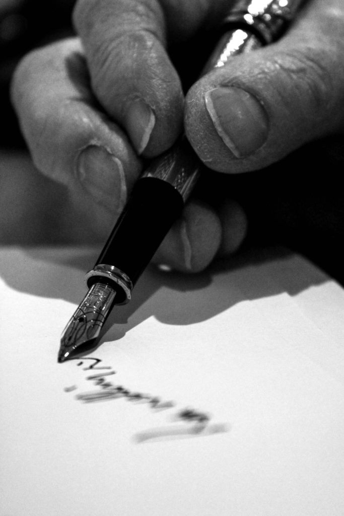
In the original photographic edit of the hand and the pen, I used Lightroom to adjust the white balance, white, blacks, shadows and contrast in order to showcase detail on his skin and the pen, allowing contextual representations about my Grandad’s job and age to be illustrated. The simplicity of the edit allows the image to follow my aesthetic which has been upheld within my project. With this edit I am wanting to create a more contemporary approach as well as a black and white version of this edit.
Design 1:
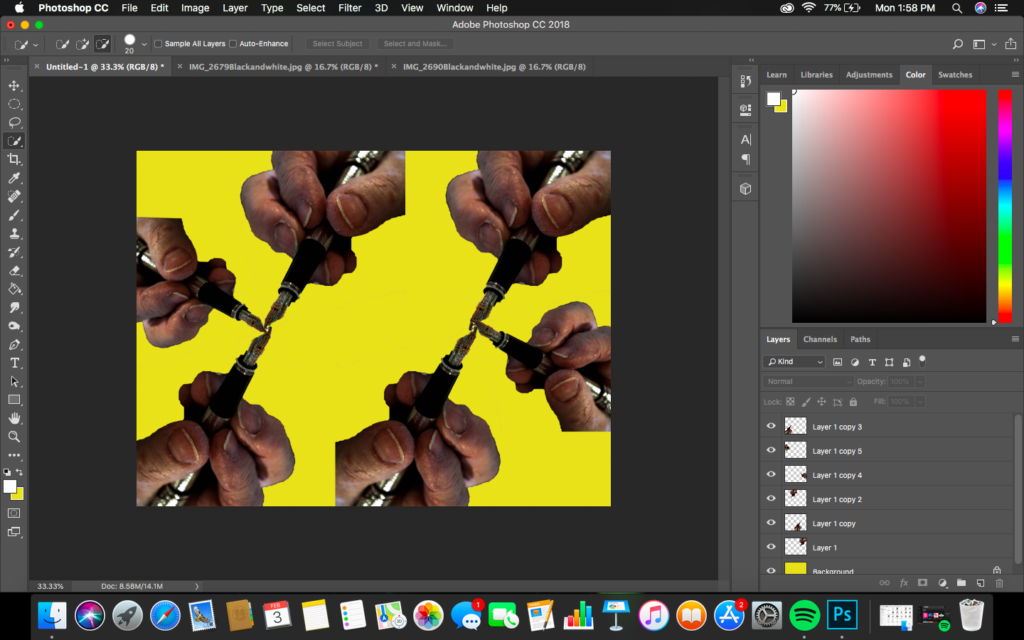
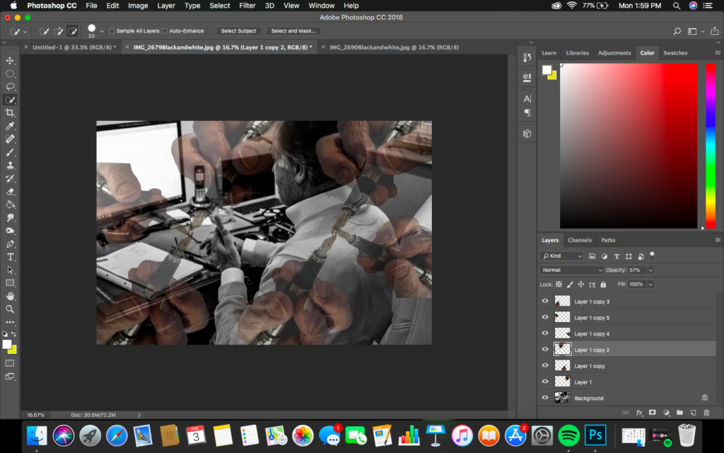
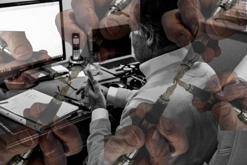
Below showcases the steps I took in order to achieve the final effect. To start the edit off, I opened up the hand picture into photo shop and using the quick selection tool I selected the hand and pressed layer via cut. Then opening a new photoshop page, I placed this layer onto the document, duplicating this layer allowed this hand pattern design to be created. I then merged all these layers into one layer. Opening up the photograph of my Grandad at work and then I placed this hand layer onto, adjusting the size to fit the page (ctrl + t). I then turned down the opacity of the hand layer to around 40% which allowed the affect below to be created. Personally, I really like the way in which this final outcome looks as it allows the conceptual representation of my Grandad being a hard and dedicated worker within the finance industry to be illustrated, as well as showing how this hard work has been developed into his retirement. Visually, the piece is interesting to look at due to the busyness of the frame and the contrast of monochrome and colour within the composition of the frame.
Design 2:
Taking a more simplistic route which follows my projects aesthetic, I decided to experiment with this outcome in black and white. Using Lightroom I got the original image and made the it monochrome. I then looked at adjusting the contrast, shadows, blacks and whites until I was happy with the overall effect. I wanted the photograph to show clear detail on the hand, allowing a clear tonal contrast to be created, in order to conceptually represent his hard work and dedication to his work life which is illustrated through the formal element of texture due to his skin. I believe this is my strongest outcome as it clearly represents my intended concept of the project, as well as following the stylised features of my other photographs.
Experiment 2:
Original Edit:
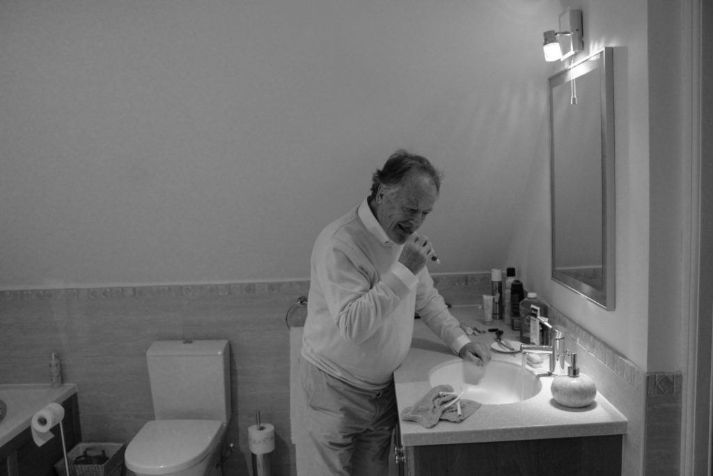
For my next experimentation I decided to explore with the photograph of my Grandad getting ready in the morning as he looks into the bathroom mirror. I wanted to take a contemporary route in order to conceptually and contextually represent his age and inner thought. In the original edit I used Lightroom to adjust the white balance, white, blacks, shadows and contrast in order to showcase detail on his skin and the pen
Design 1:
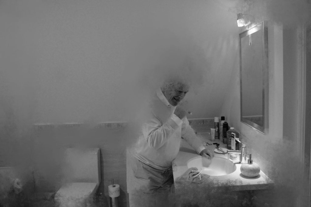
For my first contemporary edit I decided to explore using the burn, smudge tools in order to create texture within the image. To achieve the effects simply went round the outline of the back of my Grandad and smudged him which represent decay and his age, suggesting retirement and his peaceful lifestyle. Adding to this I used the burn tool in order to blend the smudge and make it look more naturalistic. I really like the way in which the photograph edit has turned out as it clearly showcases conceptual and contextual representations through distortion of my subject.
Design 2:
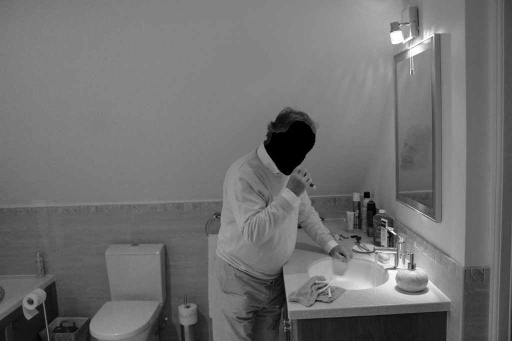
In my next edit of the same photograph I wanted to stick to the same contemporary route. I decided to use the quick selection tool to cut out the face of my grandad. Then using the transformation tool I placed the face in the mirror, looking directly at him, and turned down the opacity making it blend in. Doing this conceptually represents a more intimate approach to himself and his lifestyle, it suggests how he is always criticising himself to do better in the sense of work. It also showcases how perfection has followed him through his lifetime. Personally, I really like this outcome as it showcases my Grandad in a new limelight which is more intimate and informs us more about him, however I prefer the aesthetic of the outcome above.
Experiment 3:
Original Edit:
In this original edit of a photograph inspired by LaToya Ruby Frazier, I wanted to produce another simplistic edit as well as a more contemporary edit in order to illustrate conceptual meaning within the imagery. In the original edit I wanted to have my photograph monochrome, to match the stylistic features of LaToya Ruby Frazier. I wanted to showcase the formal elements of detail, space and form, which was clearly showcased by the composition and the way in which I adjusted the structure, whites, black and shadows. I believe that this outcome is strong but want to explore with the photograph in colour to make a comparison.
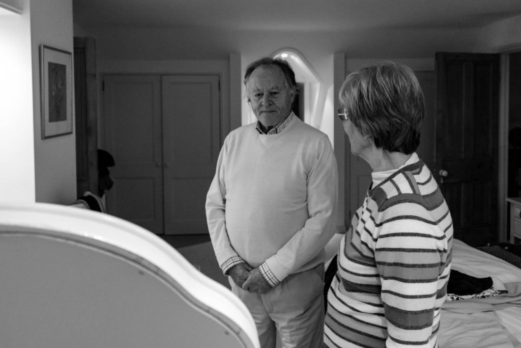
Design 1:
For the colour variation of the photograph I wanted to make the image showcase the same conceptual and contextual representation as the monochrome version of the outcome. To achieve this I simply adjusted the sliders to the same as the other variation. I then slightly adjusted the lights and darks in order to showcase detail on their skin and still illustrate the sense of space within the composition. comparing the two outcomes, I much prefer the monochrome version as I believe the contextual elements of the work is much clearer in presenting itself, due to more detail being showcased and the closer links with the artist the photograph was inspired by.
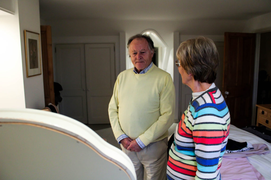
Design 2:
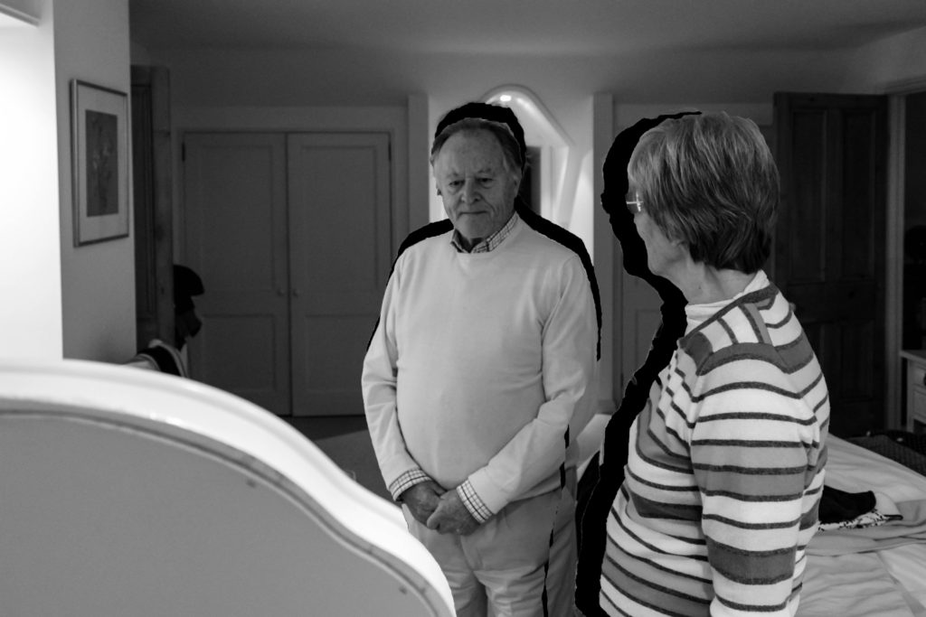
Utilising the black and white outcome of this photograph, due to my personal preference, I wanted to withstand the simplicity of the outcome but add a more contemporary stylistic feature towards it. Simply using the quick selection tool I cut out both of my Grandparents and moved them slightly from their original positioning, allowing a black outline of them to showcased. Conceptually, I was trying to illustrate how their past is leaving them as they become older how their lifestyle habits have changed and how their personality is changing due to situational factors presented in their lifestyle today. Personally, I really like the way in which this outcome has turned out as it creates a interesting piece to look at through the rule of thirds and the subtleness of the black outline.
Experiment 4:
Original Edit:
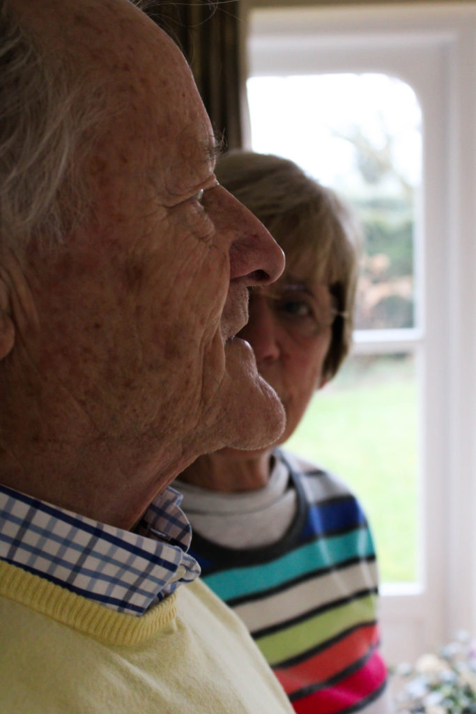
For my final experimentation I used another photographer from my LaToya Ruby Frazier photo shoot. In the original edit I wanted to have my photograph monochrome, to match the stylistic features of LaToya Ruby Frazier. I wanted to showcase the formal elements of detail, space and form, which was clearly showcased by the composition and the way in which I adjusted the structure, whites, black and shadows. I believe that this outcome is strong but want to explore with the photograph in colour to make a comparison. My third edit will still follow the simplicity as I feel if I take a contemporary route to it, it will ruin the strong conceptual values the imagery holds.
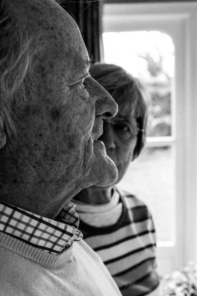
Design 1:
For the colour variation of the photograph I wanted to make the image showcase the same conceptual and contextual representation as the monochrome version of the outcome. To achieve this I simply adjusted the sliders to the same as the other variation. I then slightly adjusted the lights and darks in order to showcase detail on their skin and still illustrate the sense of space within the composition. comparing the two outcomes, I much prefer the monochrome version as I believe the contextual elements of the work is much clearer in presenting itself, due to more detail being showcased and the closer links with the artist the photograph was inspired by.
Design 2:
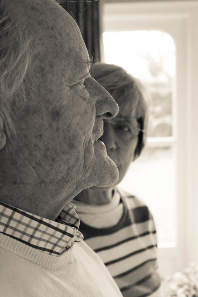
For my final variation of this outcome, I took the black and white version of the edit, due to it being stronger in presenting my conceptual and contextual representation. I experimented with adjusting the hue of the photograph in order to make it have a more orange/yellow sepia tone which helps to emphases the contextual element of the time period they were raised which influences their lifestyle of the male of the house hold being more dominant. Although I like this outcome, I feel you loose the texture and detail on my Grandad’s skin which takes away from the conceptual elements.
Evaluation:
To evaluate these further exploration, I feel I have been able to successfully use Lightroom and photoshop to create image which take a minimalistic and contemporary route to producing conceptual and contextual elements of my photographs. I have been able to demonstrate my skills of using the different tools on photoshop and justify why artistic decisions where made in order to illustrate my photographs. Moving forward, the stronger variations of the outcomes, which follow my minimalistic aesthetic I will look at using and implementing into my photographic book, in order to allow the sequence of my images to flow my easier. To conclude, this further exploration process was useful in the sense that I have been able to make my outcomes stronger in representation.


