Photo Shoot 5 – Walker Evans Inspired

Planning:

After my close analysis to the work of Walker Evans, I decided to conduct a photo shoot which captured my Grandparents lifestyle, by presenting their narrative through their outfit and emotion through facial expression, like Evans’ imagery of Allie Mae Burroughs. I intend to capture a lot of this imagery outside, using the exterior of my Grandparents house in order to make close contentions with his work and also plan to take a few (not many inside) to experiment with this technique and whether it will withstand the same conceptual representation as it would if the photographs were taken outside. Prior to this shoot, I contacted my Grandparents and asked them to wear an outfit which they believe showcases themselves and their lifestyle. In addition, I asked them to choose areas of their house, outdoor and indoors, which they spend the most time in and feel most comfortable in, which will allow the naturalistic documentary photography to accurately depict their reality. With regards to my camera, I intend to use my DSLR, utilising a quick shutter speed, low ISO, and experimenting with the aperture to add depth of field, and dependent on the natural lighting provided.

Edits:

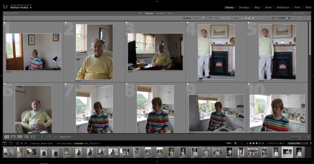
Edit 1 – Flagged
Edit 2 – Star Rating
Edit 3 – Colour Rating

Outcomes:

In respect to editing my outcomes from this photoshoot, I wanted to produce final imagery which held the stylistic features of Evans’ work. In order to achieve this I made all of my outcomes be presented in black and white, and looked at creating high tonal contrast to allow facial features to help express and convey the lifestyle in which my grandparents live in. To achieve this I looked at adjusting the contrast, structure, blacks whites and shadows in order to achieve this intended effect. My final selection are images which I believe have the same simplistic composition, but still holds strong conceptual and contextual representation, about the life my grandparents live and providing information about how they achieved this lifestyle, which is further explained in my photograph analysis.

Analysis:

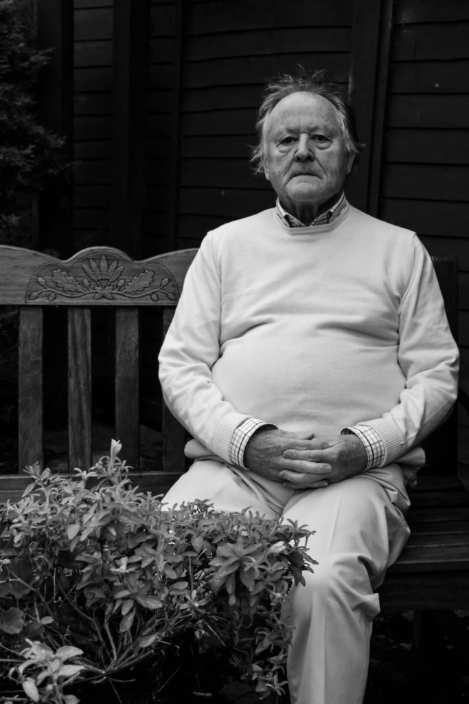
The two photographs below is my photograph which has taken inspiration from Evans’ imagery, which I believe shows my understanding and application of Evans’ photographic technique. The framing of the two images are very similar, both present the subject in the foreground, with the background being wooden and simplistic, not distracting the viewers. Similarly, both images are presented in black and white with high tonal contrast, which has allowed the detail and structure of the subjects to clearly stand out to present conceptual representation. In addition, the methodology used to capture both photographs share a lot in common, with a low ISO being used, a quick shutter speed, low aperture due to no significant depth of field, and natural lighting being utilised. Comparing the two images visually, my image shows more structure and detail, which allows a warmer atmosphere to be presented holding ameliorative connotations, which contrast Evan’s image which is a lot more smooth and naturalistic which holds a cold atmosphere, creating pejorative connotations. Along side this, the outfits of the two models are different as it clearly shows two different socio economic status of two people, and showcases their lifestyle.

Conceptually, Evan’s captured Tenant Farmers in Alabama, and their lifestyle through portraits of different families. Where as I have captured my Grandad in order to present his life story, from when he was younger working in finance and making his fortune to be able to live his wealthy and happy lifestyle now a days. Contextually, the subjects in Evans’ imagery had low income and would not be able to change their lifestyle due to their situational factors. Where as, I contextually presented Jersey as a finance institute which holds the most income on the Island, it also shows how my Grandad worked in this field as he know he could make a lot of money for it in order to afford this lifestyle later on in life.

Conclusion:

To conclude, I believe I have reinforced my ability to produce photographs which take on the stylistic features of another artist. In addition, I have also been able to apply similar conceptual representations within my work as another artists, which shows my ability to apply different elements of artists work through my understanding of their methodology. I have been able to explore capturing my subjects in a different environment, which presents them in a new ‘limelight’. Technically, I have shown my ability to capture portraits in an outdoor environment, and have again reinforced my ability to capture high quality portraits. I believe this photo shoot has been successful as I have been able to produce high quality imagery which clearly showcases lifestyle in the stylistic way of Walker Evans.

Personal Study: 2nd photo shoot

Planning:

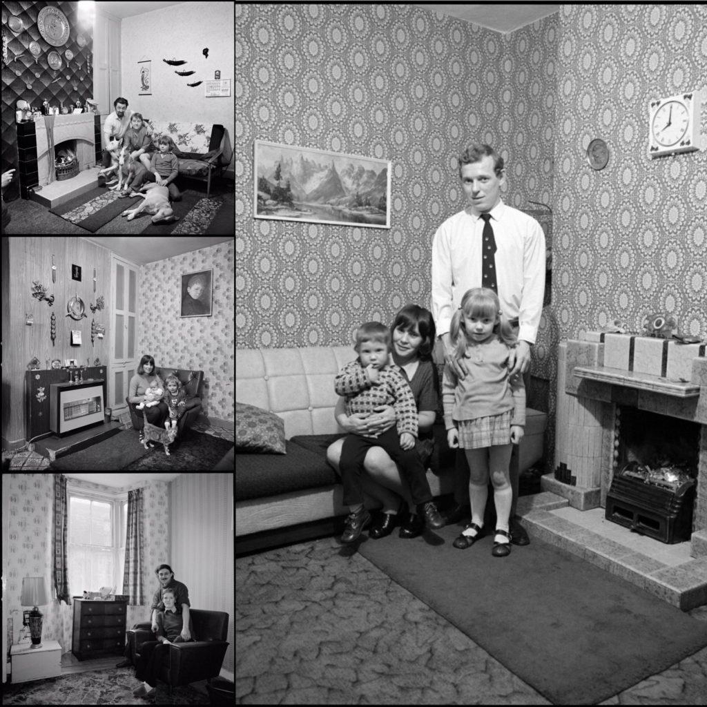
For my second shoot I will be taking portrait style images inspired by one of my case studies, Daniel Meadows. I will be taking these images in order to show my dad’s family now. Since Meadows took his images in the subject’s homes, I have decided to also use my father’s family home as the location for this shoot. I will most likely be using the lounge/livingroom as a location, as it symbolizes family as its where we spend most of our time together. I plan on organizing my family members in a distinct way as you can see in the mood board on the left, in order to make the portraits look more clean and put together. I will most likely be using a tripod in order to make sure my images are in focus, the shutter speed will not be too high as it will most likely be late towards the night when I do this shoot and this will help make sure my images aren’t too dark. The ISO will have to be quite high, and I will need to make sure my white balance Matches well with the lighting around the house.

Picking my best images using Lightroom:

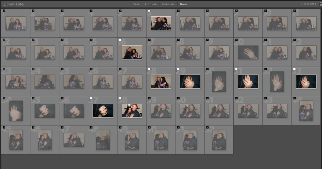
Below you can see the process of how I chose my best images through screenshots. I began by flagging my best images, in order to get rid of the bad photos then I color coded them using red, yellow and green.

Editing:

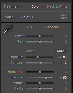
Although I didn’t intend to take images like the one above, This is my favorite outcome as one of my archival images with my parents looks very similar, and I think this could be interesting in showing how my family has changed. To edit i reduced the brightness and increased the contrast. I wanted the faded tattoos on my dad’s hand to be more visible so it is obvious to the audience it is him, although the majority has been laser removed.

Reflecting on the photo shoot:

My intention for this shoot was to capture what my father’s side of the family, now that he has a new partner, no longer together. I wanted to make the portraits similar to the ones above in the mood board, however I feel that during the photo shoot process the images turned out more candid that I originally wanted, as I also ended up capturing some detail shots also which I had not planned on doing. On one hand I believe this lets some personality shine through the images, but on the other hand I would have preferred to also capture something more professional looking because I feel that will make the photo book have a more polished look. I think I may redo this shoot, in order to achieve my original intention, then compare and see which images look best. If I do decide to retake, I would prefer to use a different setting as I think the background of these images are far too distracting to facilitate successful portraits leading to a minimal amount of successful images from this shoot. I also felt as if these images made my narrative less personal since the foundation of my project is based on my biological parents and my brother.

PHOTO-BOOK – Specification

3 Words: Stones, Slavery, Sand

1 Sentence: An exploration of the slave labour and resources used in the construction of Jersey’s German defensive architecture.

1 Paragraph: An exploration of abstraction as a medium in response to the question “how does the work of Darren Harvey-Regan explore abstraction as an intention and process?”. An interpretation of the works of both Darren Harvey-Regan and Donald Weber and how they explore abstraction with an underlying theme of the slave labor used in construction of Jersey’s defenses with familial links relating to German forced labor throughout WW2.

Analysing images – draft

Image result for Walker evans family work
A photo by Walker Evans, from “Cotton Tenants: Three Families.”

Visual :

In this black and white image you can see a family standing on what looks like the front porch of their run-down home. By the tatty clothes they are wearing you can assume that they are a working class family and are struggling with poverty. You can see 5 members of the family standing there, each doing their own thing, with a dog hidden behind the legs of the young boy at the front. The windows of the house seen quite dirty and the wood looks old and damaged – their house doesn’t look well-looked after.

Contextual :

Walker Evans photographed 3 families who were struggling with poverty during his work on capturing the Great Depression in Hale County, Alabama. The people in this image above was one of those families. This family was one of the many who were struggling with living their daily lives due to the Great Depression. At the time of this image, it was the height of it. You can clearly see how the effects of the Great Depression are taking a toll on these families – they wouldn’t have been able to afford clean clothes, enough food or the right equipment to clean their windows or fix their deck.

'Grandma Ruby and Me', 2005 by LaToya Ruby Frazier
Latoya Ruby – The Notion of Family

Visual :

In this image you can see two women placed in the middle of a room which looks like the living room of a home. While they’re very different in appearance – one looks old, with wrinkles and grey hair, while the other looks youthful – they both look like they have a comfortable relationship sitting on the floor together both looking into the camera, as if they are family.

Contextual :

In her series ‘The Notion of Family’, Latoya Ruby looks at her family’s struggle with disease and poverty. She photographs three generations of her family – her grandmother, her own mother and herself – to portray their struggles.

Understanding Photobook – Raised By Wolves Jim Goldberg

Related image
USA. San Francisco and Hollywood. 1986-92. Polaroid Grid.

The book is quite large, at around A3 size it is bigger than most photo-books I have seen. In hand the book is heavy and looks as if it is packed full of high quality images on thick paper. It is smooth and glossy on the outside and feels not much different to any other new-ish book. It contains a mixture of mostly black and white images and some coloured ones, accompanied also by notes and writings on each image written by the subject of the photo themselves. The paper texture remains the same throughout: slightly glossy. RBW is a mix of full bleed landscape images covering two pages as well as portrait. It is a soft back book that can be bent easily, there is no cloth cover or intricate binding.

The title is probably what attracted me most to the book; ‘Raised By Wolves’ is a term which was coined by one of the subjects who was being photographed, he wrote it down on a note and Goldberg has displayed it next to his portrait in the book. I interpret the meaning of this title as coming from how most of the young subjects in this book have been abused physically/sexually etc, by their own parents and have been brought up around constant drug abuse. Therefore they couldn’t escape from this way of life and ended up living on the streets and mostly following in their parent’s footsteps- the young runaways had been set up to fail since birth.


USA. Hollywood, California. 1989. “Dave at McDonald’s.”

The focus narrative in RBW is the story of Tweeky Dave and Echo. The pair share an appetite for heroin but not much else. He moons after her, proposing marriage and children, fueled by impossible, sweet bravado as he walks, half-starved, down Hollywood Boulevard with his bedroll. She recognizes him as worse than a bad risk and dumps him to run with other boys, who abuse her. She becomes pregnant, has her baby, then returns, broke, to her mother’s home. This is all portrayed through numerous written interviews with the two, as well as other characters, and through constant photos and notes that they have written.

Jim Goldberg USA. San Francisco, California. 1991. “Echo, 4 Days Before the Baby was Born.”

“I didn’t really fit in to my family as much as they wanted me to and I think that lead me eventually to photography. A camera back then, and probably still now, was like having a calling card that let you into places that you normally wouldn’t go to, or to people you normally wouldn’t talk to. I moved to San Francisco at the end of 1976 and probably soon thereafter I started going out on the street. Some of the people that I met were living in transient hotels, and they invited me into their homes and I photographed them.That was interesting to me. I was dealing with a group of people who I had very little contact with; they were poor, they were hidden, they were invisible people in these grimy rooms.”

Jim Goldberg spent 10 years photographing, audio-taping and videotaping to prepare this book. The book pairs images of the adolescents in their makeshift environments with extensive interviews. Their stories are accompanied by testimony from social workers, doctors, parents and police. The truth about a runaway’s childhood is sometimes hard to determine. These kids seem acutely aware of what adults want to hear. Some may not separate the rights of parents to exercise authority from fantasies of child abuse. But the blase accounts they gave Goldberg of violence at home and of streets rife with prostitution, AIDS and hard drugs are too numerous to be discounted.

“I had the idea of having people write their stories on the photographs and, although I didn’t really know what I was doing, that turned out to be something really integral to my practice for 40 years. I just saw something that I felt I needed to try and make sense of. And using text enabled me to do that.”

There is a definite link between the images and text in the book. As each image more often than not came alongside a note or physical writing on top of the photo, in the subject’s handwriting. Goldberg has since been using this process for many years as it allows a more open discussion between the subject and how they are being portrayed through the photograph, in their own words.

Bibliography: https://www.huckmag.com/art-and-culture/photography-2/flipping-gaze-photos-jim-goldberg-documentary-storyteller/ , New York Times.

Ed Templeton Response – First Set of Final Photos

To start practicing and developing a response to Ed Templeton’s art/photography. I’ve decided to use some select film photos which were taken and developed over the summer, these comprise of just some candid/unposed photos of my friends, as well as some I have gathered from my most recent photo-shoot. Next I am going to scan them, edited them all into black and white to create a sequence to the images, then I am going to print them out and start working over them physically with paint, pens, nail polish etc, and also add in some text where needed, I also decided after doing these to incorporate red as a colour into my book when working over the top- this is because it complements the black and white really well and contracts all the darkness aswell. I really like how they all turned out and since this process takes a long time to get each imagine finished I am planning on using all of them as finals for my photo-book, since they all have a clear unification and go well as a collective. I think its clear that they have all been influenced by Ed Templeton which was my intention, but they also are not exactly the same and include some elements of my own which I really like aswell.

Shoot 6- REflection

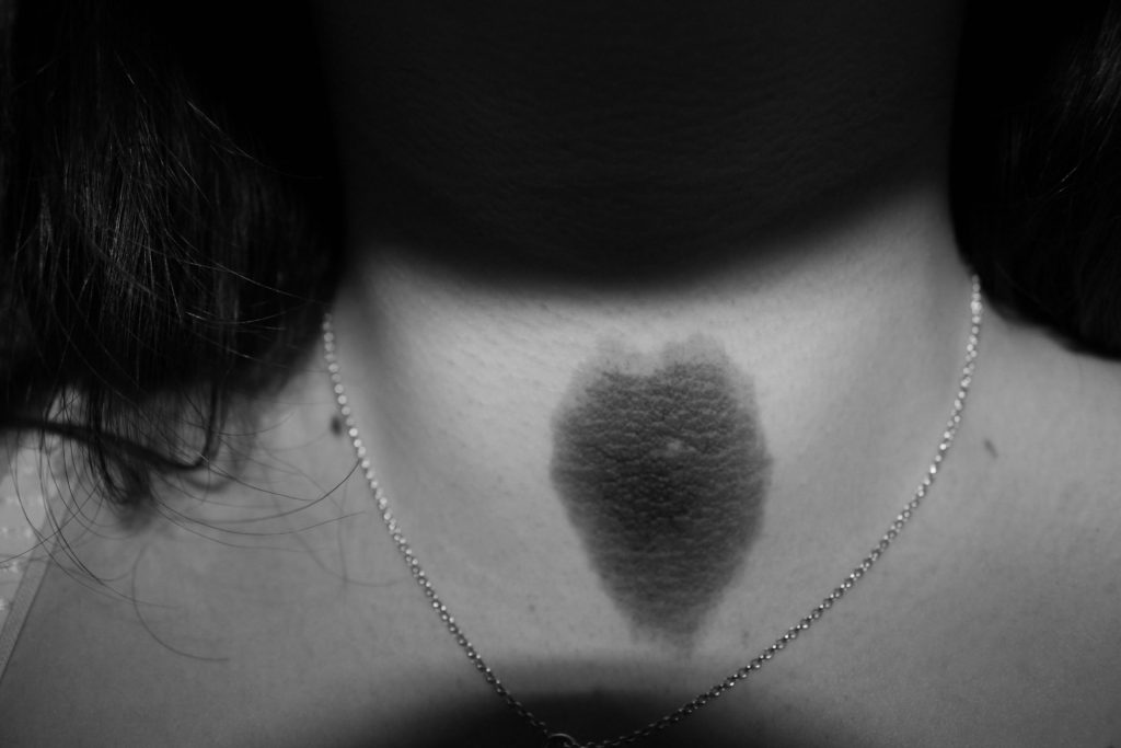
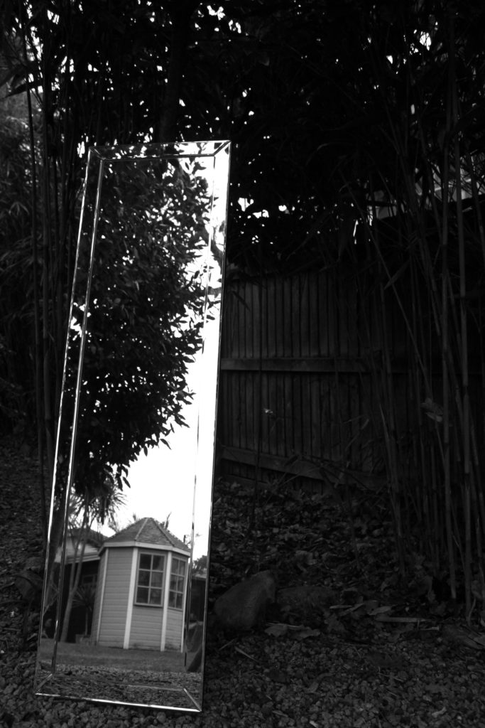
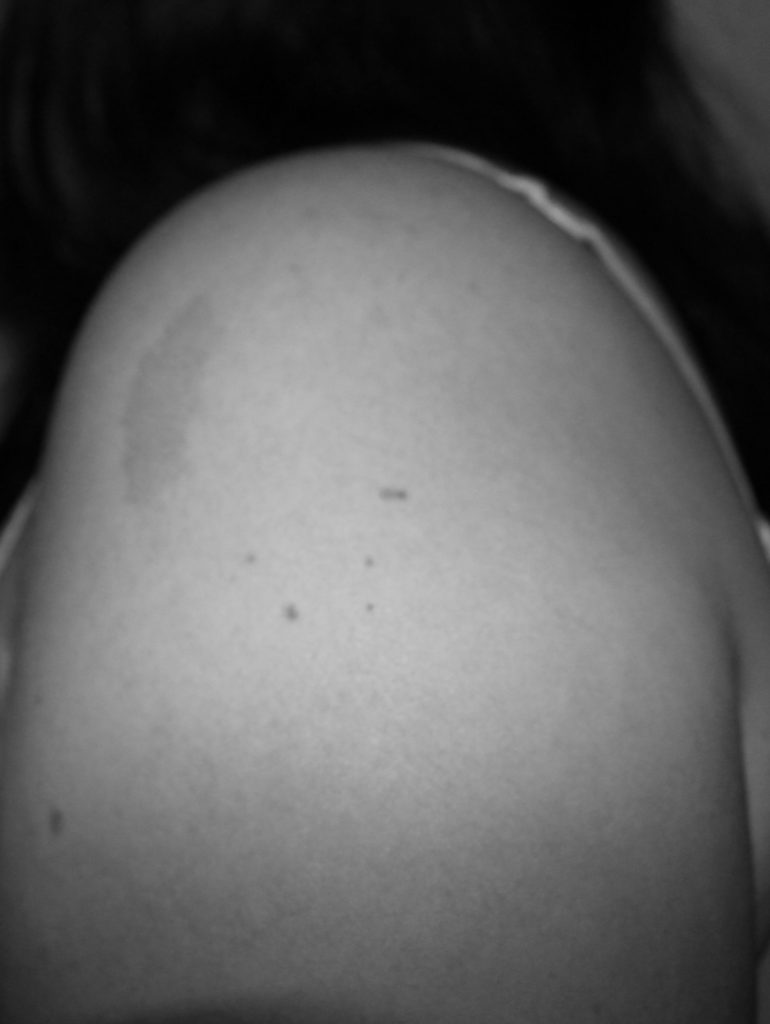
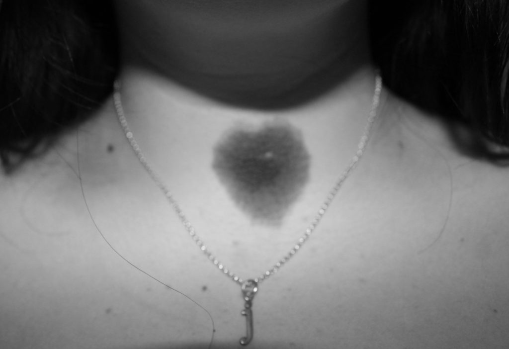
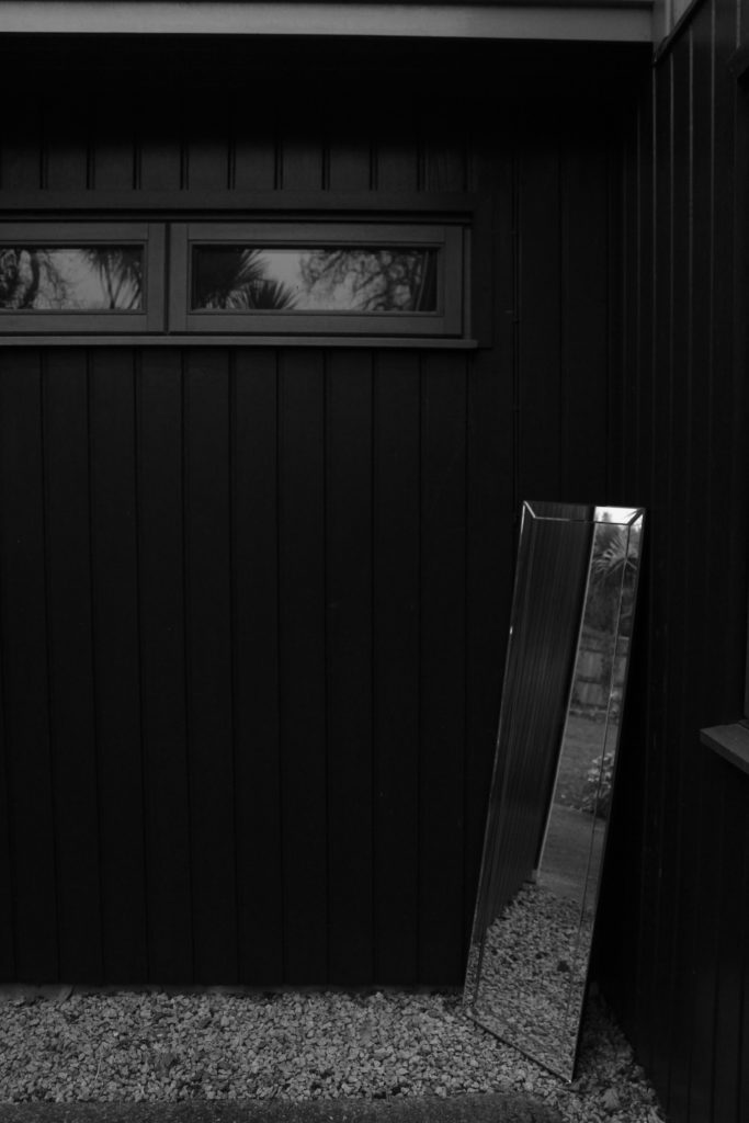
In this shoot I took self portraits of my birthmarks, to add a sense of self and identity to my photobook. My birthmarks have significance to my identity, as they are a part of me.

I took my mirror out into my garden and set it up against trees and walls. I ensured that my reflection wasn’t seen in the mirror to continue the theme of lack of identity.

The Longest Way Round – Chris Dorley-Brown

Image result for THE LONGEST WAY ROUND - CHRIS DORLEY-BROWN

The book is a soft back with, 161 pages of images telling a story. This book is about a German solider and a women from Jersey falling in love during the occupation, which was a very risky thing to do, meaning they had to keep it one the down low, to make sure no one would find out, otherwise consequences would’ve been big.

Related image

The layout of the images change from page to page, which makes the book more interesting to look through. Some of the images within the book were taken back during the occupation period and some are more up-to-date, you can see this through the change in quality, focus and layout. This is similar to what it want to present and has given me new ideas on how to layout my images. He also used documents and other objects that can relate to the two individuals, which allows the reader to get a better understanding of the couple and their life they had to live.

Image result for THE LONGEST WAY ROUND - CHRIS DORLEY-BROWN

understanding photobook design – looking for alice

Image result for looking for alice"

1. Research a photo-book

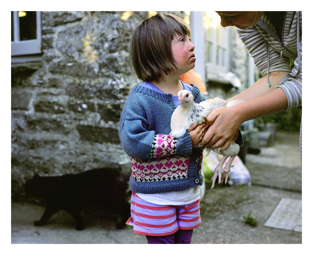
The photobook I will be looking at will be Looking for Alice by Sian Davey. The narrative is from the perspective of Sian, a mother and she captures the day to day life of her daughter Alice, who has down syndrome. Davey captures raw photos that outsiders wouldn't usually see, Alice's interactions with her family, strangers, animals and the world around her. Sometimes she is smiling, sometimes she's crying, sometimes she is all dressed up and other times she is completely naked. Alice experiences the world differently to everybody and Davey is able to capture Alice's unique experiences due to her being her mother who has an intimate relationship with her daughter.

2. Who is the photographer? Why did he/she make it? (intentions/ reasons) Who is it for? (audience) How was it received? (any press, awards, legacy etc.)

Davey started capturing images of her daughter from when she was a year old. In Davey's prologue at the beginning of the book she describes how Alice is "no different to any other little girl or indeed human being; she feels what we all feel and needs what you and I need". Davey later on discusses how "ninety two percent of Down's Syndrome babies are terminated at the pre-natal screening stage." I feel that Davey is trying to display to her audience that Down's Syndrome children are still children, wonderful, quirky and it is beautiful to watch them grow up. Davey is also trying to challenge the perceptions of difference within society as Alice should be treated with no less respect than any other being within society. Davey describes how she struggled to initially love Alice due to "fear and uncertainty", however, Davey discusses how Alice is loved "unconditionally, as it should be". Just because Alice is different doesn't make her any less of a beautiful being and that she should be valued everywhere "without distinction, without exception, without a second glance". 

3. Deconstruct the narrative, concept and design of the book such as:

The book is a hardback and feels heavier than it looks. It has a linen cover which adds a rough texture and the pages. The pages are white and are matte paper.The images are all colourful images. After you turn the first page there is a sheet there is a piece of greaseproof/acetone paper with what ooks like a blurry shadow is printed on. This adds depth to the books and I believe that it is deliberately there to make the readers question the difference, just like how many strangers tend to queston Alice, who many class as different due to her disability. The format size is around A5 and the book is portrait. The cover features an image that also features in the book of Alice standing on a fence and looking out into a meadow. There is a letter press into the cover which indents the writing and makes the letters gold.

The title is more poetic rather than literal because the photographer is Alice's mother, she doesn't really need to literally look for Alice as she's always around her. However, it can have a more metaphorical meaning, such as looking at the way society percieves Alice, how they treat her differently and how they should really treat her. The subject matter is Alice, who is Davey's daughter. She can be percieved as being unique to many other children due to her having Down's Syndrome, however, one of Davey's purposes of her book is to display that although Alice has a disability, she is no different to any other little boy or girl. The images consist of Alice interacting with her family, friends, strangers, animals and generally the world around her. 

Most of the pictures are in the same place, near the top of the page and in the middle of the page. There are no double page spreads however, there are some images that are larger than the usual pattern and does overlap onto the other page. Some images don't have text for them, however, some images has text either below them to explain the image or on the opposite page. For example, the image above has writing underneath it which calls the image The hen and the cat. At the beginning of the book there is an introduction by Davey explaining the book and her reasons to make it. She then has an extract by David Chandler called The love you take. David Chandler is a writer, editor and curator in the fields of photographic history, contempory photography and visual arts. At the end of the book, a poem by Luke, Alice's brother and Sian Davey's son. It is titled sister and it is assumed the poem is dedicated to Alice.

deconstructing a PHOTO BOOK

1. Research a photo-book 

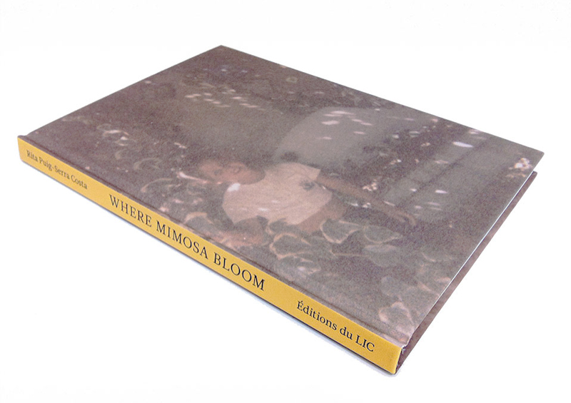
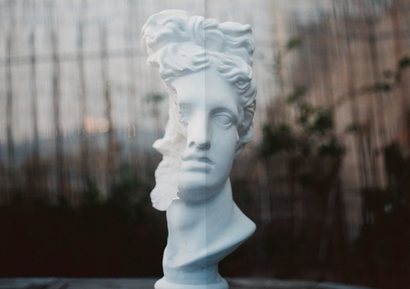
Where mimosa bloom is a photo book by Rita Puig-Serra Costa which is the result of 2 years work, collecting and photographing things and different areas. The narrative is very emotional as it was an outlet for Costa to deal with the grief she felt after loosing her mother. The subject matter of the book is diverse, as there are archival images, portraits of people who played an important role in her relationship with her mother, and also landscapes of places.

cover Where Mimosa Bloom

2. Who is the photographer?

The photo book is described as being “an extended farewell” to her mother in the form of images, meaning it was made as an homage to her mother. I think this photo book effectively shows love, loss and pain. Because this piece of work is very emotional, it is likely that only positive sentiments of her family unit will be shown, which can be limiting as we may not get a full insight to her family.

3. Deconstruct the narrative, concept and design of the book such as:

  • Book in hand: When holding the book, it is clear it is a hardcover and that there is some sort of texture to the front and back cover. The binding appears to be regular as it is all joined together on the left side.
  • Paper and ink: The paper and ink used appears to be standard and there is a clear use of bright and pastel colors instead of darker ones. The book has a Hot foil embossed textured hardcover and 5 die cut pages. 54 color plates are used.
PuigSerra_01
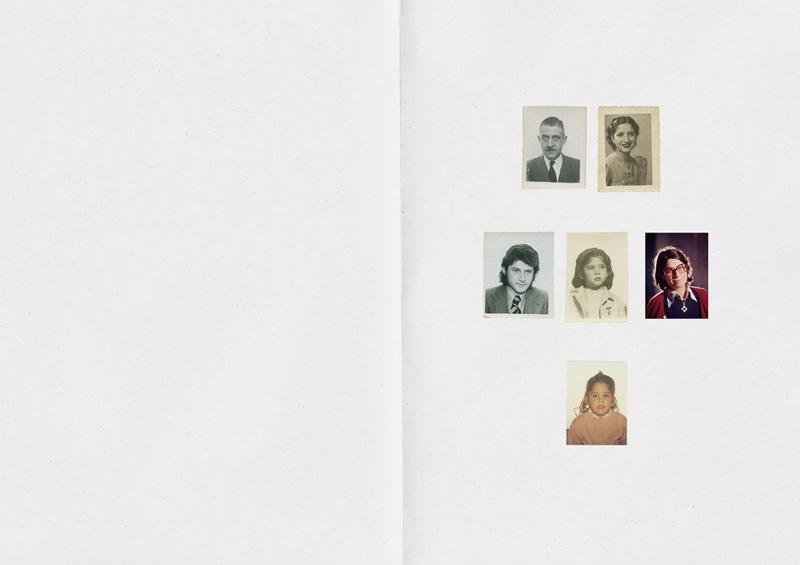
“Die cut” pages displayed above
  • Format, size and orientation: The size of the book is 16 x 22.5 cm and the orientation is Portrait.It is A5 size with 96 pages.
  • Title: The title is rather poetic, and relevant as mimosa are soft and delicate and this could reflect that this plant was important in her relationship with her mother. Since it is quite poetic it is very intriguing as it invited the reader in in order to be able understand it’s metaphorical meaning.
  • Narrative: The story is about her’s and her mother’s life and the subject matter at hand is her family and important relationships within her personal family structure. It is told at the beginning through a family tree style approach as with every die cut page we turn someone else from her family is revealed. We then go onto see archive materials in the form of images and objects along with portraits in order to further understand the individuals shown.
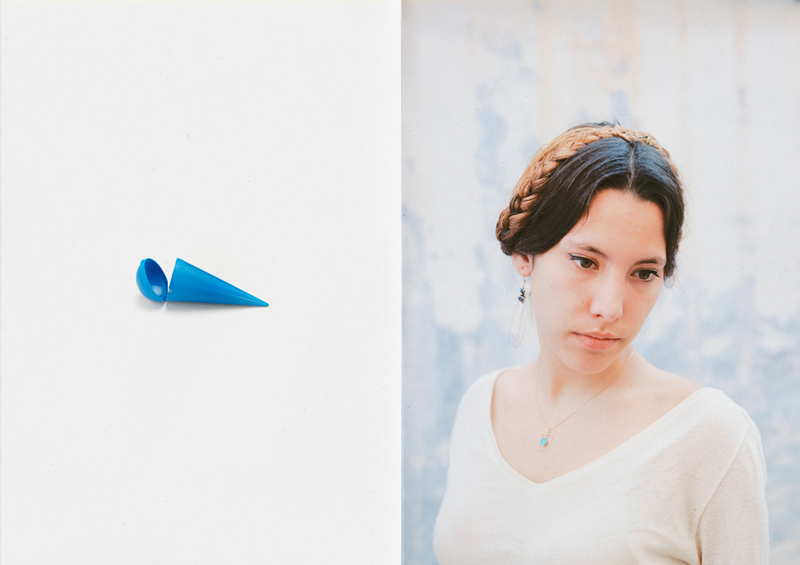
  • Structure and architecture: One repeating motif seen throughout the book is how there is a repeated structure of placing an image of an object, next to a family member’s portrait. I think this aids the narrative since it develops the concept of her attempting to reconnect with her mother through people and objects, and having this repeated also helps the audience to feel as if they are a part of her journey of discovery.
PuigSerra_05
image of an object displayed against a portrait.
  • Design and layout: The photographer uses a wide variety of techniques when displaying her images. Some images are portrayed landscape, while others such as portraits are displayed portrait. Some images are displayed using a double spread, whereas some archive images are displayed altogether on a page in groups of 3. The book contains no inserts or fold outs, which I feel is good otherwise the book could become too confusing and the viewer would not focus on the concept as the way the images are displayed is already quite varied.
PuigSerra_06
full bleed, double page spread.
  • Editing and sequencing: There are 5 die cut pages at the beginning, where a different picture is revealed from cut out paper as you turn a page. This sequence reinforces how the book revolves around family, and it introduces her relatives to us in a simple way, which doesn’t overwhelm you with knowledge. The photographer also chooses to display certain objects on one side of a page next to a portrait, which could convey the feeling that the object is of significant importance to the person shown in the portrait. This also creates an obvious juxtaposition because a portrait and an object contrast very clearly.
  • Images and text: Towards the end there is a page which lists all the objects displayed in the book and all the people who’s portraits are in the book. It also shows what each object is and who it belongs too which is very effective because it allows the audience more likely to understand her story. There is also a sentimental letter towards the end which she has written, and addressed to her late mother. It is first printed in Catalan, which is the one of the official languages of the Spanish region of Catalan, which helps show the emotional connection between her and her mother since it is written is their native language. It is then printed again in English. She speaks about her she still feels her mother’s presence when surrounded by family, of when she looks at herself. She explains how although she is very upset that she’s no longer here, she finds comfort in the fact that she has so many ways of remembering her.