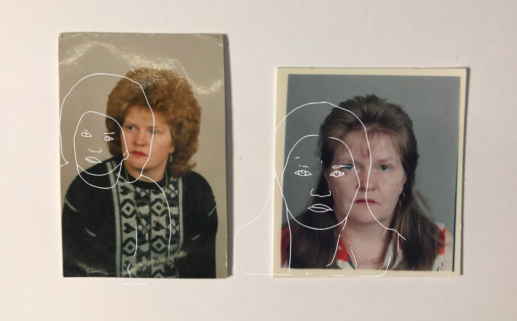
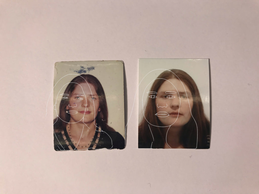
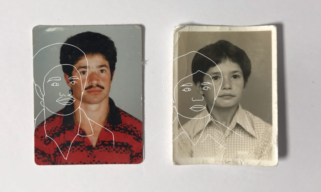
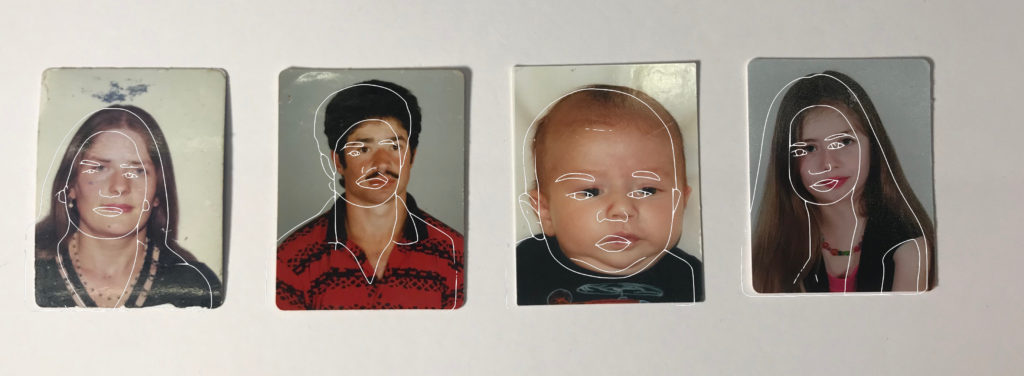
After having completed my first photoshoot I decided to play around with some of the images that I took.
These images I used an app on my iPhone called PicsArt. This edit allowed me to manipulate a somewhat cartoon line drawing over each of the portraits I have explored. I did this because I want to bring in artistic elements to create a more visual and exciting image. For some of my next edits I am going to explore a range of material and sources in photoshop and other apps I may find to create blurred effect as my book will go on.
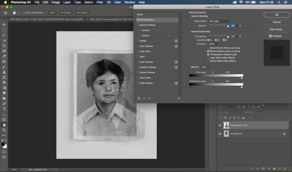
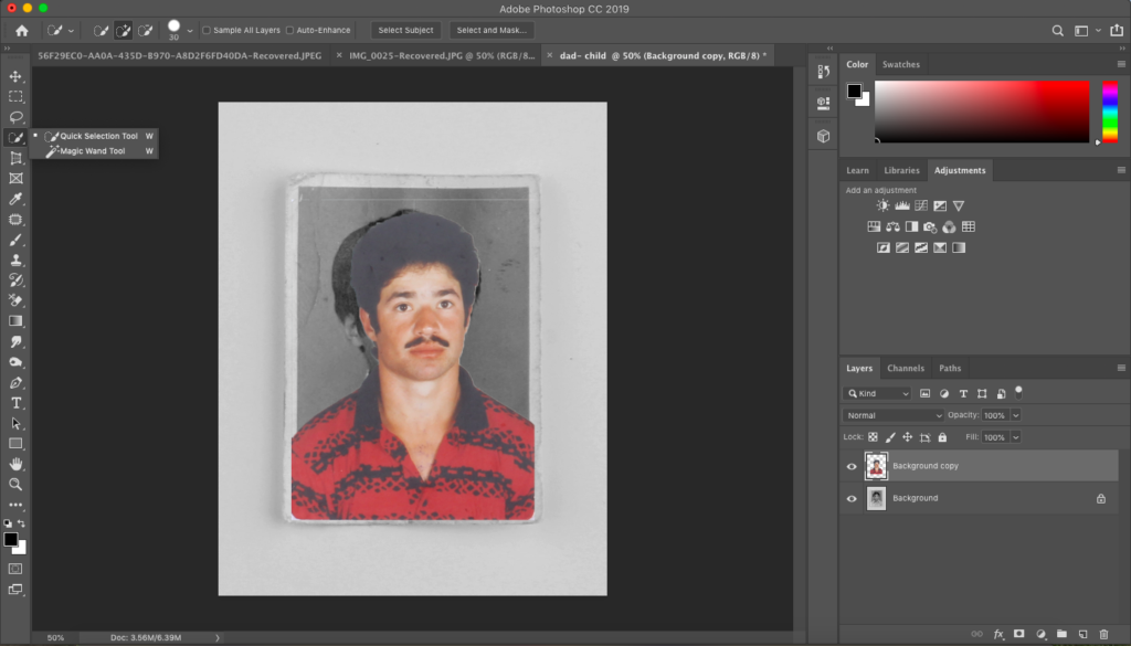
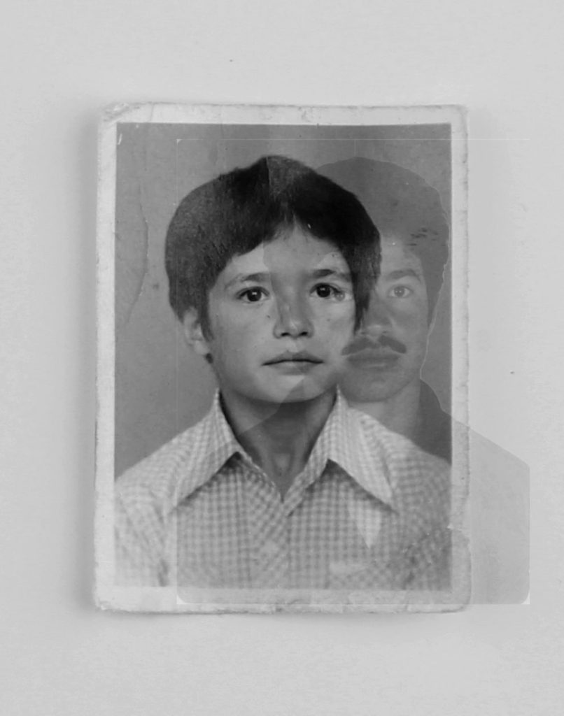
I played around with the images above in photoshop as well to see if I could create this old, edgy and faint look. As the images are a few years old i wanted to contrast them with a photo that is more up to date.
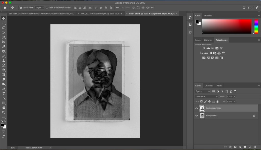
My final outcome with this experiment is below:
In photoshop I used the opacity tool to create this blurry effect. Although, I may not use this in my final outcomes for the book, I have taken inspiration from Diana Markosian who did something quite similar with images of her dad, mum and her. I experimented using the cutting tool and for my next attempt will most likely try using the blurring tool so you can still see aspects of his face.
Diana Markoisan is an American documentary photographer but also a writer and a filmmaker. Markoisan was born in Moscow but moved to California with her mother and brother whilst her dad remained in Russia. One of her most famous final projects was her ‘Inventing my father’ which is the project I am focusing on. She has an experimental approach as evident through her first image where her mother has cut out the image of her father. She began this career at the age of 20 which has led her to travel around some of the most pristine areas of the world.
This was the closest thing i had to an image of my father: a cut out on our family album. I was 7 years old when i last saw him. The soviet union had long collapsed, and by then so had my family. When i would ask my mother about him, she would look at him, disappointed. “forget him.” 15 years later i found him standing just as i left him. In a doorway, neither fully in or out my life. I listened to him speak about the past and his past feelings for my mother. Its strange to look at images of them together. They look so happy and in love. One of the only images of my Father and I
ANALYSIS
Technical – the image above is an archival photograph as Markosian said so herself she doesn’t not have many images of her and her father. Therefore the lighting in the image is most probably natural lighting that she has used coming through a window. There is a range of tonal shades on the photograph. The main beam of lighting is on her and her father, the darker and not so lit areas are on the other individuals in the image, perhaps other family members. Markosian has purposely done this so that the main area of focus is on her and father. The depth of field her in the image above is right on the focus as you can see the other people are more blurrier than them two. The lighting in the image is a fairly warm tone however having more tones of brown and black rather than orange and yellow.
Visually, the main colors that makes up the image is dark browns,blacks and then the dark blues that she and her father are wearing. I think she has chosen to shine a light on the blue making it more vibrant therefore stand out in the image. The way she has composed the lighting to only shine on her and her father I think is important as she only wants her viewers to focus on them two and not where or who she is with. From what we can see in the image she and her family are what looks like a cafe or restaurant with maybe her brother and uncle. However her mother is not in the image which leads me to believe she may be the person that is behind the camera.
Context – Markoisan chose this image to publish and to be part of her project as she did not have many photos with him. The project for her in a sense was for closure and to establish something that she had no power and control over. Her style of photography links well with realims and straight photography as she is documenting her life by what it is really like. She uses no filters and no editing that marks her images as unrealistic. Images emerged from walking and thinking, from spending time with the freedom of ideas unhooked from the psychological demands of the assignment. “It’s a form of meditation. There’s a mental archive of images that I am making, they are not for anyone but me. The walk serves as a form of inspiration. The walk becomes the art.”
The main reason I have chosen to focus on Diana Markosian’s work is because she has created a whole set of images and a project called “inventing my father.” The link to her website is above. I think this links well with my personal study due to the focus being primarily on her Dad’s absences.Most of her images have a small caption showing and explaining what each of the images contain and what’s happening in them. Most of her captions are short and direct which is what she’s trying to express with her relationship with her father. She expresses that the last time she saw her father was at the age of 7.
Although, some aspects of her project link well with mine I’m choosing to focus more half on my dad but the majority of my project on my mother. I am going to incorporate some of my art skills into this project like she has done through the use of cutting out the old images to make it look like a missing puzzle.
He told me he had been looking for me. He opened a suitcase filled with newspaper clippings, undelivered letters and a shirt for my brothers future wedding.
Exploring how judgemental society is, and how fashion can affect that.
Describing my book in a paragraph:
Modern society and the people within it are extremely quick to judge, whether that be a person or an event. Fashion, i.e. how someone dresses can drastically affect how they are viewed or treated.
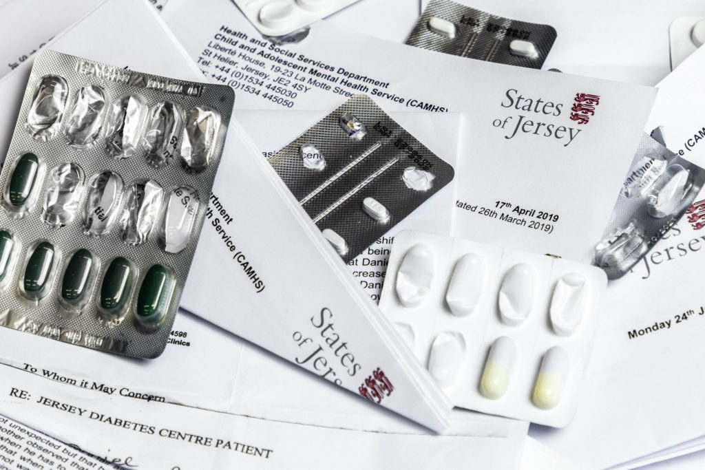
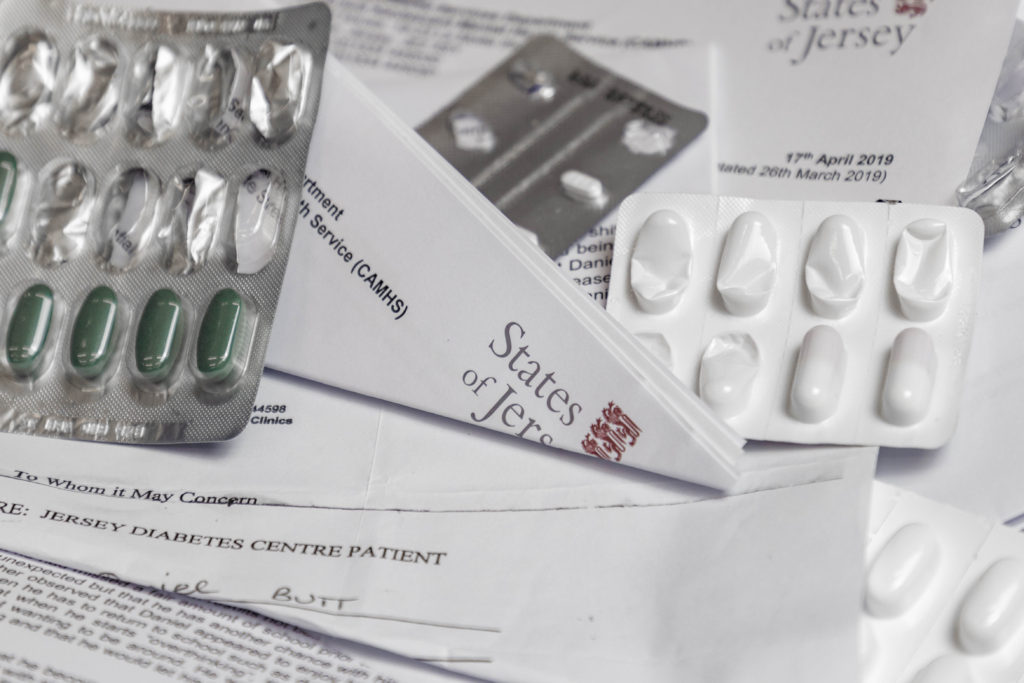
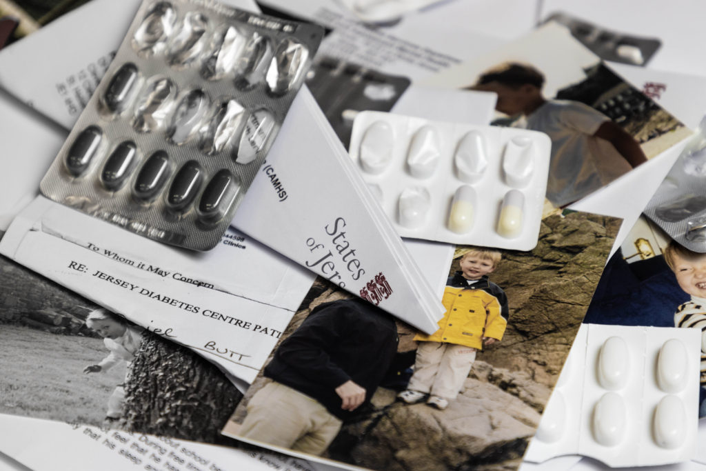
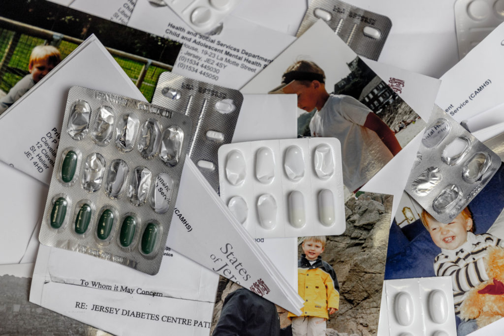
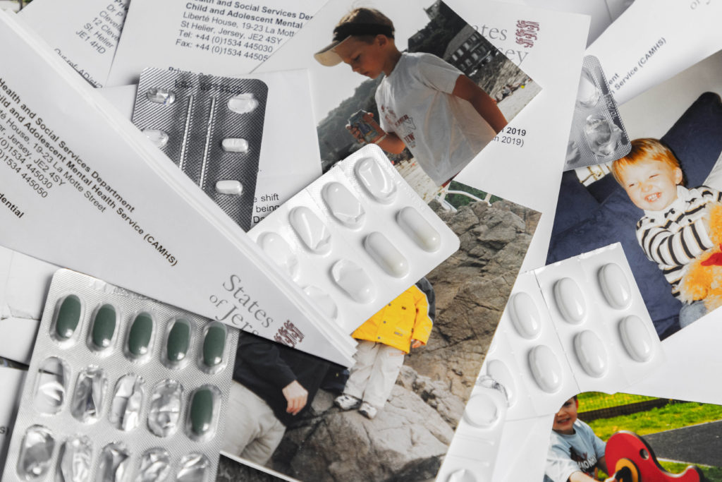
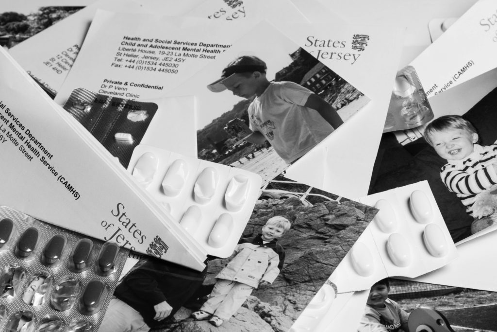
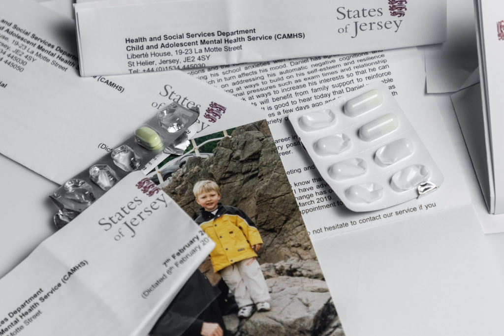
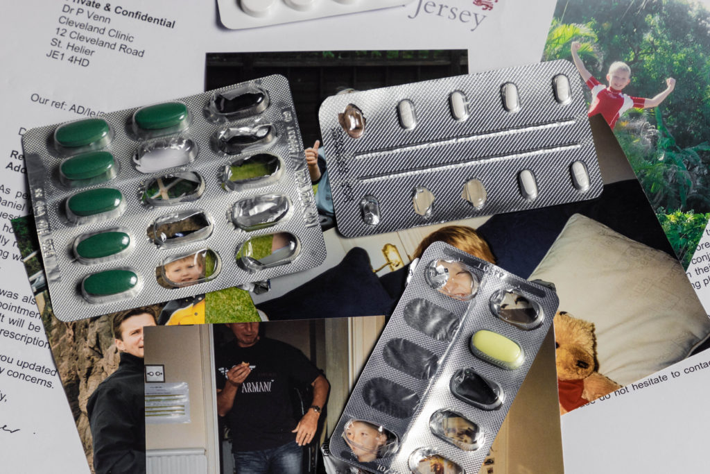
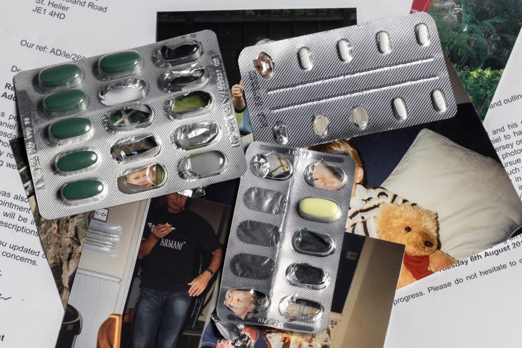
For my second photoshoot I wanted to bring to light the more clinical side of mental illness, focusing on the impact medication has on personality and the tedious nature of check-ups and hospital appointments.
To show the impact of medication, I decided to overlay both full and partially empty packets of pills over photos of me which I found in older family albums. This effect worked especially well where there is a translucent, empty pill packet over my face, which slightly distorts my face, with some doing this more than others; representing the effect that different medication can have.
I also wanted to include as many doctor’s notes and reports as possible as I think it highlights the sometimes overwhelming feeling that opening up can have. This also ties in with the older album pictures of me, as it shows the transition from a child with no worries to someone so consumed by mental illness that the only recognizable feature is their name on a piece of paper. Not only do these images help break up the more low-key lit images from the previous shoot, they also give context to the situation surrounding the subject and the story.
I am also intending to feature images with the old album photos early on in the book, then progressively have them feature less and less as it goes on, so the only images left will be ones featuring only the letters and pill packets to show the decent into a deteriorating condition.
A sentence: Exploring the occupation of folklore tales of a small collective place
A paragraph: My phonebook will look to explore the occupation of local myths and folklore tales in Jersey, Channel Islands, ones that play and important part in the islands history as well as tourism. Using tableaux photography I will be exploring the boundaries between fact and fiction, using the factual locations with stage, fictional actions.
Design: Consider the following
Format, size, orientation: I am choosing to go with a standard A4 20x25cm portrait orientation, I have chosen portrait as I want the allowance to be able to create impactful double page spreads and portrait orientation works best for this I feel. The standard size means I can keep it not overly large and abnormal, as the context isn’t too normal this allows the book to create a sense of reality and normality juxtaposing its contents.
Binding and Cover: I am choosing to use a hardback cover using an image wrap. I feel I can create a larger impact by having a full bleed double page image wrap rather than smaller images or a plain cover. With regards to binding I will have a saddle stitch, hidden by the cover, the simplicity I feel will help to not distract from the narrative
Sequencing: I am planning to move from one narrative to another, to do this I plan to use a starting image and keep a steady sequence going of mixing double page spreads and individual smaller photographs.
Title: I am looking to make my title something surrounding fantasy, I am thinking of using “A Flight of Imagination” – a different way of talking about fantasy in a way which I feel is more mysterious and intreeging.
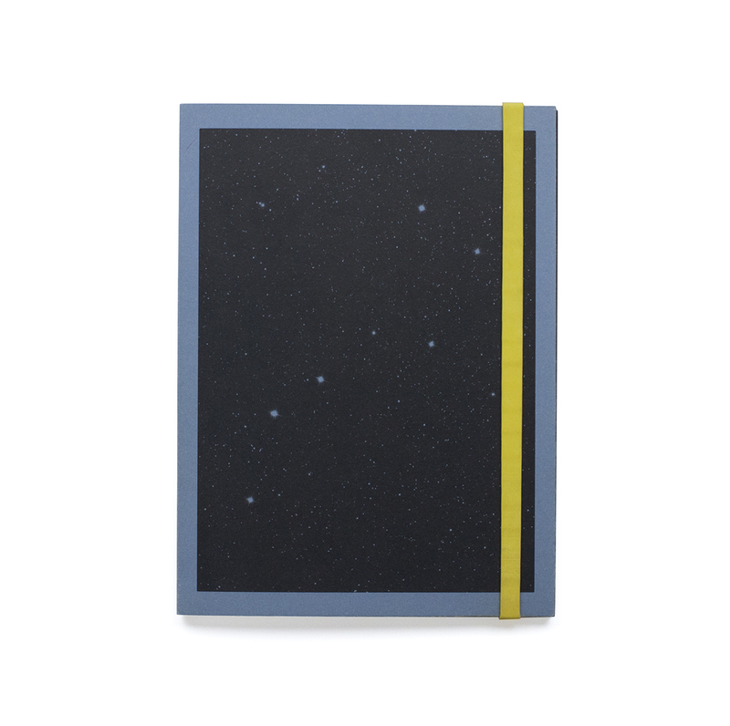
The cover of the book is made using a blue (for the 2nd edition) sugar paper with a black print showing stars, and the back is blank. The paper has been folded over at the opening and stick to itself to reinforce the covers. There is also a thick rubber band to hold it closed which is yellow (for the 2nd edition).
The intended orientation for the book is portrait however the images within are mostly squares at the top section of the page with rounded corners.
There are some images that are printed in black on some white translucent tissue paper, these are interspersed throughout the book. They are mostly showing designs of space suits as the paper with the grids on it is old designers layout paper used for designing things as it can be traced through easily.
The book has some inserts within it which are letters and conversations between people who were involved in the African space programme. They are folded over and have been glued into the binding.
The images within the book are printed on matte paper, and they are either tableaux images or ones that set up the story. With some archival images and texts within it to help illustrate the story.
There are also images within that are double page spreads except they are not the full size of the pages to differentiate them from the rest of the book.
A sentence: It’s about my inner conflict towards my role in the family after my parents divorce.
A paragraph: My photobook explores my emotions during a time of change, in which I felt everyone was going forward but I was stuck in the present, when everything was how I liked it. Through surrealistic and documentary photography it express a period in my life that was confusing, yet also exciting, new people, new places, a whole new life.
How you want your book to look and feel: I want my book to look minimal and feel smooth on the outside but on the inside it will feel chaotic.
Format, size and orientation: It will be a landscape book, A5 or A4.
Binding and cover: The cover will be hard and glossy with standard binding.
Title: ‘Life In A River.’ The idea behind my title is from the saying ‘you cannot step in the same river twice’. This connects with my book in the sense that I can never go back to before the divorce, before I moved house, life is constantly changing, it’s whether you let the river swallow you or you swim with it.
Design and layout: None of the images will cover a full page, I want it to feel like a scrap book/ family photo album that appears messy yet, the story is meaningful. I want there to be a lot of negative space surrounding the photos to symbolize isolation.
Editing and sequencing: I will start with a few documentary photos from a decade ago then move onto some surrealists images. Throughout there will be a mixture of documentary and surrealist to create a sense of uncertainty and confusion.
Images and text: My text will be on opposite page to the picture and will be quotes from my interviews of just sayings or sentence I think are significant to the image. The text will be small and black with a simplistic font because words aren’t as important as actions.
My book specification is going to follow along the lines of a story about my subject – Max my Polish friend – and in a nutshell, about the life he lives. The narrative behind it will be following him along on his ventures through everyday life and how this differs from the stereotype of polish immigrants in Jersey. The sequencing will be a photo on each page, with each double page spread having two similarly linked images of Max going about his life.
Narrative: What is your story?
Describe it in:
3 Words: Luxury, Travel, Affluence
A sentence: About my friend Max and how his affluence affects his life journey.
A paragraph: The story of this book is to explore multiple avenues in which my affluent migrant friend Max can be viewed as out of the ordinary and contrary to the stereotype most people have about his polish nationality and what he should be acting like and doing.
Design:
I want my book to look fairly minimalistic and effective. So that is easy to interpret and the images are distinct in showing what I want them too. I want it to feel smooth and solid so that it is versatile and gives off a professional, well put together feeling to those who read it.
Paper and ink: I have chosen for the paper colour to be black because this gives the book a more finished feeling than just leaving it as the plain white page colour. It also allows for the images to stand out due to the contrast in the bright image colours to the black surrounding. It also means that the book isn as harsh on the eyes as white may be, meaning it is nicer to read. The paper type is Standard 80.
The ink colour I have therefore chosen the text in the book to be is white. I have chosen this because this colour contrasts the black background directly and stands out more than any other colour would whilst also looking aesthetically pleasing.
Format, size and orientation: I have chosen my book to consist of a standard portrait 8 by 10 inches format.
Binding and cover: My book will be a hardcover with and image wrap around it. The image will be from one of the photoshoot I have carried out and will not be included within the book due to it being on the covers. The reason I chose the image I have done to wrap around the covers is because it fits the black and white aesthetics of inside the book whilst also showing a detailed, close-up and personal image of the main subject that is being viewed. It also gives viewers the opportunity to come up with ideas or pre-existing concepts before they read the book after looking at the picture of the subjects face and the facial expression they are showing.
Design and layout: The design and layout of my book was all done spur of the moment due to the fact that I thought it would be best to experiment with different image layouts and page designs whilst creating my book in order to really find out which ones were most effective rather than plan it ahead and find out it does not look as good after having invested time and effort working on it.
Editing and sequencing: All images have been enhanced through light-room to emphasise things such as colour contrast, the main focus of the image and in some images the actual make up of them and what they contain (by this I mean methods of cropping in order to remove unwanted distractions or areas that would not look right or effective in the final image presentation.
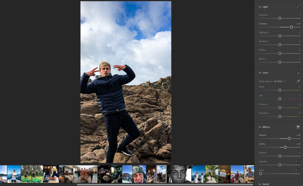
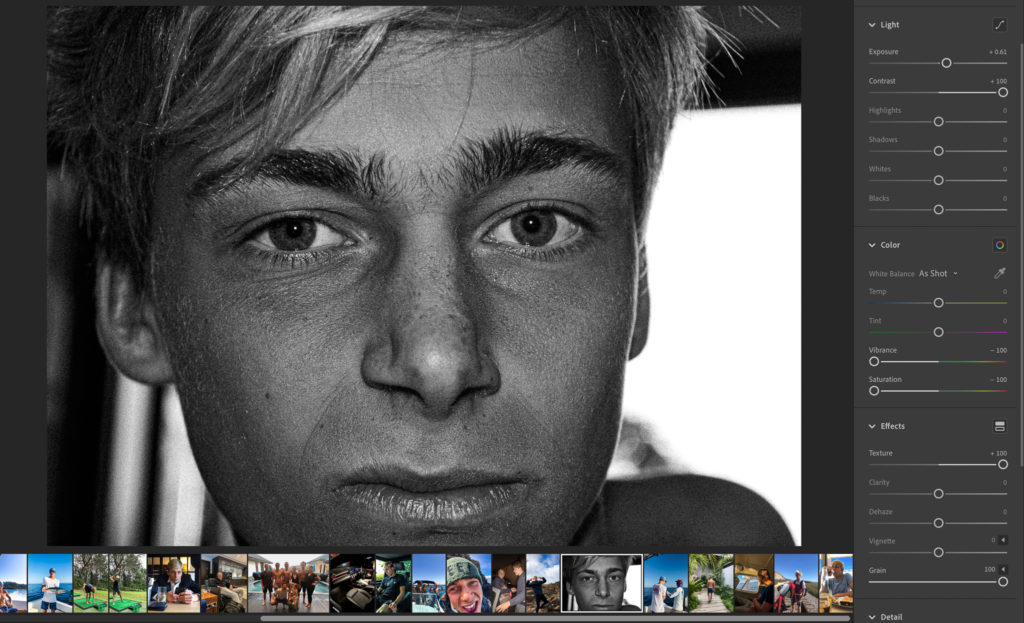
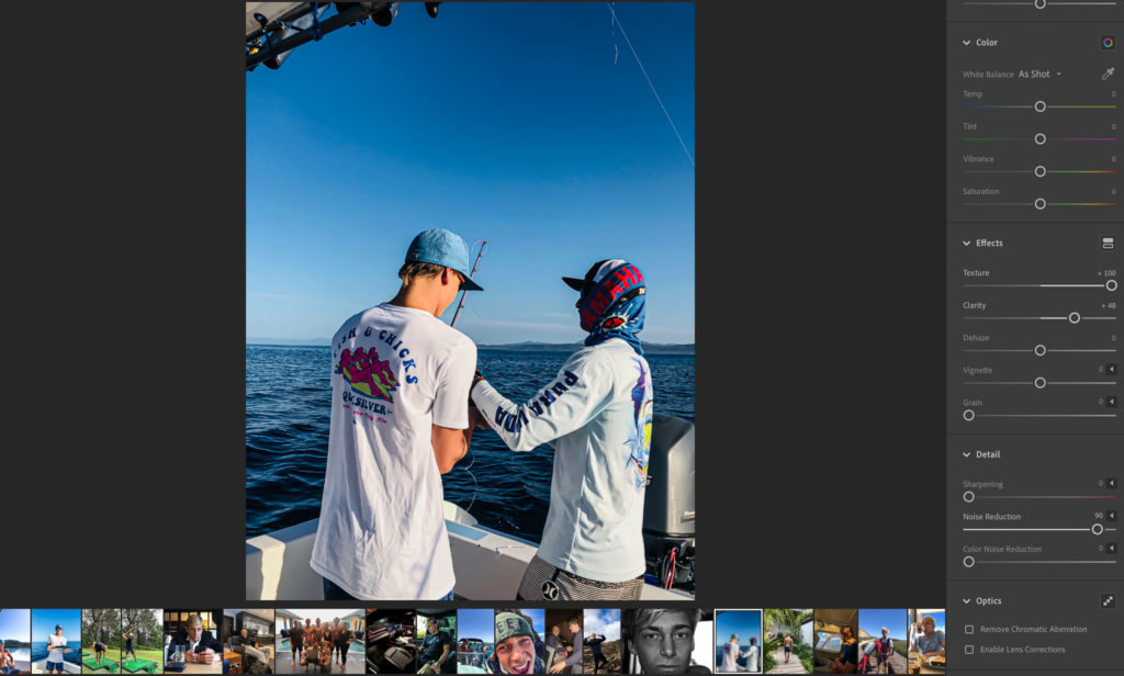
Some examples of editing I have done are visible below:
Image 1: In this fist image, to enhance it I have altered a couple of things. One of those things is the colour contrast. I have altered this because it brings out the darker colours in the subject and his clothing which makes him stand out a lot more from the background blue and browns which gives him a more prominent and powerful nature. I have also increased the texture to add more detail to the subject and scenery behind due to its abnormal and abstract nature which is visually interesting. I have also increased clarity and cropped the sides slightly to focus the viewer on the main subject more.Image 2: To start off with in image two I turned it to black and white colours to bring the viewers attention away from the colour differences and into the minor detail in the face and the different characteristics all the minor details bring to a person. Hence why I also turned up the grain and contrast to give really definitive lines and shapes.Image 3: Here in image 3 I have again altered image settings such as texture and clarity to bring out the scenery and colour in this image. I have reduced the noise completely to smoothen any grain to help follow the background setting in the ocean which is very smooth looking in this image. The contrast in this image is also turned up to a fairly high level, again to Gove the image more depth and exaggerate the colour differences even more. This image was a lot about the visually pleasing aesthetics which relate to the actions the subject is carryout out for fun which to many are unusual and diverse.
Images and text: The text I have added into my book is in the form of quotes from the movie “The Wolf of Wall Street”. These fit very well alongside the images I have taken due to relation the movie has with extravagance and wealth and the how those directly link to the life that my subject is living and that im trying to portray.