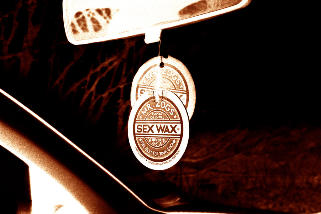
A sentence – I am going to explore bunkers created during the occupation and try and show how they have changed since the occupation.
A paragraphs – With this project, I am going to explore the bunkers around Jersey. With the images I collect from doing this, I am going to show how they have changed since World War 2 and the German occupation of Jersey. Through this I am going to try and show the memory of those involved within the war, whether it be through forced labour during the creation of the bunkers, or soldiers used within the war.
Design: Consider the following
How you want your book to look and feel – I want the book to seem fairly obvious as to what it is.
Paper and ink – Standard ink, will likely use paper that will not reflect a lot of light back.
Format, size and orientation – It will likely be in a landscape format and I may have it quite small
Binding and cover – Hardback book, one of the images I take I will probably use as a double page spread over the front and back cover.
Title – “no personal memories” – may change later in the project
Structure and architecture – Will likely structure the photobook very simply. Using similar images together and sequencing the book in a layout that works best.
Design and layout – Going to design it in a uniformed fashion, so that it has similar images together or format them in a sequence. I will likely lay it out so images of different bunkers are separated.
Editing and sequencing – will experiment with both black and white and colour, if I decide to use black and white, I will likely try adding high contrast to the images.
Images and text – Images will be taken of bunkers and show erosion and what has happened to them since The Occupation. I may add text to the photobook, perhaps something to do with the equipment at some bunkers around the island.
I want my book to have a more grunge aesthetic, but not to the point of being messy. I am thinking of using matte rather than glossy pages to help achieve this feel, using paper with a matte finish will also work well with the images within the book; as they are all very textured with added visual noise.
I am currently thinking of using a 10×8 in (25x20cm) size book, which is a standard landscape size. although I will include vertically orientated images in the book as well. I will most likely crop some images to make them square. I am also thinking of using an image wrap hardcover for the book.
As the book is about how fashion changes how a person can be viewed or treated, I am thinking of titling the book ‘prejudice’. However I am also considering other options, one of which is a less serious title: “Inside I’m crying, but outside I’m playing the Kazoo”.
The structure of the book will be a story told in pictures, but in reverse. A story which when simplified is about a man who gets attacked on the street, but he ends up being persecuted and punished due to wearing the more ‘thug’ looking clothes. It is not intended to be a realistic story, but more to send a message. So the book will start with him being persecuted, and end with him moments before being attacked.
The layout of the book will consist of two configurations; either each double-page spread will contain two full size images, or an image on one page and text on the other.
I will end the book with a conclusion of the story at the end, along with my essay.
A paragraph: Through the use of archival imagery and objects, along with a few landscapes, I intend on telling my family’s story, beginning with the fact that both my parents migrated to Jersey, to eventually marrying, having children, and separating.
Design: Consider the following
How you want your book to look and feel: since my book with be a personal story told through images I’d like mt book to have “photo album” feel and look as much as possible. Maybe through something such as a textured front and back cover, and through the look of the front and back.
Paper and ink:
Format, size and orientation: My book will have a mixture of landscape and portrait images, and for this reason I think the book would look best in a square format (12″x12″ / 7″x7″)
Binding and cover: Ideally I think a textured Cover would be best to fit in with my concept, or maybe a dust jacket so that I could include come contextual information on the inside of the book without compromising the design of the actual book.
Title: I am exactly sure on my title yet, however I want it to reflect the theme of family and relationships. I think it would be more effective if I made the title link in with something that directly related to my personal family story like Costa did with her metaphorical link to Mimosa in her title, “where mimosa bloom”.
Editing and sequencing: At the moment, the sequencing of my book and images will be in chronological order, however I may include some parallels with archival images and current day images in order to give the book a more emotional sentiment.
Images and text: I want to include minimal text in my book, As I want the sequencing of the images to tell the story. I may include things such as a small title, and perhaps the date under images if I feel they need to be explained, as seen in some photo albums, however it will be quite small in order to not distract from the images.
In order to add more context to my personal study I wanted to make sure to capture landscapes on the island my parents are originally from. While on holiday, I will be taking images in both villages that my parents are from as I think my photobook would benefit from having a few landscapes, to separate the portraiture, and archival images. I want to take images at different points of the day, and the weather will most likely vary slightly meaning I will be using different camera settings depending on what the scene is like.
Lightroom selection:
Here I have colour coded the selection of my best images, with green representing my best ones, and red showing my least favourites.
Editing my best images:
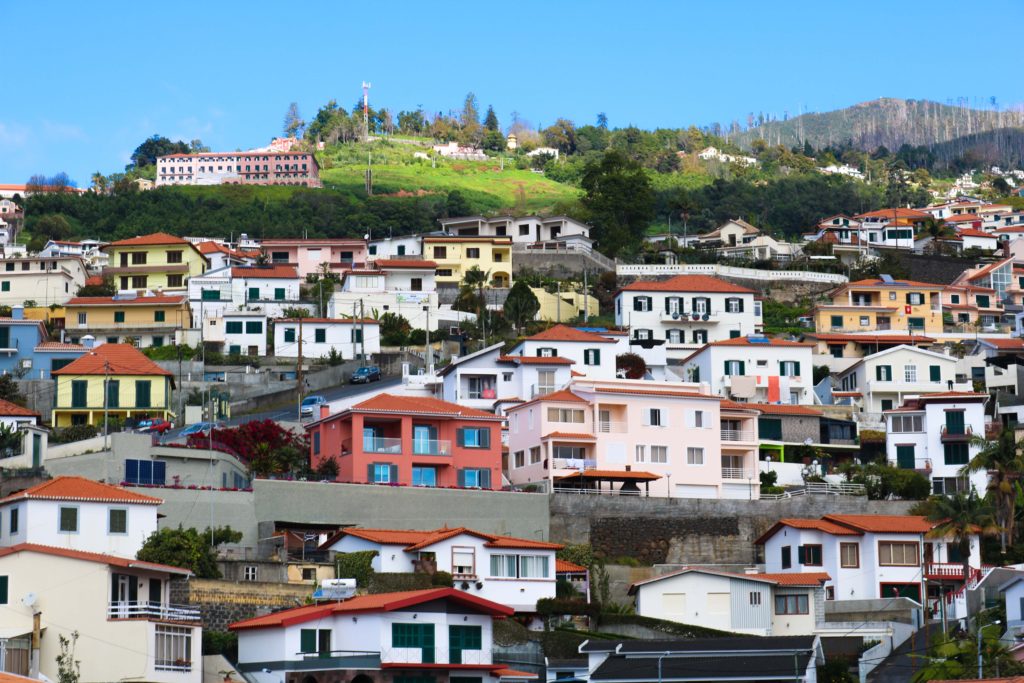
As you’ll see below, my original image is already quite bright and colourful. My aim was to further accentuate this, to make the picture look very aesthetically pleasing. I increased the contrast so that each individual house, and colour stood out. I increased the vibrancy so that the colours would become more vivid.
Before
After
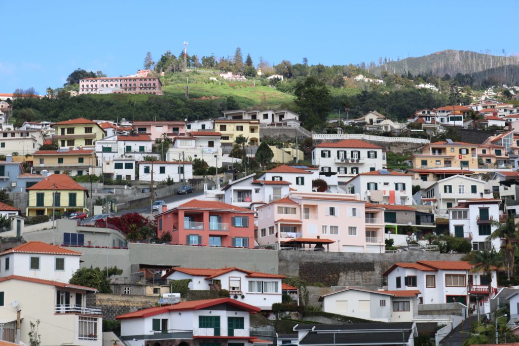
This image was taken just as I was driving out of the airport into the main city, and has no particular symbolic role. I chose this image as one of my best, because I like how to looks messy, yet very aesthetically pleasing at the same time. On one hand, there is nothing particular organised about the photo, however I think that all the bright colours help the image look quite appealing, and helps draw in attention.
These next few images were taken while I was visiting my dad’s hometown, Porto da Cruz. It is a fairly small municipality with a population of around 2,000 people located at the north-eastern part of the island.
I thought that my initial image had all the right aspects I the frame, but I wanted it to look less dull and slightly more colourful so I increased the contrast and slightly decreased the exposure, and increased the vibrancy. I like how the blueness of the sky and green from the mountainous regions complement each other in the images.
Before
After
I like the framing of this image because on the first third, we see a glimpse of the mountainous regions, to the right we see the sea which acts as a sleek backdrop for the street scene seen in the foreground. With the changes made above, I was able to bring out the colour of the sea further, which helps bring out the beauty of the landscape. I think the electricity cables in the image are quite distracting, however I think it depicts a truthful portrayal of the village.
Before
After
The image below shows the coast of the village. An area which holds many memories of my father’s younger years. Initially, I thought that the different mountain ranges struggled to stand out against each other, and my increasing the contrast I think they are more easily distinguishable as they stand out more, especially as ore colour was brought out by increasing the vibrancy.
Before
After
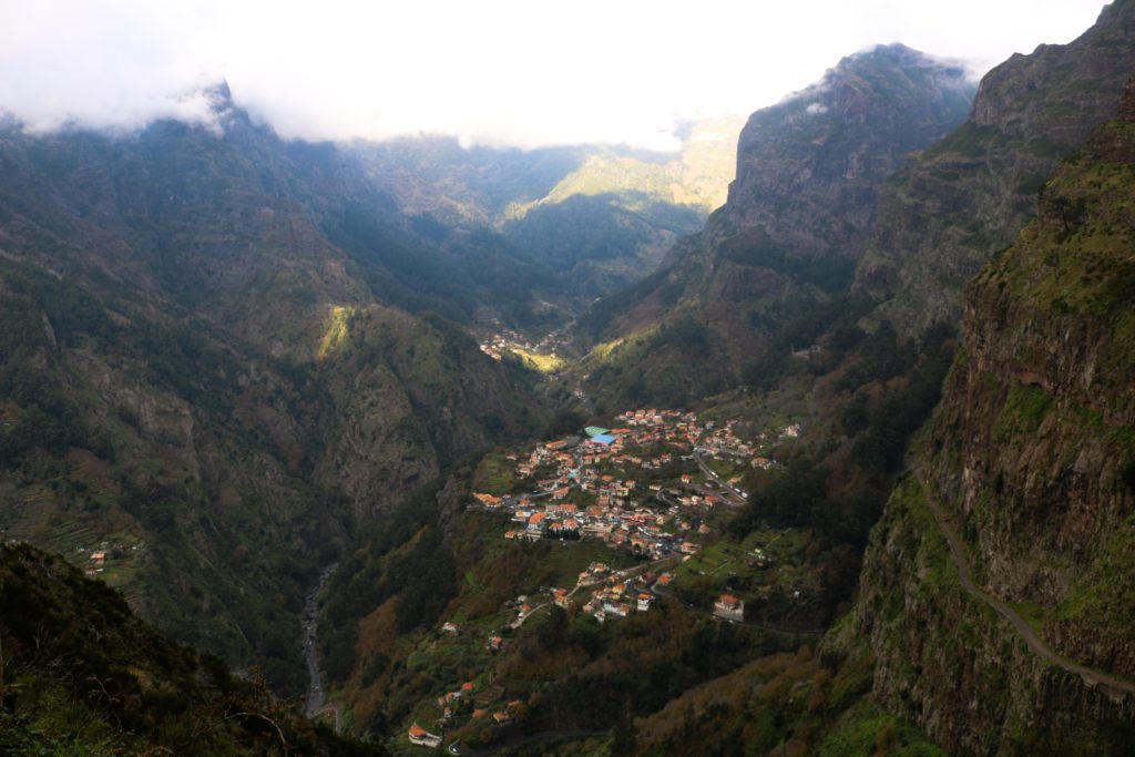
These last images show Curral Das Freiras, where my mother and her family is from. This is a little secluded village in the heart of the island with a population of around 2,000 people. named Valley of the nuns as it was a refuge to 16th century nuns during times where pirates frequently attacked the island. As you’ll be able to see from the images below, the village is surrounded by cliffs and peaks making it quite secluded from other areas of the island. These images were all taken from a particular viewpoint, Eira Do Serrado, which stands at an elevation of 1.096m allowing the entire village to be seen.
This image is perhaps my favourite from my outcomes as were able to see the skyline, mountains and village all in one making a successful landscape. Due to the fog at the top of the mountains, My image was slightly overexposed leading my image to have a whiteish tint to it. After adapting the contrast and exposure, I believe I found the right balance and by changing the vibrancy I was able to restore some colour to the scene making it appear more inviting, and less dull.
Before
After
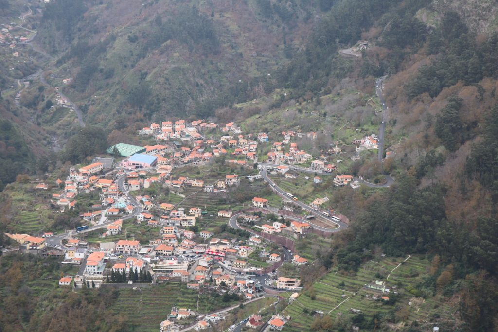
The image below is a slight close up of the image above, showing the village with some aspects of the mountains still being visible. Similar to the other pictures, I made sure the exposure was appropriate and added some extra colour by adjusting the vibrancy.
Before
After
The image below shows a close up of the many houses. I think that by itself, the image is not as successful compared to the previous ones, however I included it as it could be useful in a series along with some of the other images. The original image appeared too exposed, leading me to decrease the exposure.
Before
After
Evaluation:
I think overall I was able to capture a few successful images depicting both important parts of the island. However, I think I should have experimented more by photographing a few more different areas as most of my images are taken from the same places.
A sentence: I want to reflect how a personal identity is often conflicted with standards set by myself.
A paragraph: Body image and self worth is an ever growing problem throughout our generation with a collective obsessiveness as to the way we look and how we should be presented. This creates a comparison anxiety between ourselves and others, however it’s not all doom and gloom. I want to use this project as a self growth tool to reflect upon how far I’ve come and celebrate my personal small achievements.
How you want your book to look and feel: I want my books to all have a very handmade and personal feel so that the reader can understand my thoughts and emotions.
Format, size and orientation: My three small books will all be different sizes, my main book ‘Erasure’ is just off being A5, then ‘uncomfortable Skin’ and my essay are 0.5 cm smaller than each other. This cascading series offers the reader a structure to follow and show hoe problems are slowly getting smaller.
Binding and cover: The covers will be card with linen spines and all Japanese stab bound.
Titles: ‘Erasure’ is my main book of the trilogy that shows a narrative of contrasting childhood archival imagery vs. current images however all images are disturbed by my current thoughts. ‘Uncomfortable Skin’ is a book filled with close up and detailed self portraits that are raw and exposing of myself. Some have also been hand edited to again show disruption within the structure.
Design and layout: For every image in the book there will be a poem on the opposite page. Each image will be stuck onto parchment paper then stuck into the book, this gives the images a border and a purpose.
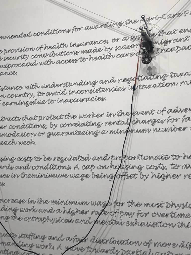
The invisible hands exhibition is placed in the Jersey Arts Centre and is a collaborative project between artist Alicja Rogalska and The Morning Boat in order to showcase life as a migrant worker. The aim of the exhibition is to bring light onto the poor conditions for migrant workers on the island for the little that they gain back, the topic is one that is not spoken about often in the island however is something that plays a huge part in the identity of it.
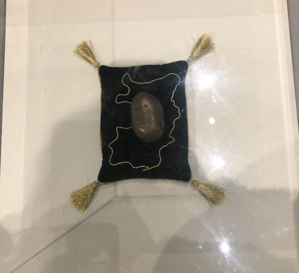
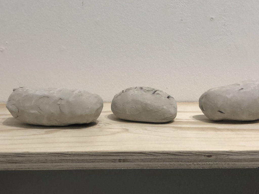
The Agri-Care prize was created during the process of talking to the migrant workers, as they were interviewed they created clay potatoes as a representation for them, potatoes being one of jersey biggest profit gains in farming, while working they decided on how they would pick out a winner for the most authentic clay potato.
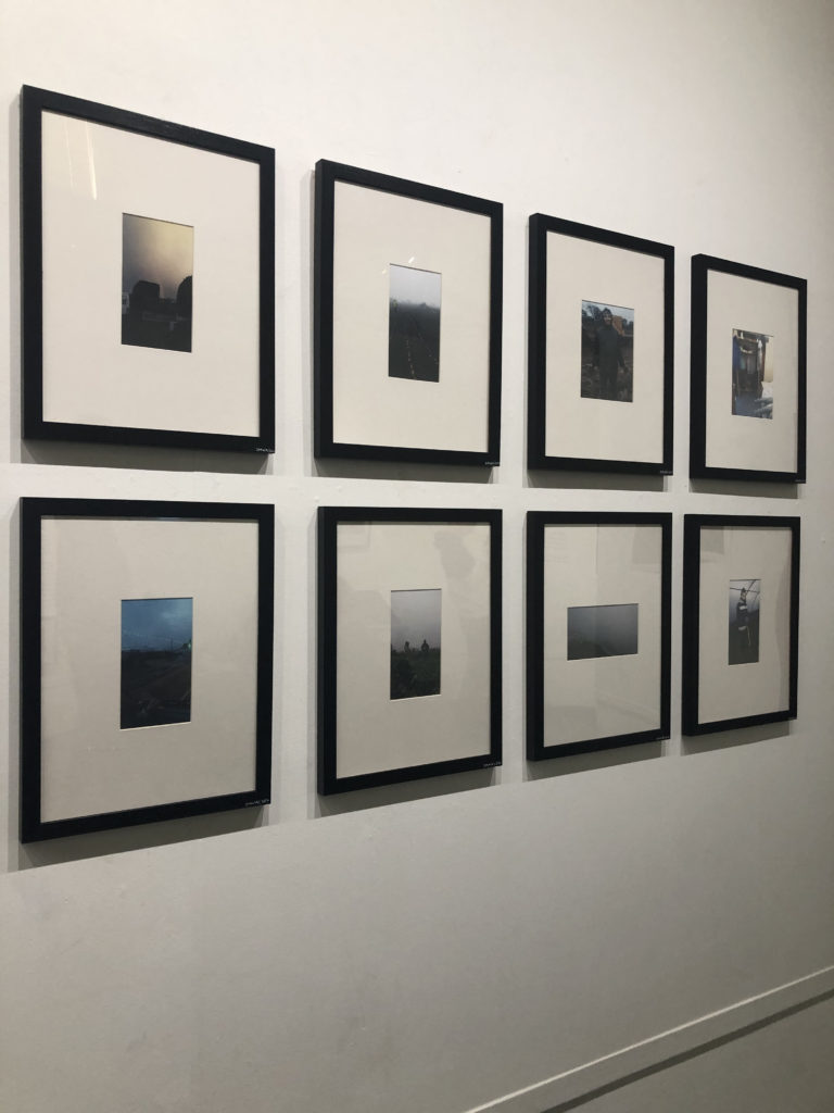
Their interviews were filmed without showing their faces and a short film was played, projected on the wall at the exhibition, the lack of faces allowed the workers to remain anonymous, allowing them to speak freely about their work and links back to the title, ‘Invisible Hands’.
The photographs shown and displayed in the exhibition were documented and taken by the workers themselves, this is adding a personal touch to the photographs, though may not all be high quality it is a real, personal and first hand representation of what life is like working for these people.
This exhibition represents and allows the public and other locals to come in and see the side of the farming and agricultural industry in Jersey that they may not normally be known too or shown.
Moving from one place to another with the help of family.
A paragraph
Moving from one place to another can be difficult, even more so without the help of the ones closest to you, who you think as family. Many small things can remind you of your previous home and it can become overwhelming at the beginning. Family helps you through times like this.
How you want your book to look and feel
I’d like my book to look / be hand made to add to the authenticity of it. I’d like to make it look like it’s something that I created throughout my journey of moving from London to Jersey, as some sort of journal.
Paper and ink
When it comes to the type of paper, instead of going for the usual glossy pages i’m more looking for a matte effect.
Binding and cover
When it comes to the cover of the book i’d like a textured cover and of a warm colour. I think it would look nicer without any images on the front page.
Title
Either : Home, Memories or Change. I’d like it pressed into the page with a golden material.