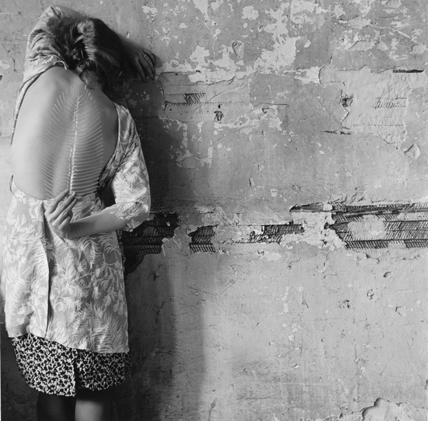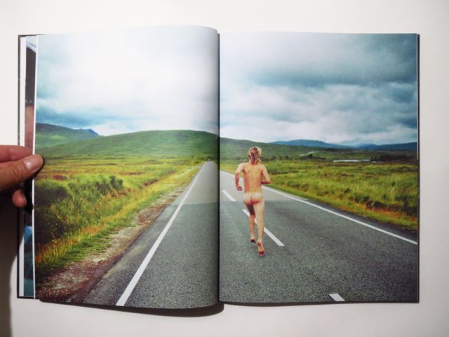
“The anthropologist, the journalist, and (apparently) the travel writer seek, and if they are lucky find, explanations and solutions. But the artist may discover that every avenue of inquiry leads to another mystery, more complex and more interesting than the original question.”
Francine Prose on the photography of George Georgiou, Aperture Fall 2012
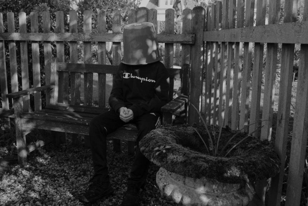
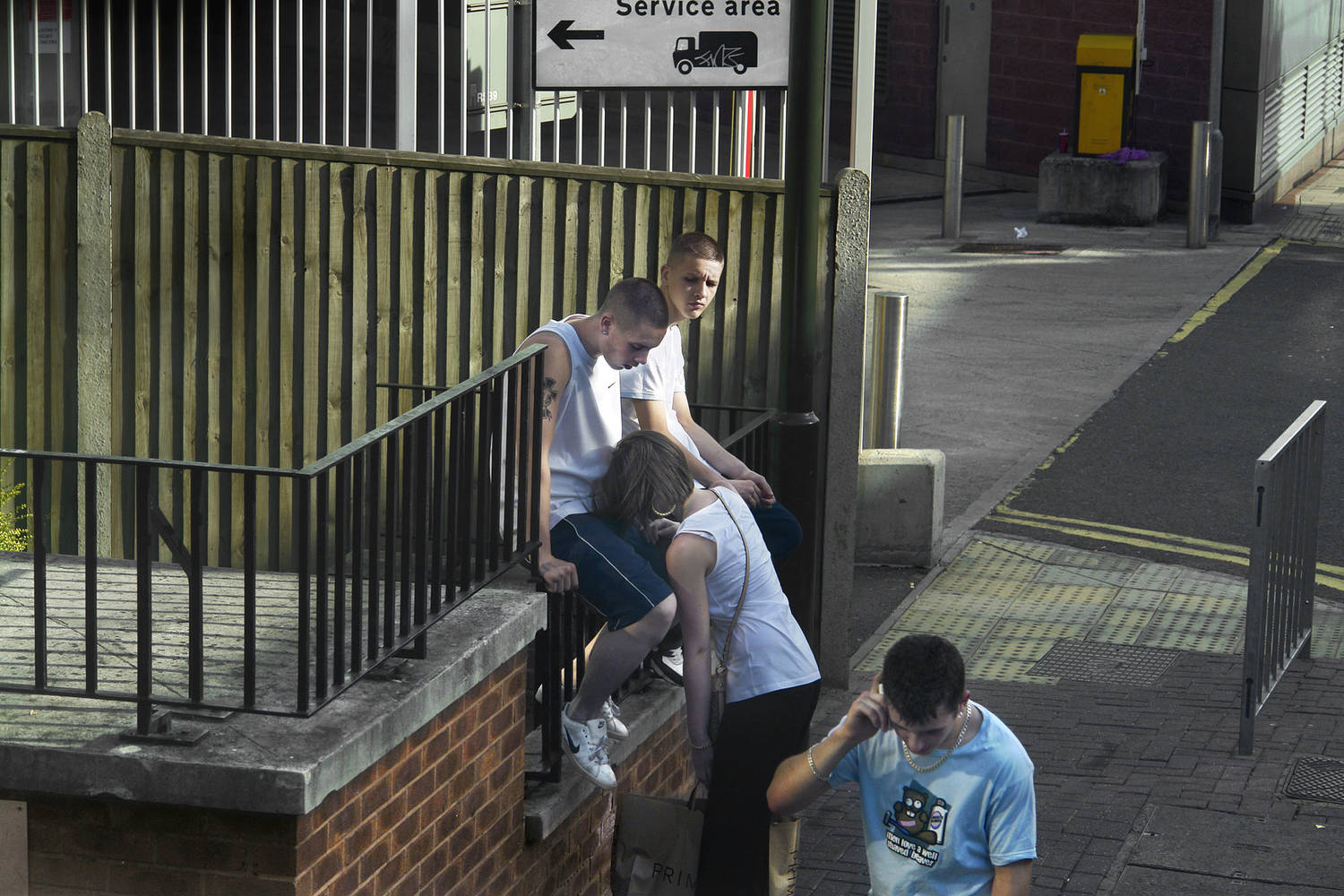
Originally he was thinking about London as a city of migration, the last stop not only for immigrants but also for people from across the UK. A city of dreams and possibilities; but as we all know, these dreams are not so easily realized. As the project evolved, he became more interested in trying to express the experience of the city, how we move through it, share it, coexist as a diverse group of peoples and cultures. The hardest part was what he considered the little soap operas we see everyday in public space, those encounters we witness and perceive as fictions – are they secret lovers or a married couple? etc. It’s a little like when we drive pass an accident on the highway: we glimpse the crashed car and imagine the rest. How we perceive became an important element in the work.

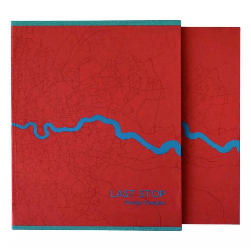
“The design of the book was by far the hardest part of the whole project as it holds together the whole concept of the work and relates to the actual experience of moving through a city.” g.georgiou – interview with Fotoroom
The essence of the project is that you might take the same route everyday but what you see, the ebb and flow on the street takes on a random nature. To capture this flow, the concertina allows the feel of a bus trip, but more importantly it gives the viewer the opportunity to create their own journeys by spreading the book out and combining different images together. This moves the book away from an author-led linear narrative to one of multiple possibilities.He struggled with the design and selection for a long time but felt that he had to take responsibility for the whole project. It was the same with self-publishing and doing a crowd-funding campaign. Because of the expenses of making a concertina book and with all the hand work that it involves, he didn’t want a third party cutting on the production values because of costs. He was lucky that he found a great printing house in Istanbul, MAS matbaa, that worked very closely with him on the technical aspects and helped make the book financially viable.
Early Examples of Street Photography
“Stare. It is the way to educate your eye, and more. Stare, pry, listen, eavesdrop. Die knowing something. You are not here long.” Walker Evans, ca. 1960 from Afterword in Many Are Called
No better advice has ever been given to street photographers than that offered by Walker Evans, one the greatest American documentary photographers of the mid-twentieth century. Best known for his work depicting unsentimental pictures of poverty stricken sharecroppers in America’s deep south during the 1930s Depression, Evans would never have described himself as a ‘street photographer’ although he did roam the streets of New York. However, these instructions reveal the essence of what is now known as street photography: the impulse to take candid pictures in the stream of everyday life.
Street photography is an unbroken tradition stretching back to the invention of photography itself. It revels in the poetic possibilities that an inquisitive mind and a camera can conjure out of everyday life. Most street photographers get their best shots in crowded and populated urban areas such as shopping malls, high streets, parks, markets, cafes/bars, museums, subways, train stations or seaside promenades. In their spontaneous and often subconscious reaction to the fecundity of public life, street photographers elevate the commonplace and familiar into something mythical and even heroic. They thrive on the unexpected, seeing the street as a theatre of endless possibilities, the cast list never fixed until the shutter is pressed. They stare, they pry, they listen and they eavesdrop, and in doing so they hold up a mirror to the kind of societies we are making for ourselves.
Walker Evans was introduced to the work of Eugene Atget through his friend Berenice Abbott and he was immediately influenced by Atget’s dispassionate style and the way Atget grouped his pictures together in themes such as shop fronts, signs, interiors, architecture, portraits etc.
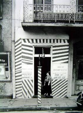
Walker Evans, New York Shop Front 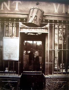
Eugene Atget, Paris shop front
Many Are Called.
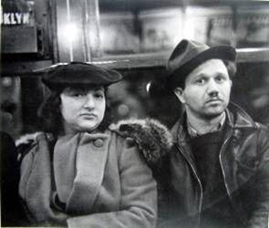
In 1938, Walker Evans began surreptitiously photographing people on the New York City subway. With his camera hidden in his coat – the lens peeking through a buttonhole – he captured the faces of riders hurtling through the dark tunnels, wrapped in their own private thoughts.
This in contrast to George Georgiou’s work within ‘Last Stop’ is somewhat similar to the fact that they are both concealing the camera as much as possible to get as real of an image as possible. Within Georgiou’s work he is photographing from above street level on a double-decker bus giving more of a separation from the photographer’s reality, and the people photographed’s reality. Evans aimed to capture people within their own thoughts ; Georgiou aimed to capture people in the middle of acting through their daily routine.
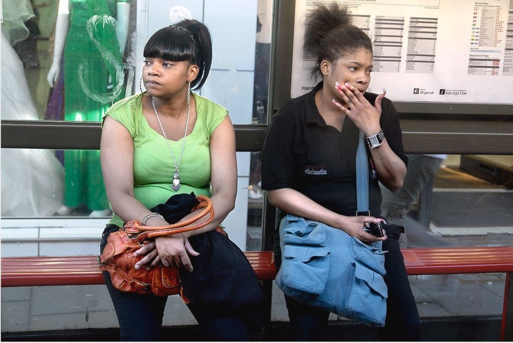

In both of these images, two people have been photographed waiting for either a bus or a train. However, within Evans’ image the pedestrian’s are looking directly at him creating an awareness of their actions being captured. Illustrated in Georgiou’s image, these people are oblivious to the fact that they are being recorded in real time, this creates a sense of there being to separate narrative’s; the journey behind how these people are living out their daily routine, and the motivation behind the photographer. Both images are successful in how they capture strangers but both have very different stories to reflect. This narrative is achieved in the majority of mages included in ‘last Stop’, the sense of an outsider interpreting others’ life story and imagining what happens after the moment of connection is gone.