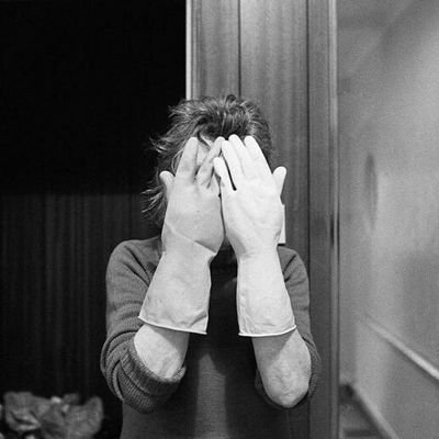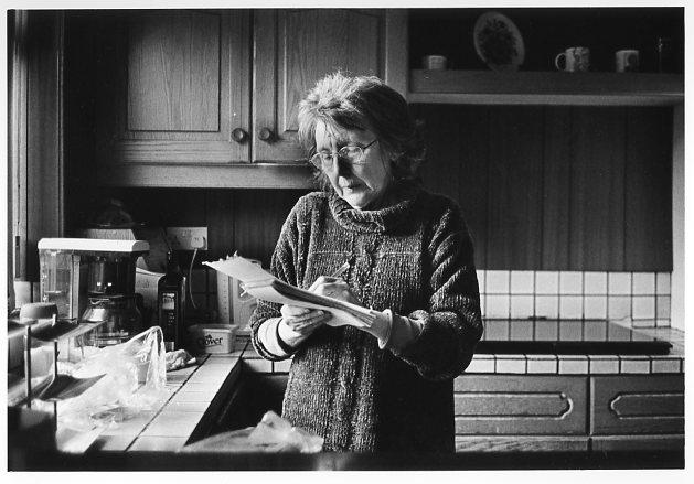
The book I have chosen to look at is called “Mother” published by Mathew Finn. His book contains a series of images of his mother. He explains that over a 30 year period he took images of his mother and reveals that they weren’t set out orderly and that it wasn’t something he put a huge amount of thought into until later on in his life. None of his images include his dad which is significant to him as his dad wasn’t present during his childhood or even adulthood. He had half brothers and sisters he wasn’t even aware they existed until the day after his dad’s funeral. He explains in his biography ” the more I knew about my father, the more I felt the need to protect my mum…”
There wasn’t a particular reason to him beginning to photograph his mum, apart from the fact they lived together and they were a lot closer due to his dad not remaining in this life. Mathew Finn was the photographer however he explains his mum was more of the director. She was aware of what angles she looked best and became more aware of how much lighting would be need in order to produce the best image. He explains that for his mother and him the roles switched when she was diagnosed with dementia. She fell silent and started to lose herself therefore their collaboration began to crumble. He explained that he no longer existed to her and what remained were those pictures to show her. On Christmas Day he shown her the images and asked her if the images described her to which she replied “I don’t know… maybe they do..”


The book he made is a hardback book A4 with most pictures being a4 but a couple of the images he has overplayed across both pages creating an A3 image. All the images in his book are black and white with a few images taking up the whole page and some images quite central to the paper. There are a couple examples he has put a very minimal and empty image next to a blank page which then leads the viewers to question why he has done this? There isn’t a set layout for the images in his book some are full page others are A5 with a white border around it. There isn’t any text on the images
