For my third photo-shoot, I will be focusing more on the physical objects that can be associated with gender, and will be contrasting these with each other in the photograph. As the focus of my project is on breaking gender stereotypes (liberation of gender) and showing the truth behind peoples identities and the way they express themselves through gender, I will be focusing on creating images that encapsulate stereotypical gender roles and stereotypes, with small twists within the image that allow the viewer to realise that the image is not what it seems (specifically, that the stereotypes they link to the objects may not always be accurate. For this photoshoot I will be focusing on feminine objects, such as makeup and jewellery, and will be intertwining the idea that both women and men can suffer when it comes to expressing femininity, to create a contrast. This photo-shoot will be focused more on the hints to the viewer that some people express their identity in less stereotypical way, and that there are often social consequences for those who do this.
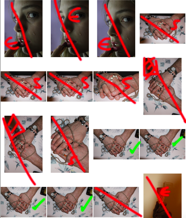
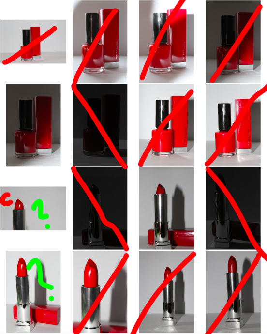
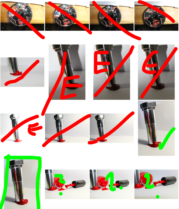
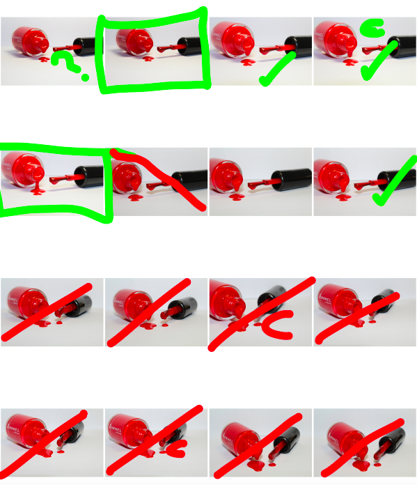
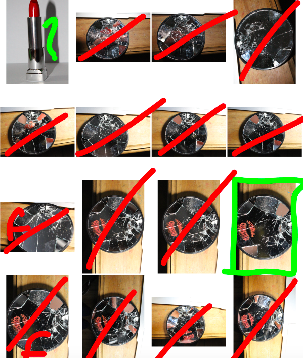
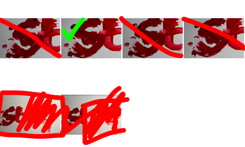
Below are the contact-sheets for my photo-shoot, I have indicated my decision making process using the brush tool:
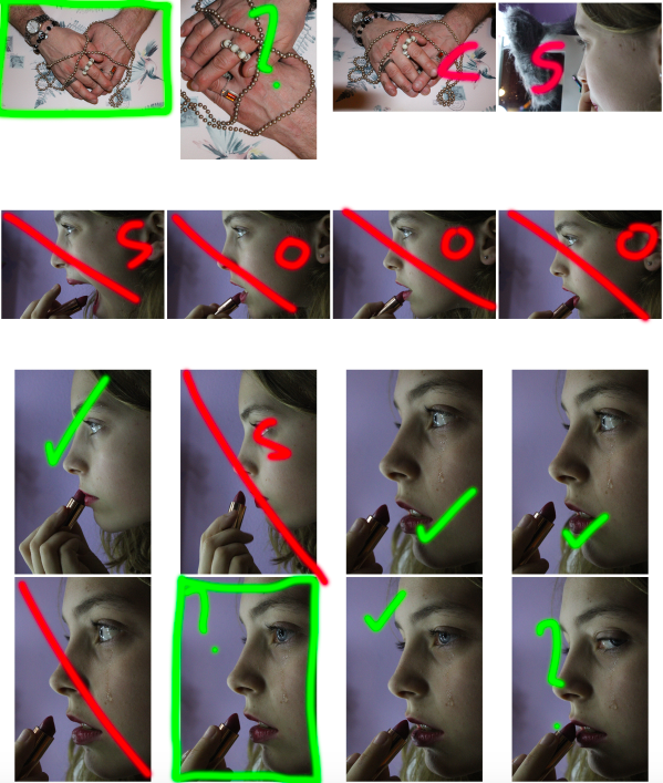
GREEN: tick – possible final image, rectangle – final image, question mark – possible final image,
RED: line – rejected image, S – subject is in the wrong pose, O – wrong orientation, E – too high/low exposure, C – camera is in the wrong position, hatched red lines – shadow/unwanted aspect
GREEN: tick – possible final image, rectangle – final image, question mark – possible final image,
RED: line – rejected image, S – subject is in the wrong pose, O – wrong orientation, E – too high/low exposure, C – camera is in the wrong position, hatched red lines – shadow/unwanted aspect
GREEN: tick – possible final image, rectangle – final image, question mark – possible final image,
RED: line – rejected image, S – subject is in the wrong pose, O – wrong orientation, E – too high/low exposure, C – camera is in the wrong position, hatched red lines – shadow/unwanted aspect
GREEN: tick – possible final image, rectangle – final image, question mark – possible final image,
RED: line – rejected image, S – subject is in the wrong pose, O – wrong orientation, E – too high/low exposure, C – camera is in the wrong position, hatched red lines – shadow/unwanted aspect
GREEN: tick – possible final image, rectangle – final image, question mark – possible final image,
RED: line – rejected image, S – subject is in the wrong pose, O – wrong orientation, E – too high/low exposure, C – camera is in the wrong position, hatched red lines – shadow/unwanted aspect
GREEN: tick – possible final image, rectangle – final image, question mark – possible final image,
RED: line – rejected image, S – subject is in the wrong pose, O – wrong orientation, E – too high/low exposure, C – camera is in the wrong position, hatched red lines – shadow/unwanted aspect
GREEN: tick – possible final image, rectangle – final image, question mark – possible final image,
RED: line – rejected image, S – subject is in the wrong pose, O – wrong orientation, E – too high/low exposure, C – camera is in the wrong position, hatched red lines – shadow/unwanted aspect
For my first image, I wanted to separate the image itself from the background in order to replace the background with a simple black background (as I felt this would draw maximum attention to the image and details in the foreground). To do this, I used the lasso tool to highlight the areas of the background, and deleted it from the layer. I then went around the edges of the image with a 0% hardness eraser tool in order to soften the boarders so that it would blend more realistically with the black background.
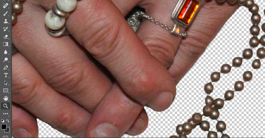
I then added a black background to the image to make the foreground image stand out more and draw maximum attention:
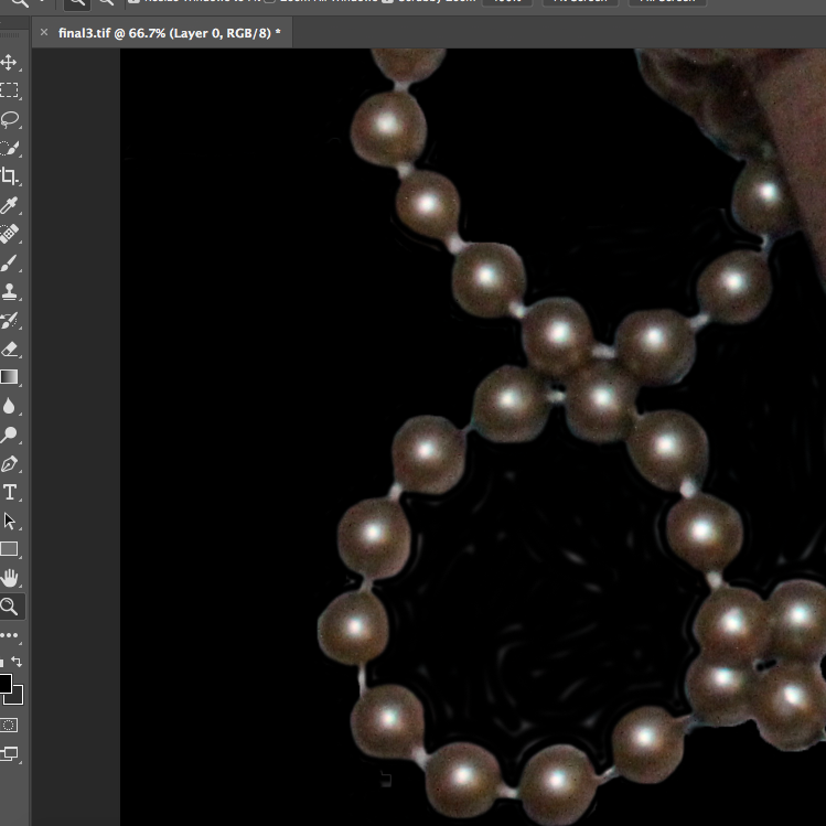
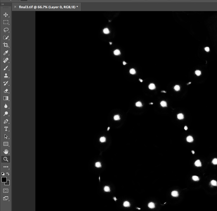
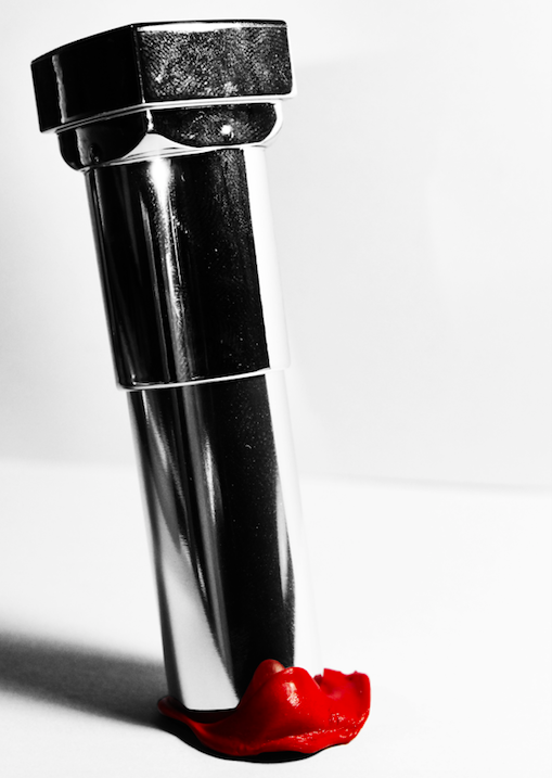
I decided to focus on the contrast of the shades, textures and shapes of the image, and therefore decided to make the image black and white, and raise the contrast substantially in order to emphasise these contrasting aspects:
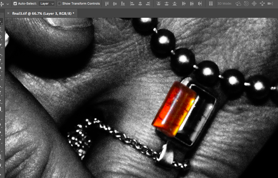
I decided that for this image, I wanted to highlight a certain area of colour in order to draw the viewers attention to the image, and to provide a small amount of contrast in the image which would draw attention to the jewellery that the subject was wearing (by highlighting the colour of the stone, the viewer can more easily focus on the jewellery itself, rather than looking at the whole image as a flat continuous image). To to this, I copied the original coloured image, and copied the stone using the lasso tool. I then pasted that over the top of the black and white image, and smoothed out the edges:
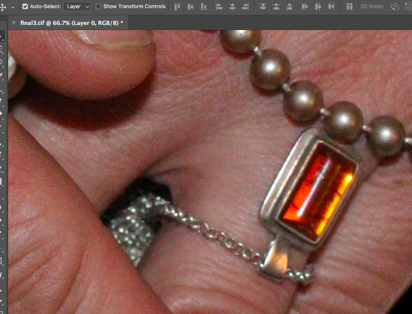
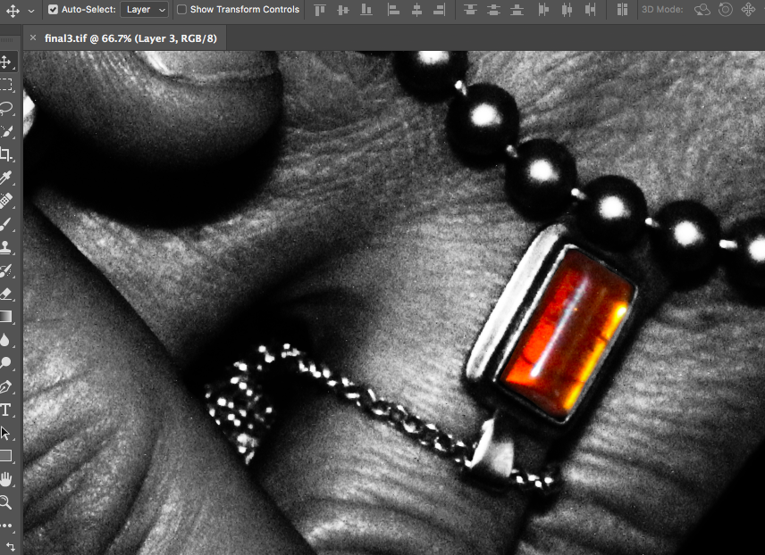
The final image can be seen below:
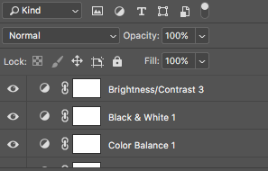
I used the same sort of editing process for the other final images in my photo-shoot. I increased the contrast of many of my photos, (especially if the image was going to be turned monochrome in order to increase contrast between shapes).
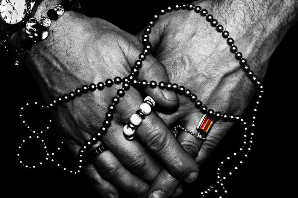
Below are my final images for this photo-shoot:
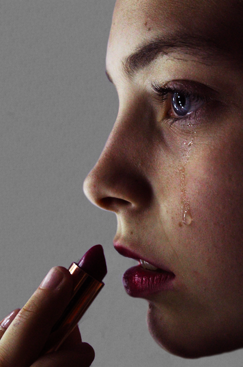
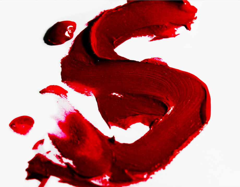
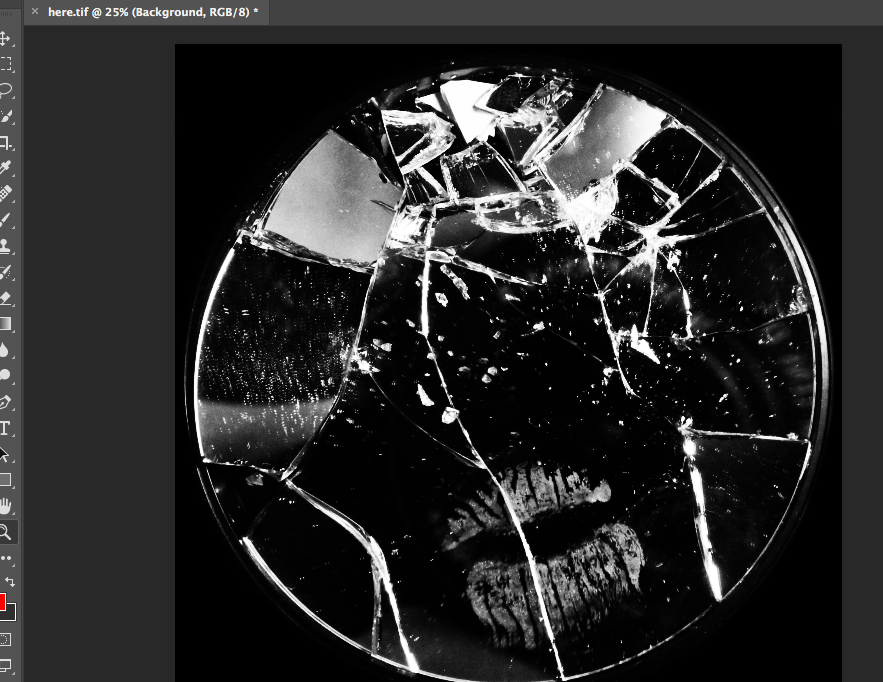
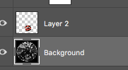
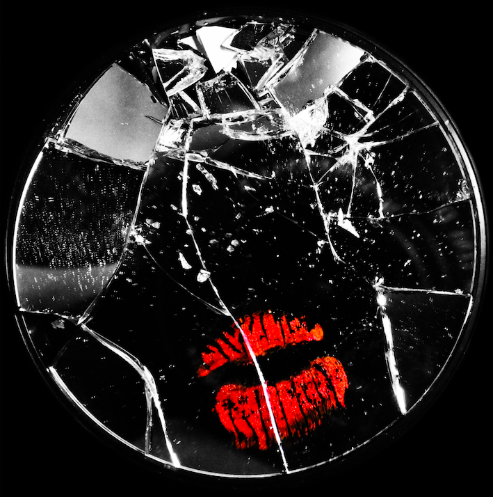
for the below image, I used the lasso tool to cut the lip mark out of the original layer and paste it onto asseverate later. I then made the first layer monochrome and increased the colour contrast of the lips to make them stand out from the background. I also cut the mirror from the background and replaced the table background with all black to force the viewer to focus on the image in the foreground: