Shoot 2

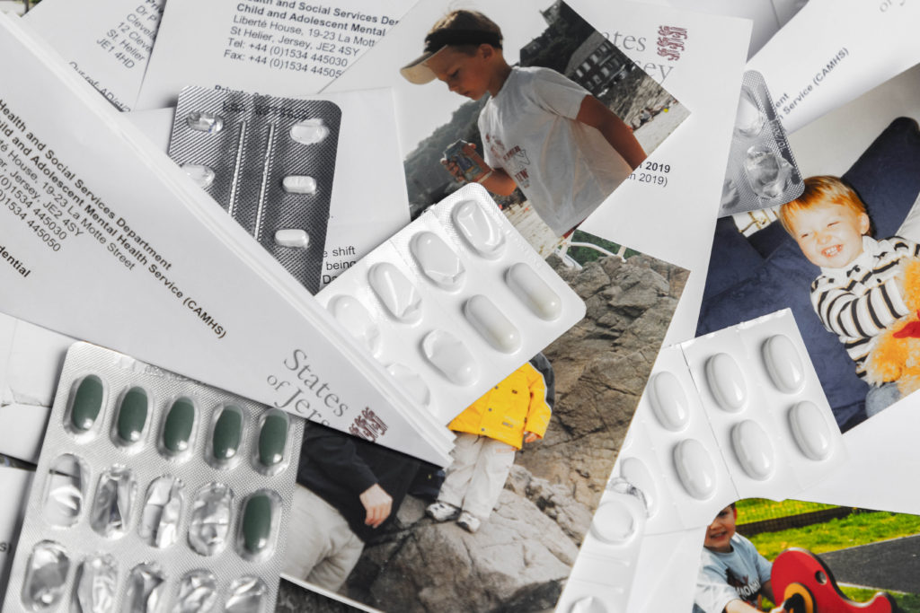
For my second photoshoot I wanted to bring to light the more clinical side of mental illness, focusing on the impact medication has on personality and the tedious nature of check-ups and hospital appointments.

To show the impact of medication, I decided to overlay both full and partially empty packets of pills over photos of me which I found in older family albums. This effect worked especially well where there is a translucent, empty pill packet over my face, which slightly distorts my face, with some doing this more than others; representing the effect that different medication can have.

I also wanted to include as many doctor’s notes and reports as possible as I think it highlights the sometimes overwhelming feeling that opening up can have. This also ties in with the older album pictures of me, as it shows the transition from a child with no worries to someone so consumed by mental illness that the only recognizable feature is their name on a piece of paper. Not only do these images help break up the more low-key lit images from the previous shoot, they also give context to the situation surrounding the subject and the story.

I am also intending to feature images with the old album photos early on in the book, then progressively have them feature less and less as it goes on, so the only images left will be ones featuring only the letters and pill packets to show the decent into a deteriorating condition.

Photobook Specification

Narrative: What is your story?

Describe in:

  • 3 words: Folklore, Reality, Fiction
  • A sentence: Exploring the occupation of folklore tales of a small collective place
  • A paragraph: My phonebook will look to explore the occupation of local myths and folklore tales in Jersey, Channel Islands, ones that play and important part in the islands history as well as tourism. Using tableaux photography I will be exploring the boundaries between fact and fiction, using the factual locations with stage, fictional actions.
Design: Consider the following
  • Format, size, orientation: I am choosing to go with a standard A4 20x25cm portrait orientation, I have chosen portrait as I want the allowance to be able to create impactful double page spreads and portrait orientation works best for this I feel. The standard size means I can keep it not overly large and abnormal, as the context isn’t too normal this allows the book to create a sense of reality and normality juxtaposing its contents.
  • Binding and Cover: I am choosing to use a hardback cover using an image wrap. I feel I can create a larger impact by having a full bleed double page image wrap rather than smaller images or a plain cover. With regards to binding I will have a saddle stitch, hidden by the cover, the simplicity I feel will help to not distract from the narrative
  • Sequencing: I am planning to move from one narrative to another, to do this I plan to use a starting image and keep a steady sequence going of mixing double page spreads and individual smaller photographs.
  • Title: I am looking to make my title something surrounding fantasy, I am thinking of using “A Flight of Imagination” – a different way of talking about fantasy in a way which I feel is more mysterious and intreeging.

Afronaughts analysis

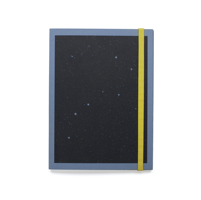
The cover of the book is made using a blue (for the 2nd edition) sugar paper with a black print showing stars, and the back is blank. The paper has been folded over at the opening and stick to itself to reinforce the covers. There is also a thick rubber band to hold it closed which is yellow (for the 2nd edition).

Image result for afronauts cristina de middel

The intended orientation for the book is portrait however the images within are mostly squares at the top section of the page with rounded corners.

There are some images that are printed in black on some white translucent tissue paper, these are interspersed throughout the book. They are mostly showing designs of space suits as the paper with the grids on it is old designers layout paper used for designing things as it can be traced through easily.

The book has some inserts within it which are letters and conversations between people who were involved in the African space programme. They are folded over and have been glued into the binding.

The images within the book are printed on matte paper, and they are either tableaux images or ones that set up the story. With some archival images and texts within it to help illustrate the story.

There are also images within that are double page spreads except they are not the full size of the pages to differentiate them from the rest of the book.

DEsigning my Photobook

3 words: identity, belonging, separation.

A sentence: It’s about my inner conflict towards my role in the family after my parents divorce.

A paragraph: My photobook explores my emotions during a time of change, in which I felt everyone was going forward but I was stuck in the present, when everything was how I liked it. Through surrealistic and documentary photography it express a period in my life that was confusing, yet also exciting, new people, new places, a whole new life.

How you want your book to look and feel: I want my book to look minimal and feel smooth on the outside but on the inside it will feel chaotic.

Format, size and orientation: It will be a landscape book, A5 or A4.

Binding and cover: The cover will be hard and glossy with standard binding.

Title: ‘Life In A River.’ The idea behind my title is from the saying ‘you cannot step in the same river twice’. This connects with my book in the sense that I can never go back to before the divorce, before I moved house, life is constantly changing, it’s whether you let the river swallow you or you swim with it.

Design and layout: None of the images will cover a full page, I want it to feel like a scrap book/ family photo album that appears messy yet, the story is meaningful. I want there to be a lot of negative space surrounding the photos to symbolize isolation.

Editing and sequencing: I will start with a few documentary photos from a decade ago then move onto some surrealists images. Throughout there will be a mixture of documentary and surrealist to create a sense of uncertainty and confusion.

Images and text: My text will be on opposite page to the picture and will be quotes from my interviews of just sayings or sentence I think are significant to the image. The text will be small and black with a simplistic font because words aren’t as important as actions.

My Own Photobook Planning

The title of the book will be “Generation-Z”.

My book specification is going to follow along the lines of a story about my subject – Max my Polish friend – and in a nutshell, about the life he lives. The narrative behind it will be following him along on his ventures through everyday life and how this differs from the stereotype of polish immigrants in Jersey. The sequencing will be a photo on each page, with each double page spread having two similarly linked images of Max going about his life.

Narrative: What is your story?

Describe it in:

3 Words: Luxury, Travel, Affluence

A sentence: About my friend Max and how his affluence affects his life journey.

A paragraph: The story of this book is to explore multiple avenues in which my affluent migrant friend Max can be viewed as out of the ordinary and contrary to the stereotype most people have about his polish nationality and what he should be acting like and doing.

Design:

I want my book to look fairly minimalistic and effective. So that is easy to interpret and the images are distinct in showing what I want them too. I want it to feel smooth and solid so that it is versatile and gives off a professional, well put together feeling to those who read it.

Paper and ink: I have chosen for the paper colour to be black because this gives the book a more finished feeling than just leaving it as the plain white page colour. It also allows for the images to stand out due to the contrast in the bright image colours to the black surrounding. It also means that the book isn as harsh on the eyes as white may be, meaning it is nicer to read. The paper type is Standard 80.

The ink colour I have therefore chosen the text in the book to be is white. I have chosen this because this colour contrasts the black background directly and stands out more than any other colour would whilst also looking aesthetically pleasing.

Format, size and orientation: I have chosen my book to consist of a standard portrait 8 by 10 inches format.

Binding and cover: My book will be a hardcover with and image wrap around it. The image will be from one of the photoshoot I have carried out and will not be included within the book due to it being on the covers. The reason I chose the image I have done to wrap around the covers is because it fits the black and white aesthetics of inside the book whilst also showing a detailed, close-up and personal image of the main subject that is being viewed. It also gives viewers the opportunity to come up with ideas or pre-existing concepts before they read the book after looking at the picture of the subjects face and the facial expression they are showing.

Design and layout: The design and layout of my book was all done spur of the moment due to the fact that I thought it would be best to experiment with different image layouts and page designs whilst creating my book in order to really find out which ones were most effective rather than plan it ahead and find out it does not look as good after having invested time and effort working on it.

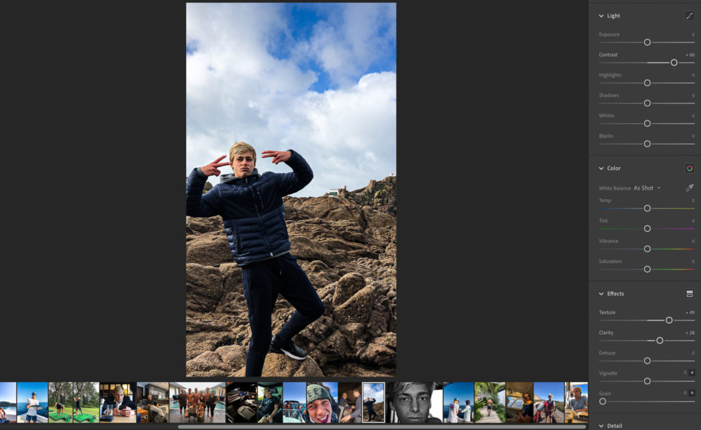
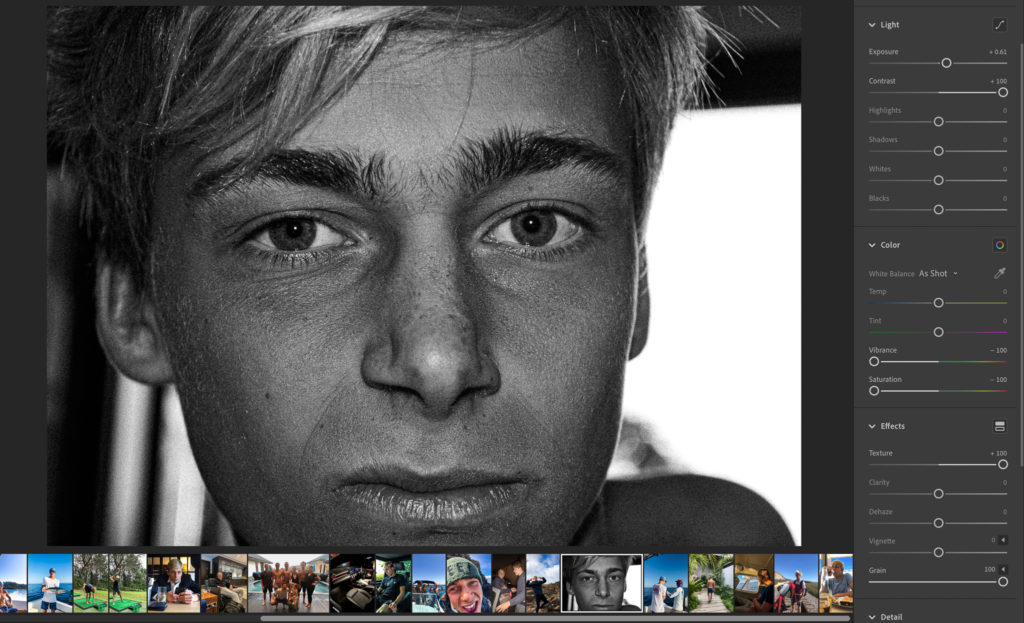
Editing and sequencing: All images have been enhanced through light-room to emphasise things such as colour contrast, the main focus of the image and in some images the actual make up of them and what they contain (by this I mean methods of cropping in order to remove unwanted distractions or areas that would not look right or effective in the final image presentation.

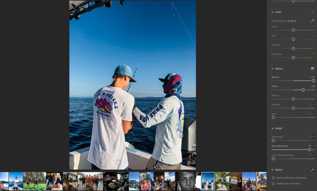
Some examples of editing I have done are visible below:

Image 1: In this fist image, to enhance it I have altered a couple of things. One of those things is the colour contrast. I have altered this because it brings out the darker colours in the subject and his clothing which makes him stand out a lot more from the background blue and browns which gives him a more prominent and powerful nature. I have also increased the texture to add more detail to the subject and scenery behind due to its abnormal and abstract nature which is visually interesting. I have also increased clarity and cropped the sides slightly to focus the viewer on the main subject more.
Image 2: To start off with in image two I turned it to black and white colours to bring the viewers attention away from the colour differences and into the minor detail in the face and the different characteristics all the minor details bring to a person. Hence why I also turned up the grain and contrast to give really definitive lines and shapes.
Image 3: Here in image 3 I have again altered image settings such as texture and clarity to bring out the scenery and colour in this image. I have reduced the noise completely to smoothen any grain to help follow the background setting in the ocean which is very smooth looking in this image. The contrast in this image is also turned up to a fairly high level, again to Gove the image more depth and exaggerate the colour differences even more. This image was a lot about the visually pleasing aesthetics which relate to the actions the subject is carryout out for fun which to many are unusual and diverse.

Images and text: The text I have added into my book is in the form of quotes from the movie “The Wolf of Wall Street”. These fit very well alongside the images I have taken due to relation the movie has with extravagance and wealth and the how those directly link to the life that my subject is living and that im trying to portray.

My Book Specification

3 words:

Love, intimacy and contrast.

A sentence:

My photo book will be about the contrast of good days and bad days in relationships and showing the difference of a healthy relationship and unhealthy relationship.

A paragraph:

For my photo book, I want to show the pejorative and ameliorative sides of a romantic relationship. I am going to investigate what a ‘healthy relationship’ and a ‘unhealthy relationship’ is as I want to show the contrast of the two. I also want to investigate the intimacy of young relationships and show the difference of different relationships within my friendship group. Another idea that I want to investigate is the relationship between myself and my boyfriend, as I have never looked at myself in a project before. 

Design: 

How you want your book to look and feel: I want my photo book to look plain and simple as I think this will look best and is good for presenting my photos. I want it to feel smooth so that it is nice to hold.

Paper and ink: Premium Lustre 148 gsm

Format, size and orientation: Standard Portrait (20×25cm)

Binding and cover: Hardcover Image Wrap with a matte finish and

Title: ‘Espera’ to wait in Portuguese. Links back to the idea of waiting for somebody or telling someone to wait.

Understanding photobook design

Yoshikatsu Fujii’s book ‘Red string’. I enjoy the tactile feel of the book.

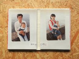
Fujii’s project “Red String,” was highly inspired by his parents’ divorce, produced a hand-made limited edition photobook. red string is a reference to Japanese legend that people who are destined to be together have been tied together by invisible red string. he documents thier lives and includes old family images.

Red string feels fragile, made of felt like material with red string stitching, sewing on the title and small image. Its a soft cover, no image wrap or dust jacket. It has both black and white and colour images with the black and white images his original images and the coloured ones are the original childhood ones. The book’s orientation is portrait, roughly A5 size with roughly 80 pages (40 or so each half). Each half is bound together with Swiss binding (no binding in typical bending place). The title itself is relevant and poetic as red string is a reference to Japanese legend that people who are destined to be together have been tied together by invisible red string, which Fujii comments on at the end of each half. The narrative of the book is Fujii documenting his parents lives after their divorce. The book is a mix of his own images along with old family photos. The book has a very interesting design as it is split in two with, it seems, his mothers story on left and his fathers on right, relaying the message of his divided parents. The photos sometimes go over each half to read as one full image. Most of the double page spreads dont usually take up the whole page with archive images layered over originals images. One singular image rarely takes up whole page and image placement varies with some pages having multiple images. Pieces of paper with messages inserted into the book. The original images take by Fujii are not highly edited other than putting the images into black and white and slight photo montage between the original and old family images. It doesn’t seem to be sequenced specifically other than the book being in two halves. There is some text at the end and 3 inserted bits of paper with some text but not much.

Photographer Case Study Research

The main photographer i will be studying is Lauren Greenfield.

Lauren Greenfield Is an American artist, documentary photographer, and documentary filmmaker. She has published four photographic monographs, directed four documentary features, produced four traveling exhibitions, and published in magazines throughout the world.

She is extremely well renowned predominantly for exploring class, status, wealth and extravagance within her own work, primarily through documentary photography. 

Some of her main work pieces are as follows:

Generation Wealth:

Her main body of work surrounding this field is named “generation wealth”. This project is multi-platform and had been worked on from 2007 to 2017 through first-person interviews, with Greenfield starting in Los Angeles and spreading across America and beyond. It was based around the visual history of our growing obsession with wealth and it demonstrates a revelatory cultural documentation of wealth for viewers to explore, looking into depth at and documenting how we export the values of materialism, celebrity culture, and social status to every corner of the globe. Greenfield also uses this project to put across this modernised attitude people have acquired of wanting to get rich at all costs which has boomed in recent years. Such as the stories within this project like those of some of the students, single parents and families interviewed, who are overwhelmed with debt, yet determined to purchase luxury houses, cars, clothing and holidays. Some of Lauren’s most popular and influential work that relate very well to the area that I am studying within documentary photography are as seen below in her projects named, “Fast Forward” and the more popular of the two, “Generation Wealth.” This visual history of the growing obsession with wealth uses first-person interviews in Los Angeles, Moscow, Dubai, China and around the world to bear witness to the global boom-and-bust economy, and to document its complicated consequences including materialism and the desire to be wealthy at any cost.

The Los Angeles children encountered early in the book have become defined by the search for status through material acquisition. They buy multi-thousand-dollar handbags to take to class. Other kids in their grade are given BMWs when they turn sixteen. They compete over whose family can afford the best designer clothes, the most elaborate bar mitzvahs, the biggest houses. A 12-year-old whose working-class mother is bankrupting herself to finance the girl’s love of Ed Hardy designer tank tops is interviewed at one point.  She explains how she knows she is putting great financial strain on her mom, and says she sort of feels bad about it, but explains: “I want the world; I want designer clothes, I want eternal happiness, the fountain of youth. I want to be able to afford ritzy private schools. I want the best of everything. Money is most definitely important for everything on my list of what I want.” 

Fast Forward (Growing up in the shadow of Hollywood):

“Fast Forward” is a powerful look at Los Angeles youth culture and its influence on the rest of our society. From the affluent children of the Westside to the graffiti gangs and party crews of East LA, young Angelenos reckon with an overwhelming barrage of advertising and entertainment images emphasizing money, possessions, and eternal youth. This collection of 79 colour photographs, accompanied by interviews with the children and their parents, reveals the realities of growing up fast in a culture that is at once irresistible and unforgiving. A compelling precursor to Greenfield’s widely praised “Girl Culture,” “Fast Forward” is a telling document of the direction in which today’s ultra-image-conscious culture is pointed. It also documents the experience of growing up in Los Angeles, and the ways children are influenced by the values of Hollywood. The quest for “fame,” the preoccupation with trends, the culture of materialism, and the obsession with image that characterizes Hollywood is reflected in the everyday lives and rituals of L.A. youth. A recurring theme in the project is the fleeting quality of youth. As one teenager says, “You grow up really fast when you grow up here. L.A. is so fast-moving, and kids really mature at a young age. Everyone is in a rush to be old, to be going to the clubs, going out… It’s not cool to be a kid.”

Image: Mijanou and friends from Beverly Hills High School spending their Senior Beach Day at Will Rogers State Beach in Los Angles. Mijanou won the title of “best physique” at Beverly Hills High.

The photo that really launched Lauren’s career was called Mijanou and friends from Beverly Hills High School on Senior Beach Day. A picture taken in 1993 in Santa Monica, California, as part of this project. Greenfield came to make this picture circuitously through an internship at National Geographic, which was the professional experience to which Lauren’s career is also indebted. In the process of making this photograph and the project for which it became the iconic image, Greenfield explains how she found her voice as a photographer. The photograph of Mijanou ended up being the cover of the book and was published and exhibited internationally. Mijanou wasn’t rich, but she lived in a world where her friends were. She explained to Greenfield about the pressures of her world and how it was hard when you could not keep up, but she also recognized that her beauty allowed her entrée into the popular clique. 

Book specification:

Narrative: What is your story?
Describe in:

3 words:

My mental illness.

A sentence:

A representation of what it felt like to experience depression and anxiety.

A paragraphs:

A primarily surrealistic representation of my feelings during, what I’ve since dubbed as, the worst year of my life. Drawing inspiration from the works of Francesca Woodman and Mark Ellen Mark’s Ward 81, this book looks at both the emotional and physical aspects of depression and anxiety.

Design: Consider the following:

How you want your book to look and feel:

The book will focus on a darker theme to fit with its images. Grey will be

Paper and ink:

Premium matte paper.

Format, size and orientation:

A4, Portrait.

Binding and cover:

Hard Back binding. Image wrap on cover.

Title:

My book will remain untitled. This is a choice I made to symbolise the subjectivity of mental illness as it can vary for different people and I didn’t want people who couldn’t relate to the title to disregard the rest of the book.

Design and layout:

It is important to me that my book is somewhat visually pleasing. There’s an element of peace and acceptance to my images that my book needs to be consistent with. To do this I will use black and white to follow the themes of my images. These colours when used together can symbolise the sadness present while also removing colour that can often be associated with joy.

Editing and sequencing:

As previously mentioned, My book needs to be somewhat visually pleasing. Another way to achieve this is with the sequencing of my images. The book will follow a pattern; An environmental portrait -> A collection of images with the same theme -> A head shot style image. This will be repeated throughout the book.

Images and text:

There will be no text to accompany the images. I had thought about adding text to further create a personal feel to the images. However, I hadn’t written down my feelings at the time and I didn’t want to add in words that may be tainted by hindsight.