
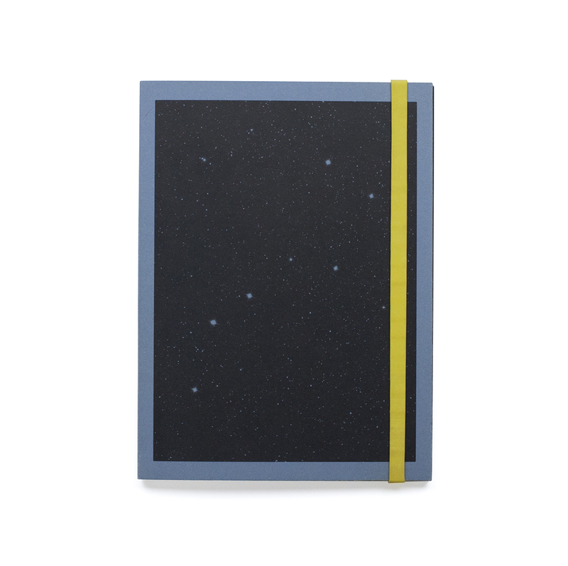
The cover of the book is made using a blue (for the 2nd edition) sugar paper with a black print showing stars, and the back is blank. The paper has been folded over at the opening and stick to itself to reinforce the covers. There is also a thick rubber band to hold it closed which is yellow (for the 2nd edition).
The intended orientation for the book is portrait however the images within are mostly squares at the top section of the page with rounded corners.
There are some images that are printed in black on some white translucent tissue paper, these are interspersed throughout the book. They are mostly showing designs of space suits as the paper with the grids on it is old designers layout paper used for designing things as it can be traced through easily.
The book has some inserts within it which are letters and conversations between people who were involved in the African space programme. They are folded over and have been glued into the binding.
The images within the book are printed on matte paper, and they are either tableaux images or ones that set up the story. With some archival images and texts within it to help illustrate the story.
There are also images within that are double page spreads except they are not the full size of the pages to differentiate them from the rest of the book.
Add more illustrations of page spreads from the book