Personal study: Madeiran landscapes

Plan:

In order to add more context to my personal study I wanted to make sure to capture landscapes on the island my parents are originally from. While on holiday, I will be taking images in both villages that my parents are from as I think my photobook would benefit from having a few landscapes, to separate the portraiture, and archival images. I want to take images at different points of the day, and the weather will most likely vary slightly meaning I will be using different camera settings depending on what the scene is like.

Lightroom selection:

Here I have colour coded the selection of my best images, with green representing my best ones, and red showing my least favourites.

Editing my best images:

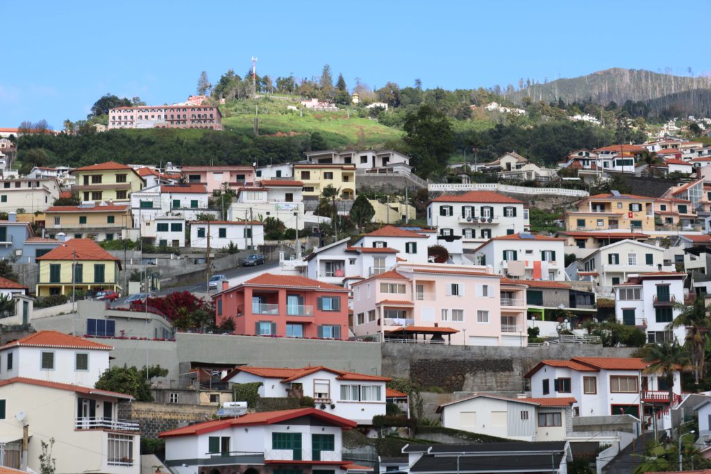
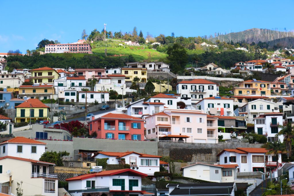
As you’ll see below, my original image is already quite bright and colourful. My aim was to further accentuate this, to make the picture look very aesthetically pleasing. I increased the contrast so that each individual house, and colour stood out. I increased the vibrancy so that the colours would become more vivid.

This image was taken just as I was driving out of the airport into the main city, and has no particular symbolic role. I chose this image as one of my best, because I like how to looks messy, yet very aesthetically pleasing at the same time. On one hand, there is nothing particular organised about the photo, however I think that all the bright colours help the image look quite appealing, and helps draw in attention.

These next few images were taken while I was visiting my dad’s hometown, Porto da Cruz. It is a fairly small municipality with a population of around 2,000 people located at the north-eastern part of the island.

I thought that my initial image had all the right aspects I the frame, but I wanted it to look less dull and slightly more colourful so I increased the contrast and slightly decreased the exposure, and increased the vibrancy. I like how the blueness of the sky and green from the mountainous regions complement each other in the images.
I like the framing of this image because on the first third, we see a glimpse of the mountainous regions, to the right we see the sea which acts as a sleek backdrop for the street scene seen in the foreground. With the changes made above, I was able to bring out the colour of the sea further, which helps bring out the beauty of the landscape. I think the electricity cables in the image are quite distracting, however I think it depicts a truthful portrayal of the village.
The image below shows the coast of the village. An area which holds many memories of my father’s younger years. Initially, I thought that the different mountain ranges struggled to stand out against each other, and my increasing the contrast I think they are more easily distinguishable as they stand out more, especially as ore colour was brought out by increasing the vibrancy.

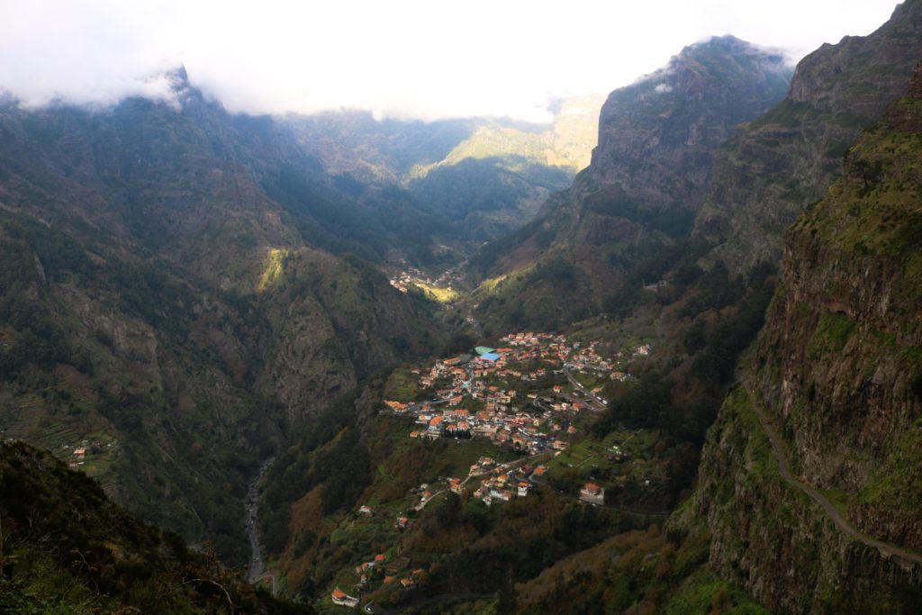
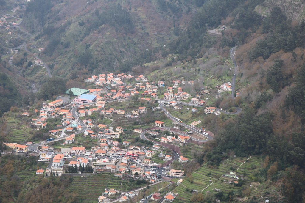
These last images show Curral Das Freiras, where my mother and her family is from. This is a little secluded village in the heart of the island with a population of around 2,000 people. named Valley of the nuns as it was a refuge to 16th century nuns during times where pirates frequently attacked the island. As you’ll be able to see from the images below, the village is surrounded by cliffs and peaks making it quite secluded from other areas of the island. These images were all taken from a particular viewpoint, Eira Do Serrado, which stands at an elevation of 1.096m allowing the entire village to be seen.


This image is perhaps my favourite from my outcomes as were able to see the skyline, mountains and village all in one making a successful landscape. Due to the fog at the top of the mountains, My image was slightly overexposed leading my image to have a whiteish tint to it. After adapting the contrast and exposure, I believe I found the right balance and by changing the vibrancy I was able to restore some colour to the scene making it appear more inviting, and less dull.
The image below is a slight close up of the image above, showing the village with some aspects of the mountains still being visible. Similar to the other pictures, I made sure the exposure was appropriate and added some extra colour by adjusting the vibrancy.
The image below shows a close up of the many houses. I think that by itself, the image is not as successful compared to the previous ones, however I included it as it could be useful in a series along with some of the other images. The original image appeared too exposed, leading me to decrease the exposure.

Evaluation:

I think overall I was able to capture a few successful images depicting both important parts of the island. However, I think I should have experimented more by photographing a few more different areas as most of my images are taken from the same places.

Designing my PHOTO BOOKs

3 words: identity, image, thoughts

A sentence: I want to reflect how a personal identity is often conflicted with standards set by myself.

A paragraph: Body image and self worth is an ever growing problem throughout our generation with a collective obsessiveness as to the way we look and how we should be presented. This creates a comparison anxiety between ourselves and others, however it’s not all doom and gloom. I want to use this project as a self growth tool to reflect upon how far I’ve come and celebrate my personal small achievements.

How you want your book to look and feel: I want my books to all have a very handmade and personal feel so that the reader can understand my thoughts and emotions.

Format, size and orientation: My three small books will all be different sizes, my main book ‘Erasure’ is just off being A5, then ‘uncomfortable Skin’ and my essay are 0.5 cm smaller than each other. This cascading series offers the reader a structure to follow and show hoe problems are slowly getting smaller.

Binding and cover: The covers will be card with linen spines and all Japanese stab bound.

Titles: ‘Erasure’ is my main book of the trilogy that shows a narrative of contrasting childhood archival imagery vs. current images however all images are disturbed by my current thoughts. ‘Uncomfortable Skin’ is a book filled with close up and detailed self portraits that are raw and exposing of myself. Some have also been hand edited to again show disruption within the structure.

Design and layout: For every image in the book there will be a poem on the opposite page. Each image will be stuck onto parchment paper then stuck into the book, this gives the images a border and a purpose.

Invisible Hands Exhibition

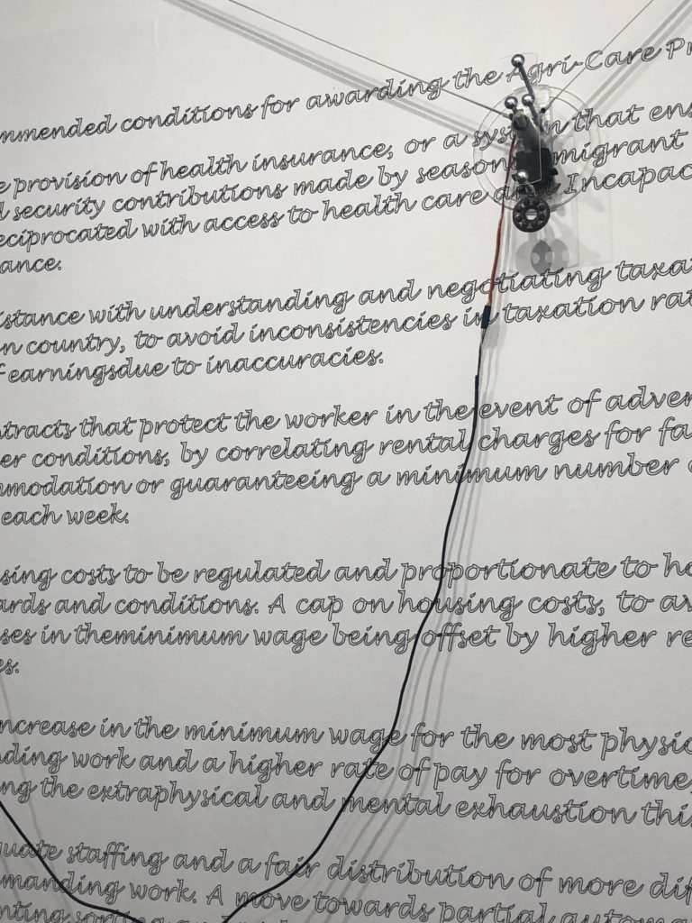
The invisible hands exhibition is placed in the Jersey Arts Centre and is a collaborative project between artist Alicja Rogalska and The Morning Boat in order to showcase life as a migrant worker. The aim of the exhibition is to bring light onto the poor conditions for migrant workers on the island for the little that they gain back, the topic is one that is not spoken about often in the island however is something that plays a huge part in the identity of it.

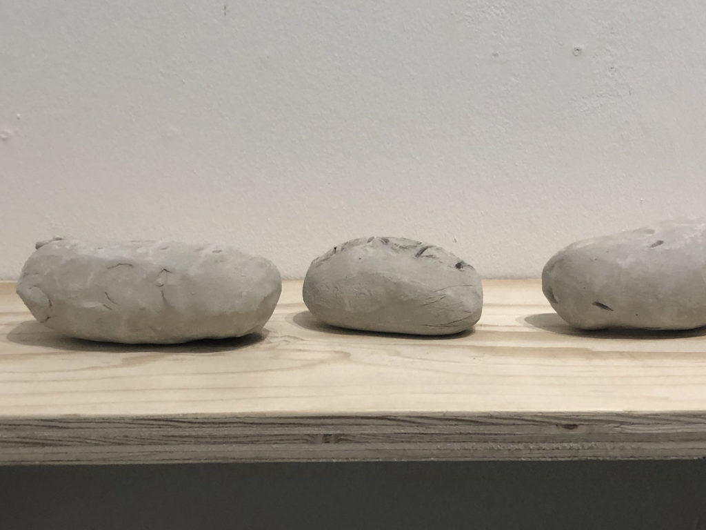
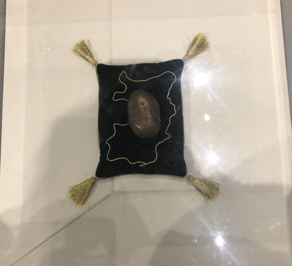
The Agri-Care prize was created during the process of talking to the migrant workers, as they were interviewed they created clay potatoes as a representation for them, potatoes being one of jersey biggest profit gains in farming, while working they decided on how they would pick out a winner for the most authentic clay potato.

Their interviews were filmed without showing their faces and a short film was played, projected on the wall at the exhibition, the lack of faces allowed the workers to remain anonymous, allowing them to speak freely about their work and links back to the title, ‘Invisible Hands’.

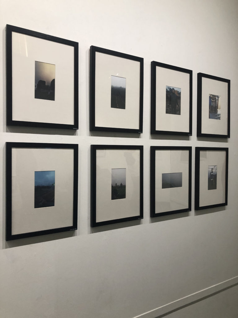
The photographs shown and displayed in the exhibition were documented and taken by the workers themselves, this is adding a personal touch to the photographs, though may not all be high quality it is a real, personal and first hand representation of what life is like working for these people.

This exhibition represents and allows the public and other locals to come in and see the side of the farming and agricultural industry in Jersey that they may not normally be known too or shown.

Book specification

  • 3 words

Change, journey , family

  • A sentence

Moving from one place to another with the help of family.

  • A paragraph

Moving from one place to another can be difficult, even more so without the help of the ones closest to you, who you think as family. Many small things can remind you of your previous home and it can become overwhelming at the beginning. Family helps you through times like this.

  • How you want your book to look and feel

I’d like my book to look / be hand made to add to the authenticity of it. I’d like to make it look like it’s something that I created throughout my journey of moving from London to Jersey, as some sort of journal.

  • Paper and ink

When it comes to the type of paper, instead of going for the usual glossy pages i’m more looking for a matte effect.

  • Binding and cover

When it comes to the cover of the book i’d like a textured cover and of a warm colour. I think it would look nicer without any images on the front page.

  • Title 

Either : Home, Memories or Change. I’d like it pressed into the page with a golden material.

  • Design and layout

  • Editing and sequencing

  • Images and text

ESSAY QUESTIONS+Plan

FAMILY / CHILDHOOD / ABSENCES

Photographers

  • Carolle Benitah
  • David clumpner
  • Diana Markosian

How does the work of Diana Markosian and Yoshikatsu Fujii explore childhood and family breakups?

Can the theme of absence be explored in the works of Diana Markoisan?

Is the theme of family prominent in the works of photographers like David Clumpner?

How does Mathew Finn’s work show the idea of love within family?

Why does documentary photography link best when exploring the idea of family breakups and childhood?

How and why does Carolle Benitah explore childhood and family breakups?

First Paragraph: Why I have chosen this topic and chosen the two photographers.

Second paragraph: FIRST PHOTOGRAPHER context behind their work and example analysis behind one of their most popular images.

Third paragraph: Repeat for next photograph and analyse one images that best suits an example of their work and one that could have inspired my images

FOURTH PARAGRAPH: Which approach best suited. (Ism)

MY WORK: examples of my experiments and how and why I chose to do it like that

Fifth: Conclusion how and why do the photographers explore (chosen theme)

experiment 1 for personal study:

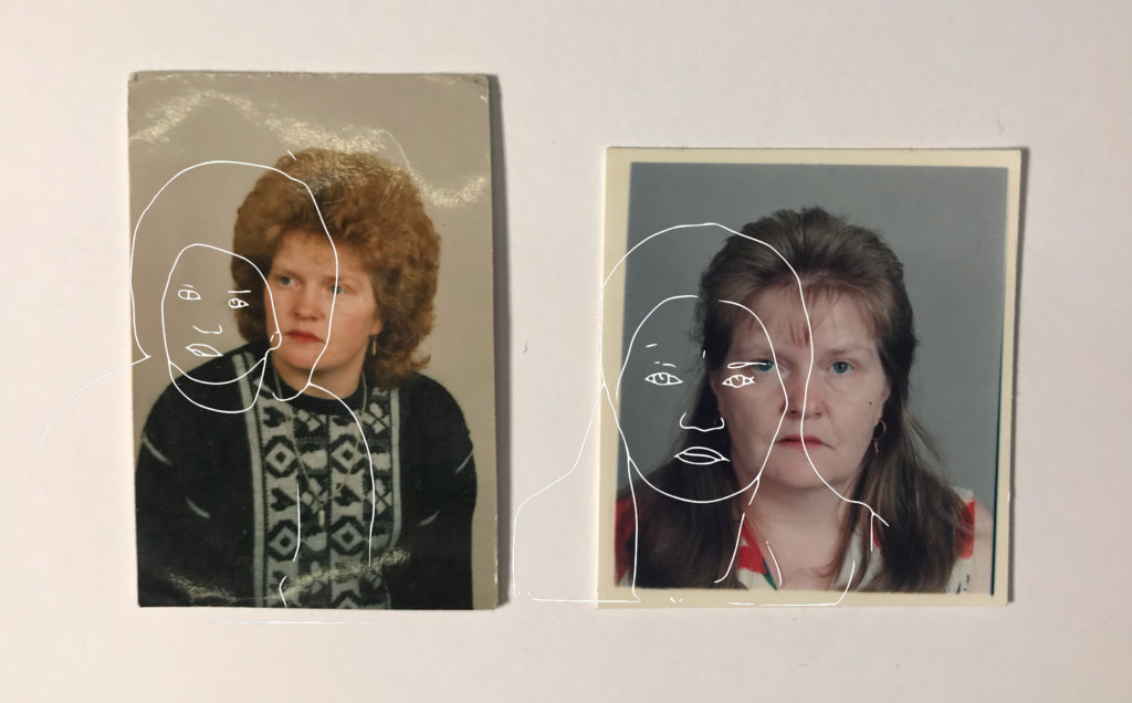
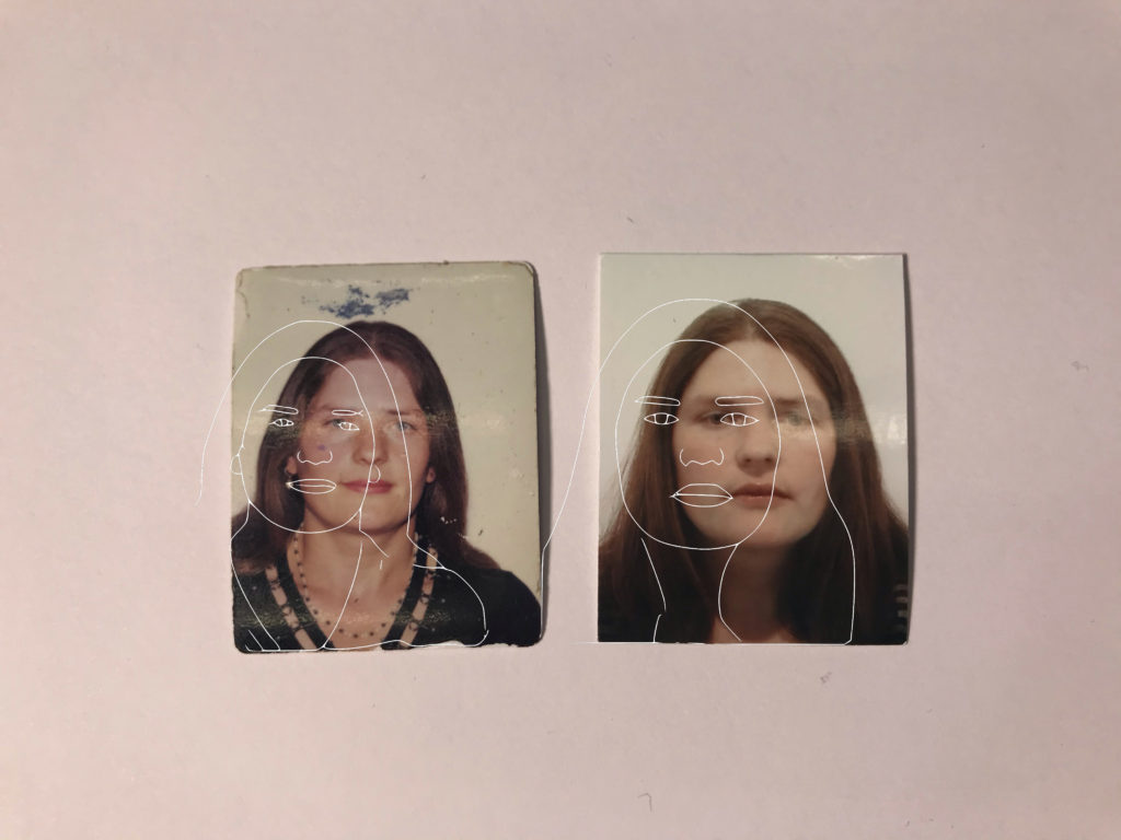
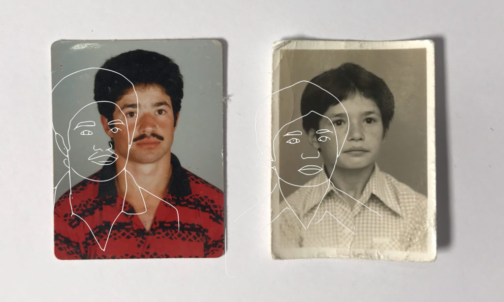
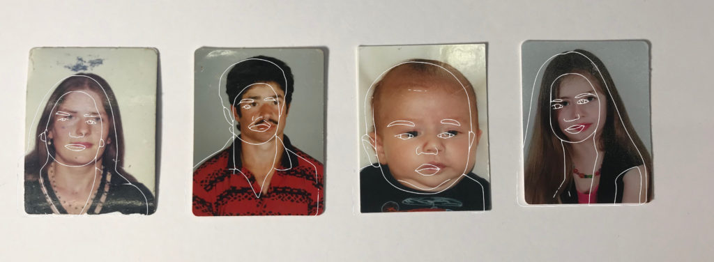
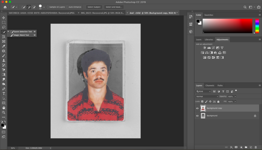
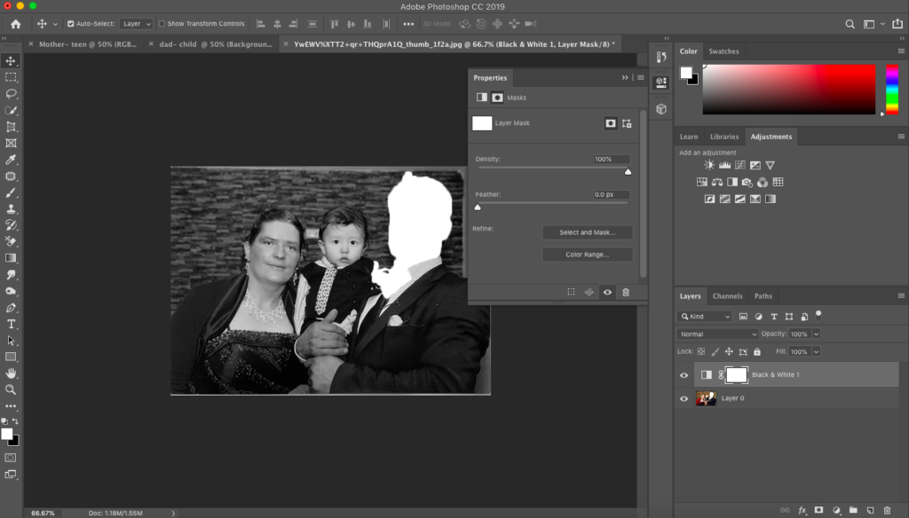
After having completed my first photoshoot I decided to play around with some of the images that I took.

These images I used an app on my iPhone called PicsArt. This edit allowed me to manipulate a somewhat cartoon line drawing over each of the portraits I have explored. I did this because I want to bring in artistic elements to create a more visual and exciting image. For some of my next edits I am going to explore a range of material and sources in photoshop and other apps I may find to create blurred effect as my book will go on.

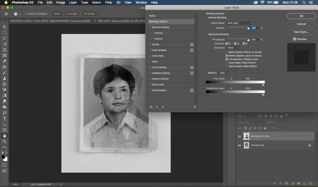
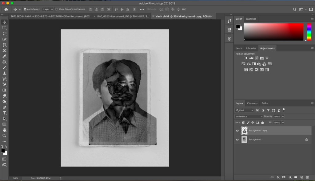
I played around with the images above in photoshop as well to see if I could create this old, edgy and faint look. As the images are a few years old i wanted to contrast them with a photo that is more up to date.

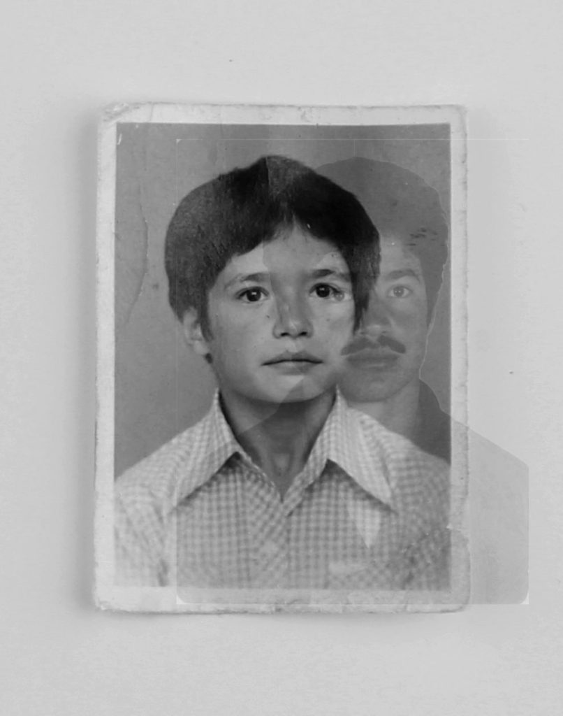
My final outcome with this experiment is below:

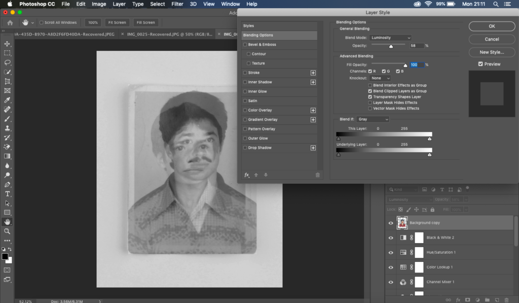
In photoshop I used the opacity tool to create this blurry effect.
Although, I may not use this in my final outcomes for the book, I have taken inspiration from Diana Markosian who did something quite similar with images of her dad, mum and her. I experimented using the cutting tool and for my next attempt will most likely try using the blurring tool so you can still see aspects of his face.

Diana Markosian

http://www.dianamarkosian.com/father

Diana Markoisan is an American documentary photographer but also a writer and a filmmaker. Markoisan was born in Moscow but moved to California with her mother and brother whilst her dad remained in Russia. One of her most famous final projects was her ‘Inventing my father’ which is the project I am focusing on. She has an experimental approach as evident through her first image where her mother has cut out the image of her father. She began this career at the age of 20 which has led her to travel around some of the most pristine areas of the world.

 This was the closest thing I had to an image of my father: a cut out in our family album.
This was the closest thing i had to an image of my father: a cut out on our family album.
 I was seven years old when I last saw him. The Soviet Union had long collapsed, and by then so had my family.
I was 7 years old when i last saw him. The soviet union had long collapsed, and by then so had my family.
 When I would ask my mother about him, she would look at me, disappointed.  “Forget him.”
When i would ask my mother about him, she would look at him, disappointed. “forget him.”
 15 years later, I found him standing just how I left him. In a doorway, neither fully in or out of my life.
15 years later i found him standing just as i left him. In a doorway, neither fully in or out my life.
 I listened to him speak about the past and his feelings towards my mother. It’s strange to look at images of them together. They look so happy, so in love.
I listened to him speak about the past and his past feelings for my mother. Its strange to look at images of them together. They look so happy and in love.
 One of the only images of my father and I together.
One of the only images of my Father and I

ANALYSIS

Technical – the image above is an archival photograph as Markosian said so herself she doesn’t not have many images of her and her father. Therefore the lighting in the image is most probably natural lighting that she has used coming through a window. There is a range of tonal shades on the photograph. The main beam of lighting is on her and her father, the darker and not so lit areas are on the other individuals in the image, perhaps other family members. Markosian has purposely done this so that the main area of focus is on her and father. The depth of field her in the image above is right on the focus as you can see the other people are more blurrier than them two. The lighting in the image is a fairly warm tone however having more tones of brown and black rather than orange and yellow.

Visually, the main colors that makes up the image is dark browns,blacks and then the dark blues that she and her father are wearing. I think she has chosen to shine a light on the blue making it more vibrant therefore stand out in the image. The way she has composed the lighting to only shine on her and her father I think is important as she only wants her viewers to focus on them two and not where or who she is with. From what we can see in the image she and her family are what looks like a cafe or restaurant with maybe her brother and uncle. However her mother is not in the image which leads me to believe she may be the person that is behind the camera.

Context – Markoisan chose this image to publish and to be part of her project as she did not have many photos with him. The project for her in a sense was for closure and to establish something that she had no power and control over. Her style of photography links well with realims and straight photography as she is documenting her life by what it is really like. She uses no filters and no editing that marks her images as unrealistic. Images emerged from walking and thinking, from spending time with the freedom of ideas unhooked from the psychological demands of the assignment. “It’s a form of meditation. There’s a mental archive of images that I am making, they are not for anyone but me. The walk serves as a form of inspiration. The walk becomes the art.”

The main reason I have chosen to focus on Diana Markosian’s work is because she has created a whole set of images and a project called “inventing my father.” The link to her website is above. I think this links well with my personal study due to the focus being primarily on her Dad’s absences.Most of her images have a small caption showing and explaining what each of the images contain and what’s happening in them. Most of her captions are short and direct which is what she’s trying to express with her relationship with her father. She expresses that the last time she saw her father was at the age of 7.

Although, some aspects of her project link well with mine I’m choosing to focus more half on my dad but the majority of my project on my mother. I am going to incorporate some of my art skills into this project like she has done through the use of cutting out the old images to make it look like a missing puzzle.

 He told me he had been looking for me. He opened a suitcase filled with newspaper clippings, undelivered letters and a shirt for my brother’s future wedding.
He told me he had been looking for me. He opened a suitcase filled with newspaper clippings, undelivered letters and a shirt for my brothers future wedding.

Book Specification – Narrative

Describing my book in 3 words:

Fashion, Judgement, Society

Describing my book in a sentence:

Exploring how judgemental society is, and how fashion can affect that.

Describing my book in a paragraph:

Modern society and the people within it are extremely quick to judge, whether that be a person or an event. Fashion, i.e. how someone dresses can drastically affect how they are viewed or treated.