Personal Study: 2nd photo shoot

Planning:

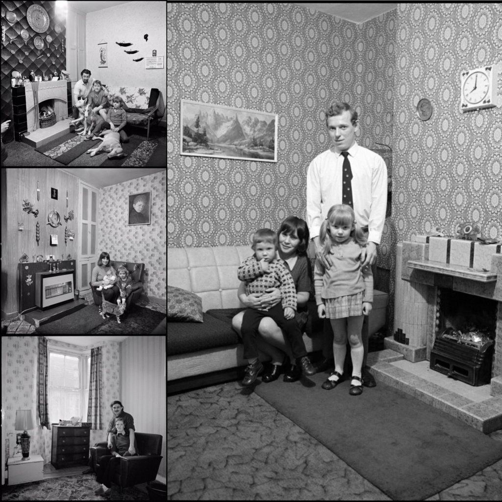
For my second shoot I will be taking portrait style images inspired by one of my case studies, Daniel Meadows. I will be taking these images in order to show my dad’s family now. Since Meadows took his images in the subject’s homes, I have decided to also use my father’s family home as the location for this shoot. I will most likely be using the lounge/livingroom as a location, as it symbolizes family as its where we spend most of our time together. I plan on organizing my family members in a distinct way as you can see in the mood board on the left, in order to make the portraits look more clean and put together. I will most likely be using a tripod in order to make sure my images are in focus, the shutter speed will not be too high as it will most likely be late towards the night when I do this shoot and this will help make sure my images aren’t too dark. The ISO will have to be quite high, and I will need to make sure my white balance Matches well with the lighting around the house.

Picking my best images using Lightroom:

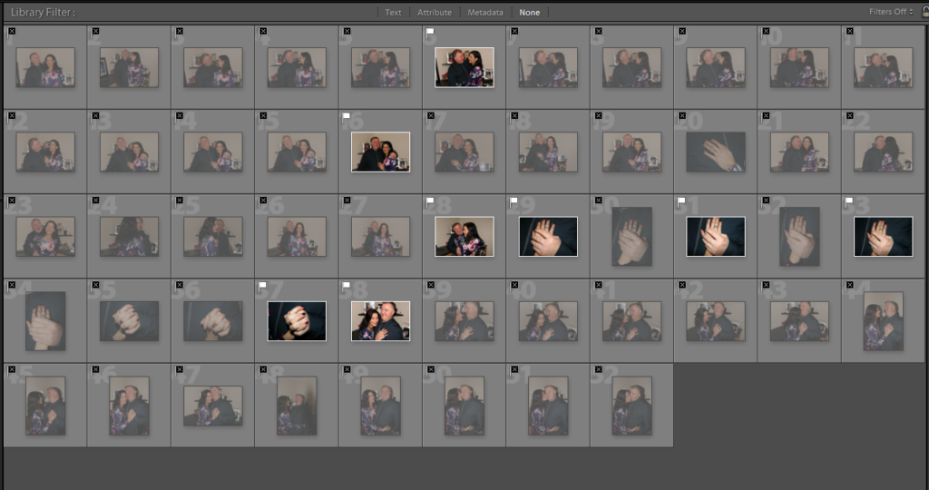
Below you can see the process of how I chose my best images through screenshots. I began by flagging my best images, in order to get rid of the bad photos then I color coded them using red, yellow and green.
Editing:
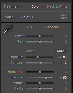
Although I didn’t intend to take images like the one above, This is my favorite outcome as one of my archival images with my parents looks very similar, and I think this could be interesting in showing how my family has changed. To edit i reduced the brightness and increased the contrast. I wanted the faded tattoos on my dad’s hand to be more visible so it is obvious to the audience it is him, although the majority has been laser removed.

Reflecting on the photo shoot:

My intention for this shoot was to capture what my father’s side of the family, now that he has a new partner, no longer together. I wanted to make the portraits similar to the ones above in the mood board, however I feel that during the photo shoot process the images turned out more candid that I originally wanted, as I also ended up capturing some detail shots also which I had not planned on doing. On one hand I believe this lets some personality shine through the images, but on the other hand I would have preferred to also capture something more professional looking because I feel that will make the photo book have a more polished look. I think I may redo this shoot, in order to achieve my original intention, then compare and see which images look best. If I do decide to retake, I would prefer to use a different setting as I think the background of these images are far too distracting to facilitate successful portraits leading to a minimal amount of successful images from this shoot. I also felt as if these images made my narrative less personal since the foundation of my project is based on my biological parents and my brother.

PHOTO-BOOK – Specification

3 Words: Stones, Slavery, Sand

1 Sentence: An exploration of the slave labour and resources used in the construction of Jersey’s German defensive architecture.

1 Paragraph: An exploration of abstraction as a medium in response to the question “how does the work of Darren Harvey-Regan explore abstraction as an intention and process?”. An interpretation of the works of both Darren Harvey-Regan and Donald Weber and how they explore abstraction with an underlying theme of the slave labor used in construction of Jersey’s defenses with familial links relating to German forced labor throughout WW2.

Analysing images – draft

Image result for Walker evans family work
A photo by Walker Evans, from “Cotton Tenants: Three Families.”

Visual :

In this black and white image you can see a family standing on what looks like the front porch of their run-down home. By the tatty clothes they are wearing you can assume that they are a working class family and are struggling with poverty. You can see 5 members of the family standing there, each doing their own thing, with a dog hidden behind the legs of the young boy at the front. The windows of the house seen quite dirty and the wood looks old and damaged – their house doesn’t look well-looked after.

Contextual :

Walker Evans photographed 3 families who were struggling with poverty during his work on capturing the Great Depression in Hale County, Alabama. The people in this image above was one of those families. This family was one of the many who were struggling with living their daily lives due to the Great Depression. At the time of this image, it was the height of it. You can clearly see how the effects of the Great Depression are taking a toll on these families – they wouldn’t have been able to afford clean clothes, enough food or the right equipment to clean their windows or fix their deck.

'Grandma Ruby and Me', 2005 by LaToya Ruby Frazier
Latoya Ruby – The Notion of Family

Visual :

In this image you can see two women placed in the middle of a room which looks like the living room of a home. While they’re very different in appearance – one looks old, with wrinkles and grey hair, while the other looks youthful – they both look like they have a comfortable relationship sitting on the floor together both looking into the camera, as if they are family.

Contextual :

In her series ‘The Notion of Family’, Latoya Ruby looks at her family’s struggle with disease and poverty. She photographs three generations of her family – her grandmother, her own mother and herself – to portray their struggles.

Understanding Photobook – Raised By Wolves Jim Goldberg

Related image
USA. San Francisco and Hollywood. 1986-92. Polaroid Grid.

The book is quite large, at around A3 size it is bigger than most photo-books I have seen. In hand the book is heavy and looks as if it is packed full of high quality images on thick paper. It is smooth and glossy on the outside and feels not much different to any other new-ish book. It contains a mixture of mostly black and white images and some coloured ones, accompanied also by notes and writings on each image written by the subject of the photo themselves. The paper texture remains the same throughout: slightly glossy. RBW is a mix of full bleed landscape images covering two pages as well as portrait. It is a soft back book that can be bent easily, there is no cloth cover or intricate binding.

The title is probably what attracted me most to the book; ‘Raised By Wolves’ is a term which was coined by one of the subjects who was being photographed, he wrote it down on a note and Goldberg has displayed it next to his portrait in the book. I interpret the meaning of this title as coming from how most of the young subjects in this book have been abused physically/sexually etc, by their own parents and have been brought up around constant drug abuse. Therefore they couldn’t escape from this way of life and ended up living on the streets and mostly following in their parent’s footsteps- the young runaways had been set up to fail since birth.


USA. Hollywood, California. 1989. “Dave at McDonald’s.”

The focus narrative in RBW is the story of Tweeky Dave and Echo. The pair share an appetite for heroin but not much else. He moons after her, proposing marriage and children, fueled by impossible, sweet bravado as he walks, half-starved, down Hollywood Boulevard with his bedroll. She recognizes him as worse than a bad risk and dumps him to run with other boys, who abuse her. She becomes pregnant, has her baby, then returns, broke, to her mother’s home. This is all portrayed through numerous written interviews with the two, as well as other characters, and through constant photos and notes that they have written.

Jim Goldberg USA. San Francisco, California. 1991. “Echo, 4 Days Before the Baby was Born.”

“I didn’t really fit in to my family as much as they wanted me to and I think that lead me eventually to photography. A camera back then, and probably still now, was like having a calling card that let you into places that you normally wouldn’t go to, or to people you normally wouldn’t talk to. I moved to San Francisco at the end of 1976 and probably soon thereafter I started going out on the street. Some of the people that I met were living in transient hotels, and they invited me into their homes and I photographed them.That was interesting to me. I was dealing with a group of people who I had very little contact with; they were poor, they were hidden, they were invisible people in these grimy rooms.”

Jim Goldberg spent 10 years photographing, audio-taping and videotaping to prepare this book. The book pairs images of the adolescents in their makeshift environments with extensive interviews. Their stories are accompanied by testimony from social workers, doctors, parents and police. The truth about a runaway’s childhood is sometimes hard to determine. These kids seem acutely aware of what adults want to hear. Some may not separate the rights of parents to exercise authority from fantasies of child abuse. But the blase accounts they gave Goldberg of violence at home and of streets rife with prostitution, AIDS and hard drugs are too numerous to be discounted.

“I had the idea of having people write their stories on the photographs and, although I didn’t really know what I was doing, that turned out to be something really integral to my practice for 40 years. I just saw something that I felt I needed to try and make sense of. And using text enabled me to do that.”

There is a definite link between the images and text in the book. As each image more often than not came alongside a note or physical writing on top of the photo, in the subject’s handwriting. Goldberg has since been using this process for many years as it allows a more open discussion between the subject and how they are being portrayed through the photograph, in their own words.

Bibliography: https://www.huckmag.com/art-and-culture/photography-2/flipping-gaze-photos-jim-goldberg-documentary-storyteller/ , New York Times.

Ed Templeton Response – First Set of Final Photos

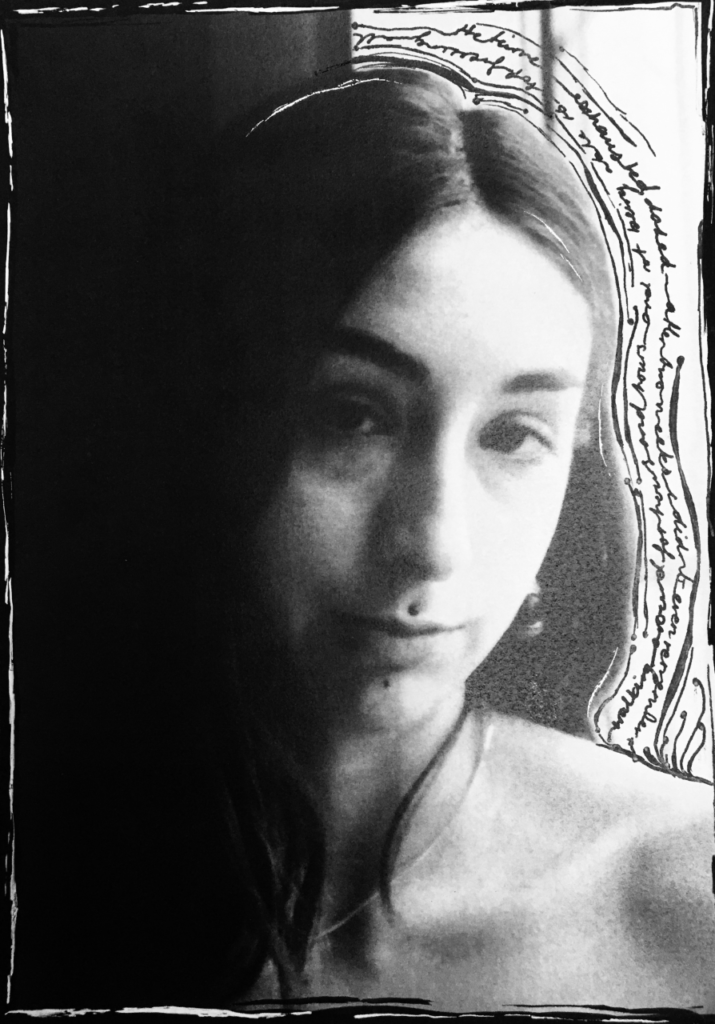
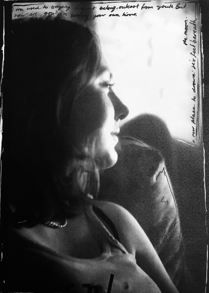
To start practicing and developing a response to Ed Templeton’s art/photography. I’ve decided to use some select film photos which were taken and developed over the summer, these comprise of just some candid/unposed photos of my friends, as well as some I have gathered from my most recent photo-shoot. Next I am going to scan them, edited them all into black and white to create a sequence to the images, then I am going to print them out and start working over them physically with paint, pens, nail polish etc, and also add in some text where needed, I also decided after doing these to incorporate red as a colour into my book when working over the top- this is because it complements the black and white really well and contracts all the darkness aswell. I really like how they all turned out and since this process takes a long time to get each imagine finished I am planning on using all of them as finals for my photo-book, since they all have a clear unification and go well as a collective. I think its clear that they have all been influenced by Ed Templeton which was my intention, but they also are not exactly the same and include some elements of my own which I really like aswell.

Shoot 6- REflection

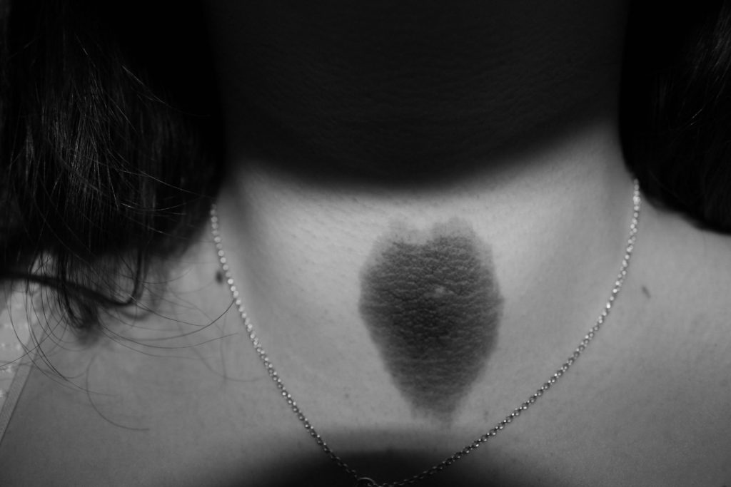
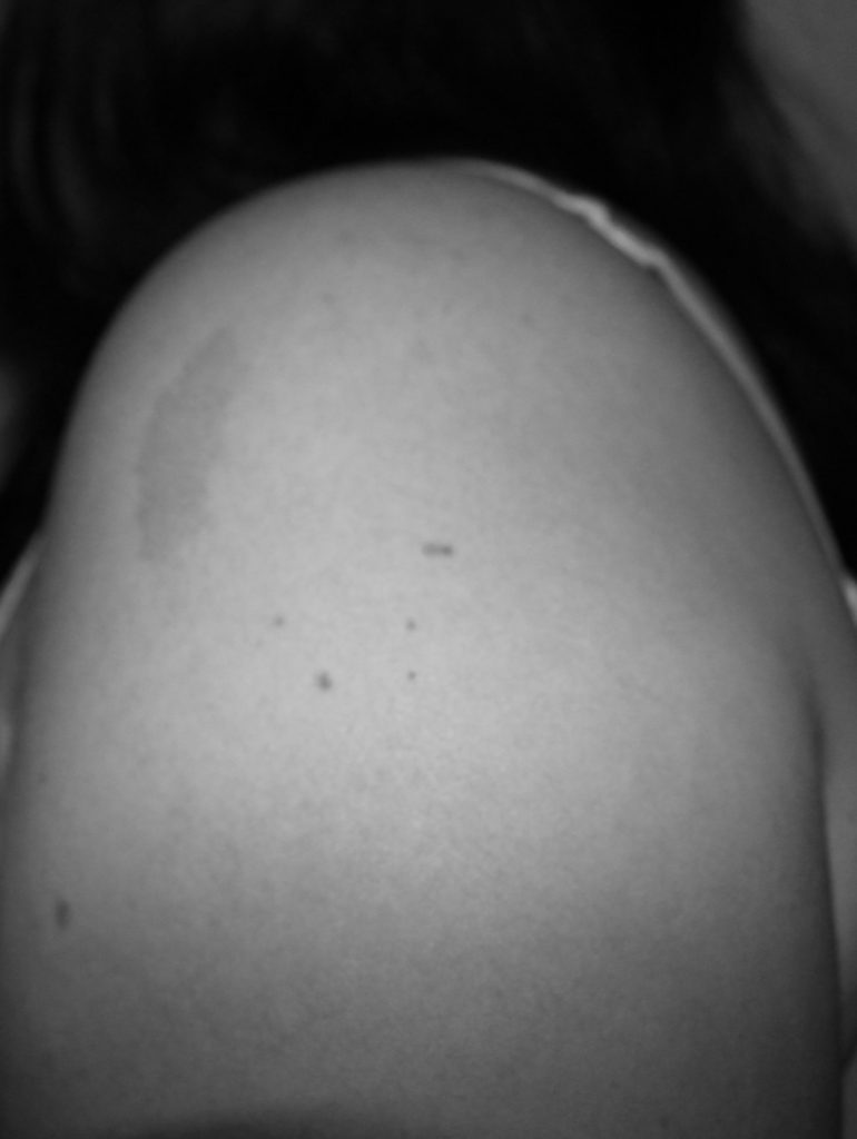
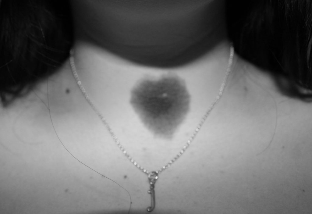
In this shoot I took self portraits of my birthmarks, to add a sense of self and identity to my photobook. My birthmarks have significance to my identity, as they are a part of me.

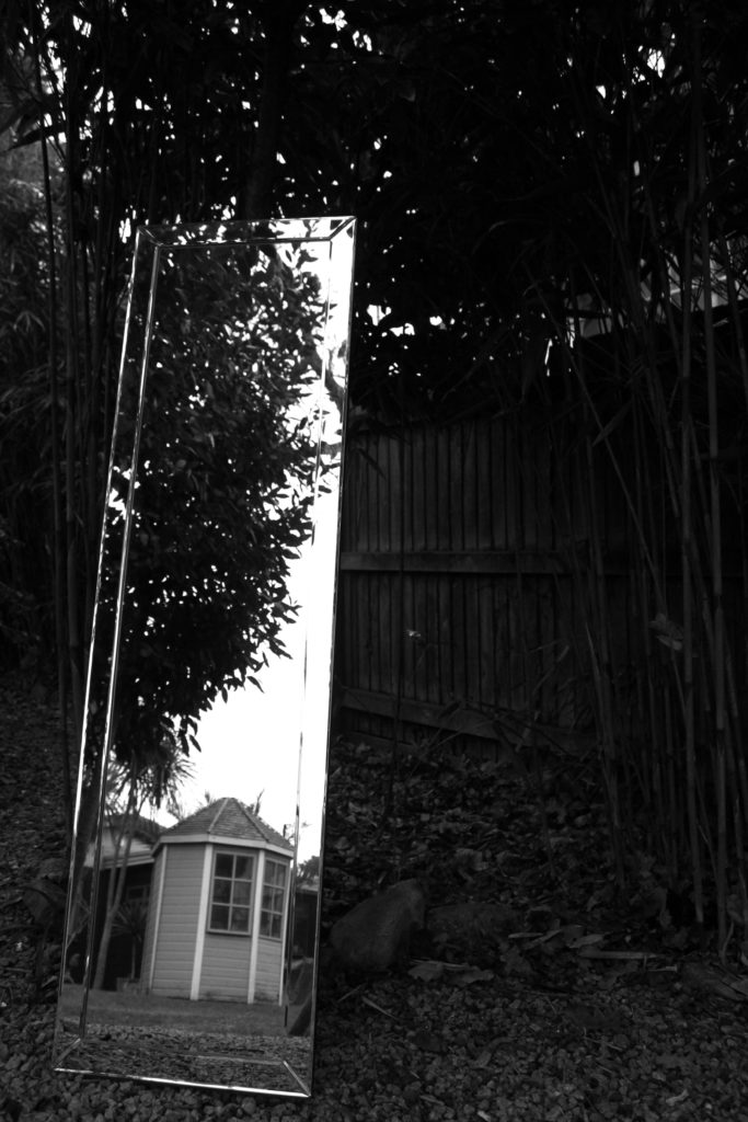
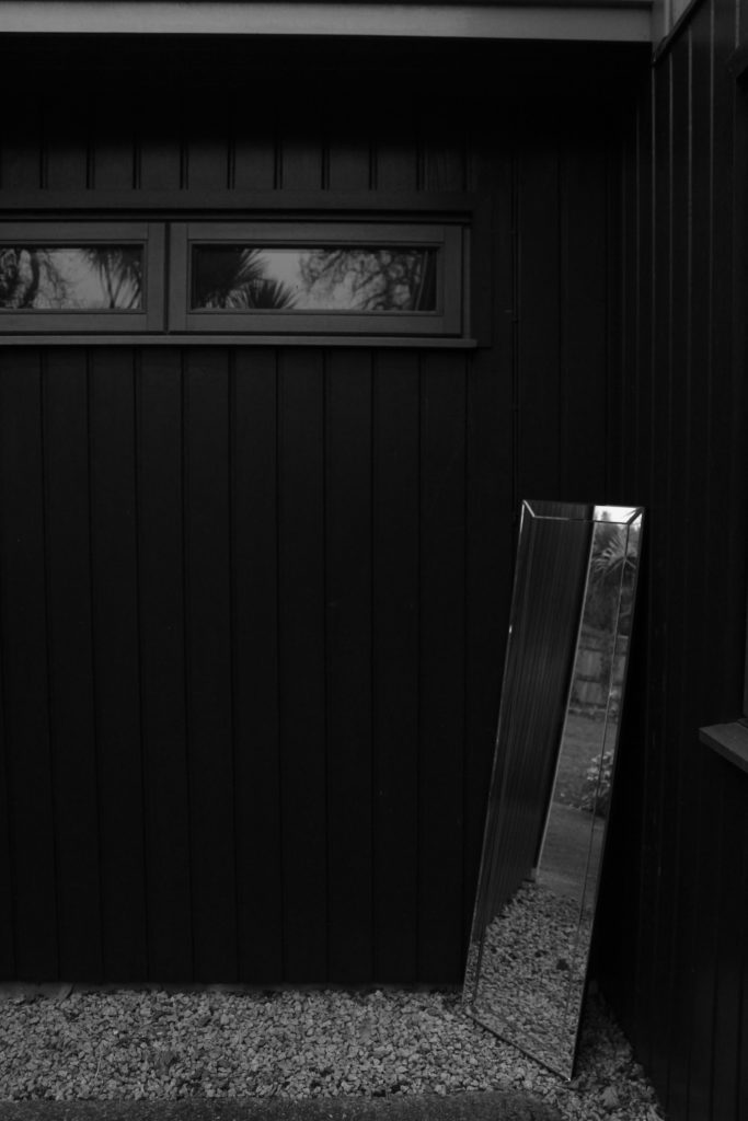
I took my mirror out into my garden and set it up against trees and walls. I ensured that my reflection wasn’t seen in the mirror to continue the theme of lack of identity.