The book is a soft back with, 161 pages of images telling a story. This book is about a German solider and a women from Jersey falling in love during the occupation, which was a very risky thing to do, meaning they had to keep it one the down low, to make sure no one would find out, otherwise consequences would’ve been big.
The layout of the images change from page to page, which makes the book more interesting to look through. Some of the images within the book were taken back during the occupation period and some are more up-to-date, you can see this through the change in quality, focus and layout. This is similar to what it want to present and has given me new ideas on how to layout my images. He also used documents and other objects that can relate to the two individuals, which allows the reader to get a better understanding of the couple and their life they had to live.
The photobook I will be looking at will be Looking for Alice by Sian Davey. The narrative is from the perspective of Sian, a mother and she captures the day to day life of her daughter Alice, who has down syndrome. Davey captures raw photos that outsiders wouldn't usually see, Alice's interactions with her family, strangers, animals and the world around her. Sometimes she is smiling, sometimes she's crying, sometimes she is all dressed up and other times she is completely naked. Alice experiences the world differently to everybody and Davey is able to capture Alice's unique experiences due to her being her mother who has an intimate relationship with her daughter.
2. Who is the photographer? Why did he/she make it? (intentions/ reasons) Who is it for? (audience) How was it received? (any press, awards, legacy etc.)
Davey started capturing images of her daughter from when she was a year old. In Davey's prologue at the beginning of the book she describes how Alice is "no different to any other little girl or indeed human being; she feels what we all feel and needs what you and I need". Davey later on discusses how "ninety two percent of Down's Syndrome babies are terminated at the pre-natal screening stage." I feel that Davey is trying to display to her audience that Down's Syndrome children are still children, wonderful, quirky and it is beautiful to watch them grow up. Davey is also trying to challenge the perceptions of difference within society as Alice should be treated with no less respect than any other being within society. Davey describes how she struggled to initially love Alice due to "fear and uncertainty", however, Davey discusses how Alice is loved "unconditionally, as it should be". Just because Alice is different doesn't make her any less of a beautiful being and that she should be valued everywhere "without distinction, without exception, without a second glance".
3. Deconstruct the narrative, concept and design of the book such as:
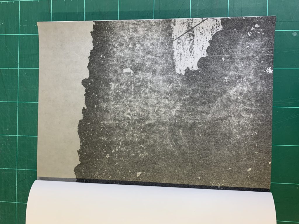
The book is a hardback and feels heavier than it looks. It has a linen cover which adds a rough texture and the pages. The pages are white and are matte paper.The images are all colourful images. After you turn the first page there is a sheet there is a piece of greaseproof/acetone paper with what ooks like a blurry shadow is printed on. This adds depth to the books and I believe that it is deliberately there to make the readers question the difference, just like how many strangers tend to queston Alice, who many class as different due to her disability. The format size is around A5 and the book is portrait. The cover features an image that also features in the book of Alice standing on a fence and looking out into a meadow. There is a letter press into the cover which indents the writing and makes the letters gold.
The title is more poetic rather than literal because the photographer is Alice's mother, she doesn't really need to literally look for Alice as she's always around her. However, it can have a more metaphorical meaning, such as looking at the way society percieves Alice, how they treat her differently and how they should really treat her. The subject matter is Alice, who is Davey's daughter. She can be percieved as being unique to many other children due to her having Down's Syndrome, however, one of Davey's purposes of her book is to display that although Alice has a disability, she is no different to any other little boy or girl. The images consist of Alice interacting with her family, friends, strangers, animals and generally the world around her.
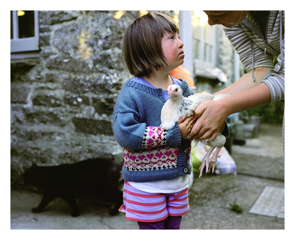
Most of the pictures are in the same place, near the top of the page and in the middle of the page. There are no double page spreads however, there are some images that are larger than the usual pattern and does overlap onto the other page. Some images don't have text for them, however, some images has text either below them to explain the image or on the opposite page. For example, the image above has writing underneath it which calls the image The hen and the cat. At the beginning of the book there is an introduction by Davey explaining the book and her reasons to make it. She then has an extract by David Chandler called The love you take. David Chandler is a writer, editor and curator in the fields of photographic history, contempory photography and visual arts. At the end of the book, a poem by Luke, Alice's brother and Sian Davey's son. It is titled sister and it is assumed the poem is dedicated to Alice.
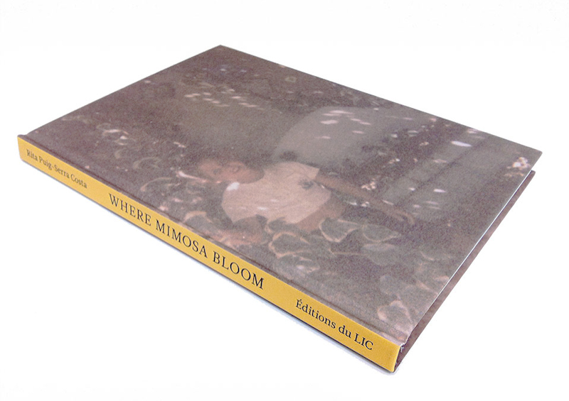
Where mimosa bloom is a photo book by Rita Puig-Serra Costa which is the result of 2 years work, collecting and photographing things and different areas. The narrative is very emotional as it was an outlet for Costa to deal with the grief she felt after loosing her mother. The subject matter of the book is diverse, as there are archival images, portraits of people who played an important role in her relationship with her mother, and also landscapes of places.
2. Who is the photographer?
The photo book is described as being “an extended farewell” to her mother in the form of images, meaning it was made as an homage to her mother. I think this photo book effectively shows love, loss and pain. Because this piece of work is very emotional, it is likely that only positive sentiments of her family unit will be shown, which can be limiting as we may not get a full insight to her family.
3. Deconstruct the narrative, concept and design of the book such as:
Book in hand: When holding the book, it is clear it is a hardcover and that there is some sort of texture to the front and back cover. The binding appears to be regular as it is all joined together on the left side.
Paper and ink: The paper and ink used appears to be standard and there is a clear use of bright and pastel colors instead of darker ones. The book has a Hot foil embossed textured hardcover and 5 die cut pages. 54 color plates are used.
“Die cut” pages displayed above
Format, size and orientation: The size of the book is 16 x 22.5 cm and the orientation is Portrait.It is A5 size with 96 pages.
Title: The title is rather poetic, and relevant as mimosa are soft and delicate and this could reflect that this plant was important in her relationship with her mother. Since it is quite poetic it is very intriguing as it invited the reader in in order to be able understand it’s metaphorical meaning.
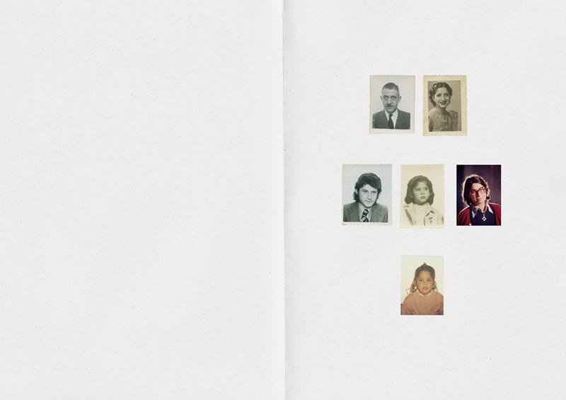
Narrative: The story is about her’s and her mother’s life and the subject matter at hand is her family and important relationships within her personal family structure. It is told at the beginning through a family tree style approach as with every die cut page we turn someone else from her family is revealed. We then go onto see archive materials in the form of images and objects along with portraits in order to further understand the individuals shown.
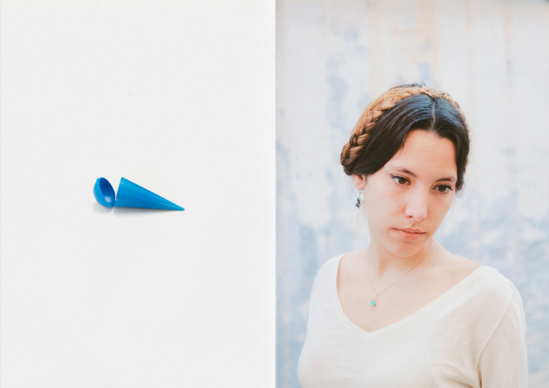
Structure and architecture: One repeating motif seen throughout the book is how there is a repeated structure of placing an image of an object, next to a family member’s portrait. I think this aids the narrative since it develops the concept of her attempting to reconnect with her mother through people and objects, and having this repeated also helps the audience to feel as if they are a part of her journey of discovery.
image of an object displayed against a portrait.
Design and layout: The photographer uses a wide variety of techniques when displaying her images. Some images are portrayed landscape, while others such as portraits are displayed portrait. Some images are displayed using a double spread, whereas some archive images are displayed altogether on a page in groups of 3. The book contains no inserts or fold outs, which I feel is good otherwise the book could become too confusing and the viewer would not focus on the concept as the way the images are displayed is already quite varied.
full bleed, double page spread.
Editing and sequencing: There are 5 die cut pages at the beginning, where a different picture is revealed from cut out paper as you turn a page. This sequence reinforces how the book revolves around family, and it introduces her relatives to us in a simple way, which doesn’t overwhelm you with knowledge. The photographer also chooses to display certain objects on one side of a page next to a portrait, which could convey the feeling that the object is of significant importance to the person shown in the portrait. This also creates an obvious juxtaposition because a portrait and an object contrast very clearly.
Images and text: Towards the end there is a page which lists all the objects displayed in the book and all the people who’s portraits are in the book. It also shows what each object is and who it belongs too which is very effective because it allows the audience more likely to understand her story. There is also a sentimental letter towards the end which she has written, and addressed to her late mother. It is first printed in Catalan, which is the one of the official languages of the Spanish region of Catalan, which helps show the emotional connection between her and her mother since it is written is their native language. It is then printed again in English. She speaks about her she still feels her mother’s presence when surrounded by family, of when she looks at herself. She explains how although she is very upset that she’s no longer here, she finds comfort in the fact that she has so many ways of remembering her.
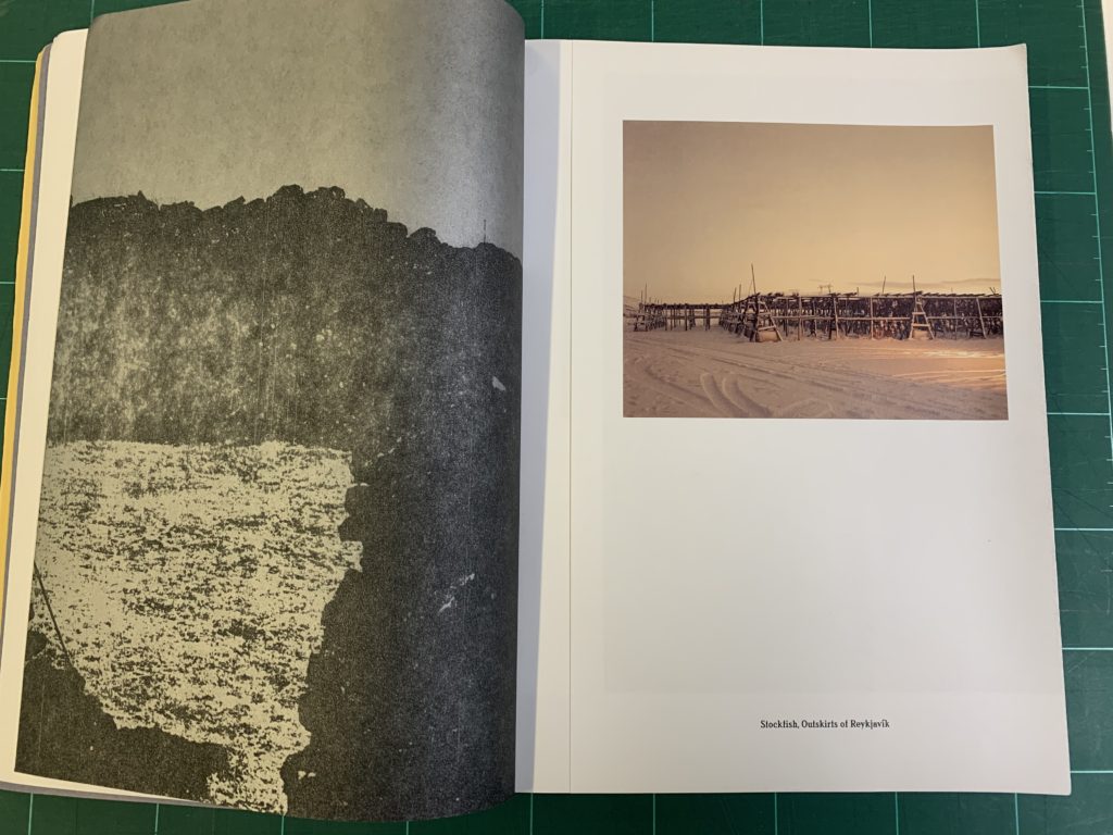
Latham was born in 1989 and is an extremely popular photographer based in Bristol and has produced several photobooks including ‘Sugar Paper Theory’ published in 2016, ‘A Pink Flamingo’ published in 2015 and many others. In 2015 Latham was awarded the Bar-Tur Photobook Award, funding the production of ‘Sugar Paper Theory’, which led to a solo exhibition. This solo exhibition was presented at Reykyavik Museum of Photography in Iceland this show helped aid his win of the British Journal of Photography International Photography Award for the series Parliament of Owls. A few more awards that Latham has been awarded: BJP – International Photography Award (Parliament of Owls), 2019/ mage Vevey – Heidi.News Prize, 2019/ Deutsche-Börse Photography Prize Longlist (Sugar Paper Theories), 2017/ Kraszna-Krausz Finalist (Sugar Paper Theories), 2017 and many more which helps highlight the significant portrayal that Latham has in the photography industry, also seen through his large amount of solo exhibitions for example, Sugar Paper Theories, Guernsey Photography Festival, Guernsey, 2016 and Worthing Artist in Residence, Brighton Photo Fringe, Worthing, 2018.
Book in hand: how does it feel?
The overall literal feeling of the book has a feeling much like sugar paper which aid the title of the book ‘Sugar Paper Theory’, along side having a tougher spine which helps combine the overall book structure together. The front cover lacks any other textures and has an overall smooth surface. The book till hold the ‘new book’ scent which creates a refreshing overall feeling over the book and suggests the owner of the book has taken good care of it, as it still looks prestige.
Paper and ink: use of different paper/ textures/ colour or B&W or both.
The front cover is a common sugar paper colour which is a pale yellow with red, blue and yellow drawings on top of the paper which look as if they have been hand drawn which adds deeper meaning and thought to the image. The ink on the front cover appears to be felt tip for the ‘decoration’ and the title in a printed text. When looking through the book there is a consistent trend of different types of paper that the images and texts. There are variations of a classic white paper boarder which is used on all the colour prints, followed by black and white pages which looks like white ink on black paper, with images printed on A3 paper and folded in with one half on the image and then when turning the page so it leave a empty unseen sleeve between pages; this creates the read to be more intrigued and adds better deeper meaning.
Format, size and orientation: portraiture/ landscape/ square/ A5, A4, A3 / number of pages./ Binding, soft/hard cover. image wrap/dust jacket. saddle stitch/swiss binding/ Japanese stab-binding/ leperello
The format of the book when closed is slightly larger than an A4 and the when opened near enough to the size of an A3, with initially the image being portrait how ever when opening and looking inside there is a large variety of portraits that over only one side of the page and some that cover across both sides the page creating a landscape image, i think makes the photo book more interesting to views as its provides a different angle and experience in each page. Furthermore the binding of the book has a classic appearance with a dirty blue spine contrasting with the pale year front cover- when taking note of this it came to my attention that the whole front cover is only presented through the three primary colours- red, yellow and blue which I thought was a interesting factor to consider.
On the cover there is no textures or embossed titles but simply a clean sheet with the texture of sugar paper which helps highlight the significance of the title ‘Sugar Paper Theories’. Have the simplistic textures I think helps concentrate the read on the title and the drawn images on the front, also leading to looking at the idea of only using primary colours.
Title: literal or poetic / relevant or intriguing.
The title being ‘Sugar Paper Theories’ at first is fairly mysterious and to me an intriguing title as it makes me want to find out more, as it does not give away much about what the book may be about- therefore giving a fairly poet feeling along side connotations of a scientific background through the noun ‘theories’ as well as there being further ideas of possibly multiple stories and thoughts that might come through the photo book.
Narrative: what is the story/ subject-matter. How is it told?
Jack Latham story is base on a true life incident that happened approximately forty years ago about a murder case, and therefore contributed to the ideas that Latham’is much like a documentary and story being told through a photo book. The story told is that 40 years ago, two men disappeared in Iceland (southwest). the findings and conclusions from the case were very limited which is why it became such a mysterious case. An eighteen year old boy set of from a nightclub on a 10 kilometer walk all the way home during the time of the true Iceland winter conditions, to continue a family man failed to return from a meeting with a mysterious strnger. In another time or place, they might have been logged as missing persons and forgotten by all but family and friends. Instead, the Gudmundur and Geirfinnur case became the biggest and most controversial murder investigation in Icelandic history. One of the main area that i believe that Jack Latham was trying to raise were the fixated factors on Iceland’s anxieties over smuggling, drugs and alcohol, and the corrupting influence of the outside world, i believe this to be an area being reflected from the book almost seen as a warning. Due to the significance of the case Iceland’s highest levels of political powers became involved in the plot soon leading to suspects of a younger generation who soon all wrote confessions, however its important to remember that in the story its noted that although all the suspect confessed not one could remember the actual event of the evening. When reading up on the story i found an interesting point that same about after the incident and how this case as helped point out ideas of interrogations and memory lose which could possibly lead to the wrong person being imprisoned. ‘ Now a public inquiry is uncovering another story, of how hundreds of days and nights in the hands of a brutal and inexperienced criminal justice system eroded the link between suspects’ memories and lived experience.’ (Quoted from the photopedagogy website)
Design and layout: image size on pages/ single page, double-spread/ images/ grid, fold- outs/ inserts. Structure and architecture: how design/ repeating motifs/ or specific features develops a concept or construct a narrative.
For me the design and layout is an essential point to consider when looking deeper into the overall view of the photobook, not only with this particular photo book that I am looking at but in fact every photo book has a deeper meaning and a story to look at through the layout and design choices made in the creation of the book. Furthermore, in the Sugar Paper Theories photo nook there is a large about of different types of pages and creations that have been produced. For example, Latham was fortunate enough to get hold of the archival photos from the time of the investigation and to me Jack Latham was trying to make these particular images stand out from the rest of his images, essays and the newspaper copies. Latham did this by copying the archival photos onto black A3 pages using grey and white ink, next folding over the A3 pages and creating pages leaving a closed gate way within the pages, which add an interesting views whether its through the literal fact that particular type of printing can be on double sided sheets or the idea of deeper meaning with idea of a secret fold in the paper which could relate to the whole concept and idea of the boom being an unsolved mystery still holding secrets and an untold story.
Images and text: are they linked? Introduction/ essay/ statement by artists or others. Use of captions (if any.)
Through out the book there are pages with essays on a yellow page which look much like sugar paper which helps highlight the significance of the title ‘Sugar Paper Theories’, Furthermore, on he yellow paper is the actual story of the murder case in much more detail told by Jack Latham which i think helps add a personal aspect, as well as this factor the idea of telling the story mixed in with the archival ohtos from the time and Latham’sown images really helps tell a proper story and really projects the whole idea and feelings that are trying o b relayed on to the reader/ viewer. In addition to the yellow pages telling the story, there are also pink ‘sugar paper’ which have photo copies of the articles published about the murder investigation at the time which i think helps the reader really get in the mind set of how different the law system and general life was back forty years. Finally there re black A£ pages folded in half with a slip inside which add a type of excitment and infantrymdscSRwfen to the story which are all archival photo from the time of the investigation as well as Jack Latham’s own images. Overall, among all the different aspects found in the book Latham has really recreated this story and all the feelings that cam along with it which help the reader get inside of the emotins that come with the murder.
Ed Templeton is an American photographer, artist and pro-skater. He is the founder of the skateboard company Toy Machine. Outside of skateboarding, Templeton is a painter, graphic designer, and photographer, areas that he has gained a reputation within without any formal training, the Photography Colleges website, in an article entitled “New School Photography: Ed Templeton”, identifies Templeton as “probably the most influential contemporary photographer”. Templeton’s signature model skateboards for the New Deal company were self-designed and he subsequently became the head designer for his own brands—Templeton produces all of the art work for the Toy Machine skateboard company that, as of January 2013, is his primary skateboarding project. Templeton is also a co-editor of ANP Quarterly, an arts magazine started in 2005.
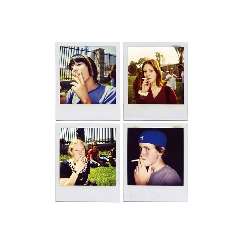
Teenage Smokers: in 2000, Templeton’s book of photography, Teenage Smokers, won the Italian Search For Art competition and Templeton was awarded US$50,000. ‘The idea for this book sprang from finding the original boxes of Polaroid’s that started this whole series, shot in 1994 at my local skateboard park in Huntington Beach, California. I would be skating there when the kids finished school and they would collect there to hang out and smoke. One day I brought a Polaroid camera to the park and started asking all of them for a portrait while smoking. Those first Polaroid’s were the photos that Aaron Rose saw when I did an exhibition at his Alleged Gallery in 1999.’
‘Templeton began taking candid, sometimes intrusive photos of his wife Deanna, strangers and teammates on skate competition tours. His next show with Alleged, in 1999, was a large collection of voyeuristic photographs of kids and the accompanying book, “Teenage Smokers,” that caught the attention of art critics and garnered a very different reaction from his first paintings. The series was acquired by the Orange County Museum of Art and the book, if found today, goes for a nice chunk of change. Since, Templeton has proven that he clearly has an extraordinary eye for composition, and is valiantly carrying on the tradition of contemporary art photography in the vein of Nan Goldin, Garry Winogrand and even Walker Evans. However, like his predecessors, his subject matter is extremely raw and personal; at times X-rated, violent and emotionally draining.’ (From Skater To Artist – K.CET)
The reason I am choosing to use Ed Templeton as an artist reference in my personal investigation is because I think he is quite unique in the way he photographs people, the images all appear to be genuine as if there is a backstory to every single one, this is reinforced with the writing that is included on almost every picture; these state dates,times, names and even the actions of those in the picture. Therefore all of his images seem raw and unedited, which is something I want to include in my own photography and responses to him. Another aspect I enjoy is how he incorporates multi-media into still photographs, such as: paint, pen, cardboard, backgrounds and other ways of displaying the photography. These techniques bring colour to the black and white photographs and give another personal touch from the photographer.
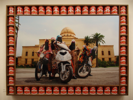
This image has a deeper social significance, as the biker group photographed ‘The Kesh Angels’ is going against the rules and norms of their country. This is as in the area women are either not allowed to drive at all, or it is extremely looked down upon. So their biker group is a kind of rebellion against both the government and the culture around them. The way the image has been set up also shows this ‘uprising’; all three bikes in the image are pointed towards the camera with the riders at an aggressive stance, which represents their attitude, that they’re not afraid to rebel. The two women on either side of the image strengthen this aggressive/intimidating effect as they have open body language and eye contact towards the camera. This mirrors the stance of the bikers in the middle of the image, but adds depth to the image.