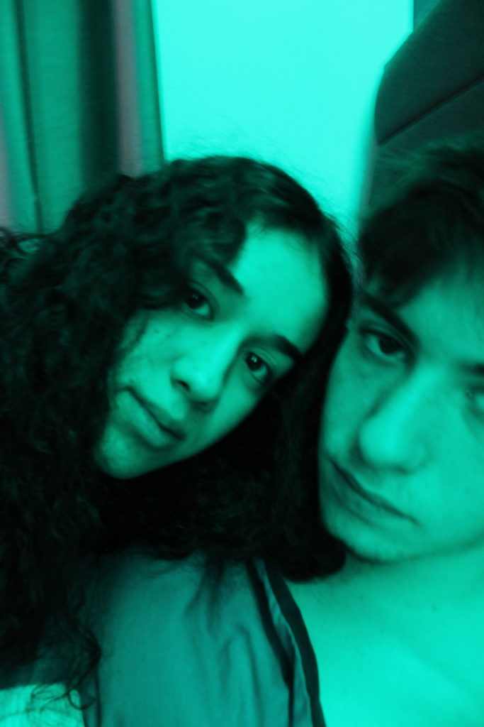
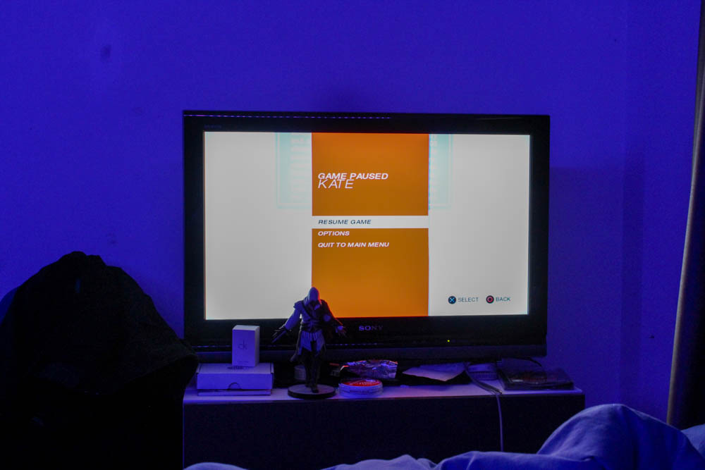
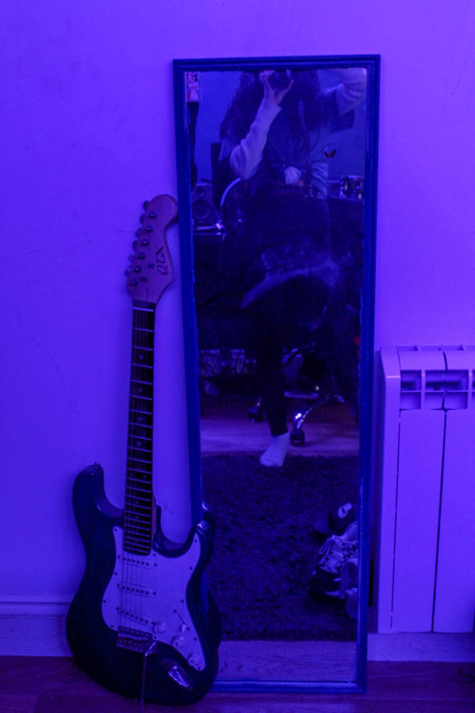
For this photo shoot I again took photos in my boyfriends room, but this time I took photos of him and significant parts of his room to show him and his living space.
Final Images (Unedited):
Final Images (Edited):
How I edited these images:
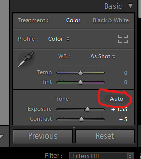
First I went on the basic setting in light room and pressed the auto button to put the auto editing on.
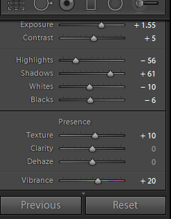
I then scrolled down and adjusted the settings to get the image to what I wanted it to look like.
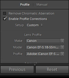
After, I scrolled down and went to the lens correction option and clicked on the ‘enable profile corrections’, then clicked ‘make’ and selected Canon.
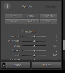
I then went on the transform section and clicked the auto option.
Conclusion:
To conclude, I am really happy with how this photo shot came out as I was able to capture the ideas that I had. I am happy with the amount of photos I took and how they turned out and I really like how I edited these images.
Walker Evans is an American photograph, who influenced the evolution of ambitious photography during the later 20th century. His imagery looks at creating a poetic resonance, which describe the subject presented within the photograph. He is said to be the first photographer to produce a photo book to present his photographic responses, entitled ‘American Photographs’. His work challenges social issues, through the style of documentary photography, this element is clearly shown within his photographic series ‘ Let Us Now Praise Famous Men’.
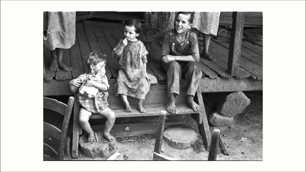
Mood Board showcasing Walker Evans’ imagery from his photographic series ‘Let Us Now Praise Famous Men’
Conceptual and Contextual:
Let Us Now Praise Famous Men, is one of Walker’s most known photographic series which was started in 1936, captured imagery for 5 years, and the photo book being published in 1941, in which he teamed up with American author James Agee to create an embodiment of work which documents the lifestyle of Tenant Farmers in Alabama during the Depression era. For contextual reference a tenant farming is a form of agriculture, in which a land owner with contribute their land on measure of operating capital and work, while the tenants contributes their labour, with the return being given in a variety of ways. The return can be, a share in the produce, cash or a combination of both. This is only said to be 5% of the agriculture, making these subjects a minority in society and within the industry, thus create more captivating imagery showcasing their lifestyle. Sadly, this form of work can lead to abuse when the landowner has to much power, or inferior social status. Initially, the project was to capture white cotton farmers in South America, but the focus soon changed after a lack of subjects being found, the new idea of tenant farmers formed after the two lived with three tenant family farmers. The families lived with no electricity or running water, and have lived this life style since their childhood.
“Let Us Now Praise Famous Men harkens back to a time when millions of Americans lived a truly subsistence existence, and their families were the one buttress against an eternal winter of silent despondency.” (Ingram.B, 2014) In a review article which analyses the book written by James Agee, with comments on Evans photographer, the author wrote about how the imagery Evan produces allows the clear narrative to tell the story of the lives of the three tenant farmer families. “Evans was a preeminent photographer of his time, and his almost stark work here is the perfect foil for Agee’s” (Ingram.B, 2014). Evans’ photographs within this book has pleased many critics as the images illustrates the imagery created by the word produced by Agee.
In another article, published by the Guardian, the author describes Evan’s imagery to present reality, “You can’t sniff the stink of the quilts in the Evans pictures, nor itch with the lice in the pillows. The foul beds take on a Shaker dignity of form. A gasoline pump on the porch of a post office metamorphoses into sculptural permanence within the fixed focal length of Evans’s lens.” (Rule.V, 2001). His positive critique to Evans’ imagery emphasises how accurately he managed to capture the raw living environments of the tenant families, which allows viewers to sympathises for these families, as we understand that they do not know life any differently. As previously mentioned it allows our imagination from the novel, written by Agee, to visually see and understand this reality, making the stories more real and empowering. The author also mentions how Evan’s photographs “beatifies, the bemused children of poverty more than any adjective or adverb Agee might edit out of his copy.” (Rule.V, 2001). This illustrates how the images within the photographic novel holds stronger representation of the lives of the tenants than the story itself, as words are not powerful enough to describe these conditions. In addition, he is referring to the idea that the images are being beatified, which informs us that the photographs are captivating and have the authenticity which makes the images seem beautiful, which juxtaposes the negative connotations the images actually hold.
Technical and Visual:
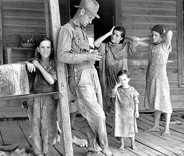
The double page spread presented below is one of the most famous page spreads form any of his photographic books, and is taken from his series ‘Let Us Now Praise Famous Men’. I believed that these two images held a lot of visual and technical value which allow me to critically analyse Evan’s work in order for me to describe the way in which his conceptual representations is presented.
Walker Evans – Let Us Now Praise Famous Men
Visually, the two documentary style portraits are minimalistic, in the sense that the frame has a lot of space, which depicts the conceptual representation of their basic and hard lifestyle they live, and shows how they have nothing. The photographs are two headshots taken at a straight on angle of a male and a female, to which I believe are husband and wife, which are the main focal points of the image. The clothing they are wearing suggests a lot about their low social status, their shirts seemed creased, and through the image being in black and white and high tonal contrast, we can see how soiled these subjects are. Their facial expressions are neutral, but their strong eye contact towards the lens almost suggests they are asking for help, and illustrates their pain and suffering. The background of the images are just their natural environment, which seems to be a wall or apart of their small wooden cottages. With regards to the formal elements, texture, space, tone and form, help to illuminate their poor living conditions, and adds to the authenticity of the naturalistic imagery, creating sympathy for viewers.
Technically, the photographs use basic camera settings, which shows how the time period of the photographs being taken, 1936, has influenced the outcomes. It is suggested that naturalistic lighting has been used to capture these outcomes, which means a daylight white balance would have been used, which juxtaposes the cold ambiance the images hold, also emphasising the pejorative connotations towards this imagery. The photographs have a grainy look, which shows the contextual element of the time period and could suggest how a high ISO was used in order to capture the images. In addition to this a quick shutter speed was likely to be used, as well as a medium aperture due to a slight depth of field being used and the imagery being having a darker tone towards it and the subject being in clear focus and sharp.
Action Plan:
Moving forward I intend to conduct a new photo shoot which looks at capturing the lives and lifestyle of my grandparents, and try and illustrate how the working lives have resulted in the lives at present. I intend to capture imagery outside, as that is mainly were Evan’s images were taken, which allows me to explore the relationship between my Grandparents and their exterior of their house. In addition, I look to create a selection of portraits which express this conceptual representation, through the images being in black and white, high tonal contrast and strong connection with the camera lens.
Bibliography:
Ingram, B. (2014). ‘Let Us Now Praise Famous Men’ by James Agee and Walker Evans. [online] Broadstreetreview.com. Available at: https://www.broadstreetreview.com/books/let-us-now-praise-famous-men-by-james-agee-and-walker-evans# [Accessed 15 Jan. 2020].
Rule, V. (2001). Review: Let Us Now Praise Famous Men by James Agee and Walker Evans. [online] the Guardian. Available at: https://www.theguardian.com/books/2001/aug/18/historybooks.highereducation [Accessed 15 Jan. 2020].
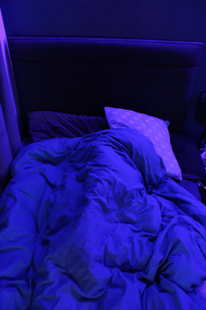
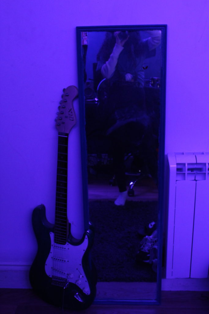
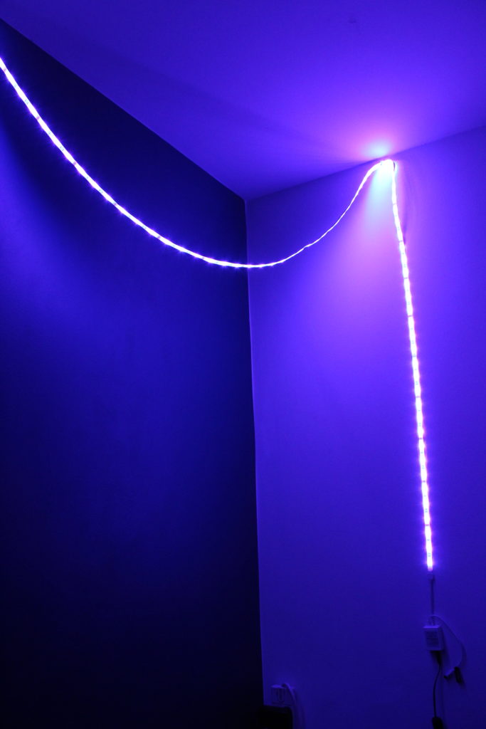
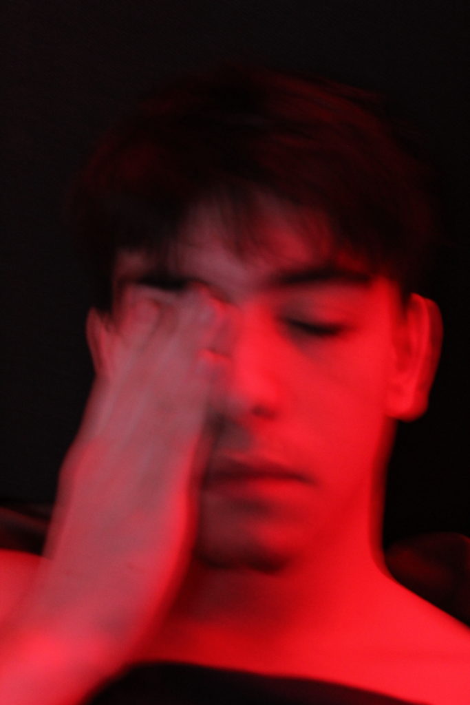
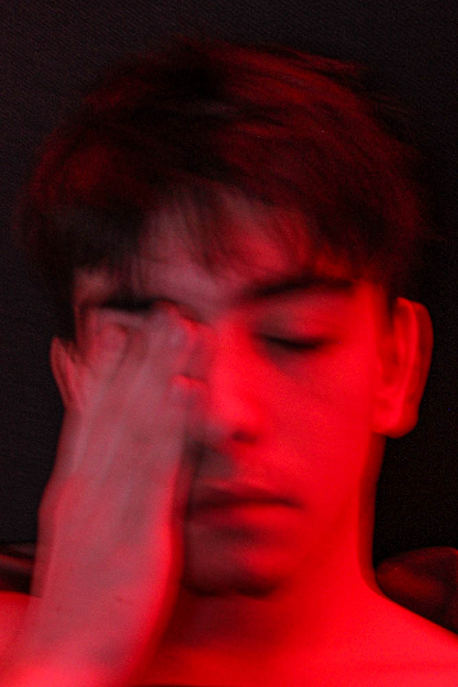
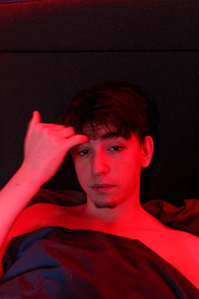
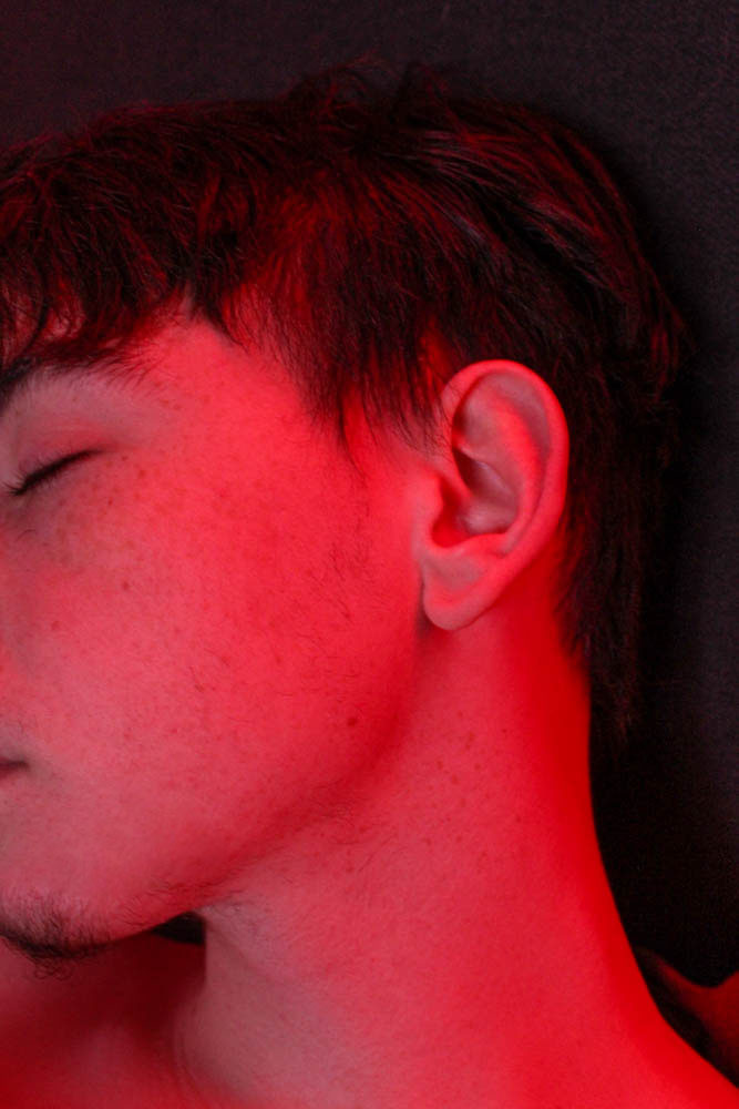
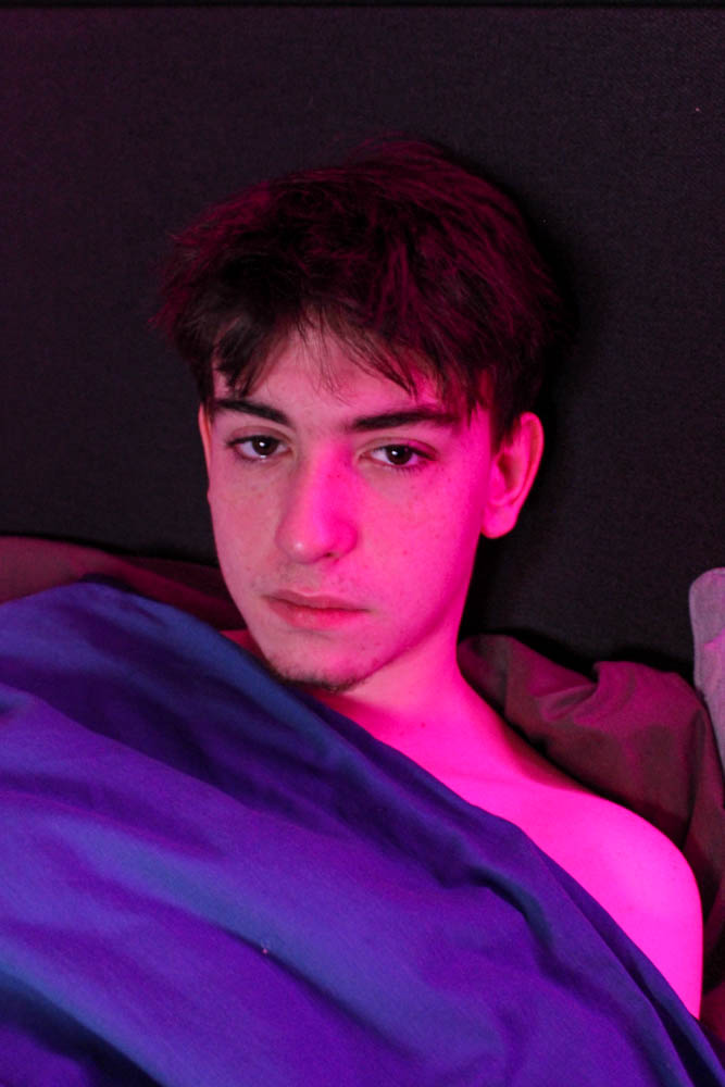
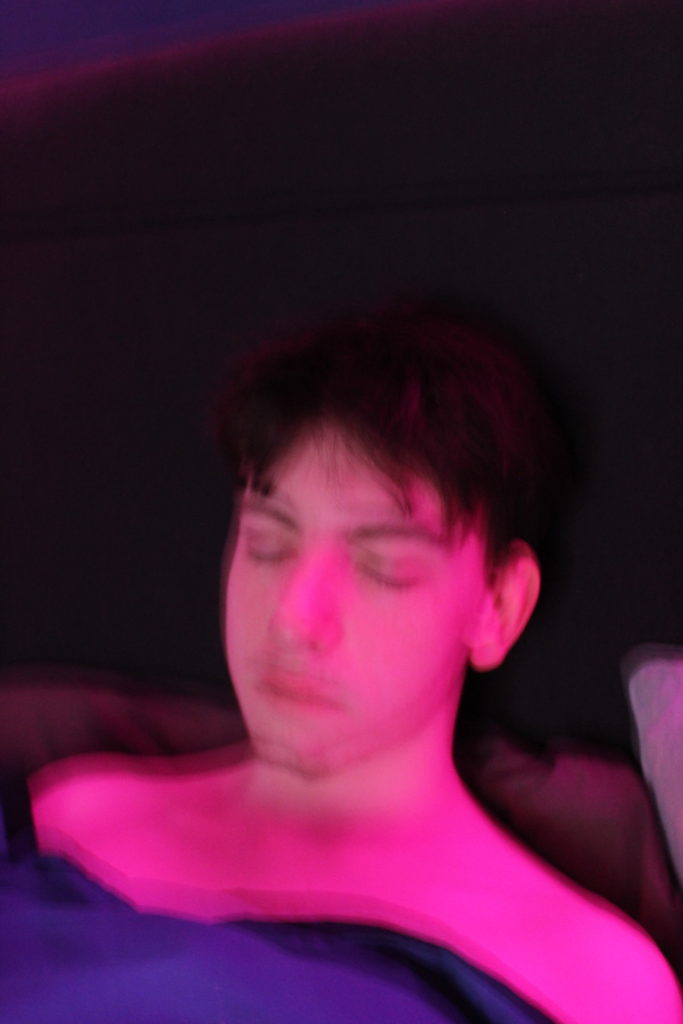
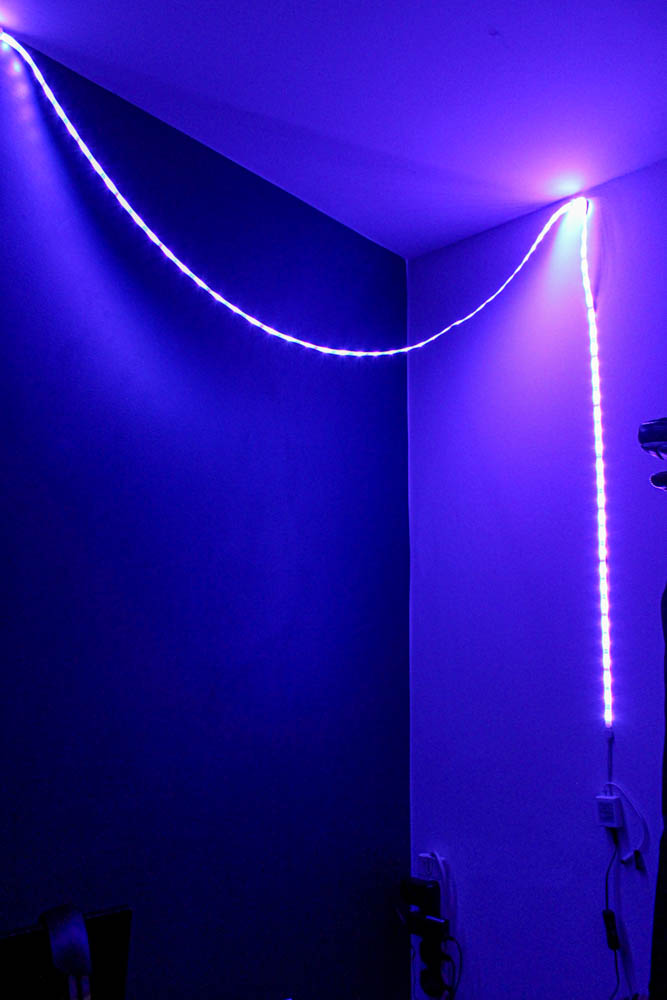
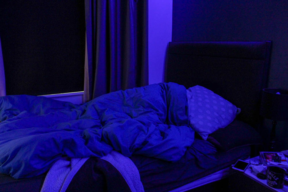
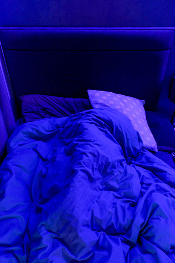
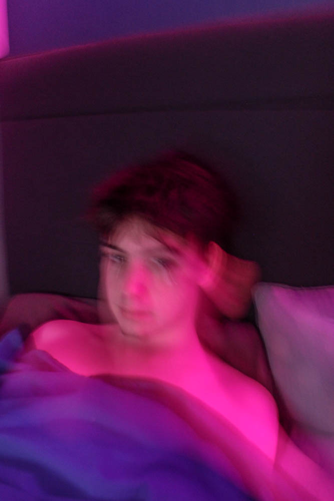
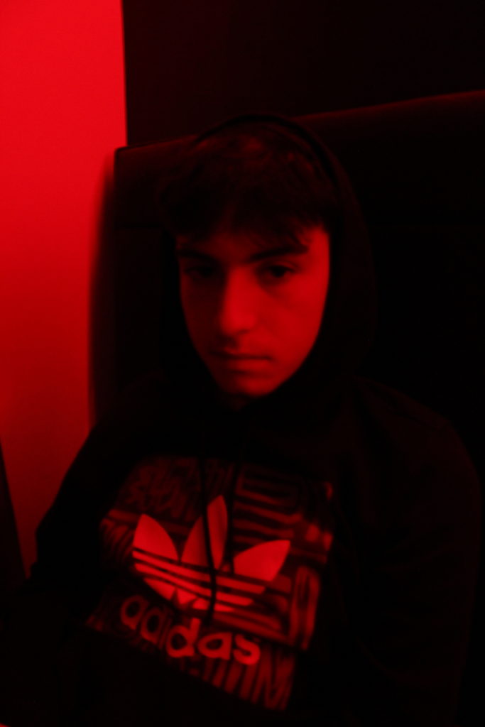
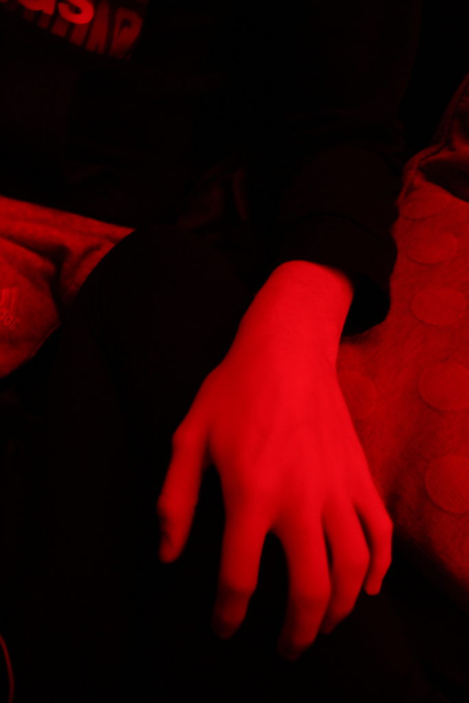
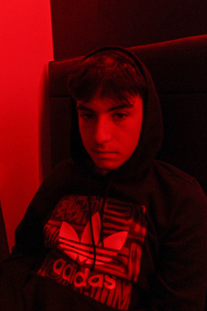
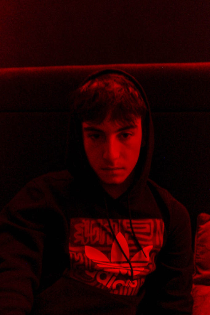
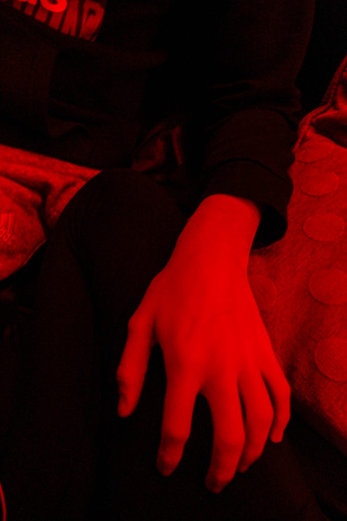
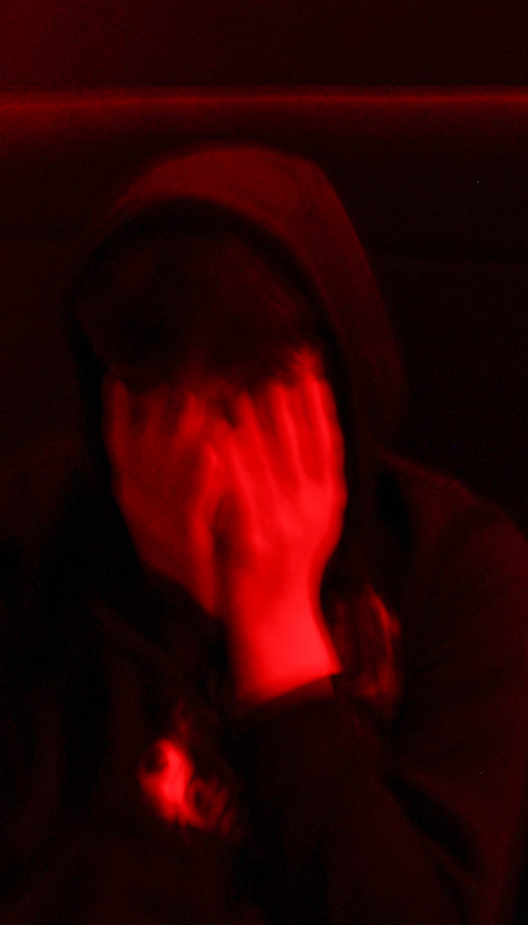
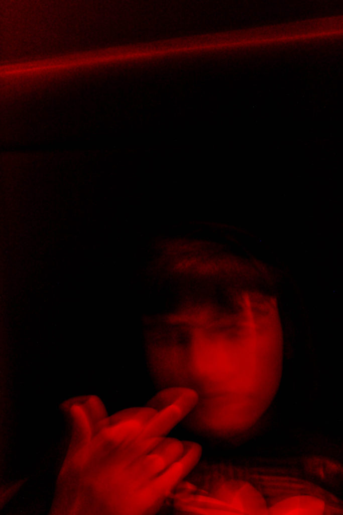
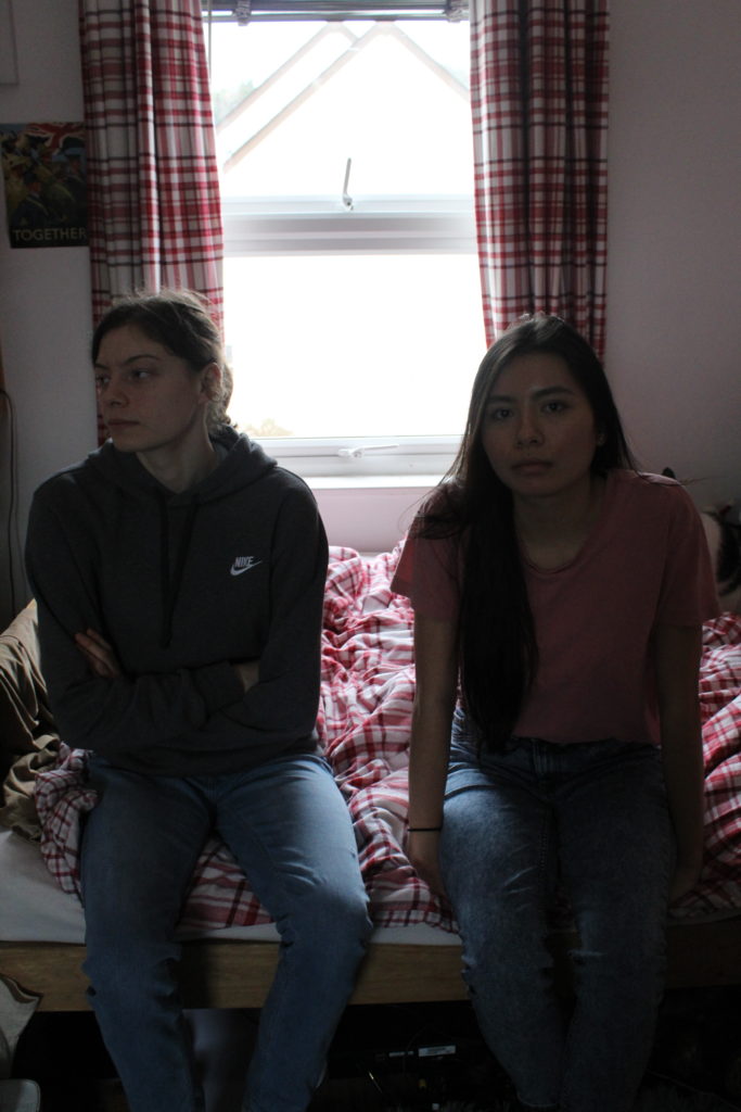
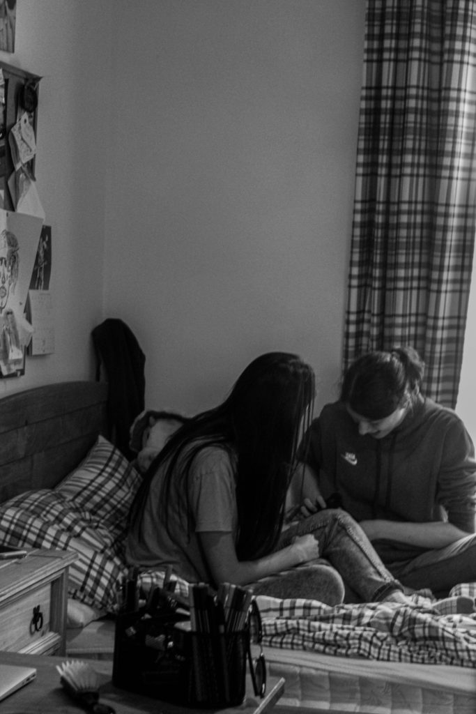
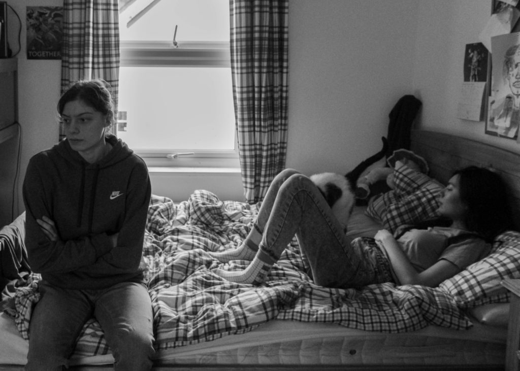
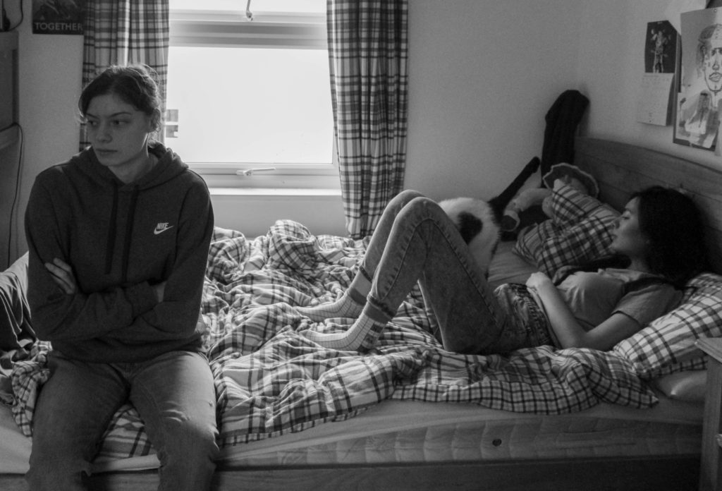
For this photo shoot I took photos of my boyfriend in his bedroom when he wasn’t in the best mood and didn’t really want to take pictures. I wanted to show that in relationships, you’re going to have good and bad days which is normal in a relationship.
Final Photos (Unedited):
As you can see some of these images were a bit underexposed and needed some editing. I then edited these photos of light room to enhance the quality and aesthetic.
Final Photos (Edited) and How I Edited Them:
First I went on the basic setting in light room and pressed the auto button to put the auto editing on.
I then scrolled down and adjusted the settings to get the image to what I wanted it to look like.
After, I scrolled down and went to the lens correction option and clicked on the ‘enable profile corrections’, then clicked ‘make’ and selected Canon.
I then went on the transform section and clicked the auto option.
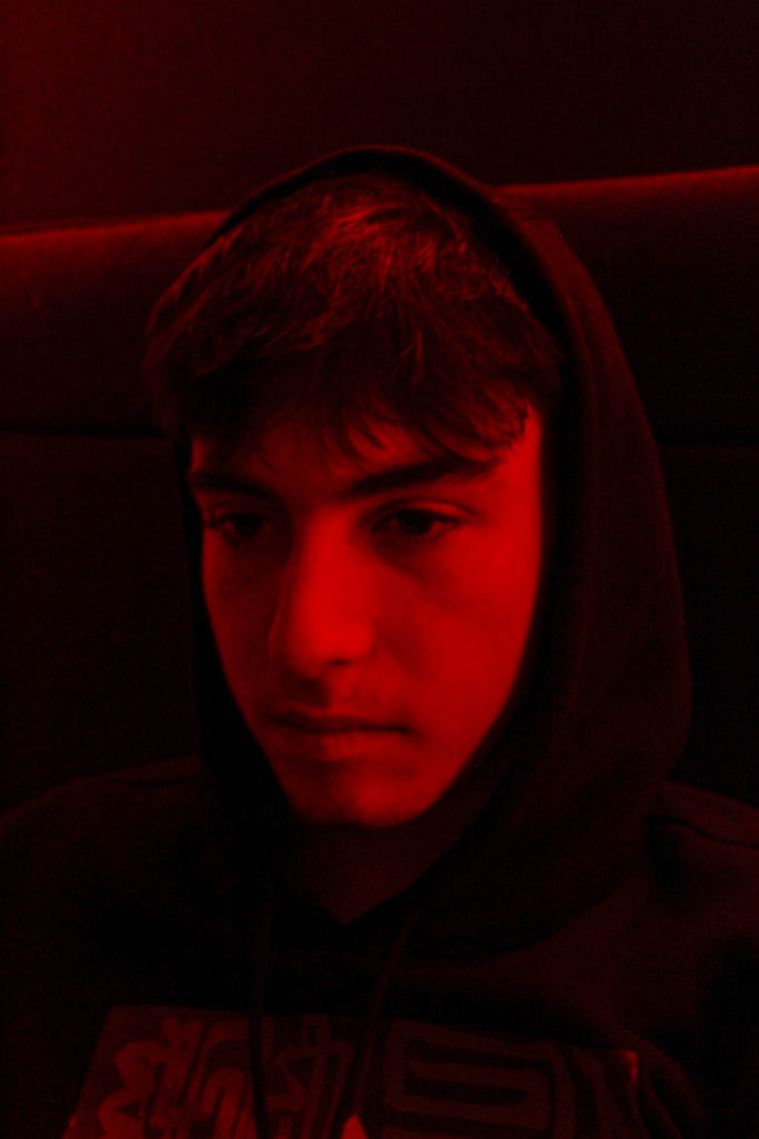
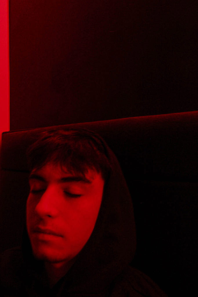
Final Images:
Conclusion:
To conclude, I am really happy with how this photo shot came out as I was able to capture the ideas that I had. I wish I took a few more photos but overall I am satisfied with the outcome of this photo shoot. I am also happy with how I edited these photos.
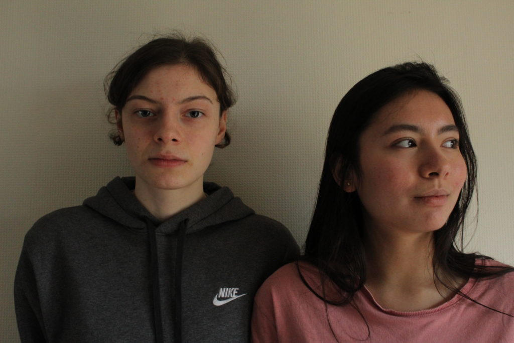
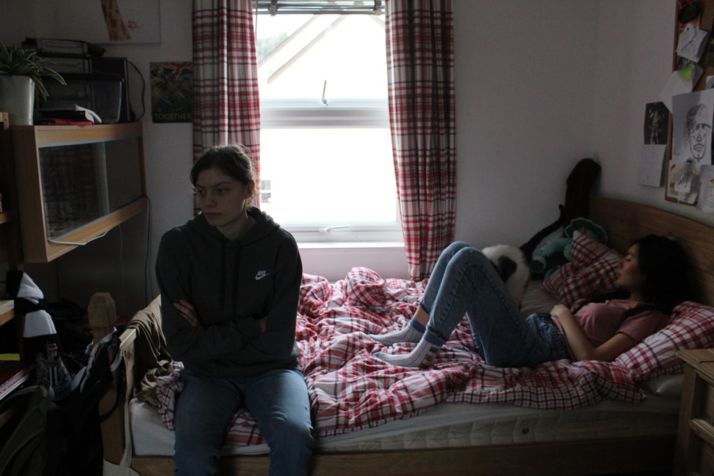
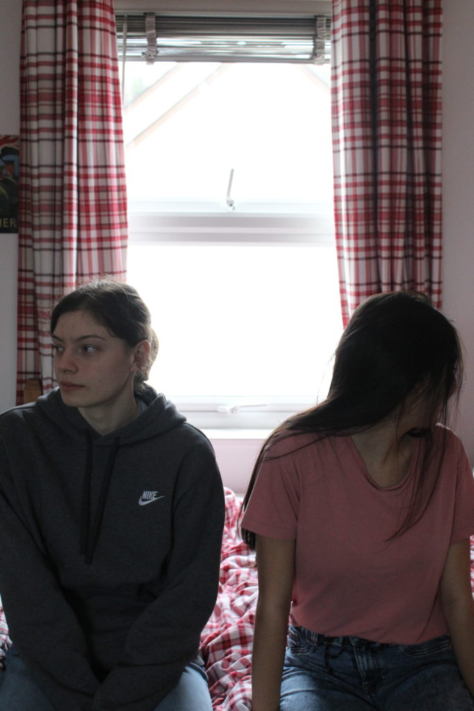
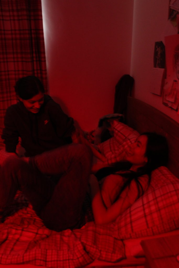
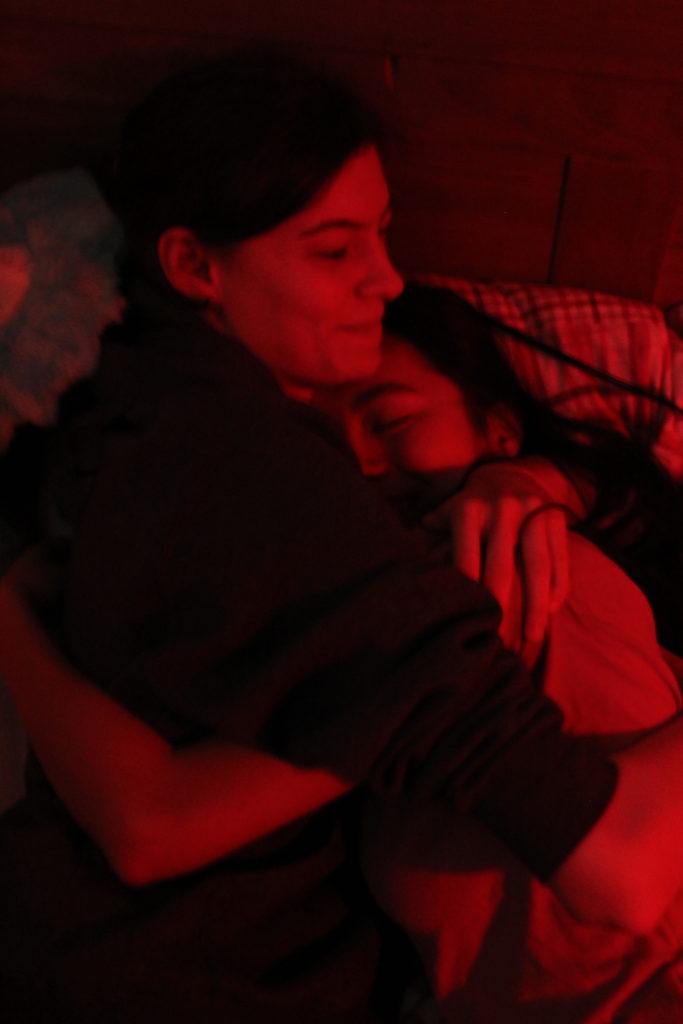
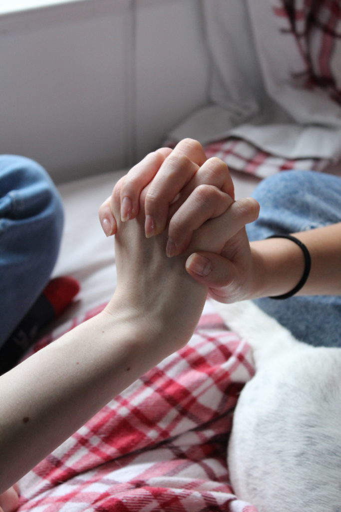
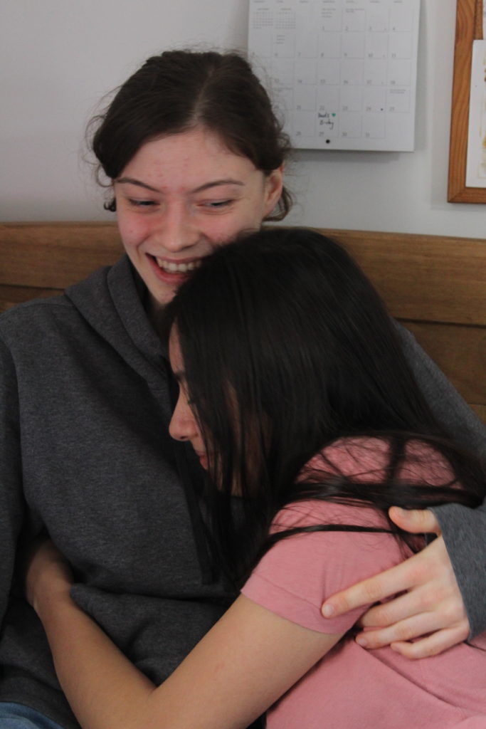
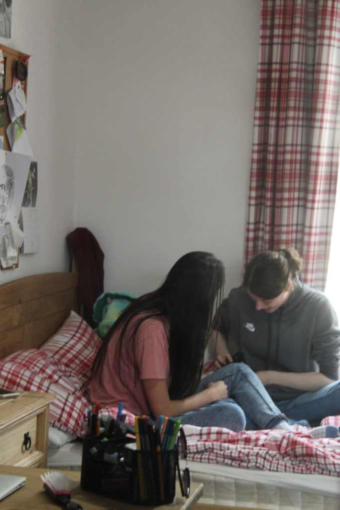
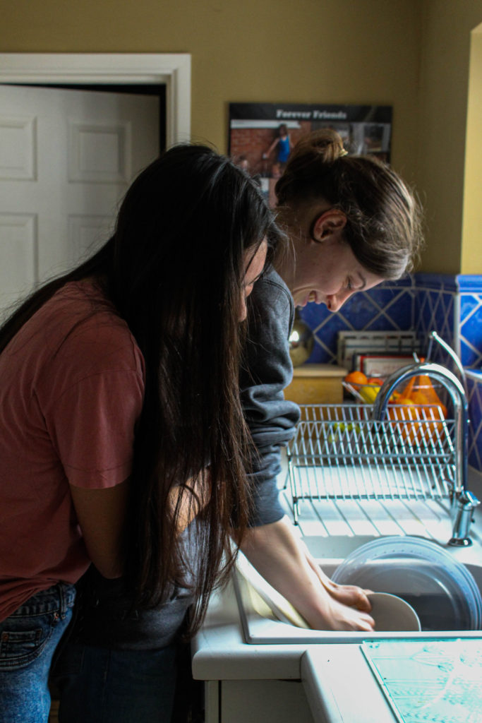
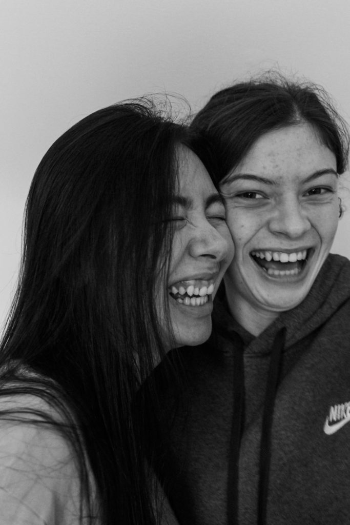
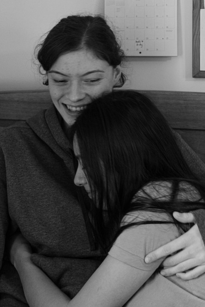
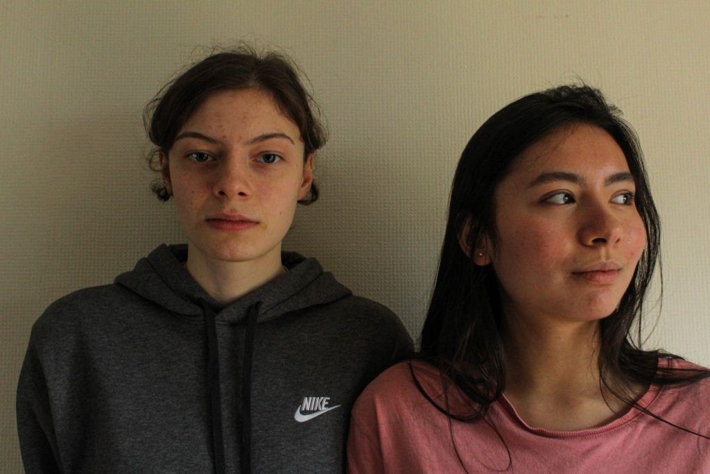
For my second photo shoot I took photos of my friends Emily and Ana’s relationship. I wanted to be inclusive of every relationship and not just include my own. I also wanted to show different types of relationships.
Final Images (Unedited):
Final Images:
How I edited these images:
First I went on the basic setting in light room and pressed the auto button to put the auto editing on. I chose the colour and black and white setting for these photos.
I then scrolled down and adjusted the settings to get the image to what I wanted it to look like.
After, I scrolled down and went to the lens correction option and clicked on the ‘enable profile corrections’, then clicked ‘make’ and selected Canon.
I then went on the transform section and clicked the auto option.
Conclusion:
To conclude, I am really happy with how this photo shot came out as I was able to capture the ideas that I had. I am happy with the amount of photos I took and how they turned out and I really like how I edited these images.
Sam Harris is a British photographer who lived in London, his first apart in the city was turned into a makeshift darkroom were he explored and experimented with photographs. During the 90’s his passion played with capturing portraits and sleeve art for recording artists. Later on in life himself and his family moved to Western Australia for a more simplistic lifestyle, where he photographic book ‘The Middle of Somewhere’ was produced, 2015.
Narrative:
‘The Middle of Somewhere’ is a photographic book which is visual family diary, celebrating childhood, family and love. The book is based around Harris’ two daughters as they move to Australia. The imagery explores the transformation of his daughters, in particular moments of time as they are able to experience freely and wonder in their surroundings. The phonebook covers a 12 year period, as they move after seeking a simpler lifestyle. The images tend to be in naturalistic environment using naturalistic light sources which allow for the ideology of exploration and children growing up to further be emphasised. Inserts are placed within the book which allows for a descriptive perspective of this journey of the girls to be showcased. Overall, the final product is intimate and embraces a memorable collection of images which tells the story of two daughters growing up.
Deconstruction:
Book in hand: how does it feel? Smell, sniff the paper.
The book itself feels quite heavy, the front cover is smooth, with a white fabric taped across the front with the title of the photo book on top of it. The book smells used and reminds of walking past books in a library.
Paper and ink: use of different paper/ textures/ colour or B&W or both.
All the images, whether they are in colour or black and white, are placed onto white matt paper which is smooth and reminds me of a photo scrap book which families hold their images in. Inside the book their is also text, which is stuck in on post it notes, which are all hand written, explaining or further reinforcing the girls exploration into the world. In addition, a written diary, typed in a newspaper font is used, which adds context about the moving process from the perspective of Harris
Format, size and orientation: portraiture/ landscape/ square/ A5, A4, A3 / number of pages.
The photo book is presented in a portrait orientation, which is slightly larger than A5 but not quite A4. The shape of the book is rectangle with no vertices, as the corners are smooth and curve. In total there are 94 photographs, 2 inserts, 48 photographs, post-its and notes.
As mentioned previously the book is a soft cover, with no dust jacket and no image wrap. The binding is a saddle stitch, as we are not able to see how the book is put together. However with the inserts they are put into the book using a Swiss stitch, which adds to the scrap book feel and almost creates child like qualities.
The cover itself is a piece of soft card, with a green background. On the background is yellow spirals, which is symbolic for the simplistic life that this family have moved on to. These drawings are also ‘basic’ which suggests that the two daughters drew the covers. In a sense you can feel these yellow spirals, creating a slight texture to the front cover. As mention prior, the title is placed on a white piece of fabric, with the title hand written onto the white fabric.
Title: literal or poetic / relevant or intriguing.
The title used takes a more poetic route to suggesting what the book is. ‘The Middle Of Somewhere’, is Harris’ was of explaining how he moved from London to remote corner of the world, in order to live the simplistic lifestyle, which is also emphasised through him not naming where he has moved to. It also hints at the ideology that his daughters are free to explore and grow up without having to worry, as he is no longer living in a major city. Personally, the title is both intriguing as it makes viewers want to fully understand the context and concept of the book, but the title also has relevance to his imagery that he produces.
Sam Harris – The Middle of Somewhere
Narrative: what is the story/ subject-matter. How is it told?
As mentioned in the narrative section of the blog post, the book explores Harris’ two daughters growing up and exploring the world after they move to Western Australia for a more simplistic lifestyle. The image is told through the naturalistic, documentary style photographs, both portrait and landscape, which allows viewers to visually understand their new lifestyle and the way in which his daughters are growing up and experience the world. This is reinforced through the travelogues within the book, which allows text to qualitatively describe this lifestyle, complimenting the imagery, as well as post-its of different messages the children have written, which also compliment the imagery.
Structure and architecture: how design/ repeating motifs/ or specific features develops a concept or construct a narrative. Editing and sequencing: selection of images/ juxtaposition of photographs/ editing process.
The construct of the photo book is simplistic, when two images are presented over two pages, the images tend to match in location and through the formal elements of colour, which allows the viewers eyes to easily guide themselves around the book. The larger images represent the key or more substantial moments through the children’s exploration. All the photographs within the photographic book, all have a connection in the sense that they are all naturalistic, and taken in an environment in which the girls feel safe in and call home. The way in which they are sequenced, is in a chronological order in order to show the children’s age and them growing up, emphasising how they have developed and changed into the simplistic lifestyle, as well as showing how their personality has changed through exploration of the area they live in. The first image presented is a landscape of a forest area in which I believe is the place in which his daughter’s are growing up in, which allows a circular plot with the ending image being a sketched map of this specific area.
Page Spread within Sam Harris’ Photographic Book – The Middle of Somewhere
Design and layout: image size on pages/ single page, double-spread/ images/ grid, fold- outs/ inserts.
Most of the book, the landscape photographs are presented on a double page spread, with an occasional 3/4 page spread, and half of a single page spread.. The portrait pictures are consistently single page spreads. Each photograph compliments one another and allows the narrative to smoothly flow throughout. The inserts within the book is the travelogues which are all text, with one of them having a few black and white images, which are all clumped together summarising the text in a visual way.
Images and text: are they linked? Introduction/ essay/ statement by artists or others. Use of captions (if any.)
At the beginning of the photo book is a series of 7 short sentences which describe how time goes quickly and how his daughters are growing up so fast, which allows us to consider the conceptual representation of the book. On top of this, as I have previously mentioned the book has travelogues, as inserts, which descriptively explain their new lifestyle, which almost acts as an explanation for the imagery. On top of this, post-it notes are found within the book which helps to explain a specific image and that specific moment, adding context to the imagery.
Video:
Below I have found a video which shows every page of the photo book, which will help to reinforce the comments I have made and illustrate some of the features I have outlines:
In order to get a better understanding of the process of designing and creating a book, I have found an already produced photo-book, and took inspiration from it in terms of the ways that books can be edited together, sequences and designed.
For this, I chose to study the photo-book titled “Redheaded Peckerwood” by photographer Christian Patterson.
Book in Hand: the book is very slightly textured, however the front cover gives the illusion that it is much more textured than it is in reality. I found this interesting, as I had to spend some time deciding whether the cover was in fact smooth or textured, as the cover photo itself acted as a slightly illusion
Paper and Ink: the book makes use of the same smooth photo-paper throughout, with the exception of a number of handouts/pullouts (such as letters, postcards and small leaflets with writing on). The images in the book are both colour and black and white, although there is a larger number of coloured images.
Format, size and orientation: the book itself is presented in portrait, however the images inside are both landscape and portrait. The overall size of the book is slightly shorter than A4, and includes around 100 pages of images (a d around 5 inserts).
Binding, soft/hardcover: the image is a hardcover book, with case binding used to bind the pages together. The book is without a dust-jacket.
Cover: the front cover is made of a card material, and includes an image of 2 subjects smiling and facing the camera. These subjects have been obscured using a grey, pixelated filter, acting as a shroud over the image, as to reduce the detail available to the viewer, and to obscure the image. The front cover does not include the photographer or the title of the book (these are only included on the spine of the book.
Title: the title “Redheaded Peckerwood” derives from the derogatory, slang name for white, lower class individuals living in the South of the USA. The title is most likely used as a derogatory term for the murderers, who are presented as important subjects in the book.
Narrative: the subject matter of the book is the murder case of 11 individuals by 19 year old Charles Starkweather, and his 14 year old girlfriend Caril Ann Fugate. During the later years Starkweathers childhood, he began to develop aggressive tenancies and anger problems. Starkweather eventually became involved in a dispute with a petrol station attendant named Robert Colvert, who Starkweather eventually shot and killed. Both Starkweather and Fugate then proceeded on a violent rampage, murdering 11 individuals including both parents and the younger sibling of Caril. The book itself follows the story of the killings, using both archival and staged images to slowly hint and give clues to the reader as to the sequence of the murders as the book progresses. The narrative of the book follows the story of the murders themselves, and uses more abstract and conceptual imagery to depict the process of the police, the murderers, and the community as the rampage unfolded.
Structure and architecture: the book follows the structure of focusing on the environment of the community in which the murders occurred. The book becomes progressively more detailed in the clues it gives, with the beginning half focusing on the context of the murders, and the images becoming more and more detailed in the second half of the book, focusing on specific objects, details, people and letters that relate to the crimes committed.
Design and layout: the inserts inside the book are the most unique feature. These inserts include letters (written and typed), postcards and documents. These inserts help to add to the narrative of the book, and moves the story along. The images in the book are rarely full-bleed, and instead sit in the centre of each page, with a white boarder around the edges. There are no double page spreads, although many of the images on opposite pages compliment each other in terms of their composition, colour and structure.
Editing and sequencing: the images seem to involve very little editing, and focus is placed on emphasis of the colour, or changing the image to black and white, rather than physically distorting the image. Overall the only place in which editing is obvious is on the cover of the book, as the rest of the images offer a more scientific and stark documentation of the objects they depict, although the meanings behind the inclusion of these images may be more conceptual. Towards the end of the book, the images begin to compliment each other more and more, with the colours and styles of images included becoming a theme that stretches across a number of pages, before changing again. The overall selection of images has been made to progressively hint more and more obviously at the acts and sequence of events of the murders, although no image is too overt in the way it documents the events. All images are conceptual rather than literal, and therefore the selection of images ranges from images depicting the scenery of the community, to archival images of the murderers themselves (towards the end of the book).
Images and text: the author of the book himself includes very little text, and instead relies on archival evidence of correspondence between the police, the murderers, and letters between the murderers and their family. These documents directly compliment the images they re found among, and help to tell the story without the need for an introduction written by the author, as the first few pages of the book includes the confession letter written by Starkweather and Fugate, setting the scene for the rest of the book. The extracts in the book (including a postcard from Starkweather to his father, and the back of the book contains a leaflet of accounts written by writers, critics, and contemporary photographers regarding the case and their opinions on the photographers work. By using a number of archival writings, critics from other members of the photography community, and the murderers own accounts of events, the author is able to sew together a detailed description of the book and case, while at the same time using very little words of his own.
Essay question: How do Diana Markosian and Rita Puig-Serra Costa express the notion of family history and relationships in their work?
Opening quote
"If manipulation is the first thing someone thinks of in connection to photography, what that does that say about the value of the photograph as a reflection of reality?" (Bright and Van Erp 2019:17)
Introduction (250-500 words): What is your area study? Which artists will you be analyzing and why? How will you be responding to their work and essay question?
My area of study will be focused on my family's history; more specifically the story of both my parents and important events in their life which lead to me being where I am today. I have chosen to analyze Diana Markosian because her project "Inventing My Father" contrasts directly with Rita Puig-serra Costa's study "Where Mimosa Bloom" which I will also be referring to throughout this essay. I like the way Diana explores the absence of her father in her life in such a personal and raw way, as I think it makes people able to empathize with her. In her project she explores the absence of her father, which eventually leads to a reunion which she captures in images. The images along with the context she provides into her life, makes this project very interesting. Equally, I think the way Costa explores her family through the use of archival images and objects was very effective as it really conveyed a sense of love and importance of family.I specifically loved how her entire project was an homage to her mother as it further shows how fond she is of her family when paired with carefully photographed objects, a thoughtfully taken portraits. I decided to really focus on these two photographers throughout my personal study because I could personally relate to the different ways both artists portrayed their family, as I think on one hand I have a close bond with certain members of my family, and due to my Portuguese heritage, family has always been of great value to me. However on the other hand, due to my parents separating there is also an element of a lack of a parental figure in the narrative I intend to tell. In this essay I will be discussing the notion of family and relationships, loss and hope in the works of both these artists.
Pg 1 (500 words): Historical/ theoretical context within art, photography and visual culture relevant to your area of study. Make links to art movements/ isms and some of the methods employed by critics and historian.
Realism is the concept of capturing things in their natural element. This genre of photography is most useful when trying to capture something such as family history, as documentary photography allows us to be able to see someone's real life situation through a photograph. Photographers such as Dorothea Lange and Paul Strand focused on documenting the effects of urbanization and industrialization on working class Americans. This was something very prominent at the time of this movement, as the great depression in 1929 left a lot of people struggling. We now see this type of photography as realism. I feel as if this movement fits in well with my personal study as it recognizes the importance of capturing raw, documentary style images which I think is important when exploring something as personal as a family’s history, especially when it involves immigration and the struggle surrounding that journey. Images of this sort are characterized by having a wide depth of field and having sharp focus which contradicts the pictorialist style. The movement away from creating a painterly aesthetic ultimately opened the door to a more forensic approach…but one that is open to distortion, manipulation and the notion of narrative. This will ultimately depend on the agenda of the artist, their integrity and skill in delivering a message, story or sequence of events.
Good flow of language showing a good understanding of documentary photography. However, what are some of the issues of photography’s relationship with reality? Photography is only a representation of reality and what;s in front of the camera can be altered, re-framed, re-contextualised to suit a particular point of view. You mention Dorothea Lange, who famous image ‘Migrant Worker’ from 1936 embodies photograpy’ ambigious relationship with realism. Use this image as a case-study to write about this problematic. See me tomorrow for something to read!
Pg 2 (500 words): Analyse first artist/photographer in relation to your essay question. Present and evaluate your own images and responses.
In my opinion, Diana Markosian uses an non-traditional method when exploring the family concept in her projects. Instead of focusing on positiveness, and happiness, she focuses on the negative aspect, which is the fact that she grew up without her father figure ;whereas normally happier moments and aspects are explored in relation to family and the concept of a family photograph. I think this makes her work stand out among other photographers who explore the concept of family relationships, as it's more truthful and goes against the dominating stereotype that every family is perfect, making it more contemporary and relatable to modern day people. This view is put across to the audience through her work as she uses a lot of black and white images which present a sense of emptiness or despair and make her images feel cold and slightly unemotional. She also uses archival images, which would otherwise portray a sense of happiness, alongside the black and white images which instead give the audience an indication that there's a slight sense of resentment, especially the archival image that her father is cut out of. I believe Diana Markosian represents a modern wave of photography where the beauty of imperfectness can be appreciated.
In my opinion the image above is one of Markosian's best as it is technically appealing a rich in context. After a 15 year separation from her father, her father told her he'd also been looking for her and showed her this suitcase of undelivered letters, a shirt he was saving for her brother's weddings, newspaper clippings and images. This image is in black and white making it more emotionally detached yet since the objects are sentimental it creates an interesting juxtaposition, as it shows the photographer is conflicted over her feelings over the objects.
Choose a specific example now and analyse
Pg 3 (500 words): Analyse second artist/photographer in relation to your essay question. Present and evaluate your own images and responses
Rita Puig-Serra Puig takes the completely opposite approach when compared to Diana Markosian. Throughout Rita's body of work, "where mimosa bloom" it is clear that the project, which is an homage to her mother, is very thoughtful, and shows a clear overpowering sense of love for her family. This can be seen through many aspects of her work, including the light color scheme throughout her images as she effectively conveys a sense of delicacy through a pastel colours and also the metaphorical link to mimosa, a brightly colored type of plant which is very graceful and lively. I think that Rita's work is a more traditional way of portraying family as she utilises portraiture and archival objects in a positive way.I think Rita Puig-Serra's work represents positive sentiments towards relationships giving a romantic representation of a typical family unit.
This book exudes closeness and sentimentality, a kind of poetic bond between women
Conclusion (250-500 words): Draw parallels, explore differences/ similarities between artists/photographers and that of your own work that you have produced
To conclude, both Markosian and Costa have created very emotional pieces of work based on their own personal family stories and journeys. Although we do get a sense of love from Markosian's work, I believe this sentiment is often fighting against a feeling of hatred and resentment towards her father, whereas we purely get the feeling of love and closeness from Costa's photo book. Costa's photo book contains a very unique color palette containing light, delicate, pastel colors which is expected as her images are delicately framed and excrete fondness towards her family. On the other hand, Markosian's body of work contains a lot of black and white images which shows that there is a lot of distance between her and the subject, yet all the things she photographs are of rich sentimental meaning to her. Both photographers also make use of archival images and objects, Costa utilises this to show a deep connection to her mother whereas due to the nature of Markosian's work, her archival objects are used to show her father as being someone she is detached from.
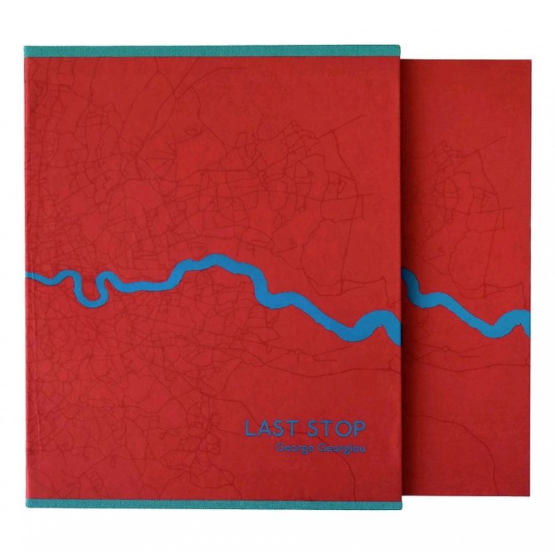
“The anthropologist, the journalist, and (apparently) the travel writer seek, and if they are lucky find, explanations and solutions. But the artist may discover that every avenue of inquiry leads to another mystery, more complex and more interesting than the original question.” Francine Prose on the photography of George Georgiou, Aperture Fall 2012
Originally he was thinking about London as a city of migration, the last stop not only for immigrants but also for people from across the UK. A city of dreams and possibilities; but as we all know, these dreams are not so easily realized. As the project evolved, he became more interested in trying to express the experience of the city, how we move through it, share it, coexist as a diverse group of peoples and cultures. The hardest part was what he considered the little soap operas we see everyday in public space, those encounters we witness and perceive as fictions – are they secret lovers or a married couple? etc. It’s a little like when we drive pass an accident on the highway: we glimpse the crashed car and imagine the rest. How we perceive became an important element in the work.
“The design of the book was by far the hardest part of the whole project as it holds together the whole concept of the work and relates to the actual experience of moving through a city.” g.georgiou – interview with Fotoroom
The essence of the project is that you might take the same route everyday but what you see, the ebb and flow on the street takes on a random nature. To capture this flow, the concertina allows the feel of a bus trip, but more importantly it gives the viewer the opportunity to create their own journeys by spreading the book out and combining different images together. This moves the book away from an author-led linear narrative to one of multiple possibilities.He struggled with the design and selection for a long time but felt that he had to take responsibility for the whole project. It was the same with self-publishing and doing a crowd-funding campaign. Because of the expenses of making a concertina book and with all the hand work that it involves, he didn’t want a third party cutting on the production values because of costs. He was lucky that he found a great printing house in Istanbul, MAS matbaa, that worked very closely with him on the technical aspects and helped make the book financially viable.
Early Examples of Street Photography
“Stare. It is the way to educate your eye, and more. Stare, pry, listen, eavesdrop. Die knowing something. You are not here long.”Walker Evans, ca. 1960 from Afterword in Many Are Called
No better advice has ever been given to street photographers than that offered by Walker Evans, one the greatest American documentary photographers of the mid-twentieth century. Best known for his work depicting unsentimental pictures of poverty stricken sharecroppers in America’s deep south during the 1930s Depression, Evans would never have described himself as a ‘street photographer’ although he did roam the streets of New York. However, these instructions reveal the essence of what is now known as street photography: the impulse to take candid pictures in the stream of everyday life.
Walker Evans, American (1913-2009)
Street photography is an unbroken tradition stretching back to the invention of photography itself. It revels in the poetic possibilities that an inquisitive mind and a camera can conjure out of everyday life. Most street photographers get their best shots in crowded and populated urban areas such as shopping malls, high streets, parks, markets, cafes/bars, museums, subways, train stations or seaside promenades. In their spontaneous and often subconscious reaction to the fecundity of public life, street photographers elevate the commonplace and familiar into something mythical and even heroic. They thrive on the unexpected, seeing the street as a theatre of endless possibilities, the cast list never fixed until the shutter is pressed. They stare, they pry, they listen and they eavesdrop, and in doing so they hold up a mirror to the kind of societies we are making for ourselves.
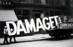
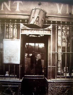
Walker Evans was introduced to the work of Eugene Atget through his friend Berenice Abbott and he was immediately influenced by Atget’s dispassionate style and the way Atget grouped his pictures together in themes such as shop fronts, signs, interiors, architecture, portraits etc.
Walker Evans, New York Shop Front
Eugene Atget, Paris shop front
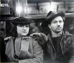
Many Are Called. In 1938, Walker Evans began surreptitiously photographing people on the New York City subway. With his camera hidden in his coat – the lens peeking through a buttonhole – he captured the faces of riders hurtling through the dark tunnels, wrapped in their own private thoughts.
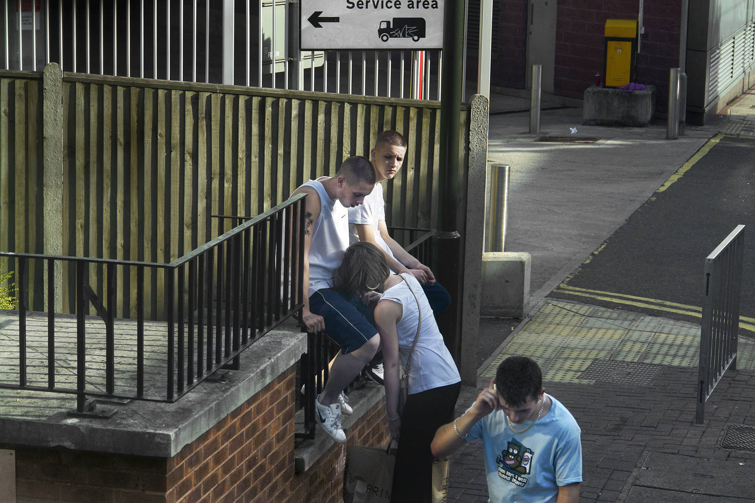
This in contrast to George Georgiou’s work within ‘Last Stop’ is somewhat similar to the fact that they are both concealing the camera as much as possible to get as real of an image as possible. Within Georgiou’s work he is photographing from above street level on a double-decker bus giving more of a separation from the photographer’s reality, and the people photographed’s reality. Evans aimed to capture people within their own thoughts ; Georgiou aimed to capture people in the middle of acting through their daily routine.
In both of these images, two people have been photographed waiting for either a bus or a train. However, within Evans’ image the pedestrian’s are looking directly at him creating an awareness of their actions being captured. Illustrated in Georgiou’s image, these people are oblivious to the fact that they are being recorded in real time, this creates a sense of there being to separate narrative’s; the journey behind how these people are living out their daily routine, and the motivation behind the photographer. Both images are successful in how they capture strangers but both have very different stories to reflect. This narrative is achieved in the majority of mages included in ‘last Stop’, the sense of an outsider interpreting others’ life story and imagining what happens after the moment of connection is gone.
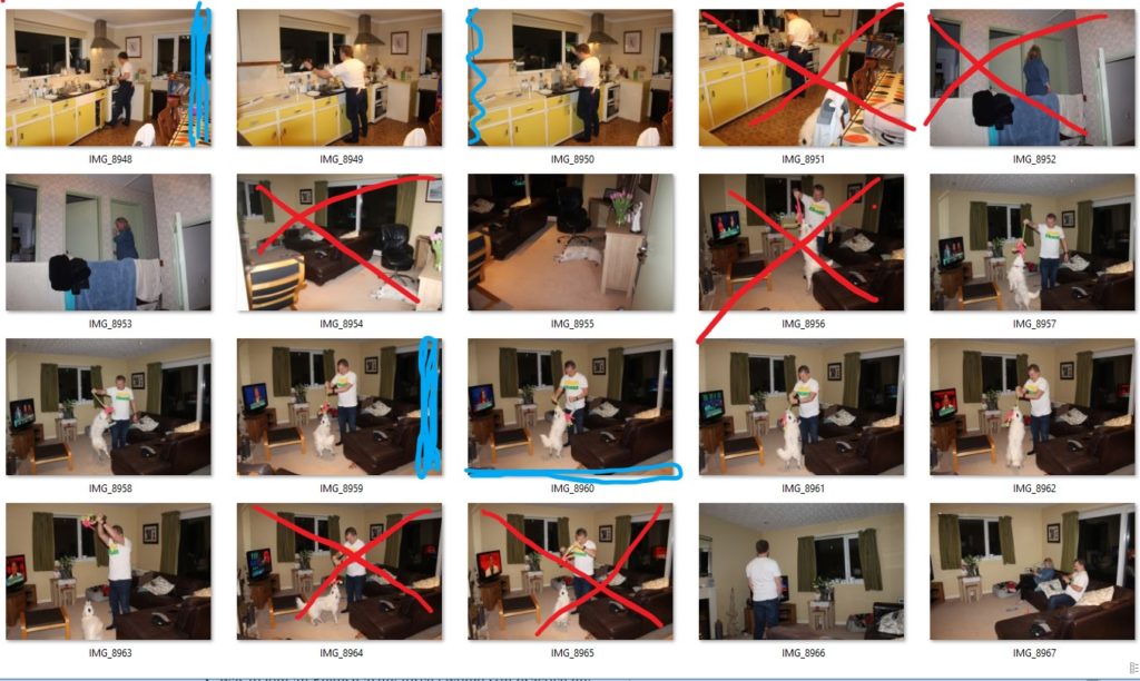
After a lot of planning i managed to get some photographs of the home i’m living in and i arranged the different photographs into a sheet where i picked the ones i’m going to use and the ones that are not good enough.
The blue colored areas are where i’m going to crop the photograph, and the red crossed ones are the ones i wont be using.
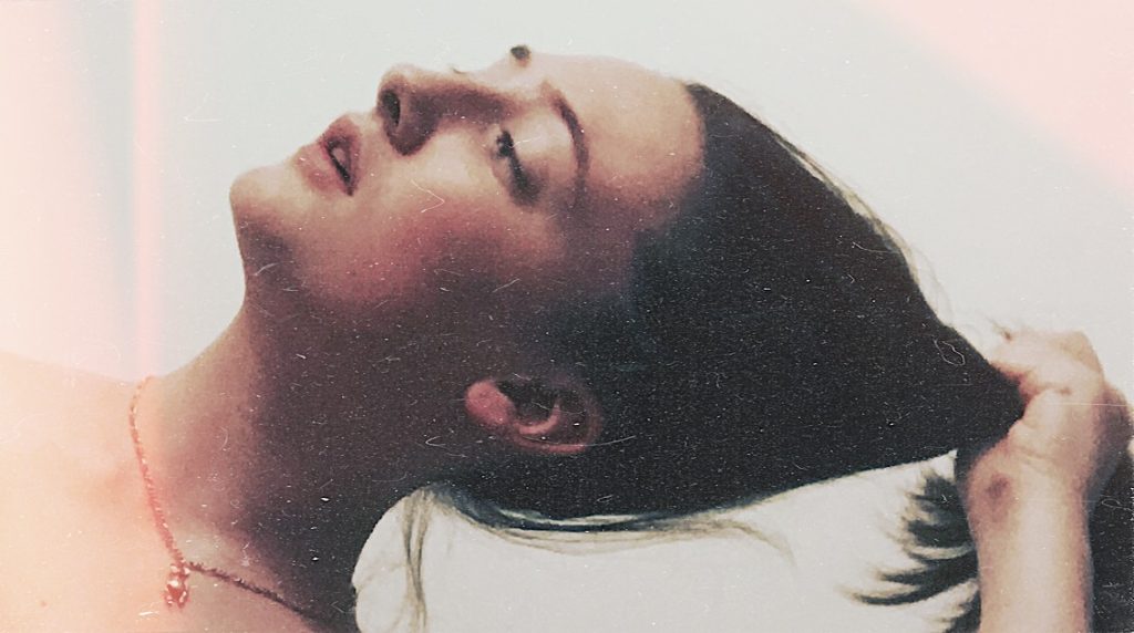
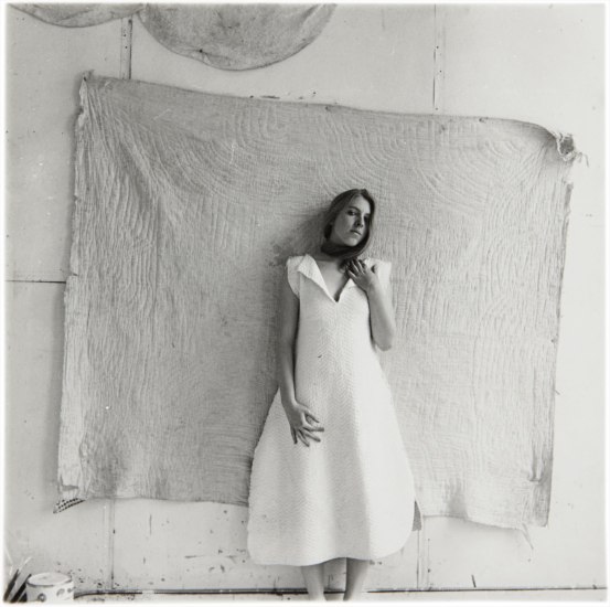
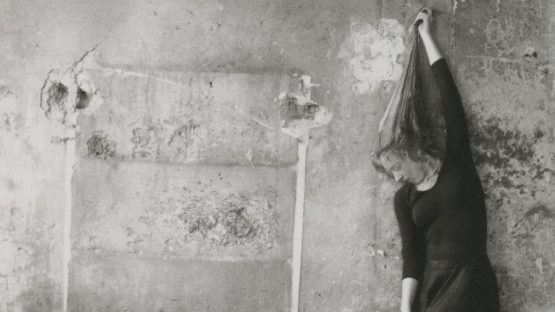
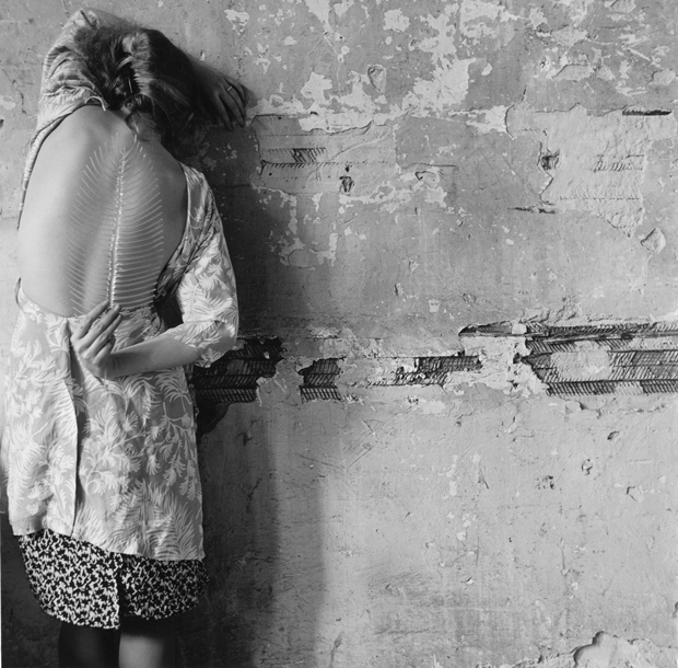
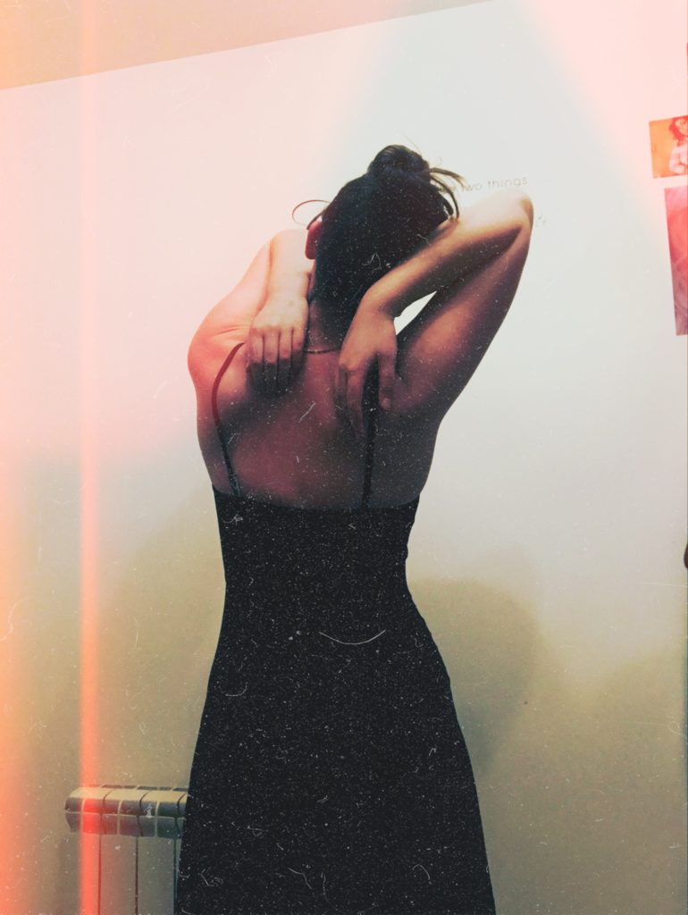
This photo shoot was inspired by the narrative positive to negative and turning a negative film into a positive image and the photographer Francesca Woodman. I wanted to have more full length images due to most of my work being portraits and not incorporating the human form. I wanted to explore this idea of body image due to my relationship with my own not being the most healthy. Baggy clothes hid lumps and curves; I didn’t want to give people the opportunity to judge my figure, only for my critique. Alongside a lack of self respect baggy clothes became my comfort zone and a way to hide the troubles no one knew of. A realisation of these habits is when it came to events in which I would wear a dress. I would list everything wrong I see which was usually anything in sight head to toe. An improvement then began and started breaking comfortable habits and turned to new ones. Not just clothing but self respect building, still in the process, just learning to accept that no matter what I’m stuck with this vessel whether I like it or not. I am the person I spend the most tine with so if I don’t like myself, how are others supposed to enjoy their time with me. This project is an aid and insight into how my identity functions and how easily someone can return back to bad habits.
Inspired by Francesca Woodman, who produced universally commanding and profound images from the age of thirteen. Born into a family of artists, ‘art’ was her first language. She experienced early exposure to a plethora of exemplary creative people along with countless potential historical, literary, and theoretical influences. Woodman worked with traditional photographic techniques but was consistently performative and experimental in her practice. Many of her works are multi-media, including drawings, selected objects, and sculptures within her photographs. Settings may vary from confined interiors to the expansive outdoors, but Woodman herself is always there. Typically the sole subject, and often naked, she can be found caught entwined within a landscape or edging out of the photographic frame. Interested in the limits of representation, the artist’s body is habitually cropped, endlessly concealed, and never wholly captured. Woodman was acutely aware of the evanescent nature of life and of living close to death. She positions the self as too limitless to be contained, and thus reveals singular identity as an elusive and fragmentary notion.
Side by Side
My interpretation of her hair pulling image above is more of a close up portrait due to me wanting to focus more on my features i dislike the most: large nose and cankle neck.
My interpretation of the image above was more focused on the idea of me being in dress; i never really express my feminine side so when I do I like to celebrate it. I don’t know why I don’t like the more femme things in life but it’s me breaking out of my girly controlled fashion in my childhood, and breaking into my own sense of self and style.
This image I interpreted as trying to break free from yourself but you’re limited to your own skin and energy.