Deconstructing Photo Book

Photo book chosen- “The Middle of Somewhere”Sam Harris

Researching the Photo Book

Researching the photo book by Sam Harris, it is seen to be a visual book which showcases a family diary revolving around his two daughters growing up. I learned that Harris is used a focused lens to show his daughters childhood in a place where it is seen if very free and allows experience. There are naturalistic elements throughout the book such as trees and sunlight which are also shown through shadows and sunlight faces, representing ‘suggestive photography’. In a similar element, it has also been noted that most of these images took place in India, a location the family moved to in order for their children to grow up around culture, freedom and overall living in a simpler existance. The twelve year span the book was taken over is showing the families life day to day, supporting this it was seen that a travelogue was included in the families book, showing life on the road in Australia and villages in India where they birthed their second daughter.

Harris’s approach to this book is seen to be expressing meanings on love, growing up, family, landscape and sisterhood, all of which are personal parts to the family and show a certain type of intimacy while still creating memorable memories, creating an inspiring collection of images, all having a sense of feeling.

Related Quote- “My work is a celebration of childhood, family life, love and our simplistic lifestyle which intertwines with out environment.”

Image represents the element of childhood, nature as well as simplicity through the use of taking a bath.

Harris’s Intentions

Harris is an American author and podcast host who is known for his work focusing on topics such as neuroscience, terrorism and free will, helping his development in creating development images, leading me to research into why he’s chosen to create a photo-book when not having previous experience. Looking into Harris’s photo book, I personally think that his intentions when making the book was to show his fresh start living on the road in Australia with his daughters who were growing up quickly. This could also be a physical memory he wanted to look back on as well as show his daughters once grown up. This therefore shows his intended audience being for mainly his family who can relive memories. An active way of allowing the family to look back on memories is by including text in the book which represents dates and locations of where they were which is represented towards the beginning of the book.

Although the book has not gained any major awards, It is well known by other photographers and inspired people to create their own imagery to create personal images to book back on.

Deconstructing the book… Narrative, Concept and Design

-Book in hand- When holding the book in hand, it was clear that this has a soft, flexible cover with small texture to it on both the front and back on the cover (paperback). There seems to be no visible binder. The book is also quite heavy.

-Paper and ink- The images in the book can be seen to be presented in either black and white or colour on matt white paper which is smooth in texture. Their are post- it notes and written text inside the book which adds a feel of it being a scrapbook.

The elements of ‘written ink’ is shown within this image which had been written by his daughters.

-Format, Size and Orientation- This is a portrait styled book which is larger then an A5 size however not A4. There are smooth corners on the book which is in a rectangle shape and includes 2 inserts inside as well as post-it notes and 94 images.

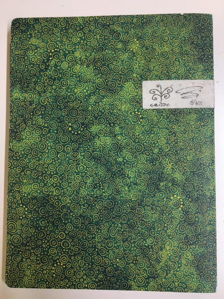
-Title- The title to the book has. an element of mystery to it in coordination to the green background which can be interpreted as nature. This title could represent many different elements such as a relationship between nature and the author. Due to this sense of mystery this could draw in people to buy it as it has a metaphorical meaning.

-Narrative- The story is about him and his families travel through Australia and is a ‘family diary’ of moments they shared with their two daughters. It is said that he used this book in order to create physical memories which the family could look back on as a group. It is also said that they’re reason for taking the daughters away from the city is because they wanted them to experience nature for what it was and wanted them to live in a simplistic environment.

-Structure and Architecture- There are not many repetition motif’s going on in this phonebook, however it is seen that they include either written work such as dates/ locations where they traveled or hand written aspects on posit notes that their daughters had written to add a more personal feel to the book. There are also a lot of noticeable naturalistic images such as clouds, trees and roads which are included to separate the images taken of his children, adding to the feel of a journey and again showing where they were at the time the images of their daughters were taken.

Shows elements of nature

-Design and Layout- The photographer used a wide variety of techniques when displaying him images. Some are shown in a landscape form, some a portrait. Adding to this, some of the landscape ones are portrayed on a double spread where as others are shown to be on single pages etc. There are no fold outs in the book, only small elements such as posit notes which I personally feel as if adds the element of evidence it needed while not making it confusing. This allows all focus to be on the images taken.

-Images and Text- Throughout the phonebook there are pages which include text, mostly typed but also written. The typed text is used to show poems and location/dates as said beforehand which gives the book the separation that it needs from images. The use of this text also allows for the audience to understand the story of the book as well as appreciate the sentimental values which lies within the book.

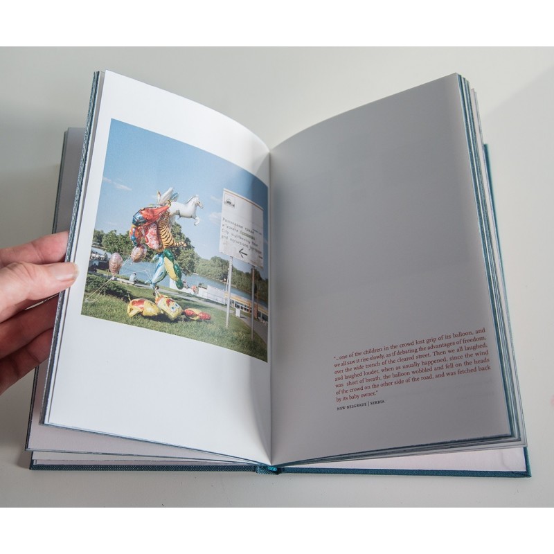
Text is represented in this image in coordination with the image of his youngest daughter on the left, incorporating nature.

Claudia Ruiz Gustafson

https://www.lensculture.com/projects/688668-historias-fragmentadas

Originally from Lima, Perú, Claudia Ruiz Gustafson is a fine art photographer based in Massachusetts. Her work is mainly autobiographical and self reflective.

Claudia Ruiz Gustafson grew up in a conservative middle class family in Perú and moved to the US when she was in her twenties. As time went and the last of her grandparents died, Claudia felt compelled to bring attention to what she had left behind, being the only person in her family who left her country of origin. This series made Claudia look deeper into her past by exploring memories and the emotion of loss.

In her series, Historias fragmentadas (Fragmented stories), she creates digital compositions from images of the past. By tearing, juxtaposing and layering archival documents, fragments from her journals and objects from her childhood, she has shed light on a personal story within an ancestral story that spans generations. Continuing her exploration to recall what she has lost, Claudia uses staged imagery, mostly self portraits, to transport her physical presence into the spiritual past as seen in the compositions. The conversations within this series, exposes the vulnerability of childhood, a longing for a time gone by and the truths of a particular Latin American Family.

I have chosen Claudia Ruiz Gustafson as my final reference for my personal investigation because her autobiographical, self reflective series Historias Fragmentadas has inspired me to make my own digital compositions. Like Claudia, I want to use archival images and documents to explore my past and my cultural identity. To respond to her work I will be juxtaposing, tearing and layering archival images in order to tell a personal story. I also hope to continue exploring my past through self portraits.

This digital collage depicts two photographs combined together. The archival image in the background depicts a middle aged man and two children. The family portrait seems to have been captured in the forest and is definitely from the past suggested by the torn edges and black and white film. The foreground image, torn in half, also depicts a forest landscape. Perhaps the same forest location from the background has also been captured in the present. I make this assumptions because Claudia feels like the best way for her to tell stories is by juxtaposing elements from the past and present. The foreground image is in colour which is why I assume that the photograph has been captured recently. Like Carolle Benitah, Claudia also uses the colour red when presenting her archival images. Apparently she uses the colour red because it symbolises the blood lineage among family members. What instantly captures your attention are the two red spirals created by thread. Both circles focus on faces depicted in the family portrait: The middle aged man, presumably her grandfather, and the young girl who is most likely to be Claudia herself. She has probably created this visual aspect to explore the relationship she used to have with her grandfather before he died. Claudia has said that the reason why she created this series is to bring attention to what she had left behind in Peru when she moved to the US.

Claudia has worked with a photograph from her family archive that she has inherited from a relative. The colour red makes an appearance once again and this time it seems to be some sort of fabric which runs down the middle of the composition. The Portrait image is torn in half, probably signifying that although her mother/grandmother has passed away the family blood line still remains. This digital collage displays layers of different archival material combined together. In the middle there is a fragment of paper, perhaps from her childhood journal or a letter she has received from the individual in the image

Understanding Photobook DEsign

YU The Lost Country- Dragana Jurisie

8G0A7899

Initial thoughts: From reading the title I assumed it was a documentary photo book about an unknown country. The image on the front page and the colours give a gloomy impression.

Dragana Jurisie: She was born in Slavonski Brod, Croatia which was then known as Yugoslavia. Now she lives in Dublin as a photographer. In 1991 her family home burnt down, this is when she said her journey as a photographer began, the day that thousands of prints and negatives her father made were destroyed. Jurisie realised that day the power photography has over memory, after the fire her father never took a photograph other then a snapshot to record the damage for the insurance company. In the 1990 census she was denied the right to be a Yugoslav despite her Croatian father and Siberian mother. The reason for her exile was because “Yugoslavia does not exist. It is a heterogeneous conglomerate that you cobbled together in Paris.”

The Book: is A5 size and is portrait. It has a linen material stuck over the hard cover, which has an image printed on it in blue and white, the material gives it a pixelated filter.

The title of the book can be seen on the spine alongside the authors name. On the front cover it can be seen in the bottom right hand corner. The title ‘YU’ stands for Yugoslavia, ‘the lost country’ is situated in the middle of the ‘YU’, giving initial connotations that Yugoslavia is currently unknown, I personally had never heard of it.The title is fairly literal because Yugoslavia I now know was a state formed in 1918 that composed to six socialist republics before breaking off into five countries.

The story behind the book is about the extinction of Yugoslavia, Jurisie uses documentary photography to create this narrative, by travelling to the current countries that used to made up ‘the lost country’. The first page of the book is of another book which is all about Yugoslavia, she uses this book as a navigation for her travels.

Image result for the lost country yu"

The majority of the book follows an image on the right and text on the left but there is an odd double page spread of image on the left and text on the right. Some pages have quotes were from Rebecca West the British writer, who was in a similar situation to Jurisie, so they hold a sentimental value and hold a similar opinion to herself. None of the images fill a full page, which gives is a scrap book feel like a traveler would make of their holidays. Under the text for each page their is a note of what city in what country the image was taken.

The juxtaposition between the old maps and the new images of Yugoslavia it adds a sense of time and how much things can change. Places that used to be meaningful to you are now unknown and foreign. In literal meaning it is contrasting the past and present, for Jurisie it creates nostalgia but for me its a new story.

Image result for the lost country yu"

The text and the images create anchorage, the two elements together make the narrative, without the text the images could have any meaning and be in any country. This concept of text and images works for me as a reader, it adds structure to the chain of images especially with the name of the country, its as if I am on the journey with her. The minimalist design works in harmony with the age of Yugoslavia and how at the time the majority of photography was influenced by realism which is the pinnacle of simplicity and lack of hidden meaning.

This photobook links in many ways to my concept as its all about identity. After her exile she felt lost and unwanted so she went on a journey to reignite that feeling of comfort and belonging, but instead she felt confused as her once foreign home of Ireland was now more familiar than her real home. She used photography as a way to feel closer to her father and her home but realised like the photos she lost in the fire that she also lost her memories of her homeland. Her absence from physically being in Yugoslavia caused her to forget her time there, much like her forgetting the times in the photos that were burnt. Without being and seeing, the memory ceases to exist.

Sans Limites – theo Gosselin

The book is hard back and slightly heavy, with a subtle sawdust smell. The images in the book are printed on A4 white card, which makes the images look bright. Within the book there is no writing, the story telling is through the images in the book which tell the story of Theo Gosselin who goes on a road trip with his friends and documents it through images, it is showing what he say and the carefree personality that people of that age have, this is really represented in the following images;

Image result for SANS LIMITES - THEO GOSSELIN

There are 112 pages showing how Gosselin lived and the activities he got up to during his time of freedom. Also, the lighting of the images is pure and bright which suggests most of his images where taken at sunrise or sunset, making the images highly focused and giving them natural lighting which enhances their surrounding. There are a few full spread images within the book and the rest of the images are one to a page with a white boarder around them, which makes you focus on the image you are looking at.

Image result for SANS LIMITES - THEO GOSSELIN

The following is a link to a flick through the book; https://www.google.com/url?sa=i&source=images&cd=&ved=2ahUKEwie7MzM-ILnAhWExoUKHQTJDxQQjRx6BAgBEAQ&url=https%3A%2F%2Fvimeo.com%2F123189895&psig=AOvVaw23Y4BCu5HR2AzLkDR0lGKb&ust=1579086091739369

The main audience for this book would be the younger generation, as I believe that older people would frown upon some of the images within the book. The images represent a carefree life, and it is encouraging adventure to the audience. The title of the book SANS LIMITES, means without limits, so they are living there life as they please with no regrets, they also stand as role modes to the younger generation to go and enjoy the life. The images are so simple yet captivating, it is as if the images have been taken out of a movie as they tell such a profound story

Shoot 5- A child

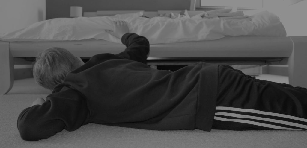
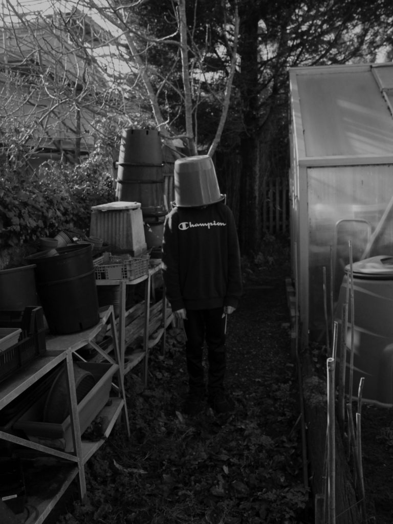
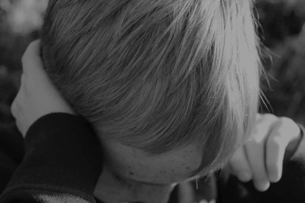
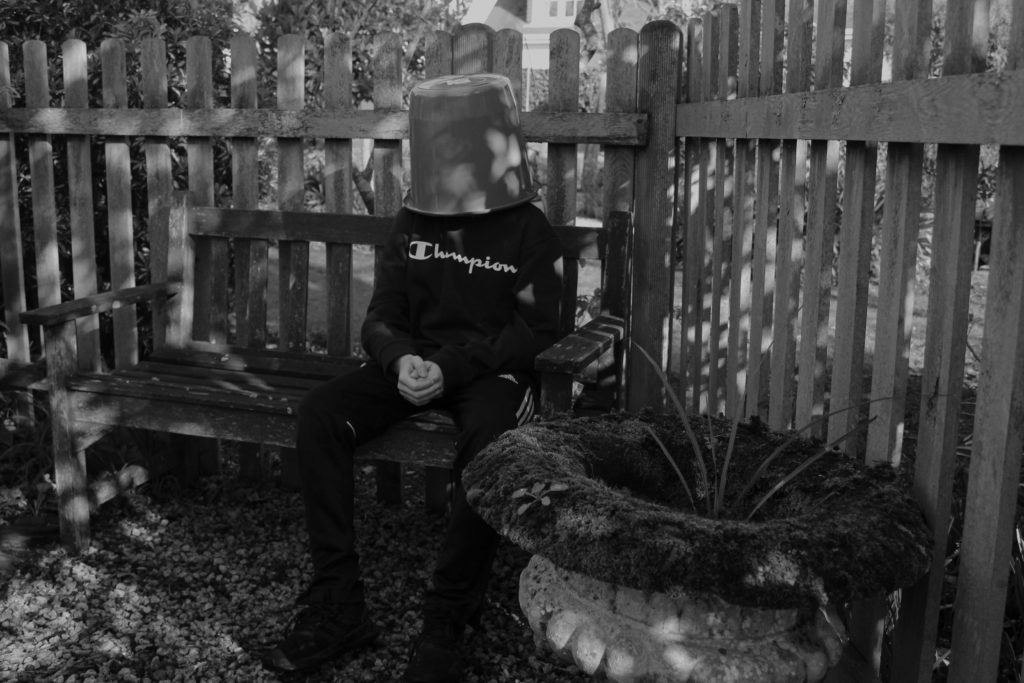
I was influenced by Joanna Piotrowska for this image and her staged family portraits. This is meant to mimic a child looking under their bed for monsters before they go to sleep. As a child I did this and some of my brothers still do.

The bucket is significant as it continues my theme of lack of identity.

UNDERSTANDING PHOTO-BOOK design

Photo-book Chosen – The Epilogue by Laia Abril

What the story is about?

For me I think that the story portrays a family struggles and how they deal with losing a love one to a disease.

What the photographer made it for?

The photographer made this book to focus on the indirect realities that are based around feminism, therefore tells the story of how a family loses their daughter to bulimia.

Audience?

Girls – Woman- families

  • Book in hand: how does it feel? Smell, sniff the paper.

When I looked at the book

  • Paper and ink: use of different paper/ textures/ colour or B&W or both.

The photo book uses a Matt paper however uses inserts with normal printing paper with either letters, and official documents.

  • Format, size and orientation: portraiture/ landscape/ square/ A5, A4, A3 / number of pages.

Portrait

  • Binding, soft/hard cover. image wrap/dust jacket. saddle stitch/swiss binding/ Japanese stab-binding/ leperello

Hard cover with a image wrap, glued stitching for binding.

  • Cover: linen/ card. graphic/ printed image. embossed/ debossed. letterpress/ silkscreen/hot-stamping.

Has got a printed image on the cover, with a blue card covering the girls face

  • Title: literal or poetic / relevant or intriguing.
From The Epilogue, Dewi Lewis Publishing © Laia Abril/Institute

The title can be found to be intriguing to the audience as it doesn’t give us an explanation into whats in the book

  • Narrative: what is the story/ subject-matter. How is it told?

The story is about a family who lost their daughter to bulimia, the book includes flashback before the event – testimonies – objects – letters

  • Structure and architecture: how design/ repeating motifs/ or specific features develops a concept or construct a narrative.

The structure of this book allows the reader to understand what is going on, the book is split in mini chapter specified by the date on a single page.

  • Design and layout: image size on pages/ single page, double-spread/ images/ grid, fold- outs/ inserts.

This photo book uses a lot of double page spreads, however in some pages uses tipin to add more information that the reader can read or look at

  • Editing and sequencing: selection of images/ juxtaposition of photographs/ editing process.

  • Images and text: are they linked? Introduction/ essay/ statement by artists or others.  Use of captions (if any.)
From The Epilogue, Dewi Lewis Publishing © Laia Abril/Institute

The are a mixture of this used in the photo book, all the text in this book relates to the image beside, this could be done by the photographer explaining what is happening in image, which gives more context to the reader.

Photo shoot 4 – Family Event

Planning:

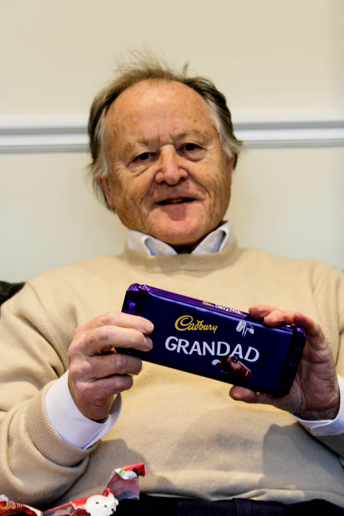
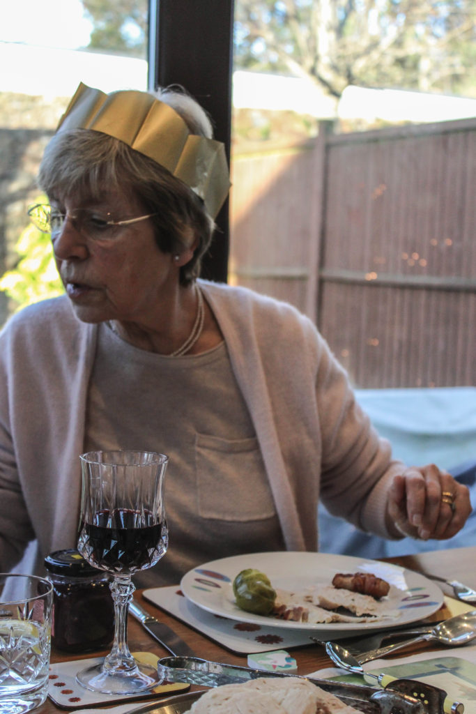
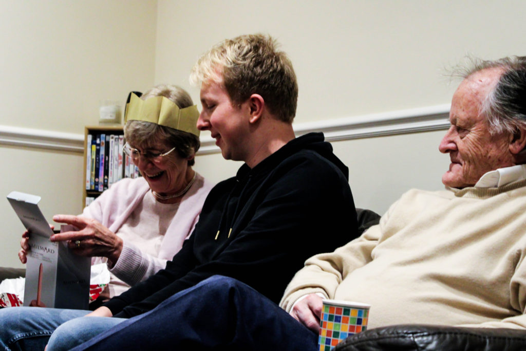
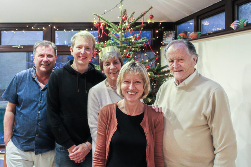
Christmas is a large event, which everyone in my family looks forward to every year. It is a tradition for my Grandparents to go to church in the morning and then come down to my house at around 12pm on Christmas Day to have a Christmas dinner with us, and exchange presents. The aim of this photoshoot is to showcase how my grandparents lifestyle influences the way in which we celebrate Christmas, due to this day being considered religious celebration. I also want to be able to capture the interaction between my grandparents and other family members, as well as showcasing our ‘traditional’ Christmas. When capturing the pictures I tended to take images of key events, and times within the day, and moments when my grandparents personality is clearly being showcased. The camera settings on my DSLR were kept minimal, allowing for a naturalistic documentary style image to be presented. My shutter speed was quick, with my ISO being low and my aperture also being low, reducing noise, blur and allows enough light into my imagery.

Structure of Christmas:

  • 12pm Grandparents arrive – drinks, snacks are presented as we begin celebration.
  • 12:30pm Present exchange – We provide a present exchange, gifting each other plants, car air fresheners etc.
  • 1pm Dinner – at 1pm we gather round the table, say grace, and open our Christmas crackers as the ford begins to arrive. We usually discuss topics such as work, school, future and how our life is in general.
  • 2:30 Dessert – We light the Christmas pudding, and my grandma provides us with her ‘Blue Peter Recipe’, a chocolate cake.
  • 3pm Queens Speech – We all gather around the TV as we watch the queen deliver her yearly speech.
  • 3:30 Christmas Tree Presents – Each year a member of the family will by a ‘joke’ gift for everyone else and will present these gifts later on in the day.
  • 4pm Leaving – My Grandparents leave with their presents, and left over food.

Edits:

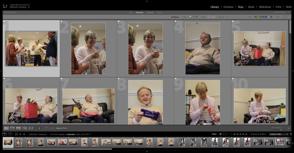
Edit 1 – Flagged
Edit 2 – Star Rating
Edit 3. – Colour Rating

Outcomes:

When selecting my outcomes to edit and adjust to improve the quality of the photograph, I wanted to select images which accurately portray the events and the relationship my family have with my Grandparents, and the way in which this tradition reflects their lifestyle. In addition, I critically chose these photographs to work with as I believed that they helped to tell the narrative of this project. When adjusting the images, I wanted to maintain this simplistic and minimalistic aesthetic towards my work, and so I only present the imagery in black and white or in colour, and the I only focused on adjusting, blacks, white, contrast, detail and sharpness of the imagery. These experimentations are clearly presented below.

Analysis:

The photograph below is my favourite outcome from this photoshoot as I believe it clearly meets the aims of this photoshoot and clearly presents my theme of lifestyle. Conceptually, this is the moment before food arrives and my family are reading out the jokes from the Christmas crackers. It showcases their reaction to the delivery of the jokes. Typically, my brother does not understand the jokes, like this occasion, and requires people to explain. The photograph shows the bond and strong relationship everyone has around this table, as we follow the family tradition, which illustrates my grandparents lifestyle on a major event like this. Contextually, every Christmas we follow the same schedule and repeat the same day essentially every year. Following this pattern is crucial, as it allows my grandparents Christian religious beliefs to fit in with the day, and allows their grandchildren to follow, understand and practice their beliefs and traditions about christianity. Personally, me and my brother have been christened but do not actively consider ourselves as religious people, so this contextual factor on Christmas influences out day and the way in which we go about activities.

Breaking down the visual and technical components of this image allows for the concept and context of the imagery to clearly be displayed. Visually, we are presented with my family sitting around a table, with Christmas hats on as they laugh and look joyous at one another, making this the main focus point of the imagery. The photograph is presented in black and white, allowing clear tonal contrast, and is taken at a straight on angle. In some respects the photograph can be regarded to be using rule of thirds, to create the composition. Further more, the foreground is considered busy and lively due to a lack of space, with the background remaining plain and simplistic, which reduces distractions from the central focus of this image. The main formal elements which are presented in this frame is, space, detail and texture, which are all shown through the way in which the image has been framed. The photograph is sharp and showcases clear detail on the subjects skin, clothes and the table. Technically, the photograph was captured using and quick shutter speed and low ISO, which reduces intended blur and means no noise is presented in the frame. Additionally, the aperture has been set to a medium setting, as enough light is being let in, and a minor narrow depth of field is being presented. Alongside this, naturalistic lighting is being used, which compliments the daylight white balance being utilised.

Conclusion:

To conclude, I believe that photoshoot has been a success. I have been able to produce imagery which meets my artistic aim, and clearly represents my conceptual message of how my grandparents lifestyle influences the way in which my family celebrate major events. On top of this, I have been able to hint at contextual representations throughout my photographs, which adds additional meaning towards my final outcomes of this photoshoot. I have been able to experiment further with different ways of editing imagery using Lightroom, and have reinforced my skill of being able to critically analyse and select imagery which meet my artistic aim.

Personal project-Secondary data (interviews)

Intro

I went to Jordan over Christmas for a couple of days and collected some data by interviewing some people about my personal project. I did the interviews as one to one interviews sitting down with a notebook in my hand and i asked them the questions i planned to ask them on my planner and recorded their answers. And i’m going to put out my results on this blog post down below.

Hamzah Al-Jazi

Hamzah is Mashhoor’s Grand son also the son of Abu Ali, after asking his permission to interview him about Mashoor i collected these answers from him down below.

-How many years do you remember with him?

“he died when i was only 12 years old so only about since i was 6.” said Hamzah.

– How did his death affect you?

“I was only young when he was in my life but yet i still have felt like there is something missing from my life since the day i died.” He said

– Is there any personal stories you want to share about him?

“One of the very few things i remember still of when i was that young was when he took me hunting with him on the weekends and he’d always make a perfect shot” He said

-How would you describe Mashhoor in one sentence?

” He was a man of power and pride who a lot of people will always remember.” Hamza Stated.

– Are you proud of your family history because of Mashhoor’s accomplishments?

“if their was something that made me who i am today then its Mashhoor’s accomplishments and i’m very proud of that.”

Wael Mattar

Wael was Mashhoor’s best friend in the old days, i went to his home and interviewed him over a cup off coffee and down below is his answered that i recorded.

For how long did you know Mashhooor?

“i met mashhoor when i was only 16 years old in the neighborhood” said Wael.

Did you have any accomplishments with him?

“i used to be Mashhoors first officer in Al Karamah battle and i was his right hand during all the battle.” He said.

Does knowing the fact that Mashhoor was your friend make you proud?

“Yes in fact i still believe the luckiest thing that ever happened to me was when i met him he changed my whole life forever” said Wael.

How often did you used to see him?

“It varied a lot but i used to see him everyday during times of battle as i had to always be by his side” He said.

What did you do when you where with him?

“We used to play soccer together as teenagers, then we used to work together at times of war” He stated.

How would you describe Mashhoor in one phrase?

“A man of pride and loyalty” phrased Wael.

Eman Mattar

Eman is Abu Ali’s wife, so i went to her house and interviewed her about Mashhoor and recorded her answers to my question down below:

How close where you to Mashhoor?

“Mashhoor was my father in law so i saw a lot of him and we were really close, he treated me as his own daughter.” Said Eman

Since your the closest one to Abu Ali how would you describe Abu Ali’s condition was when Mashhoor died?

“Abu Ali was a really strong person who didn’t show much emotion except for when hes falling asleep, even if he had any problems or depressing situations no one would be able to tell as he always puts a smile on his face, but i could tell how he may have seemed alright to everyone when his father died but i knew he wasn’t the same anymore, he always seemed a bit lost. Stated Eman

Conclusion

In conclusion these interviews and answers are going to help me a lot in my project as i have a bigger picture of the story and i have more answers now. I will now be using this data i collected as a guide to what i should include in my project.