Deconstructing photobook

Sophie Calle is a French photographer and writer. Her work frequently depicts human vulnerability and examines identity and intimacy. Her photographic work often includes panels of text of her own writing.

Contrary to other photographers who think that their photography work must explain itself, Sophie Calle’s position hiding the photographs inside the book is her intent. The text will affect the way in which the viewer will read each image but that isn’t necessarily wrong. Her work combines the text and images smoothly so that the viewer cannot prioritise one over the other. You could say the most important aspect is the story she tells using both elements in order to narrate.
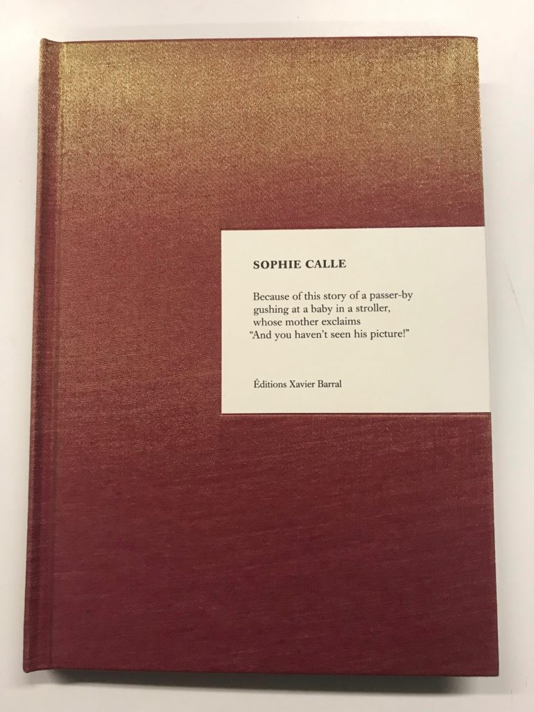
The photo-book tells a story through an image of an idea that appears into her head. She tells us the reason or at least one reason why she captured the image. The photograph is then revealed later, hidden within Japanese binding. She reversed the relationship where individuals instincts are to look at the image and then read the words that accompany it.

The photo-book’s front and back cover has a silky quality that feels smooth to the touch. Depending on where the light hits, the colour changes from burnt sienna to gold. The photographer’s name Sophie Calle is displayed on a small card on the right side of the cover. It’s unusual how the title of the photo-book Because isn’t displayed on the front, however there is a short poem which gives the viewer insight on what to expect inside.

All the pages within the photo-book have the same design and layout. In each piece, a felt curtain embroidered with Calle’s writing conceals a hidden photograph behind it. Presenting the viewers with the text before the image is an unusual order in which images are read. This aspect has intrigued me since it creates a poetic surprise.

All the images that are hidden within the pages are in colour. The photographs presented in the photobook are either landscape or portrait and they all vary in different sizes. There are 72 pages with 32 photographs inserted between the pages of the book. Behind each image is the title she gave each image

The title Because is intriguing since each poem she presents alongside the image has the word because somewhere within the poem. She either uses it once or several times. Calle uses this word to explain to her viewers on why she captured the image.

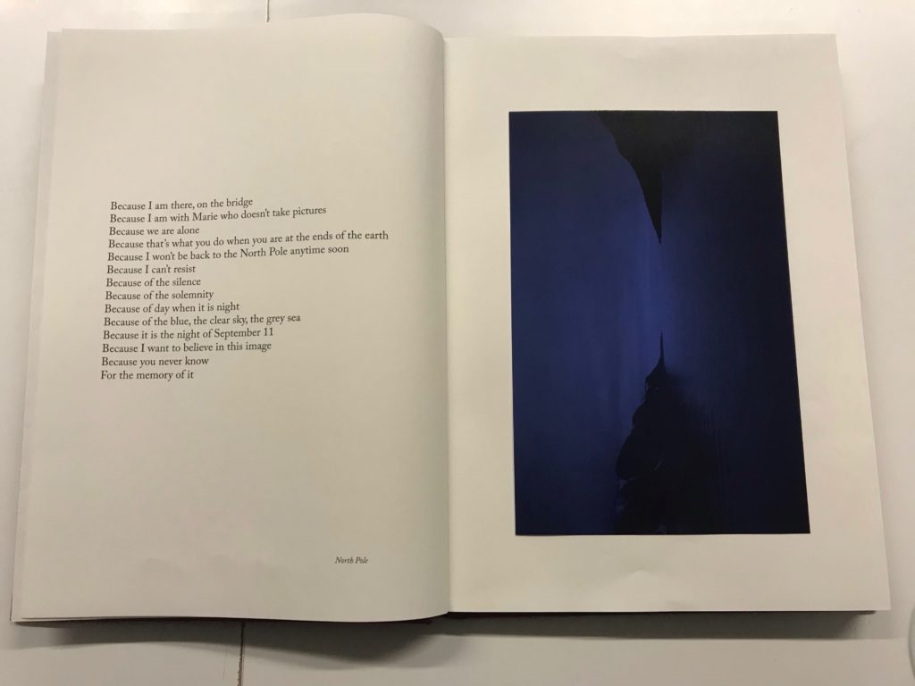
Concealed
Image Revealed

Understanding Photo Book Design:

  • Title: literal or poetic / relevant or intriguing.
  • Narrative: what is the story/ subject-matter. How is it told?
  • Structure and architecture: how design/ repeating motifs/ or specific features develops a concept or construct a narrative.
  • Design and layout: image size on pages/ single page, double-spread/ images/ grid, fold- outs/ inserts.
  • Editing and sequencing: selection of images/ juxtaposition of photographs/ editing process.
  • Images and text: are they linked? Introduction/ essay/ statement by artists or others.  Use of captions (if any.)

OUT OF THE BLUE, Virginie Rebetez.

Book in hand:

The book isn’t heavy to hold, instead it’s weight fits its size. The cover has a rough feel to it and it has that new book smell.

Paper and Ink:

Most of the book is in colour. The pages are smoother than the cover and have a very slight glossy look to them. At the back of the book when the photos end, the paper changes. It becomes pink, showing photocopies of police reports and other legal documents. Black markers have been used to censor any private information.

Format:

A4 size portrait.

Binding:

Hardcover binding.

Cover:

Linen cover. Gives the book texture. The cover has a wrap around image of the side of Suzanne’s face.

Title:

OUT OF THE BLUE. The title refers to an event that occur without warning or provocation, specifically the disapearence of Suzanne Lyall.

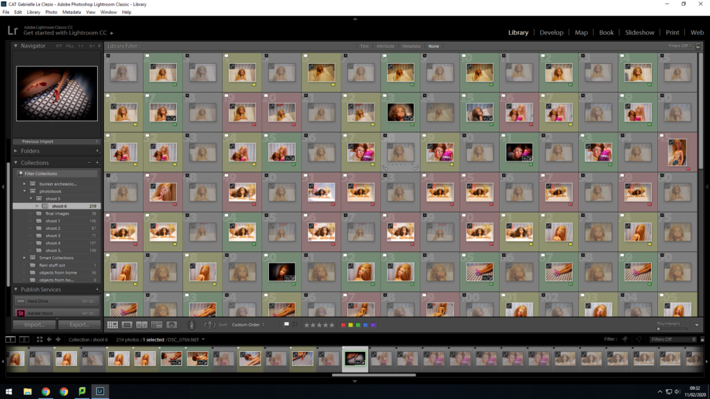
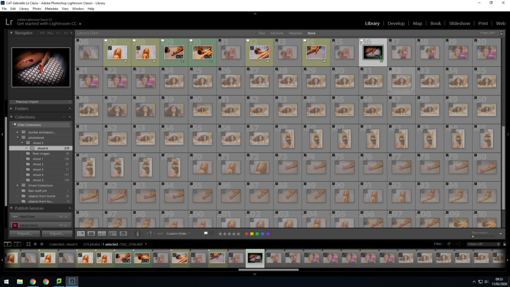
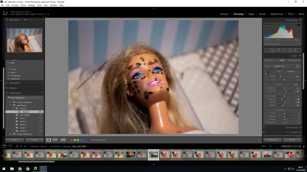
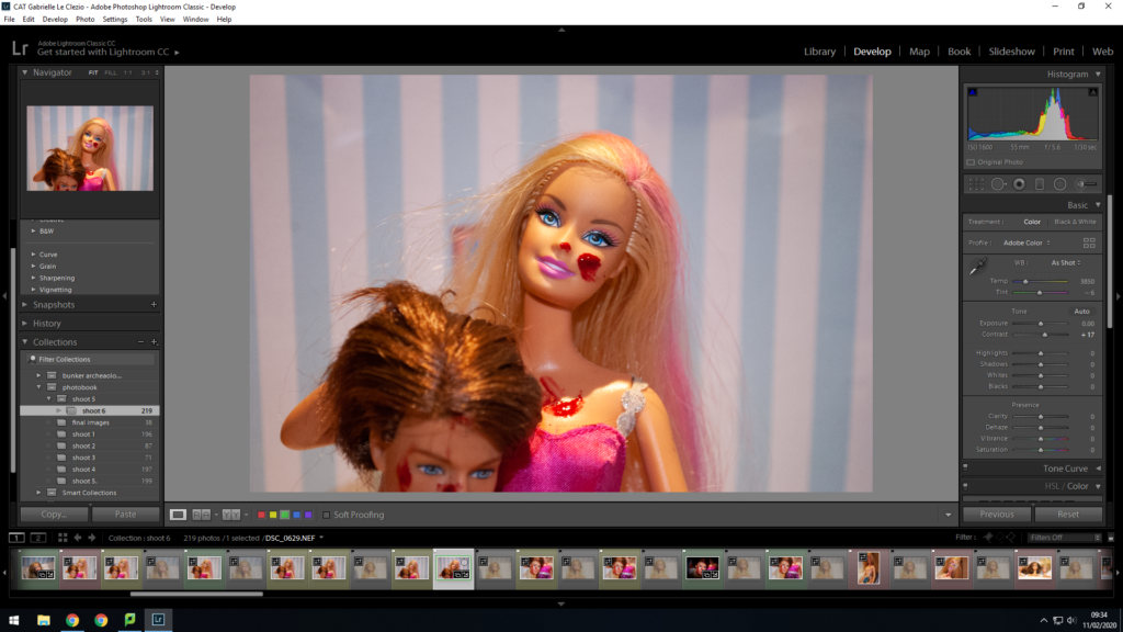
Shoot 6 and edits

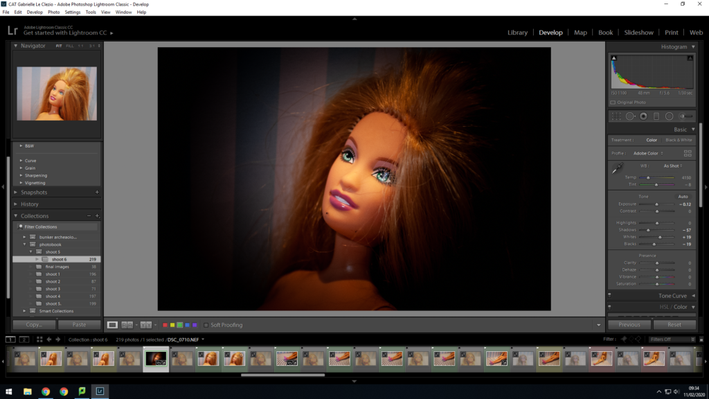
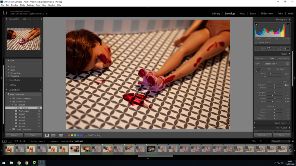
This shoot went really well. I used this shoot to create some new narratives in order to create variety in my images. I wanted to focus on the idea of women feeling like they have to get surgery and become plastic to look good. I also wanted to focus of the doll fighting back and overcoming her stereotype.

David Kirscher: Artist reference

Mood Board:

ALL IMAGES BY DAVID KIRSCHER

David Kirscher is a photographer based out of Paris and Madrid. His work is very diverse ranging from fashion and editorial work with models to even just photographing his friends in different situations. His passion for photography started when he was 15. Whether he is shooting with professional models and artificial light or with friends and natural light, he says the bottom line is always the same: how to tell a story with pictures. He says he likes to play with the boundary between fiction and reality, He likes to photograph travels, parties, love scenes, black and white or colour photography, mostly analog, but also digital.

Kirscher works on the assumption that if a picture doesn’t make him feel any emotion, it won’t to anybody. It is certainly not true, but knowing that he has a liking for extreme feelings, it is quite a challenge.

Kirscher says that Cinema is definitely what inspires him the most. He can spend hours analysing frame by frame the light work in a movie, the color of a carpet matching with a lipstick, an outfit, the shape of a lamp reflecting in an eyeball. His portfolio is rather diverse because this is the way he is. He loves soul, jazz, techno, opera, metal, pop, piano, rock ‘n’ roll. There is no overall message. He just tries to be true to himself. And don’t cheat.

Usually for editing, he tries to make the editing process not too visible. And natural. Natural is intimate. He says even in 2019, with all the editing tools and filters we have, natural doesn’t mean anything anymore. So he tries to make it not too visible. No vignette, over-saturation or HDR look. He likes to work with analogue cameras because depending on the film roll, it naturally defines the look you will get.

Kirscher says to create a safe space for his models, communication is the key. He always explain what he’s doing, and try to go step by step, and never force anybody to do anything. He also likes to put some music on. Music is important, it goes through walls. Information from https://beloved-stories.com/david-kirscher-exploring-intimacy-through-photography/?fbclid=IwAR2LoYfRQmJJskTWK5AG_JS9A_-aqKixJt6TT_489jcDEoPHv1FTK45zUhA and https://www.arismoskov.com/index.php/event-experience/310-david-kirscher

Image Analysis:

Image: David Kirscher

Technical:

This image looks like it was taken with a red light to capture the raw moment and to create a romantic and sensual aesthetic. The exposure of this photo is neatural which gives the photo detail and sharpness. The aperture for this photo is very quite high and the depth of field is quite sharp. Also, the ISO will be around 400 and the white balance looks to be either daylight or shade.

Visual:

The colour of this photo is very saturated and is quite dark to give it a ominous and mysterious look to it. Also the cropping of this photo leads the eye to the people lying and hugging on the bed. Also, the people being the main focus in the photo makes it stand out a lot.

Contextual:

David’s work is very intimate and shows raw emotions and feelings. The context of intimacy is prevalent in his work and gives the viewer a feeling of intimacy and closeness.

Conceptual:

Natural is intimate. He works on the assumption that if a picture doesn’t make him feel any emotion, it won’t to anybody. No matter who he is working with, he says the bottom line is always the same: how to tell a story with pictures.


Reflecting

After uploading and editing photos, I went back and looked at both swell and red string again and decided that I liked the physical aspect of both the projects, so decided to get some physical photos that I would be able to use. I also decided it would do two more shoots to gain even more images.

IMG_3894.jpeg
IMG_3895.jpeg