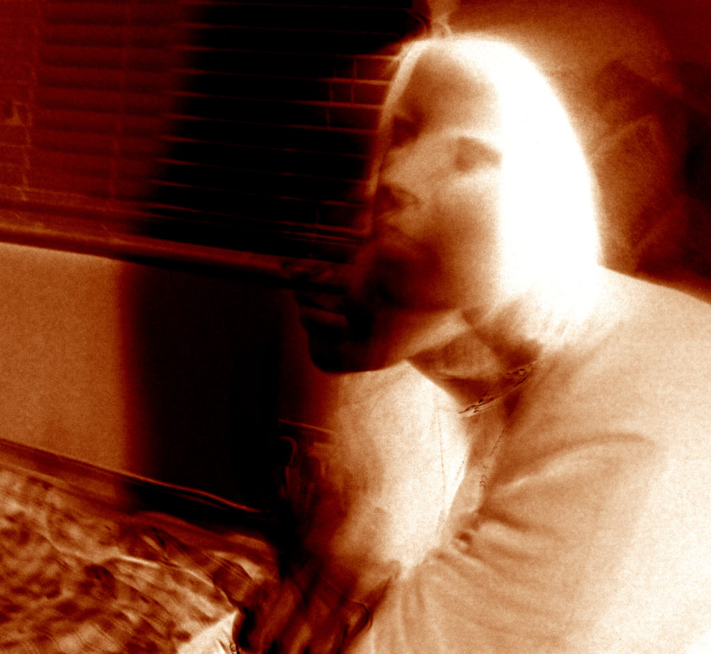
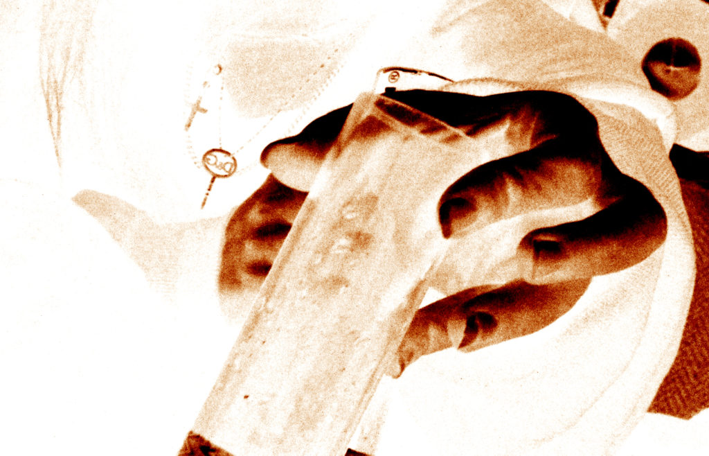
Photo shoot 2 – LaToya Ruby frazier

Planning:

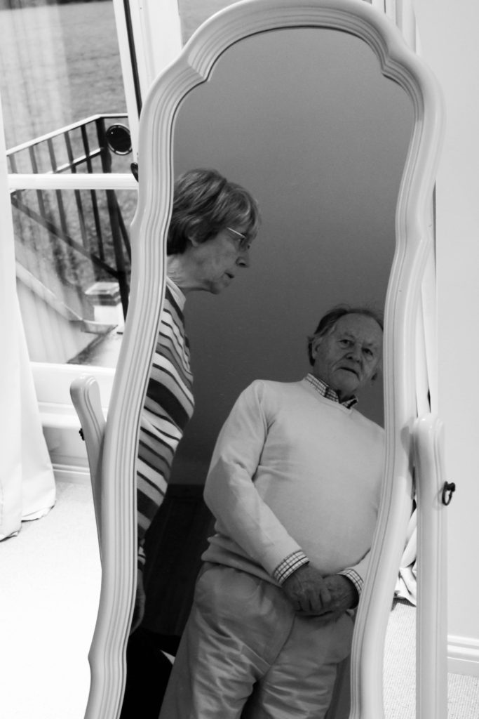
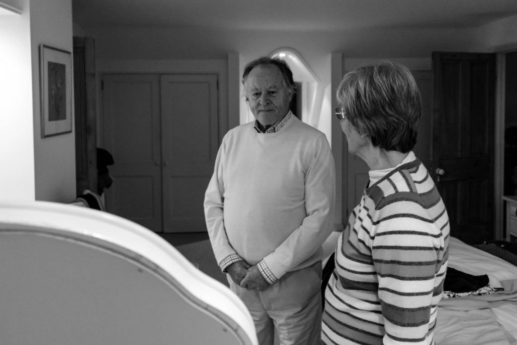
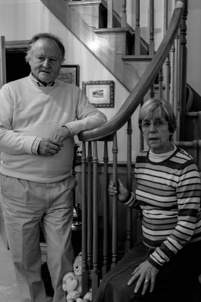
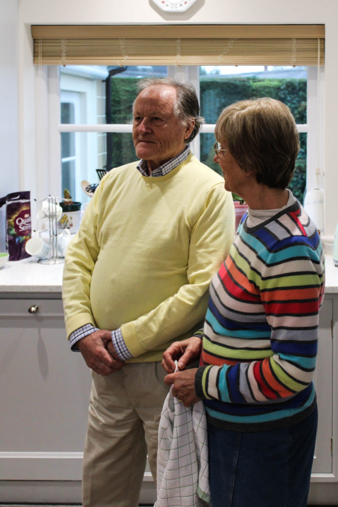
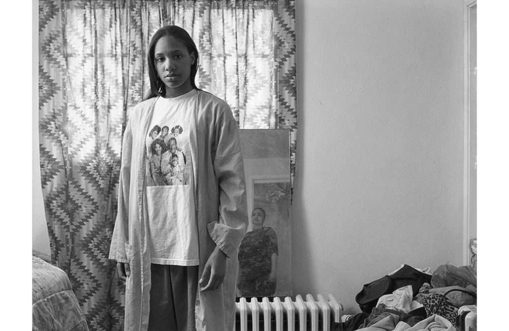
After researching LaToya Ruby Frazier, I was able to understand the way in which her conceptual representations were presented within her imagery. Using this techniques of capturing naturalistic portraits in order to portray lifestyle, I conducted a photoshoot with my grandparents. At the beginning of the session I explained the purpose of the shoot and informed them that I would be following them around as they live out their everyday lives, emphasising the importance of them sticking to their true personality to accurately representing their lifestyle as I followed them around. The shoot was conducted during the middle of the afternoon which meant daylight was beginning to become darker, which forced me to increase my aperture in order to let enough light into, for the frame to clearly illustrate their lifestyle. The camera settings were kept basic, quick shutter speed, middle – high ISO and aperture of around f/5.6 in order to capture the imagery.

Conceptually, I wanted to convey my grandparents lifestyle and how their upbringing and past has influenced their life. For example, I focused on capturing the idea of my grandma being a house wife, while my grandad provided and worked for the family. I also wanted to represent the ideology of economic status and the way in which their financial situation has influenced their lifestyle which they thought were large influencing factors during my interview with them. Due to them being financially stable, it has allowed for them to have luxury habits, such as owning a large house, being able to afford expensive furniture and being able to retire early. These factors I tried to portray through my imagery, as well as recreate and produce imagery which follows the same stylistic features of Frazier.

Edits:
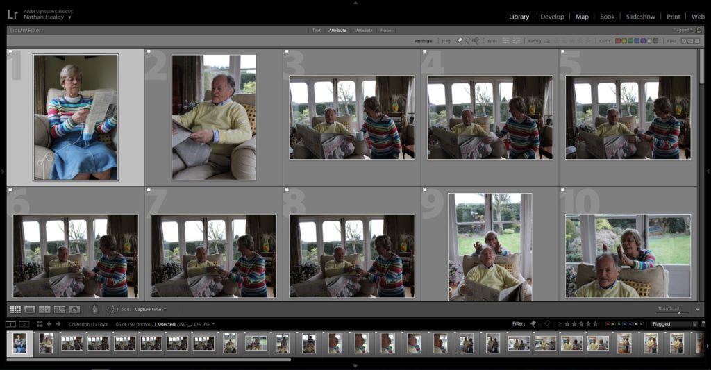
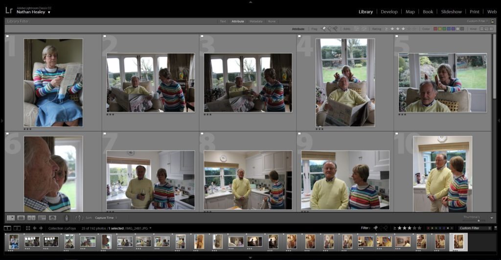
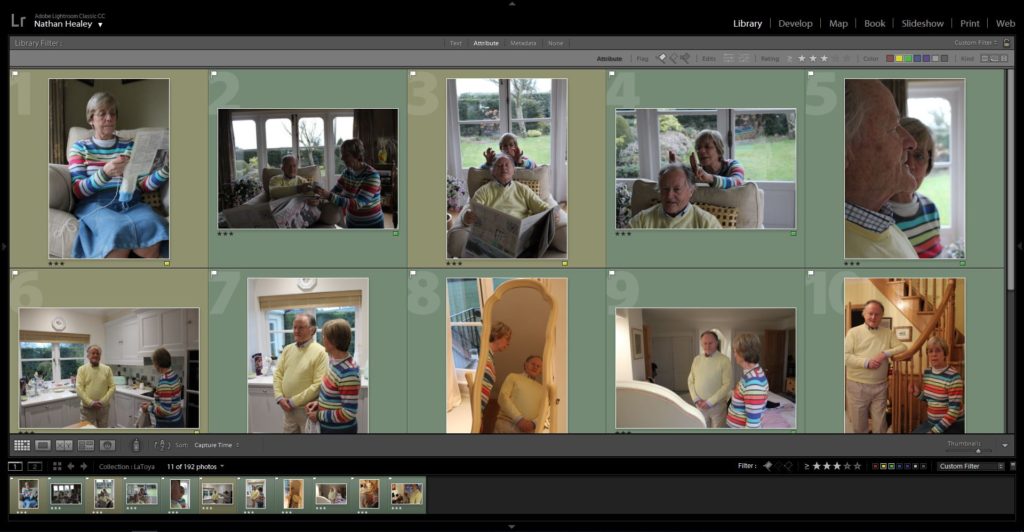
Edit 1 – Flagged
Edit 2 – Star Rating
Edit 3- Colour Edit

Outcomes:

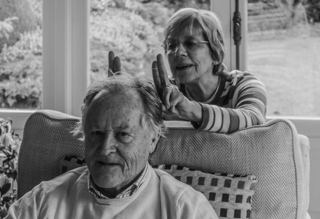
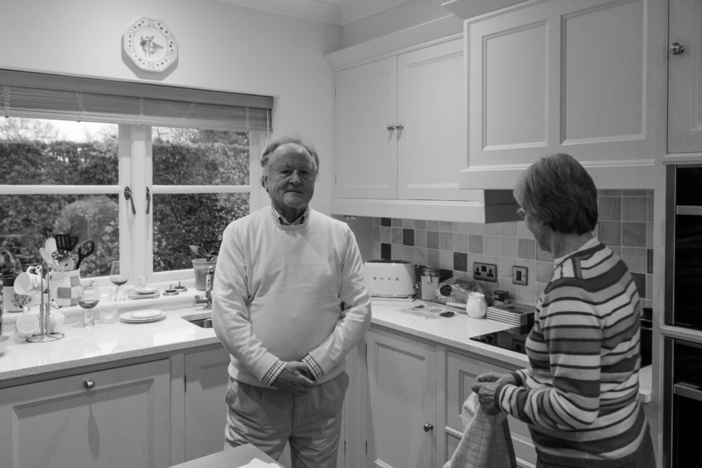
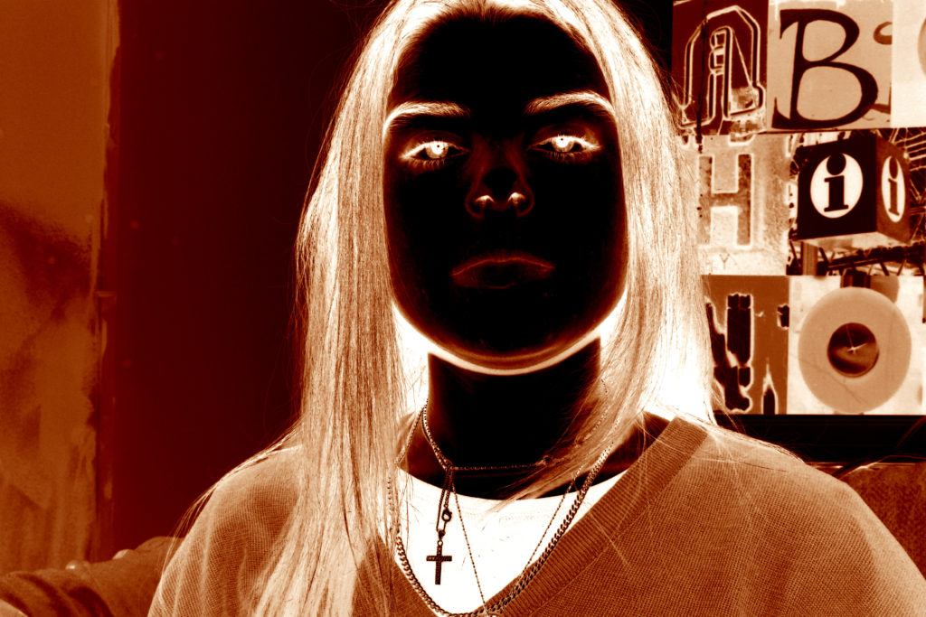
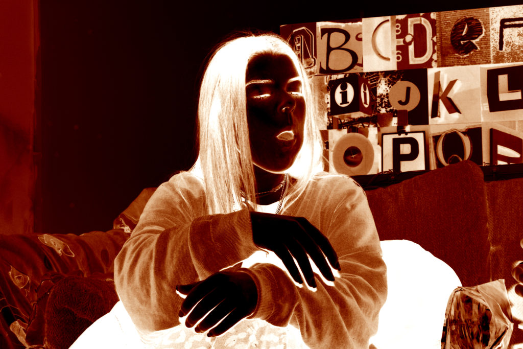
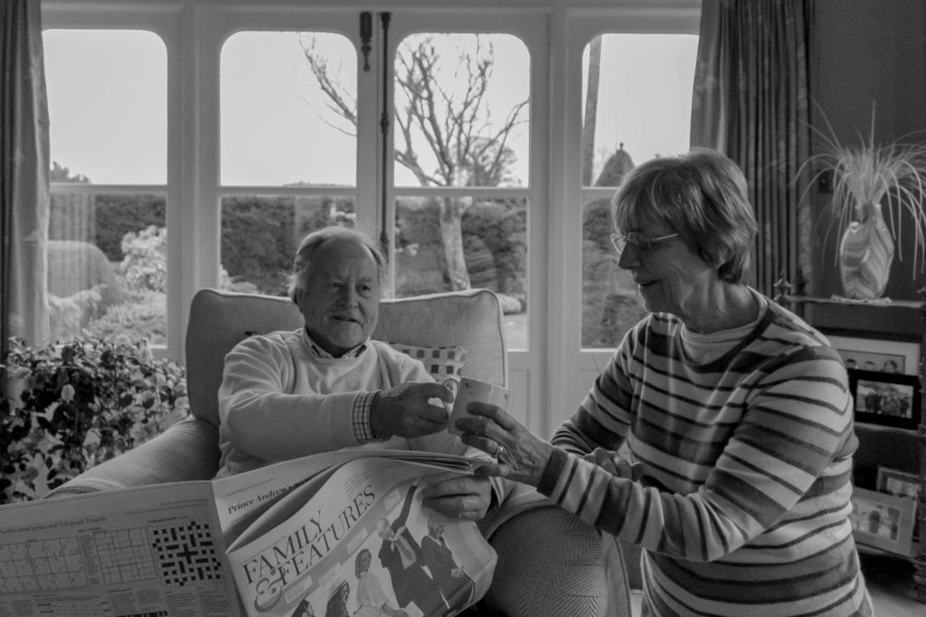
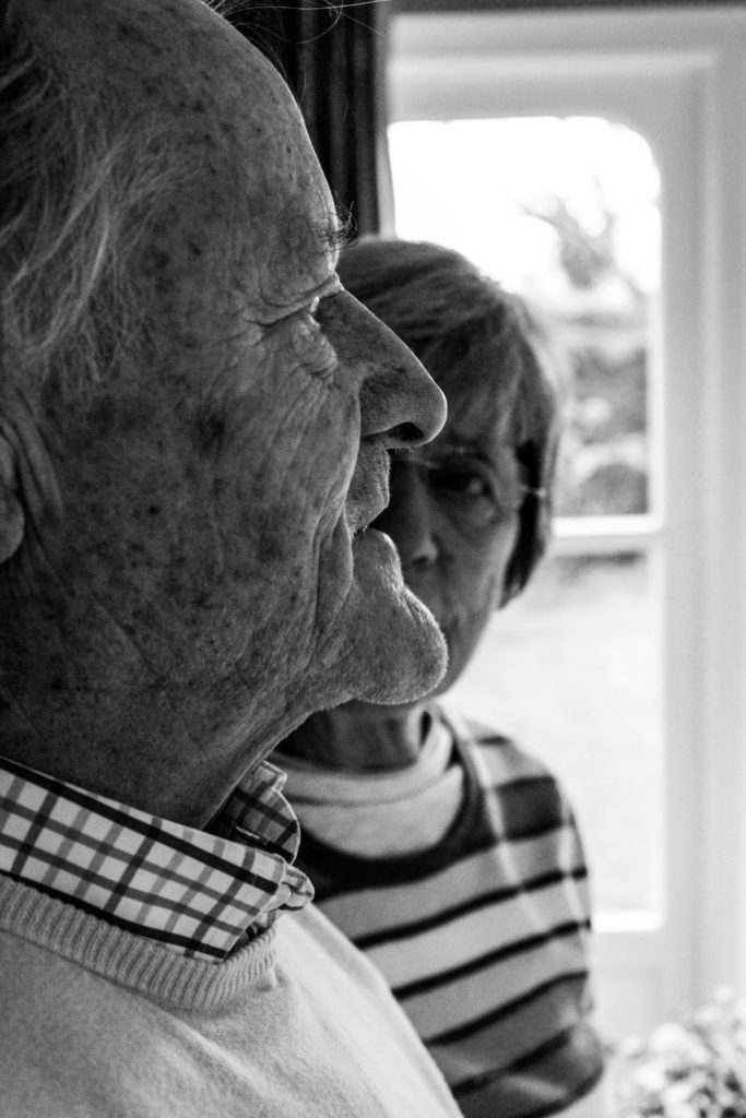
When producing the outcomes from this photo shoot, I wanted to keep them simplistic and authentic, in order to clearly and accurately illustrate the lifestyle they live. Due to Frazier’s work mainly being in black and white, lead most of my outcomes to be showcased in black and white, in order to create close connections between mine and my artists work. However, with two of the images I decided to leave them in colour, as they best suited being presented in colour, due to them having a more authentic persona towards them which meant that the colour allowed for reality to accurately be portrayed within the imagery.
Analysis / Comparison:

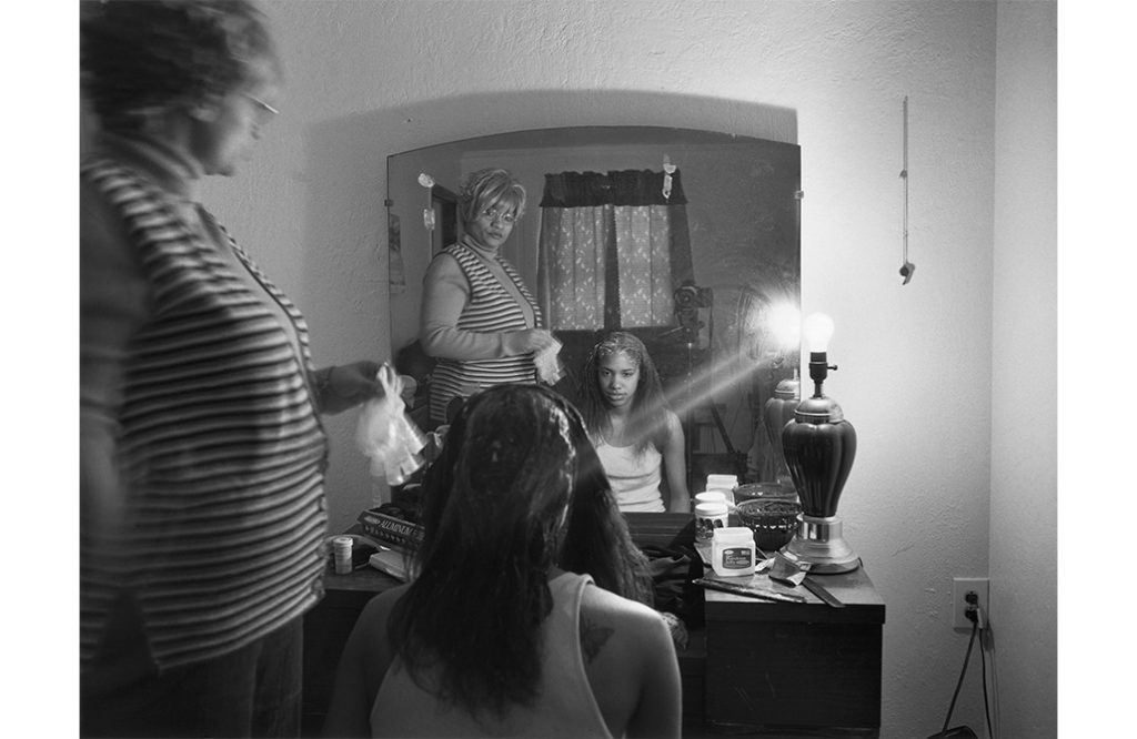
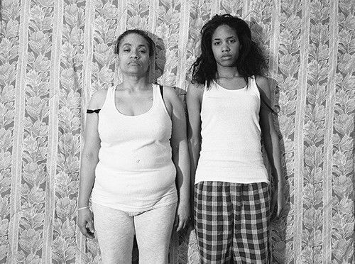
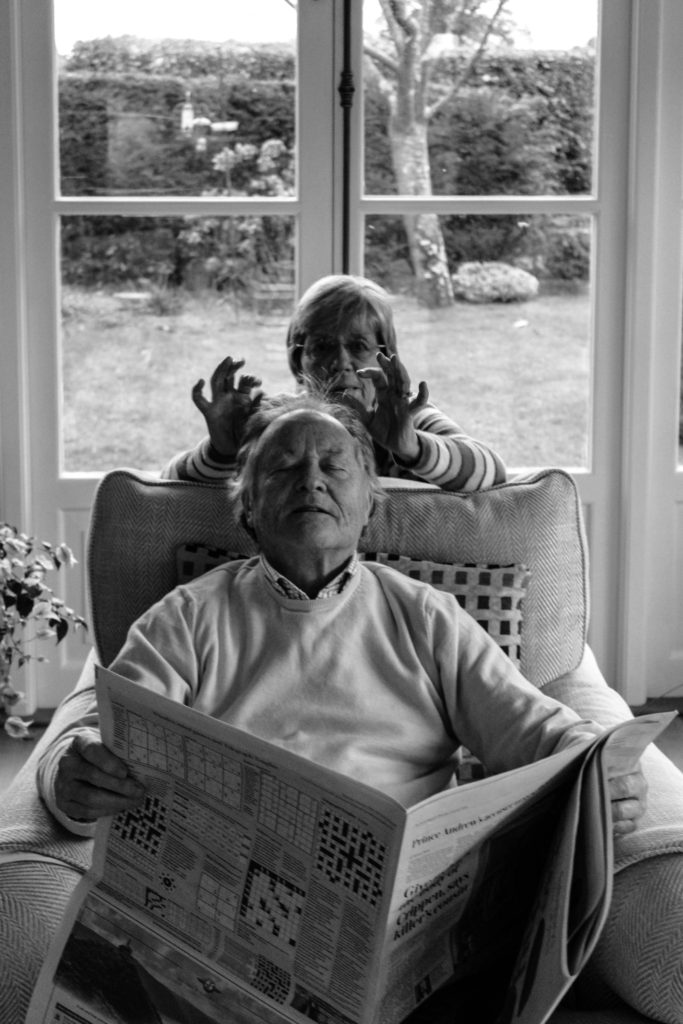
The image below (Frazier’s) is the photograph which I felt held strong conceptual representation, and wanted to recreate within my work to present different concepts in relation to the subjects I was capturing. The two images follow similar composition, by having a subject present in the foreground and background looking in different directions, with a narrow depth of field being utilised. Both photographs are being presented in black and white, with the detail and structure being high, but the smoothness of the imagery and noise being low, likely done through camera settings with editing complimenting these values. Both photographs show clear focus to the formal elements of space, tone and texture which is clearly presented from the proxemics, clothes and basic background. Another similarity between the two is through the camera settings used in order to capture these images, due to them being alike, it suggests that I used similar settings The lighting used would have been artificial through studio lighting and lighting readily found in that room. The light source is soft and can be considered cold, which illustrates the brutality of this reality and how it has negatively impacted the families life. This works well with the low ISO which is used as no intended noise is being presented within the imagery. As well as the white balance being accurately set to an in door setting allowing for clear colour correction, illuminating the tonal contrast within the frame. In addition to this, the shutter speed is kept to a quick capture as there is no movement or intended blur within the frame of the photograph, which helps to compliment the ISO setting used. 

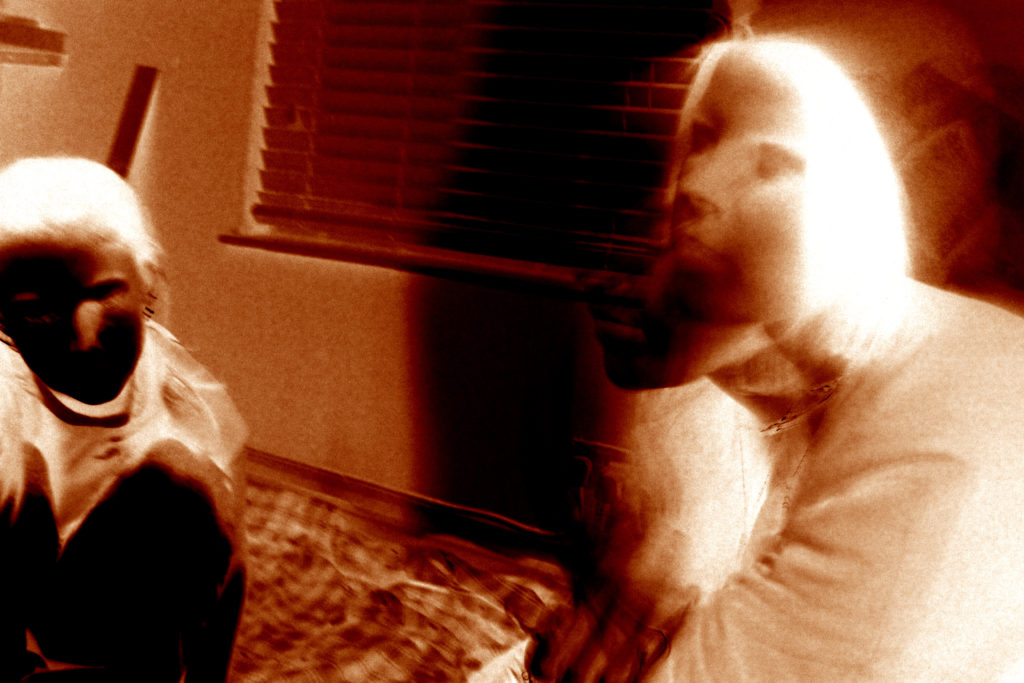
The main difference between the two images are the conceptual representation. Frazier wanted to showcase how herself and her family are being treated as invisible due to their race, presenting political power and situation in their suburb in Braddock. It also illustrates their lifestyle and poverty through the perspective of herself, mum and grandmother, this concept is further explained in my artist research on a previous blog post. Personally, I wanted to convey the social situation which was common in the 1940’s and still present in my grandparents lifestyle today, gender roles. Having my grandad being in the front of the frame well dressed up shows he is the authoritative figure who provides for the household, having my grandmother in the back suggests her submissiveness and willingness to follow instructions from her husband, although this may be considered a bad thing, to them it is normality which they both enjoy.
Conclusion:

In conclusion, I believe that the imagery produced shows close relationships with Fraziers imagery, through the sense of composition and the ideology that we have both conveyed lifestyle in a similar way. With close regards to the final imagery produced, I believe that the photographs shows my ability to capture detailed portraits, which have clear focus and show my ability to produce a strong composition, which compliments the simplistic edits. In addition, I have been able to provide evidence my reinforces my ability to use Lightroom effectively to produce strong imagery.

HISTORICAL Contents PARAGRAPH Draft

The images that I construct in my personal study is borrowing elements from tableaux-vivant. This is because I’m constructing scenes or realities in which to take my photos using objects. Tableux vivants originated in the medieval era. Actors would re-enact famous bible scenes during mass, this then evolved into actors creating live versions of famous paintings during the Renaissance era. These actors reacted paintings of Greuze, David and Isabey. Tableux viviant acting was also popular at weddings and other events. Tableux viviants became less popular in the early 19th century due to the realism movement. However, in the 20th century, actresses re-enacted nude classic paintings but then tableaux started to die out because of the invention of film, however, became popular within photography. In terms of photography, Jean-Francois Chevrier as the first to use tableaux in association which was during the 1970’s and 80’s. Photographer’s then began replicating famous paintings in constructing new meanings. Previously in my coursework, I studied Tableux viviants and reconstructed fairy tales with modern day twists. The difference with this project is that I won’t be doing it with real people but with dolls and doll house sets. 

My work also has roots in Surrealism which is all about unleashing the unconscious mind and I believe my work does this but also has socio-political connotations because they also comment on politics and society. Surrealism grew out of the World Wars in the early 20th century and Dadaism. According to Breton’s Surrealism Manifesto (1924) the new art form is a means on linking the conscious to the unconscious so everyday life will be joined up with the subconscious in ‘ an absolute reality, a surreality.’  Some of my previous work has involved quite scary looking images and I’ve planned on doing the same with this project but by taking it another step with editing. My project is surreal in the way that the realities I plan on constructing will appear dreamlike and there is a socio-political message behind them. My Socio-political message is that society and social media has developed an unattainable and unrealistic beauty expectation for women. 

EXPERIMENTATION

ORIGINALS:

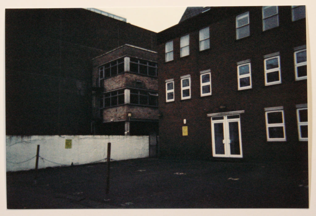
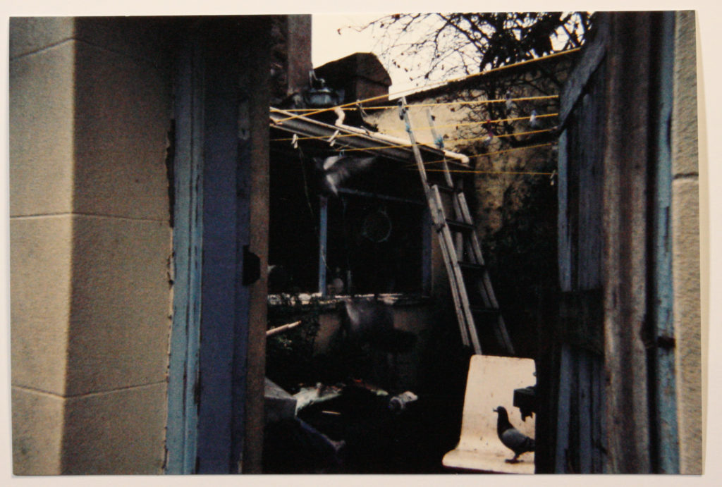
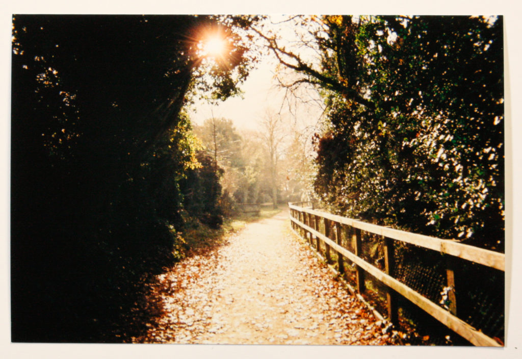
The original, images witch I have created do have the intended “nostalgic” feel to them with the use of film within the photoshoots. In order to add some points of contrast and interest it would be suitable to do some editing with them, wether that be adding filters or using various other editing techniques in order to create further meaning within these images.

In order to carry forward this theme, I will continue to use film throughout my other photo shoots as this will fit in well with the theme of my photo book which I intend to make by hand. I feel as though these images belong in a medium which isn’t perfect and printed by a machine as it would contrast too much with the images. The themes which I am tackling with these images also tie together with poverty meaning that it would only be appropriate that the book is no made in a way which is clean and sharp.

EDITS:

INTENT/EFFECT:

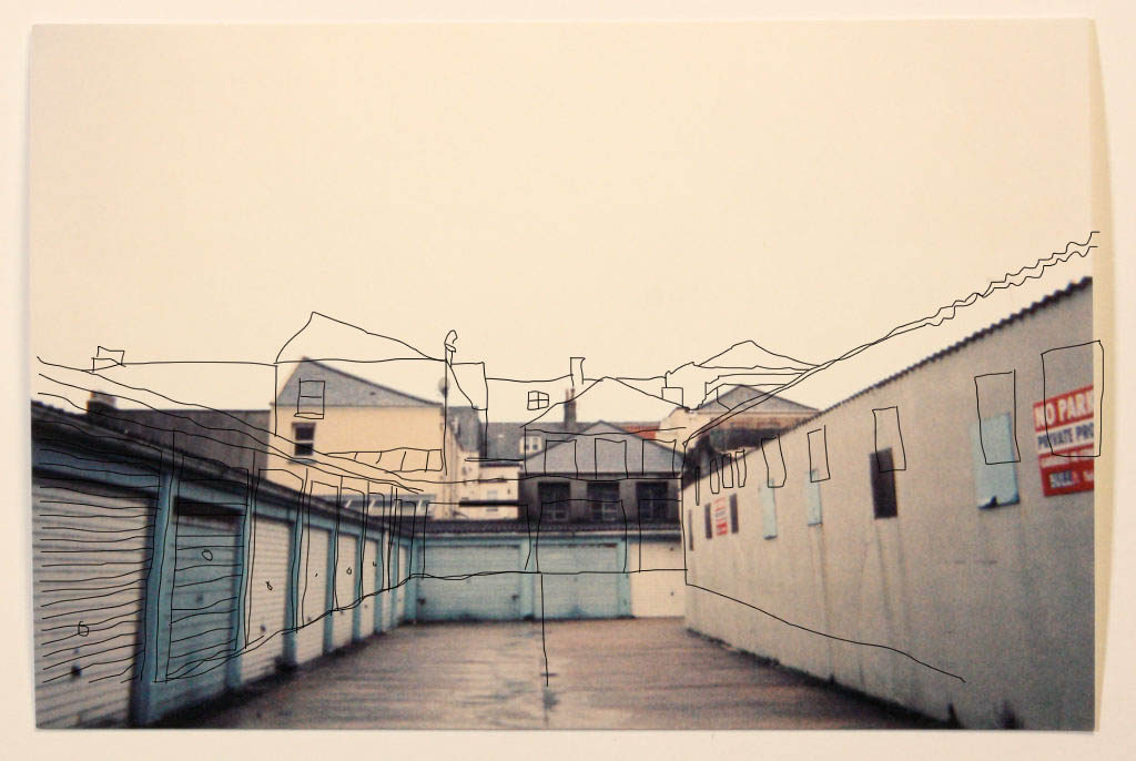
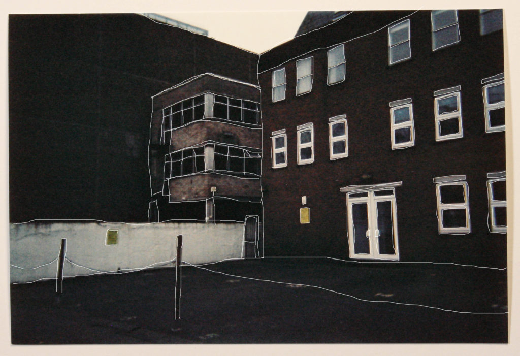
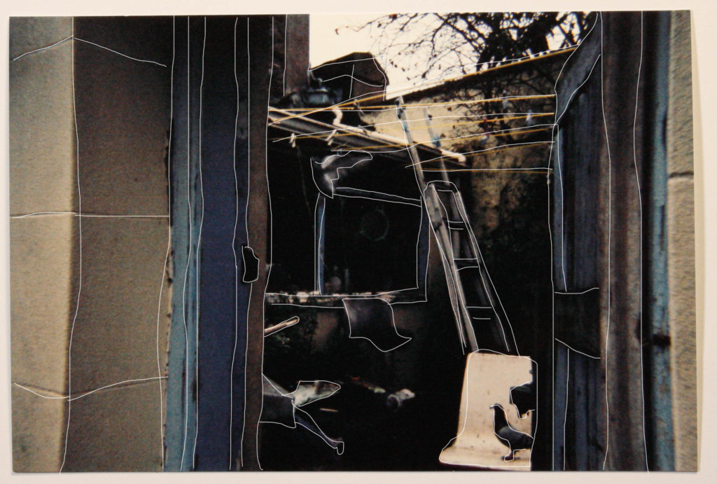
As the graininess and warmth nature are two aspects which I enjoy a lot about the photos and think is very effective, I have firstly played around with a simple trace and drag technique to the images. With these edits, I have simply traced around the images and dragged the outlines slightly to the sides in order for them to be clearly viewed. I find that this was very effective in terms of adding another point of interest to the images. These lines provoke ideas of fragility and childhood as they are rugged and un neat. As I intend to work in a similar way as the photos in the photo book “red string”, these messy edits would fit in perfectly with the theme, giving them a hand made feel with the imperfect line work.

Understanding Photobook Design

THE ERRATICS – Darren Harvey-Regan:

  • Book in hand: how does it feel? Smell, sniff the paper.

Cardboard on front cover – makes the book thicker, more sturdy . Some pages thicker than others – makes book feel like it is changing as you read – reader engagement

  • Paper and ink: use of different paper/ textures/ colour or B&W or both.

Different colours of paper. Glossy and matte paper, all black and white on white paper with black ink

  • Format, size and orientation: portraiture/ landscape/ square/ A5, A4, A3 / number of pages.

A4, portrait,

  • Binding, soft/hard cover. image wrap/dust jacket. saddle stitch/swiss binding/ Japanese stab-binding/ leperello, linen/ card. graphic/ printed image. embossed/ debossed. letterpress/ silkscreen/hot-stamping.

Black soft cover with hard cover pasted over the top – Hard cover features printed image. Soft spine slightly embossed.

  • Title: literal or poetic / relevant or intriguing.

Poetic, Intriguing

  • Narrative: what is the story/ subject-matter. How is it told?

Story told through images of large geological structures in nature contrasted with images of smaller chunks of chalk taken in studio which have been Sculpted by man vs the larger structures being sculptured by nature.

  • Structure and architecture: how design/ repeating motifs/ or specific features develops a concept or construct a narrative.

lines sculpted into rocks to follow lines of pedestal they are displayed on.

  • Design and layout: image size on pages/ single page, double-spread/ images/ grid, fold- outs/ inserts.

Variety of different image layouts – single page (full-bleed), multiple images per page, several sizes of image, loose inserts for text

  • Editing and sequencing: selection of images/ juxtaposition of photographs/ editing process.

nice contrast between studio and landscape images. Juxtaposition between locations per page. Includes both low and high key lighting.

  • Images and text: are they linked? Introduction/ essay/ statement by artists or others.  Use of captions (if any.)

Opening text links to the rest of the images and story

Photo Shoot 2 – Editing Images

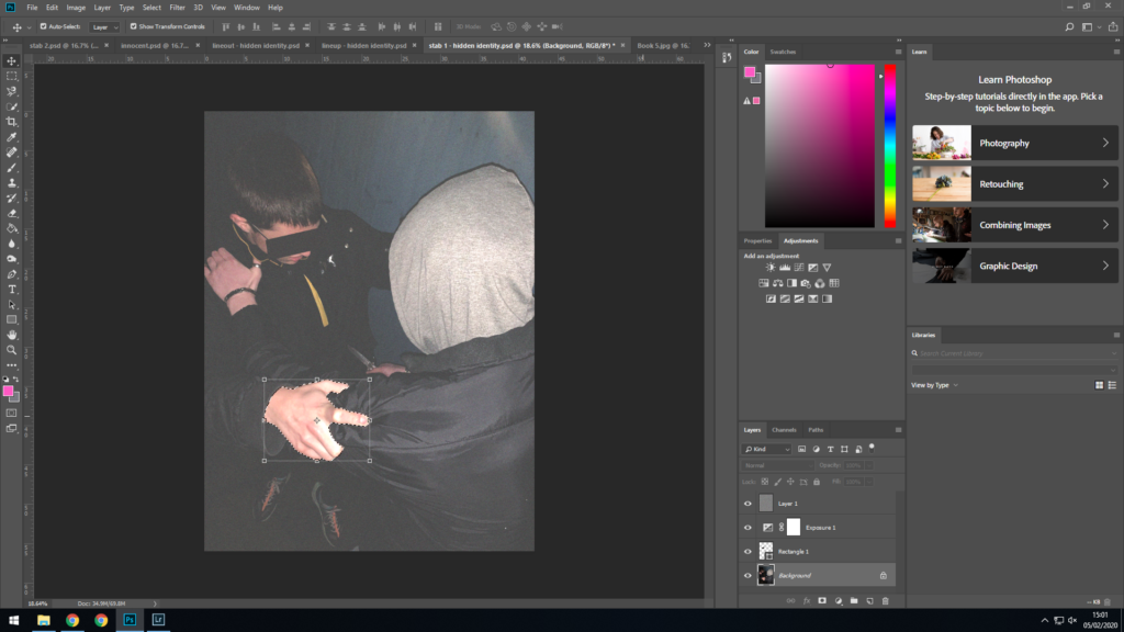
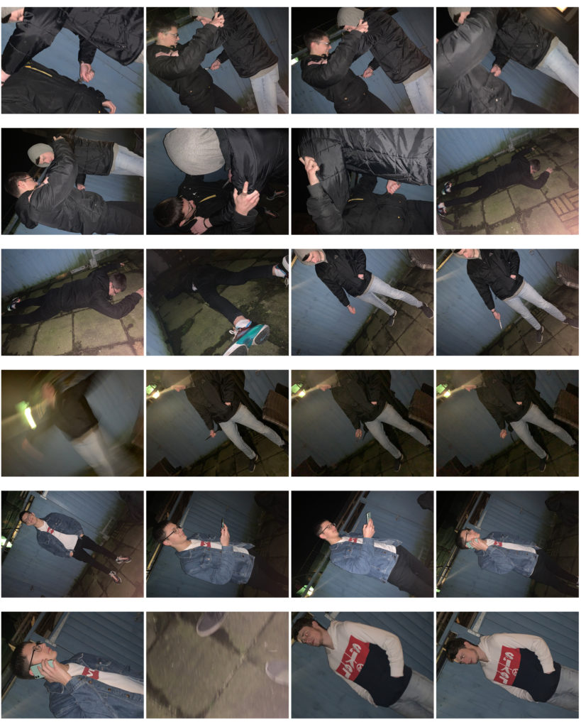
This is the editing process of one of the images from the shoot:

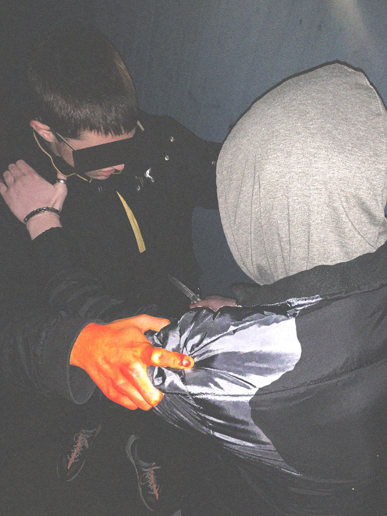
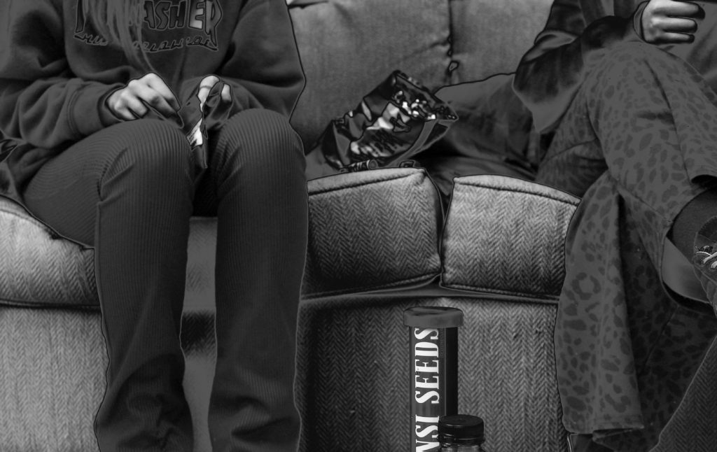
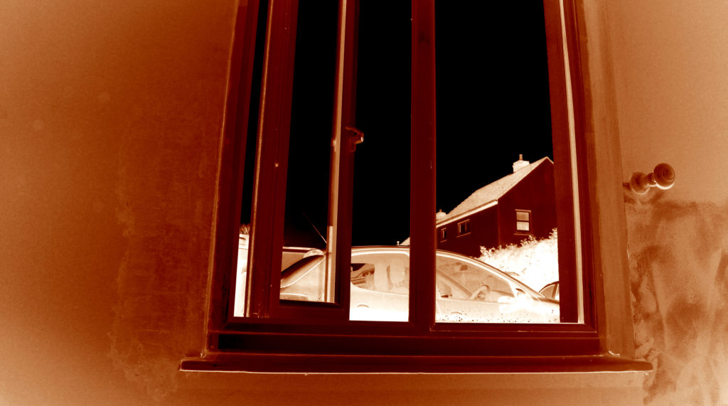
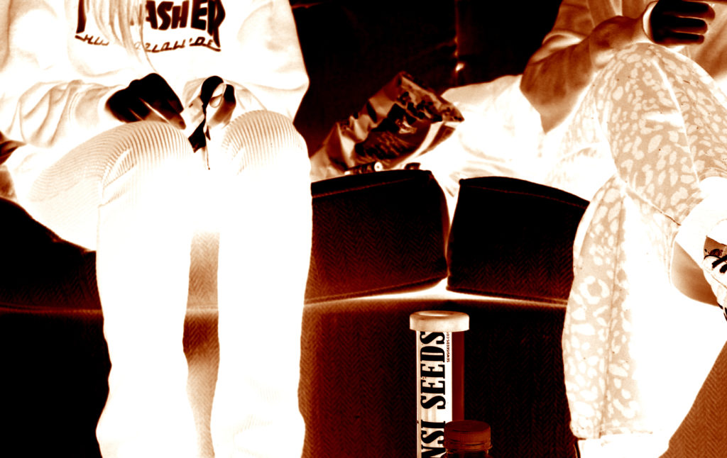
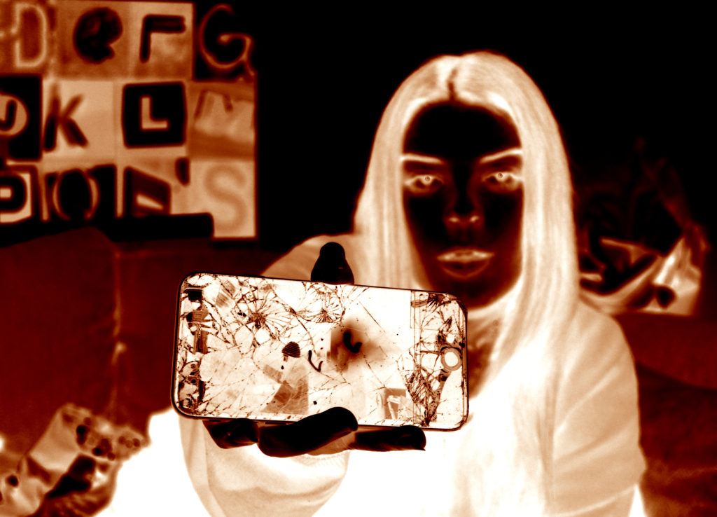
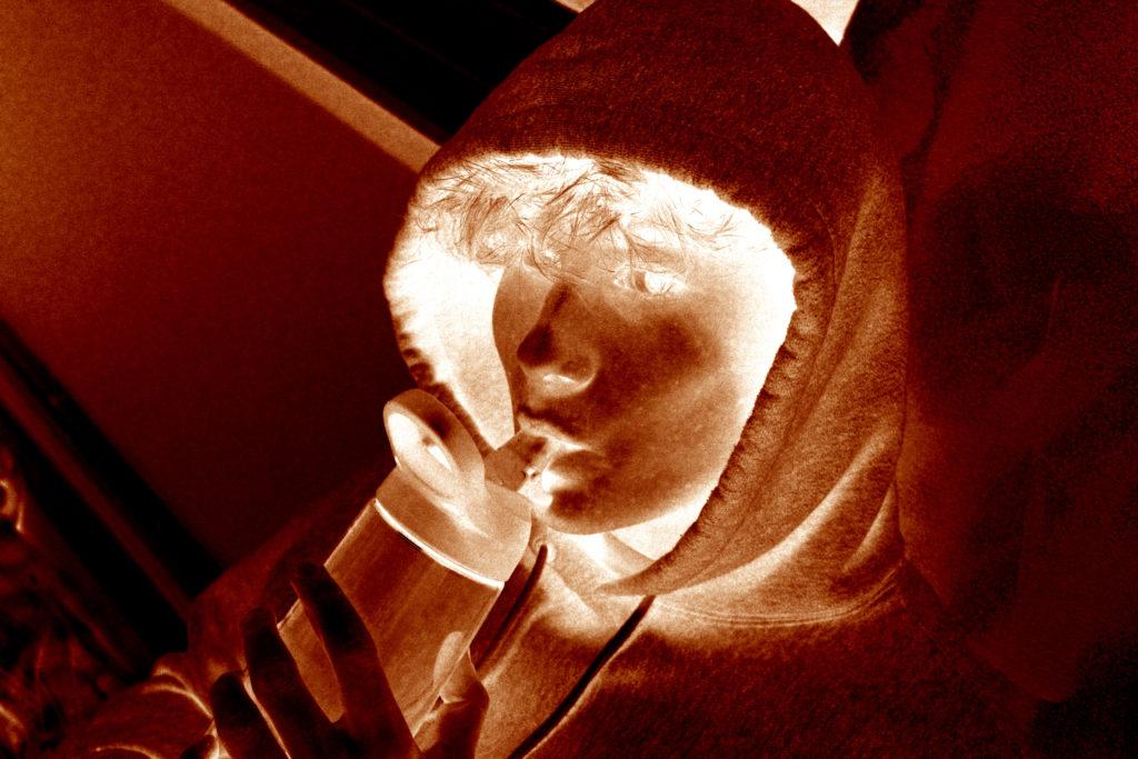
First I applied the exposure filter; raising the exposure and offset values, whilst lowering the gamma correction value. I also applied a 50% grey layer on top of this, which i added the noise filter to, adding coloured as well as monochromatic gaussian style noise. I also but a black bar over the model’s eyes to conceal their identity, as part of an ongoing theme throughout my project.

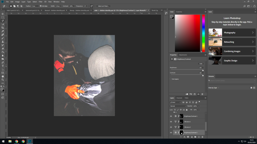
I noticed the way the model is grabbing the other model’s jacket resembles cracking from an earthquake, or perhaps an explosion. So I decided to edit the photo further in a way that will help exaggerate this. So first I selected the area of the hand.
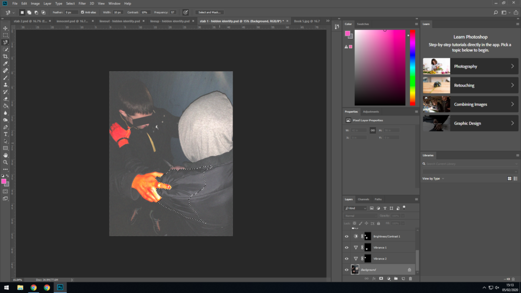
Next I bumped up the vibrance and saturation as high as they would go.
Then i selected the other model’s hand, further in the background.
And I applied the same filters to it.
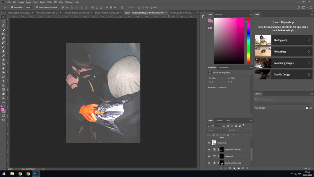
I also selected an area of the jacket around the hand in the foreground.
I then increased the brightness and contrast as high as they would go. This exaggerates the creases in the coat, and matches the almost cartoon style of the hand.
Finally, I removed all effects from the hand in the background, as it took the focus away from the foreground, which is what I was aiming for.
This is the final image.

Contextual Studies: LaToya Ruby Frazier

LaToya Ruby Frazier:

Context and Concept:

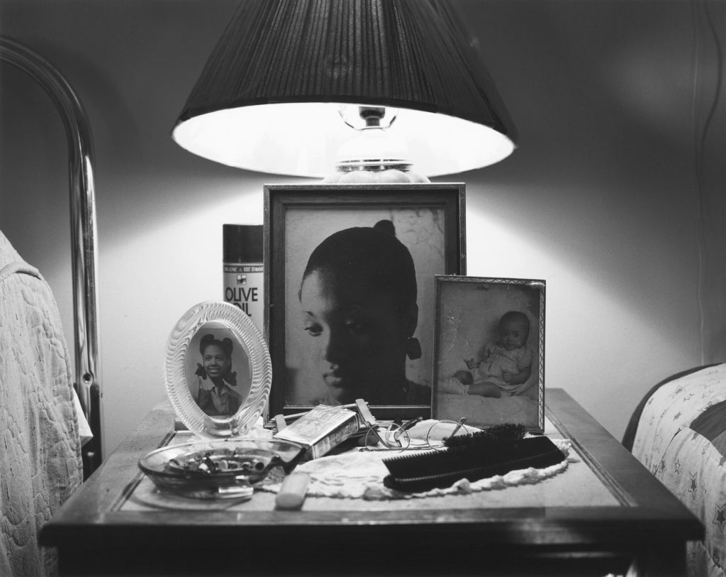
The Notion of Family (2014) is Frazier’s photographic series which aims to tell the narrative of her African-American family whom are struggling to come to terms with oppression (prolonged cruel or unjust treatment or exercise of authority) in Braddock, a suburb of Pittsburgh, and the negative physical and psychological effects of the city’s steel industry. The paperback photo-book also looks at the impact of racism in the small suburb as well as the decline in the community and family, showing her personal and political viewpoint towards this topic. In this she explore three generations of her family who have lived through these issues: her grandmother, mother and herself which reinforces the personal attitudes towards her imagery, who “lives parallel the rise and fall of the steel mill industry,” (Frazier:2014) . Critics refer to her photographs as a “weapon” of choice against racism, intolerance and poverty. This series about the substandard living conditions, hardships and withering effects of the pollution-borne illness that have effected the three women, on top of their struggles to survive, Frazier illuminates the human cost of political indifference and neglect. This begins to explain the conceptual and contextual factors of her work and how it has influenced her narrative.

Mood Board Expressing LaToya Ruby Frazier’s ‘The Notion of Family’ photographic series.

“The Notion Family responds to that call to suspend the passive aesthetics that turns abject poverty into an object of enjoyment” (Frazier:2014:’So Present So Invisible’)

The quote above comes directly from Frazier during an interview with David Company, who gains insight into her recent project ‘The Notion Family’. In this she supports her conceptual representation of showcasing the negative impact of poverty into the suburb and how it has massively impacted her family, whom are African-American. She suggests that the photographic book stops us from being susceptible, as viewers, and fully understand the crisis and the issue that she is raising through her imagery, which is done as a form of enjoyment and entertainment to us. Personally, I believe that she is correct in what she is saying as her imagery holds powerful political and personal response to this issue, as the message is at the forefront of the images. This is reinforced by the use of words, verbatim from her family, which reinforces these viewpoints, and allows us to become a more active viewer and allows the message to be more susceptible to the issue arising.

“I helped Gabriella Kessler and Jean-Loic  Portron by informing them about African-American families and residents that remain voiceless and invisible to mainstream media” (Frazier:2014:’So Present So Invisible’)

During her interview with David Company she explains how and clearly presents her conceptual elements within the photographic series and how it links into the contextual factors. In the quote above she is simplifying the point that her race, African-American, are being ignored by society leaving them to be seen and not heard. She talks about how a she helped tow people who work for the media understand this topic, as it is an issue which is ignored by journalists, thus these issues are not raised with the world. This presents the theme of neglect and really illuminates how poorly treated Frazier and her family are, thus emphasising the conceptual factors of her work. With the statement made above, I believe that what she is saying is true, as after reading around her work it is mainly art critics who are writing about the issue, but no other media source such as the news.

“I am obliged to document and counter this reality, and ultimately re-imagine and rewrite it myself.” (Frazier:2014:’So Present So Invisible’)

Above she is describing how she feels almost forced to outline these issues of racial discrimination in Pittsburg and document how it is affecting these people’s lives, in hope that she can changed the way in which they are treated and “counter this reality” so equality is accomplished within the small suburb. She talks about how this photographic series almost acts as her imagination, how she wants to reshape and create a better world were all races, genders, religions etc are treated equally with respect. Personally, I some what agree to what she is saying, after looking through the series the images hold a pejorative tone which only outline the state at which the town is in now and not the future. However, I believe this is done to also make the viewers reimagine what the town could look like.

Visual and Technical:

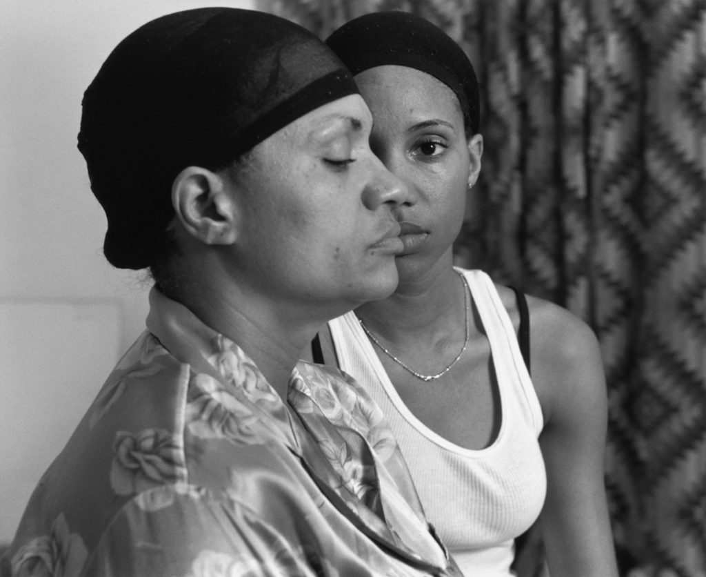
The photograph above is one my favourite outcomes from Frazier’s ‘The Notion Family’ photographic series. When looking at the image, initially out eyes are drawn to the woman’s eye in the background, located in the centre of the frame, thus making this the main focal point of the photograph. Moving around the image out eyes then move to the two models and then onto the plain background, which emphasises their race of African-American, due to the patterned curtain in the background of the imagery. Both models are wearing lounge wear with wig caps on suggesting they are in an environment where they feel safe. The women in the foreground is covering half of the other subjects face and has her eye closed which emphasises the concept that their race is only being seen and not heard and are almost voiceless and forgotten within the small suburb. In addition, the facial expressions on the women also suggest the ideology of a sense of being forgotten. The frame has a sense of space, which works well with the other formal elements of texture and pattern. The photograph itself is taken at a straight on angle with it being presented in black and white, allowing high tonal contrast to be presented, illuminating the texture. The portrait is taken as a landscape, which suggests that it is a wide and on going issue in the suburb, and is in the style of a head shot, which juxtaposes the actual reasons for a head shot.
Technically, Frazier’s work is simplistic which allows the conceptual and contextual representations to be the forefront of her work. The lighting used would have been artificial through studio lighting and lighting readily found in that room. The light source is soft and can be considered cold, which illustrates the brutality of this reality and how it has negatively impacted the families life. This works well with the low ISO which is used as no intended noise is being presented within the imagery. As well as the white balance being accurately set to an in door setting allowing for clear colour correction, illuminating the tonal contrast within the frame. In addition to this, the shutter speed is kept to a quick capture as there is no movement or intended blur within the frame of the photograph, which helps to compliment the ISO setting used. The aperture which has been used is roughly a medium setting as to some extent there is a narrow depth of field being used, as the background is slightly more blurred compared to the foreground. Due to this it creates a little blur which reinforces the ideology of the family being forgotten about in society.
Action Plan:

To further my understanding of the techniques and stylistic features of Frazier, I will implement these techniques into my next photoshoot. I intend to photograph my grandparents lifestyle through black and white portraits in order to raise viewers understanding of their social situation, employing similar conceptual reasoning towards my next photoshoot.
FIRST PHOTO SHOOT

PHOTO SHOOT PLAN:

  • WHERE: Within my personal study, I will be focusing on 3 main areas of study , personal, external and internal. The persona aspect of my project I will be looking at my own personal journey and the ways in which my family has occupied Jersey, capturing images of my own home. The external aspect of my project will be focusing on the exterior aesthetic o low cost housing within Jersey. Lastly the interior aspect of my project will done within empty properties, arranging viewings with estate agents in order to do so. 
  • WHEN: in order to capture the exterior photo shoots, I will be attempting to capture them during more gloomy and overcast days as I feel this will add to the themes associated with the topic at hand which is all about control and institutional discrimination. 
  • WHO: My project will be focusing less on people but rather places, I will be using documentary style photography in order to carry out my shoots, focusing on the state of the housing market and the truth of affordable housing. 
  • WHY: The topic at hand is personal to both me and a large population of Jersey. Immigrants, young people and the elderly, making it almost out of reach to buy or rent property which lives up to suitable standards. 
  • HOW: I will be using a mixture of both film and digital photography in order to carry out my photo shoots. A theme which I also want to convey through my work photography as it will be linking to the impacts of trauma and childhood. 

SUCCESSFUL IMAGES:

IMAGE ANALYSIS:

VISUAL:

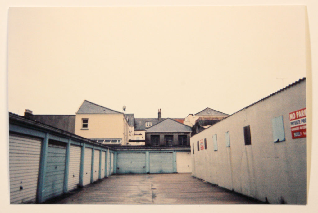
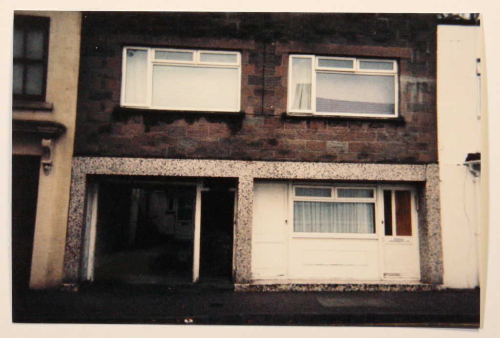
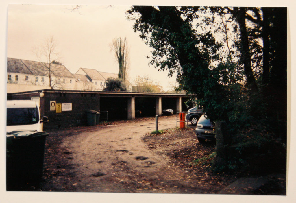
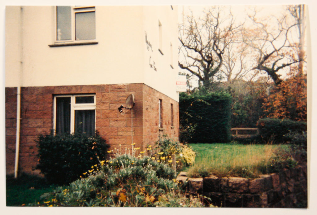
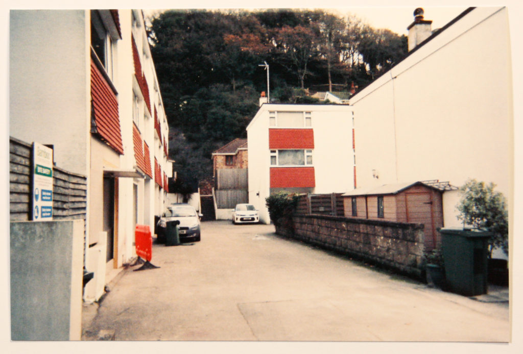
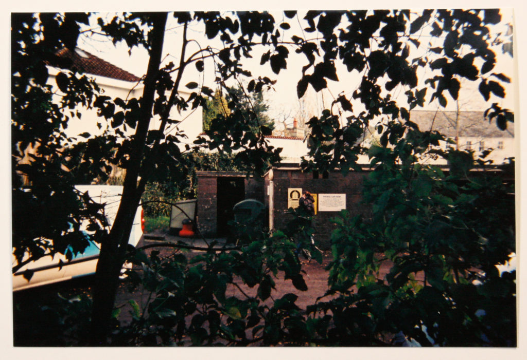
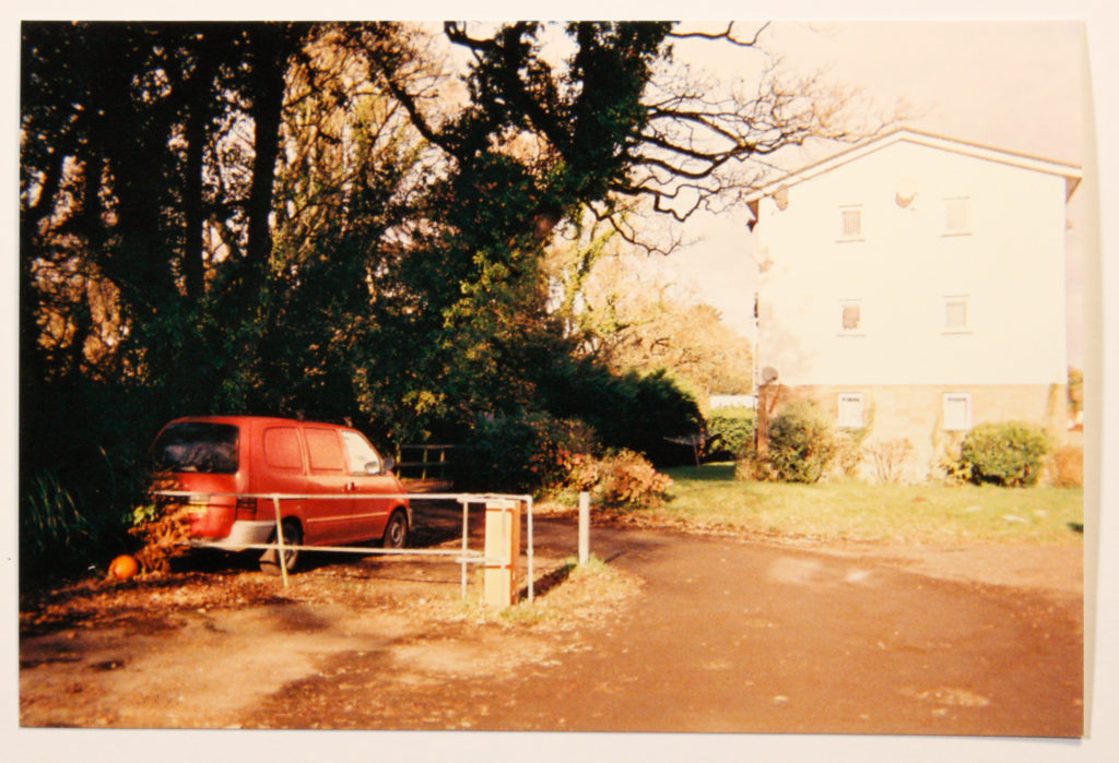
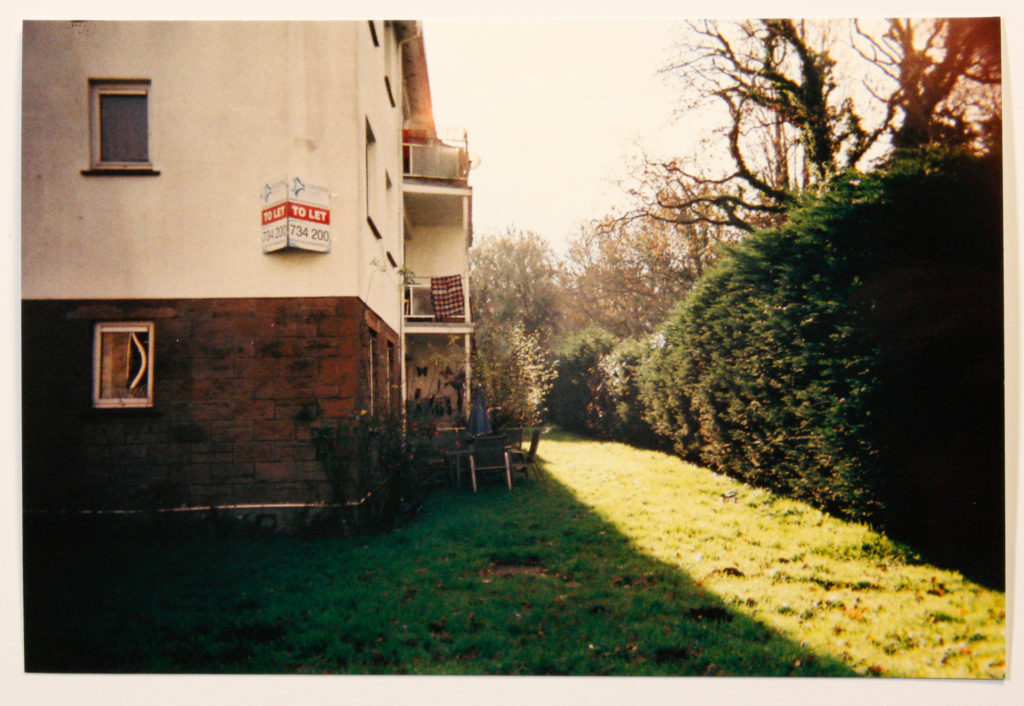
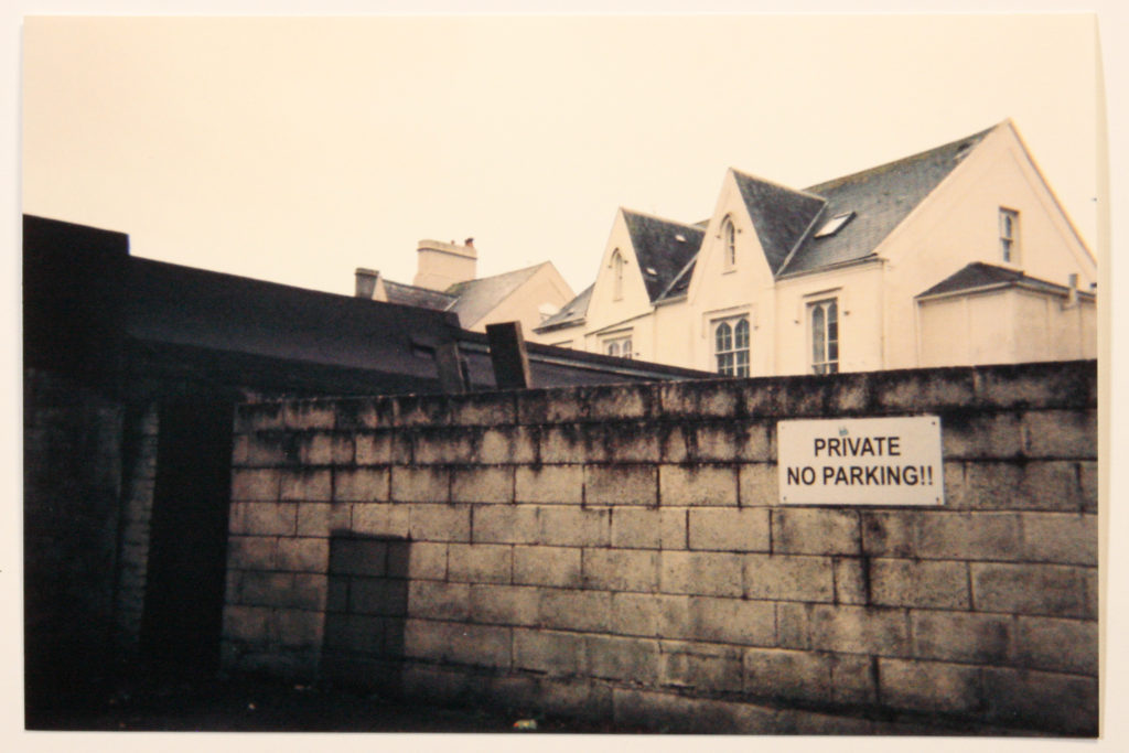
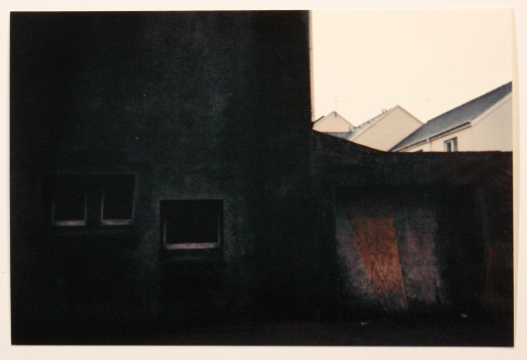
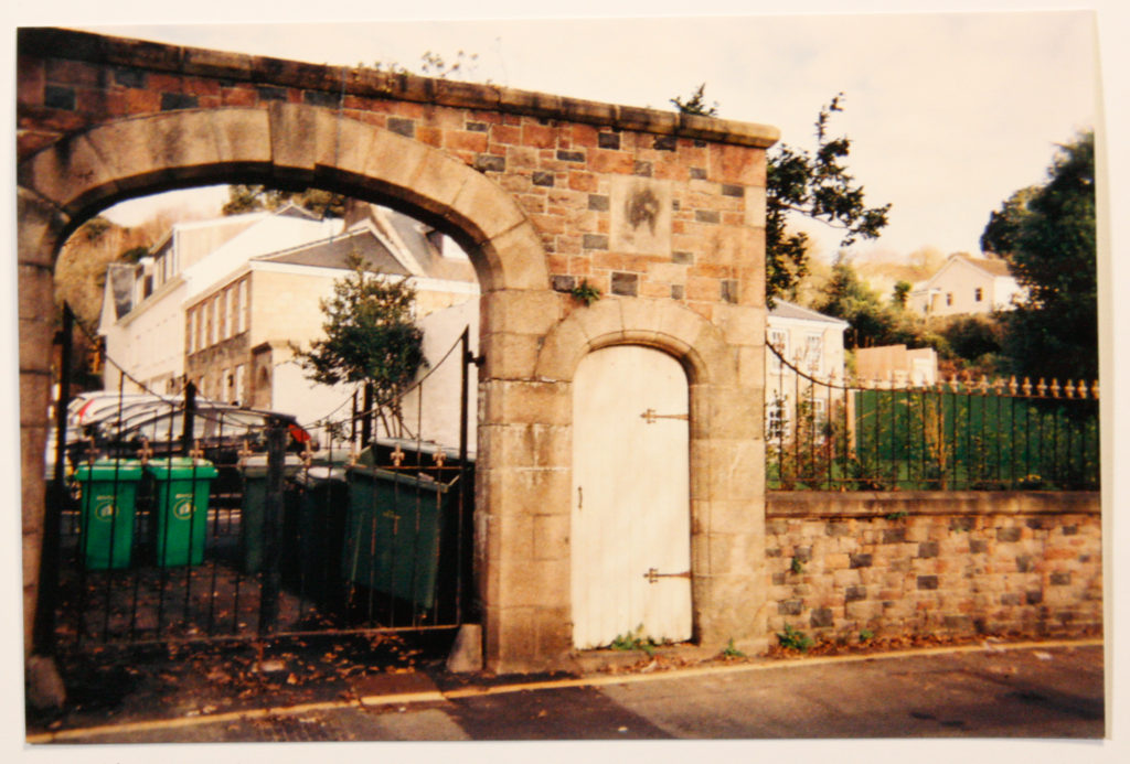
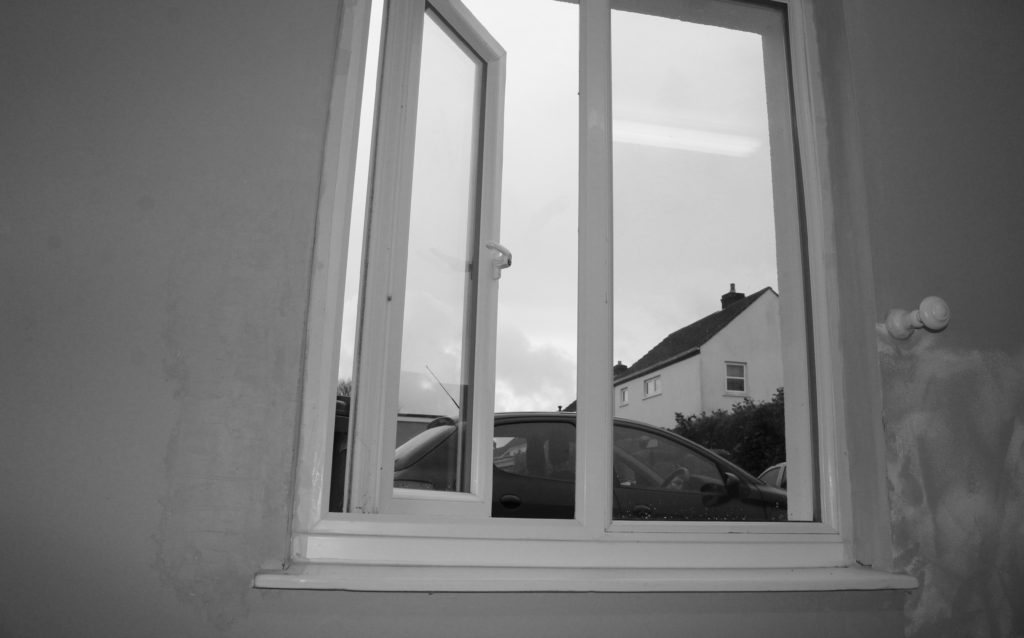
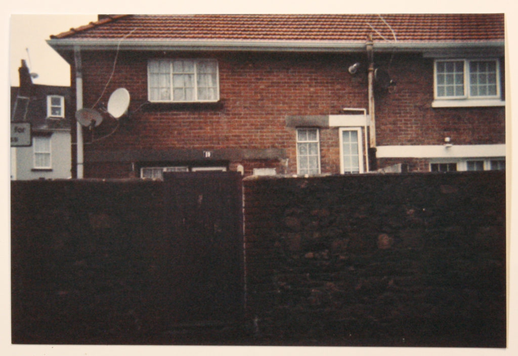
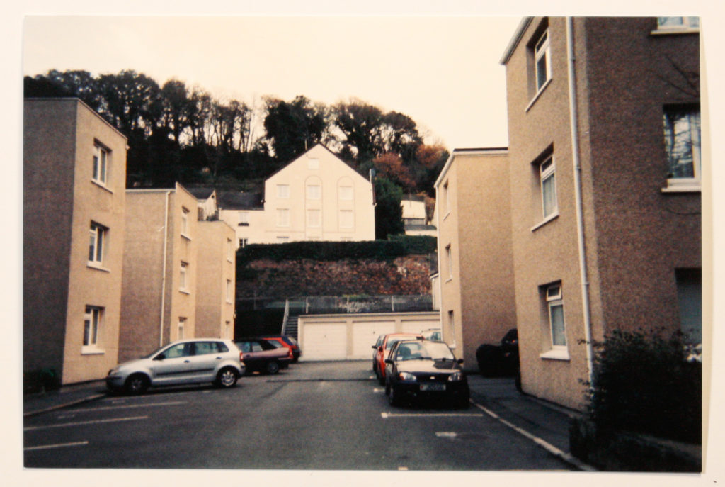
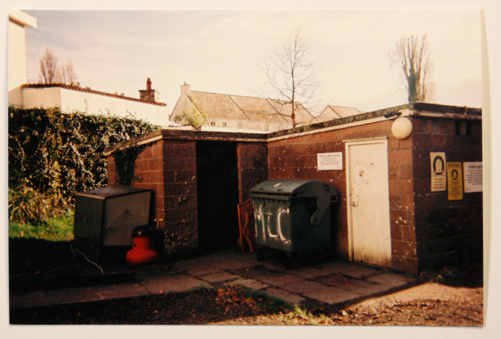
I find that the overall visual appeal of this image comes from the film which I developed, having a grainy texture and golden overcast which provokes feelings of nostalgia as if the image was taken by your relatives in the 80’s. Visually and on a surface level the image is not extraordinary, capturing a very mundane scene, but adding the contextual information means that there is more to the image than the eye can see. The first thing which strikes the viewer is the dark and dingy scene of the garages and dustbins on the outside, the ye being drawn to the bright white writing on in the center of the image. Another major aspect of this image is the light. The sun is hitting from the top right side of the image, totally illuminating the sky and casting a deep shadow on the left hand side of the image.

TECHNICAL:

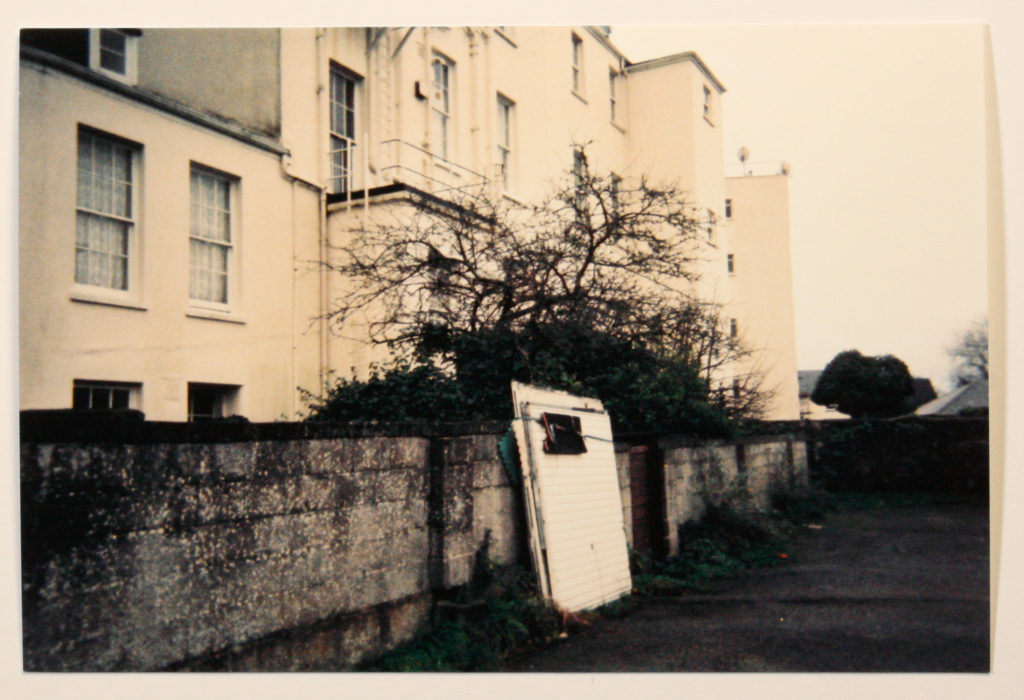
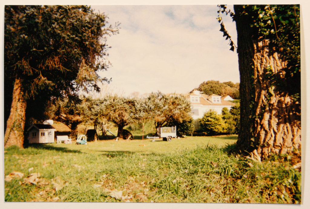
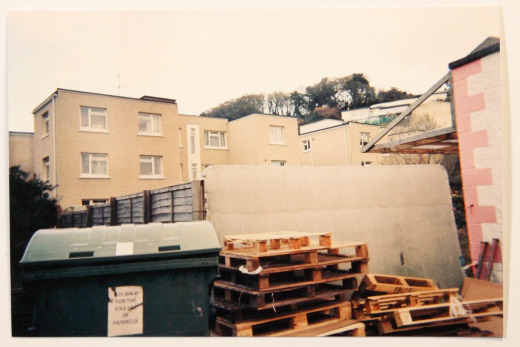
This image is a physical print copy of the film which I developed using a disposable camera, the overall aesthetic aspects of film meant that I had wanted to work with it for a long time. It is a difficult medium to work with for three reasons. Firstly taking the images is like a shot in the dark as you cannot see a preview up until the images are printed. Secondly there are restriction as to how many images you are able to take due to the use of film, I for instance could only take 39 images meaning that each shot had to be planned and meaningful as it would be wasteful to take any old shot, and even with careful planning some shots were unusable as they were either too dark or over exposed. Lastly the cost factor of creating these images was also a large part to the difficulty as disposable cameras can be quite pricey depending on the quality, mine being £11, also costing £9 to develop the images meaning it is not a viable source of images if images need to be taken quickly and efficiently.

CONCEPTUAL:

Going back to the theme of nostalgia and wanting to home in on this, Using film was an effective way to achieve this. When looking at the image, one of the first feelings which is provoked is nostalgia with the grainy, warm nature of the final prints, looking like family archival images which have been taken from the attic, dating back to the 80’s. I want to to retain this feeling throughout my images as it is a different approach to modern digital photography. Using a medium such as film makes me appreciate photography on a deeper level by making me consider each shot before taking it due to the material restraints of using film. Each shot has to be planned and considered as this isn’t a priority anymore when using digital photography. Even if each shot is not perfect, I will be including each shot as this will reflect the “take what you can get” approach of housing as people will, in desperate times, take whatever comes their way.

CONTEXTUAL:

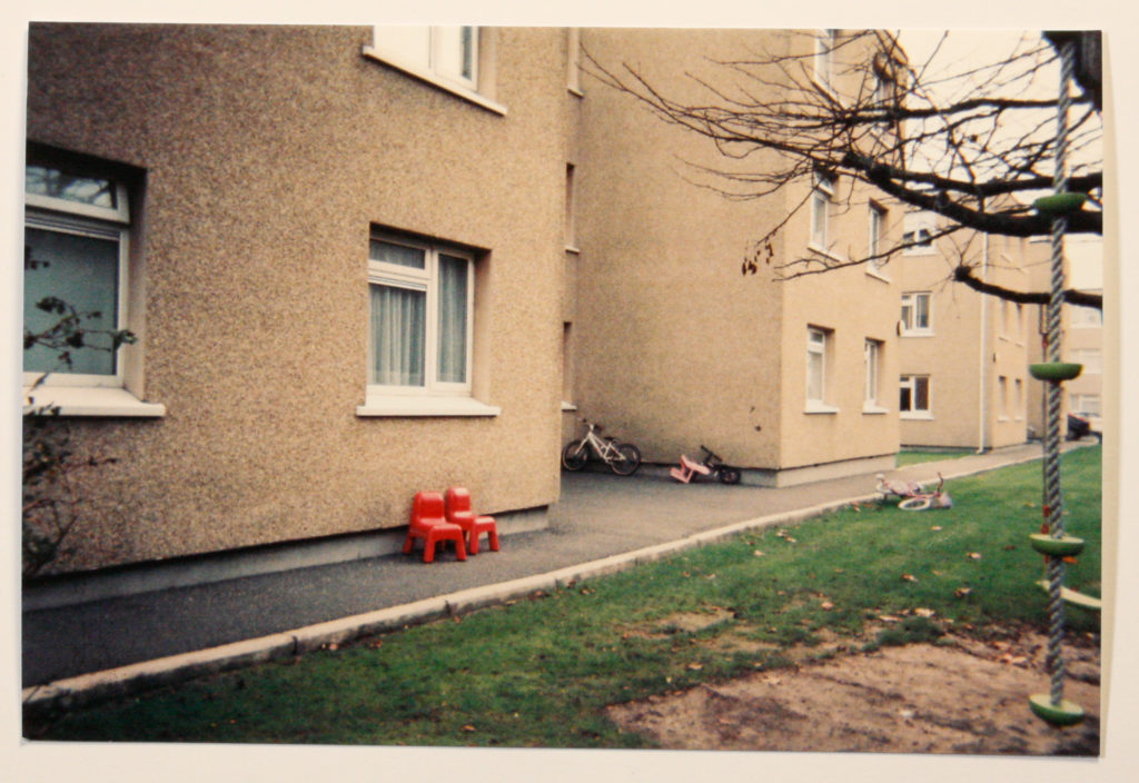
States figures suggest the elderly, younger people and smaller families are struggling to find suitable and affordable accommodation in the private sector. A reflection of this struggle can be seen within the social and low cost housing of Jersey. Currently demand outweighs supply therefore the need for affordable housing is in more need than ever.

EDITING IDEAS:

An idea which I found to be quite interesting in terms of the visual aspects of the image is tracing the outlines within the image and then moving this traced layer to one side, creating a sort of child like drawing which can be seen a top of the original. Although not directly linked to any contextual information to the image, I find that this editing technique is an effective way to give an image a stronger focal point and to draw interest.