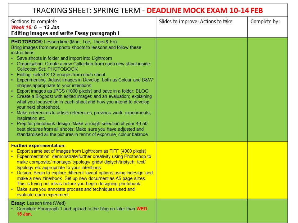
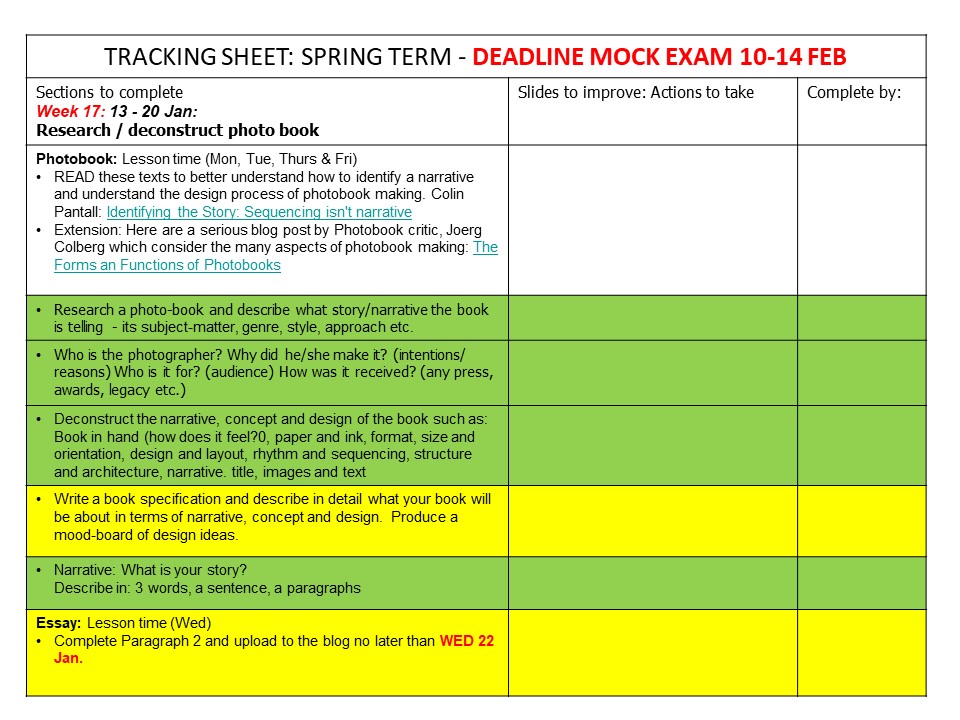
Green: Completed.
Yellow: Started/Not finished.
Red: Not started.
Green: Completed.
Yellow: Started/Not finished.
Red: Not started.


Book Name: INCURSION
Initial Layout

Second Layout
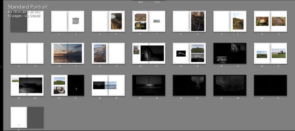
In my second photobook layout, a few of the spreads have been rearranged and sequenced so colourful images are presented in the beginning of the book and gradually the images become black and white. Text has also been added to pages 3 and 7 describing the beginning of what happened in Operation Hardtack 28. The panorama image on pages 16 and 17 from the first layout has been removed and will be printed individually to be applied as a fold-out in the final photobook on pages 14 and 15.
Double page spreads of coastlines have been included in the book to show the landscape which the bunkers were defending.


I have Decided to include two small paragraphs which provide context on what operation Hardtack 28 was, this is crucial for the viewer as I am basing the commando mission as the beginning of my story.


The reason behind the spread showing an establishing shot and detail shot of one of the bunkers located at Fort Henry, paired with a pitch black photograph showing a spotlight is to signify what role the bunker took when defending the Island from allied forces.




Narrative:
Design:
To what extent does Surrealism create an unconscious representation of ones inner conflicts of identity and belonging?
To conclude, I believe that to some extent Surrealism creates an unconscious representation of one’s inner conflicts with identity and belonging. Throughout the work of Claude Cahun, it is evident that imagery of belonging is present; for instance, the concepts around her sexual identity and how that “works” in society. However, in terms of the unconscious mind I feel Cahun’s work is limited as the issues proposed are part of her reality and conscious, which is also shown through her ambiguous name and open sexuality in her daily life. Claude’s work is at the heart of surrealism when it comes to ‘avant-garde’, nowadays people aren’t scared or ashamed to be gay but back in the 1920s it was a taboo topic that she wasn’t afraid to discuss. Ray’s work doesn’t focus on topics such as identity and belonging, he keeps his concepts deliberately enigmatic. As one of the pioneers of the movement proves that surrealism isn’t just about feelings but about breaking the chain of repetition in photography. Linking to the idea of unconscious, Ray’s images involve dream-like visions of black and white. His Rayographs specifically act as works of the imagination and leave the audience in a state of confusion. Overall surrealism does create unconscious representation but not always following issues of identity and belonging, the whole idea of surrealism is going against the current and creating photos that are unique. Therefore, not all surrealists explore the same concepts, some don’t even have a reason for their images. The messages Cahun and Ray wanted to convey was that photography can be whatever you make it, whilst challenging pre-conceived notions, readings and conventional approaches.
Both artists are extremely influential surrealists, but they use different elements of the movement in their work. In comparison to Cahun, Ray is more of a creator of surrealism whereas Cahun is developing and extending the idea. Ray doesn’t involve issues such as belonging in his Rayographs, it’s more about abstraction and exploration, he takes household object and makes them into dreamlike visions, rather than dream like concepts. Although some of his images did include silhouettes of his head and his partners head, this image connected to the idea of an autobiography running through his rayographs. His images didn’t so much involve conflicts of identity but rather a narrative of his life and the people in it. ‘We need to insist that we read a photograph, not as an image but as a text.’ This quote is taken from Graham Clarke and I feel it is the basis of surrealism. Both photographers don’t just take a picture in the moment, they set up a narrative, not necessarily a clear one but there is a reason for their work. The idea that we need to treat a photo as text, is seen throughout their work, especially with Claude where she uses her images to create a story around her sexual identity.
Looking back at the question it’s clear that surrealism involves topics of identity, but it doesn’t just stop there, the subject matter is endless. For instance, Man Ray doesn’t use his work to explore self-conflict but rather to explore photography as a medium. The camera-less images are groundbreaking in the way that we don’t even need high tech equipment to make an image. With the Rayographs he makes a statement rather than text, surrealism is about breaking regulations that were once in place surrounding photography. Cahun’s work focuses on portraits, almost all her images feature a person, whereas Ray uses objects as his focal points. “In any image, however, the primary frame of reference remains the subject of the photograph,” is said by Graham Clarke. This relates to how the people and objects featured in the artist’s work become the backbone of their narratives. Roland Barthes came up with the theory of connotation and denotation which represent the difference between straight photography and surrealism. In Cahun’s work she uses people and their clothing as connotations to create an idea behind literal subjects. In straight photography everything captured has a denotation, it has no depth to its meaning, for instance a portrait of some men farming has no narrative, it is what you see. Whereas Ray uses a combination of objects to collectively create connotations, this allows the audience to decode the underlying message of the image.
For my personal study and the narrative I am going to be exploring the photographical approach I will be using is Documentary photography.
The definition of Google for documentary photography is : “Documentary photography usually refers to a popular form of photography used to chronicle events or environments both significant and relevant to history and historical events as well as everyday life.”
I watched a couple videos on the history of Documentary photography and who’s work contributed to this approach.
The video above is a from a Ted Talks from a man called Billy Weeks. In his video he explained that his voice was going to be used through photographing things, people, objects and that’s exactly what he done. The video being titled “two views” is a high indicator that in every image there is always 2 people, the subject and the person behind the lens. We doesn’t see one person but we as the viewers know that they’re there. Without documentary photography many great social issues would not be publicised and would be censored into the unknown, therefore by having practices like this its opening views and doors for people that they might not even know existed.
Later on in the video Weeks also talks about several photographers associated with this practice like Robert Capa a famous war photographer who once said that ‘If your photos aren’t good enough its because you’re not close enough…’ Unfortunately for Capa, he was later killed in the battle field but, what made him so different from other documentary photographers is that he knew that in order to tell the narrative you needed to live in that narrative.

Robert Capa was born on October 22nd 1913 to a Hungarian family and was later discovered through his journalism skills and his photography skills. Capa fled political repression when he was younger, moving too Berlin. He also watched the rise of Hitler which then lead him to moving to Paris where he met and began to work with Greta Phoroylle. During his time as photographer he conquered 5 wars . The Spanish Civil war, the second Sino- Japanese War, World War 2 across Europe, the 1948 Arab- Israeli War, and the first Inodchina War, with his photos published in major magazines and newspapers.
What I learned from this video and Weeks’ practice that in order to capture that documentary style image a piece of the photographers background has to be captured. For this project I will be trying to incorporate importance in the setting of each image and the subject or the object I will be photographing.



The book I have chosen to look at is called “Mother” published by Mathew Finn. His book contains a series of images of his mother. He explains that over a 30 year period he took images of his mother and reveals that they weren’t set out orderly and that it wasn’t something he put a huge amount of thought into until later on in his life. None of his images include his dad which is significant to him as his dad wasn’t present during his childhood or even adulthood. He had half brothers and sisters he wasn’t even aware they existed until the day after his dad’s funeral. He explains in his biography ” the more I knew about my father, the more I felt the need to protect my mum…”
There wasn’t a particular reason to him beginning to photograph his mum, apart from the fact they lived together and they were a lot closer due to his dad not remaining in this life. Mathew Finn was the photographer however he explains his mum was more of the director. She was aware of what angles she looked best and became more aware of how much lighting would be need in order to produce the best image. He explains that for his mother and him the roles switched when she was diagnosed with dementia. She fell silent and started to lose herself therefore their collaboration began to crumble. He explained that he no longer existed to her and what remained were those pictures to show her. On Christmas Day he shown her the images and asked her if the images described her to which she replied “I don’t know… maybe they do..”

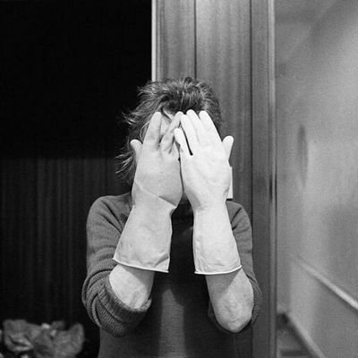
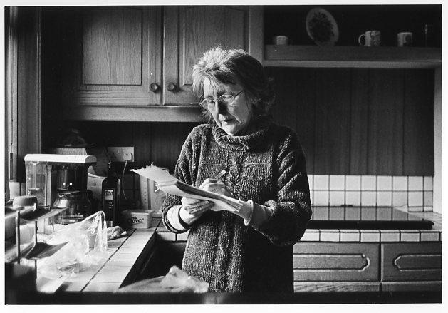

The book he made is a hardback book A4 with most pictures being a4 but a couple of the images he has overplayed across both pages creating an A3 image. All the images in his book are black and white with a few images taking up the whole page and some images quite central to the paper. There are a couple examples he has put a very minimal and empty image next to a blank page which then leads the viewers to question why he has done this? There isn’t a set layout for the images in his book some are full page others are A5 with a white border around it. There isn’t any text on the images