The final products of the editing process can be seen below:

In this image, I was looking to focus on editing to paint the picture of the contrast between feminine and masculine features. The broken, split appearance of the image is meant to signify the broken and split boundaries of gender norms, that are presented in the image. The choice to include pink as the boldest colour in the photograph, was decided due to the fact that pink is often seen as a delicate, feminine colour, yet in this context is being used in a bold manner, with a bold pink tone being used to split the black and white fragments of the image. This image was created with the idea of liberation in mind, with the gender and identity of the individual being expressed as bold, proud and strong.

I have selected the above image as a final image due to the shapes and details within it. I feel that the shape of the forearm in the foreground is eye-catching, and draws viewers into the detail of the arm. It also makes it very clear that the arm is of a male, and therefor the viewer may assume immediately that the subject is male. However, the feminine clothing in the background, and the delicate, soft colours of the image give a contrast to this view, and provide contrast between masculinity and femininity in the image. I feel that this image presents a contrast between stereotypical male gender roles, and the defensive, masculine posture of the subject draws attention to the fact that the subject has to hide the feminine side of themselves (the floral dress) in order to present themselves as stereotypically masculine in order to avoid judgement from the outside world.

I feel that the simplicity of this image allows it to covey the meaning in a more fluid and subtle way. I used the split down the centre of the image to represent a split in an individual persona; how they present themselves on the outside may not be the way that they feel on the inside. The cut could also represent a split between what an individual knows is considered socially acceptable, versus what they wish they could be. I feel that the solemn, sturdy pose of the subject (hands held together in-front) helps to express the idea that individuals often have to keep these internal conflicts hidden from the outside world to avoid being judged or stereotyped.

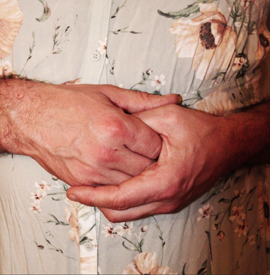
I selected this image as a final image, as I feel it represents and brings to light the more delicate, emotional side of men, and shows that, regardless of the masculine presentation of the individual, their ability to feel, love and their need to be cared for is no less. This image is made to reflect the more feminine aspects of gender stereotyped; the subjects hands are posed in a delicate feminine manner, and the slight warm hue of pink/red is meant to give the photograph an overall soft, feminine feel. However, this is all contrasted by the masculine shapes of the hands, which are placed as the main focal point of the image. I feel that by placing the subject in a feminine pose, while also drawing attention to the detail of the masculine features, helps to reflect the way in which, although an individual may present as stereoypically masculine, clues may show the reality of hidden emotion, and delicacy.

This image, I feel has a slightly vintage appearance to it, with the slight blue hue giving a vintage magazine effect. I decided to use this image as a final image due to the shape of the subject, and the hue that is edited over the top. I feel that the simplicity of the pose helps to draw attention to the clothing of the subject (which is the focal point for this particular image) and the close up allows for the detail of the masculine, contrasting features to be shown. I feel like this image is simple enough to be used as a single image that could sum up the entire study, and its simplicity makes it appealing for a stand alone image.

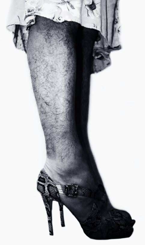
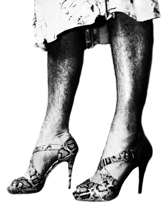
I feel that this image reflects the work of Helmut Newton, in the way it presents the subject in a posed, model like way, with the focus of the image being the legs of the subject. Using inspiration from Newton, I heightened the contrast of the image in order to draw attention to the details of the shape of the legs, and the details of the clothing of the subject (which contrast one another). I wanted to flip the idea of Newtons work, using a male subject to reflect the reality of the way that Helmut presents his models. Using a male model in a similar way helps to draw attention to the way in which we are desensitised to the sexualization/presentation of women body in media, and yet are not at all used to the same concept occurring with men
For this photo-shoot, I was looking to focus on the contrast between masculine and feminine features, and show how, in the modern era, these contrasts (which were once much more prominent and strict) are beginning to merge into one another. My focus for this photo-shoot was to create a response in the viewer, as the images are bold and striking in their contrast, and therefore I attempted to present a moral example to the viewer, asking them to decide whether the images make them uncomfortable, or whether they embrace the images and the way they differ from typical gender stereotypes. For this photo-shoot, I feel like I was able to show a striking contrast between typical feminine and masculine features, in a way that draws the attention of the viewer, but also reflects the progress that the world is making towards their views on gender and the lack of boundaries that should be placed on individuals when expressing themselves.
