Invisible hands exhibition

Invisible hands is a very intriguing exhibition by Alicja Rogalska in association with The Morning Boat, and also migrant workers. It is on show at the Jersey Arts Centre and it aims to show Jersey through the perspective of the migrant workers in Jersey. I think this is very important as the seasonal work undertaken by these migrant workers has always been vital to Jersey’s economy, however it is an area that is not very well documented or known about.
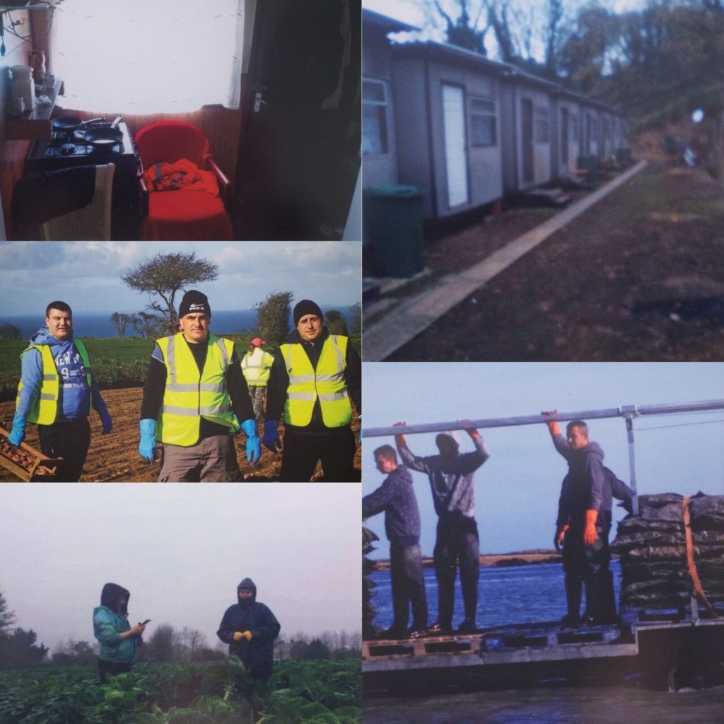
As you can see from some of the images on the mood board, technically, the images are not of high quality. This is due to the fact that the migrant workers actually took the images themselves. Because of this the images give us an interesting first hand insight that a photographer would not be able to achieve. So, although they may not be of high technical quality, they are conceptually and contextually rich.

During the exhibition a video was played, which showcased the migrant workers, but not their actual faces in order to allow them to be more honest about what they face. In this video we saw all the migrant workers creating clay potatoes as this is a symbol of what they do. As they were making the potatoes they spoke about important criteria they felt was important to meet in order for an employer to be awarded the Agri-care prize.
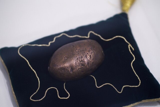
The Agri-care prize is an award for the best employer in the agricultural sector, which was created with the help of migrant workers. Through conversations with Polish manual laborers, the criteria for this prize was created. During these discussions, they made clay potatoes as I mentioned above, and the best one was selected to be cast in bronze and used as the physical award. During the exhibition I learned that some of the criteria that the workers felt were important to meet, could only be achieved through legislative changes and industrial action in order to created a fair working environment where workers are not exploited.

I thought that this exhibition was very important. Highlighting this aspect of Jersey’s agricultural sector is super important as there is not much known about it, meaning that there are many people living and working in conditions that most people would be appalled by. This exhibition highlights the importance of being socially aware, through first hand testimony and images which triggers emotion within the viewers, which in my opinion, makes it a very effective exhibition and project. I really like how the photographer decided to let the migrant workers capture the images, as it allowed the concept to shine through more clearly compared to if she had decided to photograph it herself. I also think that having a video conveyed more emotion and context as images are limited to only appealing to an audience visually, where as being able to hear from the actual people who are suffering makes it more personal. The exhibition name “invisible hands” is emphasized by the fact that no one face is seen in the video, and it also has a metaphorical meaning as these are the people that our society, sadly, doesn’t notice.

I especially like this exhibition, as it partially fits into the beginning of my personal study since both my parents were economic migrants before they decided to settle in Jersey.

My first shoot plan/ARTIST RESPONSE

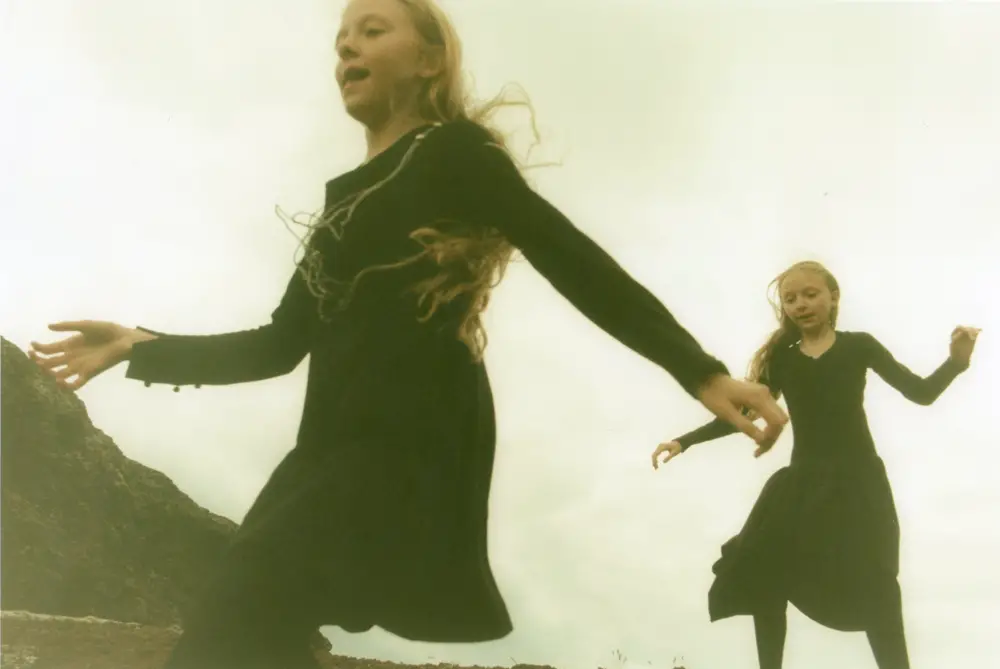
For my first shoot I plan to take inspiration from Ariko Inaoka and replicate the third eye image. I want to recreate this as it has a very dream like feel to it and can replicate their unique connection to eachother. To recreate this shoot I will photograph the girls outside because I feel that being outside in nature gives the image a more pictorialist approach and has a dream like effect. We live quite close to a lot of trees so I will probably photograph them there. I will use facepaint to draw the eyes onto their heads. I will dress the girls in either all white or black to have similar outfits and to make the audience focus more on the eyes rather than what they wear. I will take the photograph in the afternoon to have a lot of light in the photo and have lots of exposure to help with the dreamy effect. 
Image result for Ariko Inaoka

ARIKO INAOKA

Ariko Inaoka is a Japanese photographer who photographed two Icelandic twins for 5 years. Inaoka believes that the twins have a telelpathic connections as they are always together, never fight with eachother and claims that she has never seen such a powerful connection between two individuals. One quote that she got from the twins which Inaoka says they tell her a lot is that "We dream the same dreams sometimes". Dreams are individual and unique to every person, it is often the peak of people's imagination as their mind is allowed to freely flow. By having the same dreams indicates an intense connection between the two, leading the mind to imagine that maybe they do have a telepathic connection. A good website for images is the Guardian:  https://www.theguardian.com/artanddesign/gallery/2014/nov/23/ariko-inaokas-photographs-of-devoted-icelandic-sisters-in-pictures 
Image result for Ariko Inaoka
I believe that the eyes drawn on their heads is to connote the ‘third eye’ and Inaoka is trying to make the readers think that they have an ethereal connection aswell as a telepathic bond.
Image result for Ariko Inaoka
Inaoka uses a pictorialist approach to her photographs, making the images hazy and dream like. I think that Inaoka considers the twins claim that they dream the same dreams sometimes and tries to replicate some of them. I want to use some of Inaoka's techniques in my personal study to portray the intense connection my sisters have. Although they are very different in many ways, they're also extrememly similar and have an unique connection. I will increase the haze whilst manipulating my images to create a pictorialist approach and I also want to use the idea of drawing a third eye on their heads to replicate their telepathic connection.
Ariko Inaoka
Erna and Hrefna - Ariko Inaoka - Phases Magazine

Photo-shoot 1: Planning

For my first photo-shoot, I will be focusing on the liberation of male gender stereotypes and roles. I have decided to dedicate a photo-shoot to this, as I think including both male and female stereotypes, and struggles related to the pressure of abiding to a strict “gender model”. In being able to showcase men breaking from the gender norms of being strong, unemotional, adventurous and competitive, I will be able to show a new perspective, where men are presented as being delicate and emotional human beings, and are not confined to the characteristics that society has laid out for them. For this photo-shoot, I will take a lot of inspiration from photographer Phoebe Jane Barrett, as in her work she portrays the delicate, emotional side of men, and draws attention to the unrealistic belief that all men must be emotionally detached and constantly strong in order to qualify as having masculinity. In taking inspiration from Barrett, I will be showing contrast between stereotypical femininity and masculinity in my work, and will be highlighting this contrast through overt and obvious visual examples, such as placing a masculine object/action/concept directly next to a feminine one, or merging the two together.

I have decided to take the approach of merging together both feminine and masculine traits in an obvious but thought provoking manner, and in order to do so, I will be using a male subject, and will be placing him in stereotypically feminine situations and scenarios, all the while keeping his identity hidden from view. In doing this, the viewer will be forced to only consider the contrast between the male model and feminine activity/scene, and will only be able to develop an opinion on the actions themselves, rather than the identity of the subject. Removing the identity of the subject also allows for the conclusions that the viewer develops, to be generalized to all individuals and scenarios in which there is a contrast between the stereotypical “gender” of a specific activity/scene/scenario, rather than focusing on the identity and individual scenario that the subject is in.

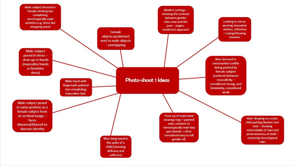
I have produced a mood-board in order to collect some of my ideas for my 1st photo-shoot:

John Stezaker

https://www.saatchigallery.com/artists/john_stezaker.htm

https://www.theguardian.com/artanddesign/australia-culture-blog/2014/mar/27/john-stezaker-sydney-biennale

John Stezaker is a contemporary British Conceptual artist who is best known for his collages of found images taken on postcards, film stills and commercial photographs. Stezaker’s work resembles early Surrealist and Dada collages. 

With surgical like precision, Stezaker overlays distinct images to create new personalities, landscapes and scenes. “I’m using an archive to create another archive of my own,” he elaborates. “My ideal is to do very little to the images, maybe just one cut: the smallest change or the most minimal mutilation. What I do is destructive, but also an act of deliberate passivity.”

Stezaker has a collection of photographs, some which have been sliced in half diagonally or carefully cut around so that only a silhouette of the face remains. He collects photographs in order to deface them and in the process, create something new. His collages give old images a new meaning. He states that “There is something very odd, even unnerving about cutting through a photograph; It sometimes feels like I am cutting though flesh.”

One of Stezaker’s most famous series is called Mask where he fuses the profiles of glamorous sitters with natural landscapes or architecture to create images of eerie beauty. By simply placing an old coloured postcard of a landscape across a face he creates a strange new world. The end results are both deceptively simple in their execution and oddly disturbing in their suggestion. “When we look at a face, we assume that we are looking behind the face for a personality”, he says, “By making literal that behindness, I often create something that twists into an image of horror”.

I have chosen John Stezaker as one of my references for my personal investigation because I like the concept of hiding the facial features of the subject with a postcard showcasing nature or architecture. When I create my own collages, instead of using postcards I will use archival images depicting countries I have lived in and their most iconic scenery and architecture. These photographs will make the country clearly identifiable through symbolism and well known places or landscapes. These archive images will cover the face from my current self to convey how living in different countries has shaped my current identity. Perhaps I could also capture portraits of my parents since when I think of “home” I associate it with them since I haven’t had a long term house or place I have lived at. In order to replicate Stezaker’s collage style from the series Masks, the archival images will have to blend with the face. Although there will be minimal manipulation to the images, the overall design will have a huge impact.

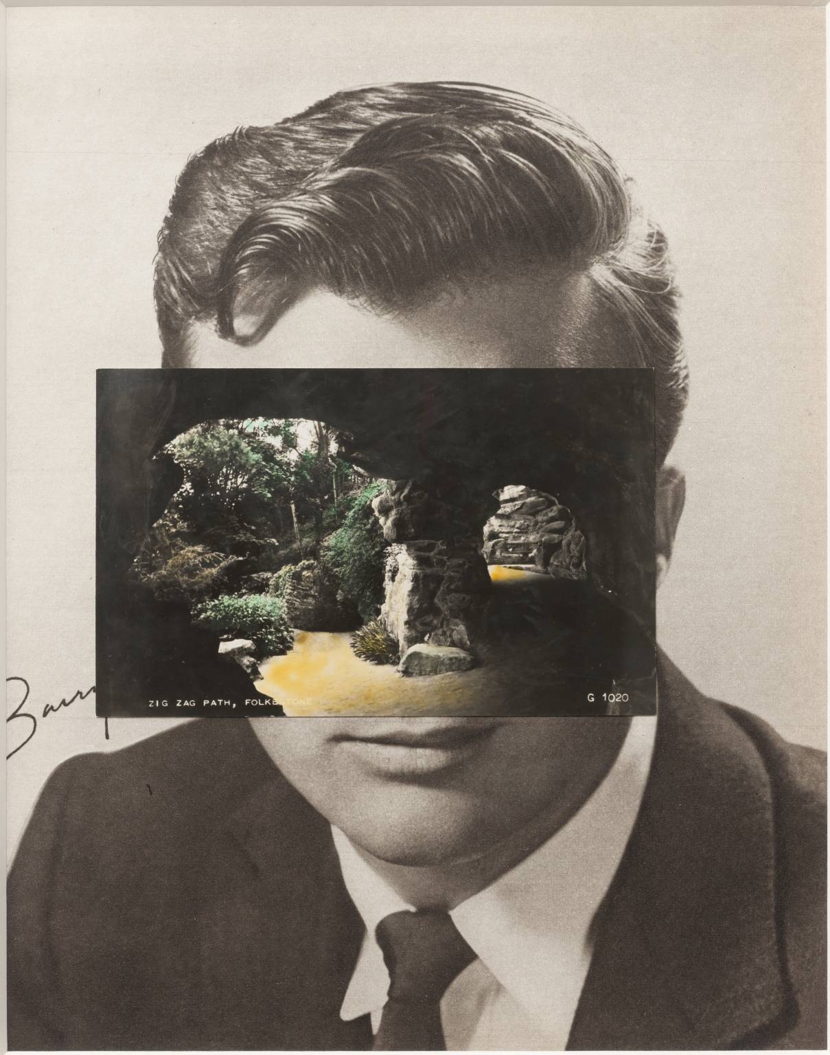
https://www.tate.org.uk/art/artworks/stezaker-mask-xiv-t12347

Mask XIV 2006 John Stezaker

The image depicts a collage created by superimposing a postcard on a black and white photograph. The photograph is a film publicity portrait of an unidentifiable actor taken during the 1940s or 1950s. the postcard is a colour image mounted over the actor’s face. It showcases a rocky cavern in which a sandy track curves around a central pillar. The postcard photograph appears to have been taken from inside the cave looking out through two openings towards the light. Stezaker has positioned the card on the actor’s face so that the dark silhouette of the rocky opening and the curvature of the cavern line up with the contours of the actor’s face. This placement creates human features. The two openings to the light suggest eyes connected by the rocky central column which covers the actors face in the position of his nose. This is an unusual composition and is definitely associated with the term “uncertainty” because we as viewers have no idea who the person behind the postcard is. His story is also unknown and we do not know the reason why that image has been associated with him, other than the fact that the suggested facial features of the postcard aligns with the portrait.

Third Shoot- Costuming Images

Planning the Shoot

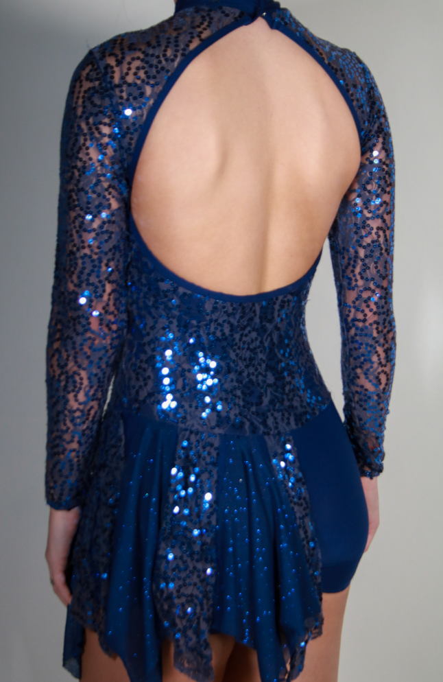
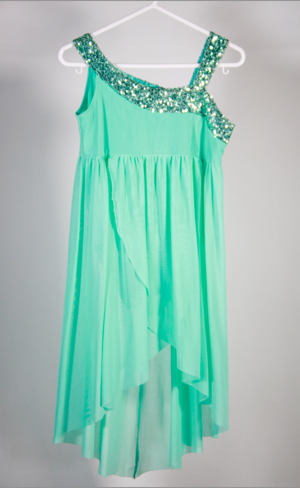
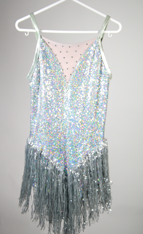
For my last photo shoot I will using self portraiture as a way of representing fashion through dance costumes. The influencer for this shoot is fashion photographer Hasson Hajjaj who is known for his colored photography, as well as being a self-taught designer and filmmaker. I have chosen him as an influence as I love the sense of fashion he includes in his photos which he captures in a colored background using a fast shutter speed. I think this will fit in well with my other shoots and my whole photo book as costuming can be seen as another archival term and represents fashion throughout different years and how it has developed. The costumes will be linked to my other shoots to create a selection of images where you can see the growth of costuming within dance. These images will be in the photography studio with a plain white background where I will be both photographing costumes as well as modelling my recent costumes in a way of self portraiture. Due to Hasson taking his images in portrait style therfore I will follow the same layout as I think this will be an easier way to show my images in a book. I will also not include my face in this shoot and may include dance poses to add to the dance element. The images will also be in color as it relates back to Hajjaj’s style as well as helps to show the costumes for how they realistically are. Futhermore, i will be using artificial lighting which may include a transmitter to capture my images, I will not be using any flash photography as I don’t think this will help towards the effect of my images.

Looking into camera settings/ equipment into more detail, I intended to use a Canon Camera with a setting on Manual Focus so i can play around with the camera settings freely. The use of a tripod will be important as there wont be much moving around in the image and i can then place the camera to a height where i feel as if will be the best angle to showcase the costumes. The artificial lighting will be coming from a soft box which will be placed to each side of me as well as an additional light in front.

Process of Elimination

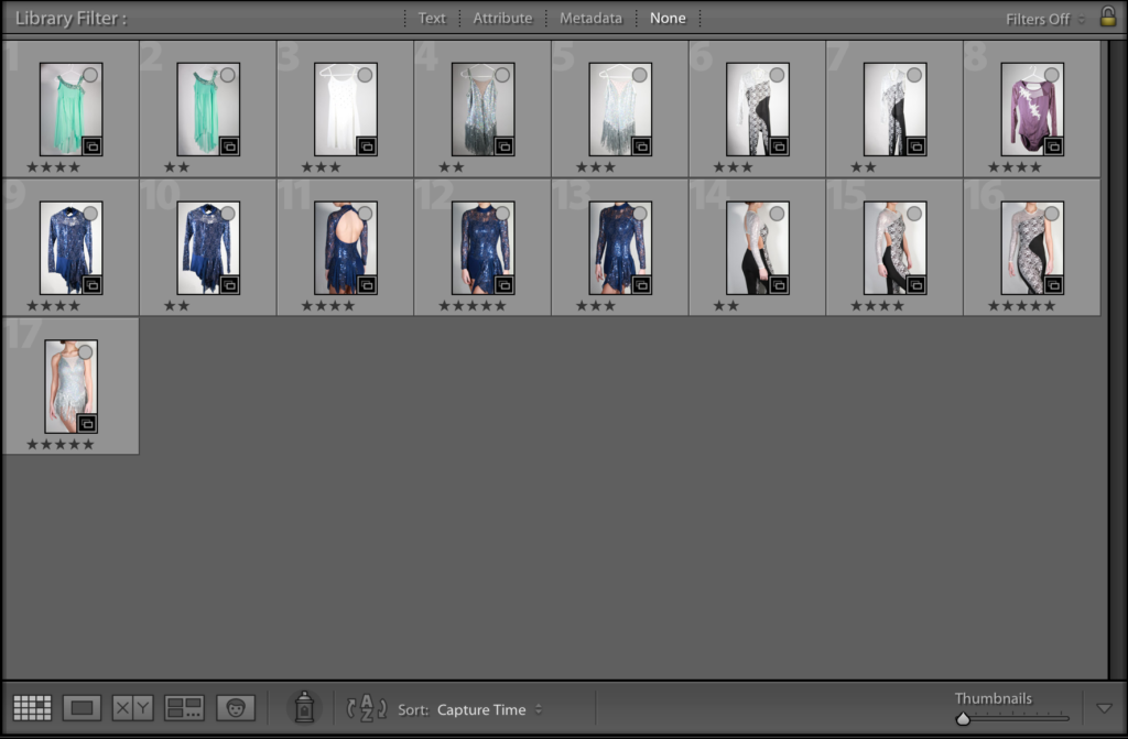
I firstly sectioned the best images from others in order to allow it easier to choose the overall best images.
I then rated the images out of five stars to show further selection.

Planning Editing Process

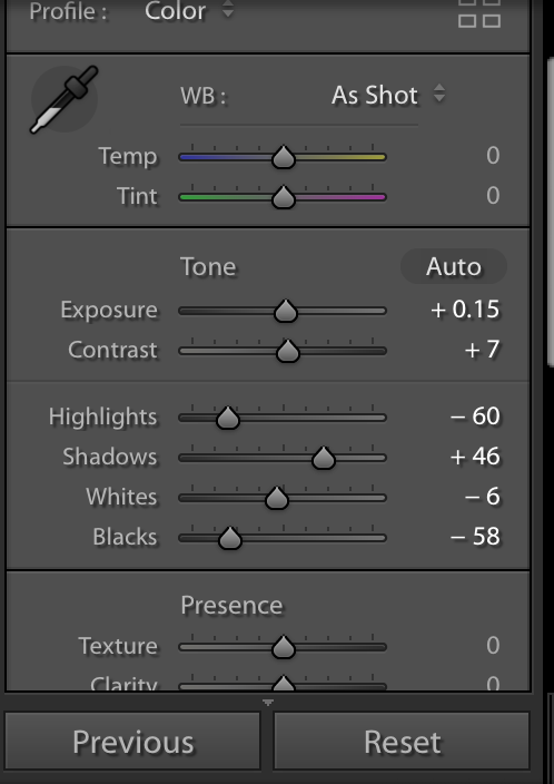
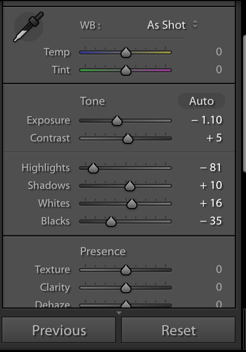
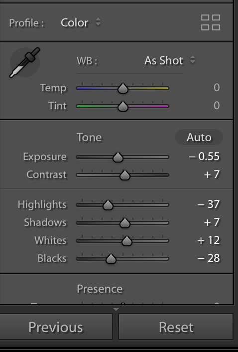
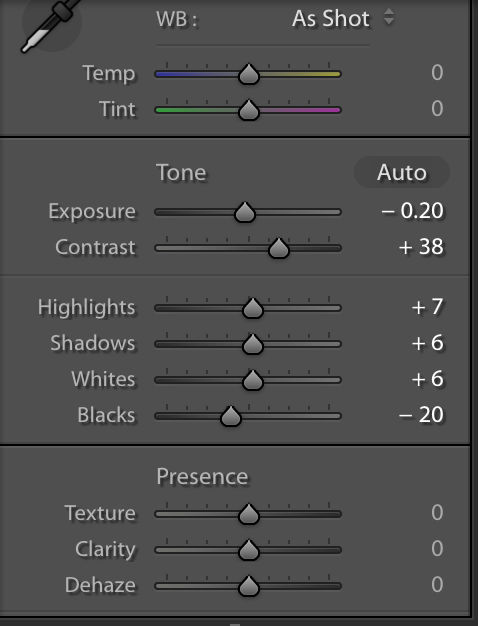
I am extremely happy with how my images turned out and don’t think they need much editing doing to them as they are well lit, however i plan to edit them using Adobe Light room to do simple edits such as cropping of image, contrast change, brightness etc to ensure the image doesn’t look too over edited.

Editing my Images

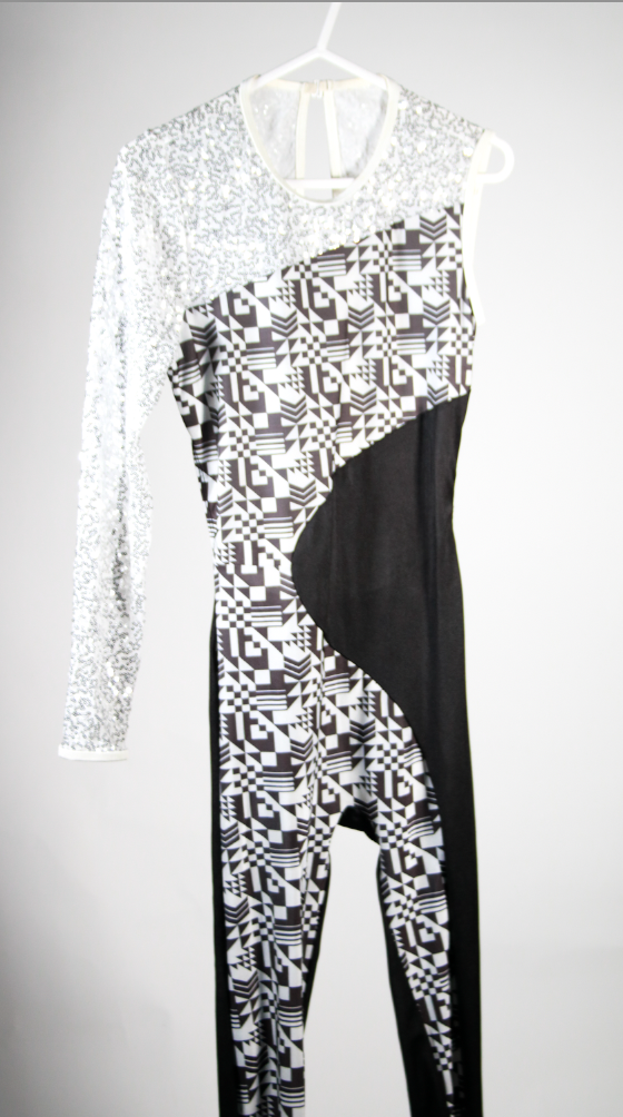
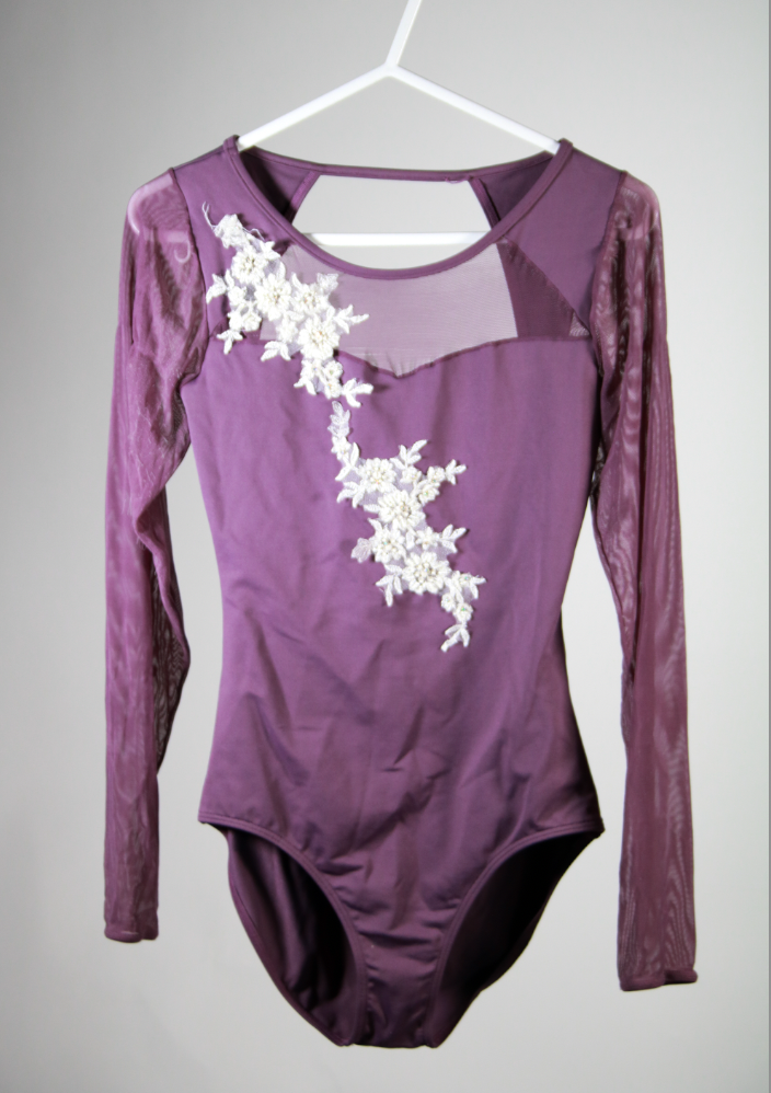
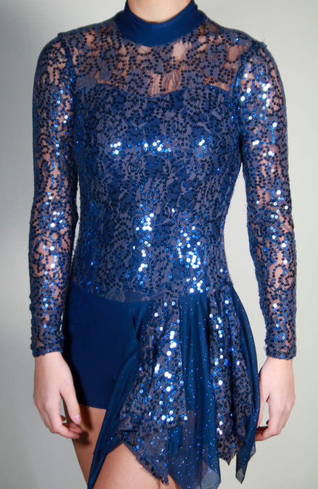
The process above was then carried on for all other images which will be shown below. In order to elaborate, the images below have cropping edits, contrast, brightness, exposure, highlight edits in order to create even images.

Best Edited Images

Technical Analysis- Technically, I used a Canon Camera on Manual Focus in order to allow change to settings. Therefore, I had a high ISO setting of 1600 with my shutter speed being quite high to allow a fully focused image. In regards to the lighting set up I used, I used three artificial lightings in total, one placed either side with the other being a ring light which was placed in front. I also did some of these images in ‘self portraiture’ therefore used a tripod for my camera which was placed in the middle of the ring light.

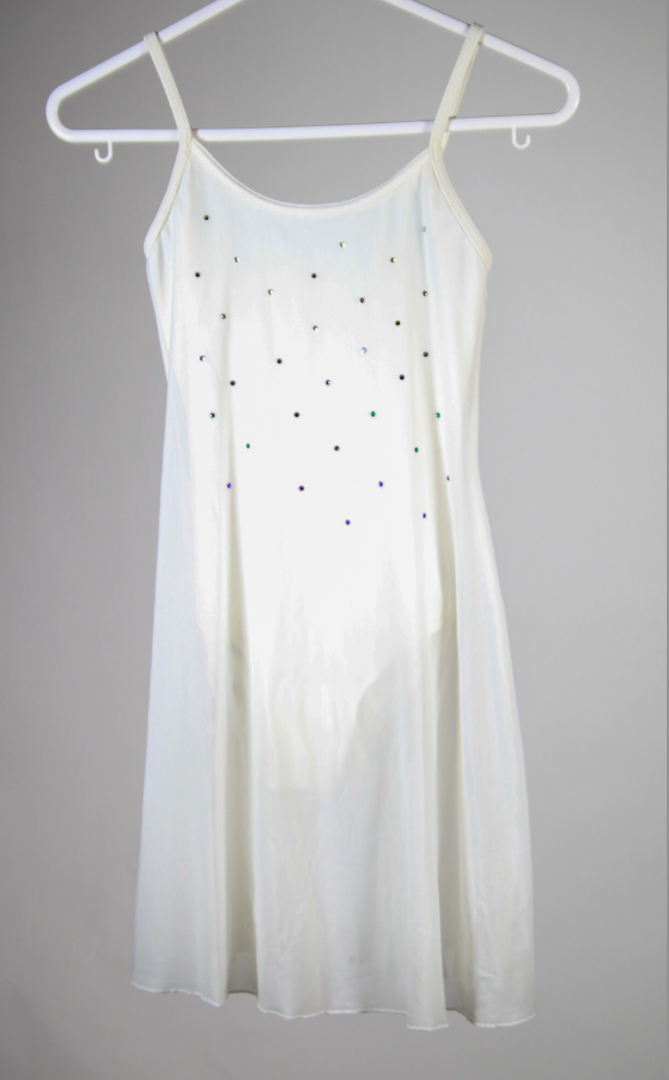
Visual Analysis- Visually, we can see that the images are clearly focused and there is no intended blur. The images are clearly lit showing the three lighting points worked, carrying on from this there is a white background used to add an aesthetic to the images.

Evaluation

Overall, I think I have been able to capture successful images with the use of camera settings and location. I like the positioning of the hanging costumes as well as how the modelled images worked out and I wish I had developed this more with other costumes as I found these images were better.