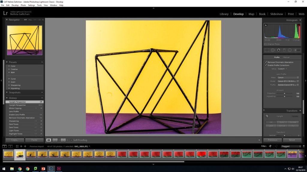
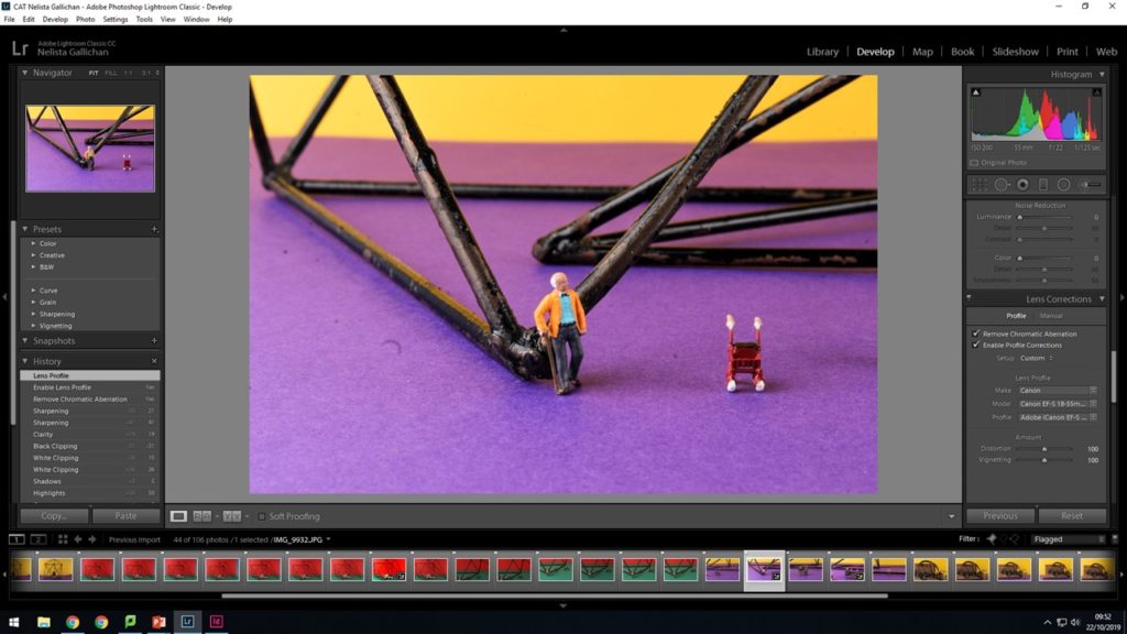
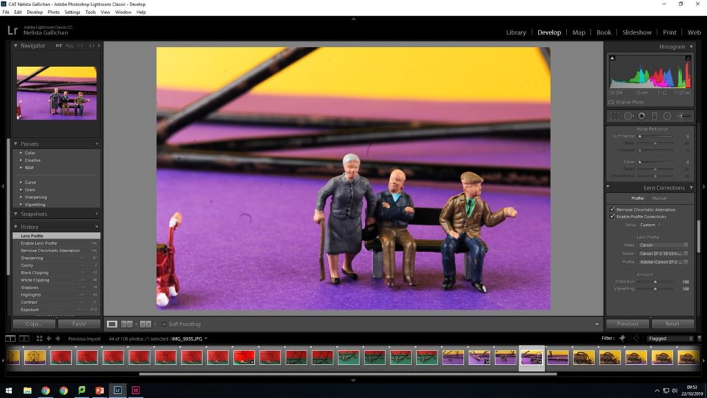
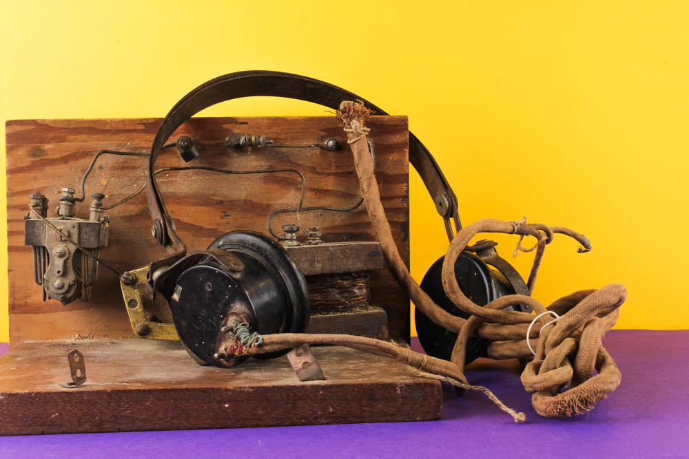
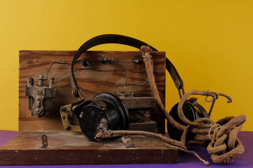
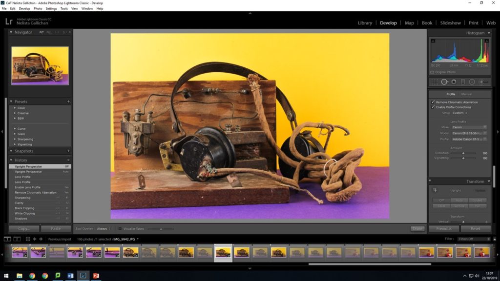
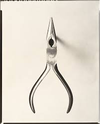
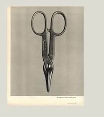
In the studio using a still life set up with a colored background like Mirach does using a background color that contrast the base color to make the items in the images pop. Using old geometrical instruments from the math’s department this mage the images look a lot more like Milachs work with the bold structural lines going through the images.
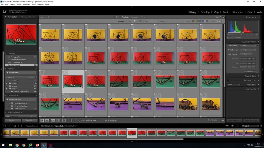
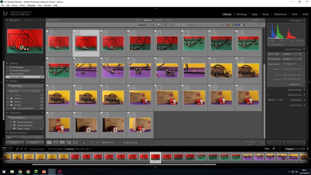
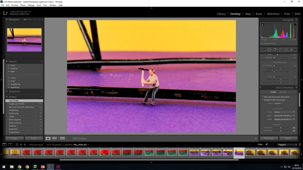
First, I imported all the into light room and then went through a process of discarding and keeping all the images i wanted. I did this through the x and p keys of the key board. X was images to be discarded so they would come up with a little flag on the corner. I discard images when the were out of focus or i felt the composition wasn’t right. I used the P key to keep all the images that i felt i could take on to edit and have an effective final piece of of them. This is what in looks like in light room classic cc when all my images are highlighted that i want to take on to edit.
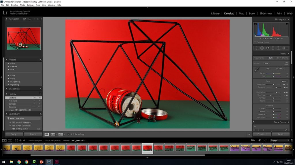
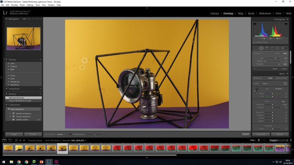
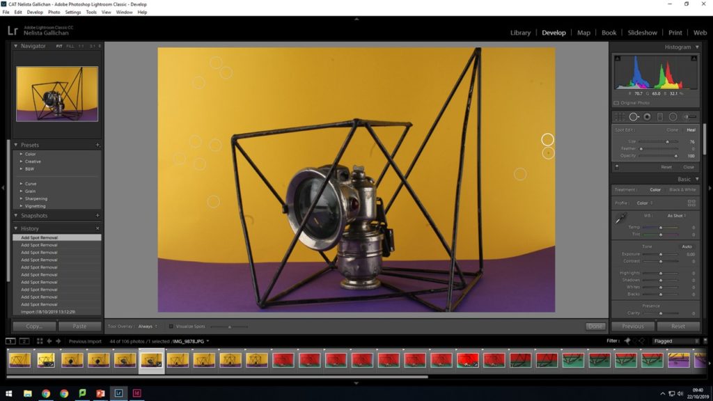
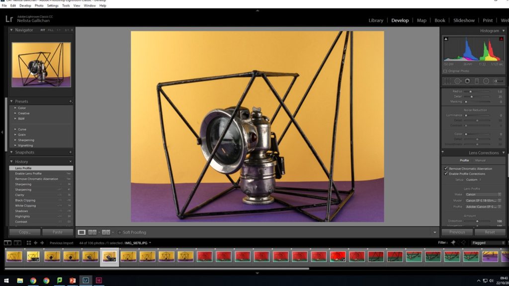
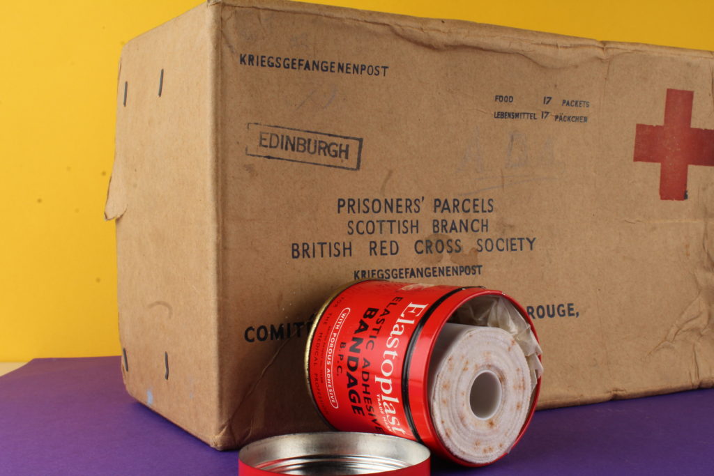
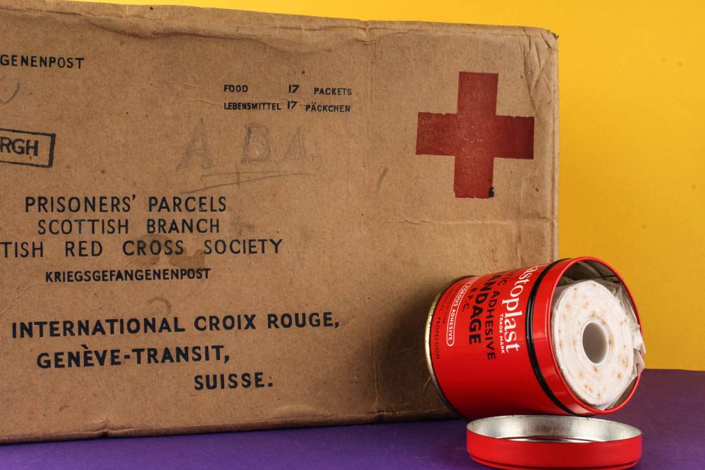
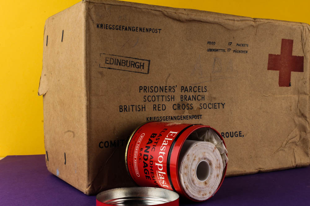
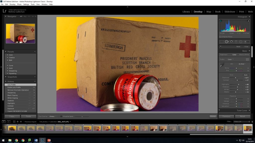
When editing in light room I use the develop section to edit my images. For this images i kept the temp and tint the same but then when on to lower the exposure slightly and up the contrast to give my images more of a vibrant contrast between the red background and the red bandage container. The highlights are increases as will so the sliver of the tin really stands out. The shadows are decreased so that you can see the real detail on the metal geometric shapes rather than it just being solid black lines. You can see bits on black paint flickering off and the joins where the metal has been forged together i feel that this adds another layer of depth to the image.
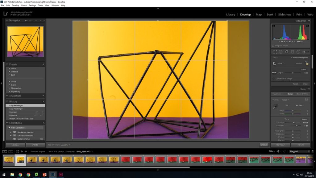
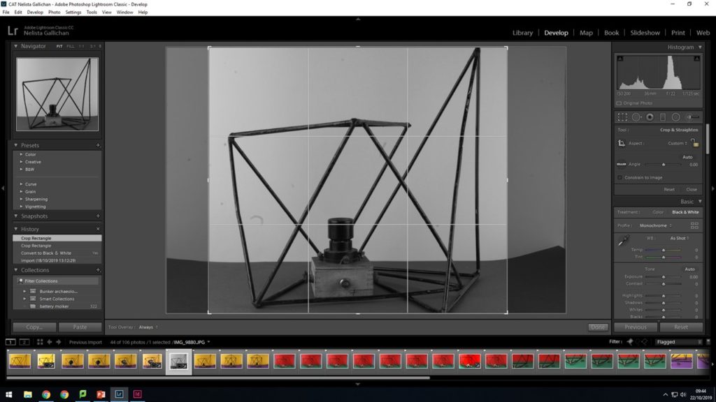
Before staring to edit this image i decide to crop it because the background was rather plain ether side and I didn’t fell like it brought anything to the image. Also the background slanted up on the right side of the images which i felt didn’t look as good as a crisp clean line for the background. This is because all the lines in the image are completely straight so i feel like it looks cleaner and sharper with a straight background.
I then went on the edit the cropped version of the photo.
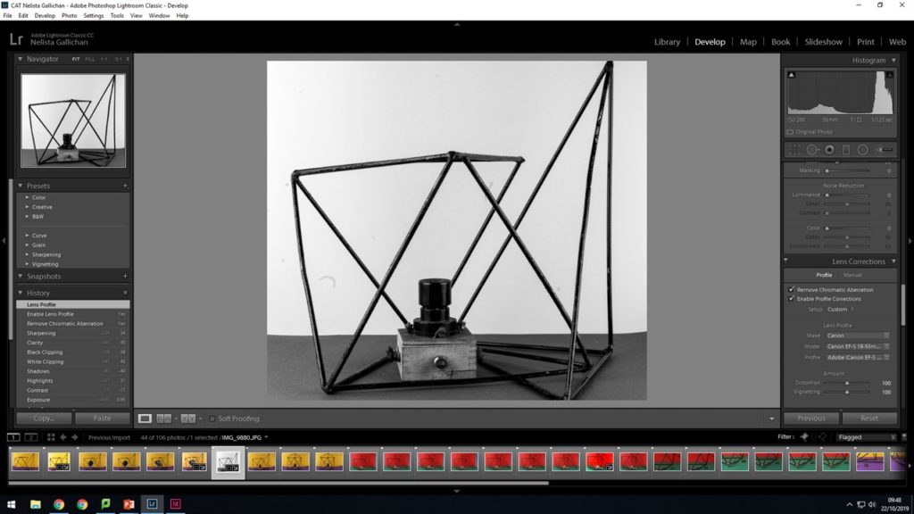
Then i decided to see how the images would look in black and white as Ralph uses black and white images within a lot of his photo montages.
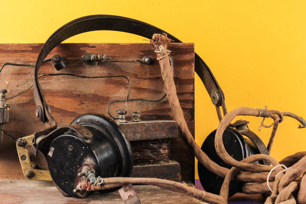
I then went on to edit my macro miniature people images making a lot of the images sharper so the look more chrisp and in focus to give the image more clarity and look more effective.
Rafal Milach celebrates people power in The First March of Gentlemen
Polish photographer, Rafal Milach. This body of work is a fictitious narration composed of authentic stories. Historical events related to the town of Września in Poland came to be the starting point for reflection on the protest and disciplinary mechanisms experienced under Communist rule. In the series of collages, the reality of the 1950s Poland ruled by the communists blends with the memory of the Września children strike from the beginning of the 20th century. This shift in time is not just a coincidence, as the problems which the project touches upon are universal, and may be seen as a metaphor for the contemporary social tensions and politics currently playing out in Poland . The project includes archive photos by Września photographer Ryszard Szczepaniak.
More than 100 students of the Catholic People’s School took part in a strike against the Germanisation of their education, which would aim to eradicate the Polish language from their teachings, and the physical violence used by teachers. The strike, though historically remembered for its triumph, is synonymous with Września, and over the years has become somewhat a cliché of association.
Silent, loud, peaceful, political – whatever form protest takes, the mobilisation of people to challenge authority has grown in confidence through history. The thing about protest is that the impact it desires is not instantaneous but, even though the results may take time to shape, they do eventually become manifest. It is, after all, the power of protest that began the domino effect of the disintegration of the Soviet-controlled communist regime in Poland in 1989. Sparked by dozens of workers’ strikes in coal mines and shipyards around the country, it was the demands of the people that propelled the Solidarity movement led by Lech Wałęsa into the first democratic government in almost half a century.
Skip ahead to present-day Warsaw, and the echoes of dissent can be heard upon the streets once again. Last time I spoke to Polish photographer Rafal Milach (for BJP’s September 2017 feature on the latest work from Sputnik Photos, the collective he co-founded), he told me that protesting the alarmingly fast political changes brought about by the PiS (Law and Justice) government felt like his new hobby. And he reiterates this today, speaking of the “permanent state of demonstration”.
Milach was wary of this obvious reference point, but given the timing of the residency – which coincided with a series of massive street rallies demonstrating against the government’s grab for extra judiciary powers – he couldn’t ignore it. And so it ultimately formed the backbone of the resulting project. The First March of Gentlemen, a 72-page photobook composed of collages that mingle elements illustrating the 1902 Children’s Strike with characters that lived during the communist era a half-century later, delineates a fictitious narrative that can be read as a metaphor, commenting on the social and political tensions of the present day.
“The most important thing was to create a story that would be accessible to everyone because this is, in the first place, my vision of a society, in which individuals can protest in the public space, regardless of consequence,” he explains. “The initial idea of working with the archive was sustained, but the topic changed as I began looking for material that could occupy two spheres – discipline and pacification, and the sphere of freedom – and to bring these elements together in a series of collages.”
Milach found it in the work of local amateur photographer Ryszard Szczepaniak, and his archive of images shot in Września during the 1950s and 1960s. He photographed his and his brother’s friends in formal street poses, many of them while on leave from the military, some of whom came from the Armia Ludowa, a communist partisan force set up by the Polish Workers’ Party while under German occupation during World War II.
They pose for the camera, hands crossed and guns poised, but with a glimmer of a smirk at the side of their pursed lips. Those not in uniform are well-dressed, dandy-esque figures, standing around with cocked hips and cigarettes, their long dusters, waistcoats and hats beginning to show signs of wear.
“They were a poorer version of the glamour they probably knew from American films,” Milach observes. “This intrigued me… The photo shoots that Szczepaniak was doing were somehow detaching the guys from the context of contempt in those days. The 1950s in Poland was a pretty oppressive time in terms of the communist regime, and these guys were just having fun in some remote areas within Września county… posing, staging shooting scenes… It was like being part of the system, but making a joke out of it.”
By extension, Milach detaches them physically, cutting out the figures and pasting them onto brightly coloured backgrounds, hinting at ideas of contrast and displacement. The resulting book, beautifully designed by his wife, Ania Nałęcka-Milach, references a children’s exercise book in its choice of size and coloured papers, bound by a long red thread to contain its assembly.
The design is “like a toy, like a candy – something nice to look at and to touch,” Milach says. “But it’s only a camouflage; a beautiful skin to disguise these spheres, to somehow smuggle them into your daily life” – just like the jubilant propaganda posters of the 1950s, or the cheery chat shows on the newly nationalised television stations of today. Page by page, the singular figures in these candy-coloured landscapes are joined by gatherings of larger groups, and geometric shapes representing mathematical teaching aids begin to appear as symbolic cages.
As these structures grow to command the composition of each image, the positioning of the figures becomes more claustrophobic. The young men are trapped into constricted spaces, yet their faces remain fixed with an expression of naive indifference. Do they not understand that their freedoms are an illusion that is entirely under the control of a superior authority? Akin to a children’s animation, the scenes build, frame by frame, and then break down again.
“The linearity of the book is very important,” Milach says. “It has a certain structure that you read from the front to the back – gathering, deconstructing, pacifying and then again, it loops and the story repeats.”
The repetitiveness of the story is also key, he says, because whether it be the early or mid 20th century, or the protests of today, “the patterns are pretty much the same”. “But still, the people act and react, and this is the bottom line of the entire project,” he continues, “that you’re active and you’re responsive regardless of any possible consequence – that’s the story.”
Milach wouldn’t call himself an activist, nor is this book an object of activism, though you will often find him on the street campaigning with his peers. He is, however, a great believer in the power of the people’s voice, which he wants to encourage to grow louder. Rather than just preaching to the converted, he’s targeting the people who have taken a back seat.
“It is titled the ‘First March’ because it is the characters’ first experience of being an active citizen,” he says. “The ‘Gentlemen’ is just a figure of speech. It’s not a gender-related thing, it’s just a representation of some activated unit. To me it was rather a metaphor of being in some sort of bubble where you don’t really have to act because you are comfortable.”
Later, reflecting on his own actions within the bigger picture, he adds: “You have to use the tools that you have. Does art change the world? Or photography? I don’t think so, but it can be a tool. And it can be just a fraction of something bigger.”
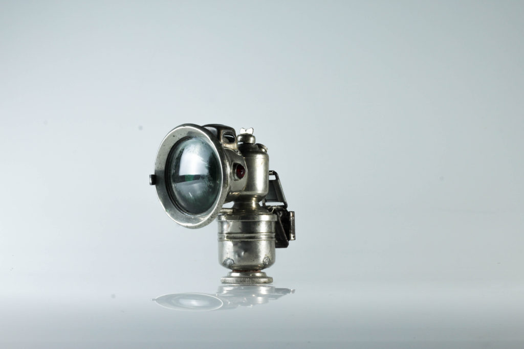
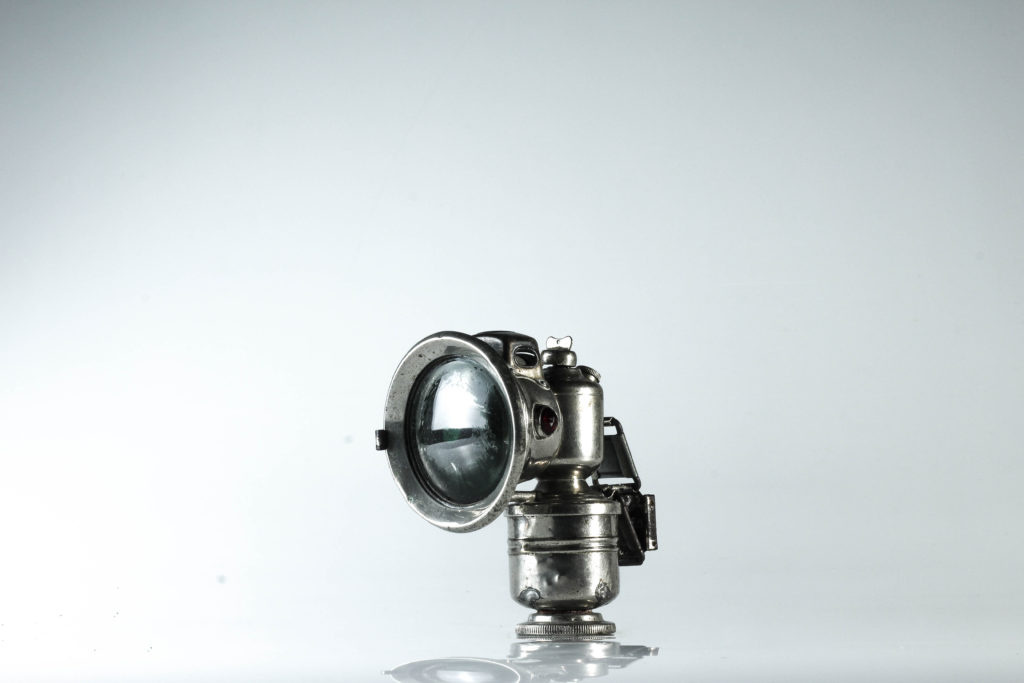
After looking at still life images with a plane white background i decided to experiment with color and see what differences this made to the images and whether i liked it or not.
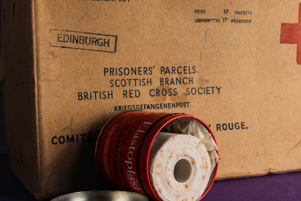
Using lightroom cc to edit a lot of my image is focused on making them look as vibrant as possible whole at the same time not having the background over power the image as a whole and the objects become lost within the image.
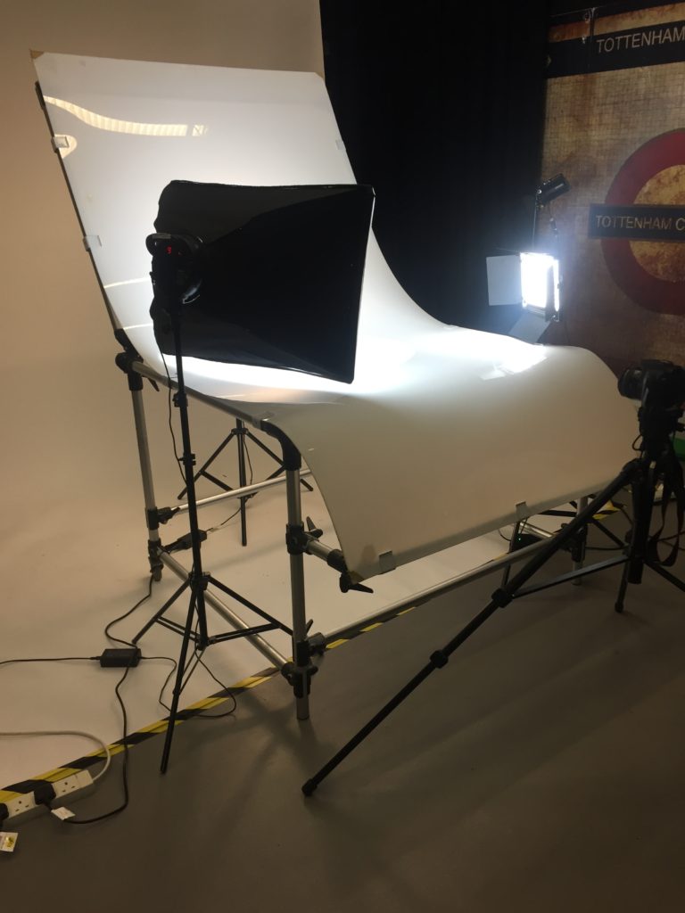
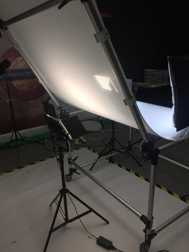
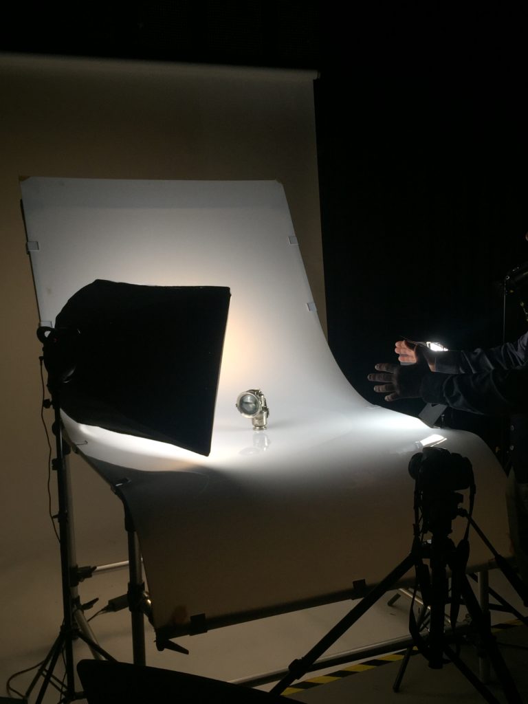
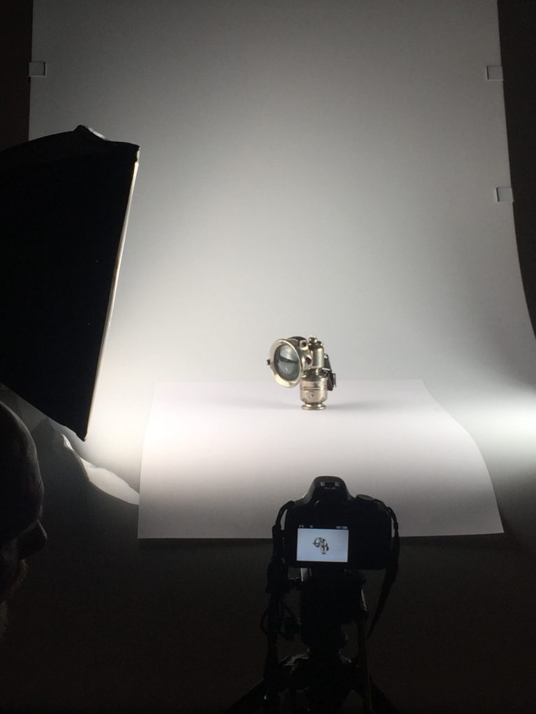
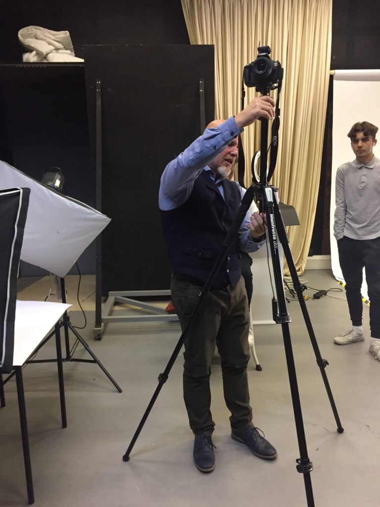
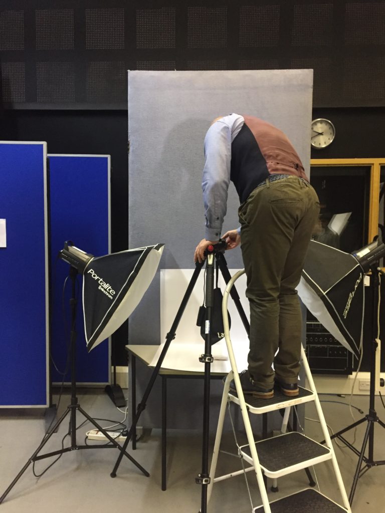
We were taken down as a class to the studio where we got the opportunity to be introduced to the world of still life on a professional commercial level using a professional still life table. The still life table is made a bent piece of white plastic acrylic. To set up the still life table you need lighting. The big light on the left is the key light also known as a tong stone light. The light on the right is called a fill light.
There is also a back light. This isn’t vital but is using when the objects being photographed are too light . This is used to blast out any shadows at the back of the images so that to object looks as if it is floating , suspended with a background behind.
Placing the object in the center is important because it because there is an even distance between each object and the light so that there are minimal shadows created.
Using a piece of paper under the object mean that there is minimal reflection in front of the object so the main focus of the image is on the object.
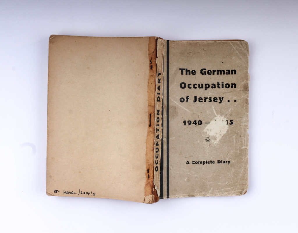
4. Contemporary practice: Complete at least one artist reference on how contemporary photographers explore still life and objects in their work. What meaning can we attribute to images of food and everyday objects – consider social, economical and cultural references.
Walker Evans, (born November 3, 1903, St. Louis, Missouri , U.S.—died April 10, 1975, new haven, Connecticut), American photographer whose influence on the evolution of ambitious photography during the second half of the 20th century was perhaps greater than that of any other figure. He rejected the prevailing highly aestheticized view of artistic photography, of which Alfred Stieglitz was the most visible proponent, and constructed instead an artistic strategy based on the poetic resonance of common but exemplary facts, clearly described. His most characteristic pictures show quotidian American life during the second quarter of the century, especially through the description of its vernacular architecture , its outdoor advertising, the beginnings of its automobile culture , and its domestic interiors.
Most of Evans’ early photographs reveal the influence of European modernism, specifically its formalism and emphasis on dynamic graphic structures. But he gradually moved away from this highly aestheticized style to develop his own evocative but more reticent notions of realism, of the spectator’s role, and of the poetic resonance of ordinary subjects. The Depression years of 1935–36 were ones of remarkable productivity and accomplishment for Evans. In June 1935, he accepted a job from the U.S. Department of the Interior to photograph a government-built resettlement community of unemployed coal miners in West Virginia. He quickly parlayed this temporary employment into a full-time position as an “information specialist” in the Resettlement (later Farm Security) Administration, a New Deal agency in the Department of Agriculture.
Between 1934 and 1965, Evans contributed more than 400 photographs to 45 articles published in Fortune magazine. He worked at the luxe magazine as Special Photographic Editor from 1945 to 1965 and not only conceived of the portfolios, executed the photographs, and designed the page layouts, but also wrote the accompanying texts. His topics were executed with both black-and-white and color materials and included railroad company insignias, common tools, old summer resort hotels, and views of America from the train window. Using the standard journalistic picture-story format, Evans combined his interest in words and pictures and created a multidisciplinary narrative of unusually high quality. Classics of a neglected genre, these self-assigned essays were Evans métier for twenty years.
In 1973, Evans began to work with the innovative Polaroid SX-70 camera and an unlimited supply of film from its manufacturer. The virtues of the camera fit perfectly with his search for a concise yet poetic vision of the world: its instant prints were, for the infirm seventy-year-old photographer, what scissors and cut paper were for the aging Matisse. The unique SX-70 prints are the artist’s last photographs, the culmination of half a century of work in photography. With the new camera, Evans returned to several of his enduring themes—among the most important of which are signs, posters, and their ultimate reduction, the letter forms themselves.
Analysis: Select a key painting and comment on the religious, political and allegorical symbolism of food and objects in terms of wealth, status and power, or the lack of.
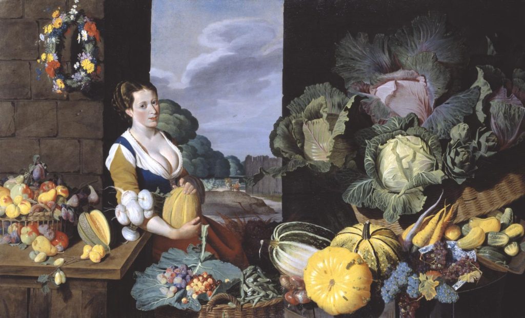
Cookmaid with still life of Vegetables and Fruit by British painter Sir Nathaniel Bacon
Title: Cookmaid with Still Life of Vegetables and Fruit
Sir Nathaniel Bacon did not paint professionally, although he was a skilled amateur artist. Very few works attributed to him survive, so the appearance of this work on the art market presented the Collection with a rare opportunity for acquisition. Furthermore, the subject matter, a cookmaid surrounded with lavish produce, more usually associated with Dutch and Flemish art, is highly unusual in England for the period and associated only with Bacon. Every item depicted is known to have been growing in England: Bacon himself grew melons on his Suffolk estate
Additional Viewing Notes: ‘Cookmaid’ and market scenes, popular in the seventeenth century, evolved in the Low Countries from a genre practised by Pieter Aertsen (c.1533-c.1573) and his pupil Joachim Beuckalaer, which combined contemporary kitchen scenes with a New Testament episode beyond. Bacon could have seen such works on a visit he made to the Low Countries in 1613. An inventory of 1659 connected to the will of the artist’s wife lists ‘Ten Great peeces in Wainscote of fish and fowle &c done by S:r Nath: Bacon’ (quoted in Gervase Jackson-Stops, ed., The Treasure Houses of Britain, exhibition catalogue, National Gallery of Art, Washington, DC 1985, p.140). Two other ‘Cookmaid’ pictures are known to exist: Cookmaid with Still Life of Game and Cookmaid with Still Life of Birds, both in the possession of the artist’s descendants. The Tate’s work is possibly part of this group. Such groups were often intended to depict the four seasons or the twelve months of the year. In the case of this piece, however, although every item represented in the painting was grown in England at the time, not all would have been in season simultaneously. Bacon, according to a letter dated 19 June [1626], was growing melons at his estate in East Anglia, and he was known to have a keen interest in horticulture. The subject would most likely have had erotic connotations. The abundance of ripe melons surrounding the cookmaid echo her voluptuous cleavage.
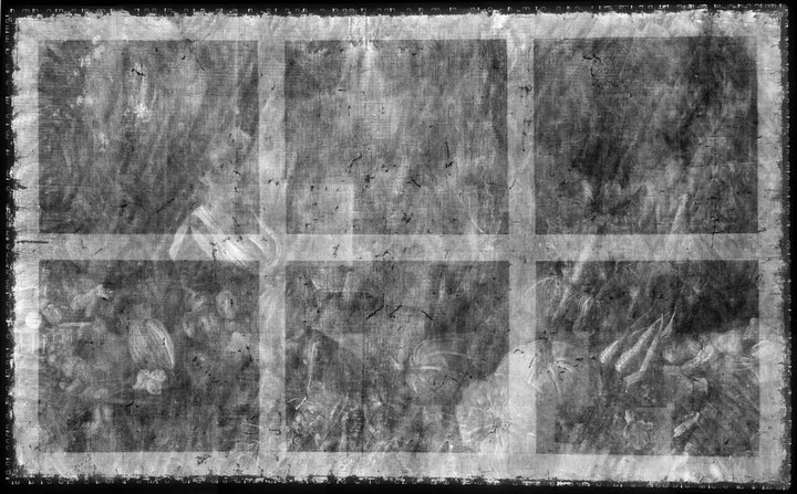
This painting is in oil paint on canvas measuring 1510 x 2475 mm (fig.1). The support is a single piece of very fine, plain-woven linen. It has 15 vertical threads and 17 horizontal threads per square centimetre. Cusping of the weave around the edges indicates that it was primed as a single piece on a strainer or stretcher that has not survived (fig.2).1 When acquired by Tate in 1995 the lined painting was attached to an adjustable pine stretcher. The style of this stretcher and of the lining (linen canvas with red lead in oil as the adhesive) suggested an origin in the late eighteenth century, although the use of red lead as the lining adhesive would be unusual at any time. The stretcher was slightly smaller than the original would have been; the ground and the painted design strayed over onto its tacking edges on the top, bottom and left sides.
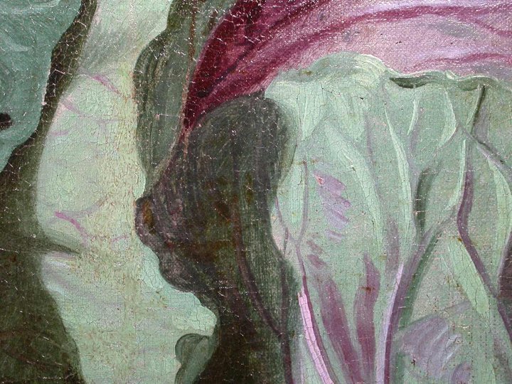
No underdrawing is visible with the unaided eye or infrared. Cross-sections and surface examination indicate an additive or sequential style of painting. The cabbage leaves, for example, were first laid in with opaque bluish tones composed of smalt, azurite and red lake. The deep shadows were added on top with a mixture containing azurite, red lake, vermilion and black; the highlights with pale green mixed from azurite, lead tin yellow and smalt. Finally thin glazes of red lake or red lake mixed with azurite were applied here and there (fig.4). The purplish blue grapes at the bottom edge were laid in with opaque grey paint, then glazed all over with semi-translucent purplish red before the opaque blue paint was applied selectively on top (fig.5).
The range of pigments is fairly restricted. Azurite mixed with lead white was used for the cookmaid’s blue bodice, with smalt and black added for the shadows. The sky is a mixture of white lead and smalt. The bright yellow of the melons and other fruit is lead-tin yellow. The sixteenth-century miniaturist and writer Edward Norgate tells us in his bookMiniatura of 1627−8 that Bacon made his own yellow lake (‘pinke’) from the plant Dyers’ Broom and analysis of this painting showed that Bacon used this pigment mixed with ochres and azurite to make the greens of the distant foliage, and also on its own as a top glaze.4 The dye was fixed to a substrate containing calcium, aluminium and sulphur, as related in the recipe. The red plant dye in the red lake is cochineal, almost certainly from the New World. It is possible that the painting has undergone some fading. Cross-sections from the sky and from the blue grapes suggest that there has been some degradation of the smalt, and examination of the red skirt suggests it was originally glazed with red lak
Still life emerged as an independent genera particularly during the early 1600s Dutch and Northern European paintings. Many of the objects depicted in these early works are symbolic of religion and morality reflecting on the increasing urbanization of Dutch and Flemish society, which brought with it an emphasis on the home and personal possessions, commerce and trade. Paintings depicting burnt candles, human skulls, dying flowers, fruits and vegetables, broken chalices, jewelry, crowns, watches, mirrors, bottles, glasses, vases etc are symbolic of the transience and brevity of human life, power, beauty and wealth, as well as of the insignificance of all material things and achievements.
Origins and Definition of Still Life As a result of this trade with far-flung places and the introduction of exotica, Dutch artists of the 17th Century became renowned for being greatly concerned with what Kahr refers to as a: ‘close scrutiny of the natural world.’[1] This, combined with their preoccupation with perspective and the study of light, provided the basic elements of Still Life painting. The term had come into general usage in mid-century, Still Life being the carefully composed portrayal of inanimate objects. Living creatures were in fact allowable as long as they were incidental to the main theme. Specialization was a notable feature of Dutch 17th century art; consequently, Still Life – itself a particular aspect of art – further diversified into different categories.
The Distinct Categories. The earliest examples, from the beginning of the 1600s and later influenced by ‘tulip-mania’, were the popular floral paintings; these were followed by flowers with fruit, then the humble ‘breakfast pieces’. As the century progressed, and wealth became widespread, so the ‘breakfast’ developed into the ‘banquet piece’. Perhaps influenced by deep-rooted Calvinism centred on Leiden University, the Dutch psyche remained a moralising one and the concern with the transience of life was the motif of the numerous ‘Vanitas‘ paintings and an element in other genres. Another important facet of Still Life, Trompe L’Oeil – French for ‘deceive the eye’ – evolved in mid-century from the game piece, its illusionism appealing to the Dutch penchant for humour. Finally, at the latter part of the century, taste changed, colour and form became more baroque and pronk still life- the art of the ostentatious – was born.
Socio Economic Background The creation of the Dutch Republic gave rise to a great pride in national identity and with it came a delight in the new art that was uniquely Dutch. As the economy flourished, and trade with the Indies and South America expanded, so did the fashion for collecting, the popularity of painting in general, and Still Life –Stilleven -in particular. Watchful Calvinist ecclesiastics, dwindling royalty and powerful Burghers changed the face of patronage. With the emergence of the aspirational, property-owning bourgeoisie, a whole new market opened up.
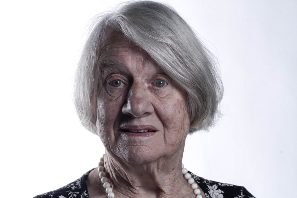
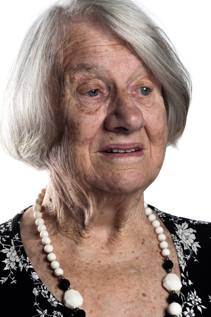
This out of the set of my final images to me is my favorite because i feel that it really captures her internal emotions through her eyes and expression on her face. The direct eye contact with her eyes and the camera lens makes you feel as if you are there and makes you connect more with the models inner emotions. Also i really like the gradient background how it goes from bright white to a subtle grey creating a contrasting flow through the background. the face is also lit with one half darker and one half lighter than the other. This is diagonally matching with the back ground the the side of the face which i feel makes the image more interesting. This creates depth through the light and the darkness and dimension and texture with the focal point of the image remaining to be the eyes.
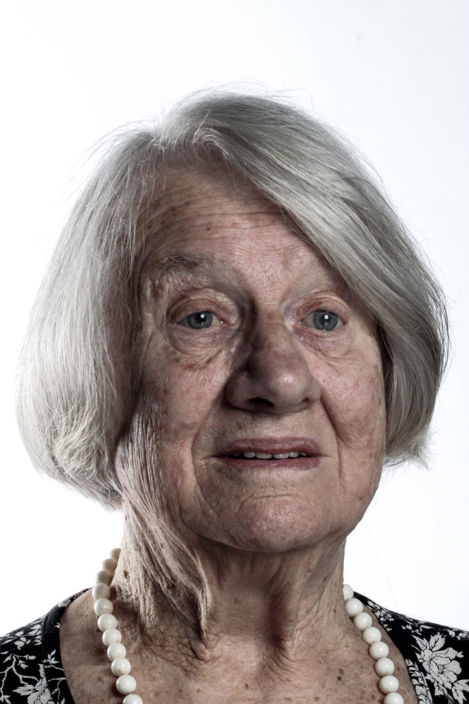
The next image i chose has a lot more cooler tones and the background is lighter and so are the highlights in her face.