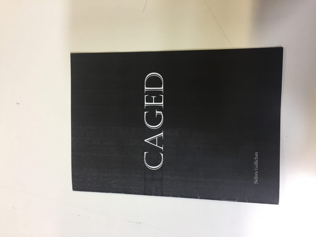
I wanted to create a narrative through my zine and i felt that having a tital that fitted with that would be accurate and tie the whole composition of the zine together. I wanted the font to haven a element of white and black lines to replicate that theme of structure and lineage.
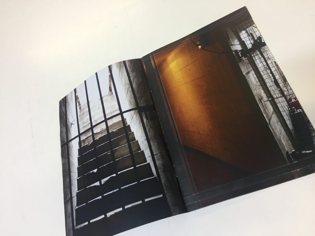
I liked the look of the images being full bleed across the page rather than having a border because the white border looked to bold. It was almost as if you were looking at that more than the actual image itself it was some what distracting.
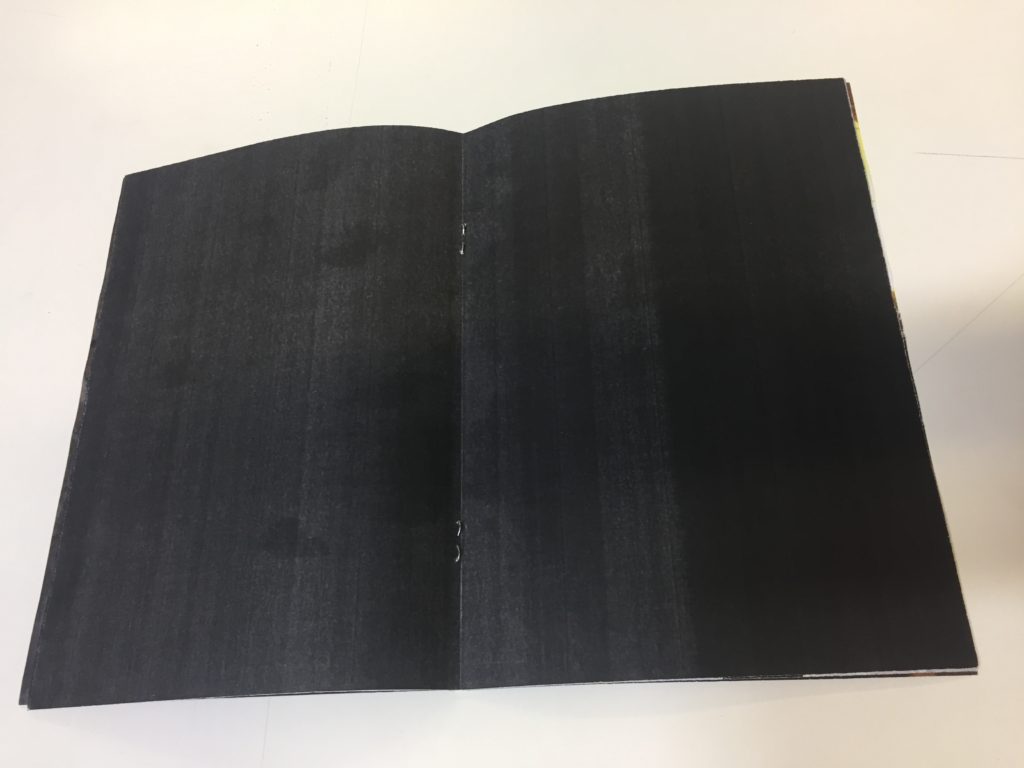
Each sheet is printed as a piece of A4 it is put together. The pages are printed double sited and many image cross over onto different pages not being next to each other which was my intention. Each page is folded down the central line of the page and then slotted in in the order i wanted each of the pages. Then laying the zine flat with the central double aged open i stapled along the spine of the zine binding it together. At this point there was execs paper from each page so when folder over the zine wasn’t one clean opening line. I used the guillotine to over come this and trimed the zine so all the pages were identical and the edge of the zine was straight and looked professional.
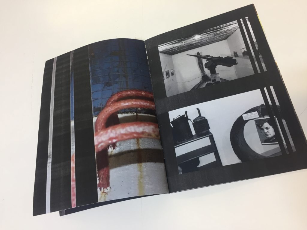
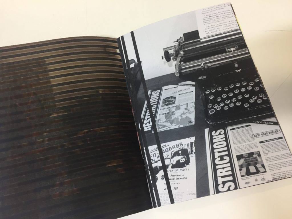
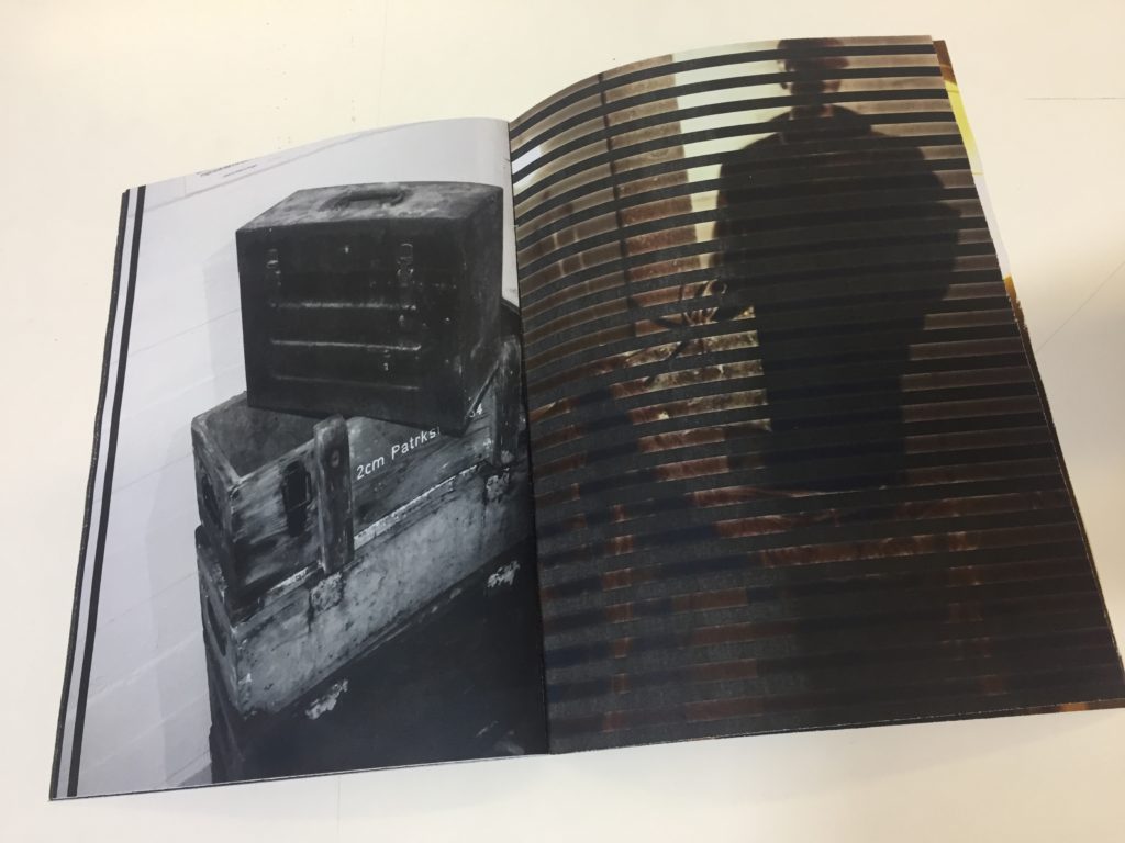
I chose to have the middle page black but when printed it came out this this striped effect from the printer and i really liked it it looks as if it was meant to be that way on purpose because it fits with the narrative on the caged lines.
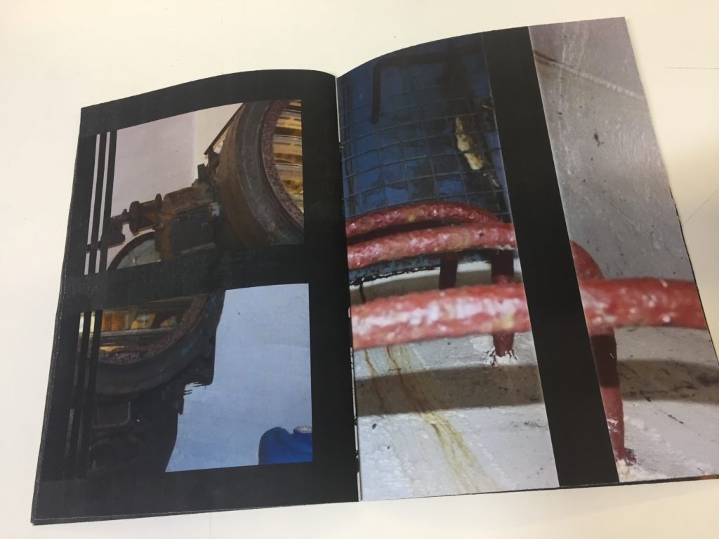
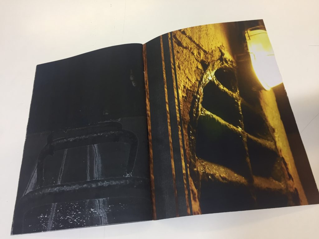
Many of my images carry across two pages but appear in different sectors of the zine. I did this because there is this repetitive orurance of lines and images emplying the emotion s of being traped, caged and being unable to escape.