In the studio using a still life set up with a colored background like Mirach does using a background color that contrast the base color to make the items in the images pop. Using old geometrical instruments from the math’s department this mage the images look a lot more like Milachs work with the bold structural lines going through the images.
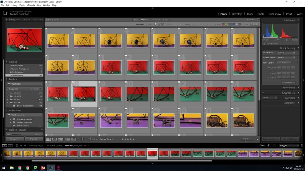
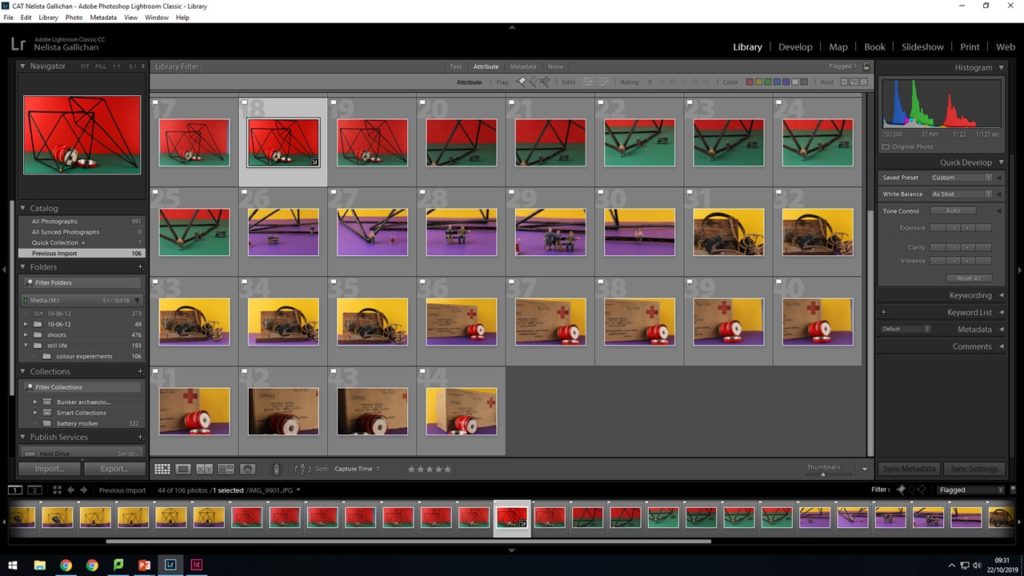
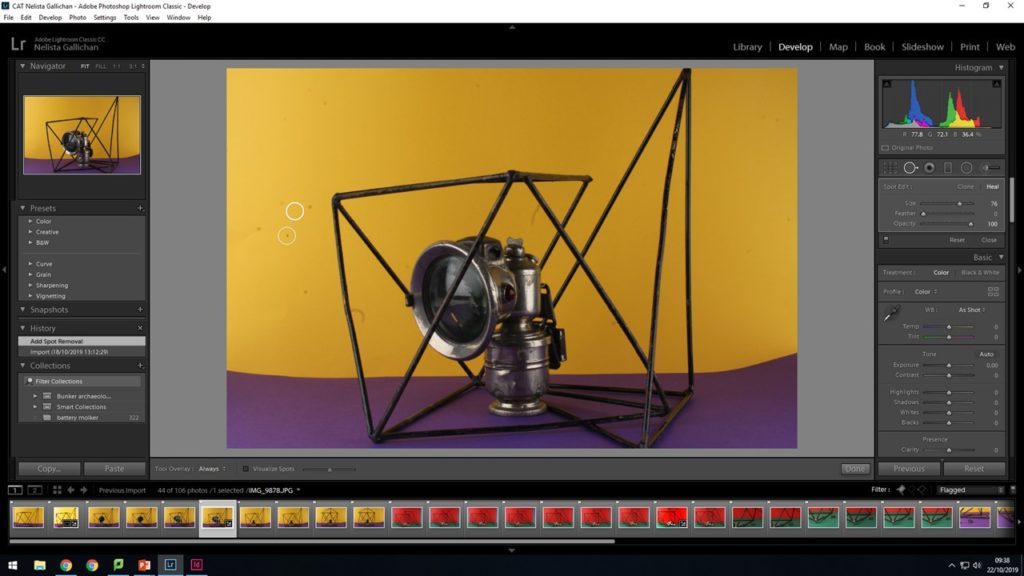
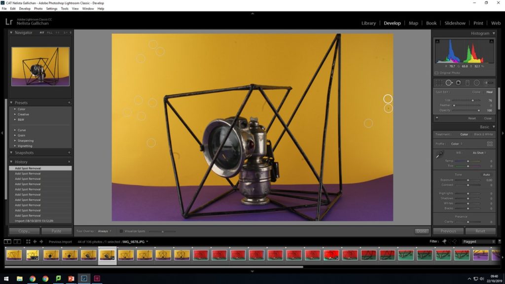
First, I imported all the into light room and then went through a process of discarding and keeping all the images i wanted. I did this through the x and p keys of the key board. X was images to be discarded so they would come up with a little flag on the corner. I discard images when the were out of focus or i felt the composition wasn’t right. I used the P key to keep all the images that i felt i could take on to edit and have an effective final piece of of them. This is what in looks like in light room classic cc when all my images are highlighted that i want to take on to edit.
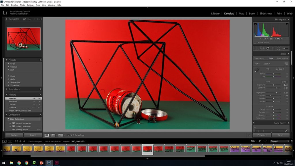
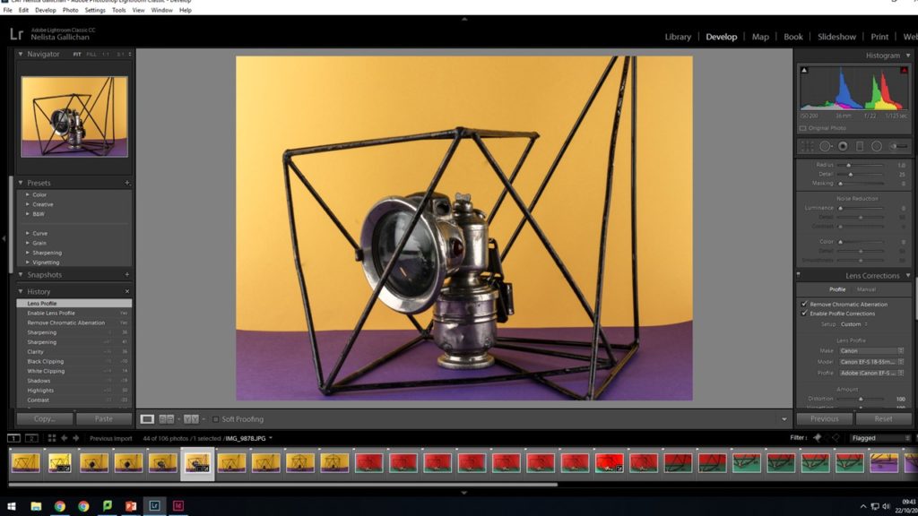
When editing in light room I use the develop section to edit my images. For this images i kept the temp and tint the same but then when on to lower the exposure slightly and up the contrast to give my images more of a vibrant contrast between the red background and the red bandage container. The highlights are increases as will so the sliver of the tin really stands out. The shadows are decreased so that you can see the real detail on the metal geometric shapes rather than it just being solid black lines. You can see bits on black paint flickering off and the joins where the metal has been forged together i feel that this adds another layer of depth to the image.
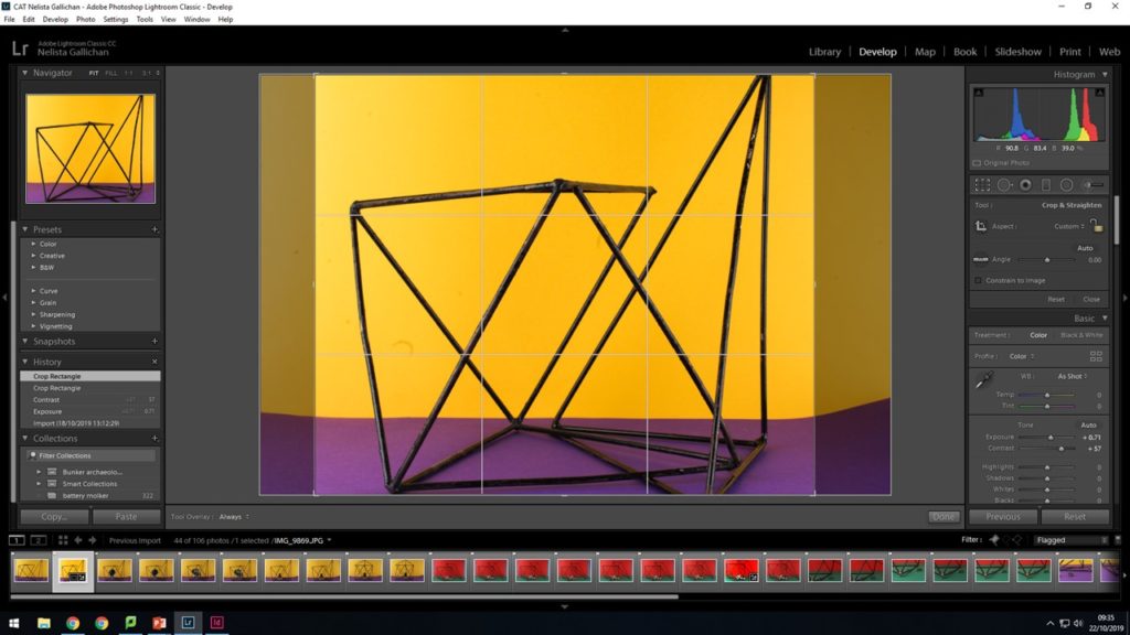
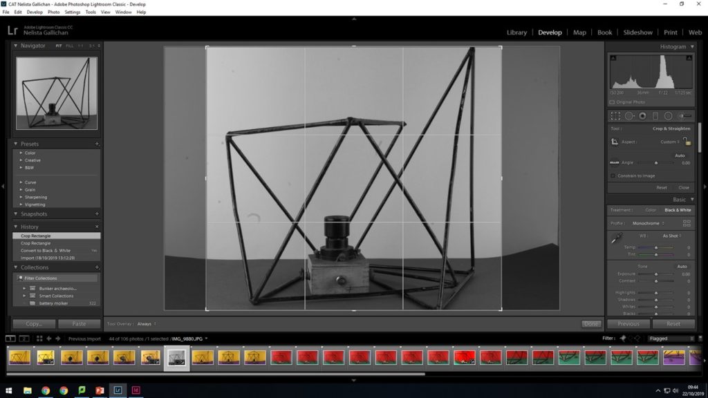
Before staring to edit this image i decide to crop it because the background was rather plain ether side and I didn’t fell like it brought anything to the image. Also the background slanted up on the right side of the images which i felt didn’t look as good as a crisp clean line for the background. This is because all the lines in the image are completely straight so i feel like it looks cleaner and sharper with a straight background.
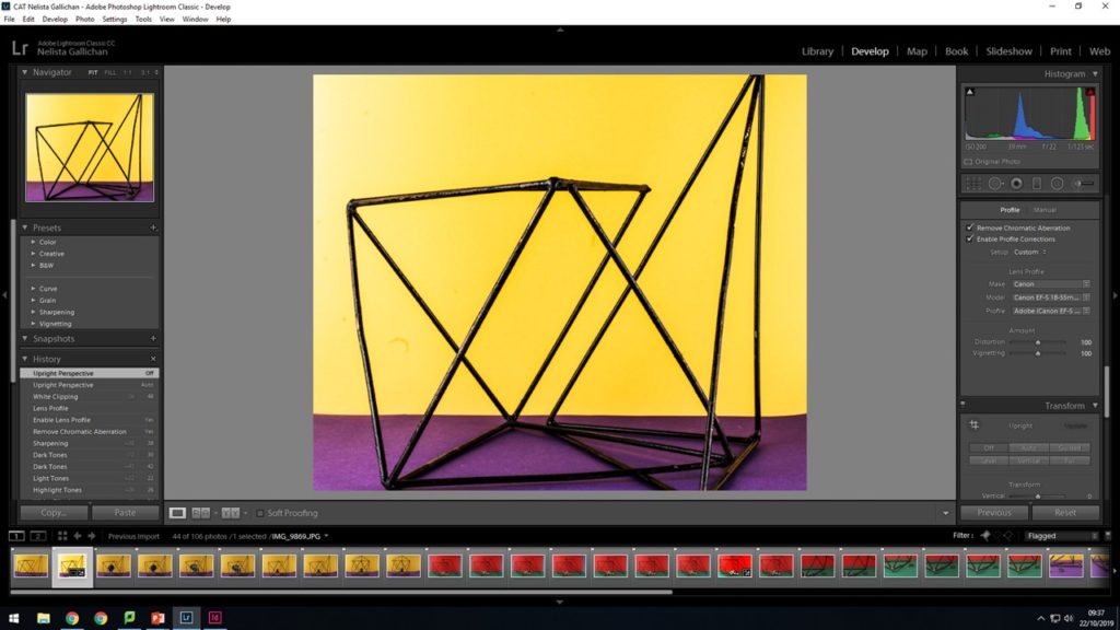
I then went on the edit the cropped version of the photo.
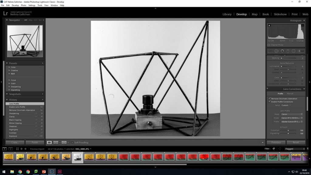
Then i decided to see how the images would look in black and white as Ralph uses black and white images within a lot of his photo montages.
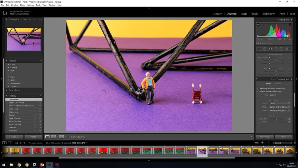
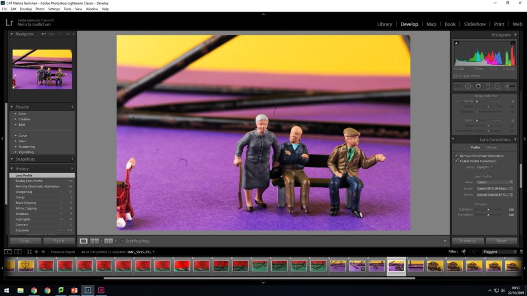
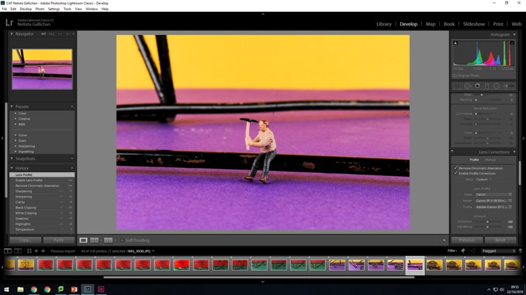
I then went on to edit my macro miniature people images making a lot of the images sharper so the look more chrisp and in focus to give the image more clarity and look more effective.
