Contextual Studies:Paul Graham

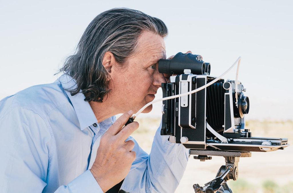
Dave Campany’s booked is called ‘So present, so invisible, Conversations on Photography’ it includes interviews with world-class photographers. The interview I am going to discuss is with Paul Graham a British fine art and documentary photographer. He has lived in New York since 2002, so a large majority of this work is based in America but he has projects based in Northern Island after the famous ‘Bloody Sunday’ in 1972 as well as a project called A1 which is based on the Longest marked road in the UK. This most recent work ‘A Shimmer of Possibility’ based in America is a sequence of edited images of everyday street life. When he was emerging as a photography colour photographer was beginning to make and appearance in the industry. In his interview he was saying how it was hard as an artist to break out of the cycle of black and white photography. ‘ I don’t want to call it radical but some found it so,’ clearly the audience and some artists at the time were threatened by evolving technology, which made it harder to introduce colour. ‘You can use the beauty of the landscape to seduce people into engaging with a picture they normally wouldn’t look at,’ I picked this quote because this is the basis of excellent photograph it’s all about capturing such a powerful image that people can’t help but look at it. The whole idea of attracting more than just one audience is a way to stretch yourself as a photographer by being able to take an image that has more than one simple concept. When discussing his style and how it can be seen as controversial he uses this metaphor, ‘you don’t call cooking with ingredients that came from the garden documentary cooking, it’s just cooking’. He saying that photography is a broad creative subject which has no rules, it’s all about capturing in the moment through observation just because he doesn’t stage or plan this photos doesn’t mean their aren’t part of medium.

Graham doesn’t says his in his interview but I found it powerful, ‘Perhaps instead of standing at the river’s edge scooping out water, it’s better to be in the current itself, to watch how the river comes up to you, flows smoothly around your presence, and reforms on the other side like you were never there.’
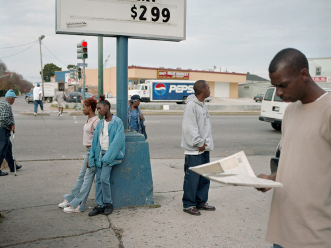
Image result for paul graham a shimmer of possibility

Most of Graham’s images are of interest to me but this one of the most striking. I love the overall simplicity of this photo, yet it’s contextual depth. The main focal point is how their is only black people present, the odd thing to me is that they all seem to be very comfortable in such a public environment. Conceptually, I think this photo is displaying how idotic prejudice views are about the black community. In the photo Graham portrays the subjects reading newsapers crossing the road, chatting, all normal acts. Some white people hold the view that black people are constantly out in public causing trouble, this image challenges this racist view. He uses natural daylight to capture this untempered image. It is neither under or over exposed which is a hard skill considering he works under low control situations that require a steady hand and quick eye. He uses a medium lens inorder to capture the setting as well as a fast shutter speed to avoid motion blur. The photo has very dull colours giving it a cold temperature with the greys and blues. The Pepsi van, the mans hat, the womens jacket, the post she is leaning against all work together as a spetrum of different shades of blue, creating harmony within the colours. There is a combination of textures, the uneven and cracked pavement, the smooth road tarmac, these opposites create constrast between the surfaces. The lack of repetition is what makes this a candid image, its raw and unplanned, creating an authentic documentary style photo.

Artist Reference (Fashion Images) -Hasson Hajjaj

Hasson Hajjaj was born in Morocco, Larache in 1961 and is known as a contemporary artist based in all London, Morocco, UK and Marrakech where he takes fashion inspired images in different cultures. He is also known as the ‘Andy Warhol of Marrakech’. His most well known photographic works is his collection which is being displayed in New Yorks Brooklyn Museum as well as others in the United Kingdom and in France.

He was known as a photographer, filmmaker and a designer and is self-taught with having a lot of influence from hip-hop in London which allowed him to have a diverse practice in portraiture, installation, performance and fashion. This then developed into drawing more influenced from pop art, fashion as well as his overall photography to create more studio works with Malick Sidibe.

Carrying on with the theme of film, Hajjaj’s first feature-length film was premiered in Los Angeles Country Museum of Art and it takes viewers into the world of one of his most iconic series ‘Kesh Angels’. He was also the winner of the 2011 Sovereign Middle East and African Art Prize.

His Style

  • Color Images
  • Portrait way up
  • Full Focused- High Shutter Speed
  • Are posed images
  • Front facing angle used
  • Low ISO
  • Solo images

Mood Board

Analysation Image

Image result for hassan hajjaj

Technical Analysis- Technically we can see this is a well focused image with good camera quality helping to show that a high shutter speed would have been used in addition to a low ISO allowing for there to be no graininess to the image. Along with this a high contrast is used allowing colours to be bright and for the image to be focused and stand out. We can also see an appropriate white balance to go with the artificial lighting which is allowing for the saturation of the bright colours to be well seen.

Visual Analysis- Visually we can see that the saturation on this image has been enhanced to allow the bright colours and patterns to be seen with Hajjaj’s desired effect. The male model is wearing a red and white matching suit with orange timberland boots creating a mix match effect due to the colours not usually going together. There has also been a blue and black roll of paper laid out as a background which shows this had b been a set up photoshoot. However, looking at what the models wearing and what the background is we can clearly see that these colours don’t go together. There is also a border to this image which are individual tomato canisters which can be seen as random.

Conceptual Analysis- Conceptually, due to the blue and back spread we can guess this is a set up photo shoot meaning that the photographer wanted for every aspect in the image to be as it is, otherwise it would have been edited out. Therefore I personally think that her meaning through this photograph is that she wanted to show fashion in the way that you can wear what you want even if it doesn’t’t live up to societies image of colours going together etc.

Contextual Analysis- Looking into Hajjaj’s work, as well as his images it has become clear that he has a very certain type of style where he likes to experiment with colour, patterns and the way they are worn showing his passion for fashion and art. This image specifically represents experimentation with society and how people respond to the crazy patterns and lifestyles some people wear and choose to live.

Meaning behind this choice

After looking into fashion photography, I have found that it doesn’t have to be all about fashion and I can link the images in alternative ways. I think this is a good idea as I want to base my third shoot on costuming which also links to fashion at the time the costume was bought, therefore allowing me to show fashion between dance during that year period. This is also a subject of occupation I would like to cover within my project, leading me to believe this is a good base for my third shoot.

case study: Rita Puig

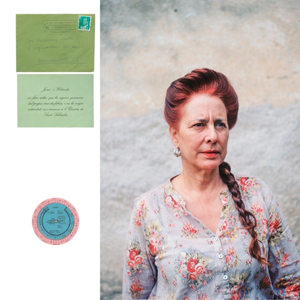
For my first case study I will be using Rita’s book, “where mimosa bloom”. This photo book was made after the death of her mother, Yolanda, as a way to deal with her grief following this. This photo book intrigues me since the photographer uses a combination or archival image, images of objects and also the metaphor of a mimosa, which is a type of tree native to Barcelona.

The photographer spent two years collecting materials and photographing places, objects and people of significance in the relationship between her and her mother. We see this throughout her book with portraits of her family, and old letters and drawings.

“where mimosa bloom traces a walk across the memory. It tries to remember a mother who is no longer here, through objects, persons, and moments which takes us directly to her person. That’s an homage of Rita to her mother Yolanda. An attempt to assemble in a book her familiar universe.” Source

Right at the end of the book the photographer has included an essay style letter dedicated to her mother. She goes into detail about how she can “see you [Yolanda] in Dad’s eyes”. This is very emotional and adds to the personal aspect of the images in the book. She also says how “when I was younger…I sometimes imagined that you had died”. Going into detail about her thoughts and feelings in this manor makes the objects and letters within the book, things that would normally have limited meaning to strangers, have more meaning to the viewer.

“Where Mimosa Bloom takes the form of an extended farewell letter”Source

Analysis:

This memoir is also part family biography, which is why I picked this as a case study as I will also be including my family in my project and I thought it would be useful to see how someone else interpreted their family.

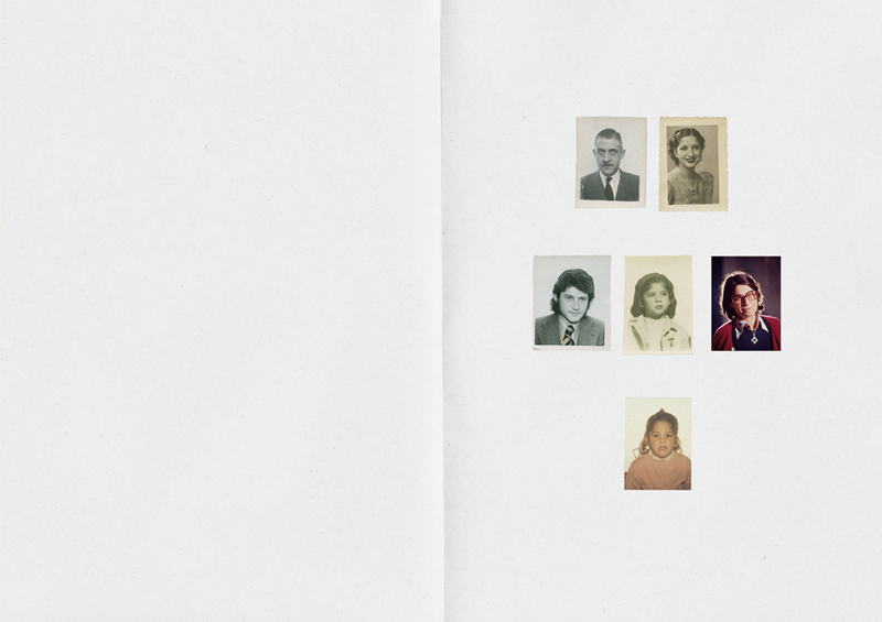
You can see the image on the side skillfully shows some family members’ portraits which helps to create a clear narrative throughout the book, helping the audience understand her perspective.

Technically, this page interests me a lot. Every time you flip a page over, and image of someone from her family is reveled until the audience is able to see an almost type of family tree.

Visually, All these images are clearly older, meaning they are most likely archival. I think this helps add a sense of history to her work making it more deep and meaningful.

Artist Study- JEff Wall

Jeff Wall is a Canadian born, Vancouver based photographer who specializes in back lit tableaux photographs of the city of Vancouver itself

Wall studied at the University of British Colombia and graduated with a masters degree in photography in 1970. In the same year he relocated to London to study for a post graduate degree at the courtyard institute, studying with Manet expert T.J Clark. He then went on to become the Assistant professor at Nova Scotia college of Art and Design from 1974-1975 and he then became the associate professor at Simon Fraser University, British Columbia from 1976-1987 whilst also teaching at The University of British Columbia.

Wall is renowned for his tableaux reconstructions of scenarios he had witnessed himself that were representative of the political environment at the time. His photos are always back lit and in a cinematographic style, Depicting more of a story through this means. Due to his tableaux style, His shoots often consisted of many people such as cast, crew as well as digital post production workers. Almost all of his shoots are centered around suburban Vancouver, world renowned for the relationship between the suburban environment and the rural environment. Many of the suburban areas have mountainous backdrops and are bordered by forests as well as having a substantial amount of urban architecture, which Wall finds to be a great way of providing contrast within an image.

Image Analysis

Image result for jeff wall
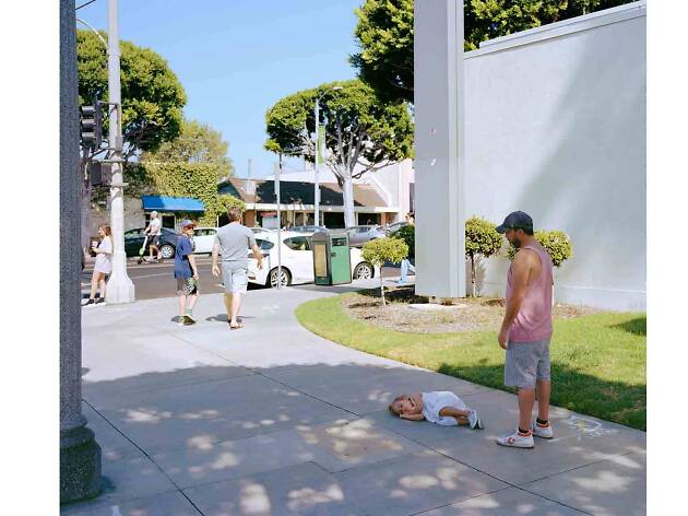
Parent Child- Jeff Wall 2018

In Walls image ‘Parent Child’ we see a striking usage of colour. The green of the foliage and grass compared with the white shades of the wall and sidewalk as well as the vehicles in the road create a sense of elegance and almost calm. The blue of the sky above also depicts a sense of calm. The child on the floor seemingly sleeping calmly acts as a further metaphor for this portrayal of calm. The father looks over the child dressed in a pink vest and gray shorts, and judging by his slightly slouched posture and his tilted head, He is tired of his child playing games and playing around as he potentially may be on his way somewhere with her and she is holding him up. The image is very bright in itself and consists of high contrast colour to reflect the atmosphere of a sunny midsummer day. Overall there is a sense of serenity and happiness in the image and the person in the background on the scooter can be seen as representative of time passing by. This point is furthermore illustrated by the presence of people walking past the parent and child, just in front of them, with the subject on the left looking over his right shoulder to examine the scene presented before him. This makes us ask the question ‘What is it he sees’? Does he see a Child having a tantrum? Does he see a fed up father? Does he feel sorry for the father?.

Personal Opinion

Personally, I am a big fan of Wall’s work and his representation of modern day life in a suburban community. His usage of back lighting makes his images consistently bright and vibrant and allows for him to experiment with contrast between brighter and darker colors. Walls Tableaux approach is a method that I would like to replicate in my personal study, essentially creating everyday life scenes that appear candid in nature but are actually fully staged and instructed. This would aid me in portraying senses and feelings of occupation and liberty however I please, rather than waiting for an opportunity, I am able to capture exactly what I would like to achieve when I want to capture it.

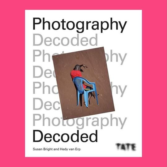
Photography Decoded – Post 1

Bibliography; Bright, S. and Van Erp. H (2019), Photography Decoded. London; Octopus Publishing House

“Nonetheless, we can still ask ourselves in every single instance: under what circumstances are these images to be trusted as real?” – (Bright, S. and Van Erp, H. 2019: page 17)

“The daguerreotype had aspirations to both the realistic and theatrical, as well as to the commercial. The ‘mirror’ can serve as a metaphor for reality, whereas the red velvet evokes theater curtains, within which the beautiful drama would unfold” (Bright, S and Van Erp H. 2019: page 17)

“If manipulation is the first thing someone thinks of in connection to photography, what does that say about the value of the photography as a reflection of reality? And what does ‘real photography’ even look like.” (Bright, S and Van Erp H. 2019: page 17)

“Documentary and news imagery may seem the more realistic genres in photography, but their realism means nothing independently…” (Bright, S and Van Erp H. 2019: page 18)

“The process of manipulation starts as soon as we frame a person, a landscape, an object or a scene with out cameras” – (Bright, S. and Van Erp, H. 2019: page 18)

“It was taken by a drone… makes it easier to interpret the degree of reality in this image, for the lack of human subjectivity makes it an example of ‘true reality” (Bright, S and Van Erp H. 2019: page 17-18)

“Photography has undergone a transformation, not only technologically but conceptually. Initially described as a means of capturing or freezing ‘real life” (Bright, S and Van Erp H. 2019: page 18)

“The process of manipulation starts as soon as we frame a person, landscape, an object or a scene with out cameras’ (Bright, S and Van Erp H. 2019: page 18)

Contextual Studies: Conversations on Photography

Jeff Wall Image Analysis

Image result for Jeff Wall

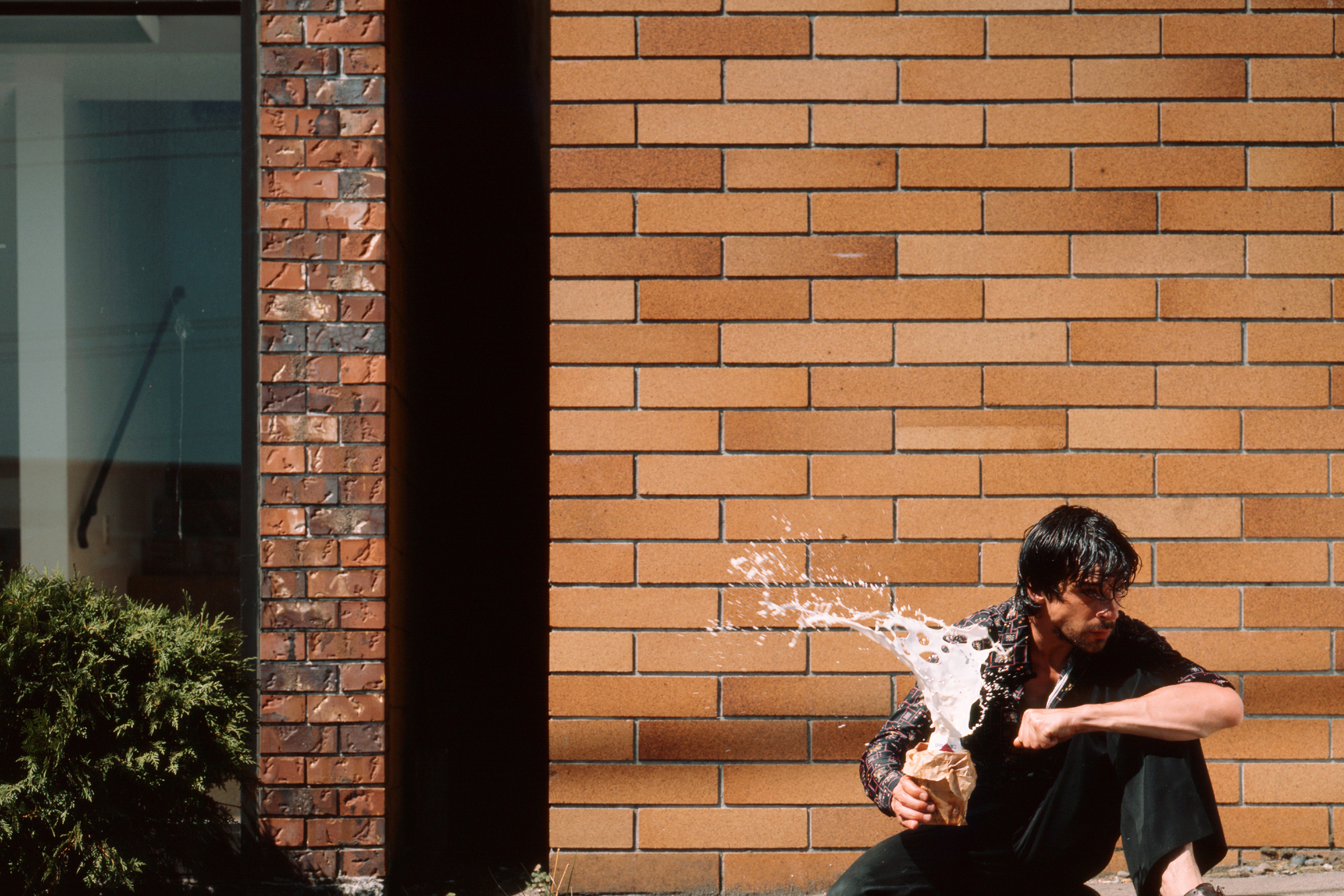
In this image titled simply “Milk”, Wall has depicted a male holding a milk drink and squeezing it, causing the milk to erupt in the subjects hands. The subject is in full focus and the background seems to be that of the exterior of a well kept and clean building, Whereas the subject appears dirty and scruffy, With greasy hair and dirty clothes. This creates a contrasting image, With a sense of cleanliness making up the background with the focus being on the messiness of the main subject of the image. The explosion of the milk carton makes us question why this is happening. Is the man angry? is he undergoing stress? or is he potentially in a crazed mental state?. This image essentially allows for the critic to create their own context to the image and create their own story due to the multiple scenarios that may be at play here in a contextual mannerism. Wall quotes from his interview with David Campany ” I think the pictorial problems emerge from the accidental encounter that reveals the subject”. I find that his quote means in a sense that the use of the medium of photography has opened up a conversation regarding the issues the subject themselves could potentially be dealing with, and that photography can be used to portray an individuals expression of their inner selves. The composition of the image in terms of contrast plays a role in telling the story as well, As the background is bright, contrasted by the small shadow of the wall of the windowed building. The usage of tinted blue for the glass and the green of the plant give the background an uplifting feel due to the bright colours. However this is contrasted by the ragged appearance of the male subject in the foreground, Depicted by his dark coloured clothing and dark hair. The white of the milk drink exploding instantly draws us to the image due to the absence of white in the background as well as the shape and texture of the liquid itself captured in the time frame it was captured in. The explosion of the milk carton creates a dramatic contrast when observed in comparison to the solid, tranquil background of the image. The eruption of the milk itself creates a talking point. Why is the milk exploding in this manner? What is the subject currently feeling in terms of emotion? Was there an event that caused this reaction?

contextual study; conversations on photography

JEFF WALL

Jeff Wall

Jeff Wall is a Canadian artist who is best known for his large-scale photographs and theories on art history. In an interview which was conducted with Wall he said;

‘Not every image is (or wants to be, or needs to be) a tableau…and when an image isn’t as acutely composed, it has less presence as a tableau. – this is suggesting that even if an image is directed/staged it doesn’t has to be categorized as a tableau, as you the photographer are adding your emotions and effects to it, making it an unique image,.

‘Photographers often want to treat a subject extensively, devote themselves to it and make groups or sequence of pictures about it. I do it to one image, and clear the debt in one throw of the dice

‘Subjects might have their own specific pictorial energy, but I don’t think they require any predictable way of being shown. So, I look forward to showing, ways of creating an appearance of something, whether it is a scene of tension or of something else.’ – this is suggesting that images can present different emotions, depending on how the photographer photographed their image and the meaning behind the image can help set the scene and emotion for a project or an individual image. Along with this, experimenting with how to present your work can be fun as you can show it in different ways, which can simple of unique.

‘Any slightly unusual subject would likely have to come to the artist through some sort of unexpected encounter. In the absence of such an encounter, you can still keep working by using once of the generic subjects as your starting point.’

‘there are simply NO RULES’ – from this quote, Walls is saying that there are no rules within photography. You can photograph what interests you and experiment it in different ways and it won’t be wrong as it is your view and perception on a certain genre and topic.

Image result for jeff wall photography
Overpass, 2001

Technical; The lighting in the image is bright and sharp which contrasts against the dark, grey sky, the lighting is a natural source and the photo may have been slightly edited to make it brighter in certain areas. The image has a wide depth of field, this is due to the face the subjects are up close to the camera, yet you can see far down the street, making the image seem longer than it is. The color of the image is blue and grey, which gives off a cold effect and this is enhanced by the way the subjects are dressed as they are in coats.

Visual; Within the image there are three main subjects you can visually see, who are carrying luggage with them, they are also walking past traffic on an overpass. The lines created by the barriers of the left hand side of the image create a parallel effect for the image and these correspond with the shadows create on the floor and the line on the pavement. The shadows in the image give it a 3D effect.

Contextual/Conceptual; Within one of Walls interviews that I have looked at he said ‘Not every image is (or wants to be, or needs to be) a tableau…and when an image isn’t as acutely composed, it has less presence as a tableau.‘ part of this image may have been staged so Walls could get the affect of commuters he wanted but this image would’ve taken divers planning to photograph the people at the right time and to give off the correct emotion. As Wall said ‘Subjects might have their own specific pictorial energy‘, such as this image is presenting what it is like for travelers going to the airport, work, etc this images gives off the sense living and he is documenting what it is like for people living in different areas. The image is simple, but possess it’s own ‘pictorial energy‘ as photography has ‘NO RULES’ according to Wall, it is a free flow and everyone gets their inspiration from different subjects and whats to present their work in different way as mentioned when Wall expressed ‘I look forward to showing, ways of creating an appearance of something, whether it is a scene of tension or of something else.’, this scene carries some slight tension, the stress of having to be at a detestation will all your baggage both physically ad emotionally. Wall, throws everything he has at an image to give it a feeling of emotion and in this instance tension, which is present through the subjects and the dark sky as a background.