Artist references for personal study

The two following photographers have very different approaches, ass well photographing completely different things; Hassan Hajjaj is a portrait photographer, whereas Jean-Pierre Raynaud is an object photographer. However I enjoy both of their styles; they would also both fit into my personal study as I have done both styles in past projects and enjoyed doing them.

Hassan Hajjaj

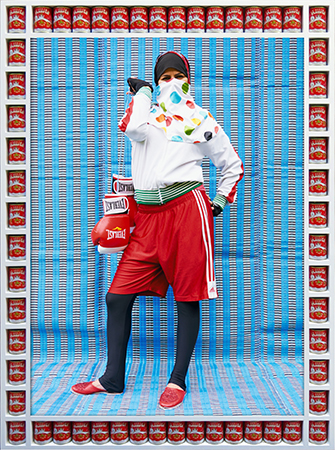
I really enjoy the vibrant colours he always implements into his work, they are always bold and help turn the photo into a statement through exaggerating certain elements of the photo. Such as in the photo below, its a woman wearing boxing clothing and holding boxing gloves in the way a purse would be conventionally held. This has been done to show the strength of a woman, especially in a male dominated scenario.

I also really like how he makes a frame for every photo out of food related items most commonly found in Morocco. This helps add another layer of, usually contrasting, colour to the photo, as well as to strengthen the feel the photo gives you.

Image result for Hassan Hajjaj

Jean-Pierre Raynaud

These photos are of the Jean-Pierre Raynaud designed ‘La Maison de La Celle-Saint-Cloud’ in Paris; which opened in 1974. It is a house and art installation comprised entirely of white tiles. The obsessive construction of the house’s walls, floors, ceilings and fixed furniture were all coated with white 15cm x 15cm ceramic tiles with black joints.

design_lamaisondelacelle-saint-cloud_jeanpierreraynaud_3
La Maison de La Celle-Saint-Cloud House by Jean-Pierre Raynaud | Yellowtrace

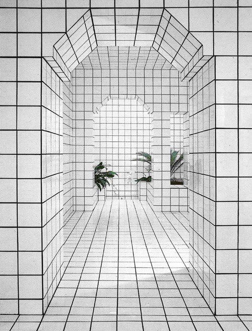
I like the strong geometric shapes all of his work is based upon;they help make all the images bold, and make any other objects (e.g. a plant) stand out a lot more due to the contrast between its curved/irregular lines and shapes and colour, compared to the black and white grid of its surroundings.

I also enjoy the simplicity that comes with his style of work; there is usually one focal point of the image, using the example of a plant again, which attracts all of the attention towards it. The grid around it also helps accentuate the shape of the object through again, contrast between the lines.

Image result for Jean-Pierre Raynaud Cibles

To conclude, both these photographers have very different styles which both appeal to me, however they do have one main thing in common: the subject of their photos always majorly contrasts with the rest of the image, be that through colour or shape, and I will take inspiration and feature this in my future work.

Personal investigation

Below is a mind map and moodboard of how I have personally interpreted the theme of Occupation vs. Liberation in order to begin my personal study. as you can see below, i interpreted Occupation in a metaphorical way, but also in a more literal manor. I also associated Liberation with the concept of freedom and limitations which led me to explore things such as immigration and gender inequality.

Mind Map

Moodboard

Personal Study moodboard.
Images are not my own.

REVIEWING and reflecting

Intro

During the time and effort i put through doing my investigation and investigating with the project (Occupation vs. Liberation) i gained a lot of experience and skills with working on portraits, environmental photography, photo shop skills……. .And in this blog post i’m going to write and overview of these stuff i learnt as well as the inspirations that inspired me throughout my work.

Knowledge

The occupation

I gained a lot of knowledge about the island through this project as i have lived in jersey for almost a year and a half without even knowing that there was an occupation that occurred before i came. so through this project i now gained knowledge about almost everything i can know about the occupation from when it started to what they ate during the occupation.

Home

Moreover i also gained knowledge about the family i lived with as i lived with them without knowing that much about them but when i was working on my Home Sweet Home project i learnt a lot about them by photographing what they do at home throughout the day.

Skills

Light Room

Throughout doing this project i gained a lot skills with practicing photo editing specially using Light room as i have always been using Photoshop but we had to use light room in this project which really worked to my advantage because i got to explore all the new ways of editing photographs.

Camera Handling

I also expanded my photography techniques specially with environmental portraiture and still object photographing through the project (Still Life). And got more professionalized with using camera skills and adjusting settings.

Conclusion

in conclusion this project really taught me a lot of stuff but mainly just gave me experience about the whole idea of being involved in the history of the German Occupation in Jersey.

Artist Reference: Richard Avedon

Richard Avedon was born in 1923 in New York city and had an interest in photography from a very early age. He joined the YMHA camera club at the age of 12 years old, And then attended the DeWitt Clinton High School in the Bronx where he was a key figure in the development and production of the schools magazine. Soon after he was named as the poet laureate of New York City high schools in 1943.

Avedon served in the US Army in World War 2 as an identity card photographer, Photographing soldiers for use of an ID card. After the war he went into fashion photography and he studied at the Design Laboratory at the New School for Social Research. When he was 22, Avedon was approached by Harpers Bazaar, An American female fashion magazine. He was initaially denied access to a studio by them so he used to photograph subjects in abnormal environments such as at a circus, the beach and nightclubs. This very quickly became a key element of his work. He soon rose up to become the lead photographer for Harpers Bazaar. Avedons main focus on his work was the suggestion of a persons personality that photography was able to portray, so he took extra care in planning and detailing shoots and hairstyles, outfits and objects became key focal points for expression within his work. Below are some examples of his work that highlight his ideals

Samuel Beckett, writer, Paris, France, April 13, 1979
In this image of authour Samuel Beckett, Avedon has chosen to keep the composition of the image simple, utilising a plan white background. the contrast in the image is one of the most striking elements to me as there is a lot of detail highlighted by the contrast, Specifically Beckett’s Hair. The use of a turtleneck jumper with a three button blazer suggests class and order
Bob Dylan, singer, New York City, February 10, 1965
In this image of American musical artist Bob Dylan, Avedon has chosen to keep Dylan within focus and have the background out of focus. This effect can be seen as metaphorical in terms of Bob Dylan being a world famous musician at the time, In a sense that he stands out from anywhere and is instantly recognizable.
New York Life #9, Harlem, New York, March 23, 1949
This particular image, Taken in Harlem, New York, Depicts a dalmatian and his owner, with another male seemingly admiring the dog. This image strongly represents the idea of ‘mans best friend’ as both of the subjects are admiring the dog and there is a sense of unity within this ideal, as the two men, Judging by the way they are dressed, have different occupations and backgrounds, yet they are united as one over the dalmatian and there could also be a link to the sociological state of the United States at the time this photograph was taken in 1949, As African Americans were the target of severe racism and discrimination. This image thereby can also depict a feeling of unity between the two men as despite their different occupations and socio-economic status, They are united as one in their fight against racism.
Mike Bencich, Dan Ashberger, coal miners, Somerset, Colorado, August 29, 1980
In this image of two coal miners from Colorado We see a striking usage of contrast to highlight and depict the conditions they are working in by highlighting the soot and dirt on the skin and clothes of the workers. There is also a sense of unity between the two as seen by the hand of the left hand subject on the center subjects shoulder, a universal sign of unity and compassion.

Personal opinion

I personally find Avdeons work inspiring due to his portrayal of different people and their lives through his attention to detail within his work and use of varying photographic techniques to utilise the full scene to full affect. I would like to take inspiration from Avedon as I am inspired by his work and I take a lot of inspiration from his technique and ideas. I would like to have a main focus on personality within my personal study, focusing on the elements of a person that makes them who they are. Whether this be clothing, location or accessories and objects that highlight aspects of the subjects personality and who they are. Based upon the theme of Occupation VS Liberation, I would like to photograph subjects in their spare time and partaking in hobby’s/ past times and highlighting this sense of liberty through their clothing objects and scenario.

Artist Reference (Archival Images) – Diana Markosian

Diana Markosian is was born in Moscow in 1996, making her a Russian American who left Moscow to live in California with both her mother and brother. She was family orientated due to not having contact with her father until age 23 before travelling to Armenia to see him 15 years later. Markosian is known as a Russian American artist of Armenian Descent.

Markosians most recognised work is “Inventing my Father” where she explores her fathers absence throughout her life through using archival imagery and landscapes to support her lost memories. She also used physical elements such as newspaper articles, letters and objects which is photographed in a still-life way to represent a personal element to the project, showcasing raw emotion to her audience through using black and white edit and through portrait images of her father.

Relevant Quote- ” I often wondered what it would have been like to have a father. I still do.”

Her Style..

  • Black and White Edits
  • Burns images
  • Fully focused Images
  • Birds eye view
  • Photo Manipulation

Mood Board

Analysation Image

Technical Analysis- Technically this image is seen to be taken in a poorly lit room which adds to the emotion of the raw image, there is shadowing going on to show that there is a light source coming from somewhere in the room. The image is fully focused and good quality showing that a goof camera has been used to take the depressing photograph.

Visual Analysis- Visually, we can see a printed photograph of Diana and her mother with a cut out image which we can assume would have been her father, representing a broken family photograph. The image has been cut out physically through scissors. Due to the background we can also see that this image has been taken in a photo album due to the type/ texture of the paper.

Conceptual Analysis- Conceptually, this image can be seen that there is a clear disappearance of a family member in the image which represents lack of responsibility and absence in the family home. This can further be looked into by the cut out showing the audience how important Diana’s mother was to her due to being the only adult influence she had.

Contextual Analysis- After research, this image contextually portrays an image which Diana’s mother had cut out after being stuck into the family photo album. The cut out represents the loss of a family member.

Meaning behind this choice

After researching the artist Diana Markosian in detail, I have decided that I would like to use her as an inspiration towards my first photo shoot as I feel as if our imagery is in relation to each other. Although her images have depressing backgrounds to it and mine will be showing good times in my life, I still feel as if she is a good basis on what archive images can been to a certain personal emotionally which is an element I was aiming to use in my project.