FRONTCOVER:
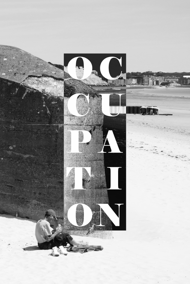
To gain inspiration for a from cover I used a previous idea from my bunkers zine. The front cover consists of a base image and a square which has been inverses in order to contrast the original image. Then on top of this I have written the word occupation in order to symbol the theme of the newspaper. I think this s a very effective layout in general as the contrast between the inverse and normal image is symbolic of the topic at hand, opposing sides, which fight against each other with opposing ideas. The image came from a photo shoot I did of the bunkers located ear Coronation park, which now sit dormant on the edge of the sea wall.
DOUBLE PAGE SPREAD 1:
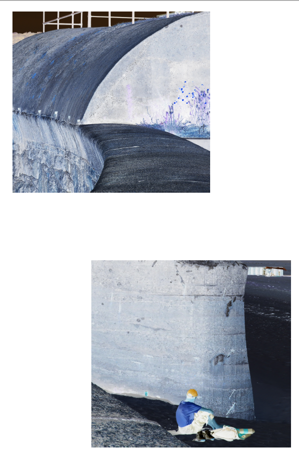
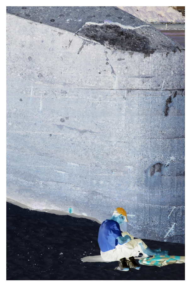
Coming from the same photo shoot as the image from the front cover, I employed a similar concept, using inverse imagery to represent the fight of two opposing powers. Instead of using black and white imagery, here I used the inverse of the original image. This spread is slightly different as I used two images which have been slightly spread out over the page in order to give some varying features to my newspaper spreads, this was an effective method of doing so without losing the value of the images.
DOUBLE PAGE SPREAD 2:
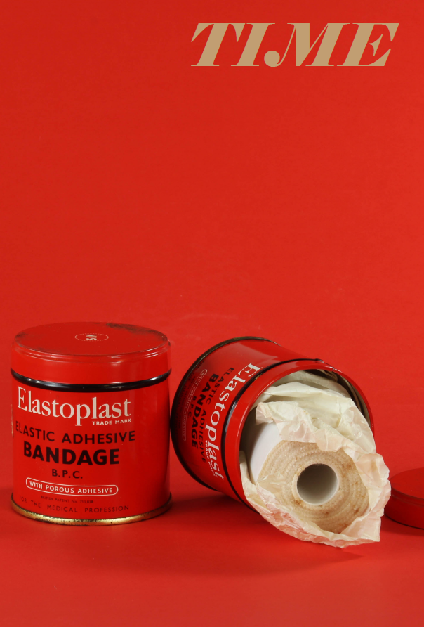
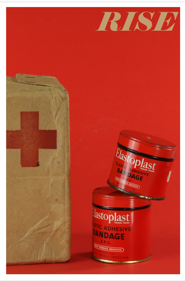
The second double page spread of my newspaper uses the images which I took during the making of the still life series. These were a good fit overall for the spread as they use items and objects specific to the time period of WW2, perfectly fitting with the theme of occupation vs liberation. I also retained the writing on the top left hand side of the image, just like in my zine, as I thought this added one interesting aspects to the image which otherwise would have not been there, adding a point of contrast and a second focal point. The bright red backdrop and tins of bandages in a way merge together in terms of there colour palette so therefore it was essential for the writing to act as a point of interest. The second page of my spread is also not full bleed as again it adds difference and variation to the overall design of the spreads.
DOUBLE PAGE SPREAD 3:
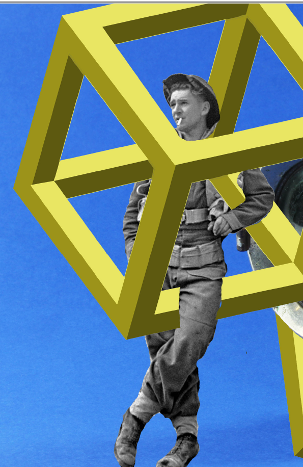
For my final layout, I employed the use of my previously made photo montage. I felt as though this was a suitable image to use for my spreads as it again fits with the theme of occupation vs liberation era well. The base image came from the photo shoot using war memorabilia to create still life images. I then went onto the editing process of the images, using another archival image of the soldier leaning on the side of the bike light and creating the geometric square laying on top. This is a nice contrast to the other spreads as it is in many ways both archival in nature but also modern with the inclusion of the geometric square, having a contemporary take on the topic as a whole.
