Statement of Intent

My personal study is based on divorce and separation. I will be exploring how a split between two people can affect a whole family. My idea links to the occupation vs liberation theme, the occupation connects to before the divorce and how my parents felt uneased in each others company. The liberation relates to how the split was for the best for my parents but it also created a lot of changed and instability for me. Via my personal experience I am going to create images that display feelings of lack of identity and belonging. Divorce is such a common action these days that it gets overlooked, I want to highlight that although its not an abnormal family situation, it is still life changing. I’m going to take a documentary approach by taking picture of old house I have lived in, old toys and old photos that remind of the times where I missed either my mum or dad. After I am going to explore surrealism and post-modernism approaches to represent my inner conflict during the divorce. I am going to hold interviews with my parent about their experience as well as some of my friends with divorced parents and some with parents still together. These interviews will help to give me a more accurate representation of divorce as everyone takes it differently also it will provide me with different viewpoints by also interviewing my parents.

My first shoot will inspired be by surrealist photographer Chris McKenney. His ‘Self-Ghost’s’ project is a representation of the supernatural and horror genre, which is what I want to use as it lacks identity even though his images are portraits. I am going to take my brother to a forest or nature filled backdrop similar to McKenney and place a sheet on his head to hid this face. A box is going to present in those images as it represents how I have to pack up my belongings everytime I go to my mums or dads and to express how many times I have moved house. Hopefully, I will highlight the idea that you can pack your whole life into cardboard boxes and each time it gets harder because as soon as you have settled another box appears. .I am then going to stray away from McKenney’s supernatural approach and take pictures of my brothers hands on trees, then up against the semi-see through windows in the bathroom.

NEWSPAPER SPREAD

FRONTCOVER:

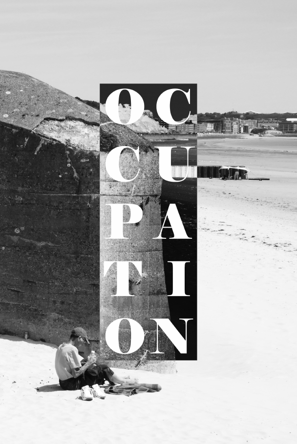
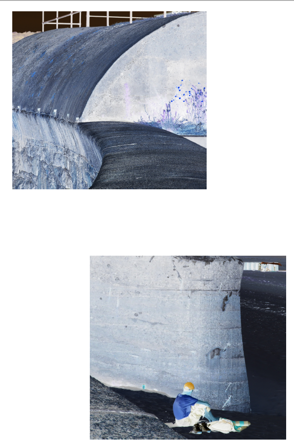
To gain inspiration for a from cover I used a previous idea from my bunkers zine. The front cover consists of a base image and a square which has been inverses in order to contrast the original image. Then on top of this I have written the word occupation in order to symbol the theme of the newspaper. I think this s a very effective layout in general as the contrast between the inverse and normal image is symbolic of the topic at hand, opposing sides, which fight against each other with opposing ideas. The image came from a photo shoot I did of the bunkers located ear Coronation park, which now sit dormant on the edge of the sea wall.

DOUBLE PAGE SPREAD 1:

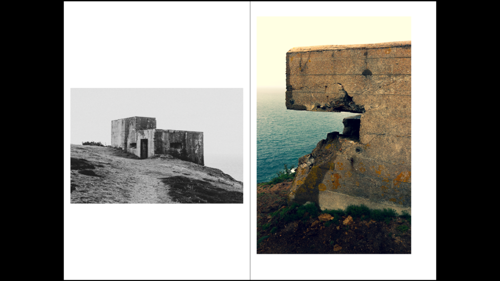
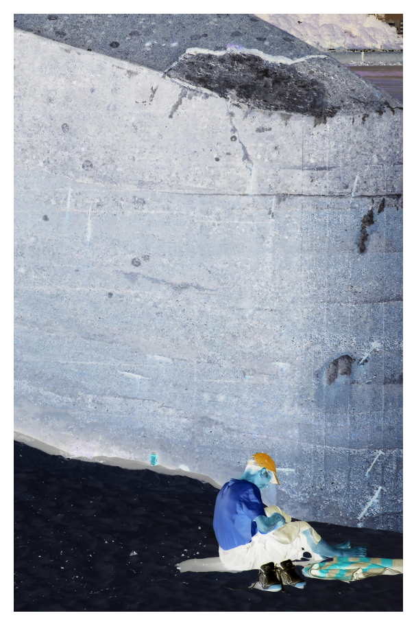
Coming from the same photo shoot as the image from the front cover, I employed a similar concept, using inverse imagery to represent the fight of two opposing powers. Instead of using black and white imagery, here I used the inverse of the original image. This spread is slightly different as I used two images which have been slightly spread out over the page in order to give some varying features to my newspaper spreads, this was an effective method of doing so without losing the value of the images.

DOUBLE PAGE SPREAD 2:

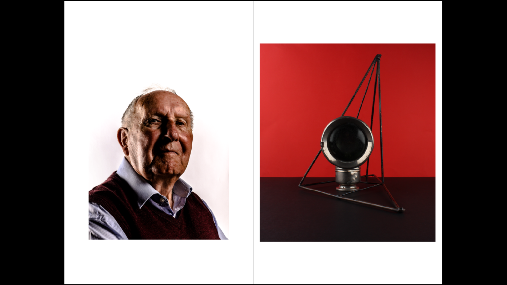
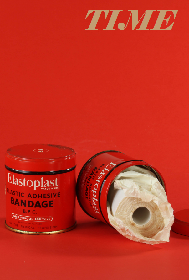
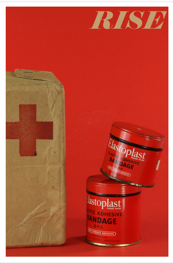
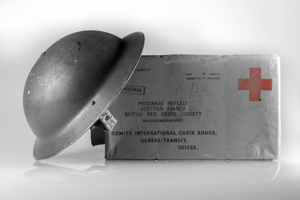
The second double page spread of my newspaper uses the images which I took during the making of the still life series. These were a good fit overall for the spread as they use items and objects specific to the time period of WW2, perfectly fitting with the theme of occupation vs liberation. I also retained the writing on the top left hand side of the image, just like in my zine, as I thought this added one interesting aspects to the image which otherwise would have not been there, adding a point of contrast and a second focal point. The bright red backdrop and tins of bandages in a way merge together in terms of there colour palette so therefore it was essential for the writing to act as a point of interest. The second page of my spread is also not full bleed as again it adds difference and variation to the overall design of the spreads.

DOUBLE PAGE SPREAD 3:

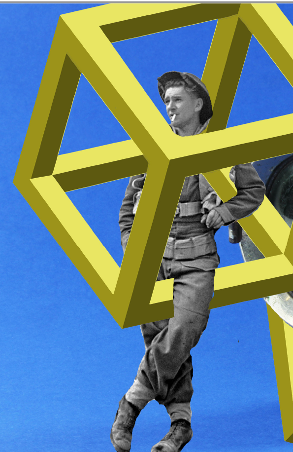
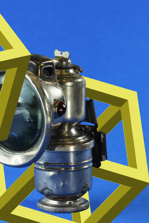
For my final layout, I employed the use of my previously made photo montage. I felt as though this was a suitable image to use for my spreads as it again fits with the theme of occupation vs liberation era well. The base image came from the photo shoot using war memorabilia to create still life images. I then went onto the editing process of the images, using another archival image of the soldier leaning on the side of the bike light and creating the geometric square laying on top. This is a nice contrast to the other spreads as it is in many ways both archival in nature but also modern with the inclusion of the geometric square, having a contemporary take on the topic as a whole.

Reviewing and Reflecting:

  1. From your Personal Investigation based on OCCUPATION vs LIBERATION write an overview of what you learned and how you intend to develop your Personal Study.
  2. Describe which themes, approaches (LANDSCAPE, PEOPLE, OBJECTS), artists, skills and photographic processes/ techniques inspired you the most and why.
  3. Include examples of current experiments to illustrate your thinking.
  4. Produce a new mind-map and mood-board based around how you interpret the theme of OCCUPATION vs LIBERATION now.

Overview:

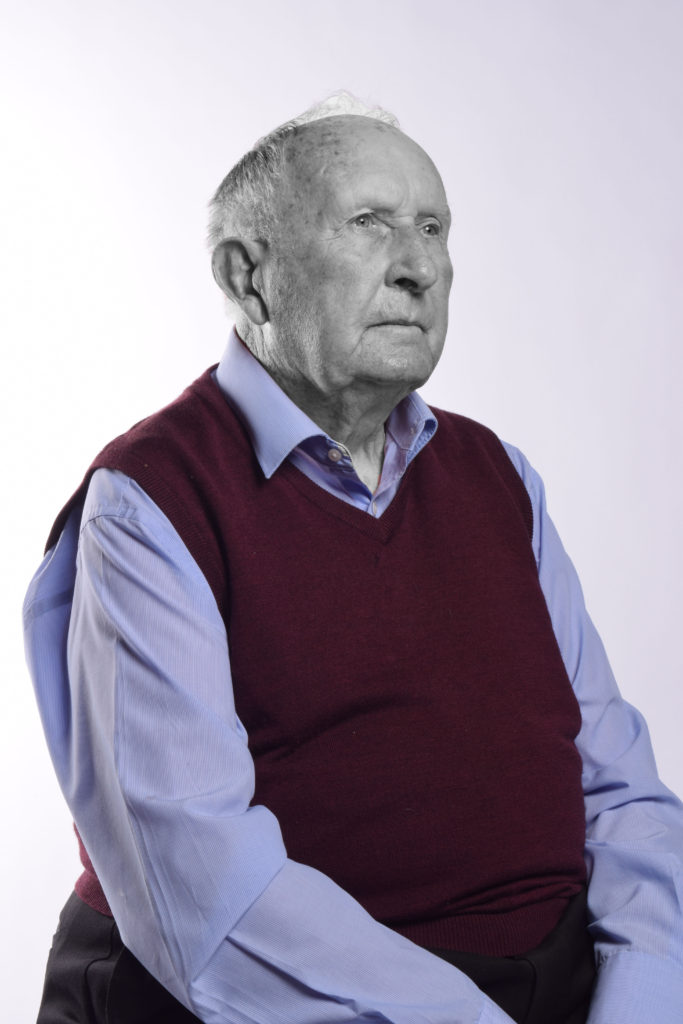
In June, we began our personal investigation based on ‘Occupation Vs Liberation.’ To begin with, due to the nice weather, we focused on the bunker fortifications left behind by the Nazi occupying forces. This would be the focus of our first zine. This was followed by looking at the people involved in the Occupation, including those who are still alive today, and how objects and still life could be used to tell the Occupation story. This would be our second zine. Where as I had looked at still life and portraiture during AS, landscape was an area of photography I had yet to explore in detail or try out for myself. I thoroughly enjoyed the project as a whole, I found myself continuously lost in the landscape shoots while also discovering a new interest for portraits. This is what I hope to use in my personal study to show a new take of the idea of ‘Occupation Vs Liberation.’

New skills and inspiration learnt:

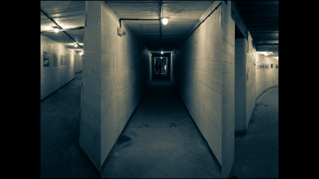
From day one, I had already been introduced to a way to improve and research my photography in a way I had never considered before. This was the use of archive images. We are incredibly lucky in Jersey to have access to our very own photo archive at the Societe Jersiaise. It was incredibly interesting to see some of the old photos from 1940-45 because I realized that maybe I didn’t know as much as I thought I did about the Occupation. However, the use of these images never really crossed my mind after that until much later. If I’m being completely honest, I had no intention of ever incorporating archive images with my own, at least not during the landscape part of the project. With archive out of my mind, we began our first shoot for landscapes. A permanent reminder of Nazi occupation are the remains of the concrete bunkers they built to fortify the Island. This was of course the perfect thing to photograph for this project. While visiting Battery Lothringen at Noirmont, we were given the opportunity to go inside one of the bunkers and take photos of the displays inside. This meant that we had to adjust the settings on our cameras to accommodate for the lack of light. I was reluctant to rise the ISO above 1600 as I didn’t want my image being grainy. To compensate for this I had to use a low aperture to allow for as much light as possible to enter the camera lens. I then went on to use this when taking photos at Jersey War Tunnels.

A second major skill that I was introduced to was zine making. I had never used InDesign before, but quickly caught on with how to layout my images in a way that created a narrative that told showed the relationship between Islanders and their occupiers.

Examples of current experimentation:

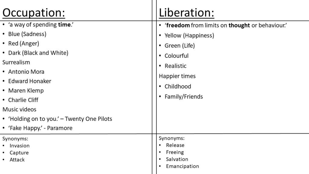
Occupation Vs. Liberation:

Personal Study- Initial Research/ Ideas

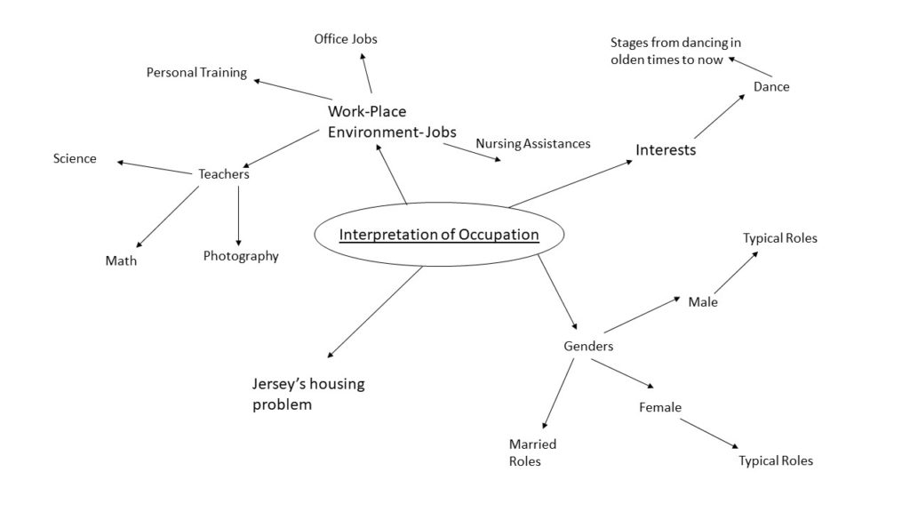
Interpretation of Occupation

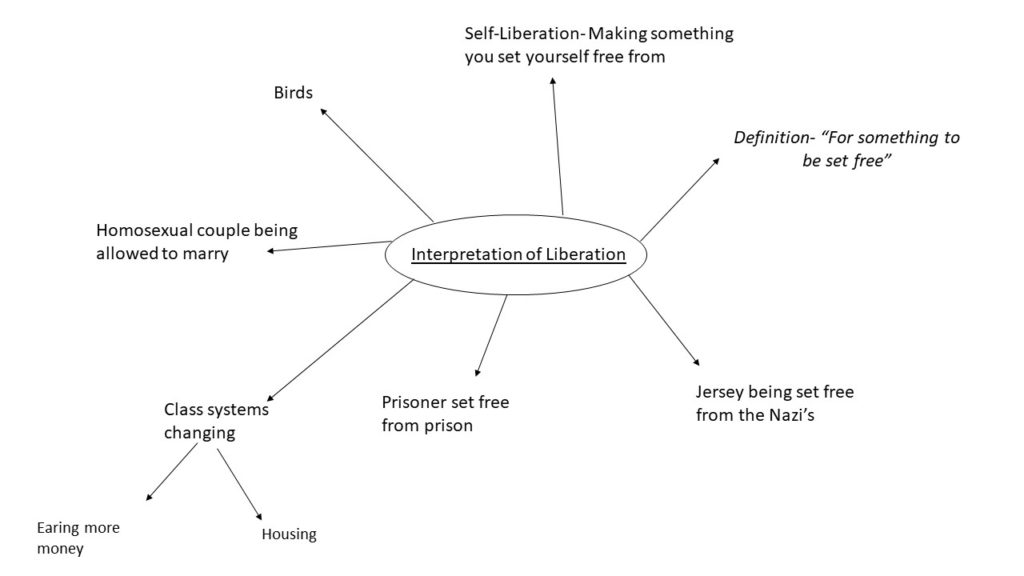
Interpretation of Liberation

Exploring for Personal Study

In order to begin researching for my personal study I looked at last years photo books for inspiration as it was the easiest source of examples. I gathered three photo-books from the previous A-Level students and went through the book in detail while picking out elements i liked from the photo book/ parts which inspired me. I also looked at the composition of the books, all of white included a mixture of full bleed images, double page spreads as well as a range of sized images.

“Jersey Was The Land Of Fairies”- Jade Dingle

The first book i looked at was ‘Jersey Was The Land Of Fairies’ by Jade Dingle. I found that this book had an unusual concept to it as it is seen to be about four different fairies, all of which she has dressed up the same girl in different costumes and created a story for the ‘fairy’. The book purely contains her own images with a page of her own writing which is about the subject of the following images. I liked how she included text in the book as it isn’t overpowering however it does also allow the audience to gain a sense as to what the photographer was trying to portray. For example, as seen below there is a page for a specific fairy called ‘William And The Water Sprite’ this title followed by the text allows us to understand why the model is in water, why she has blue face paint on etc..

“All My Love”- Jude Luce

This second photo- book i looked into had a theme of family ad relationships with parents and friends. When looking through this book I found that there were a few images which didn’t necessarily link to the theme of the book which I felt as if didn’t need to be there. However there were also aspects I liked such as the physical photos which have been stuck in, comparison in old and new images, including sentimental elements ie tattoos and archival images from there parents.

“Inside Out”- Anna

When looking through this photo book, i quickly gained a personal concept in my head. The book includes a lot of images with the model wearing barely any clothing and also being placed in different locations such as the beach, studio, in the bath etc. I feel as if this adds a purity to the book and the lack of clothing showing her femininity, these elements work well together as they both help to empower a women which i feel as if this book is trying to do. When being able to see the models face we can see a straight face suggesting shes effected by this subject and is showing her own body to people who don’t feel conformable in their own, to empower them. This can be seen in the image below.

“Those Who Dream Only By Night”- Cole Courval

In this photo book I can see that there is a mixture of images included, most of which don’t add up to create a narrative. However, there are sectioned images which all represent a typical subject which I feel is a good aspect to this book. There is also a theme of black in the book which creates an aesthetic. Different locations are shown in the book, ie. town, beach, skate park etc. all suggesting that the overall theme could be teens.

Evaluation:

I found that looking at previous students work has been very inspirational and given me an insight as to the standards some photo books are as well as help to allow me to understand different compositions which people used for certain effects. This has allowed for me to create a few subjects which I would like to explore in my own photo-book.

I will also research well known photographers and look into their work in order to look at more technical elements to a photo book and photographic techniques used to create effect.