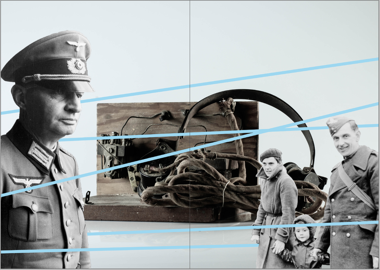
My zine has been influenced by The First March of Gentlemen by Rafal Milach. I have detached figures from the Société Jersiaise archival imagery and placed them onto my still life photographs of Occupation objects. Several figures in the zine are caged in geometric shapes as a metaphor of the restrictions the German’s introduced into Jersey when it was Occupied
I love the bold, vivid colour scheme of my zine since it juxtaposes with the historical, black and white images of the soldiers. The colourful aspect of the zine camouflages the serious subject matter of World War 2. I have also included typography inside to add a pop of colour, so there would be a constant colour scheme running throughout my zine.
The theme of the zine is looking at the different topics that we have explored during the Occupation vs Liberation project. These include portraiture, still life and photomontage. The majority of the images in my zine are montages since I wanted to present my photos in a creative way, however there is a double page that includes a portrait of Joan Tapley and two still life’s from the Jersey War Tunnels.
The front cover includes all the archival figures that can be seen inside the zine. I used the font TitlingGothicFB Skyline as the title since it’s bold and will most likely capture the viewers attention. Previously, I had the title in the colour black but decided to change it to white since there is greater contrast between the lettering and the “candy” coloured background. The background from the front continues to the back cover, where a newspaper from the Jersey Weekly Post is depicted stating “Liberation Supplement”. This was published in 1945 and shows Jersey’s Liberation from the German Occupation, creating a pleasant ending to this zine.