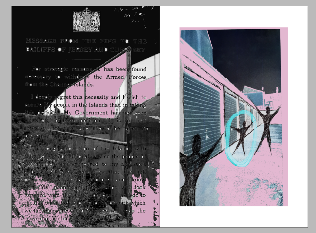
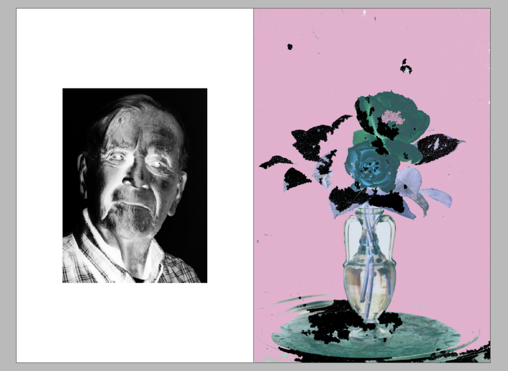
Below are the 3 different variations of a double spread for the newspaper. Most of the images I have used are Occupation related or have a relation to something we have worked on in this unit, such as the montage of the Emile Guiton auto-chrome rose. I’ve chosen a light pink, black and blue/green theme for all these images as I think they go well together but also work well on their own. I’ve also inverted 3 of my montages in Photoshop as I think it gives an interesting effect and matches the colour scheme well.


