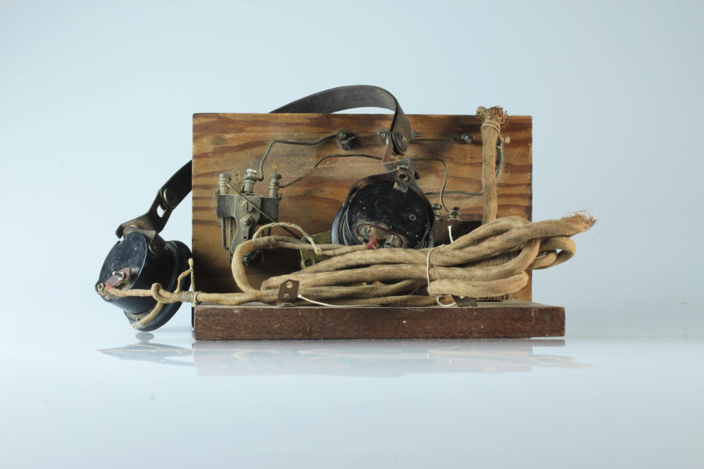
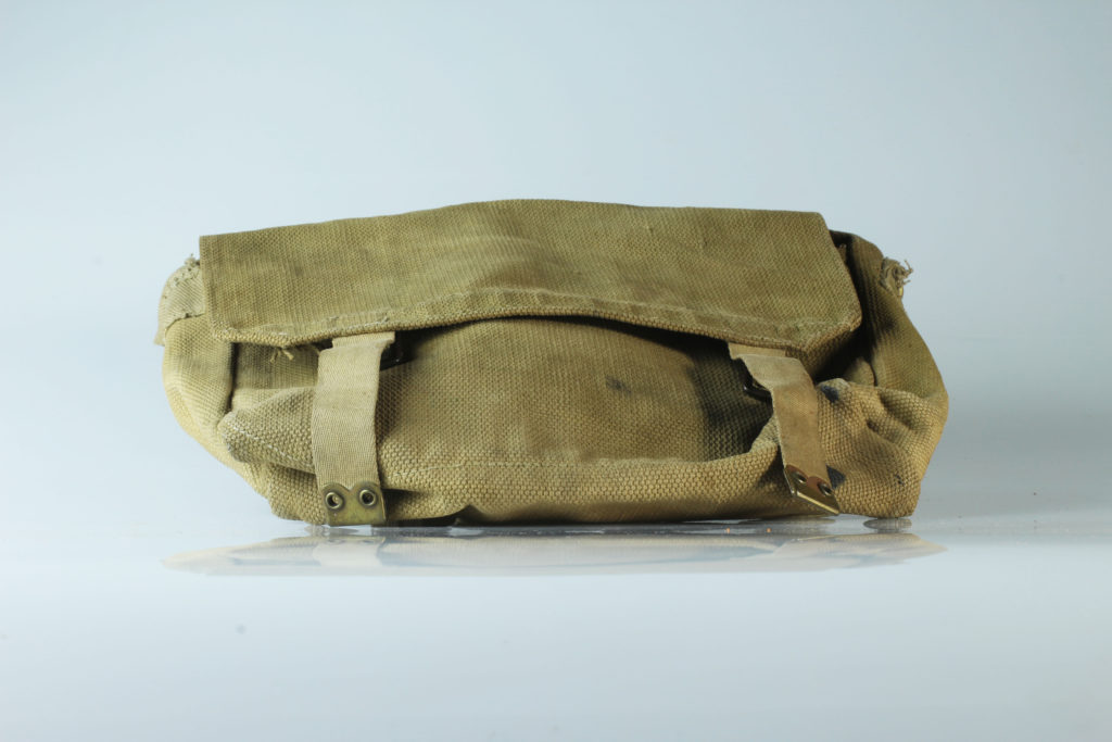
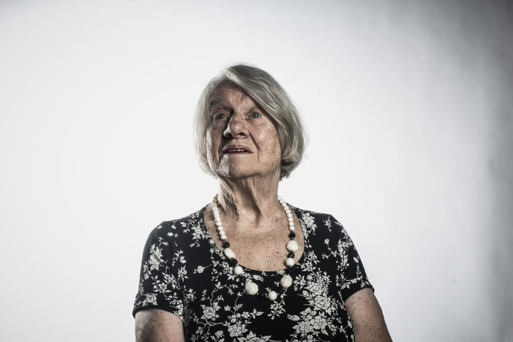
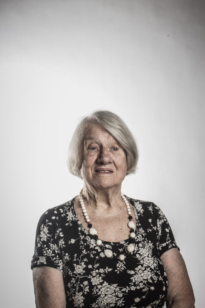
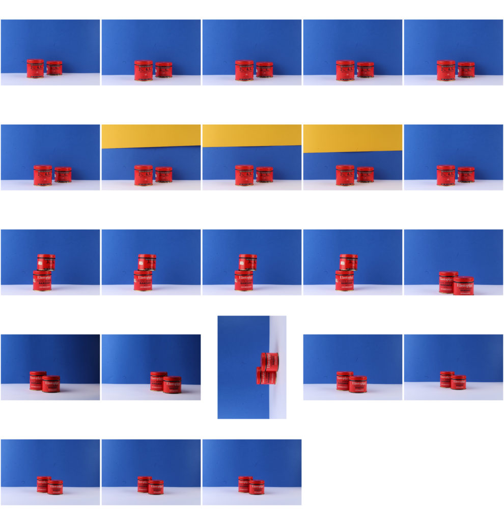
I have chosen these four photos out of many others which I have edited; this is as due to the colour block theme most of the images look similar, and these four are a good representation of the whole photo shoot.
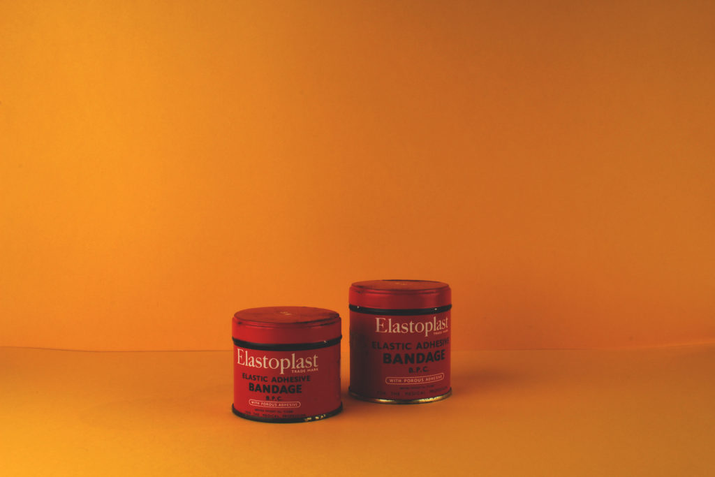
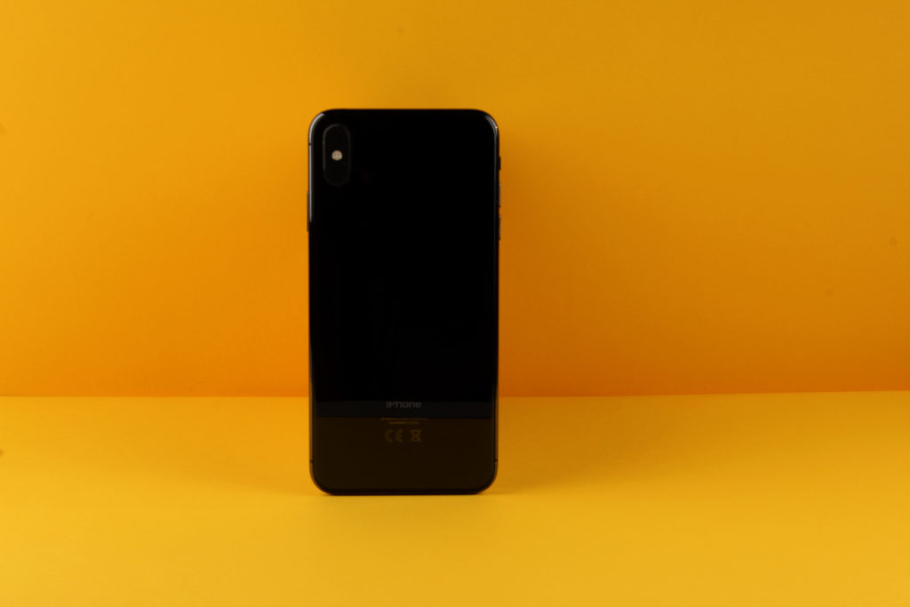
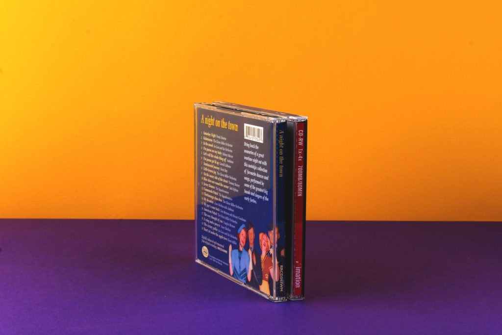
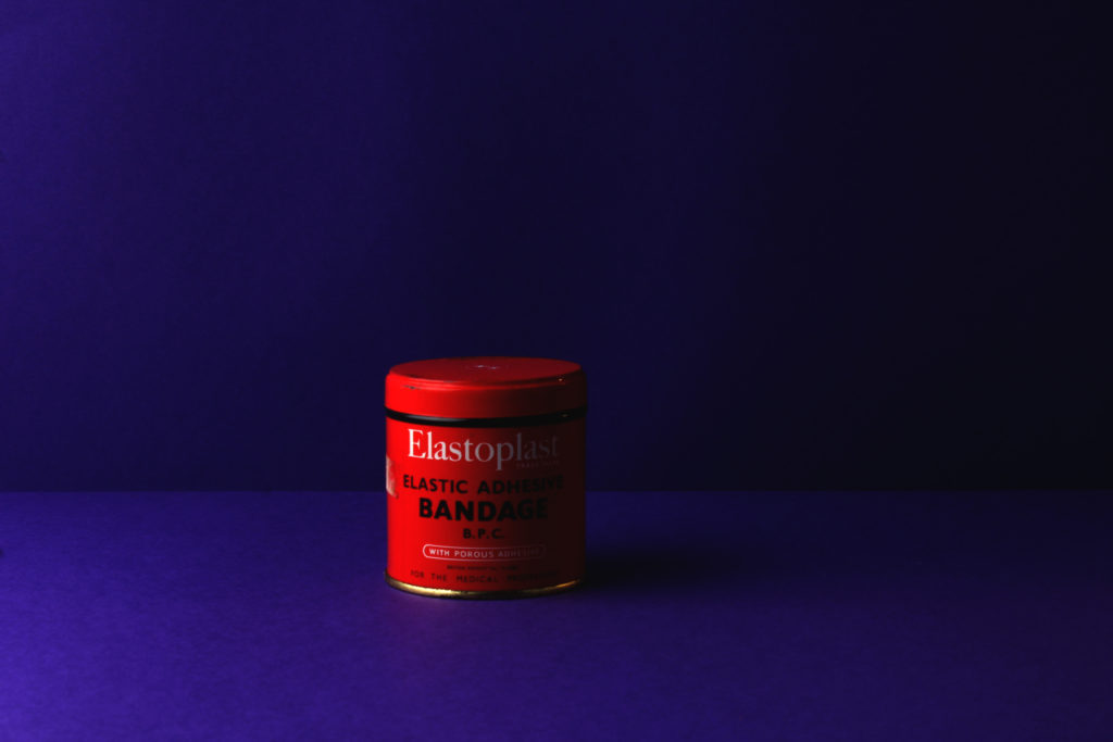
I have chosen these four photos out of many others which I have edited; this is as due to the colour block theme most of the images look similar, and these four are a good representation of the whole photo shoot.


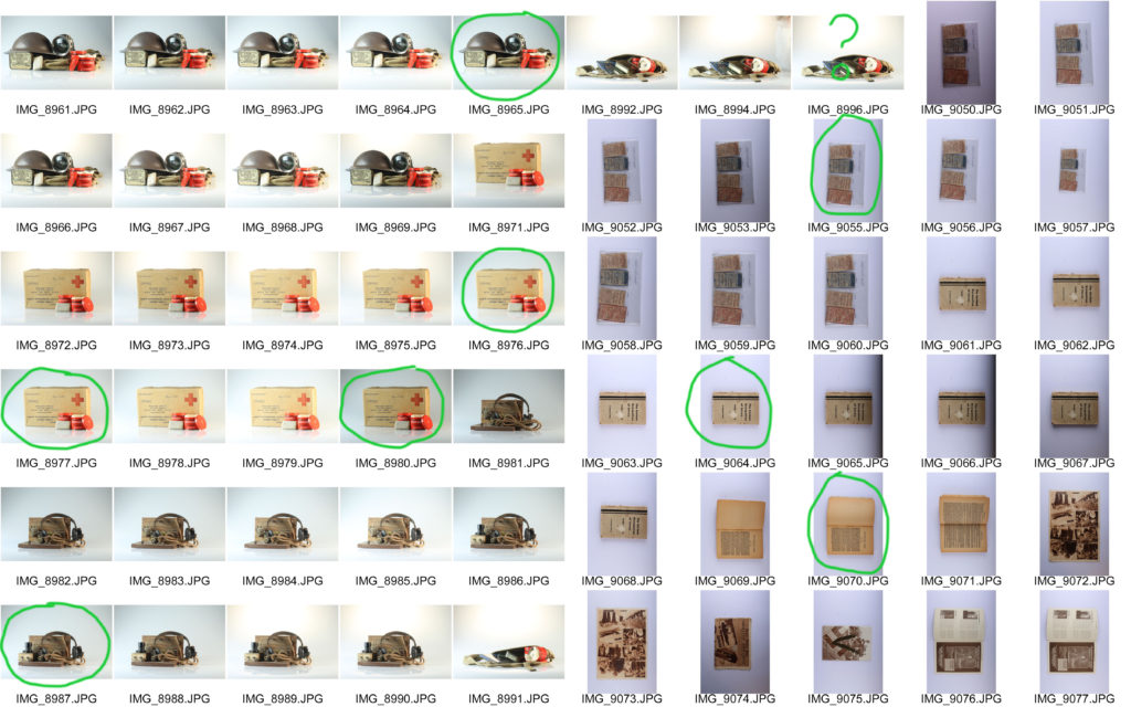
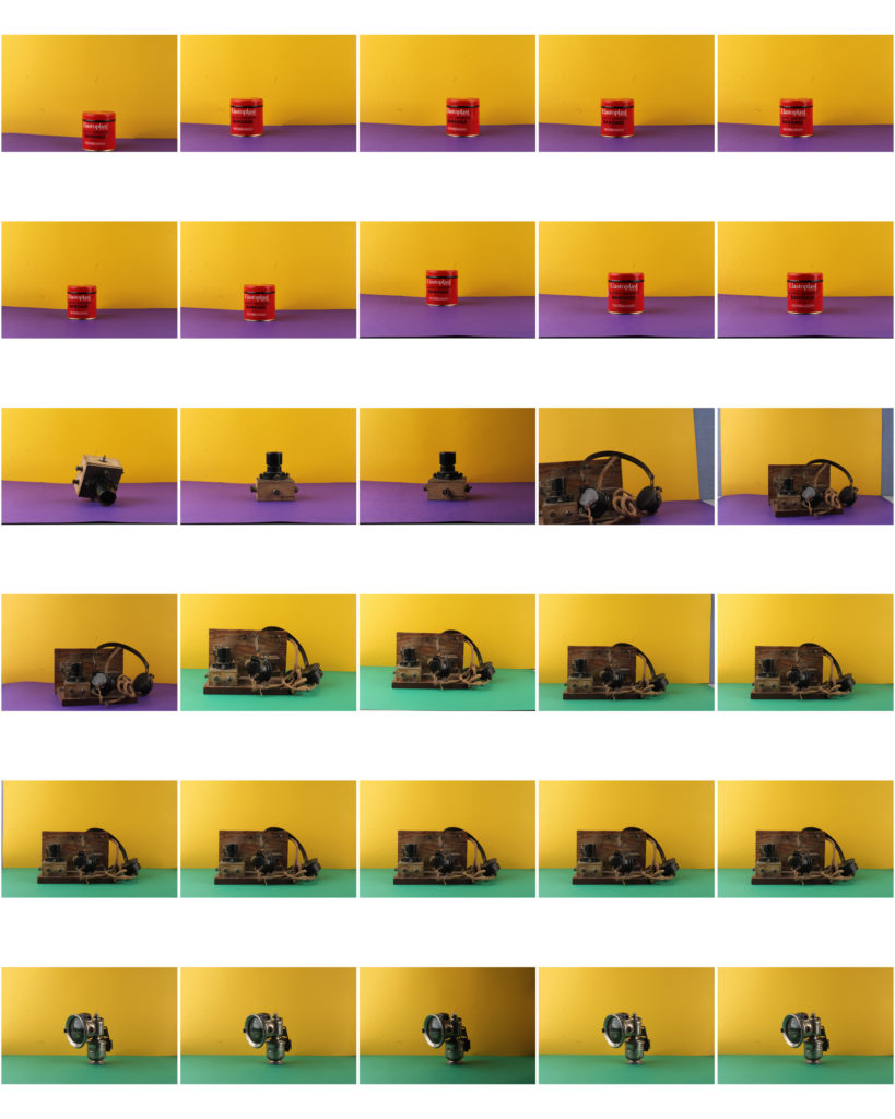
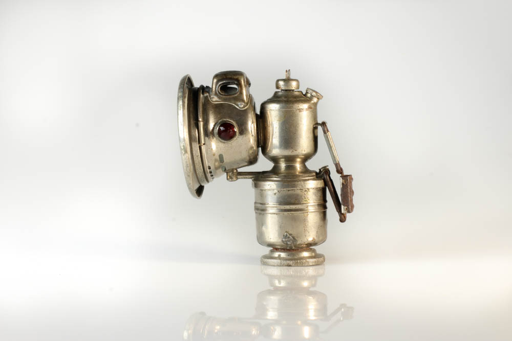
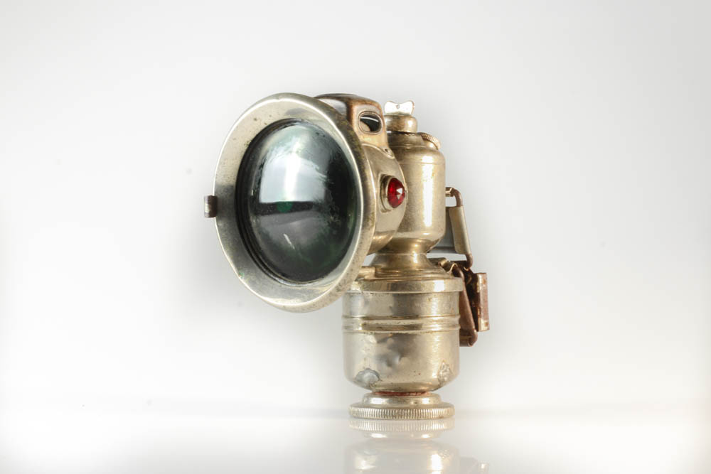
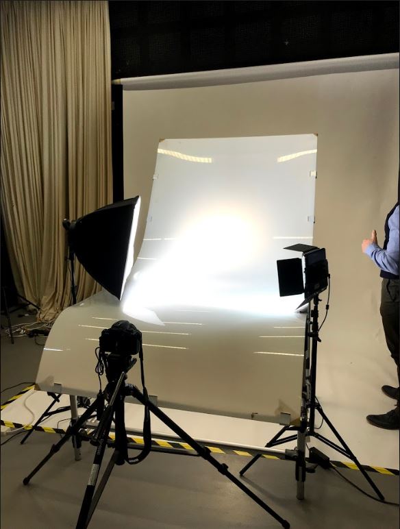
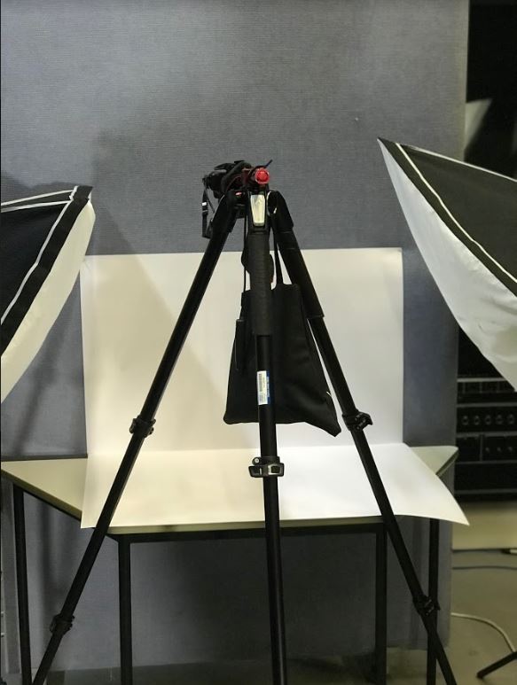
The main focus of this photo shoot was to capture objects from the German occupation in Jersey. There were two different camera set ups to capture the objects, one being straight on and the other from a birds eye view. The straight on set up was used to capture bigger objects that could stand up by themselves, such as helmets, boxes, lights. Whereas the birds eye view angle was used to take photos of objects that couldn’t stand up such as books, newspapers and magazines.
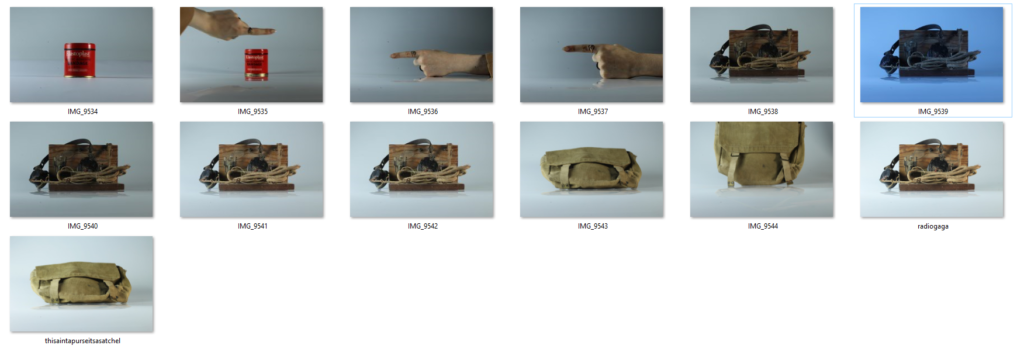
Contact Sheets:
Edit 1:
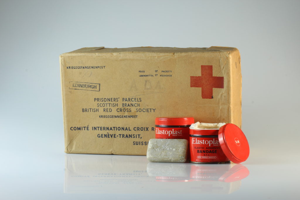
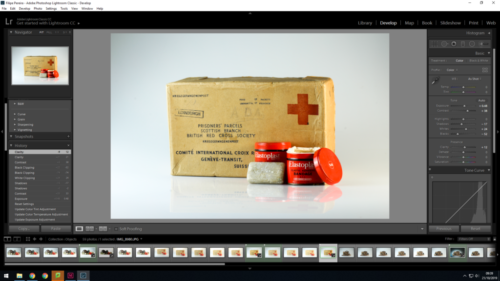
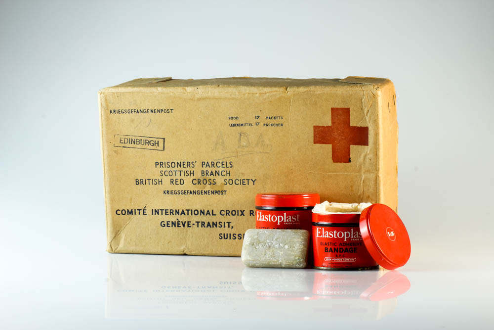
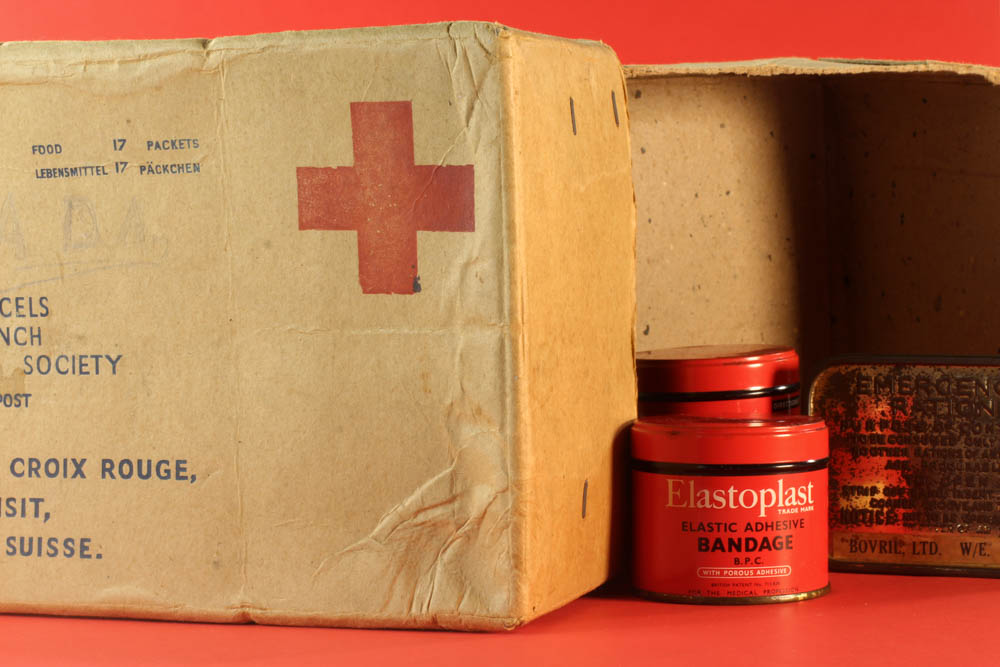
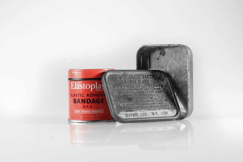
In this edit I began by trying to make the background brighter so that the object would stand out a little more and to also brighten up the image. I did this by increasing the exposure and the white sections in Lightroom. The next thing I did was tried to make some of the details on the box and tubs become clearer, and I did this by increasing the contrast and decreasing the shadow sections to make so that the shadows would stand out more and so that there would be more of a contrast between the dark and light sections of the edit. To conclude the edit I increased the clarity just so that some of the creases and damage on the box could stand out and give the box a bit of texture.
Edit 2:
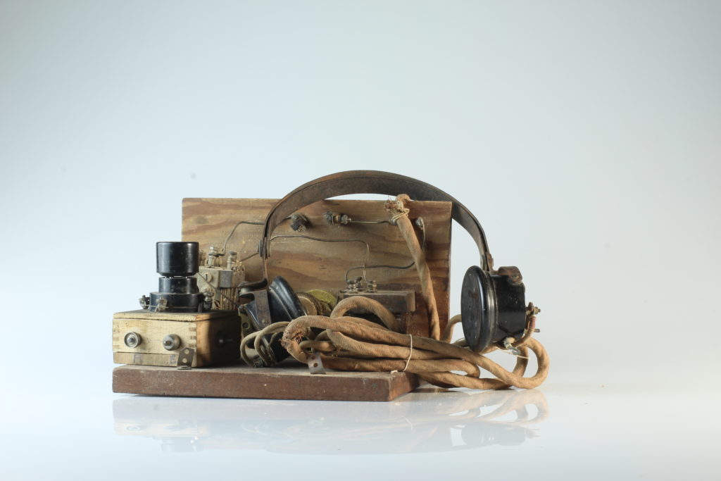
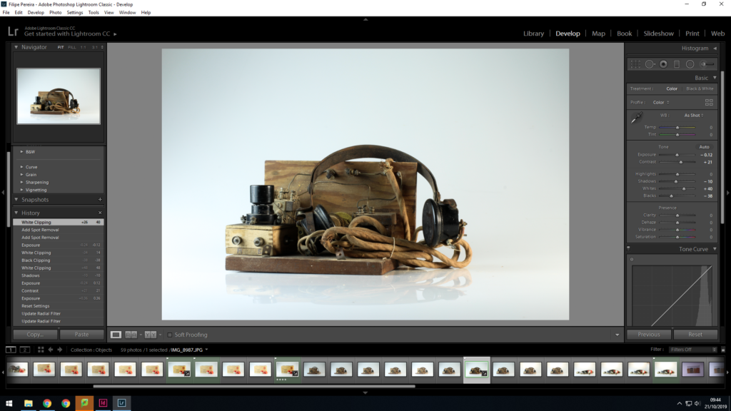
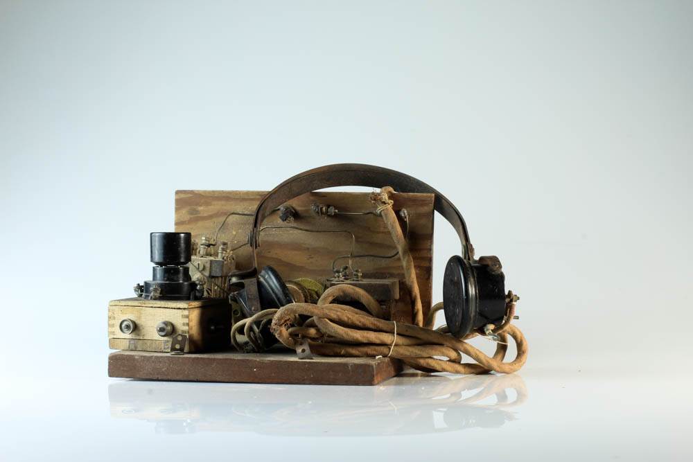
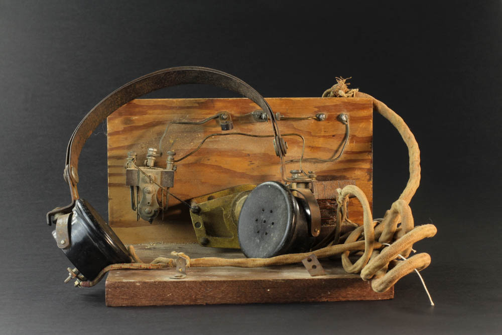
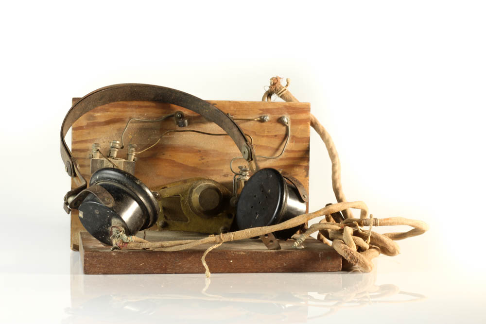
In this edit my main aim was to make the detail on the wood and the headphone wires clearer. To do this I began by increasing the contrast to try make the little bumps on the headphone wires stand out and make the little cracks and scuffs on the wood clearer. I also increased the amount of white and black in the photo to make the background brighter and to also make and lighter shades on the wood and headphones brighter to try create more of a contrast.
Edit 3:
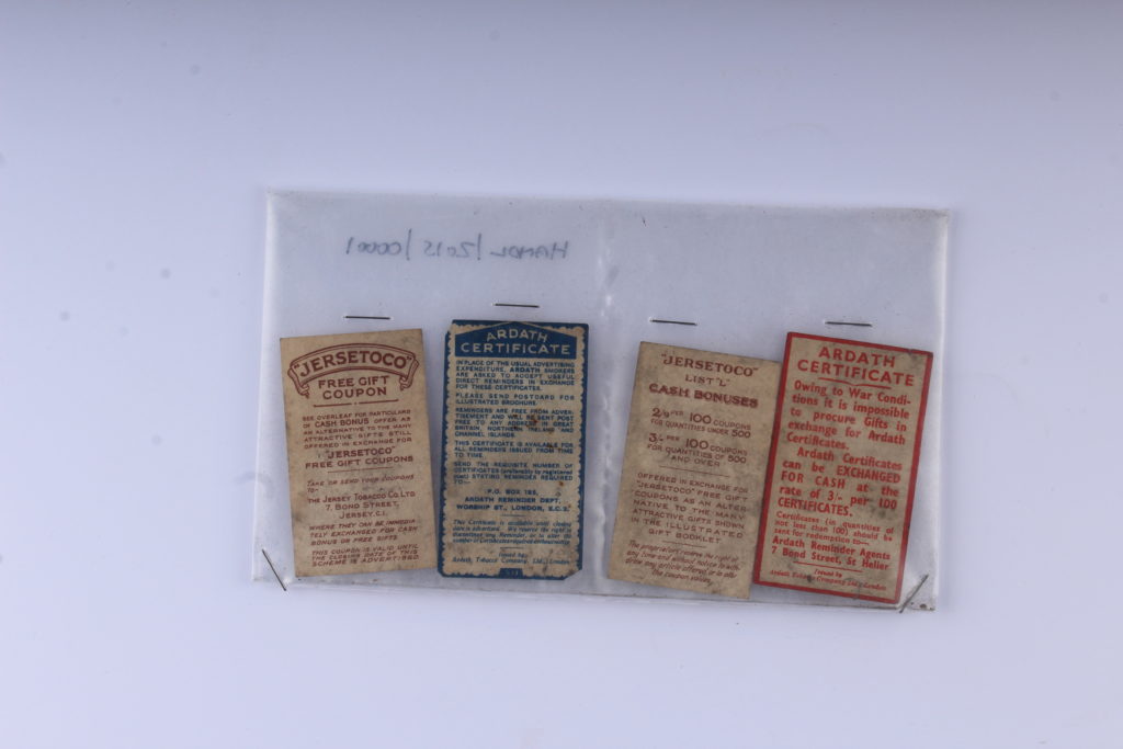
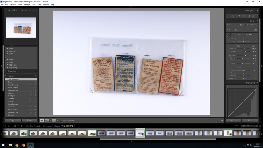
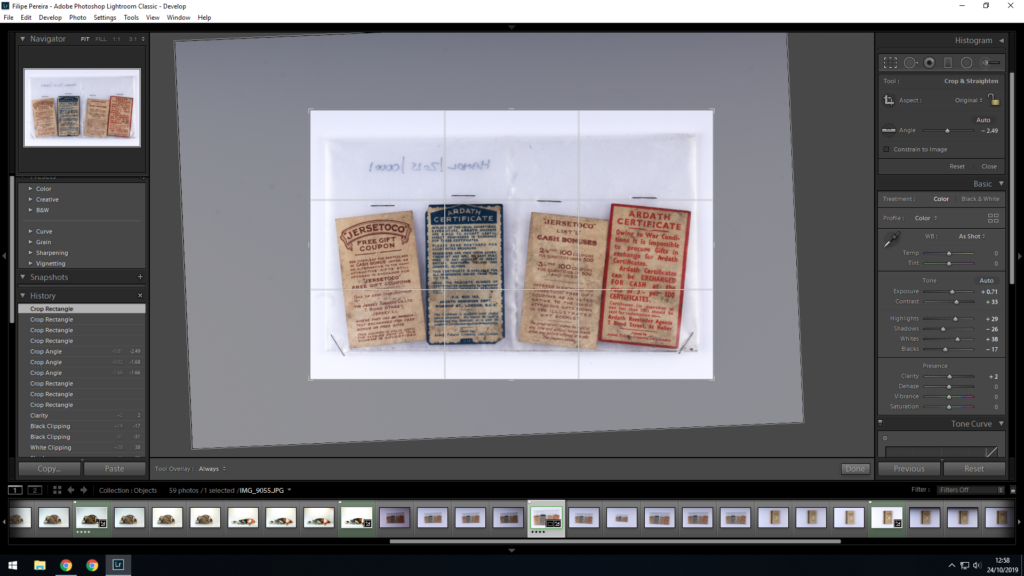
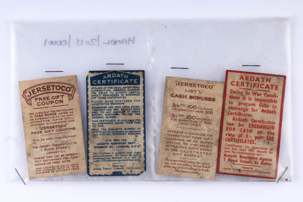
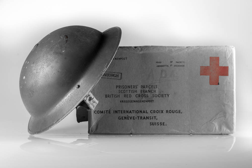
I began this edit by increasing the contrast and shadows in order to make the red and blue stand out more from the brown paper and also to make the pieces of paper stand out from the background. To also help create a contrast between the pieces of brown paper and the white background I also increased the whites in the image and the exposure. I finished off the edit by cropping out the extra white background and by making sure the subject of the image was adjusted so that it looked straight.
Edit 4:
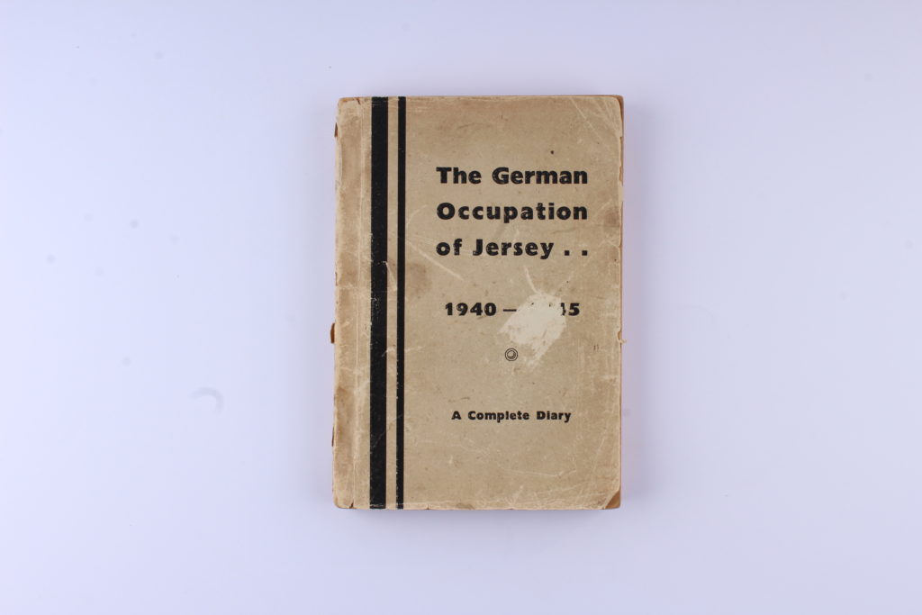
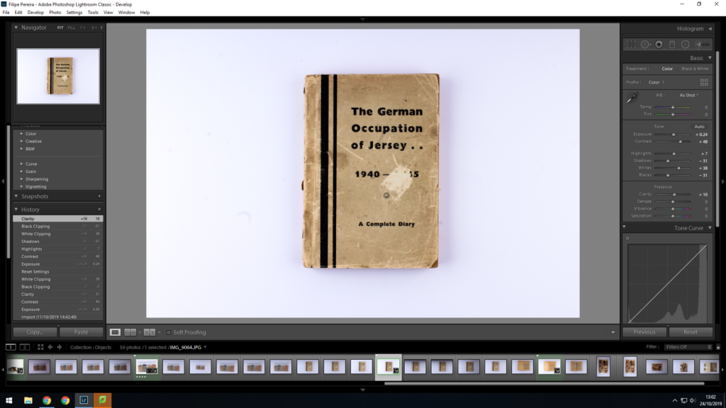
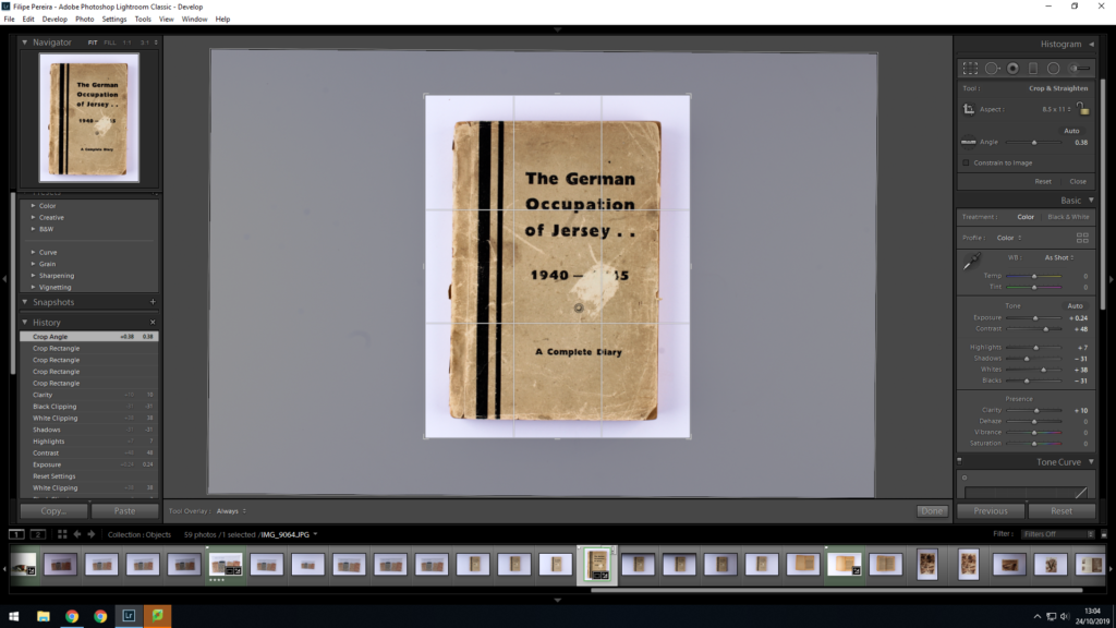
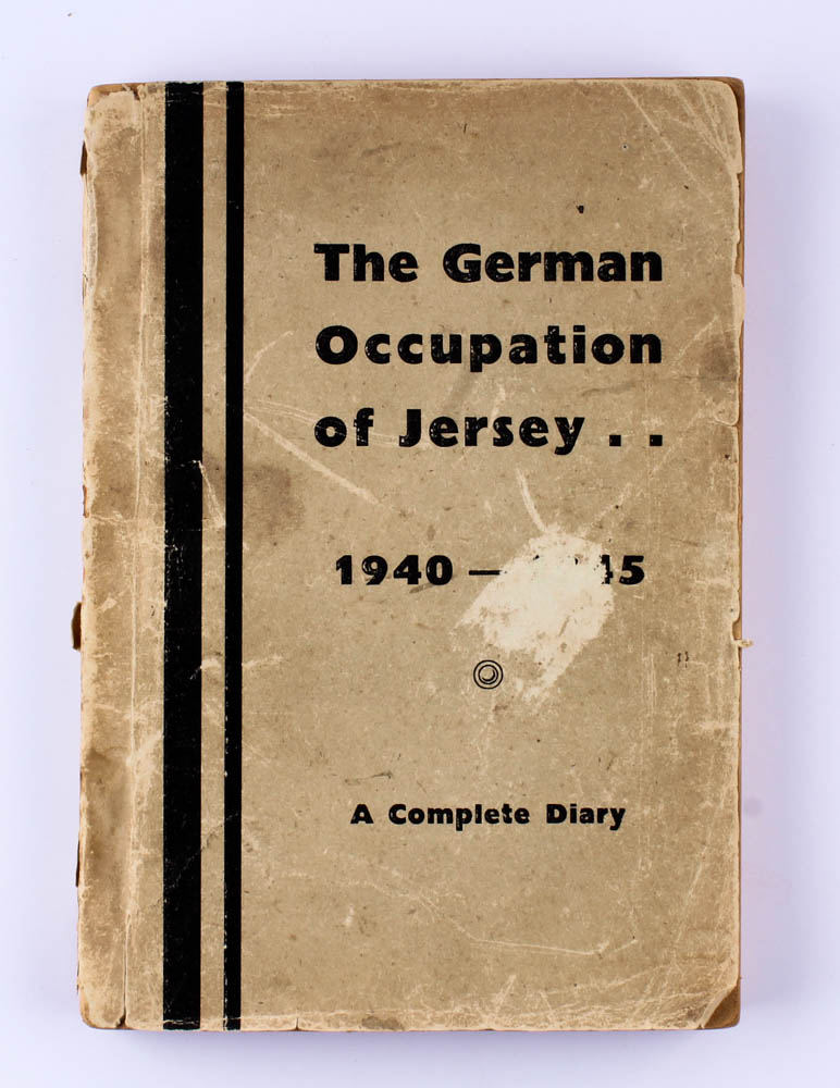
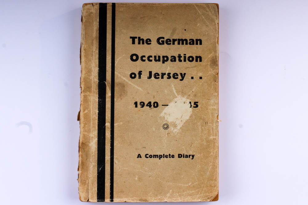
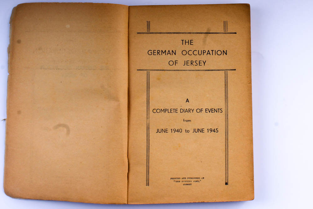
When editing this image I tried to make the details in the book stand out as much as possible. To do this I started by adjusting the contrast and shadows in Lightroom to try get all the little detail on the book cover. I also increased the whites in Lightroom to try get the background a light as possible without making the image too overexposed, and to also make the book stand out from the background a little more. I also increased the blacks to make the writing on the book a little darker. I finished the edit off by cropping the image to get rid of the extra white back ground and making sure that the book looked straight.
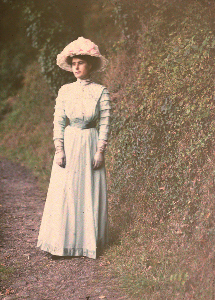
The first practicable method of colour photography was the autochrome process, invented in France by Auguste and Louis Lumière. Best known for their invention of the Cinématographe in 1895, the Lumières began commercial manufacture of autochrome plates in the early 20th century.
Emile Guiton was a keen amateur photographer and practised throughout his long life. He experimented with colour at the beginning of the twentieth century in “Autochromes”. His subjects include the recording of archaeological excavations and he was one of the few people in Jersey permitted to take photographs during the German Occupation of 1940 – 1945. Emile Guiton also recognised very early on the importance of collecting photographs, both as a valuable social historic resource and as interesting artefacts – examples of developments in science and technology. He donated many images to the Société Jersiaise. He died in 1972.

https://blog.scienceandmediamuseum.org.uk/autochromes-the-dawn-of-colour-photography/ https://www.independent.co.uk/life-style/autochrome-lumiere-colour-photos-oldest-potato-starch-dyes-a8190846.html https://edition.cnn.com/2015/06/03/world/gallery/autochrome-christina/index.html
Contact Sheet:
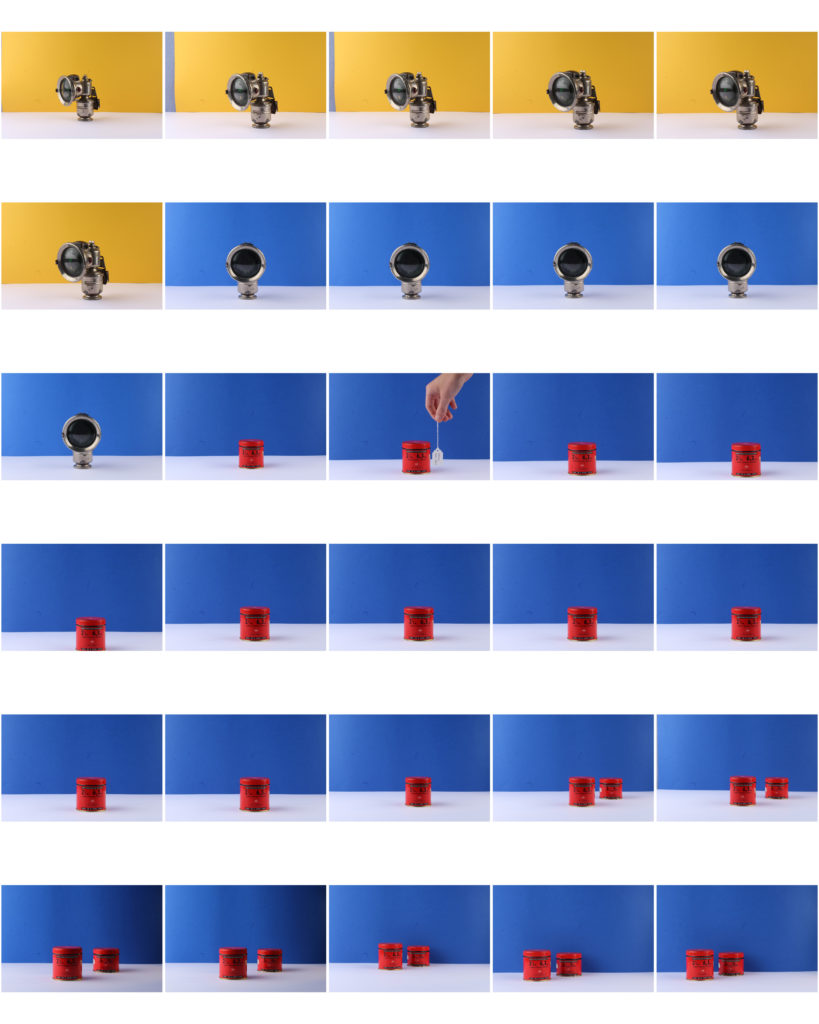
To get a better understanding of the Occupation, Jersey Heritage kindly allowed us to borrow some object from their collection to photograph.
The best way to photograph object is by placing them on a table top and with a continuous background. Documents can be photographed by placing them on top of a table and photographing from above.


Food shortages were common across Europe during WWII and despite rationing, people often went days without food. By December 1944, Jersey was short on food, fuel and medical supplies. The SS Vega first arrived in St. Helier on December 30th 1944, bringing with it much needed Red Cross packages. While the SS Vega sailed from Lisbon, its packages were from Canada and New Zealand. Without the Red Cross packages, many islanders across the Channel Islands would have starved to death.
This image shows an open Red Cross package along with two bandage tins and an emergency rations tin. The objects are arranged as if the three tins were inside of the Red Cross package. A red background can also be seen.
I took this image using an aperture of F/16, a shutter speed of 1/2 seconds and an ISO of 100. The objects were placed under soft lighting, with a soft box on the left and an LED light on the right. To give the image a red background, I placed two pieces of red A3 paper under the objects, concealing where I’d joined the paper to created a continuous effect.

During the Occupation, radios were banned to prevent Islander from receiving news about the War from Britain and France. All radios were to be confiscated, however, many Islanders hid their radios or even built their own crystal radio sets (as seen above).
To take this image I again used an aperture of F/16, a shutter speed of 1/2 seconds and an ISO of 100. Soft lighting was also used from both the left and right and two black pieces of A3 paper used as a background.
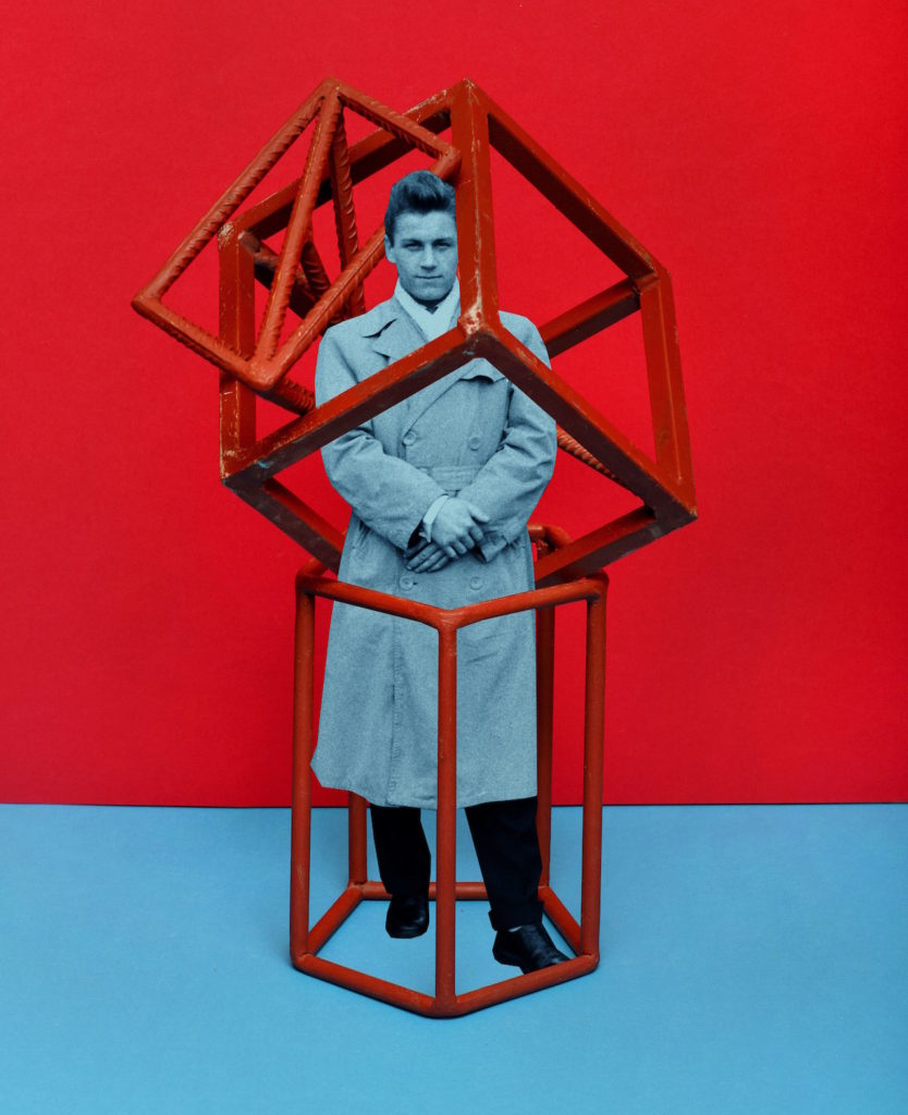
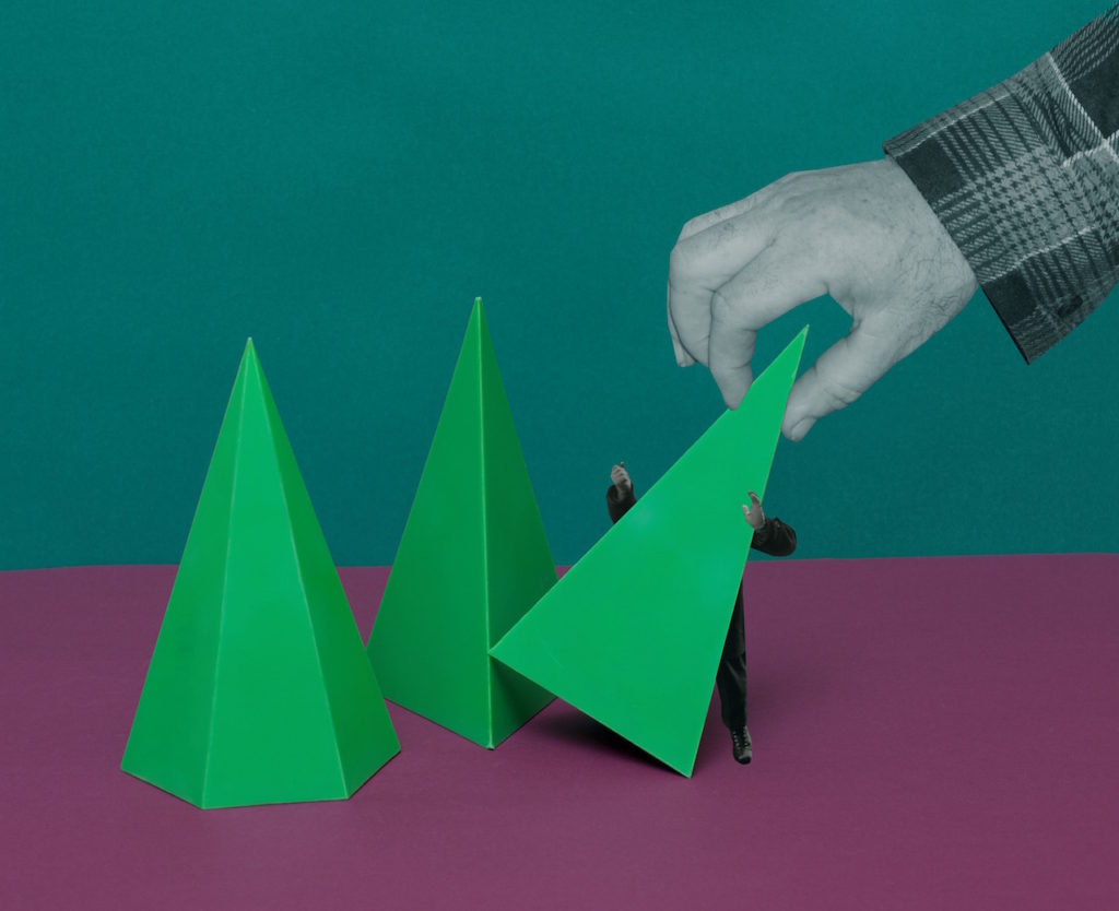
 The First March of Gentlemen, a 72-page photobook composed of collages that mingle elements illustrating the 1902 Children’s Strike in the city Września. The children striked against the Germanisation of their education. Ther Germanisation would mean that physical violence would be enforced and Polish, their mother tongue would be eradicated from the classroom. It has become synomynous with Września.

The First March of Gentlemen is a fictitious narrative that can be read as a metaphor, commenting on the social and political tensions of the present day.

Rafal Milach explained that “The most important thing was to create a story that would be accessible to everyone because this is, in the first place, my vision of a society, in which individuals can protest in the public space, regardless of consequence,” he explains. “The initial idea of working with the archive was sustained, but the topic changed as I began looking for material that could occupy two spheres – discipline and pacification, and the sphere of freedom – and to bring these elements together in a series of collages.”
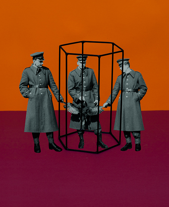
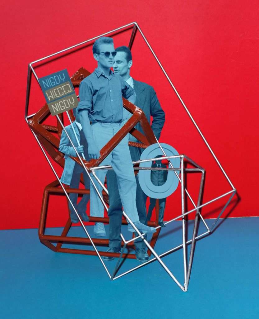
Milach found and used the work of ametuer photographer  Ryszard Szczepaniak. His archive consisted of images shot in  Września during the 1950's and 1960's. He photographed his and his brother’s friends in formal street poses, many of them while on leave from the military, some of whom came from the Armia Ludowa, a communist partisan force set up by the Polish Workers’ Party while under German occupation during World War II.

 Milach detaches them physically, cutting out the figures and pasting them onto brightly coloured backgrounds, hinting at ideas of contrast and displacement. The book was designed by his wife Ania Nałęcka-Milach, and it references a children’s exercise book in its choice of size and coloured papers, bound by a long red thread to contain its assembly.

The design is “like a toy, like a candy – something nice to look at and to touch,” Milach says. “But it’s only a camouflage; a beautiful skin to disguise these spheres, to somehow smuggle them into your daily life” – just like the jubilant propaganda posters of the 1950s, or the cheery chat shows on the newly nationalised television stations of today.
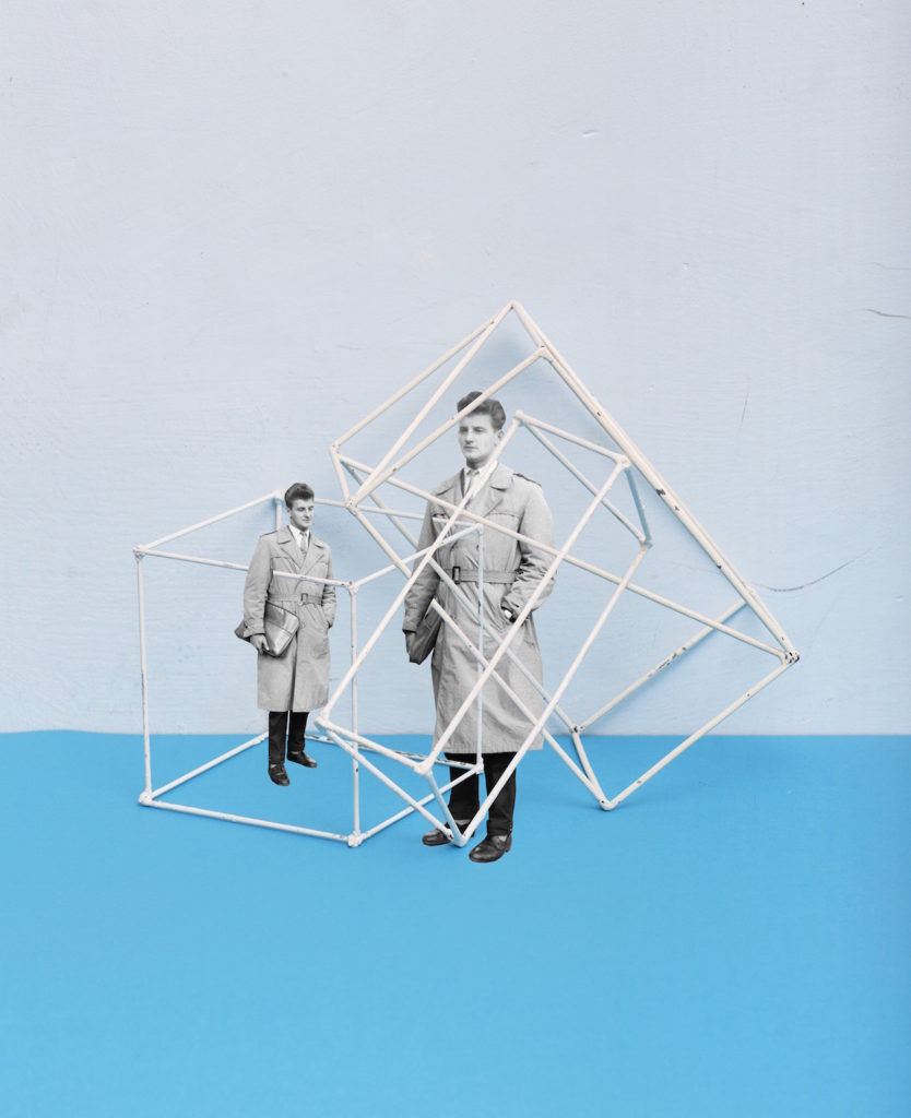
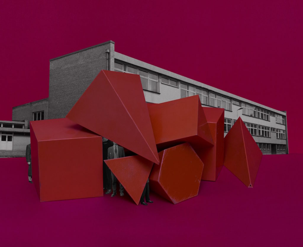
Information from: https://www.bjp-online.com/2018/06/milach-gentlemen/
With the images from my visit to Batterie Moltke, I am going to experiment with various techniques such as cropping and colour adjustment as well as Desaturating images entirely to create a series of variation in my images
Below I have included some of my original images followed by cropped edits. Cropping is used to remove irrelevant or unwanted subjects fro an image which allows for more focus and emphasis on the main subject. Cropping also helps change the aspect ratio of an image and also allows for an overall improvement in terms of the images composition
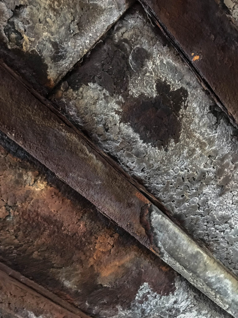
Above is an image of a corroded ceiling inside of the German MP4 Radio Tower. I like the texture given off in the image as it shows a true sense of age and decay, However I find that a crop could benefit the image well in terms of overall composition. Below is my Cropped Image
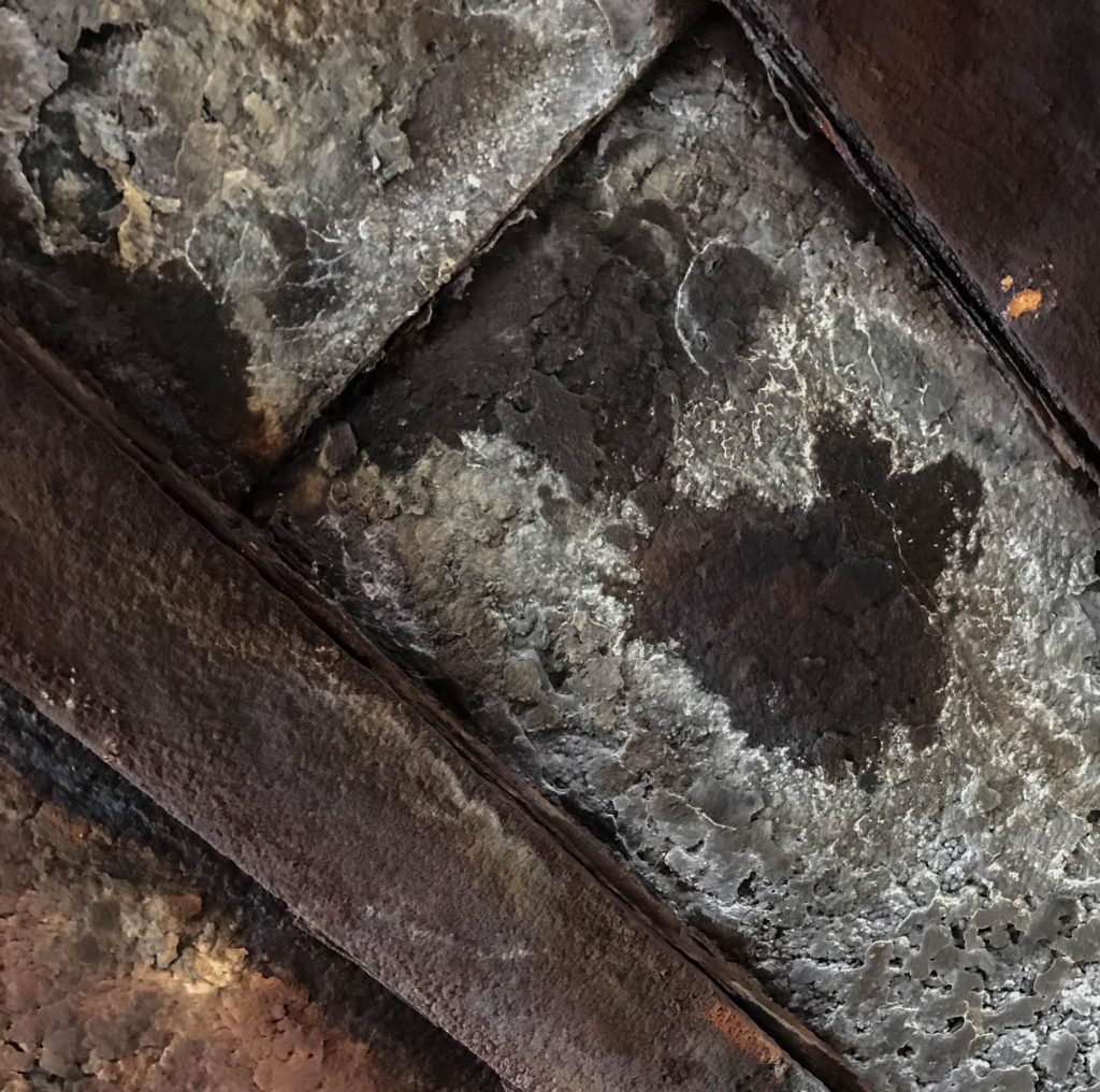
I have decided in this edit to focus more on the patch of decaying brown material in the roof rather than focus on the wider Image as I found there was too much to take in #
Colour Adjustment involves utilizing the colour palette in an image to create variation. In Adobe Lightroom, There is a whole HSL/Colour control panel which enables the user to have control over the various colours in an image and allows for the Hue, Saturation and luminescence to be controlled with sliders. Below is an example of an image where I used this function to alter the colours to create a dramatic image
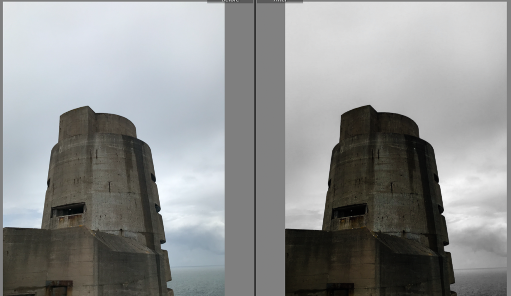
For this image, I took control of the Aqua and blue colour filters and completely desaturated the image, Leaving the Gray/ brown of the concrete bunker as the only subject with colour in the image. This method also helps to isolate the main subject to give it much more emphasis and make it stand out from the image. I further altered the contrast and exposure to create a dark and moody image
Desaturating an image is a great way to create an atmosphere within the image. This process is acheived through desaturating the image and then dependent on the mood of the image the photographer/ editor wants to give off, The contrast, exposure, shadows and highlights are altered to give off the desired effect.
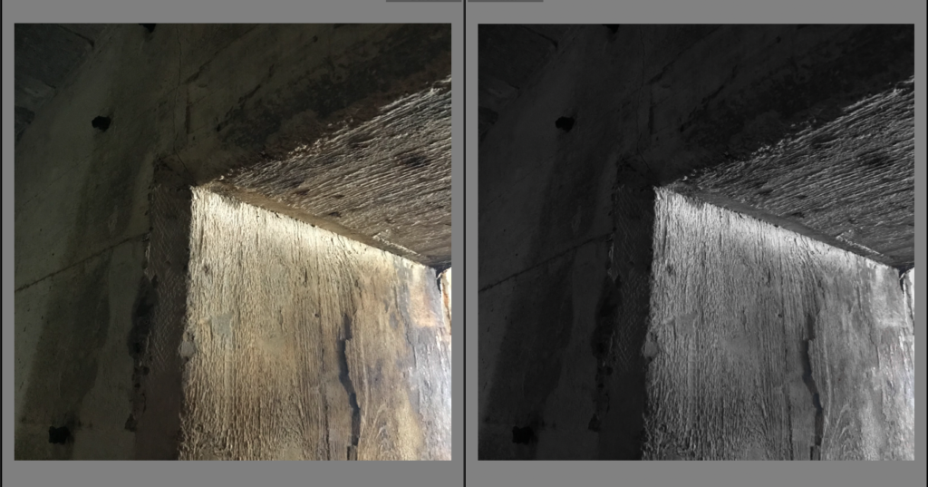
For this image I desaturated all of the yellows, Greens and oranges within the image as these are the only colours present and turned up the contrast slightly and altered the exposure to create an effect involving the light and the darkness inside of the wall. I find that using black and white gives a great emphasis of contrast within the image
Set-Up
For our studio objects photo shoot, we used continuous light on an infinity screen so that there was limited shadows and no distractions from the central object. For the birds eye view set up, we used flash head lights to give an even diffusion of light.
Final Edits
