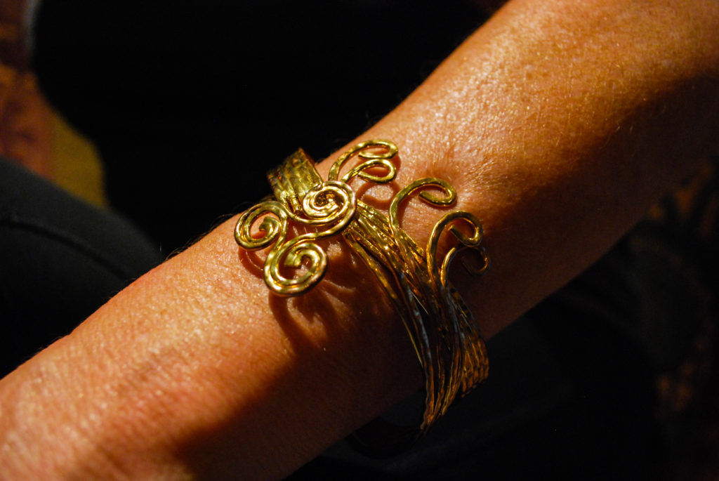
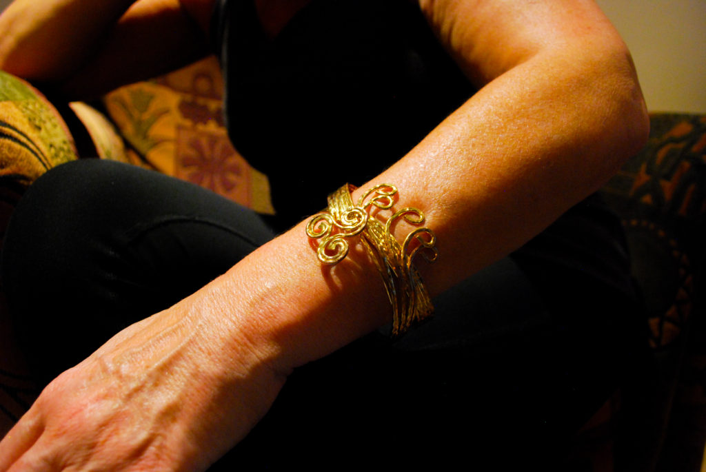
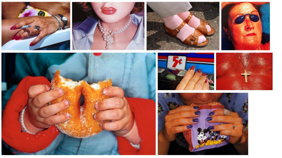
Detail shot

DETAIL SHOT Focus on a detail of a person or close up of something that conveys something about the individual character or identity eg. age, race, gender, sexuality, fashion, hobby, lifestyle, etc.
Information:

He was born in 1952 and is a British documentary photographer, photojournalist and photobook collector. He had the ambition to be a photojournalist since he was 14. His grandfather was an amateur photographer. He studied at Manchester Polytechnic with Daniel Meadows and Brian Griffin. They collaborated on projects frequently.

His first mature piece of work was in 1975, called Rural Communities. He spent five years photographing rural life in West Yorkshire, Greater Manchester, and Ireland. His focus was on isolated rural communities that were closing down. He shot in black and white to give the images a nostalgic look.

He then went on to do many other projects including Common Sense. In 1988 he joined Magnum photos. He became a full member in 1994 and was even president of Magnum Photos international for 3 and a half years.

Martin Parr style of Photography:

Martin Parr uses his photography to display his unique view of the world. He uses bright colours which can appear garish, he makes them appear this way so you react slightly in disgust as some of his images like the ones of bizarre people sunbathing in Common Sense. He focuses on the way we live, the way we present ourselves and our culture to others and what we value.

To contextualise his work he has researched leisure, consumption and communication, which is very evident in his works. He shines a new light on normalities in our culture and makes them seem peculiar and ridiculous. Within his images, he manages to create his own view of society which makes you question your view on society.

His style is humorous and makes one question our values and culture within the ideas of leisure and consumption. Within his photobooks, he juxtaposes images that are of completely different things but are similar because of a common colour or subject like below. You have this woman on a blue towel sunbathing which is already peculiar then he juxtapositions it with this image of what looks like blue meringue with a smily face which is of a completely different thing yet is similar.
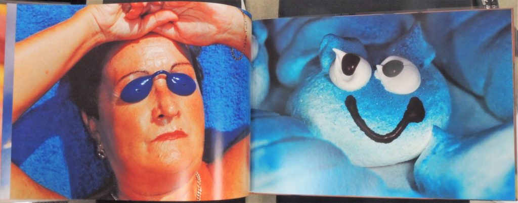
Image result for martin parr common sense

Analysis:

Related image

Technical

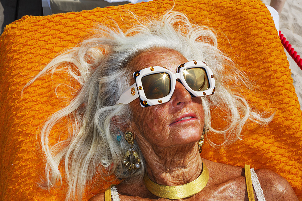
The lighting in this image is natural because it’s outside. You can see the light reflecting off the sunglasses. The image was taken with a wide aperture because the items in the background are still in good focus. I think it’s got a lower IOS, it’s got low light sensitivity because the image isn’t grainy.

Visual

The colours in the image are highly saturated. Every different colour catches your eye, from the red rope in the background to the small pink lines of her lips. This is intentionally done by Parr to make our leisure culture appear bizarre and question the society we live in. This image has a lot of variety of texture. You can see the leathery texture of her skin, the wispy texture of her hair, the grainy texture of the dand and the texture of the towel fabric. The image has been cleverly composed so you have this bronze leathery woman haloed with white wispy hair sprawled ly medusa on this bright beach towel taking up most of the image. It’s been taken at just the right time where you can see her eyes within the glasses looking towards the sun.

Contextual

This image was taken in 2019 as part of a Gucci Cruise of the French Riviera#. It was a reminder of his work from Common sense due to its saturated colour and bizarre subject.

Conceptual

The conceptual image behind this is much like the conceptual meaning of his Common Sense work. The idea behind it is to make us be critical of British culture through his satirical eye. This image shows it in the way that yes, she’s this woman in lavish jewellery, glasses, swimsuit and she seems to be enjoying it but the concept is to make us question it. And we do. Why is she such big earrings whilst sunbathing? Why is she sunbathing, she already looks like she’s had so much sun? Is this what I look like sunbathing? This idea behind it is to make us cringe at ourselves and make us self aware of our peculiar culture of leisure. The idea behind it is idiosyncrasy which is to express excentricity and peculiarness.

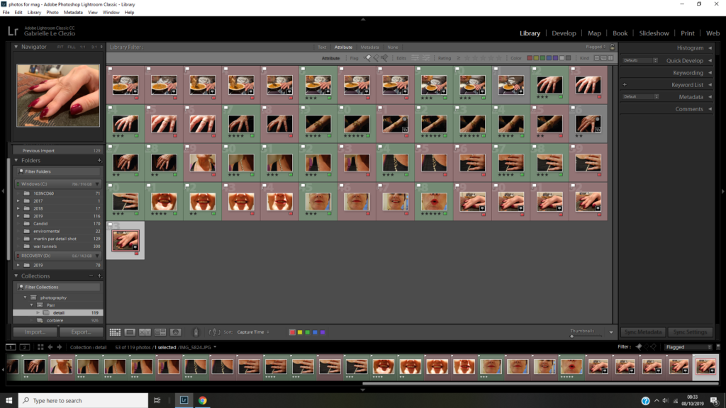
Martin Parr Detail shot Inspired shoot

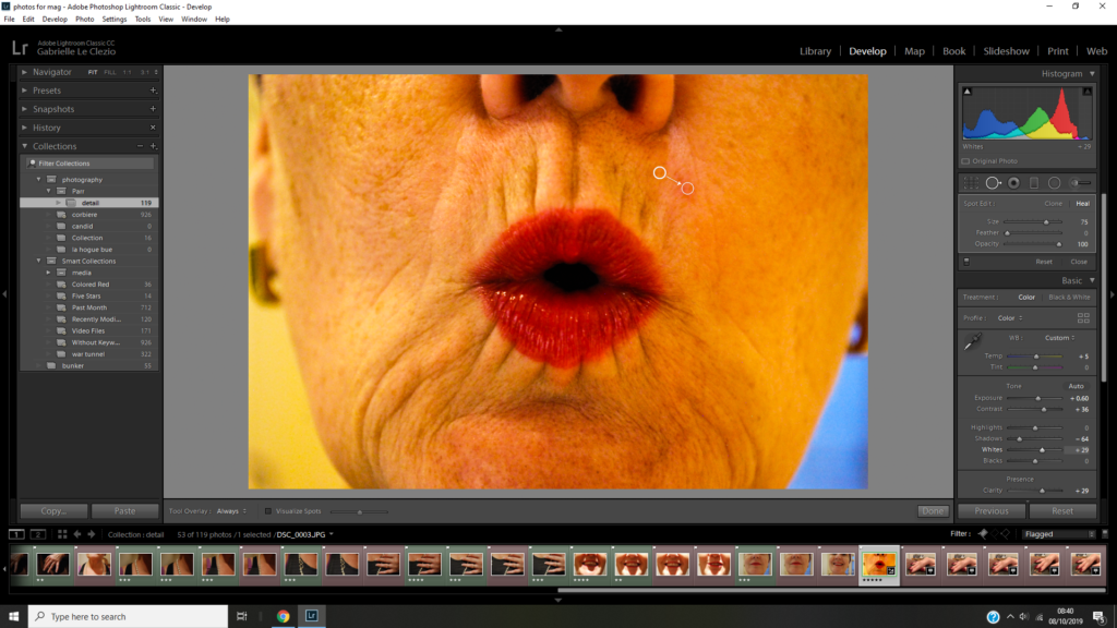
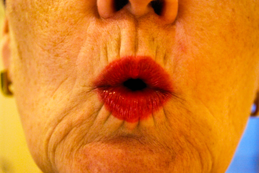
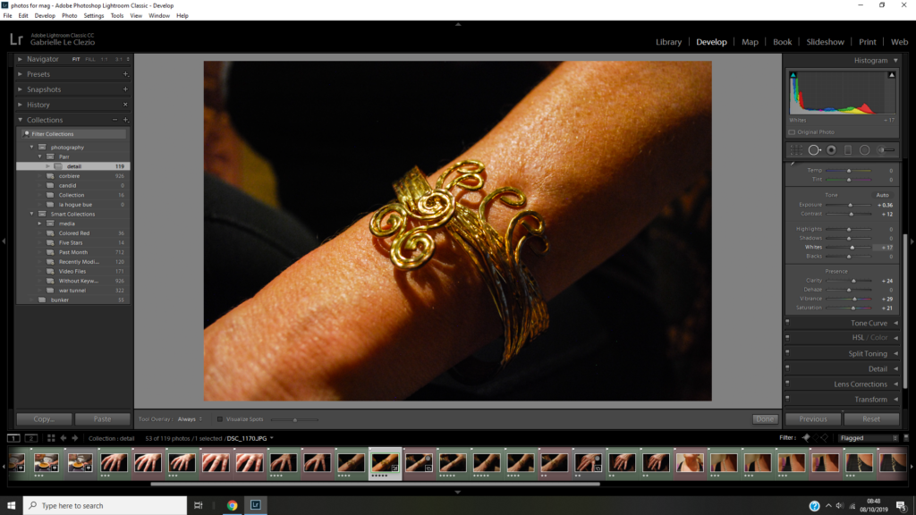
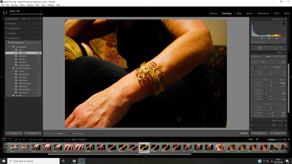
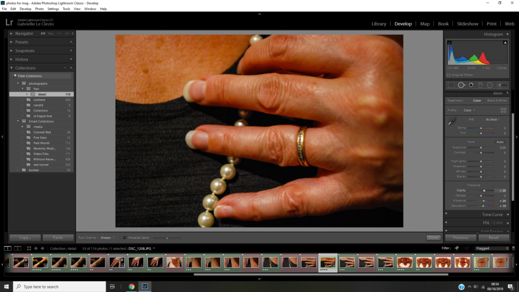
I’m really happy with the outcome of this shoot. I think the outcomes really reflect the genre of detail shot in the way that I’ve used a close aperture to focus on a small detail of a person or what they are wearing. I think the images also reflect Martin Parr in the way that by editing their saturation and vibrancey I’ve made the images look like his and because I’ve focused on jewelry which is a constant subject in his work.

Autochrome

In 1802, Thomas Young theorised that all different colours were produced optically through your eyes, and there were only 3 wavelengths of light, this is called trichromatic. These colours were red, green and violet. These theories also provided the first framework for the first commercially viable method of colour photography, the autochrome.

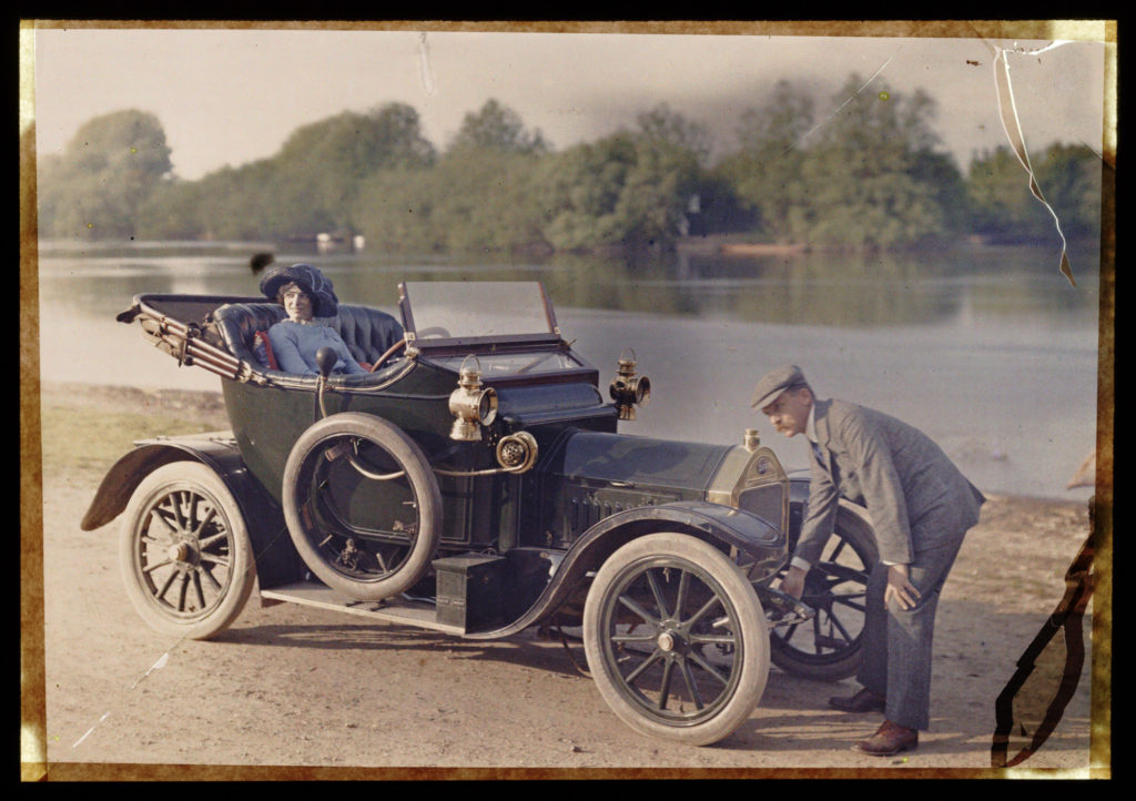
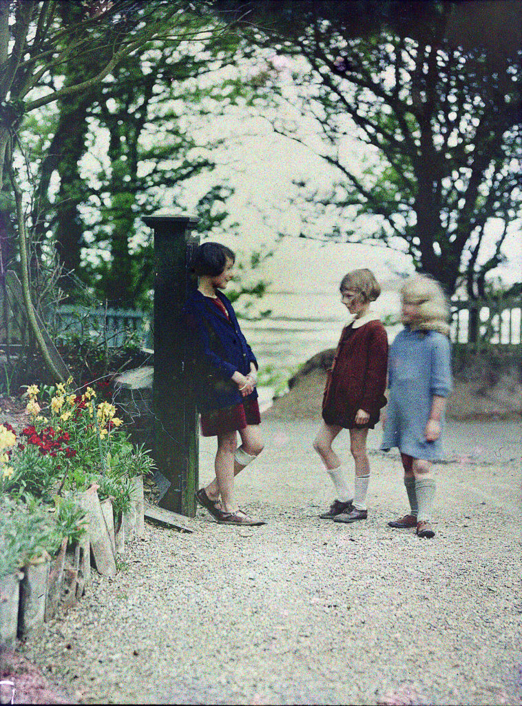
Emile Guilton was the founder of the Societe Jeriaise photographic archive. Emile took the first colour photograph in Jersey using autochrome. This image was called Lumière Autochrome. Though it is hard to see, each image is made up of lots of small dots with one of three colours, red, violet and green. Our eyes make the dots within the image merge into the colours they would make when mixed and create this bright image of colours.

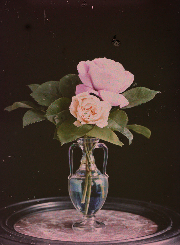
The image above is an example of autochrome image, made by Emile F. Guiton. This is an early example of colour photography using the autochrome technique. The image is of plants in a vase. These plants are pink, and the use of autochrome allows this pink to show brightly due to the colours mixing into the colour it should be.
CONTEMPORARY PRACTICE:Mat Collishaw

Matthew is an English artist, born in Nottingham, raised in a Dawn Christadephian family and is now bases in London. Collishaw’s work uses photography and video. He’s well known for his Bullet Hole which was taken in 1988, which is a closeup photo of what appears to be a bullet hole wound in the scalp of a person’s head, mounted on 15 light boxes. Collishaw took the original image from a pathology book that actually showed a wound caused by an ice pick . Mat got his debut when Bullet Hole was exhibited in Freeze, the group show organised by Damien Hirst in 1988 that launched the YBA (Young British Artists). It is now in the collection of the Museun of Old and New Art in Hobart, Australia. Mat has done many projects throughout his career but I one I am going to focus on is the still life exhibition named ‘Last Meal on Death Row’, which is pretty self explanatory.

Image result for allen lee davis last meal on death row

This work of Collishaw’s is a depiction of Allen Lee Davis’ last meal, a lobster tail, fried potatoes, fried clams, fried shrimp, garlic bread and root beer. Davis was executed in Florida in 1999 as he was convicted of a brutal crime in 1982, he murdered Nancy Weller and her two young daughter, Kristina,nine ans Katherine, five, in Jacksonville, Florida. Karma caught up to him when the electric chair failed to deliver a clean death and witnesses heard him scream and saw him bleed. That was the last time the electric chair was used in the state of Florida and now only the lethal injection is allowed. The meal has been placed in a banquet looking way, like the last supper that Jesus held before he resurrected this emphasises the inevitable death of Davis. As well as that it is mutely lit and under-exposed as if there is no light left to give and there won’t be in hell. There is plenty of depth in the shadowing, this could represent the inner feelings of guilt, shame, regret or maybe even happiness going through the heads of the criminal on death row. His still-life resembles foodstuff painted by some Dutch artist in the age of the Vermeer. He takes a 1700s approach and matches it was a modern concept of the last meal but at the same time it goes with old times as the death penalty is seen by the large majority as an outdated punishment. The plate and the table look as if they are from a different century even the meal itself, I feel the underlining message could be that the death penalty should be abolished.

Contemporary Still-life

Paulette Tavormina:

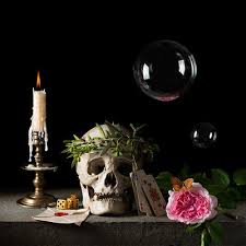
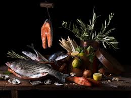
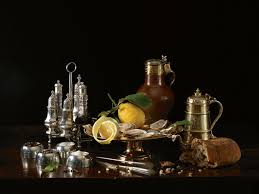
Paullette Tavormina lives in new York. she gets a lot of the flowers, fruit etc from the local farmers. Her photographs are said to resemble ‘old master’ painters. Her photography style is based on old Still Life paintings from the 17th century.

“I have long been drawn to the seventeenth century Old Master Still Life painters Giovanna Garzoni, Francisco de Zurbarán, and Adriaen Coorte. I am particularly fascinated by Zurbarán’s mysterious use of dramatic light, Garzoni’s masterful compositions and colour palette, and Coorte’s unique placements of objects.”

Paulette Tavormina

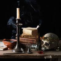
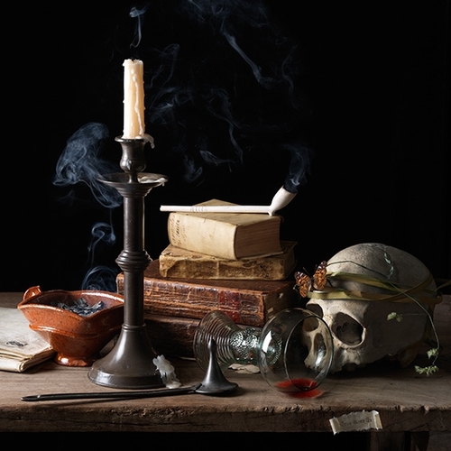
I chose Paulette Tavormina as I love how it really does look like she has brought the old still life painting of the 17th century to life. I also like how she has captured elements such the smoke from the candle and the light on the bubble. She manages to bring the old symbolism of the period to contemporary photography.

Vanitas IV, Dreams, After A.C., 2015

The background of this photo is completely black with out only focus on those object on the table. The eye is naturally drawn to light, therefore having the objects all in light, allows the viewer to be focused on what the photographer, in this case Paulette Tavormina, wanted the viewer to focus on. as it is the tallest object in the photo, the eye is immediately drawn to the candle and from there your eye is lead by the glass pointing at the skull, thus telling a story. The smoke also captures the light making the negative space around the objects more visually pleasing. The light is coming in at an angle form the side which creates dynamic shadows.

The skull is as an image is meant to signify death and act as a reminder of ones own mortality in old vanitas paintings. The snuffed out candle and pipe is also mean to signify life eventually being snuffed out. Also part of typical Vanitas and still life imagery. The over turned glass is there to represent the emptiness of life. The red wine might be referencing the blood of christ because in old still life paintings, grapes would represent this. Therefore the red wine may be the contemporary answer to this. The decaying flowers on the skull, along with the butterfly is to represent the inevitability of death within the beauty of life. The books within this photo show the artificial virtues of life and the pride in knowledge.

How would I respond to this?

I would think about how i could also incorporate things other than objects into my piece to make it stand out and have some contrast e.g smoke, reflections. I like how Paulette Tavormina angles the light and I would also use that as it matches with my preferred style of photography.

Emile F. Guiton: Autochromes:

https://blog.scienceandmediamuseum.org.uk/autochromes-the-dawn-of-colour-photography/

The first practicable method of colour photography was the autochrome process, invented in France by Auguste and Louis Lumière. Best known for their invention of the Cinématographe in 1895, the Lumières began commercial manufacture of autochrome plates in the early 20th century.

HOW DO AUTOCHROMES WORK?

Autochrome plates are covered in microscopic red, green and blue coloured potato starch grains (about four million per square inch). When the photograph is taken, light passes through these colour filters to the photographic emulsion. The plate is processed to produce a positive transparency. Light, passing through the coloured starch grains, combines to recreate a full colour image of the original subject.

Emile Guiton

Emile Guiton was probably the most prolific of the Jersey photographers who chronicled island life during the first half of the 20th century. A substantial collection of his pictures is contained in the photographic archive of La Société Jersiaise.

Born in Jersey in 1879 he had a keen interest in history and was a member of La Société Jersiaise, served on its executive committee as joint honorary secretary, and was curator of the Museum and editor of the Annual Bulletin.

He also realised that history was being made during his own lifetime and he recorded the development of his native island from the turn of the century until his death in 1972. He experimented with Autochrome colour very early in the century.

Not only did he record events and activities during his own lifetime, particularly agriculture, but he had a fascination with the past and chronicled with his images many archaeological excavations (his pictures of the interior of La Hougue Bie remain some of the best in existence) as well as photographing Mont Orgueil Castle and other coastal fortifications, sites of geological interest, and architecture. Guiton had a particular interest in the design of Jersey houses over the centuries, and particularly in different styles of arches to be found in the island.

He was present at many major events, including the Liberation in 1945 (he had also taken photographs during the German Occupation, and the proclamations of successive monarchs in the Royal Square.

Autochrome

Autochrome is an early colour photographic process created by the Lumiere brothers in France in 1903. It was the main colour photographic process available to photographers until as late as the 1930s when Dufaycolour became popular. It consists of a glass plate coated on one side with microscopic grains of strach dyed red-orange, green and blue-violet, the grains act as colour filters. Lampback fills the spaces between grains and a black ans white panchromaticsilver halideemulsiom is coated on the top of the filter layer. The autochrome was loaded into the camera with the bare glass side facing the lens so that the light passed through the colour filters before reaching the photographic emulsion. The plate is processed to produce a positive transparency. Light, passing through the coloured starch grains, combines to recreate a full colour image of the original subject.

Unlike ordinary black-and-white plates, the Autochrome was loaded into the camera with the bare glass side facing the lens so that the light passed through the mosaic filter layer before reaching the emulsion. The use of an additional special orange-yellow filter in the camera was required to block ultraviolet light and restrain the effects of violet and blue light, parts of the spectrum to which the emulsion was overly sensitive. Because of the light loss due to all the filtering, Autochrome plates required much longer exposures than black-and-white plates and films, which meant that a tripod or other stand had to be used and that it was not practical to photograph moving subjects. The plate was reversal-processed into a positive transparency that is, the plate was first developed into a negative image but not “fixed”, then the silver forming the negative image was chemically removed, then the remaining silver halide was exposed to light and developed, producing a positive image.

Still Life – Post 4 (Contemporary – Lorenzo Vitturi)

Lorenzo Vitturi:

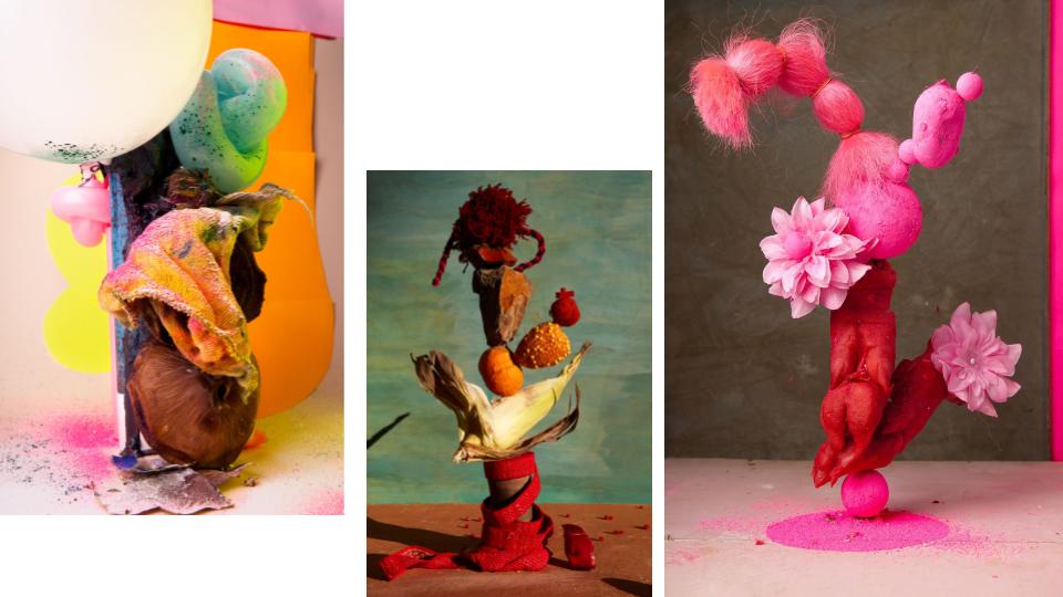
Lorenzo Vitturi (b. 1980, Italy) is a photographer and sculptor based in London. Formerly a cinema set painter, Vitturi has brought this experience into his photographic practice, which revolves around site-specific interventions at the intersection of photography, sculpture and performance. In Vitturi’s process, photography in conceived as a space of transformation, where different disciplines merge together to represent the complexities of changing urban environments.

Vitturi’s latest solo exhibitions have taken place at FOAM Museum in Amsterdam, The Photographers’ Gallery in London, at Contact Photography Festival in Toronto, and at the CNA in Luxembourg. Vitturi also participated to group exhibitions in Rome, at Centre Georges Pompidou in Paris, at La Triennale in Milan, at the Shanghai Art Museum and at K11 Art Space in Shanghai, and at BOZAR in Brussels. 

Following the presentation of Dalston Anatomy in 2013 as a book, multi-layered installations and performance, Vitturi’s latest photo-book ‘Money Must Be Made’ was published by SPBH Editions in September 2017.

Dalston Anatomy:

Dalston Anatomy is a book project, a multi-layered installation, and a visual celebration of the Ridley Road Market in East London. Lorenzo Vitturi recognised the market as a unique place where ‘different cultures merge together in a celebration of life, diversity and unstoppable energy’ and was inspired to capture this place before it transformed beyond recognition.Residing in the area for over seven years, Vitturi visited the market daily and witnessed the local community, economy and the very nature of the market changing around him with striking acceleration. From this complicated process of transformation stems Vitturi’s compulsion to collect and picture the objects found at the market.


The objects were left to rot, manipulated with pigment or deconstructed and then rearranged in compositions and photographed against discarded market materials before and after their collapse. The ephemeral nature of these sculptures mirrors the impermanent nature of the market itself, while the reconstruction and placement of these totem-objects in the exhibition space reflects on constant cycles of production, destruction and recreation.

Artist Study – Laura Letinsky

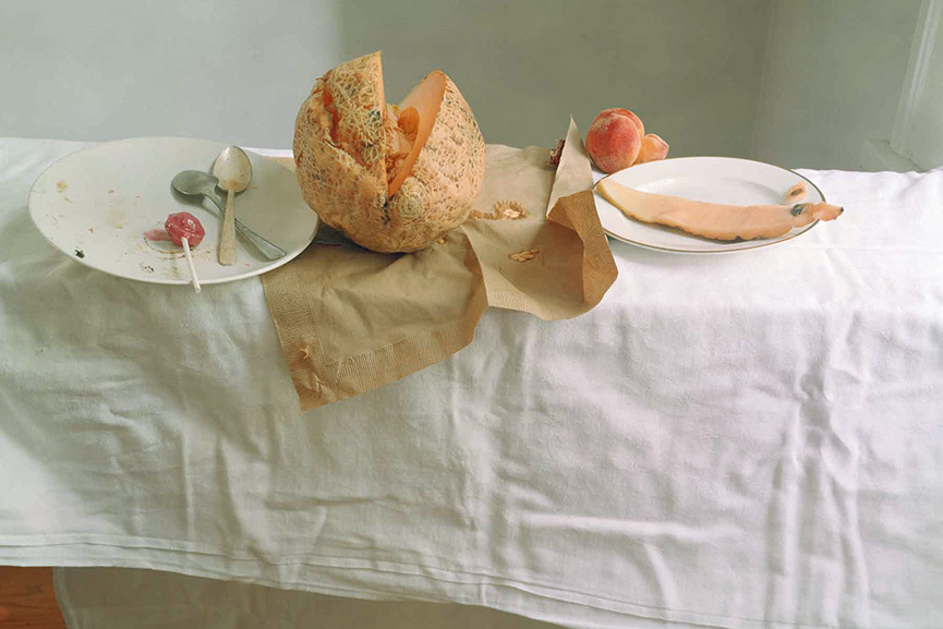
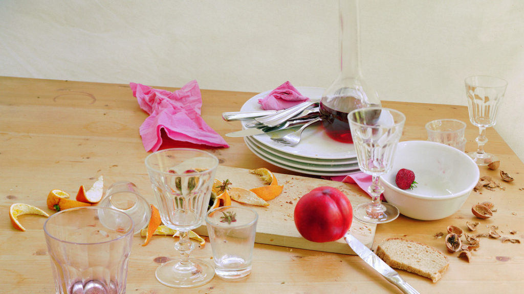
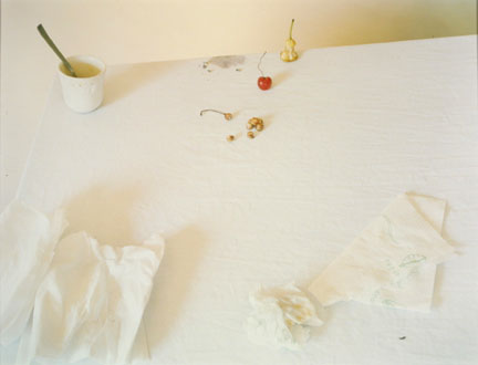
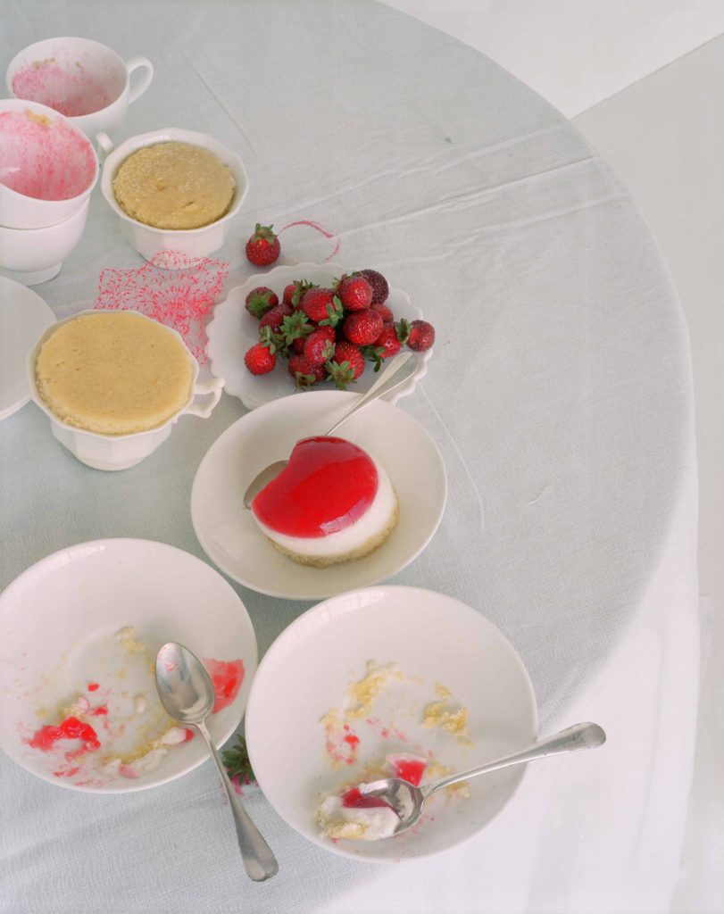
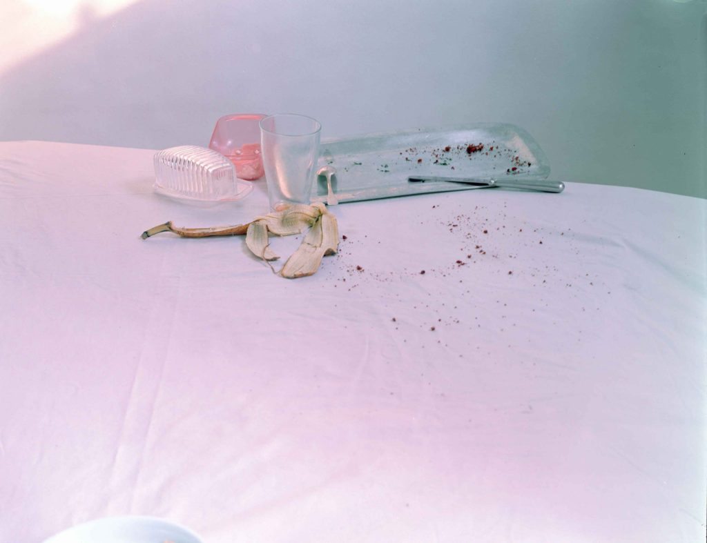
When Letinsky first started out in photography, she was a portrait photographer, however as she matured through her photography, she moved onto working with still life, which is what made her famous. Laura Letinsky's still life photographs are describes as "elegant, subdued and gently but relentlessly off-putting, her large-format photographs have an arresting presence that seems out of step with time. At the same time, though, art history suffuses her meticulously constructed scenes as fully as the softened daylight does the sparse interiors she photographs." 

Letinsky's photos are reminiscent to the famous Dutch still life's, however they include "freshness, ripeness and decay." However what makes Letinsky's still lifes different to the Dutch still lifes are that Letinsky's is modernised by featuring modern brands such as styrophone cups and coca cola cans. They also contrast the Dutch still lifes and the Dutch focused on wealth and status, as Letinsky's are a more raw and down-to-earth version of still lifes that every social class has/understands.

Quotes from:  https://drive.google.com/file/d/0B40pOw0Hw2JMcWFSQV9wclZNTkU/view 
Laura Letinsky's photos are for the audience to presume human activity, without the presence of any poeple in her work. Her imperfections that she creates in her photographs such as chewed food, crumpled napkins/tablecloths and spilt glasses create an image that the audience is able to percieve as a personal situation such as someone leaving in a rush. By adding a personal touch to her work, Letinsky is able to make her viewers emotionally attatched.