
Zine mood board:

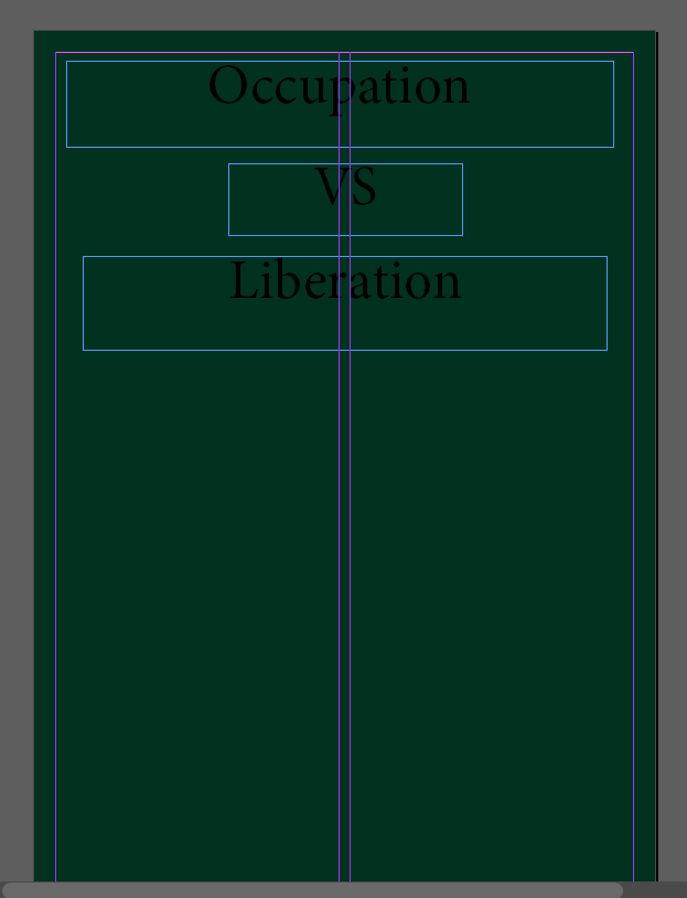
For my first design, i created a division between having have of my booklet on occupation, and the other half on liberation. I stuck to the typical 16 page A5 booklet which i created on InDesign and was set up in portrait style. Although i created this draft and had experimented with have a half and half booklet, i felt as if it didn’t link up very nicely and the two contexts were not very clear and it wasn’t as effective as i would have liked.
Screenshots of my first experimentation is below along with a reasoning of why i made certain choices in the photo book.
Page One and Sixteen
For the front and back of this zine, I decided to keep the design simple with no actual images which I have taken included. As seen I used a dark green colour to cover the back and front of the photo book as my thought is that green is a typical archive colour which is used on websites as well as other photo books I have seen. Although I like the simplicity of this colour as well as it giving off a well-respected vibe to the book I am unsure if I fully love it enough to keep it. I may decide to keep this colour theme going or choose another.
Pages Two- Seven
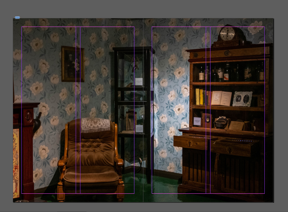
Due to wanting the first part of my photo book to represent the theme of occupation, I used three of best images from my ‘Jersey War Tunnels’ photo shoot as I felt as if it gave a clear representation of conditions people in the war lived in and guns/ helmets which German soldiers used during the time. These occupation items created a theme of realization, the objects such as the gun allowing outsiders to be put in the position people in the war were in, see things which they had to deal with everyday. As for the image of a living room, I wanted to include this image as I found it interesting as the set up included typical books on the bookshelf seen which are from the occupation, helping to vision household items seen in homes.


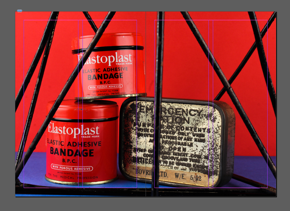
Page Eight and Nine
For my fourth page, I created a double page spread which included an image from my still-life occupation objects shoot. This image was created in the style of Rafal Milach and included two bandaid red pots, a book on the occupation of jersey and a real occupation ration pot. These elements were designed in front of a red and blue background with geometric frames also included in the image. This helped to add an element of style into what would have been a plain image.

Page Ten and Eleven
When creating my fifth double page spread, I left the left hand side of the page plain white to create a separation between the two different themes of occupation and liberation but had a simple title at the top of the page stating ‘Liberation’. On the right hand side of the page I included an image of speaker Joan who told us about Liberation Day which she experienced when she was younger, therefore i thought this was an appropriate way to introduce the next topic.

Page Twelve to Fifteen

For my second zine, I plan to use Images which I took at the Jersey War Tunnels and Occupation Objects as I found that these images have been my best from my latest photo shoots. I think including Occupation Objects will be a way of making my zine personal as there objects I chose myself. In order to make it more personal I may include portrait images. I also plan to use relevant quoted from occupation survivor ‘Joan’ who spoke about her experiences in the occupation.
I’m not too bothered on my zine having a set structure to it, however I would like it to have a pattern in the images that are used. Example- Don’t have two images with quotes next to one another. I stuck to the typical 16 page A5 booklet which i created on InDesign and was set up in portrait style.
Page One and Sixteen
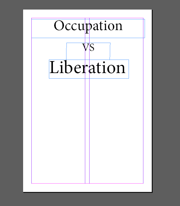
As seen, on the front of my page I have used a plain white page with a simple title “Occupation VS Liberation” which I liked as it adds simplicity to the front of the book and has no images distracting the title. In also felt like I needed the simplicity again at the end of the Zine and therefore left it the same.
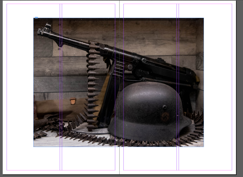
Page Two and Three
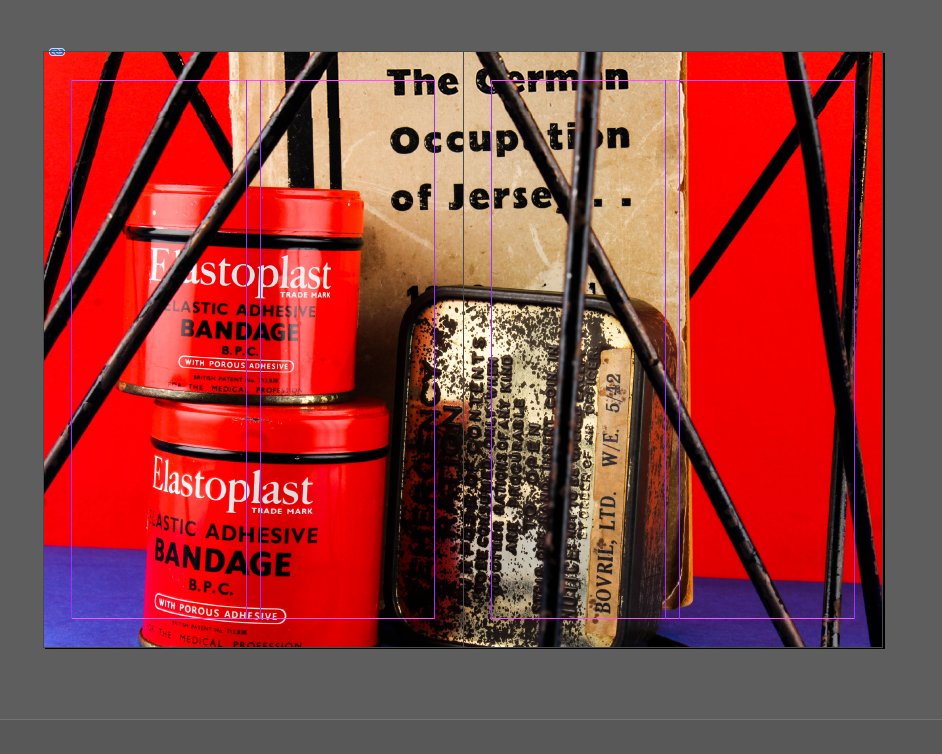
I decided to full bleed this image as I thought it is one of my better images included in the book and that it should be showcased. The image also links to the occupation due to including an emergency kit with two pots of bandages and an occupation book. This image was part of my experimentation with Rafal Milach’s photography style, therefore including a coloured background and geometrical shapes which I think added to the image and the subject as the shapes give off the idea of the bandages being trapped linking to the idea that some people couldn’t get ahold of some of these items.
Page Four and Five
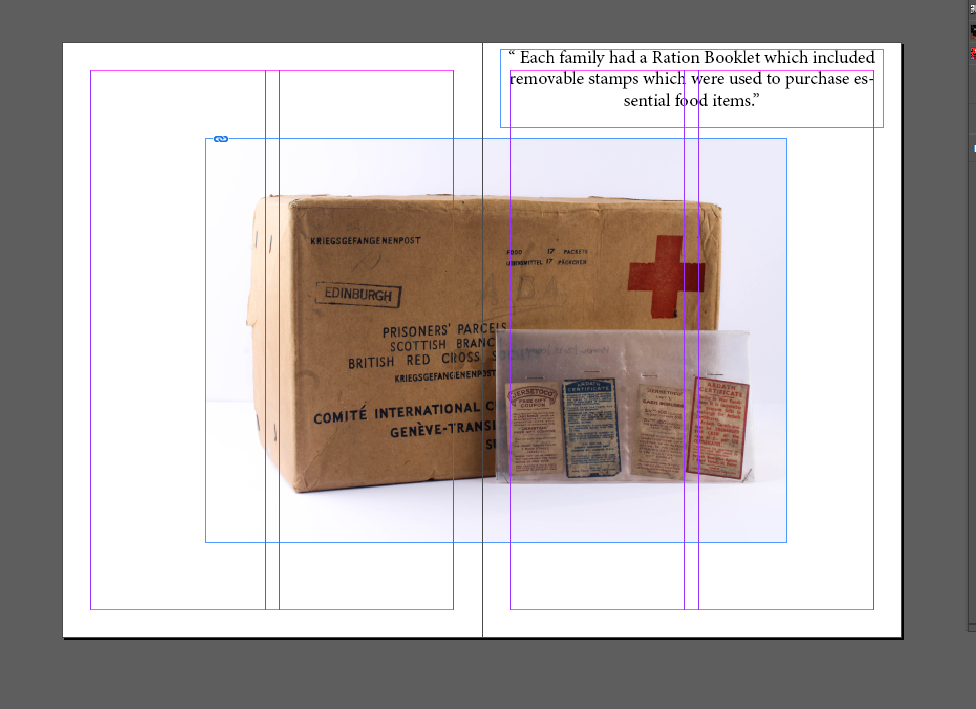
For the next page I decided to enlarge the image which was taken in my ‘Occupation Objects’ shoot. As seen, the image includes a British Red Cross Food Parcel as well as some stamps. I kept a boarder on page of this image which can be seen as white. This allowed for me to include a quote if I wanted to use one which can be seen on the top right hand corner. I chose the quote “Each family had a Ration Booklet which included removable stamps which were used to purchase essential food items” as it links to the food parcel as both the quote and image are to do with the shortage of food in Jersey.
Page Six and Seven
This third image is an image which was taken at Jersey War Tunnels and is a set up bedroom representing what a typical one would have looked like. I used this image to cover two pages as a double page spread to represent an actual living room.
Page Eight and Nine
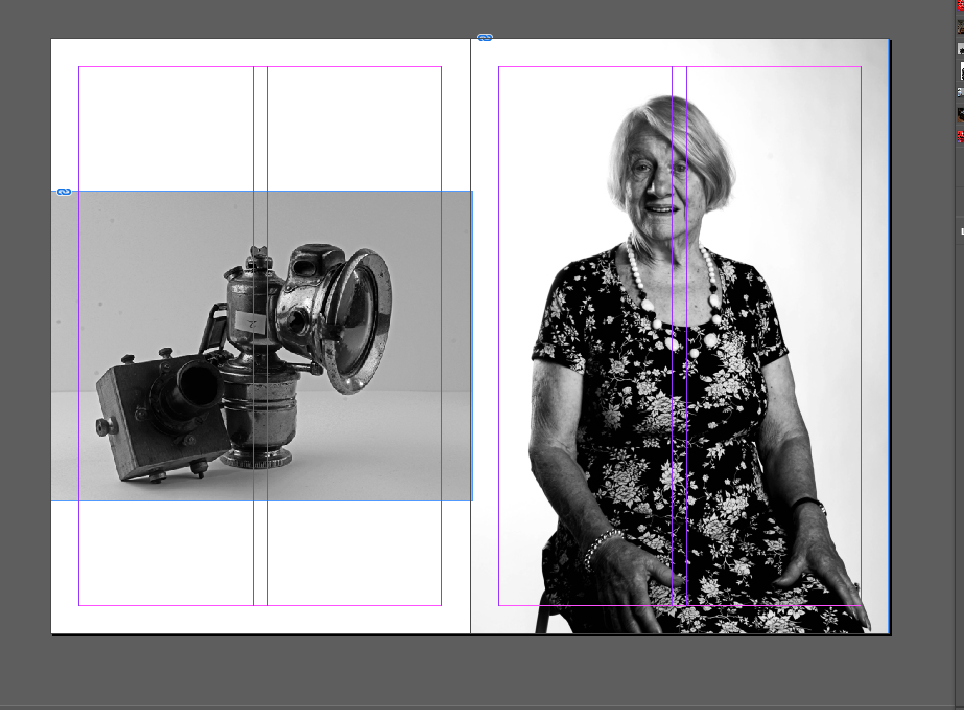
I have included a portrait image of speaker Joan as she was very inspirational to our class and told us on her story of her time in the occupation. During her story she mentioned her mother having a secret radio which can be seen on the page next to her portrait (page eight). On page eight the radio is included as well as an old fashion bike light. I edited both these images black and white so they suited better.
Page Ten and Eleven
Page Twelve and Thirteen
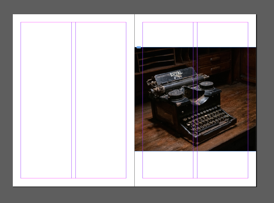
For page twelve I wanted to make it a blank page so there was a separation from the image of page eleven, I liked the design of having a blank page. I arranged the typewriter image which was taken at Jersey War Tunnels to be covering only half of the image as I liked how the boarder around the image blended with the black page next to it.
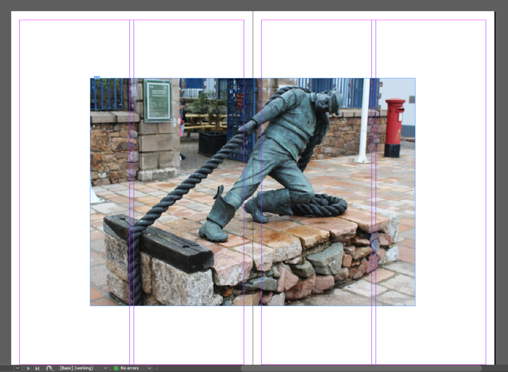
Page Fourteen and Fifteen
I found that this image looked best spread over two pages therefore I placed it at the end of my zine due to having one similar at the beginning of my zine.
Overall I feel as if my second zine example is more successful than my first due to me learning from mistakes and edits in the first zine. Although the first zine shows more of a narrative than the second, I still do prefer the second due to the specific layout and the overall design of the piece as each image has a reason as to why its been placed there. I have been able to showcase an artistic approach throughout each zine and believe that I will stick with my decision to use my second zine as my final. However, sue to me thinking the white background for the front and back cover is too plain I will use my experimentation one front and back cover as it adds more to the zine.