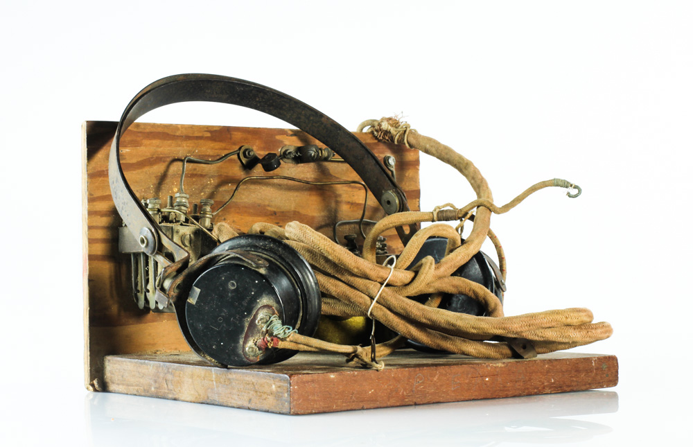
For my second zine, I will be using manly the images I have taken of the occupation objects and people, and also some archive images. I think this will be very interesting as I have already shown the story of the occupation in my previous zine through the physical aspects in Jersey, but now I will be able to tell it in a more personal way, through the objects and portraits.
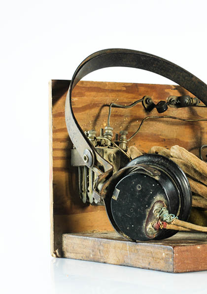
I want my zine to have a structure to it, or to have some sort of pattern to it. I first started of by using the initial images I had taken of the objects and placed them on every other double page spread since they were landscape images. I had to edit one other image in order to have enough.
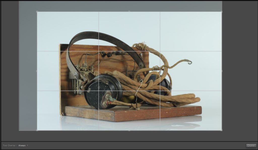
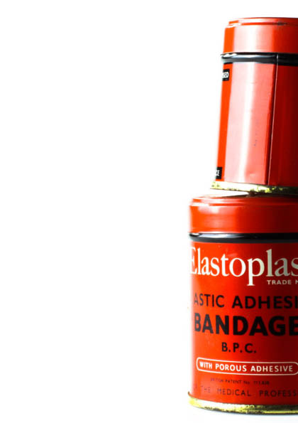
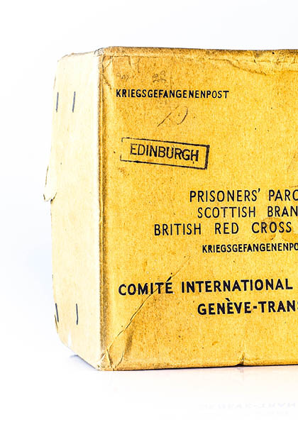
To begin, I cropped the image so that the empty space was more even the whole way around the image, as there was a lot more on the top left hand side compared to around the rest of the image.
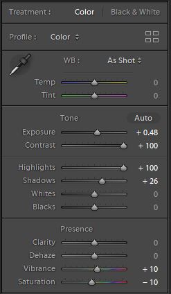
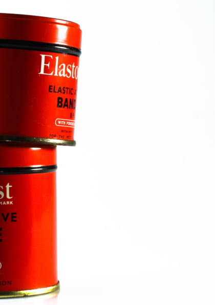
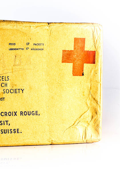
Here you can see how I developed my original image. Increasing the exposure and the contrast helped to make the image stand out vividly, while also making the background a plain white colour. I increased the shadows and highlights as this helped get rid of the darker tint the background had. I increased the vibrancy to add an extra pop of colour to the object, and I decreased the saturation since increasing the vibrancy added a yellowish tint to the background.
Initial image vs. edited image

Here you can see what my layout looked like after adding these initial images to my zine design:
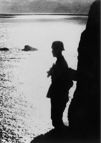
I then added in 2 archive images which you can see below:

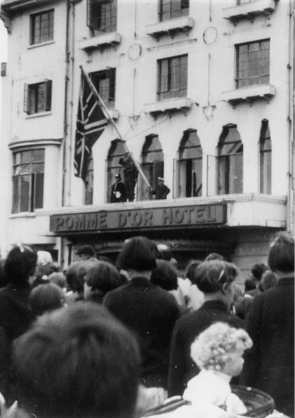
I decided I wanted to include these 2 archive images because they both show people during opposite stages of the occupation. The first archive image shows the silhouette of a soldier, which I placed at the beginning of my zine as I wanted to show the images in chronological order, and this picture shows a soldier standing in full combat uniform showing the intensity of the beginning of the war. My last archive image shows the end of the occupation, as you reach the end of the zine.
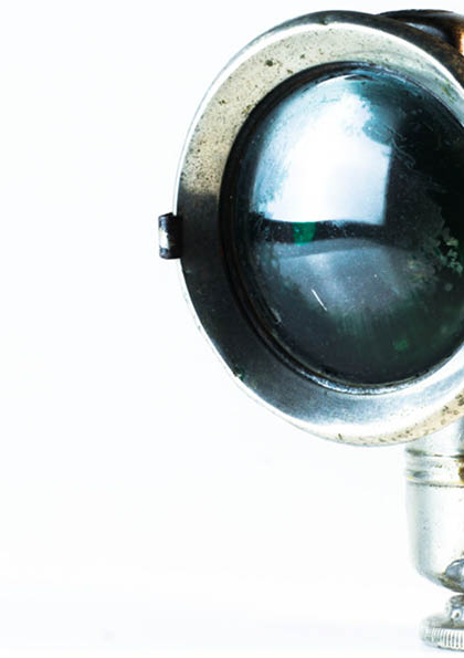
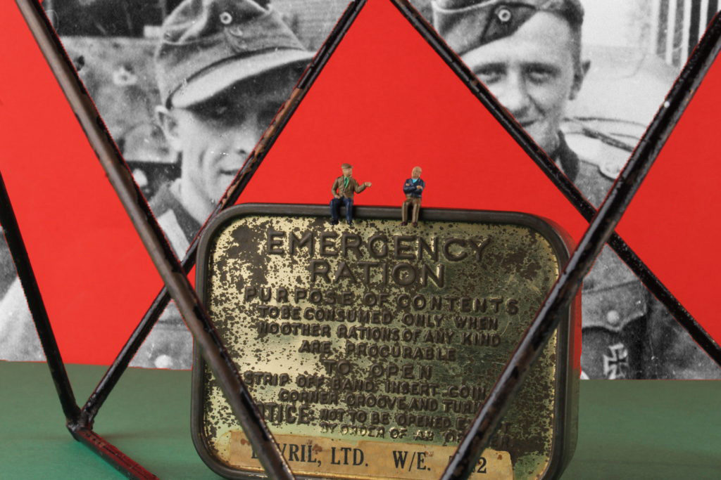
I also added the image below into my zine, instead of the image of the 3 objects together. I did this because I thought it would look best to have all my full bleed pages displaying an image with only 1 object in them as it makes the narrative flow better.
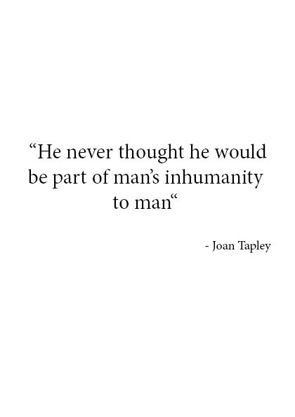
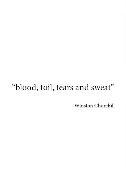
You can also see that I added 2 different quotes onto the pages opposite my archive images as I thought this would help make them impact the viewers emotion more if there was some text to add context. The first quote I placed in the zine was from Joan Tapley who’s a Jersey occupation survivor. I chose this specific quote because it was very hard hitting, and I think it fit perfectly with the silhouette of the soldier as the quote was originally about how Joan’s father had acted in a slightly inhumane way towards an unknown soldier. My second quote was by from a speech given by Winston Churchill, “blood, sweat and toil”. I thought this quote was fitting to display next to an image of liberation day because those three very powerful words are almost a reflection of the 5 years of hardship faced by Jersey people.
Lastly, I thought about the front and back cover and the title of my zine. I decided on the title “objects of the occupation”. The word “objects” refers to both the physical objects, and also the people, since I also view the people as being objects of the occupation. I wanted this title to stand out by itself in order for the metaphorical meaning of it to be clearer and more easily absorbed by the audience.
Final Zine layout