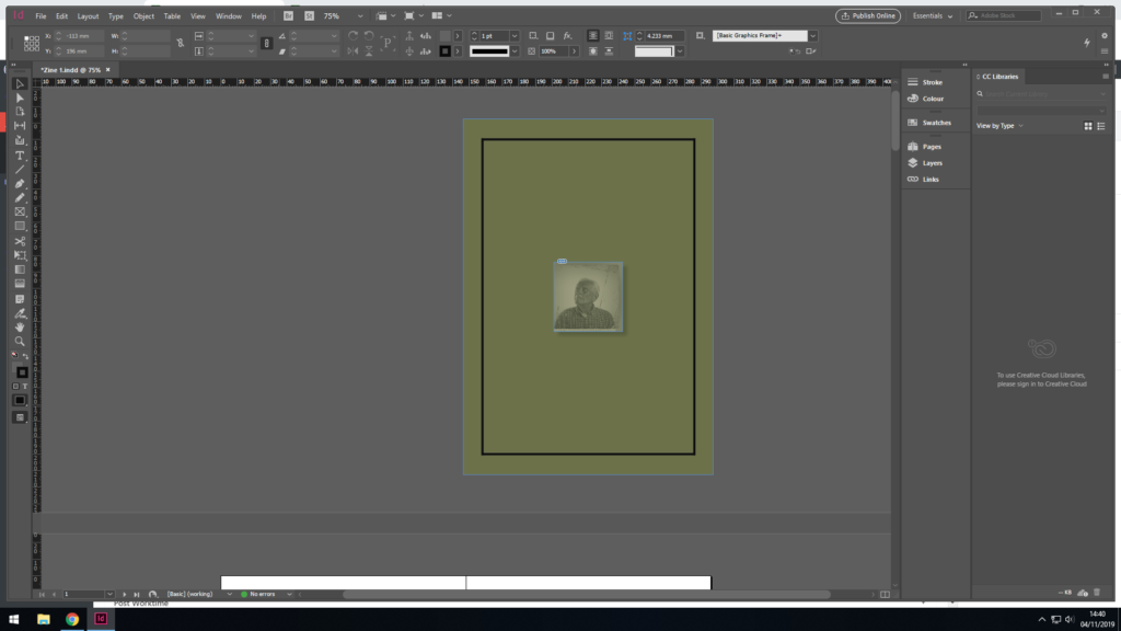
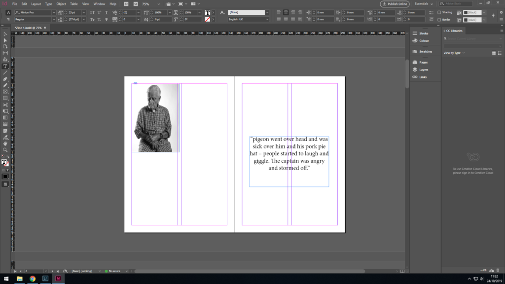
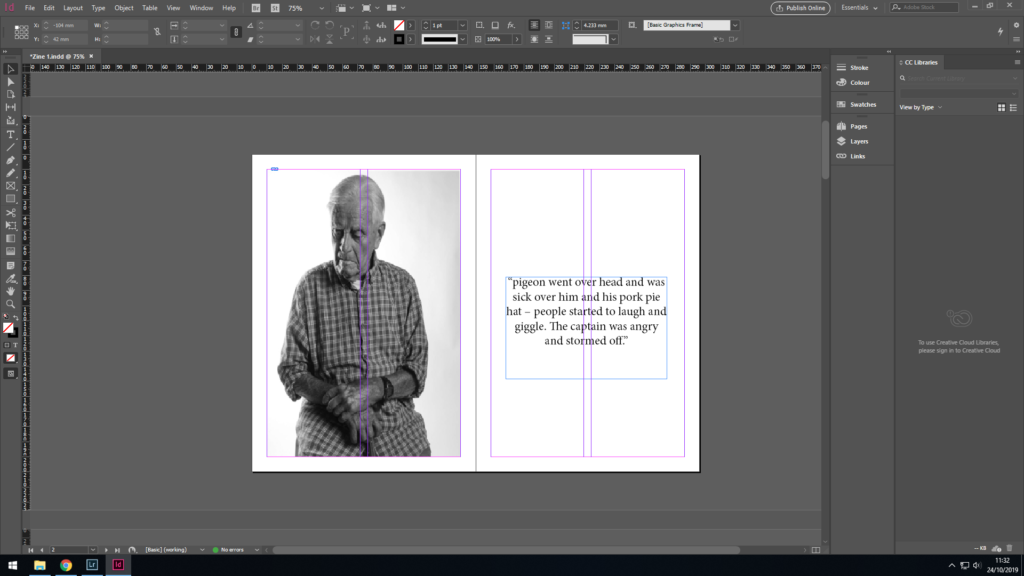
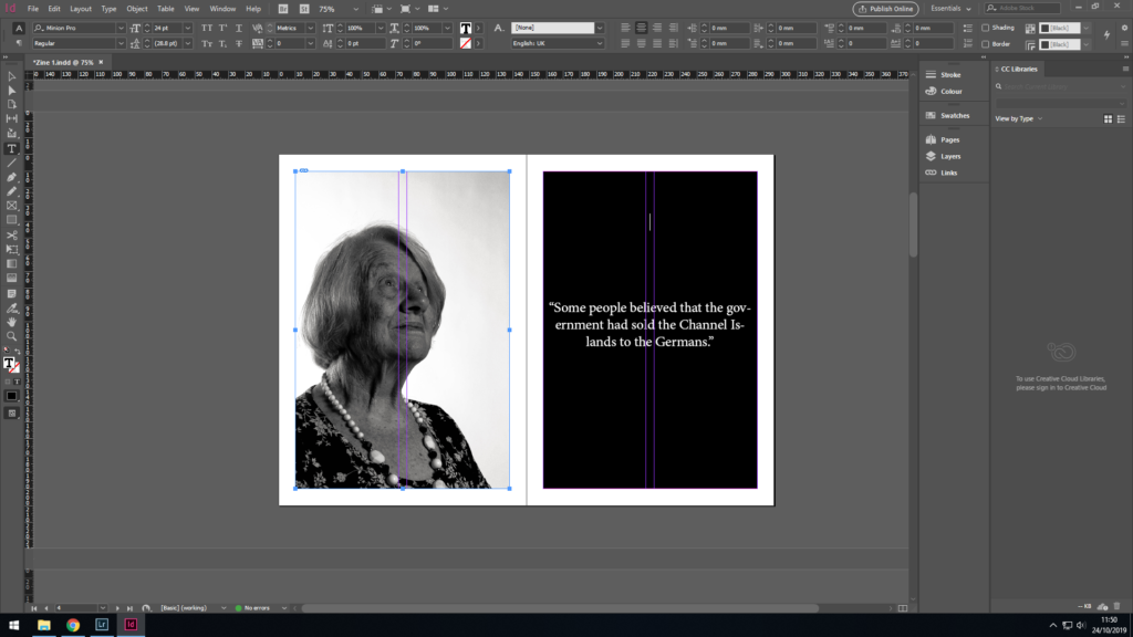
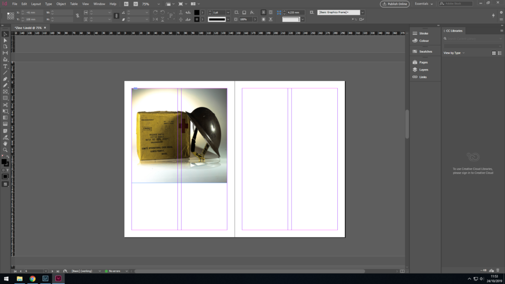
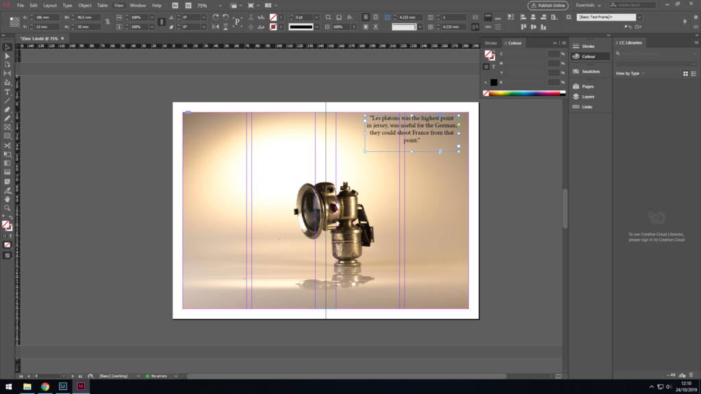
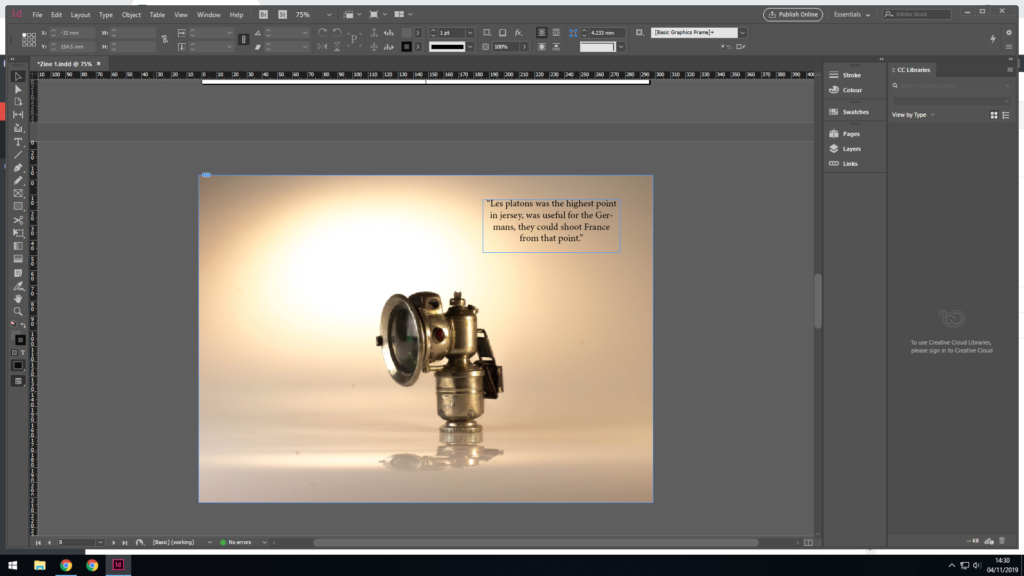
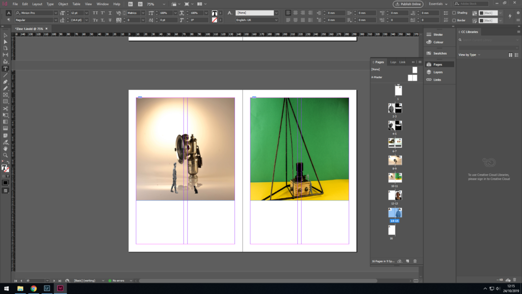
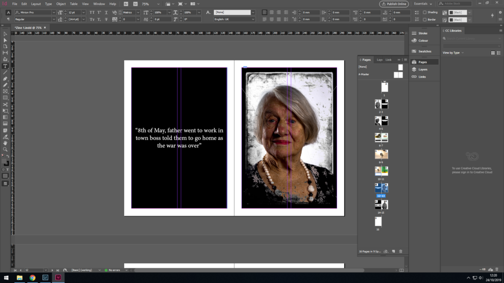
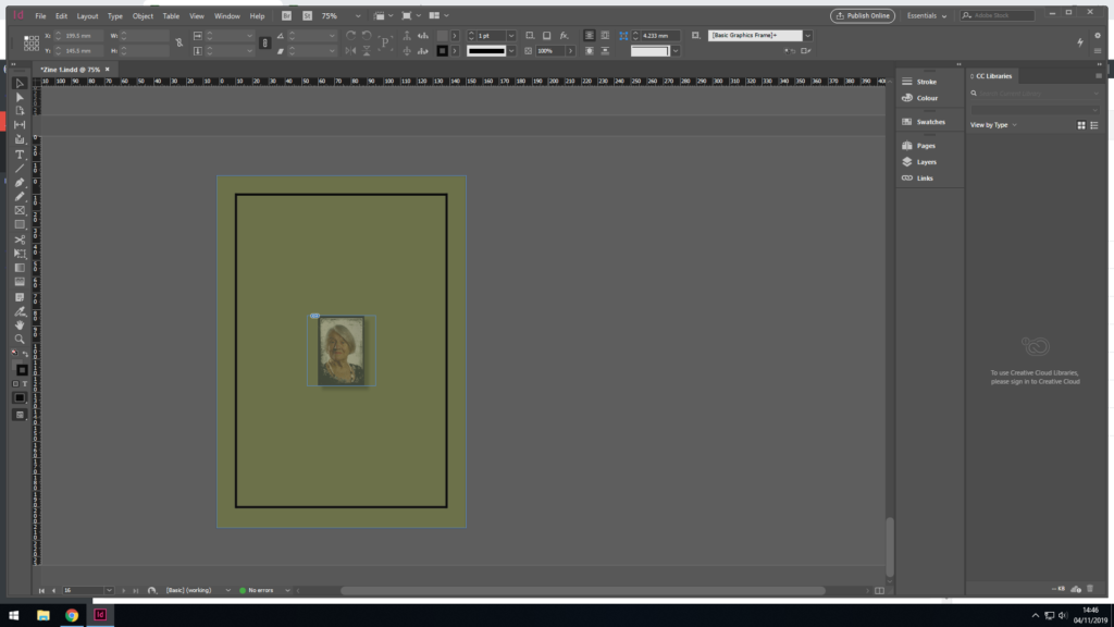
These are screenshots of the finished second Zene:
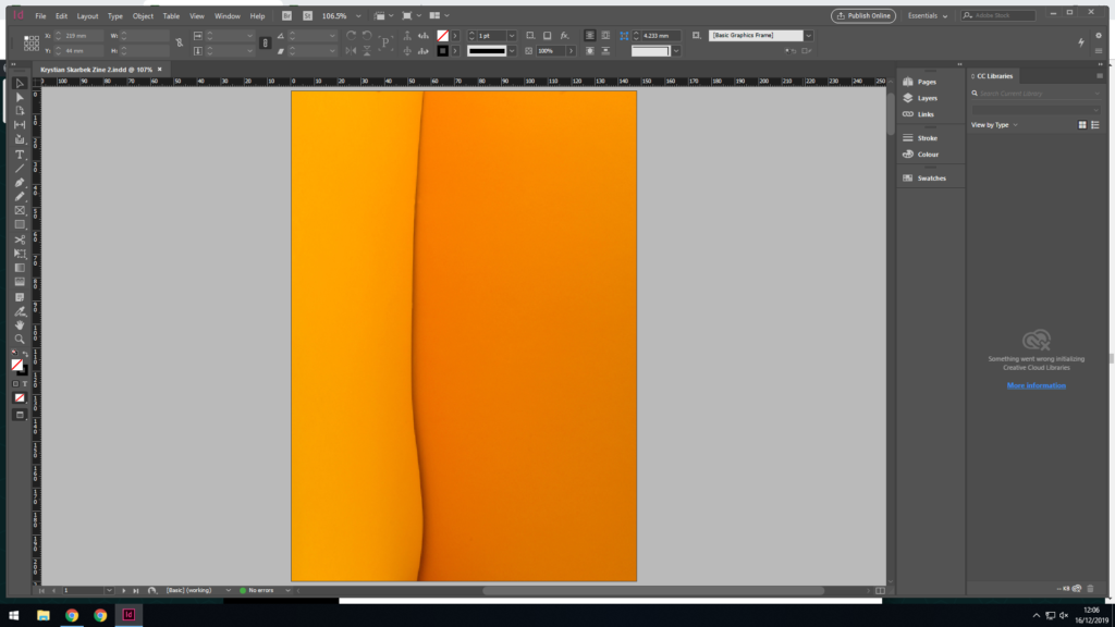

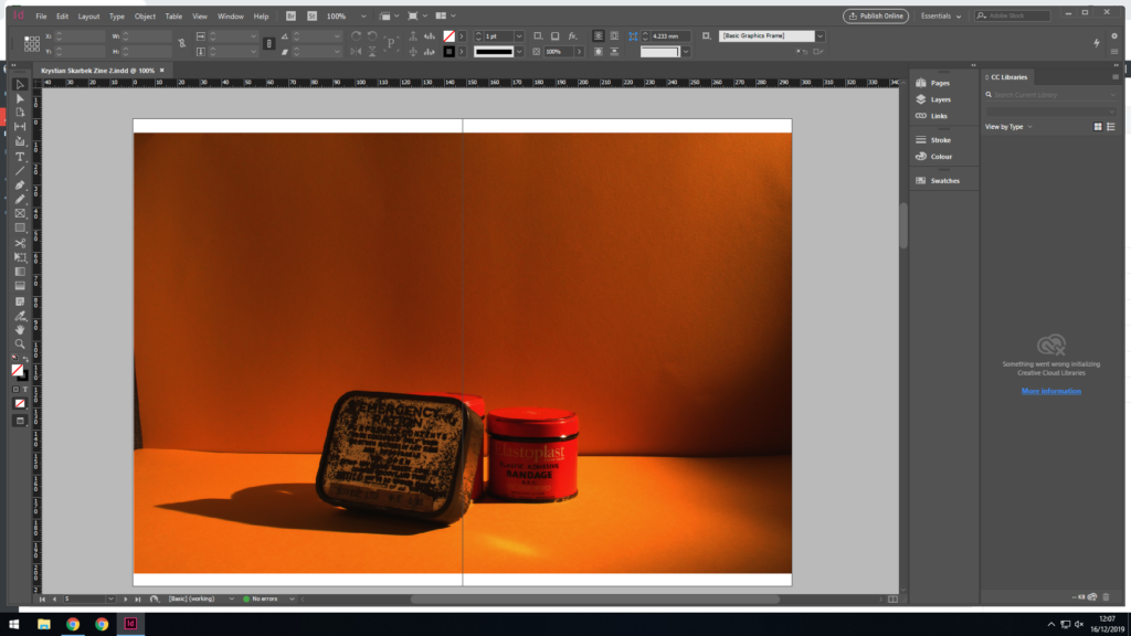
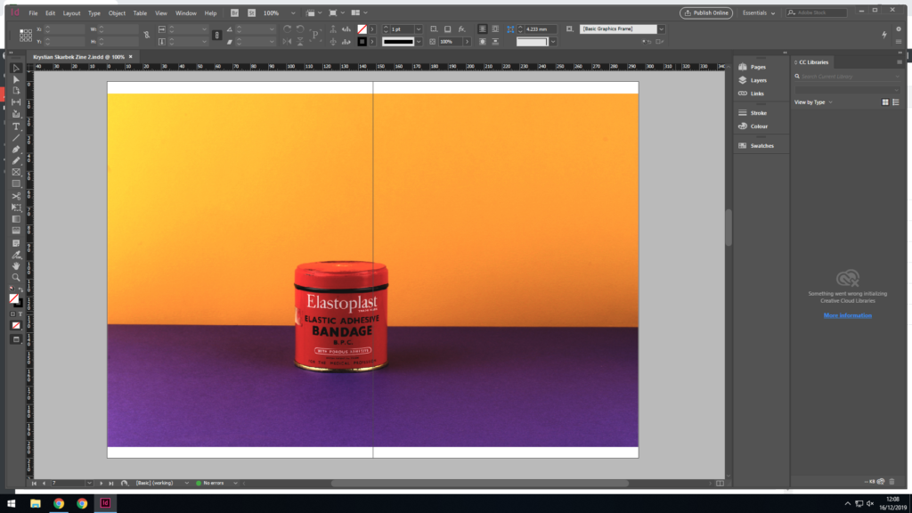

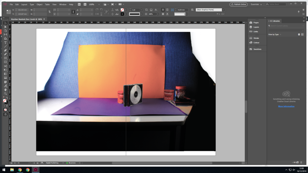


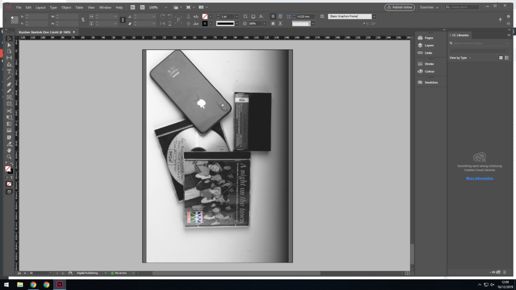
These are screenshots of the finished second Zene:


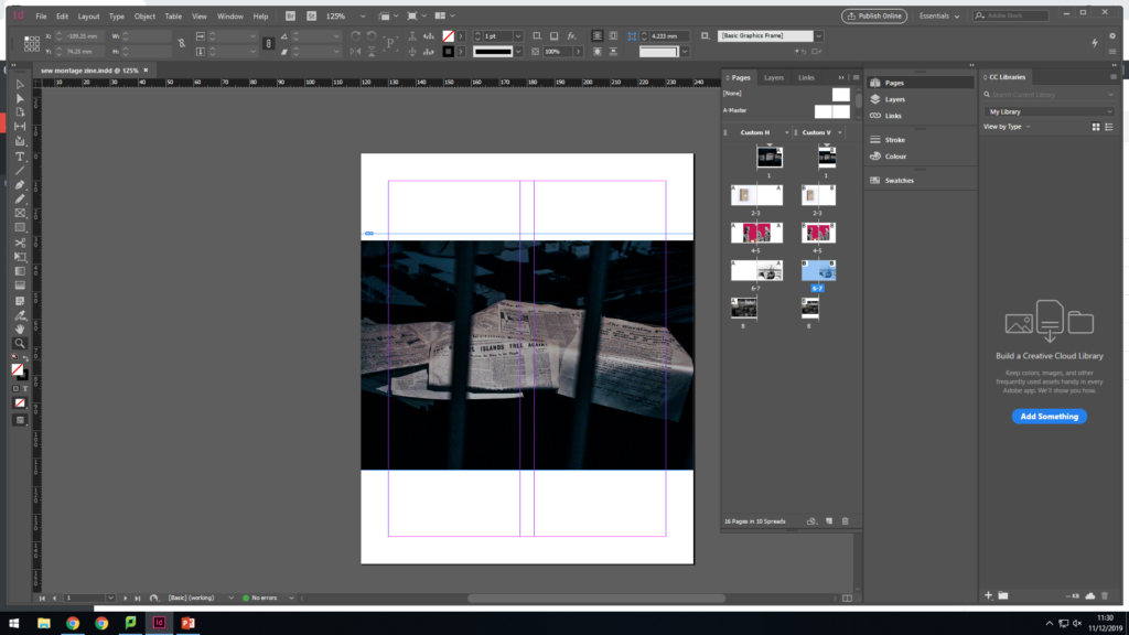

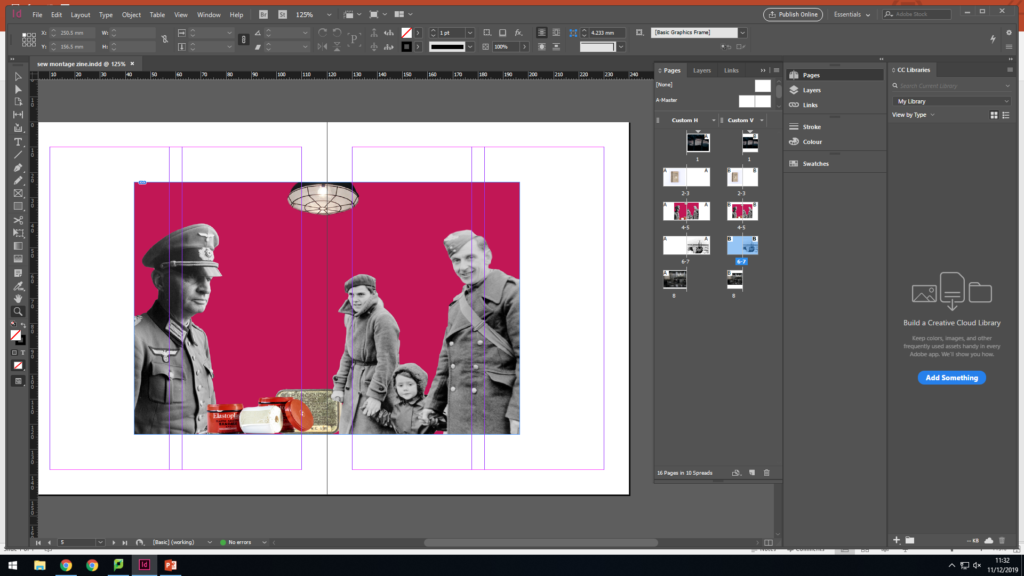

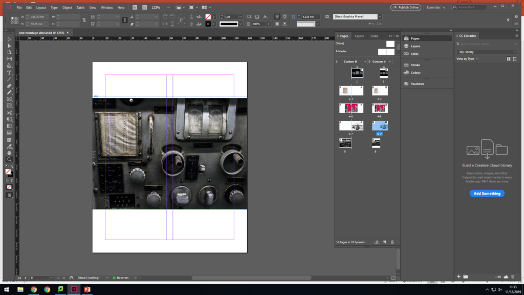
I will be printing this on A5 paper then trim down the images to their intended size. I had to leave two pages blank because I will be sewing into the photomontage so the pages behind can't have images as they would have string all over them.
For my zine I decided to experiment with images and text, which I have gone with, I wanted to use text because it would give the images a clear understanding of the message I am trying to get across.







in this experiment i am going to photograph objects and i decided in this photo shoot to take still photos of objects from the German Occupation, these objects where brought from the Jersey Archive to give us an opportunity to photograph them, and this is how i planned to do that:
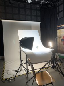
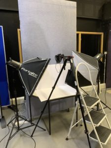
i decided to use two different setups to photograph my objects as some different objects need to be photographed at different angles and these are the two setups i used:
For the straight on angle set up I used a continuous light set up. I used a fill light illuminating the object, with a secondary (tungsten light) light source to reduce the shadows and clearly showcase the object. I also experimented with back lights, but felt that it was not successful and did not justify the objects, thus I stopped using the back light. The camera was on a tripod with a 50 mm lens.
For this set up, I used two flash head lights, set on a 2.0 power output. The lights where paced either side of the table, slightly facing downwards towards the object. On my camera I used a transmitter which triggered the flash heads to operate as I captured my imagery. In addition, I also used a pilot light in order to position a and frame my composition, this was located at the back of the table (on right) and did not affect the coloring or the outcomes of my image. The camera itself was placed on a tripod looking down at the table.
My plan is to work on this project with my friend who also takes photography so we can exchange skills and get the best results. we are going to go to the studio for three hours divided into three school days and use one camera between us and take photographs on different personalized settings then comparing the results to come out with an even better setting for the camera. We are going to start photographic the most suitable eye catching 3D objects using the straight on angle lighting setup, and afterwere done with that were going to photography the flatter objects on the birds eye view lighting setup.
What is a zine?
A Zine is a self- published or individually produced booklet, which can be made by physically sticking, cutting and gluing images and pages together or using InDesign to help plan your zine using a computer then printing it out. Zines have been around since approximately 1776 when Thomas Paine self-published Common Sense and used it as an instrument in promoting the ideas that contributed to the US War for Independence.
For example some popular artists who use zine to express their work are: Lorenzo Vitturi, Sam Ivin, Rita Puig-Serra Costa.
Lorenzo Vitturi

Lorenzo Vitturi are clearly presented to have consistently used more bright and vibrant colours in the zine, the zine images are fairly unusual creating different shapes and colour by combining different objects together to portray a certain effect and feel.
Sam Ivin
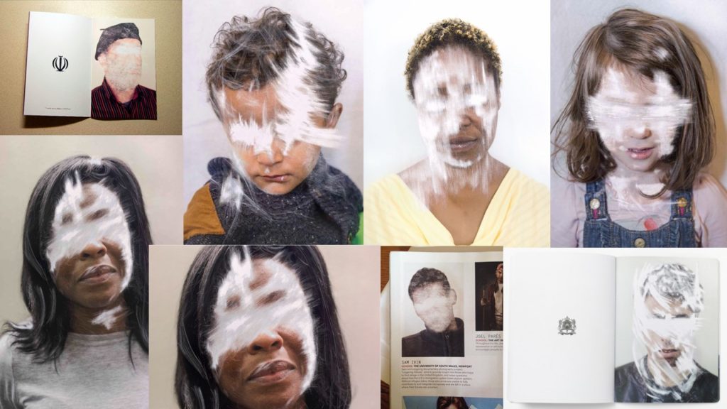
Sam Ivin has a more consistent style that he used within his zine, using portraits of people and editing them to have white strikes and marks across their eyes key facial features. this creates a deeper meaning and overall representation of individualism.
Rita Puig-Serra Costa
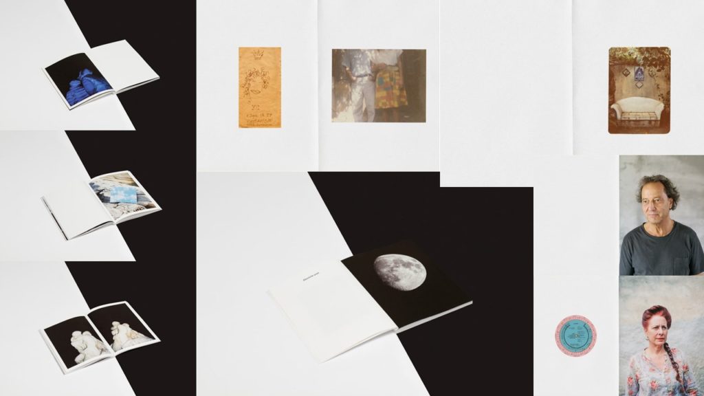
Rita Puig-Serra Costa presents a more abstract and original sense to the zines, consisting of various sizes and colours, including portraits, objects and landscapes. this provides a wide range of aspects to the zine producing a different feeling and personal response each time you turn a page.