

PHOTO SHOOT PLANNING:
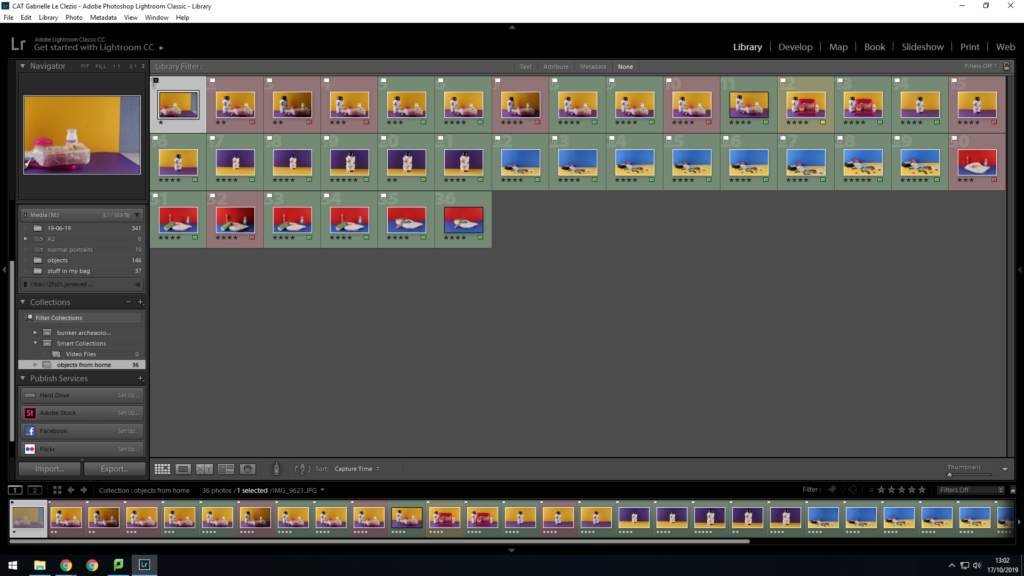
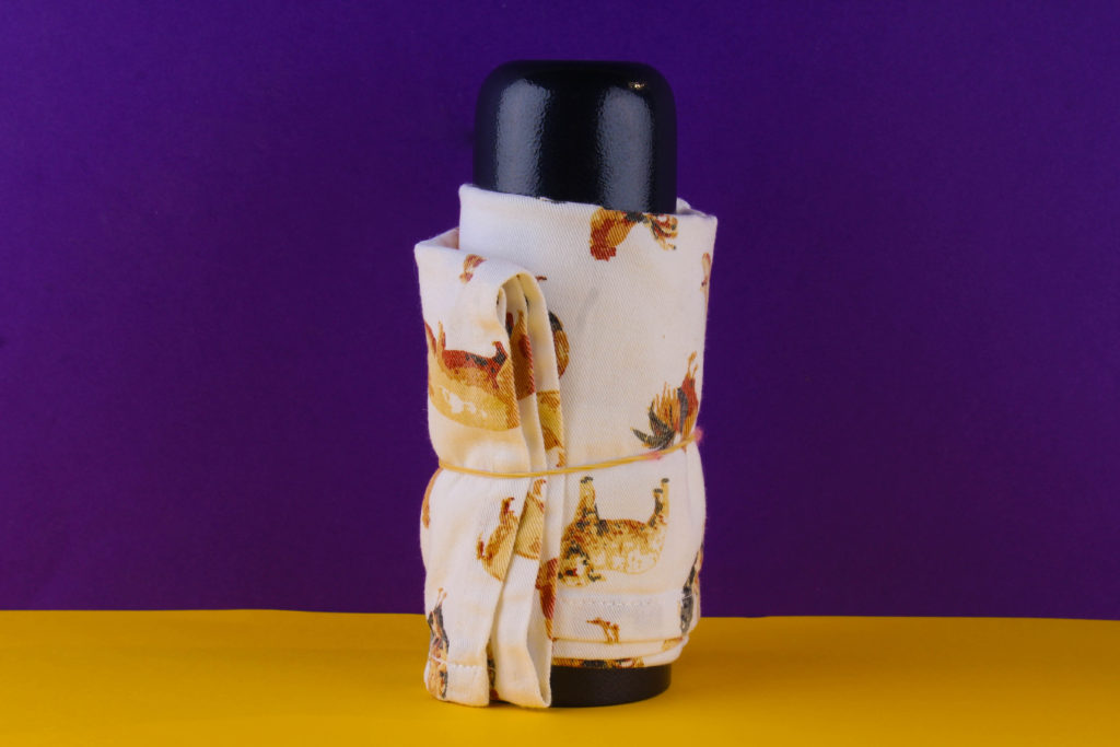
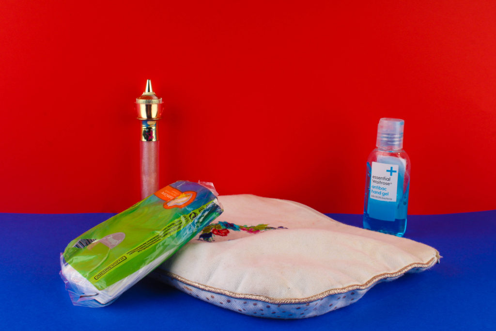
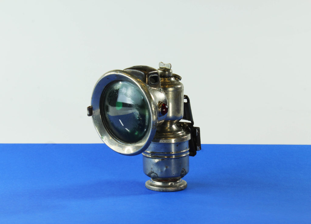
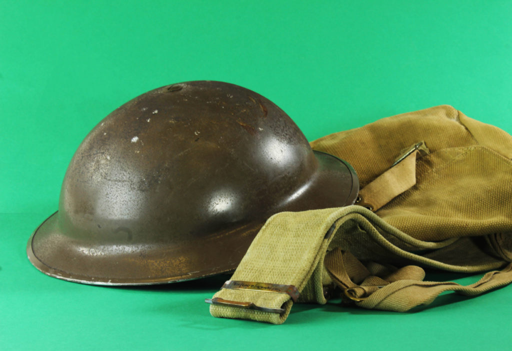
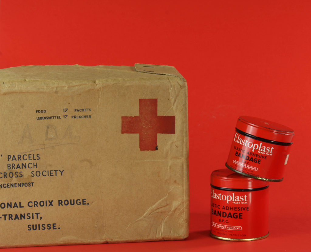
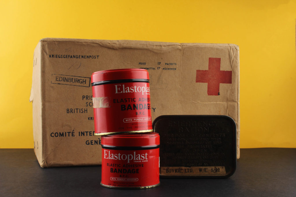
WHERE: In order to take these images in a professional setting we utilized the studio and various other equipment in order to take the images. We used a three point lighting system in order to illuminate the still life table. Much like the previous still life photography, this time we used various different coloured backdrops. These allowed us to play with different compositions and set ups.
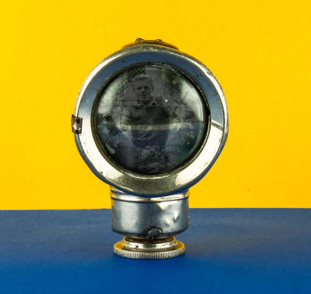
WHAT: We used a variety of war items and memorabilia and set them up as still life n order to capture them and continue our occupation vs liberation topic.
WHY: In order to be more technically skilled in terms of lighting set ups and using the camera. We were able to learn a variety of things such as how to set up a horizontal tripod, the use of a flash transmitter and how to illuminate a professional still life table.
HOW: In order to create these images, we used various types of equipment and professional still life photography set ups. The most notable thing we used was the transmitter in order to set of the flash whilst photographing.
CRITICAL ANALYSIS:
TECHNICAL:
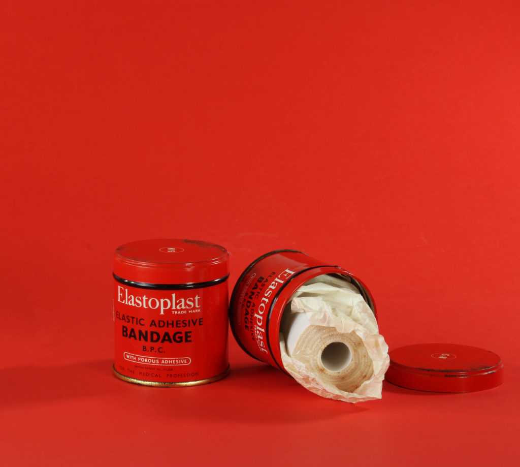
In terms of the technical aspects of the image, the was one of the most technically challenging shoots which I have done to date due to the various professional aspects which had to be taken into account. Firstly, in order to sufficiently illuminate the image, we used a 3 point lighting set up in order to do so, using a a primary, secondary and fill light in order to do so. Yet we often found that the fill light was making the image over exposed so for the majority of the time we did not even use this lighting set up. As we wanted very high quality images for the outcome, we used a fixed lens in order to shoot the photos, this meant that if we wanted to zoom into the composition, we physically needed to move the camera. Another piece of equipment which was essential for this shoot was a tripod which we used in order to get the most accurate and crisp images as possible as it prevented the occurrence of motion blur. Another precaution which we took in order to avoid this was the use of a trigger, this allowed us to take the image without actually physically touching the camera. The table with we set the composition up on was actually a professional still life table intended for this one purpose. The most notable aspect of it was the large curve which extended upwards, this makes the backdrop continuous and undisturbed, very similar to an infinity screen. One downside which I found whilst working with this was the fact that the surface was made out of a very reflective plastic which meant that the backdrop wasn’t even, as small reflections of light could be seen which have to be edited out later. This was also combated with the use of the colored backdrops which were matte in texture and could be fixed onto the still life table and act as a new backdrop.
VISUAL:
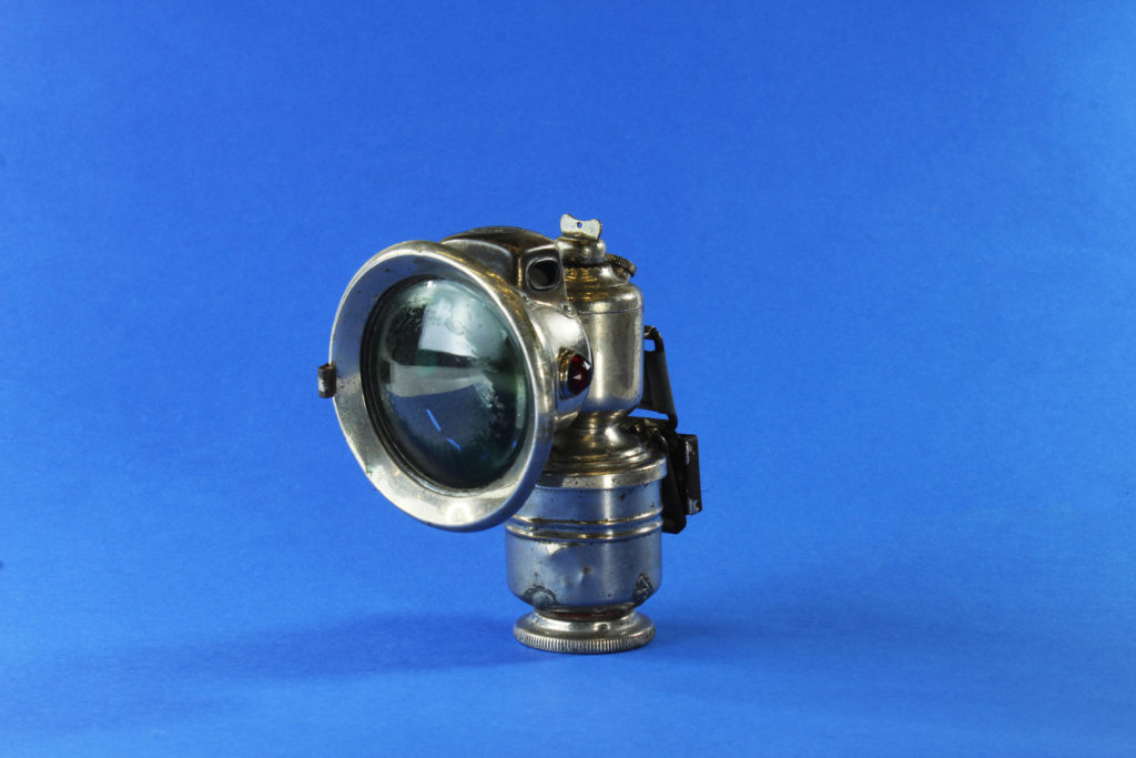
In terms of the visual aspects of the mage I find that it is very harmonious in nature and many aspects compliment one another very nicely. the most notable aspect of the image is the continuous use of the color red within the object and the backdrop, this was done deliberately in order to create harmony and cohesiveness between the backdrop and the object. Even though there are an extremely similar tone, the two colors do slightly vary so there is still a distinct difference between the backdrop and the object, this is further created by the cylindrical shape of the tins which curve and create a shadow whilst doing so. The focal point of the image is undoubtedly the opened tin on the right hand side of the image which is spilling out it’s contents, the bright white of the bandages nicely contrasts the bright red which encompasses the image. The shapes which can be seen in the image also complement each other very well as there is a set of two very cylindrical objects, the lid and bandage also following this same pattern. Due to the more powerful lighting which is hitting the right hand side of the image, a light shadow is cast, leaning onto the left hand side of the image, this not only creates slight contrast, it also creates depth and distinguishes the backdrop from the objects which are stationed in the foreground of the image.
CONCEPTUAL:
Still life has always been about more than fruit and flowers arranged on tables. The French word for the genre – nature morte – references mortality, a nod to the brevity of even the most luxurious of lives. Still life images at their best illicit a response on both a visual and an intellectual level – both examining the principles of arrangement and aesthetic taste, and asking questions about commodity-based status, the everyday, and life and death. They take the ordinary and make it extraordinary. Everyday objects morphed into high art.With any genre rooted in such tradition though, it takes special work to push it in new and interesting directions – for the work to feel fresh and exciting, rather than just referential and appropriated. An aesthetic document is one thing, but what does a modern still life communicate that we don’t already know, that photographers weren’t already exploring almost a century ago?
CONTEXTUAL:
The main thing which we tried to achieve with this photo shoot was to learn about the formalities of still life and extend our knowledge within the studio and different lighting set ups. It was critical that we learn about different artistic imagery, even if it is not formally related to modern day photography. Still life as a whole can be categorized within a classical genre which is essential if we are wanting to explore a variety of photography styles as a large chunk of history was spent perfecting the technique in which to visualize objects.
EDITING PROCESS:
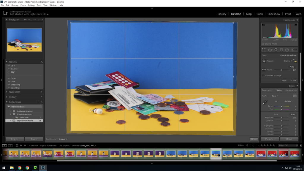
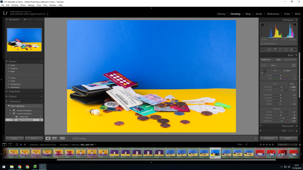
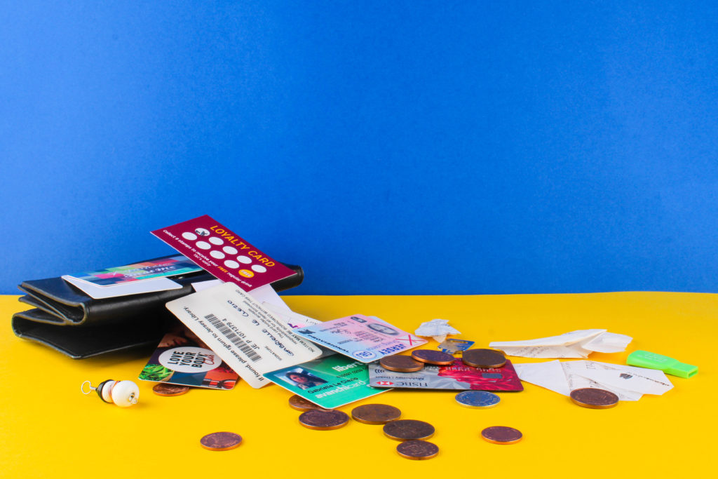
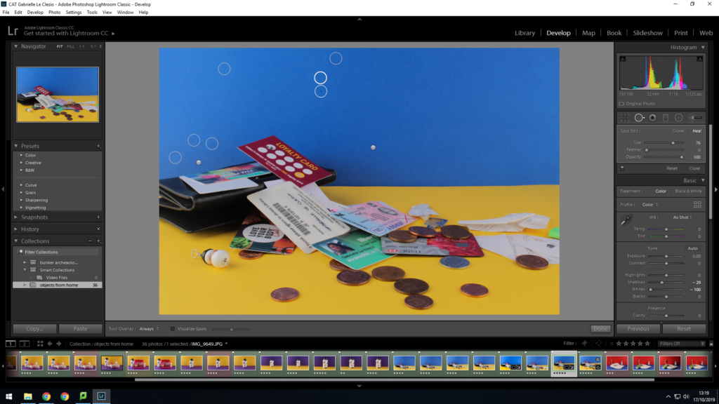
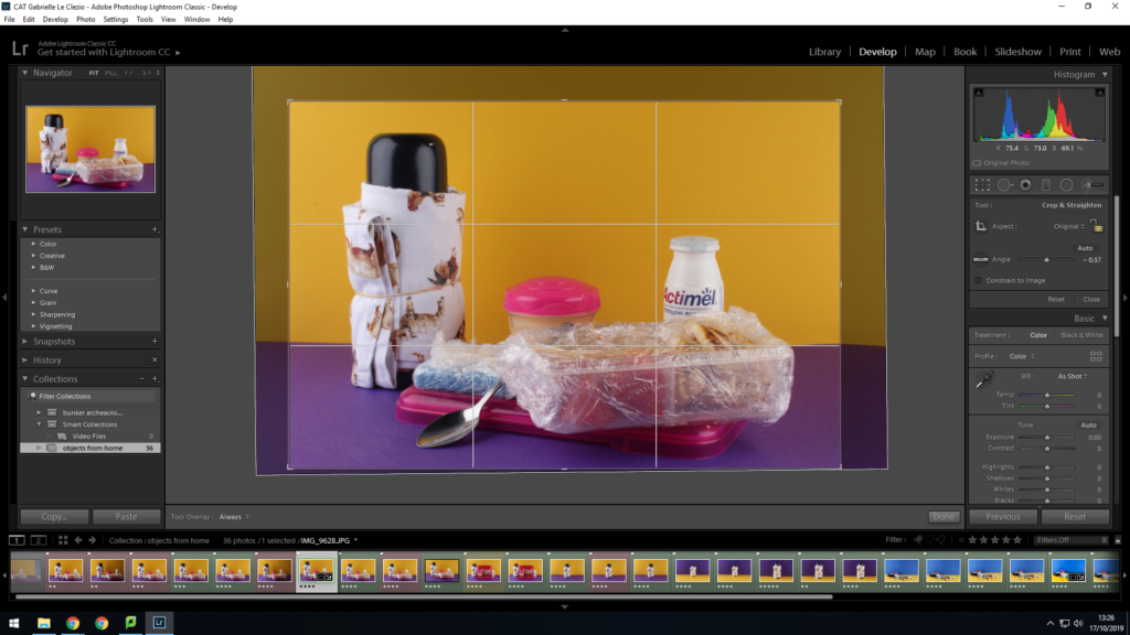
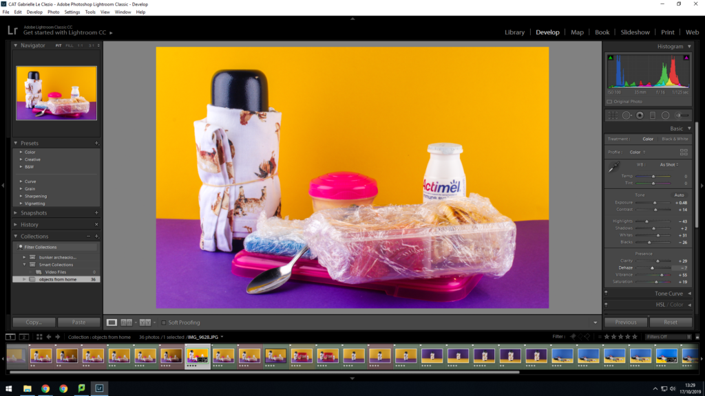
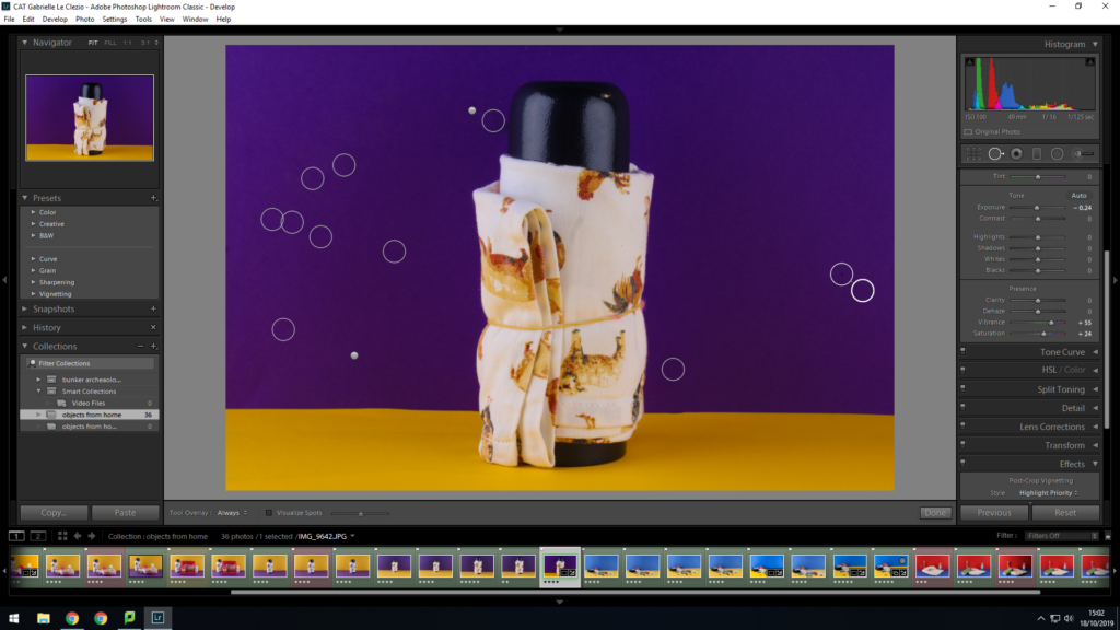
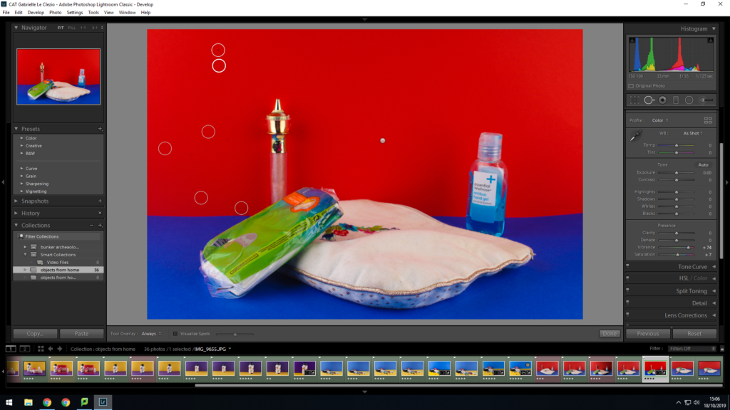
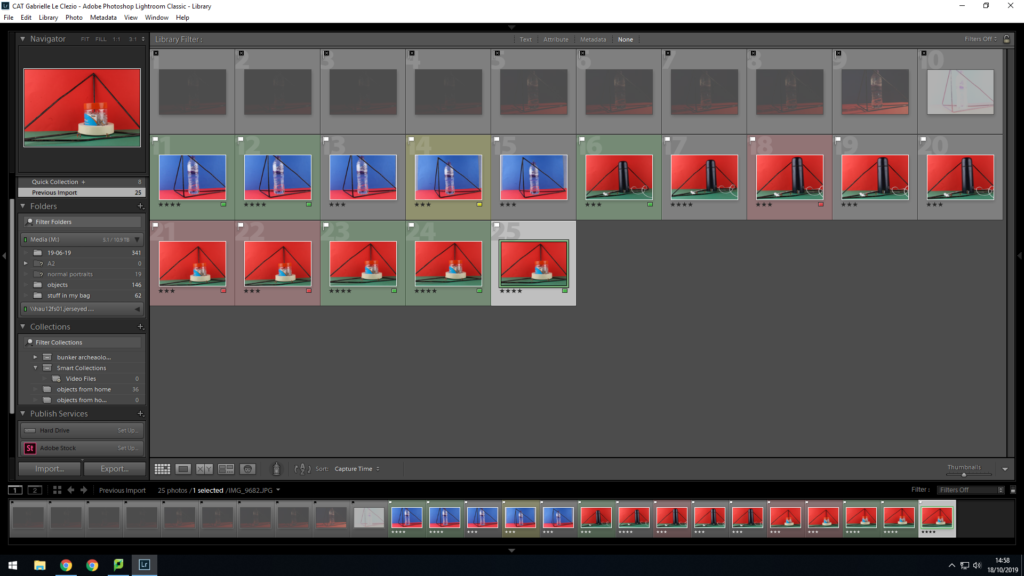
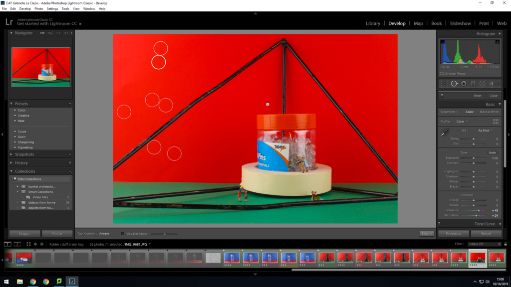
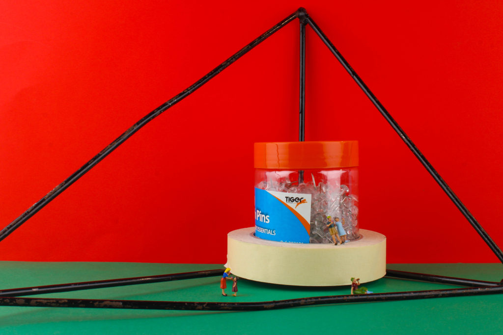
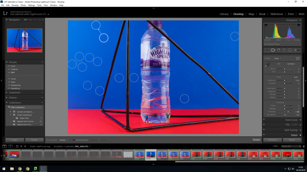
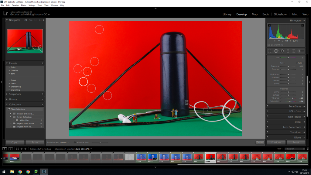
In terms of the editing process, this was a slightly longer process than the previous still life set up with the addition of colored backdrops. To start of with, i completed the typical adjustments of exposure, brightness, contrast, vibrance and saturation in order to create more striking and impactful images. I then moved onto fixing the backdrops of the images, as when it came to the reviewing process, I found that an abundance of them displayed scuffs and marks, with uneven tones. It was essential that these were removed as this would ultimately just distract away from the main focal point of the image. I used the spot healing tool for the majority of the images as i found that this was very effective in removing small marks quickly. I increased the size of the brush head in order to target large areas where tone may have been off.

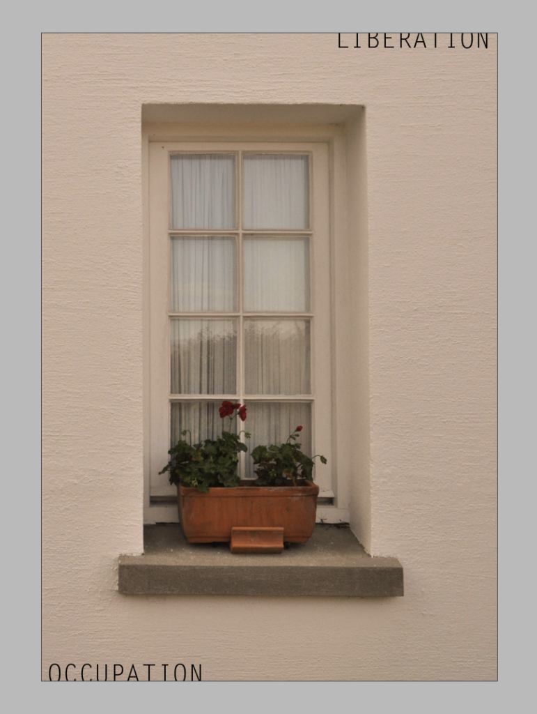
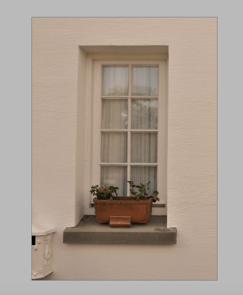
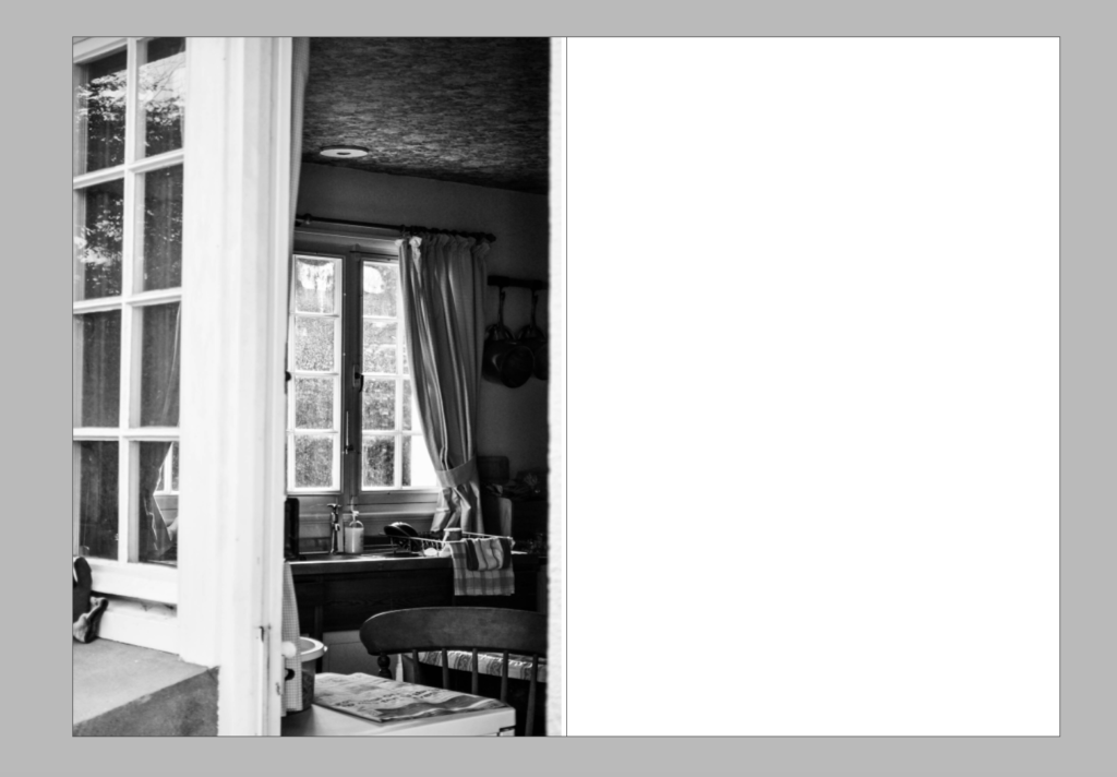
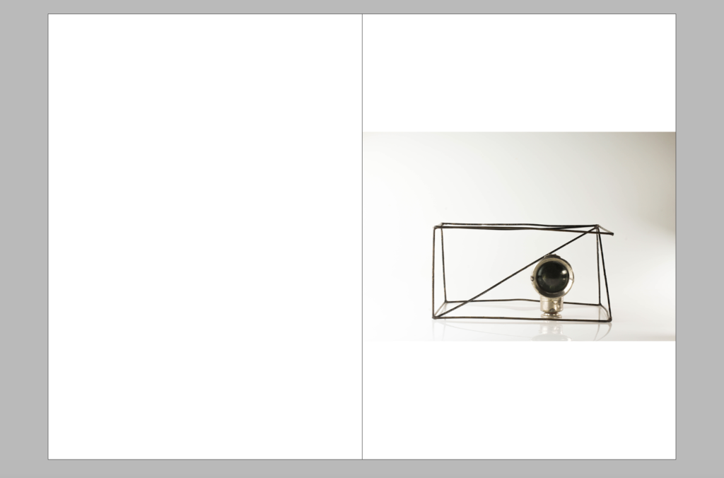
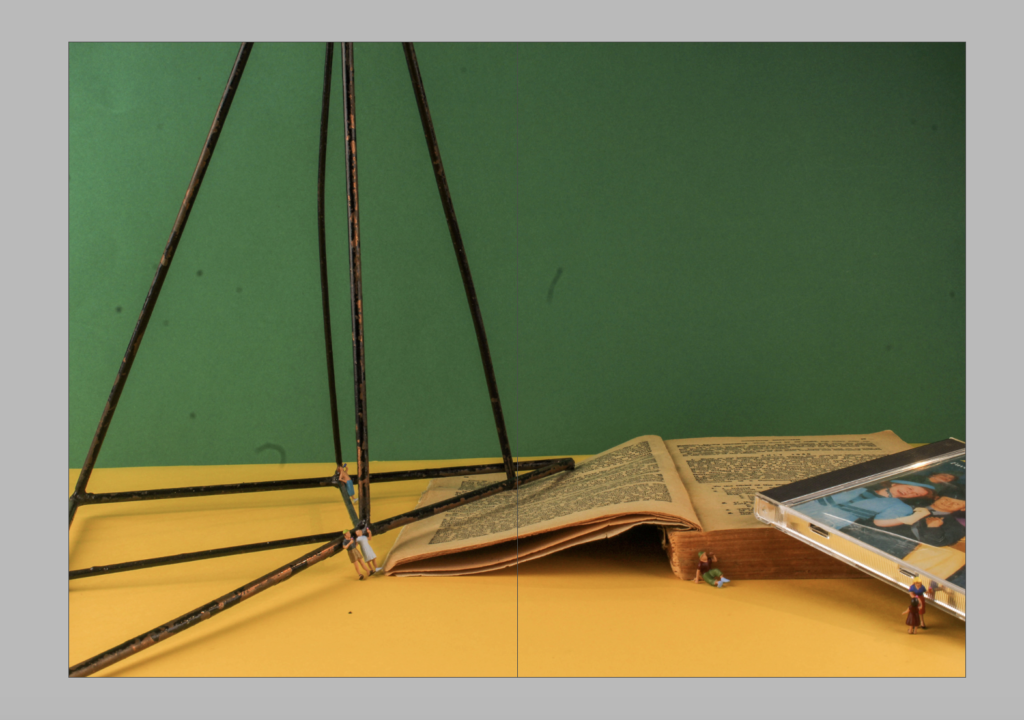
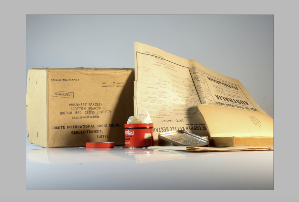
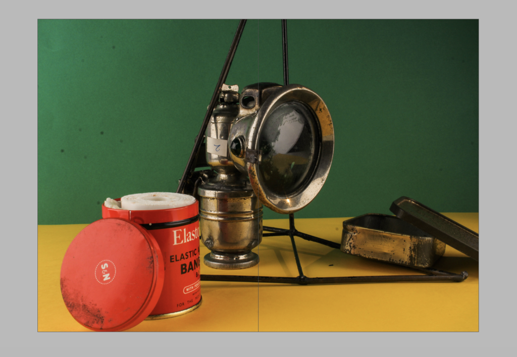
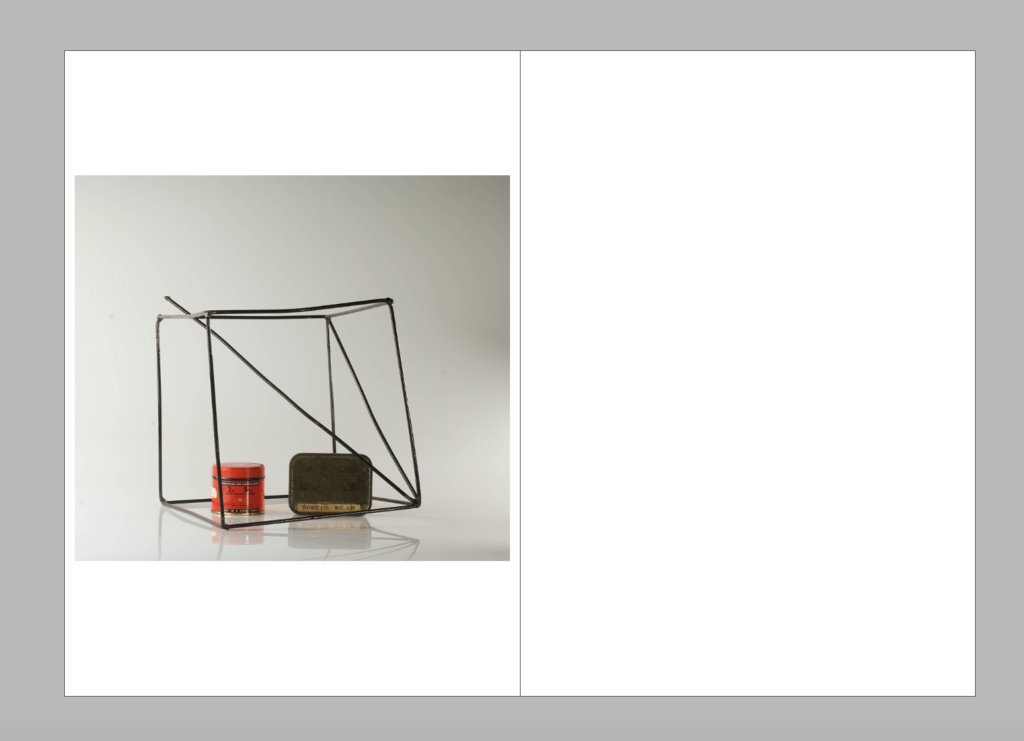
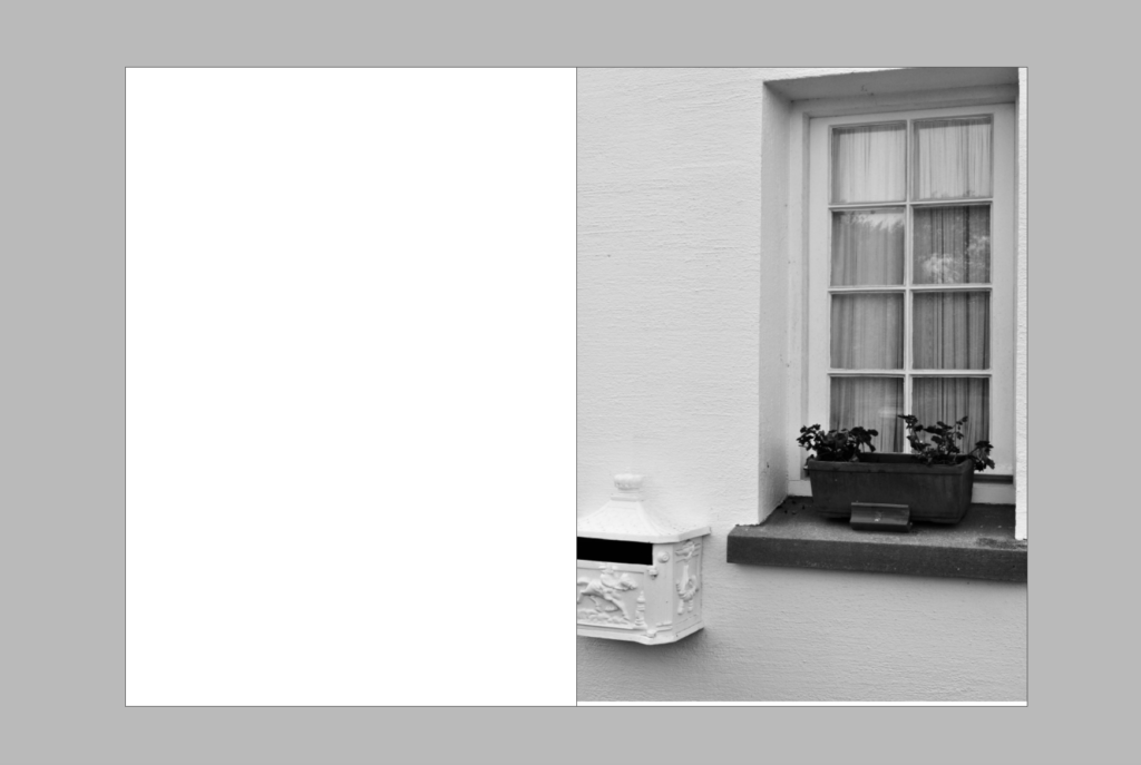
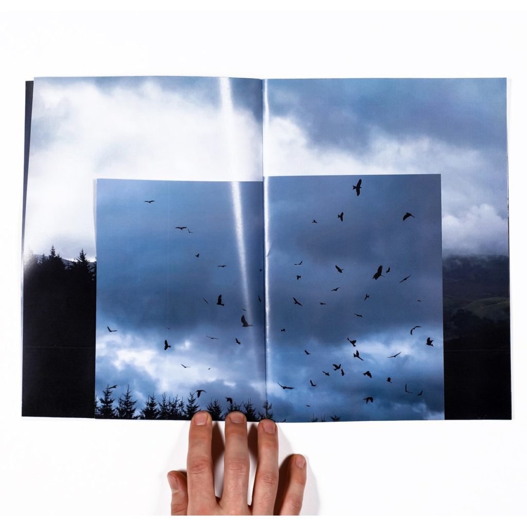
For my zine I experimented with different layouts of the photographs looking at how they are working together and what the narrative will look like and seem to be. I experimented with the use of some of my ‘home sweet home’ images to create and idea about looking inside a house, the house I used to create my home sweet home images was one built just after the war and contains a lot of old and collectable archival stuff. For this reason I began to experiment with the idea of having the first couple and last couple of photographs be of the house to create the idea of looking into the house and showing the object photographs of being stuff inside the house to create a sense of narrative and story to the zine. I also liked experimenting with the start and end of the book being in duller colours, black and white photographs as well as the use of grey and minimal splattering colour I feel this works well in the beginning of end being calming and minimal.
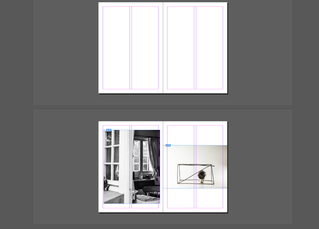
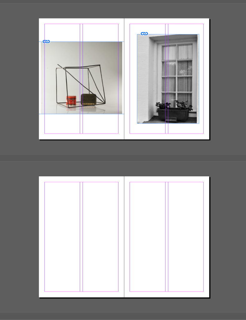
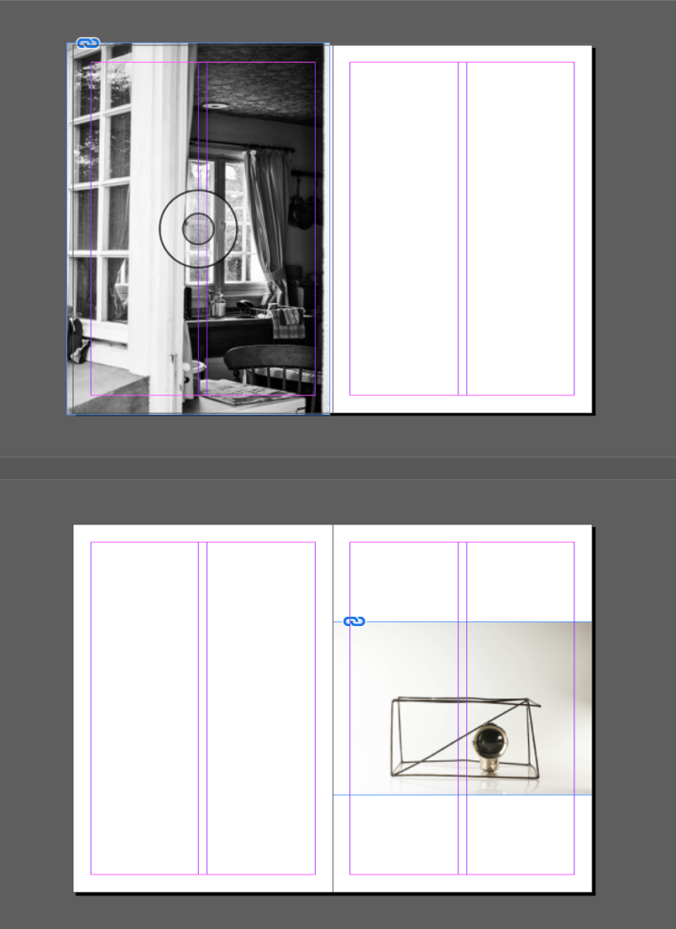
For the middle of my zine I began to experiment with my other object photographs that had been produced in more colour as well as my photomontage ones in response to Rafal Milach. I started to experiment with them being full bleed and leaving boarders as well as looking at the different orders I could place them in to create and narrative sequence to work with the idea of looking into the house and back out with my starting and ending photographs. I found that the photographs I feel worked better as full bleed as I think it gave more effect to the photographs and created a bigger impact.
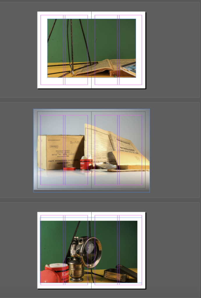
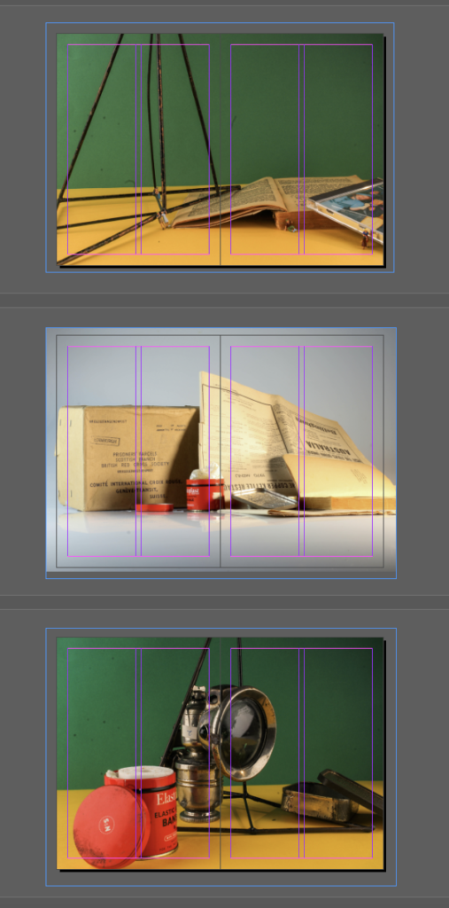
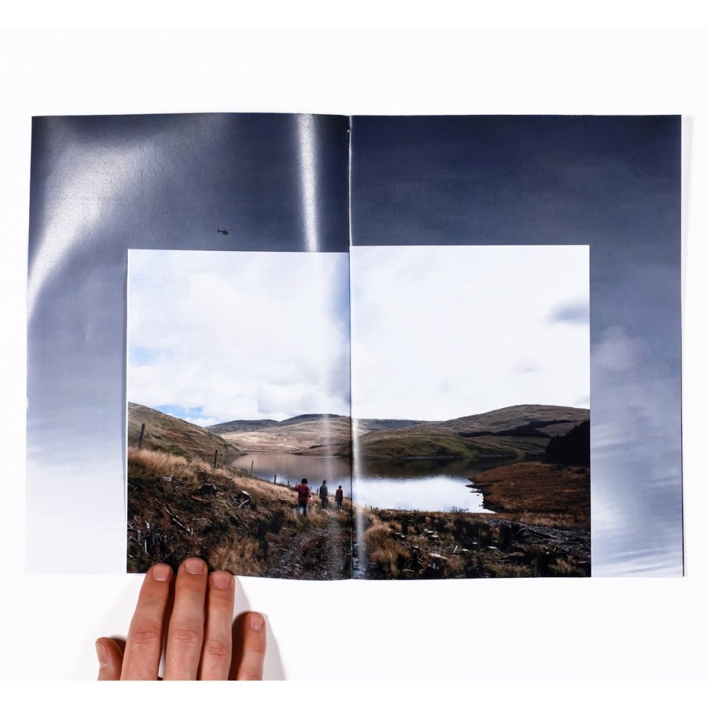
For my zine, I want to explore the different types of zines to create a unique one. My last zine that I made was a single section zine which is known as a booklet. Although this is a good way to display my photographs, I feel it isn't as creative as it should be. After some research and experimentation with paper I have decided to make a zine within a zine. This is basically a single section zine however, it combines a variety of paper sizes which can be distributed is numerous ways. For my zine I will have three different paper sizes.

On the outside I will have a length is 21cm and width 7.5cm. I will print this out on a piece of coloured paper/card and it will have the title of my zine with my name at the bottom to display that it is made by me. I will only have one of this paper size on my zine as it is used for a title page.

The second paper size I will use in my zine has a height of 12cm and a width of 14.8cm. This size will feature throughout my zine, however, there will be a pice in the middle of my zine. This will be my montage that I sewed into. However,  instead of having the photo of it being sewed in. I will re-sew into the piece making the zine have multi-media. The sewing patterns will be different from the first sewed montage I made but I don't mind that as it ties in with the message of the montage, everyone's experiences of the war is individual.

The third paper size I will use for my zine will be A5. This is the typical paper size of a zine and will be throughout the zine. Here I can use both vertical and horizontal images, but vertical images will be a lot more suited to the A5 paper than the 12cm by 14.8cm paper.
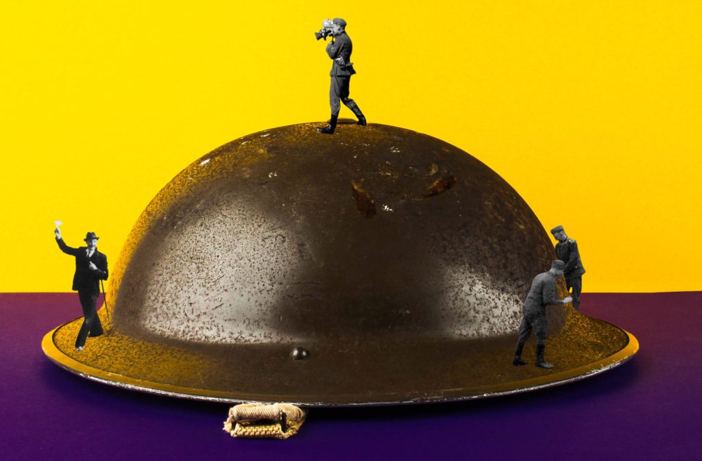
I took some of my images which I took in the studio and some which are from the archives and made photo montages by mixing these. I was primarily taking the people from the archive images and putting them into my object images to replicate the style of photographer Rafal Milach, who took images of objects with colourful backgrounds and photo shopped people into them to create an interesting aspect.
What I did :
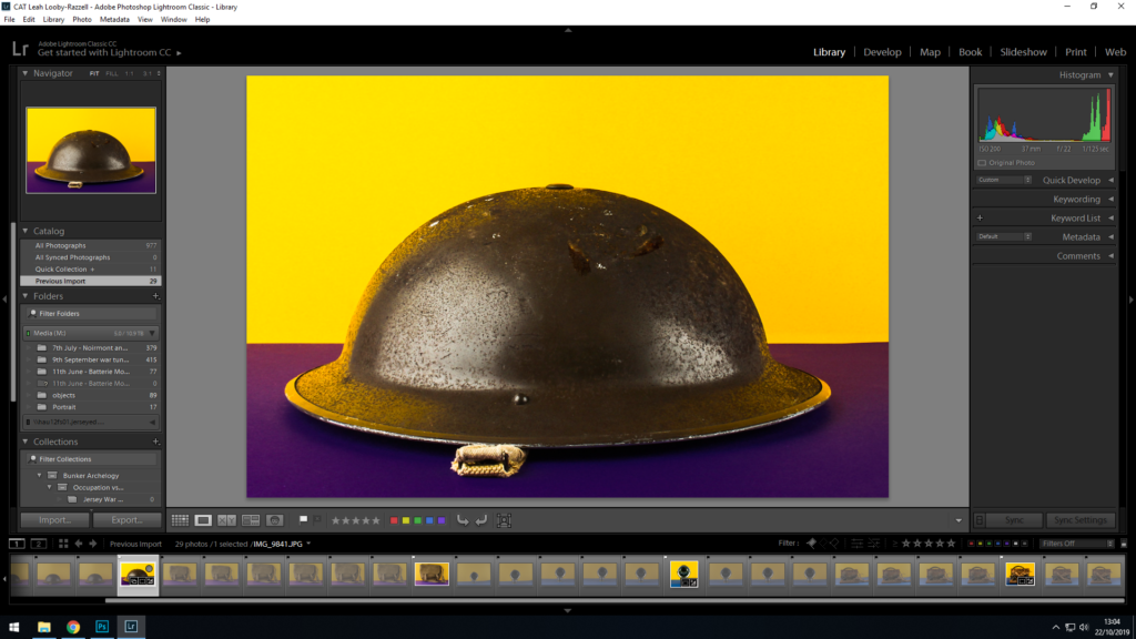
I first took an image which I liked and which I felt can be used for this type of photo montage.
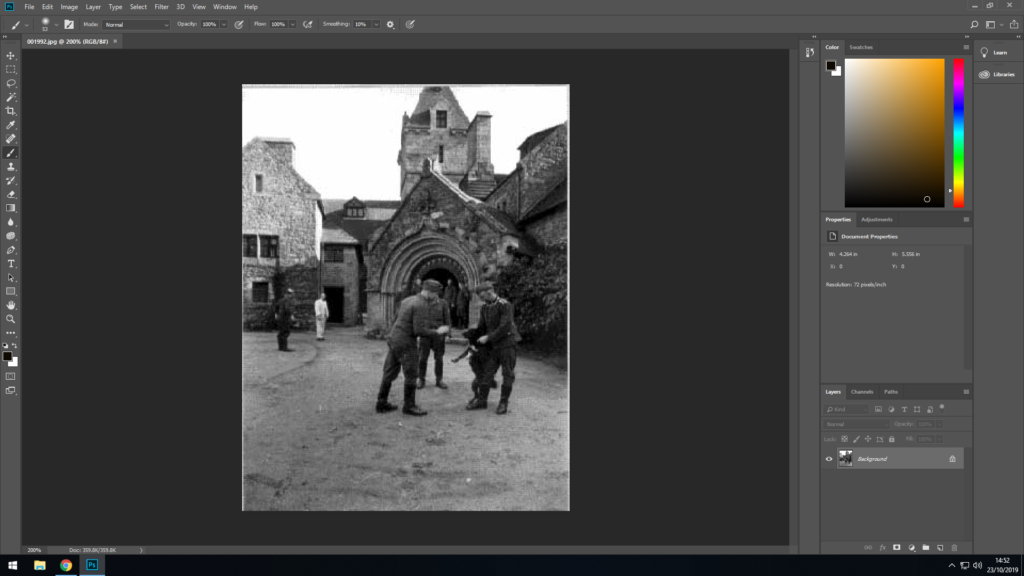
I then took an archive image with people in it which I could use with the object photo I chose.
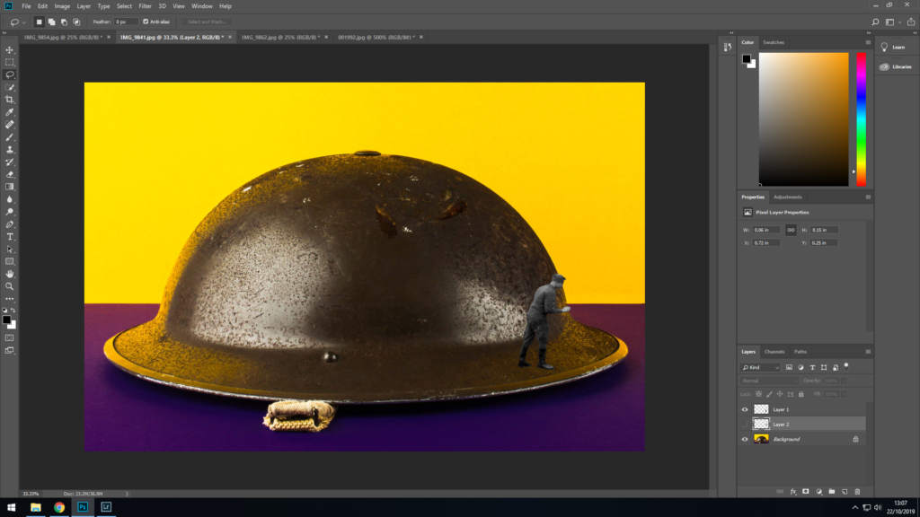
For this photo montage, I wanted to make it look like the soldiers are looking for something or someone, so I chose one who looked like he could be peering around the corner. I cut him out and put him at the side of the helmet, and then went and cleaned up the edged with the eraser to give it more of a neat and natural look.
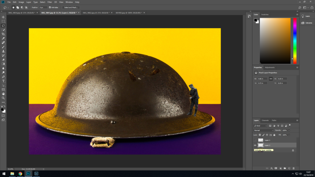
From that same archive image I took another soldier and did the same – cut him out and put him on the side of the helmet.
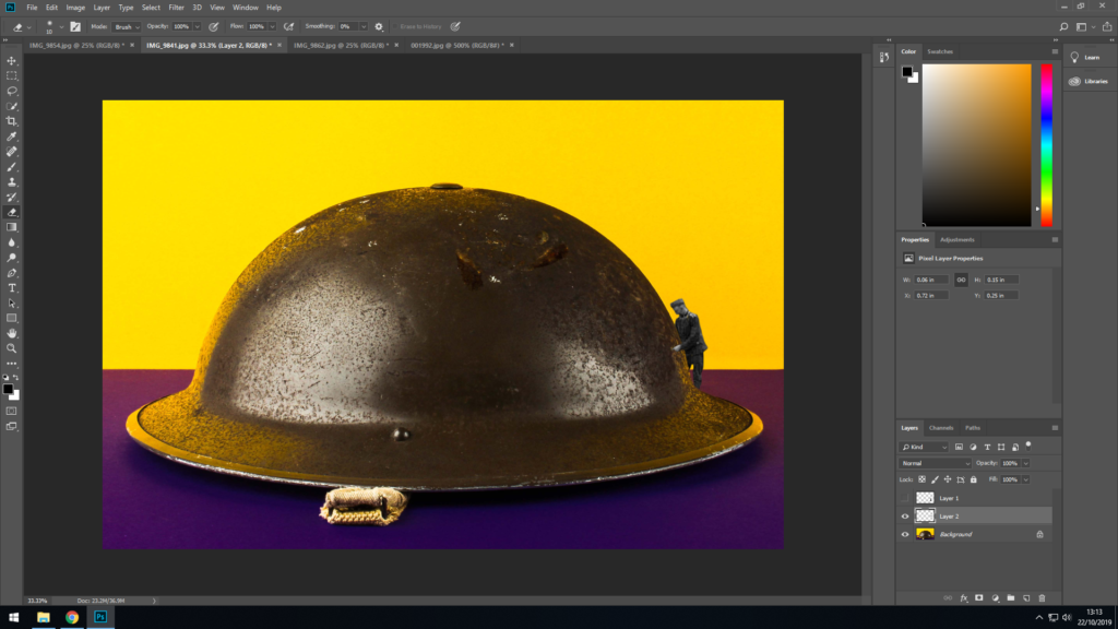
Since I want to make him look like he’s looking around the side of the helmet, I needed to erase some of the image away to make him look like he’s on the other side of the helmet. To do this I erased his legs but kept his arm on the side.

I moved the layer the cut out was on to be underneath the first guy I cut out to make it seem that he is in front of him, and so they don’t over lap and seem unnatural.
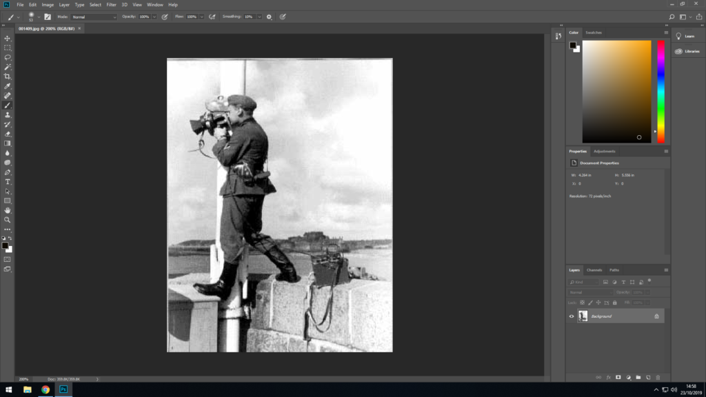
I found another archive image which I thought I would be able to use in my object image.
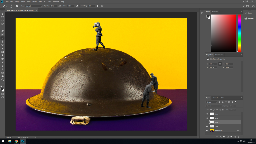
After cutting the soldier out I placed him on the top of the helmet to make it look like he’s looking for something or someone from a higher angle, since he looks like he’s holding some sort of device, such as binoculars or a camera. Like the other two, i cleaned up the edges to give it more of a natural and neat look.
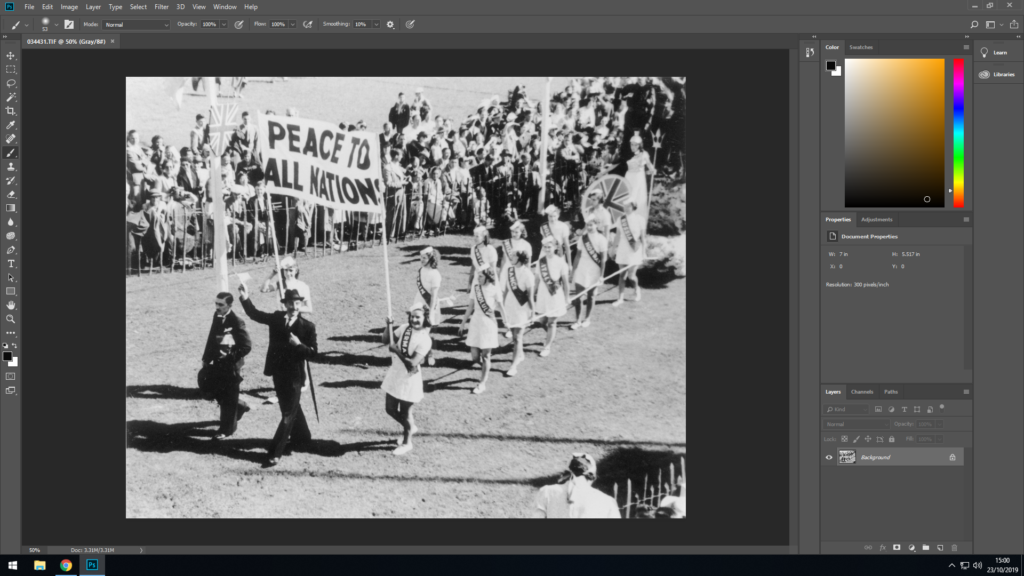
I chose one more archive image and cut out the guy at the front in the suit.
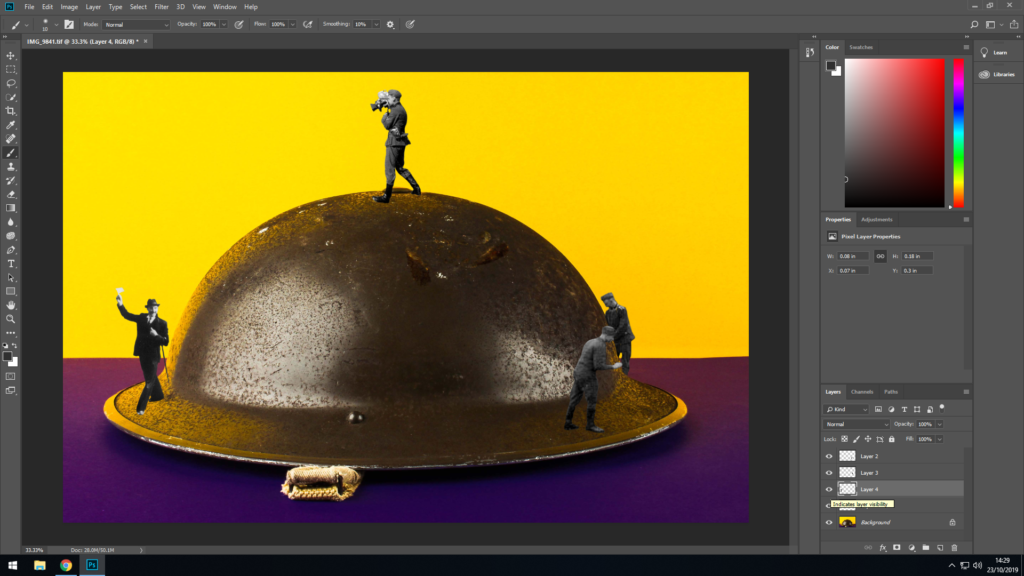
I decided to place him on the other side of the helmet to make it seem that he is the guy the soldiers are looking for, and since he is holding something in his hand it looks like that he might have something which the soldiers want and that’s the reason they are looking for him.
Final outcome :
