Planning:
In preparation for my second photo shoot I reflected back on my previous shoot, looking at lighting techniques which worked and looked over the camera settings in order to capture effective imagery. For this shoot I decided to take a more contemporary approach by adding colour backgrounds to my straight on angle photographs, allowing an inspiration link to Rafal Milach’s work, developing my response to still life photography. I also wanted to explore more using singular objects of the complete white background, working on my manual focusing skills. I will again be using two set ups, the first for more flat objects (Birds Eye View) and one for 3-Dimensional objects (Straight on Angle). These two set ups required different lighting rigs, which is explained below. With my camera settings I put the mode to Manual, the ISO to 100 and the aperture to F16, allowing a wide depth of field to be utilised. The shutter speed for the Birds Eye View was between 1/250 – 1/200 and the straight on angle’s shutter speed was 0.5 – 0.8. The white balance for both was set onto daylight, with manual focus being used.
I used two flash head lights, set on a 2.0 power output. The lights where paced either side of the table, slightly facing downwards towards the object. On my camera I used a transmitter which triggered the flash heads to operate as I captured my imagery. In addition, I also used a pilot light in order to position a and frame my composition, this was located at the back of the table (on right) and did not affect the colouring or the outcomes of my image. The camera itself was placed on a tripod facing straight on at the table, with adjustments allowing me to have control over the composition of my imagery.
Edits:


Outcomes:
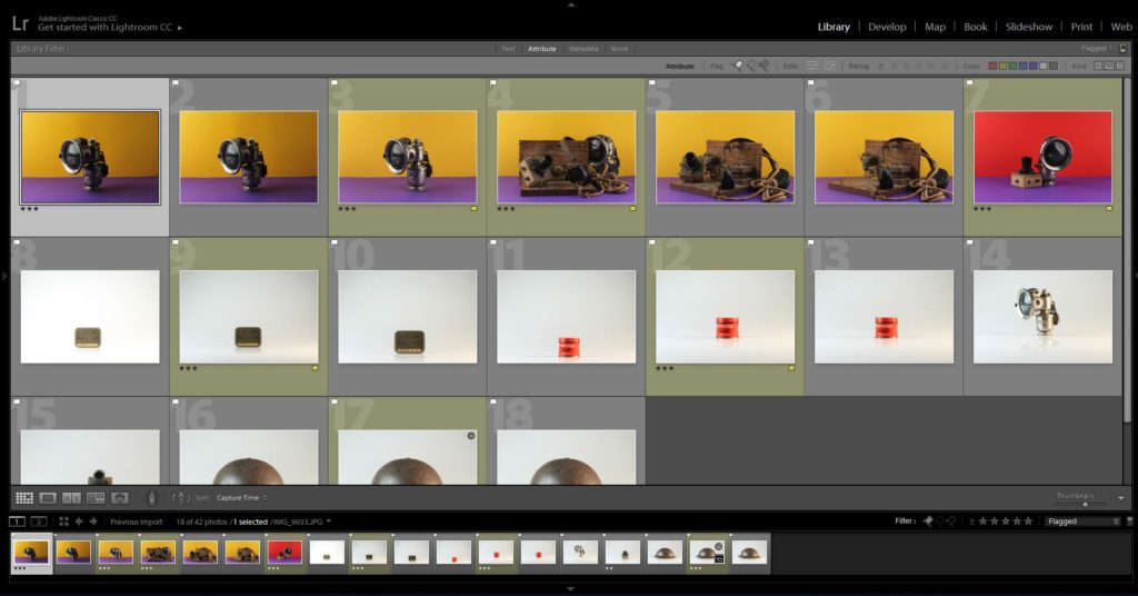
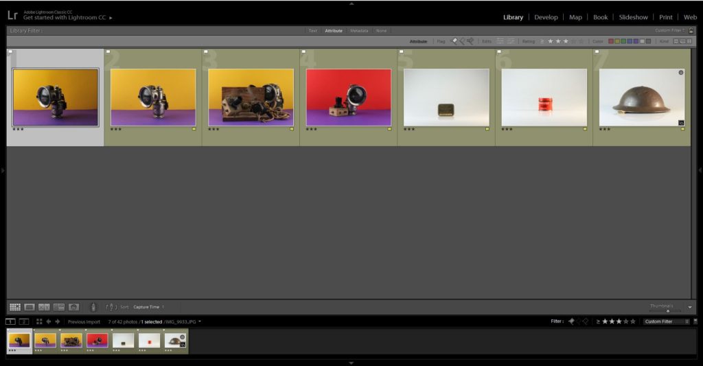
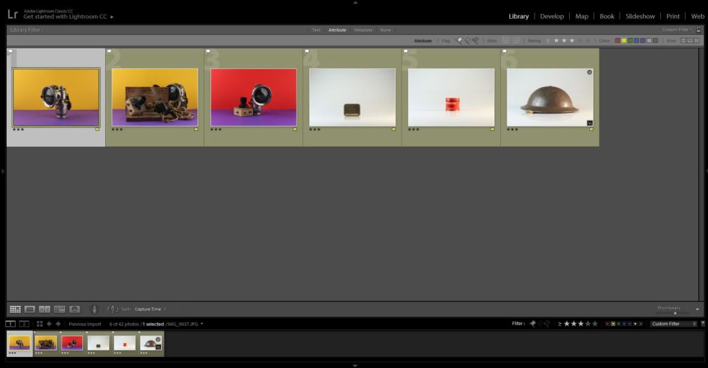
The three outcomes below are my top photographs from the shoot, which clearly showcase my inspiration and application of Milach’s work into my own. I explored with coloured background, which complemented one another, allowing a more ameliorative tone towards my final outcomes. I felt that it was important the the colours were vibrant and bright, almost welcoming, in order to draw the eyes into the objects located in the centre of the frame, I really emphasised this when editing. I started off by adjusting the whites, darks, shadows and contrast, allowing the objects to show clarity and tonal contrast, on top of accurately making the background vibrant. I then used the spot removal tool, to ensure a consistent coloured background, so that the viewers attention is not drawn away from the objects presenting the concept, a lack of simple supplies that citizens had to live off when the German’s occupied the island, of the imagery. I also selected another photograph which used the plain white background and experimented with attempting to get the text clear and bold, making it the main focal point, which was done by adjusting the clarity, structure, blacks and whites.


Evaluation:
To evaluate I believe I have been able to produce strong imagery, which clearly convey my understanding of Milach’s work and ability to apply his techniques and designs into my photographs. In addition, I have been able to explore a new way of capturing still life, furthering my exploration with this style of photography allowing more conceptual and contextual outcomes to be presented. To further my exploration even further I now intend to create photomontages with the coloured outcomes to make stronger links with Milach’s work, as well as creating different edits of the same photograph to showcase my exploration.
