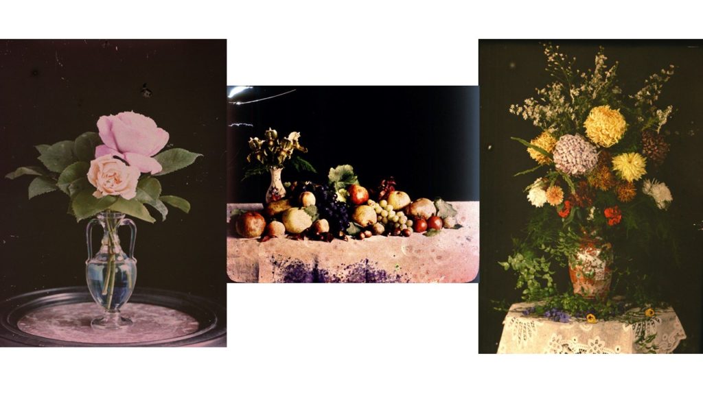
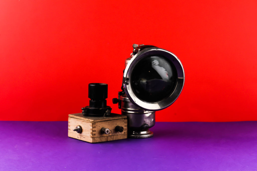
Still Life – Further Editing

Photomontage:

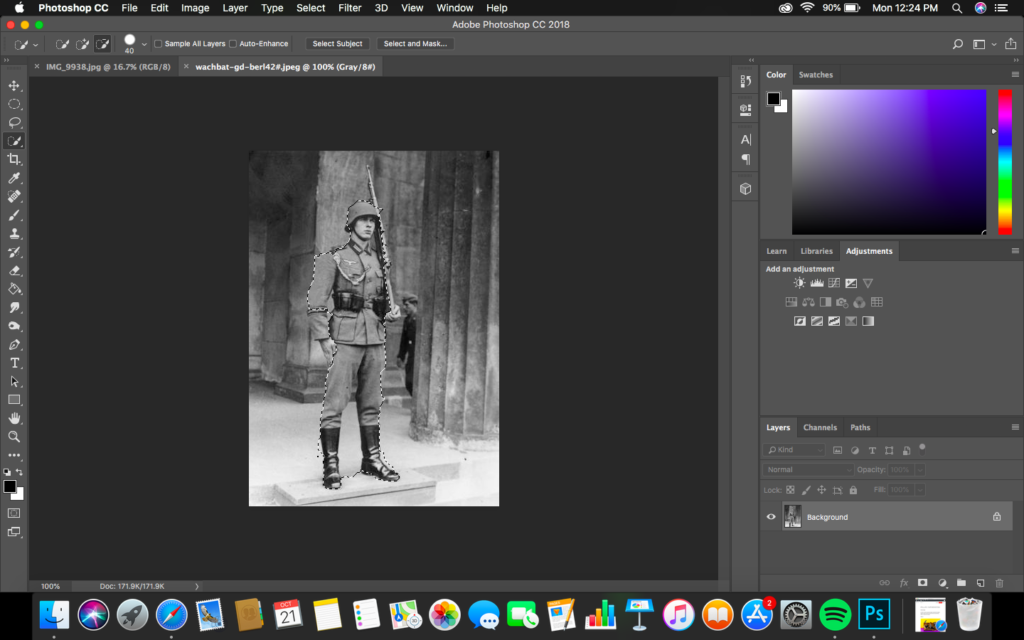
In order to create my photomontages I exported the original images as JPEG’s and then imported them into photoshop, where I created the montage. These outcomes are inspired by Milach who created similar imagery to contextually presented the children strike.
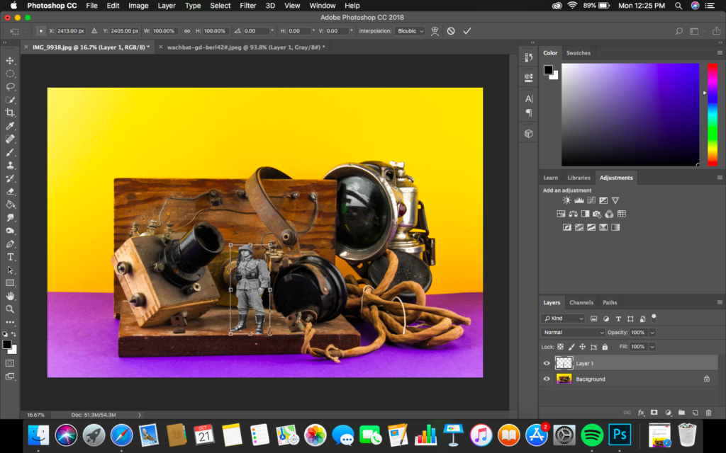
Design 1:

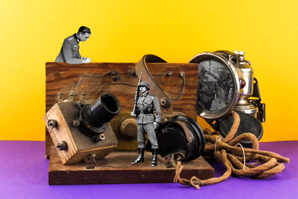
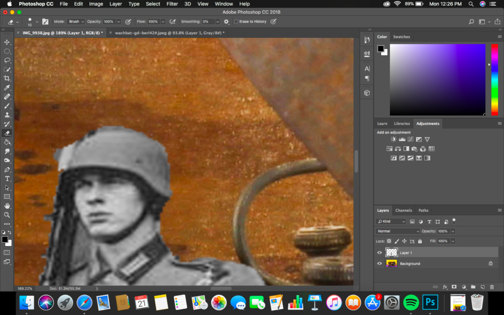
To create this design I opened up archival images of German soldiers, using the quick selection tool I cut out the sliders and placed them onto the still life photograph. Using the transformation tool I adjusted the size and positioning of the soldiers. I then used the rubber tool and went around the cutting making the outline smooth and more naturalistic. I then added a whole solider image in the light, which was done by cutting out the centre of the light and using the blending mode tools to combine and create this overlay of the two layers. I believe that this outcomes is the most successful from my further experimentation with my still life imagery.

Conceptually I wanted to convey the restrictions the German’s bought in on islanders when Jersey was occupied over the 5 years. The objects in the frame are minimalistic and basic suggesting how restricted Islanders where, as well as the ideology of lack of communication on the island which is shown by the radio set in the centre, contextually Islander where not allowed radio sets or contact with the main land which influenced the restrictions of objects the islanders where allowed. The soldiers represent the restriction and how the German’s were always around making it hard to have the contraband without being caught, creating a sense of authority and entrapment. On top of this, the soldiers in the light represent the unknown, when the war was occurring islanders did not know where they stood and who was winning due to the lack of communication

Visually, the image is busy creating a sense of chaos and lack of space, showcasing the conceptual meaning on how Islanders where restricted. The colours contrast the archival photographs, creating clear juxtaposition which reinforces the conceptual and contextual meanings outlined above. Everything is central in the frame, making it the main focal point. The lack of shadows and simplistic background supports this being the main focus point. On top of this, the main formal elements presented are colour, space and texture which is presented through the positioning of the composition.

Technically, the camera settings are simplistic and similar to Milach’s photography. The ISO was kept on 100 as well as the shutter speed being quick. The aperture was F16, allowing no depth of field to be showcased, but still allowed enough light in. The lighting was two artificial flash heads, reducing shadows in the background, which worked with the colour accuracy of my white balance used. Overall, I believe I have managed to produce successful imagery with strong conceptual and contextual representations.
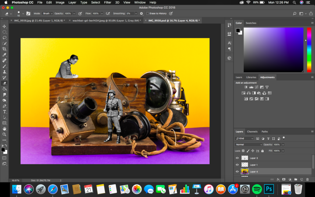
Design 2:

For my second design I followed similar steps as to my first photomontage. When creating this image I selected an archival image of a solider and used the quick selection tool to cut it out. I then placed and positioned the the solider to look at the light, creating a minimalistic and simplistic documentary photomontage. Although this imagery is still successful and rich with conceptual land contextual representation, I do not believe it is as strong as the imagery created above.
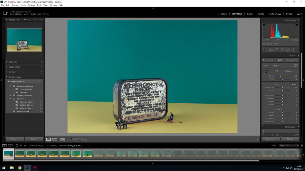
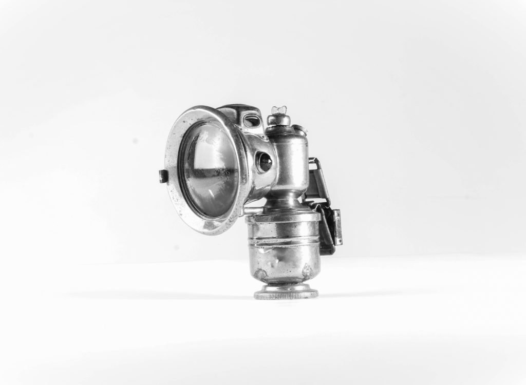
Exploration Edit:

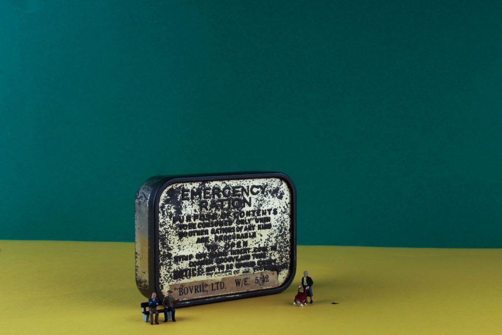
For my next edit I decided to select my top photograph which captured a singular object at a straight on angle on the white background. For my first design I created a colour version of this. I achieved the look by adjusting the contrast, structure, white, blacks and shadows allowing the colouring to be emphasise, making it the main formal element being presented in the outcome. There is clear highlighted areas which create a contrast in tonal regions, which compliments the rustic feel towards the imagery. A vignetting has been used to draw attention to the centre of the frame, almost creating an artificial depth of field. I find the colour edit visually pleasing to look at due texture and colour of the object to clearly be illuminated.

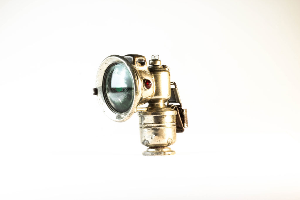
For my next design I wanted to create a black and white variation of the same image. To achieve this I started by making the image monochrome, and similarly adjusted the sliders of contrast, blacks, whites and shadows like the colour edit above. Doing this allowed a clear comparison as to if the image presents itself better black and white or in colour. Personally, I prefer the black and white outcome due to a ore metallic feel and the texture of the object to be showcase more, which helps to emphasise the contextual representations of the object more clearly.

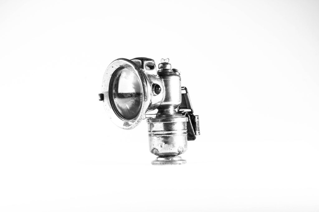
I then decided to make a third edit, which really emphasised the texture and tonal contrast of the object. Utilising the image above I then went on to moving the sliders to the extreme, at the bipolar ends, allowing the metal to be clearer and showcase more tonal contrast. Doing this also allowed the shadow of the object to be presented, which I think compliments the object and outcome. In addition, it has allowed the backgrounds to be multiple tones of white and grey, which does not distract viewers from the background, making a more intriguing representation of the object. I believe that this outcome is the most successful from this photograph due to the overall atheistic it brings and the strong conceptual and contextual representations it holds.

Most Successful Outcomes:

Evaluation:

To evaluate I believe I have been able to show clear further exploration to my still life imagery, through using inspiration from artists and experimenting on Lightroom to produce different outcomes of the same image. Doing this has allowed me to develop my project and understanding of still life, as well as produce outcomes which I would not have initially created. I have shown my creativity through my photomontages and ability to use photoshop to create such design. The two successful images, are definitely images which I will be using in my new zine which explores objects and people. To conclude, I have successful produced further exploration to still life which showcase my ability to think about conceptual and contextual meaning when creating the imagery.

autochromes

What are autochromes?

Autochromes were the first practicable method of colour photography and was invented in France by Auguste and Louis Lumiere. The autochrome process was also known as the autochrome Lumiere- named after the creators themselves was originally a research project into colour photography to the Academie des Sciences in 1904 and the commercial manufacture of autochrome plates began in 1907, which led to the first public demonstration of the invention occurred on the 10th June 1907 in the offices of the French newspaper company ‘L’illustration. Autochromes plates are surrounded in microscopic red, blue and green coloured potato starch grains- approximately four million per square inch. When a photograph is taken, light passes through these colour filters to the photographic emulsion the plate is the process to lead and develop a positive transparency, therefore light passes through the coloured starch grains and leads to a combination to recreate a full colour image of the original subject, producing a coloured image. For autochromes to be taken there was specific apparatus which was required and photographer could also use their own existing cameras; on the other hand it was essential for the photographer to remember to place he autochrome plate in the camera with the plain glass side nearest the lens so the light passed thorough the filter screen before reaching the sensitive emulsion.

EMILE GUITON:

Emile Guiton was beyond influential and was aid to be the most prolific photographer in Jersey at the time who chronicled island life during half of the 20th century. a large percentage of he photography is kept and preserved at the photographic archive of La Societe Jersiaise, in total 781 images of Emile Guiton’s can be viewed. Guiton was born in 1879 in Jersey and from a young age had an interest in history and was a member of La Societe Jeriasise, whom served on its executive committee as joint honorary secretary and was curator of the Museum and editor of the annual Bulletin. Emile Guiton was an amateur photographer and began to develop great skills throughout his life and career. Guiton also experimented with the early stages of colour photography known as ‘autochrome’. His main subject which he used was the recording of archaeological excavations, as he was one of the few members in Jersey who were permitted to take photographs during the occupation in 1940-1945. His research and photography really helped him develop a true understanding of the significance of taking photographs and the historical and social resources they hold. Tragically Emile Guiton died in 1972 and donated many of his imaged to the Societe Jersiaise.

Still Life – Second Photo Shoot

Planning:

In preparation for my second photo shoot I reflected back on my previous shoot, looking at lighting techniques which worked and looked over the camera settings in order to capture effective imagery. For this shoot I decided to take a more contemporary approach by adding colour backgrounds to my straight on angle photographs, allowing an inspiration link to Rafal Milach’s work, developing my response to still life photography. I also wanted to explore more using singular objects of the complete white background, working on my manual focusing skills. I will again be using two set ups, the first for more flat objects (Birds Eye View) and one for 3-Dimensional objects (Straight on Angle). These two set ups required different lighting rigs, which is explained below. With my camera settings I put the mode to Manual, the ISO to 100 and the aperture to F16, allowing a wide depth of field to be utilised. The shutter speed for the Birds Eye View was between 1/250 – 1/200 and the straight on angle’s shutter speed was 0.5 – 0.8. The white balance for both was set onto daylight, with manual focus being used.

I used two flash head lights, set on a 2.0 power output. The lights where paced either side of the table, slightly facing downwards towards the object. On my camera I used a transmitter which triggered the flash heads to operate as I captured my imagery. In addition, I also used a pilot light in order to position a and frame my composition, this was located at the back of the table (on right) and did not affect the colouring or the outcomes of my image. The camera itself was placed on a tripod facing straight on at the table, with adjustments allowing me to have control over the composition of my imagery.

Edits:

First Edit: Flagged
Second Edit – Star Rating
Third Edit – Colour Rating

Outcomes:

The three outcomes below are my top photographs from the shoot, which clearly showcase my inspiration and application of Milach’s work into my own. I explored with coloured background, which complemented one another, allowing a more ameliorative tone towards my final outcomes. I felt that it was important the the colours were vibrant and bright, almost welcoming, in order to draw the eyes into the objects located in the centre of the frame, I really emphasised this when editing. I started off by adjusting the whites, darks, shadows and contrast, allowing the objects to show clarity and tonal contrast, on top of accurately making the background vibrant. I then used the spot removal tool, to ensure a consistent coloured background, so that the viewers attention is not drawn away from the objects presenting the concept, a lack of simple supplies that citizens had to live off when the German’s occupied the island, of the imagery. I also selected another photograph which used the plain white background and experimented with attempting to get the text clear and bold, making it the main focal point, which was done by adjusting the clarity, structure, blacks and whites.

Evaluation:

To evaluate I believe I have been able to produce strong imagery, which clearly convey my understanding of Milach’s work and ability to apply his techniques and designs into my photographs. In addition, I have been able to explore a new way of capturing still life, furthering my exploration with this style of photography allowing more conceptual and contextual outcomes to be presented. To further my exploration even further I now intend to create photomontages with the coloured outcomes to make stronger links with Milach’s work, as well as creating different edits of the same photograph to showcase my exploration.

Colour PHOTO SHOOT Objects

Here I have selected out of the images I took, the best ones and the ones which I dont want to further use as they were blurry, or they didn’t have the effect I wanted.
Final selection of photos I am going to Edit

First Edit:

Firstly I have used the spot removal tool, to get rid of dirt which was left on the picture from the camera lens.
I have decided to edit the temperature of the image, to make it feel as if it has a colder feel, relating to the severity of war.
I have also changed the contrast and exposure to increase the feeling of how the war effected the islanders during the war.
Final Image 1 – Emergency Rations box, with Small people figures.

Edit 2:

Here I have used the spot removal tool to remove the dust and dirt particles which were on the lens of the camera.
I have decided to make this image brighter than the previous image I edited because I wanted this to have a different feel to the other one. I have done this by editing the exposure and contrast.
I have edited the highlights and shadows to crease the colour vibrancy throughout the image.
Final Image 2 – Bit radio set and metal frame.

Edit 3:

I have Cropped the image so that you cant see the unwanted background. I also increased the amount of sharpening so that it get rids of the blurriness in the image

still life- historical context

STILL LIFE:

Still life photography is a specific genre of photographing objects to create a main focus of image, the subject matter is inanimate and therefore never moves, for example household objects, flowers, or fruits. This particular genre helps the photographer expand and explore the arrangement of designing element and set ups.Typically, still life’s are not close up to the subject nor far away, but at a very medium angle. For still life photography it is key for the photographer to have a true understanding of how to control the studio lighting/natural lighting in order to help illuminate their image to their own personal preference. Within the idea of still life photography there comes many different types for example crated still life or found still life, each one producing a slighting different effect and feeling, which is clearly essential to produce the most effective and creative images.

Still life developed as an independent genre which occurred way back in the early 1600s from Dutch and Northern European painting. The objects used to form these still life images often had strong connotations of symbolic adherence to religion and mortality which helped reflect the ongoing urbanization of Dutch and Flemish society, all these factors produced an emphasis on the home and the significance of personal possessions, commerce and trade. Paintings consisting burnt candles, human skulls, dying flowers, fruits, vegetables, broken chalices, jewelry, crowns, watches, mirrors, bottles, glasses and many more are all portrays in a symbolic light of the transience and brevity of human life alongside power, beauty and wealth.

Categories of still life:

Flower pieces: using flowers in still life is an extremely popular genre and is highly regarded and well paid. When considering the still life of floral images, its said to be important to reflect the bloom of flowers from the four different seasons to help represent different feelings and portrayal. Flower paintings were always accurately detailed without the overlapping that would have naturally happened in a vas giving a more controlled look and structure.

Fruits with flowers: it was often found that still life images that consisted of fruits was closely linked with flowers and would often be captured together, where symbolism was still being presented, in the exotic fruits and shells bought back by trading merchants. as well as symbolism fruits had a religious message; apple of temptation, the grape the blood of Christ.

Vanitas paintings: a metaphor of transcience, which meant society’s awareness of death did not disappear with the end of the Twelve Year Truce; two outbreaks occurred in the 1920s republic known ass the outbreaks of Bubonic Plague, this is suggested the beginning and development of Vanitas paintings, which consisted of recurring motif, the skull which provided a connotation of mortality

As well as:

  • Breakfast pieces
  • Trompe L’Oeil and its Relationship with the Game Piece
  • Curtain painting