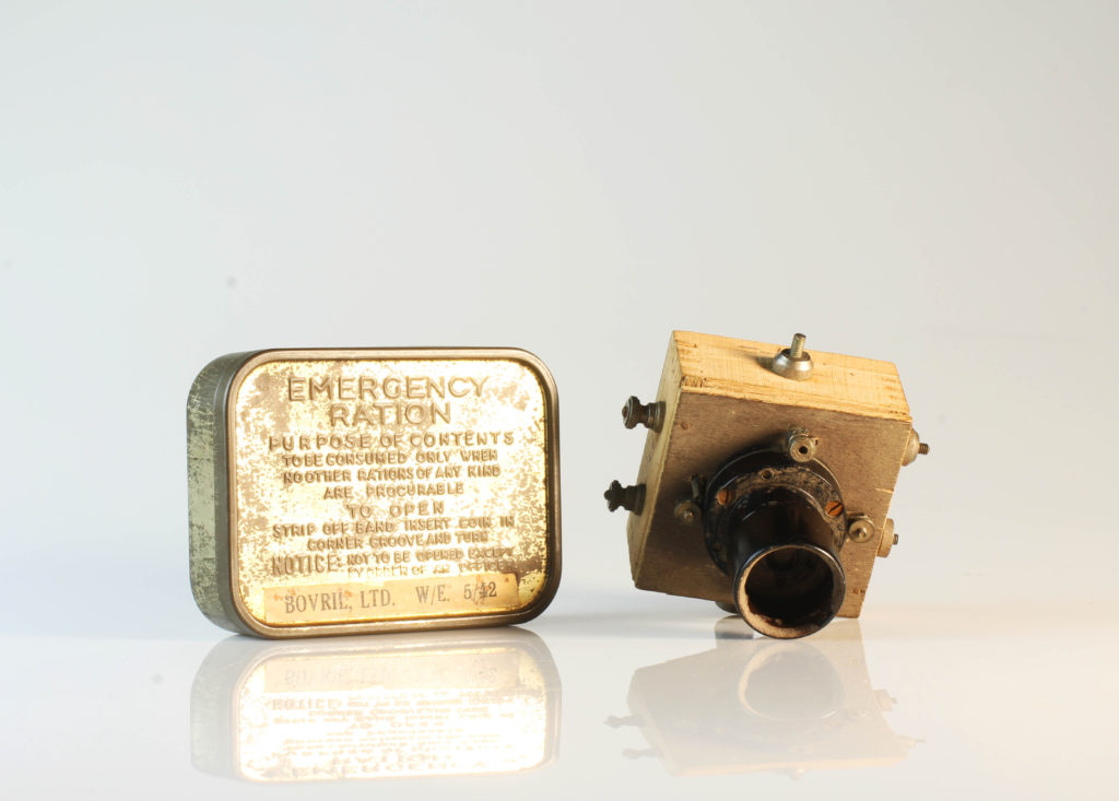
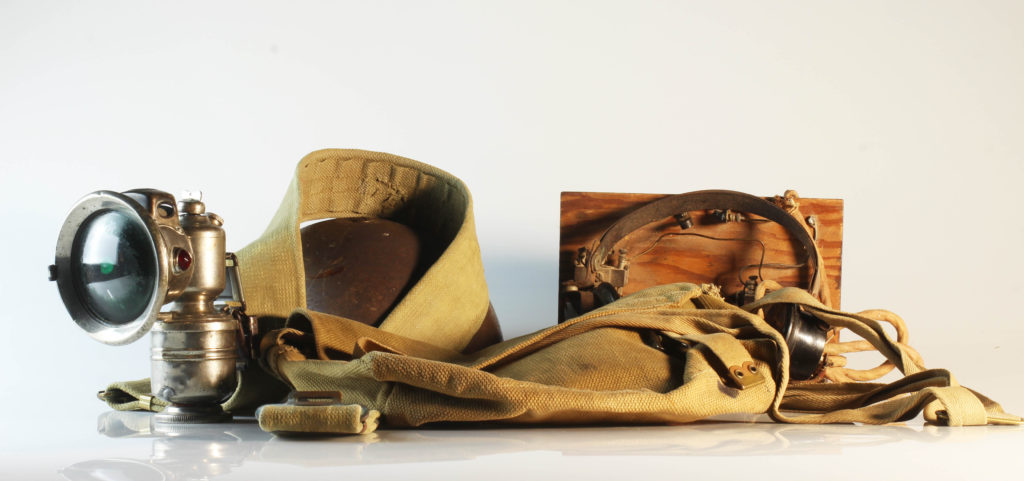
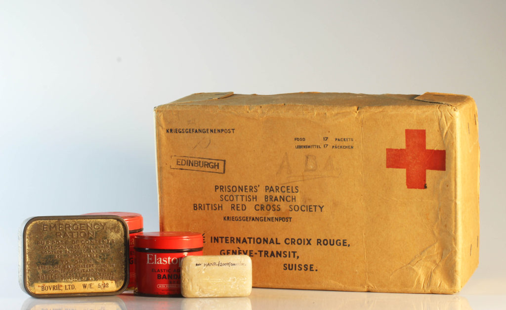
PROFESSIONAL still life set up

PHOTO SHOOT PLANNING:

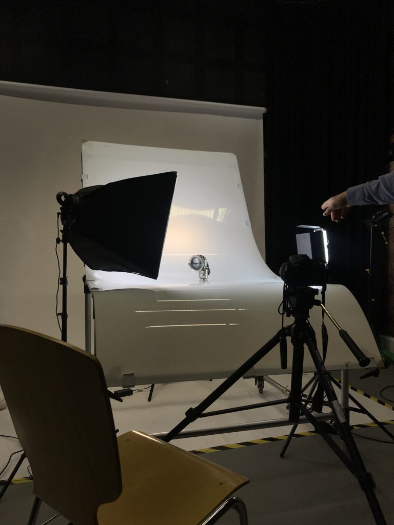
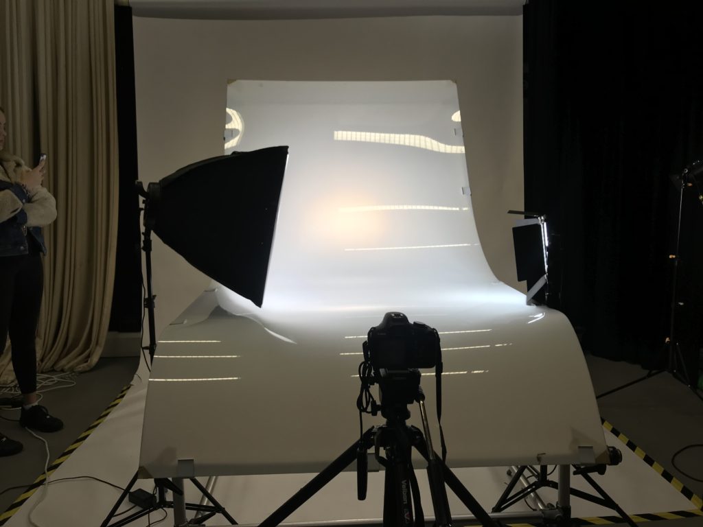
WHERE: In order to take these images in a professional setting we utilized the studio and various other equipment in order to take the images. We used a three point lighting system in order to illuminate the still life table.

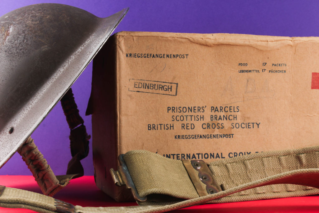
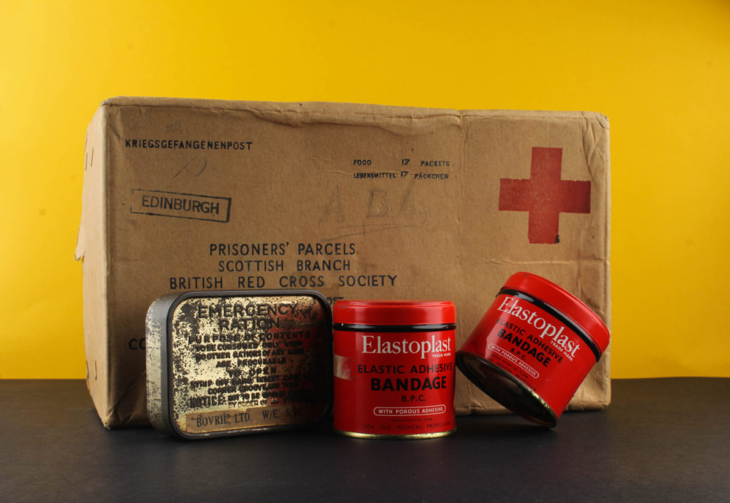
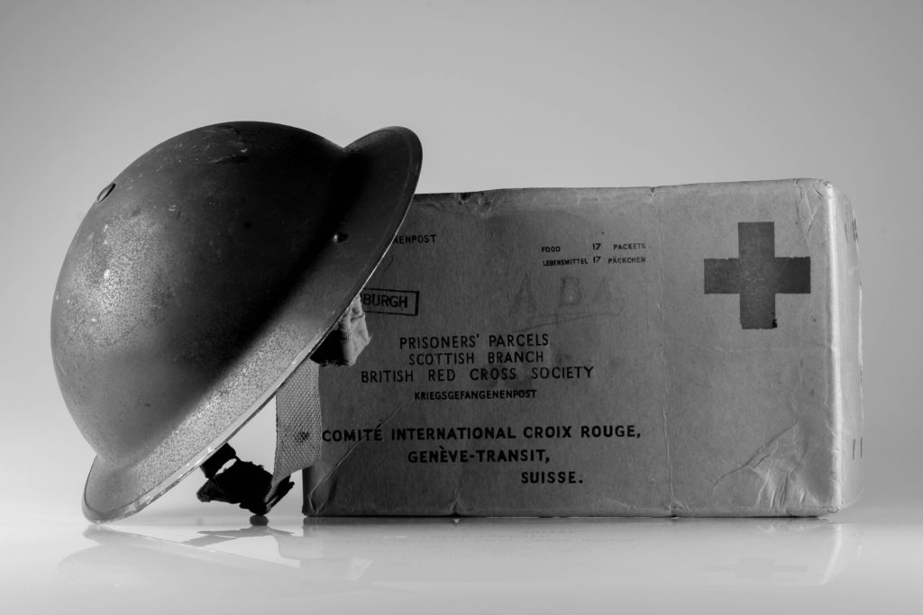
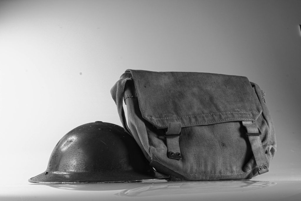
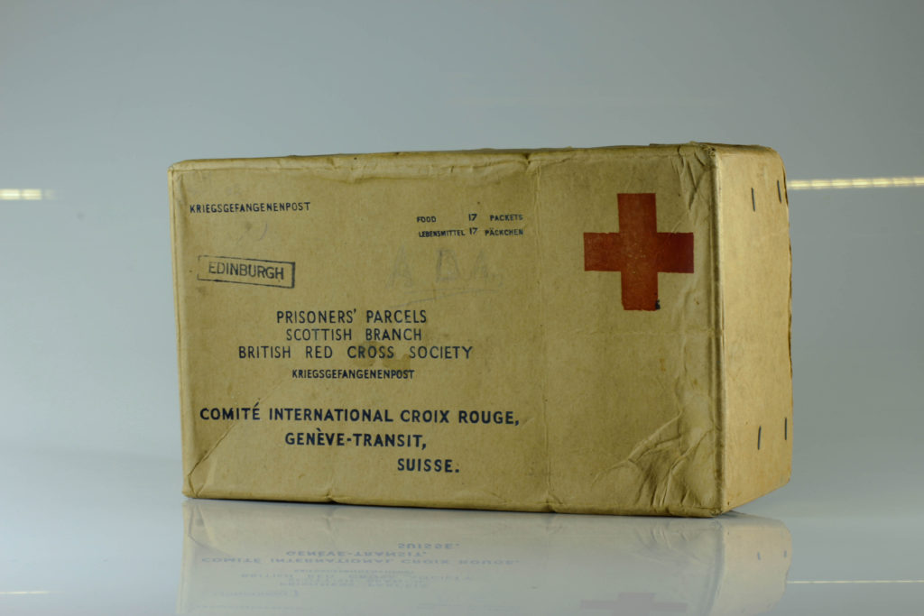
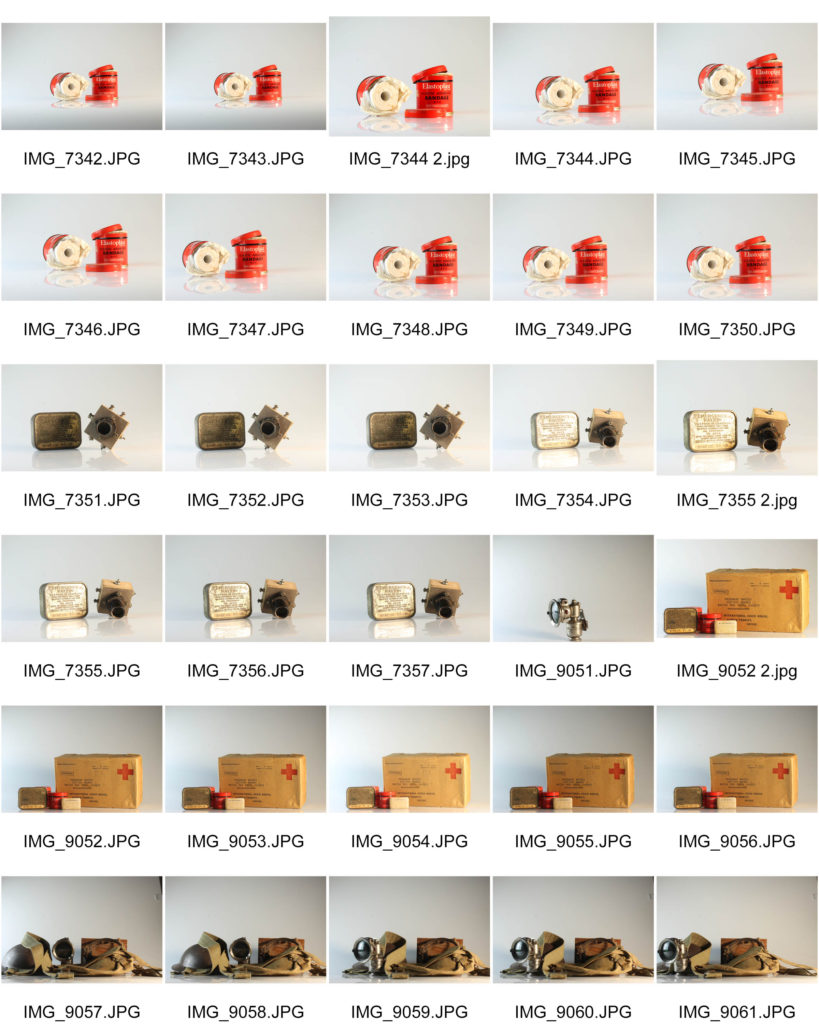
WHAT: We used a variety of war items and memorabilia and set them up as still life n order to capture them and continue our occupation vs liberation topic.

WHY: In order to be more technically skilled in terms of lighting set ups and using the camera. We were able to learn a variety of things such as how to set up a horizontal tripod, the use of a flash transmitter and how to illuminate a professional still life table.

HOW: In order to create these images, we used various types of equipment and professional still life photography set ups. The most notable thing we used was the transmitter in order to set of the flash whilst photographing.

SUCCESSFUL IMAGES:

STILL LIFE STUDIO SET UP:

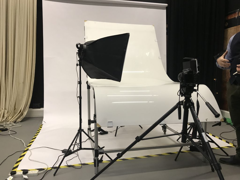
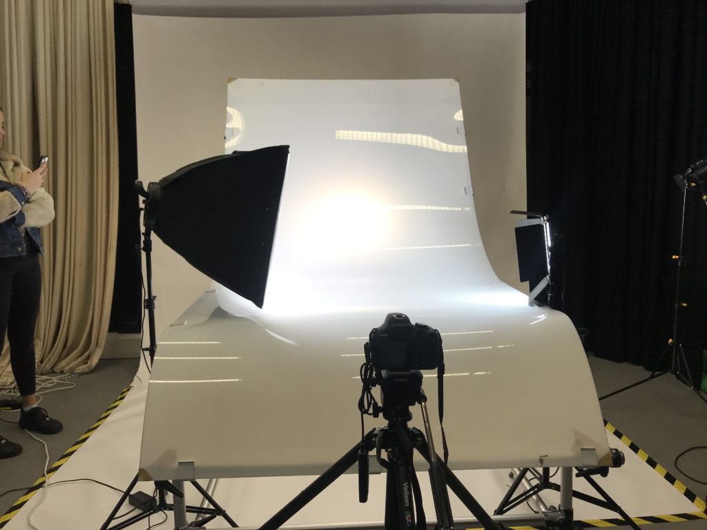
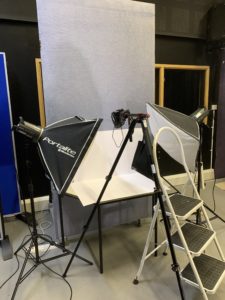
Much like the set up below, we used a professional still life table and three lights in order to illuminate the images. The perspex table was able to give us a very even and smooth surface on which to capture the images on. This was essential as the focal point of the image should always be the items, explaining why in classical still life, black or extremely dark backdrops are used in order to put all focus on the objects. A combination of three lights was used in rotation to illuminate the images and a tripod with a flash trigger was used in order to get precise and consistent images through out the photo shoot.

Image result for still life studio setup"

IMAGE ANALYSIS:

VISUAL:

In terms of the visual aspects of the image , there are a variety of different things going on. Firstly, the lightning set up means that there are different strengths and tones of light going on within the photo. Coming from the left hand side of the image, the light is fairly neutral in tone and much more powerful than the light coming from the right hand side of the image as can be judged by the white background. The light coming from the right hand side of the image on the other hand is much more warmed tone and dull. The composition of the image is also interesting as it is quite horizontally spaced, meaning that during the editing process, the most appropriate thing to do was to crop it so that it is almost within the proportions of a panoramic image. The items which I chose to use within the composition are also quite effective as they work together cohesively due to the fact that they come from the same time period. One of my favourite aspects f the mage is the bike light on the left hand side of the image and the powerful reflection which can be seen on the glass, overall it gives the object a lot of dimension and depth that makes it the focal point of the image. Another successful aspect of the image is the colour scheme as all the items fall within a grey/brow colour palette making them work together harmoniously. Overall the composition and image are a good response to classical still life, yet the crucial aspect of chiaroscuro lighting is missing rom the image as we used a 3 point lighting set up.

TECHNICAL;

In terms of the technical aspects of the image, the was one of the most technically challenging shoots which I have done to date due to the various professional aspects which had to be taken into account. Firstly, in order to sufficiently illuminate the image, we used a 3 point lighting set up in order to do so, using a a primary, secondary and fill light in order to do so. Yet we often found that the fill light was making the image over exposed so for the majority of the time we did not even use this lighting set up. As we wanted very high quality images for the outcome, we used a fixed lens in order to shoot the photos, this meant that if we wanted to zoom into the composition, we physically needed to move the camera. Another piece of equipment which was essential for this shoot was a tripod which we used in order to get the most accurate and crisp images as possible as it prevented the occurrence of motion blur. Another precaution which we took in order to avoid this was the use of a trigger, this allowed us to take the image without actually physically touching the camera. The table with we set the composition up on was actually a professional still life table intended for this one purpose. The most notable aspect of it was the large curve which extended upwards, this makes the backdrop continuous and undisturbed, very similar to an infinity screen. One downside which I found whilst working with this was the fact that the surface was made out of a very reflective plastic which meant that the backdrop wasn’t even, as small reflections of light could be seen which have to be edited out later.

CONTEXTUAL:

Still life has always been about more than fruit and flowers arranged on tables. The French word for the genre – nature morte – references mortality, a nod to the brevity of even the most luxurious of lives. Still life images at their best illicit a response on both a visual and an intellectual level – both examining the principles of arrangement and aesthetic taste, and asking questions about commodity-based status, the everyday, and life and death. They take the ordinary and make it extraordinary. Everyday objects morphed into high art.With any genre rooted in such tradition though, it takes special work to push it in new and interesting directions – for the work to feel fresh and exciting, rather than just referential and appropriated. An aesthetic document is one thing, but what does a modern still life communicate that we don’t already know, that photographers weren’t already exploring almost a century ago?

CONCEPTUAL:

The main thing which we tried to achieve with this photo shoot was to learn about the formalities of still life and extend our knowledge within the studio and different lighting set ups. It was critical that we learn about different artistic imagery, even if it is not formally related to modern day photography. Still life as a whole can be categorised within a classical genre which is essential if we are wanting to explore a variety of photography styles as a large chunk of history was spent perfecting the technique in which to visualise objects.

CONTACT SHEETS:
contemporary: still life

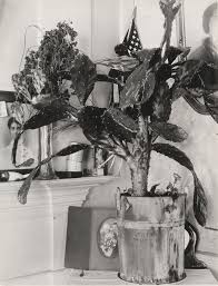
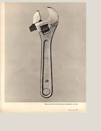
WALKER EVANS

The images above are from a famous photographer called Walker Evans.
Walker Evans was born in Missouri in 1903-1975. He is best known for his 1930’s and 1940’s documentary photographs of the United States. He spent an early part of his career experimentally photographing the streets of New York. From 1935, he worked for the Farm Security Administration and travelled through the mid-west and southern states of America creating his most important and significant work. Evans was the first photographer that the museum of Modern Art in New York honoured with a solo exhibition called Walker Evans, American photographers

Picked fruit and cut flowers, artefact of glass, plastic, wood and metal objects are just some of the things gathered and put in front of a camera to photograph. In the 1820’s ad 30’s photographers could simply not resist in gathering these ornaments to capture not only a photograph but also a story. The still life was ideal for a world of accelerated manufacture and exchange, mobilising desires and expressing tastes.

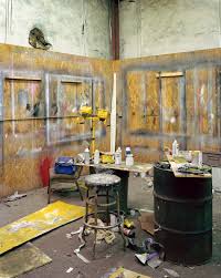
MITCH EPSTEIN

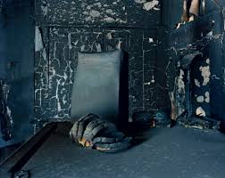
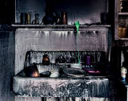
Another contemporary photographer that focuses on still life is Mitch Epstein.

STILL LIFE; PREPARATION

LIGHTS

CONTINUOUS LIGHTS – PHOTOGRAPH OBJECTS THREE DIMENSIONAL

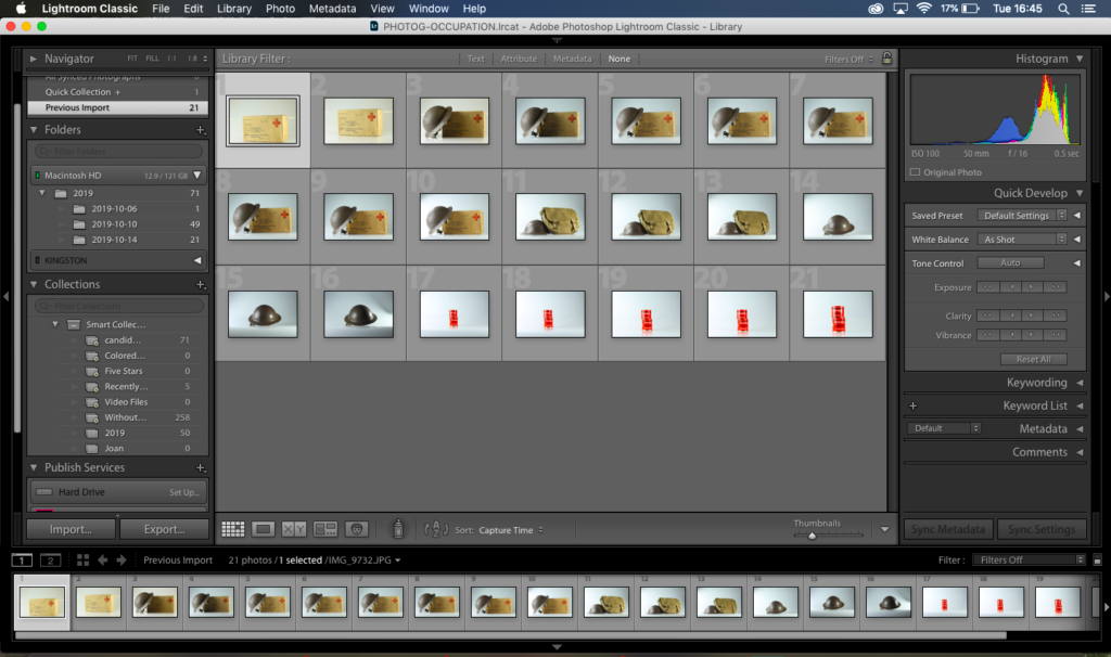
The camera setting for the shoot when the lights had been turned off would be on manual mode, this is because if the lights are on there would have been reflections in the image. The ISO for this was on 100, the white balance is on daylight and aperture is on F/16 and the shutter speed is on 0.5 sec to 0.8 sec. (depending on the reflection of each objects)

Birds Eye View Lighting Setup:

This is the set up for the birds eye view images. The camera is placed on a tripod looking down at the table. To produce these images we had to place the object in the center of the white sheet of paper and put 2 flash lights either side of the table so the image has just the correct amount of lighting. The flash lights are normally used to photograph images, documents, books and newspapers. The camera setting for this particular shoot is manual mode, the ISO setting was on 100 and the white balance was on daylight, Apeture on F/16, the shutter speed was on 1/125- 1/200 depending on reflection of each object. Flash heads set to power output: 2.0.

STILL LIFE: OBJECTS

HISTORICAL CONTEXT:

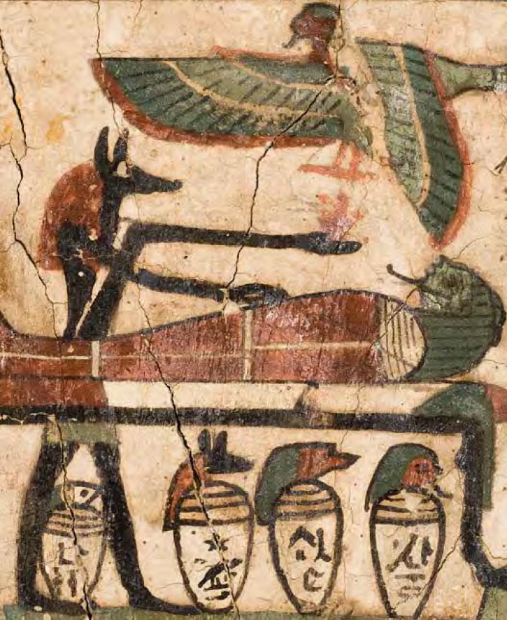
Still life is a work of art, a drawing or painting of a group of objects. Objects do not move, hence the word ‘still.’ In the past the objects tended to be flowers,fruit and other kinds of food or dead animals- hence ‘life.’ The French for still life is ‘nature morte’ meaning ‘dead nature.’ Nowadays, though, still life can mean any objects small enough to be put infront of us, usually on a table. The Ancient Egyptian people have been painting collections of objects for a thousand of years. The ancients Egyptians painted stacks offering for thousands of years. The Egyptians painted objects typically to offer them to Gods in temples or tombs.

Image result for egyptian still life painting

The earliest known still life painting was created by the Egytpians in the 15th Century BCE. They produced paintings of food, including crops, fish and meat some of this fabulous artwork has been discovered and retrieved out of ancient burial sites. Ancient Greeks and Romans also created similar deceptions of inanimate objects.

The goal of a still life composition is to direct the viewer’s eye through a painting and lead them toward what the artist thinks is important. Many beginning painters tend to devote their energy to drawing and painting objects accurately, and find it difficult to create a strong composition.

https://mymodernmet.com › what-is-still-life-painting-definition

EXAMPLES OF HISTORICAL STILL LIFE IMAGES:

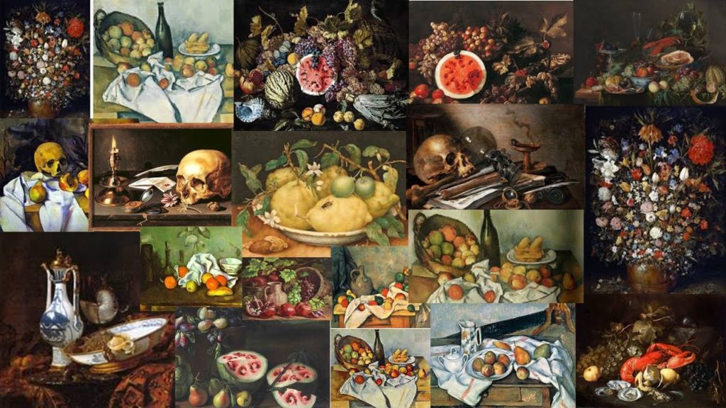
Mood Board for still life objects
Image result for cookmaid with the still life vegetables
Cook maid with the still life vegetables by British painter Sir Nathaniel Bacon

The cook maid and market scenes, popular in the seventeenth century evolved in the low countries from a genre practiced by Pieter Aertsen ( c.1533 – c.1573) and his colleague Joachim Beucklaear, which combined contemporary kitchen scenes with a new testament episode beyond. Bacon could have been inspired by the work he had seen on his visit he made to the low countries in 1613.

Religiously, this image would have suited the era in which it was painted. Symbolically, the idea that their is a house wife in the kitchen would have suited the traditional values that would have had to be upheld during this time. A woman would always be the one that sat at home and cooks for her family .

Establashing shot | Sian Davey

What is an establishing shot? An establishing shot usually requires more than one individual in the shot. The photographer positions the individual in order to tell a story making this the main element to an establishing shot. Most photographers interpret this topic by either presenting it through an individual or the environment they’re in.

DIFFERENT ESTABLASHING SHOTS

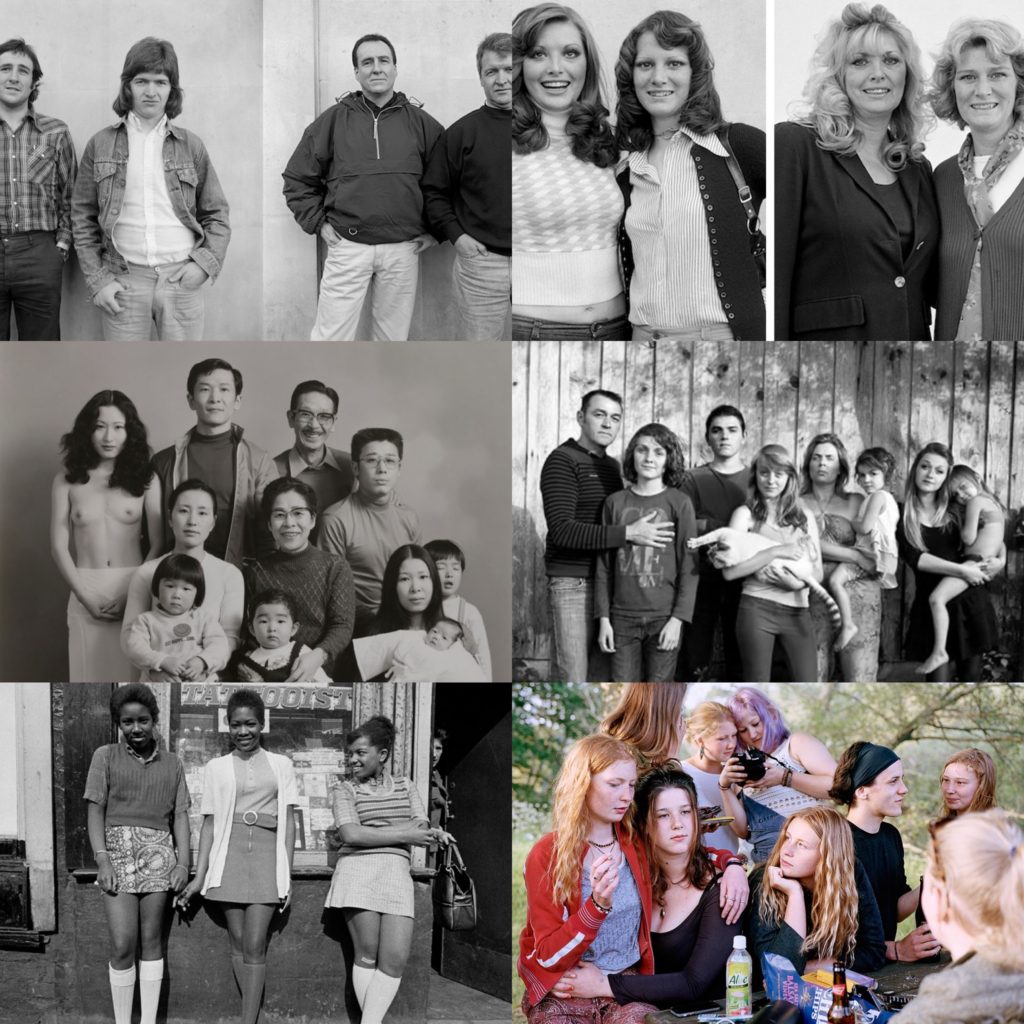
Here is a selection of Alain Laboile, Sian Davey and Masahisa Fukase

Sian Davey

A photographer that particularly stood out when researching about the establishing shot was Sian Davey.

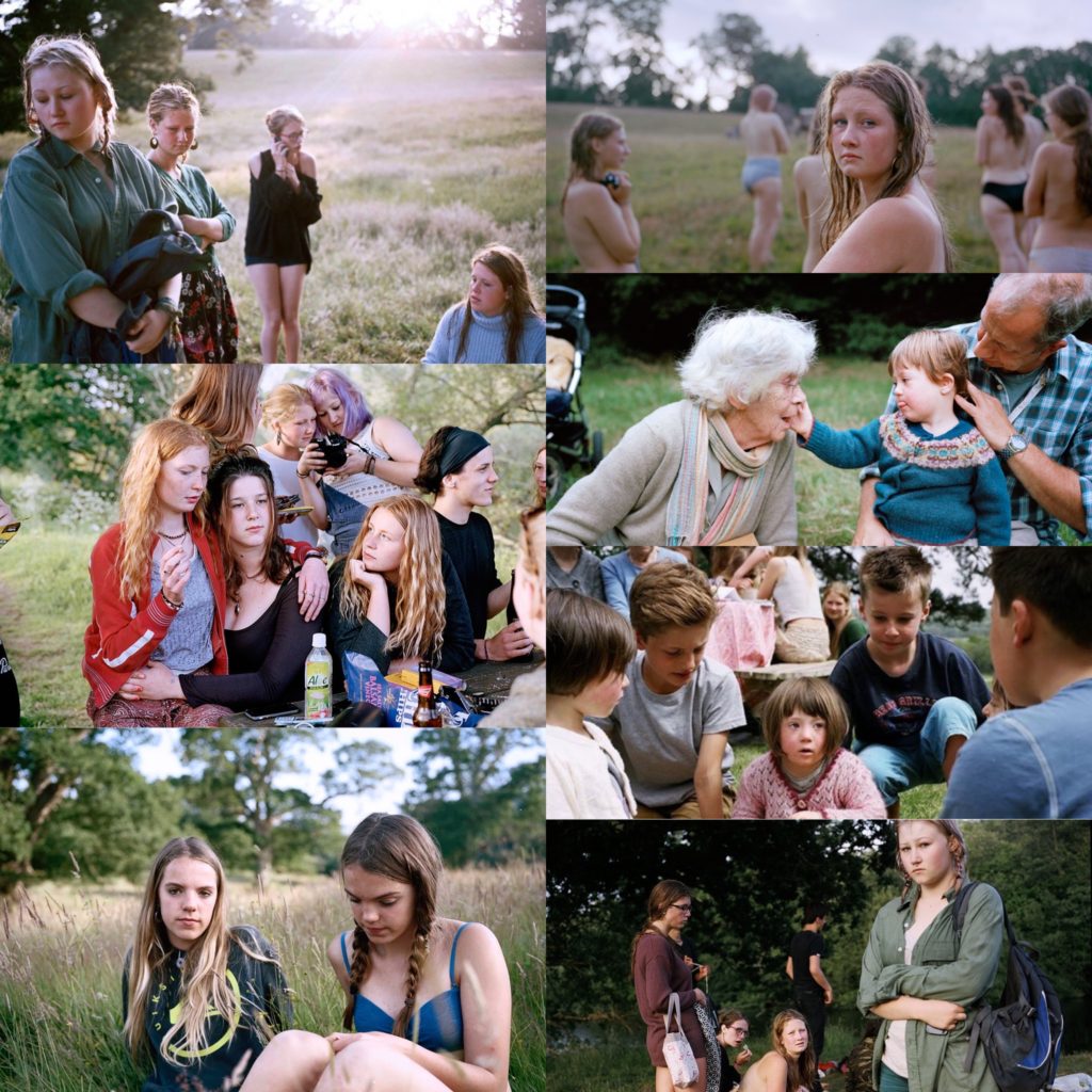
Sian Davey’s work mainly focuses on her family, community and self and is informed by her backgrounds. She has a famous series called ‘Looking for Alice’ which is portraits of her daughter who has down syndrome. Davey’s older daughter participated in the making of “looking for Alice” which then lead to her other famous series is from her other daughter ‘Martha.” This series Davey explores her older daughter and her teenage life and friends. In 2017 Davey published a new series of images which this time was called “We Are Family” for this series she travelled all across Britain and photographed 31 families in 21 days.

Martha series

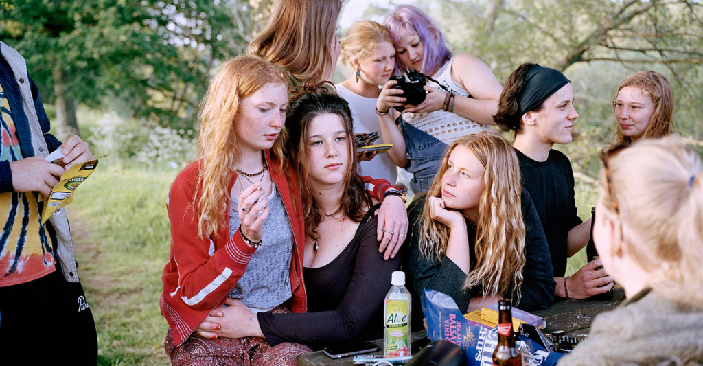
The image above is the image I have chosen to focus on. It was one of my favourites from her “Martha” series.

Visually, within her shot she has captured a series of things making the image almost seem busy in a sense. It contains different focal points when first glancing at the image however her main focus in this being the 3 girls directly in the centre. The background of the image from I can see looks a Forrest or park of some sort where people go and hang out which also suggests why there’s a bench and table. She’s captured this image from a straight on As the focus is on the girls we can see that one of the girls is smoking whilst the others have an alcoholic drink in-front of them. Davey’s capturing the moments of her teenage transition which in this case is breaking laws as she was 16 when these images were taken, therefore she’s creating an establishing shot as her daughter is the subject and her narrative is rebelling against what she’s been told not to do. The image doesn’t looked staged as its captured in a realistic environment of people doing realistic actions which adds the narrative Daveys trying to convey.

Technically, the lighting used in the image above is natural daylight which is seen by the use of her outdoor environment that she’s placed her daughter in. The lighting has undertones of yellow indicating she’s placed it on a warmer setting in order to achieve the image above she’s corrected the white balance to suit her outdoor scene. Along with changing this she would correct the ISO to a low sensitivity as the image isn’t grainy. Her shutter speed for the image would’ve been quick as there is no blur in the image however she would have raised the aperture as slight depth of field is being shown focusing on the 3 girls with the other being slightly blurred.

Conceptually, the story she’s capturing through the image is her eldest daughter growing up around her teenage friends rebelling to rules she’s been told to comply with. Davey tries to convey this weirdness through her images, a quirky side to society that isn’t normally shown or is frowned upon. However she captures the reality and is spreading the idea that this does happen and all this is out there, its a part of growing up and will last forever.

HOME SWEET HOME

Candid Photography

A Candid portrait is one where the subject is unaware that a photo has been taken. The idea of a candid portrait is to capture people acting naturally. They should be unaware they are being photographed, as their behaviour often changes once they become aware of the camera.

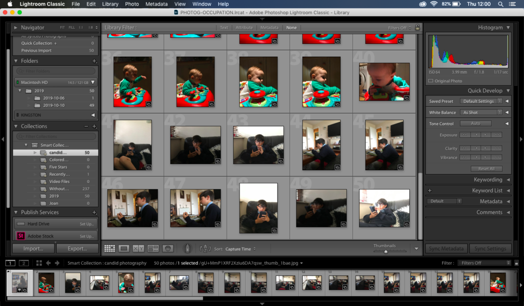
Above is my photoshoot for candid photography.

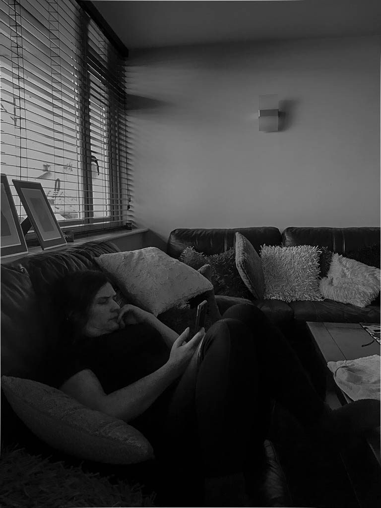
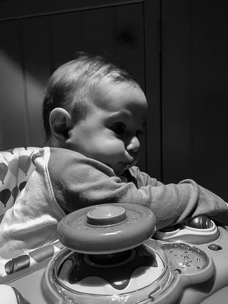
The final images I have chosen are:

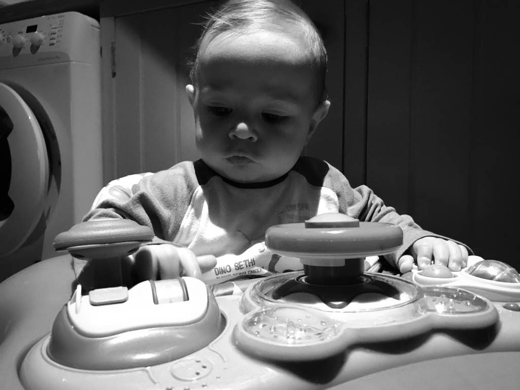
Out of all the images I decided that these were the best outcomes. These shoots didn’t work out the way I wanted due to the timing of day I chose to do it. Underestimating how dark it is now in the afternoon my images have a slightly darker tone to them than desired. Nevertheless I have used Lightroom and photoshop and edited the brightness and exposure of each image making it slightly lighter but keeping the contrast to a middle tone so the image wouldn’t look less focused and too dark in some areas.

If I was to do this shoot again I would definitely do it during the day and try and photograph outside rather than inside. The lighting being used in the first 3 pictures is normal daylight simply shining through my lounge windows. However in the last image of my younger baby brother I was indoors using artificial light which meant that already some of my images have turned out with these yellow undertones which is why I have decided to change my images too black and white.

Zine research

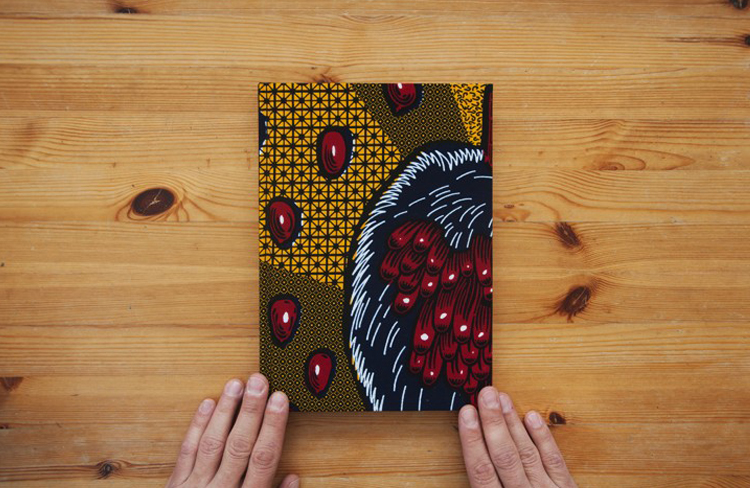
A zine is a photo book that is mostly produced on a small scale and by hand. Most of the time they are self published and will be distributed by the artist or by small scale businesses.

There are different kinds of zine, the differences can be based on the content and the way that they are created and presented. The genera that I will be studying is the photo zine; in which a photographer will present their photographs in a way that can tell a story or impact on a reader.

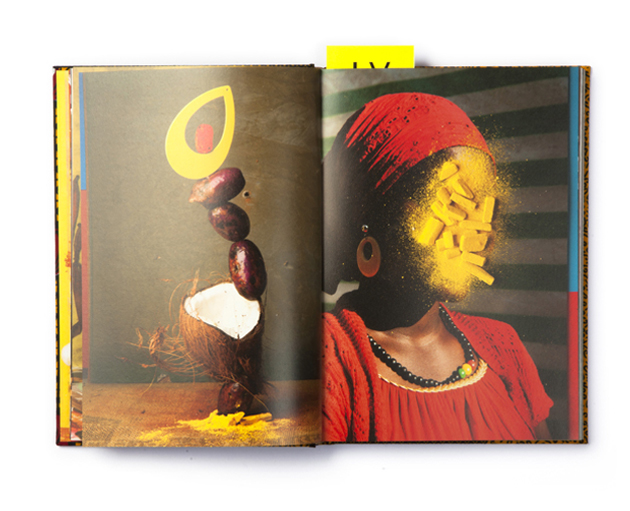
An example of a zine is from the Italian photographer Lorenzo vitturi called ‘Dalston Anatomy’, he lived in the Dalston area of Hackney in London. This is the area sometimes known as the African Quarter. He would photograph the people who he saw in the market and then with the leftover food at the end of a days sale. Then he would arrange the food into elaborate sculptures and would use some of the produce to make the portraits more interesting and colourful.

Image result for dalston anatomy

The way that he presented the book was a simple hardcover but the photos within were not set out normally they are different sizes with different sized borders, there are also set-up with matching or complimentary colours in a double page spread.

Image result for Lorenzo Vitturi zine

The second Zine I will be studying is called ‘Red String’ by Yoshikatsu Fujii it is based around the splitting apart of his family due to their parents divorce. The name ‘Red String’ was based on the old Japanese that says that two people destined to fall in love have an invisible red string tied around their little finger and it grows smaller and smaller until they are together. Fujii says that the string between his parents has been cut. The zine incorperats the theme of red string because the pages and cover are all bound with a red string.

The layout of the book is done so that it can be opened up to show two different smaller zines and they can be read through in different way to show the full history and story of the family and the parents relationship.

The book is laid out so that the left side is photos of his father and the right is his mother. The cover that connects the two sides is made of a soft felt.
The cover of the book is stitched with the red string an has loose tails, the title and Fujii’s name are written by hand. The cover photo was his parents wedding photo but the heads have been cut off and then stitched to the cover only by their necks.
There are pages in the book which have photos then attached to them by red string is a quote or a message given by that parent.

“The split binding allows the reader to page through one side and then the other, but the powerfulness comes from pairing both halves together. In this delicate and personal family album, Yoshikatsu Fujii ties the memory of his family back together with the cultural metaphor of red string.”

Larissa Leclair, Founder of the Indie Photobook Library