RAFAL MILACH THE FIRST MARCH OF GENTLEMEN RESPONSE

ARTISTS WORK:

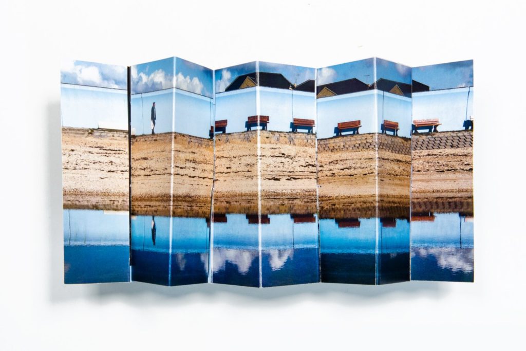
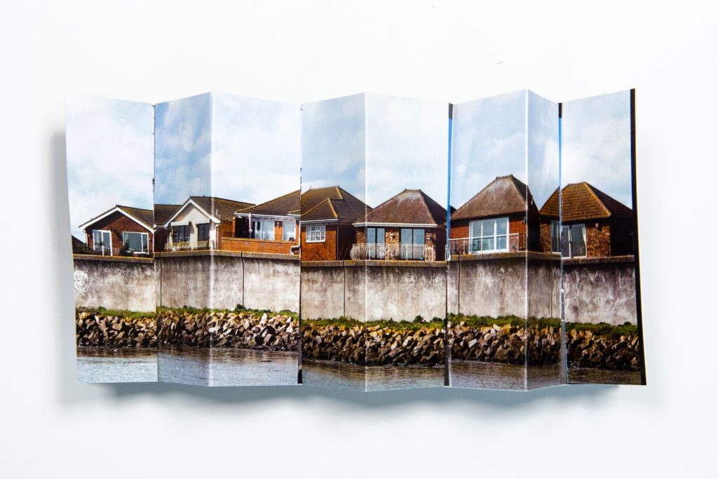
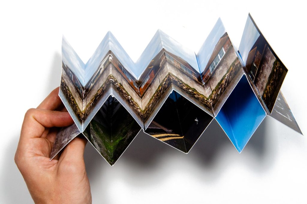
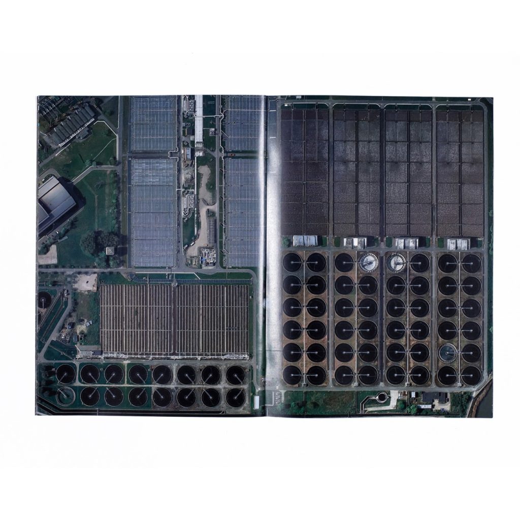
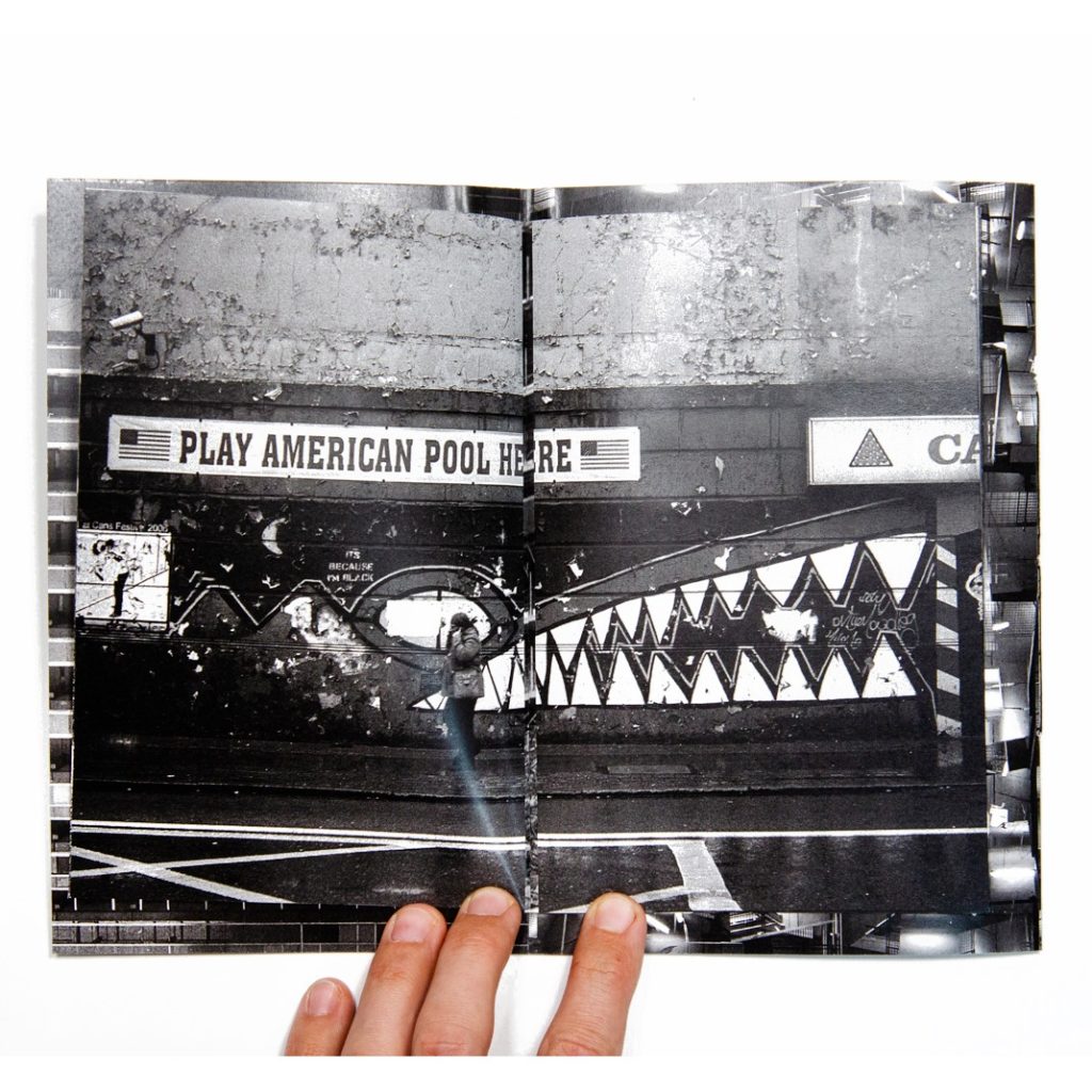
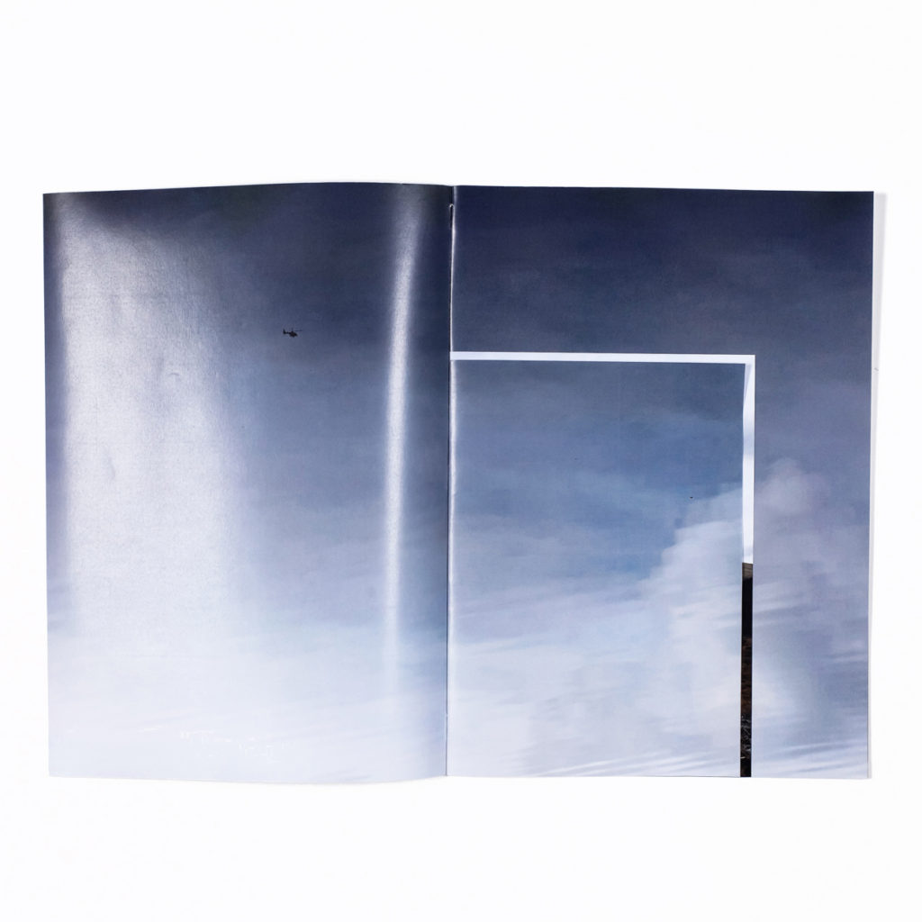
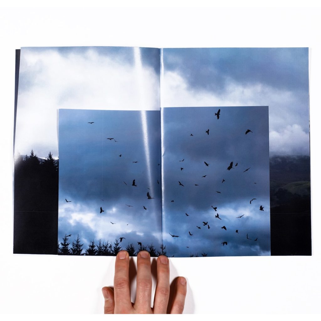
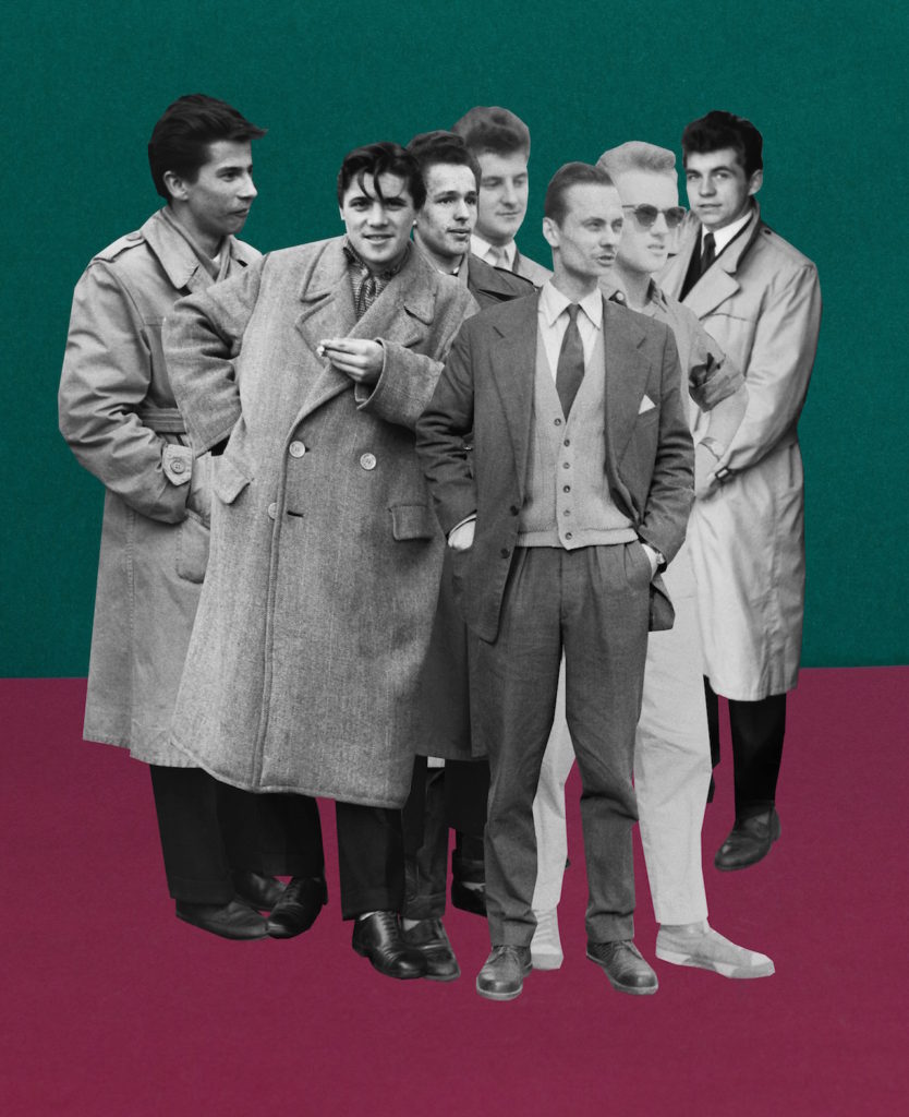
Rafal Milach is a visual artist, photographer, and author of photo books. His work focuses on topics related to the transformation in the former Eastern Block. Graduate of the Academy of Fine Arts in Katowice, Poland, and the ITF Institute of Creative Photography of the Silesian University in Opava, Czech Republic (currently lecturer at ITF).

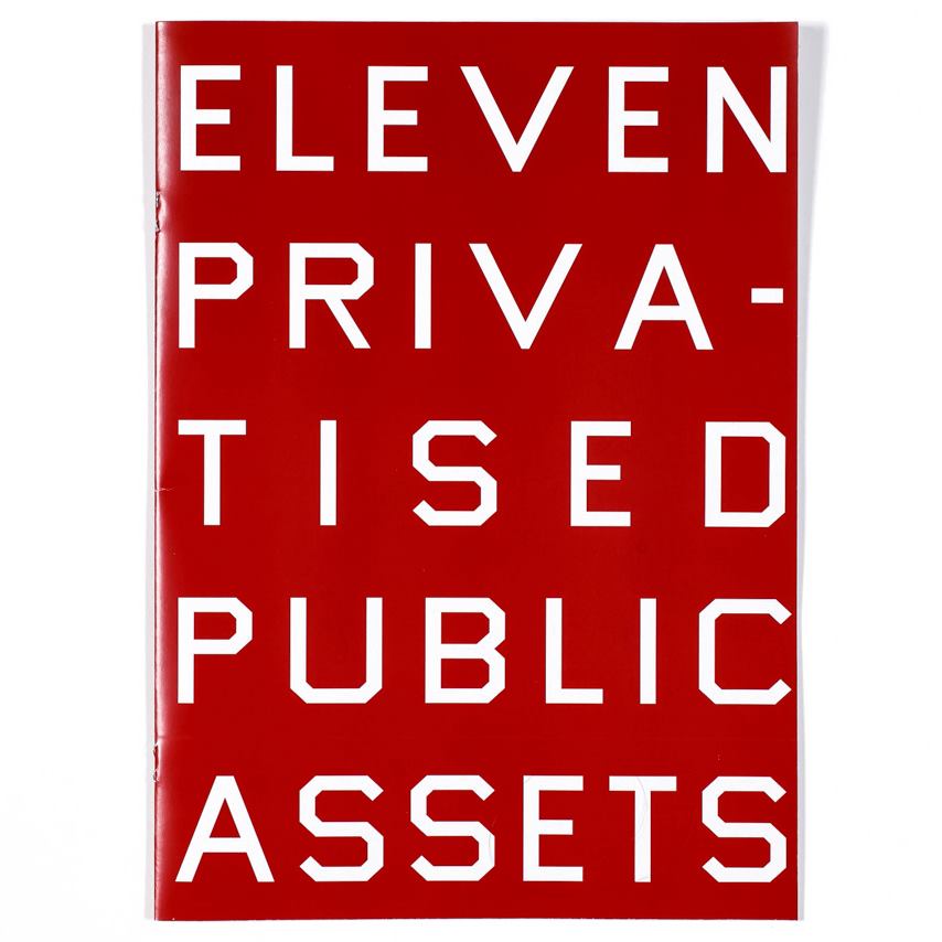
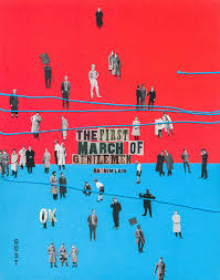
His award-winning photo books include The Winners, 7 Rooms, and The First March of Gentlemen. Rafal Milach has received scholarships from the Polish Minister of Culture and National Heritage, Magnum Foundation, and European Cultural Foundation. Finalist of the Deutsche Börse Photography Foundation Prize 2018 and winner of the World Press Photo competition. Co-founder of the Sputnik Photos collective.

His works have been widely exhibited in Poland and worldwide, and can be found in the collections of the Centre for Contemporary Art Ujazdowski Castle in Warsaw, the ING Polish Art Foundation, Kiyosato, the Museum of Photographic Arts (Japan), and Brandts in Odense (Denmark).

Image result for rafal milach the first march of gentlemen

MY RESPONSE:

FIRST ATTEMPT:

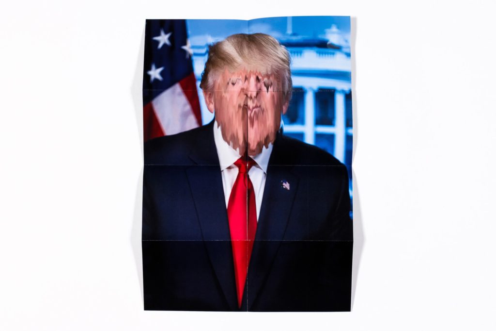
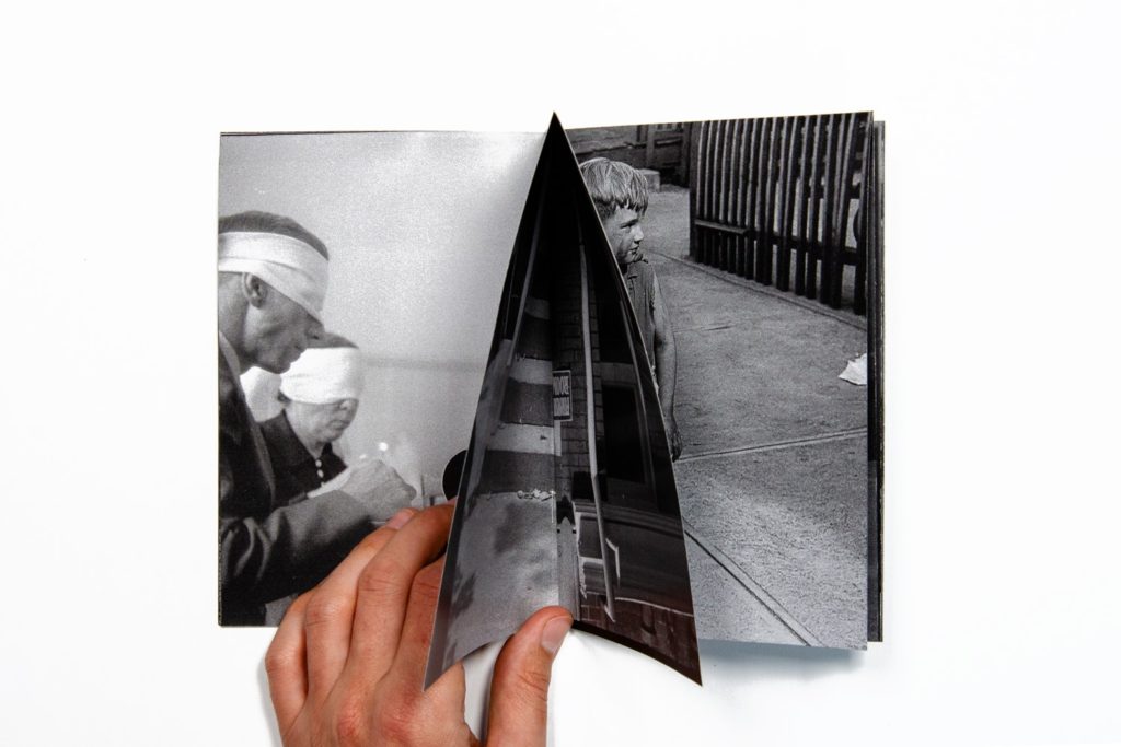
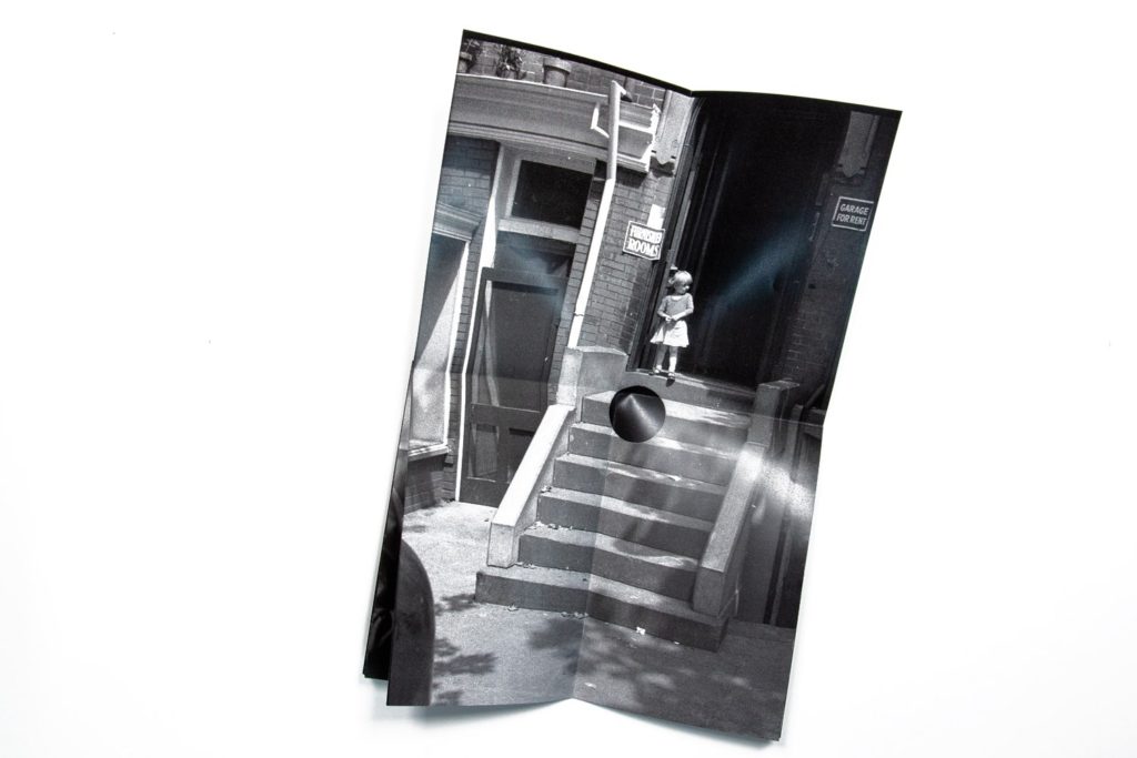
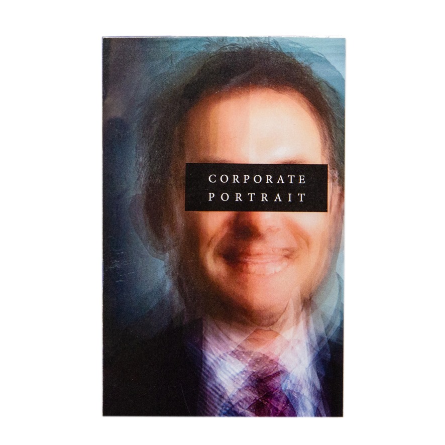
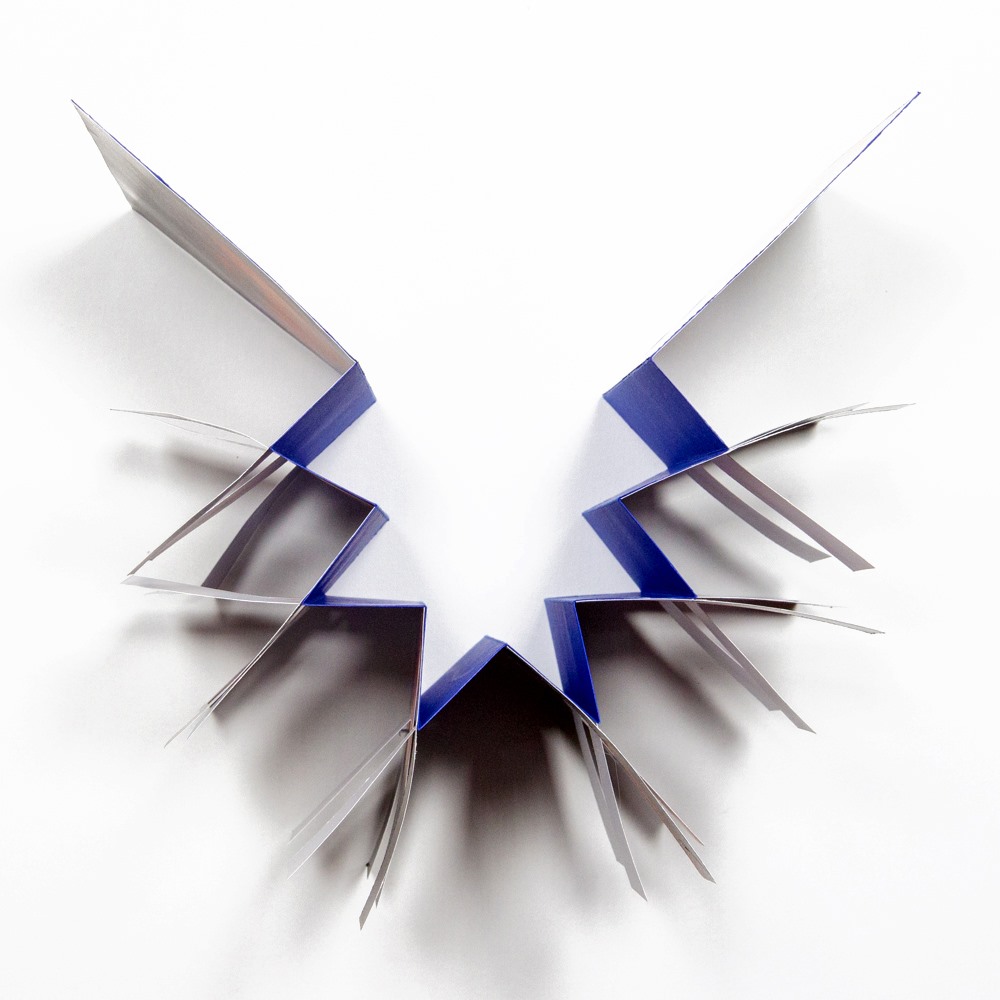
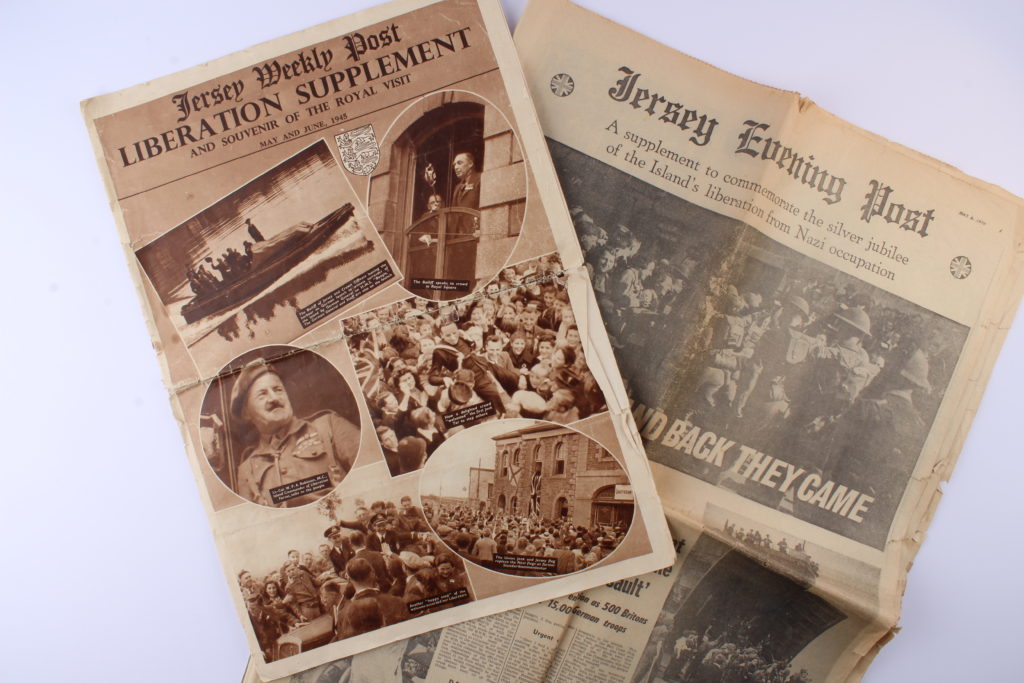
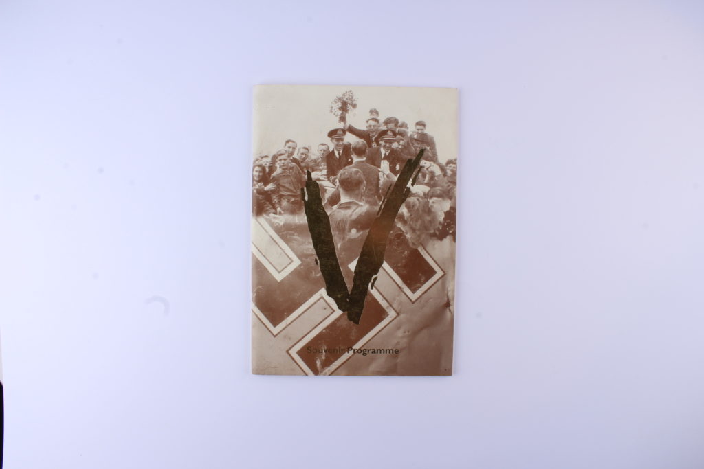
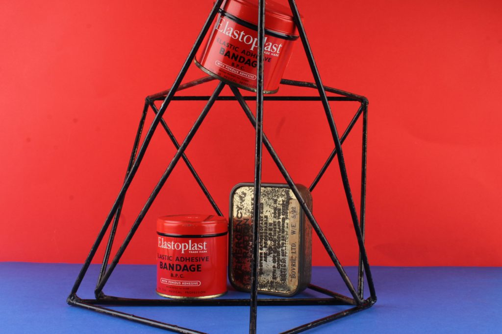
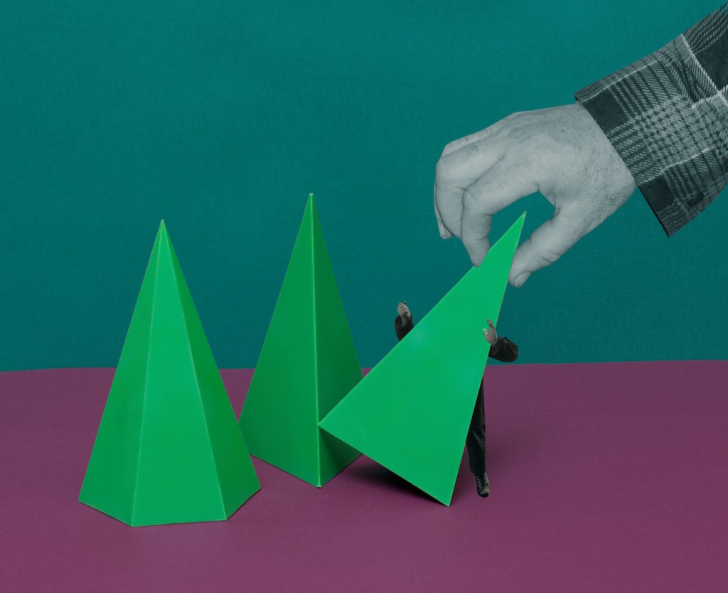
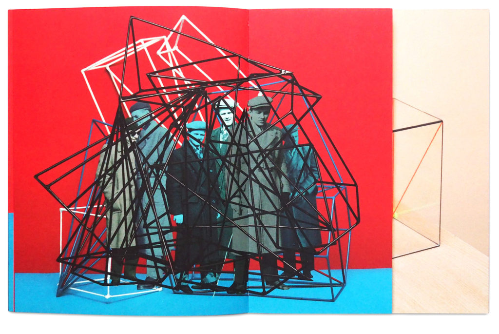
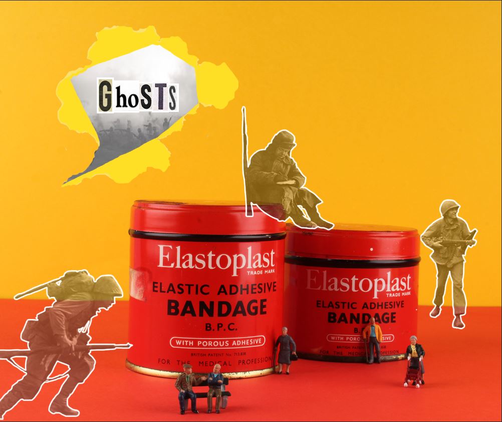
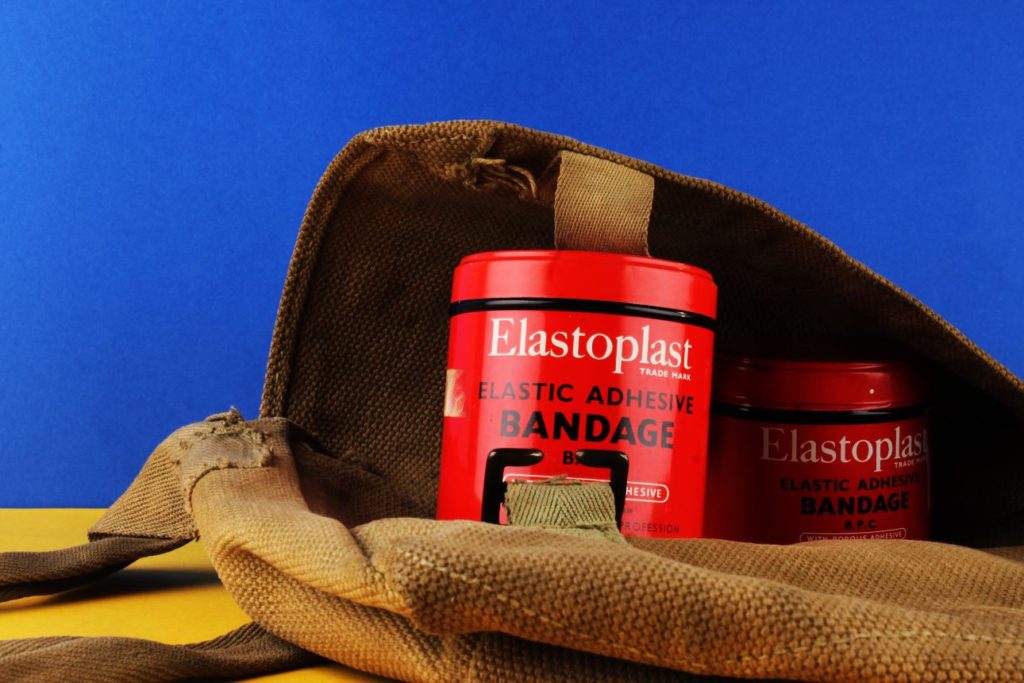
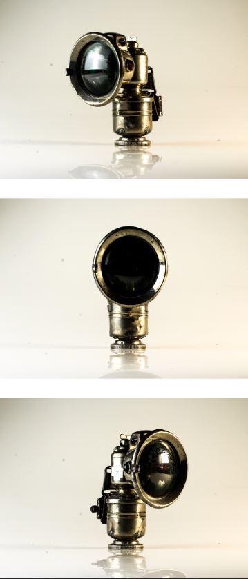
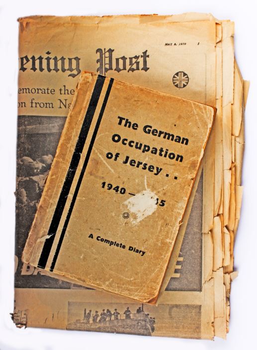
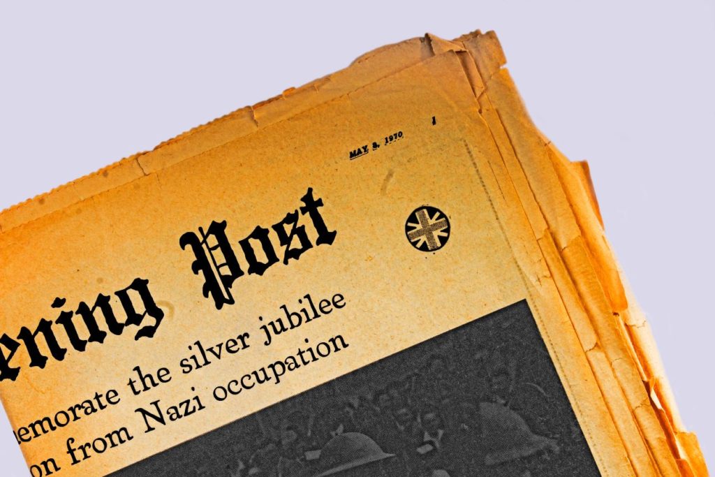
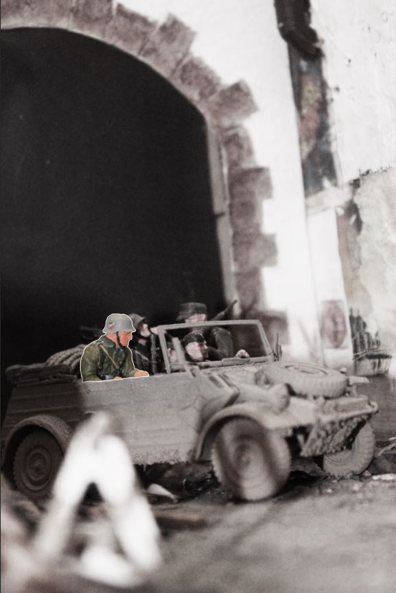
In order to understand how Milach creates his own work, I set out to create my very own photo montages using photo shop instead of the manual means which he uses to create his own work. In order to create the montages I used a combination of still life images which I took in the studio and photos from the societe de Jersiaise, from their WW2 occupation archives.

In terms of the outcome of the first photo montage, I was still getting to grips with the style of Milach therefore it does not completely match the formalities of his original images. I took inspiration from crystals in order to create the polygonal shapes which wrap around the image.

SECOND ATTEMPT:

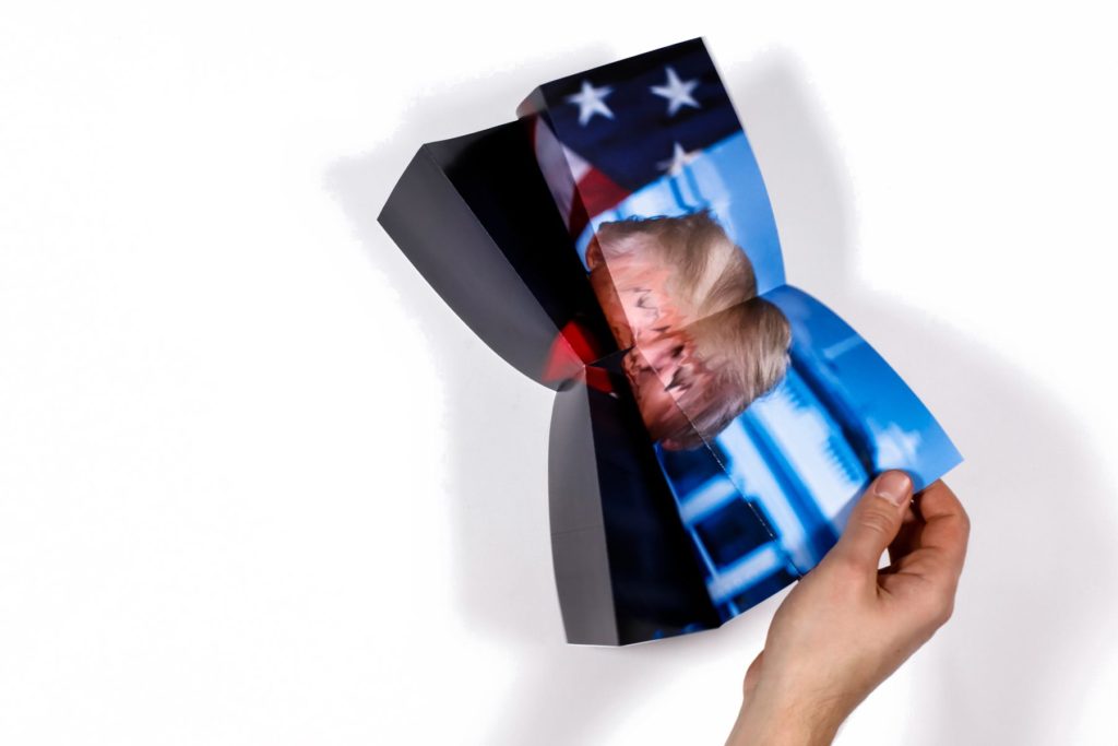
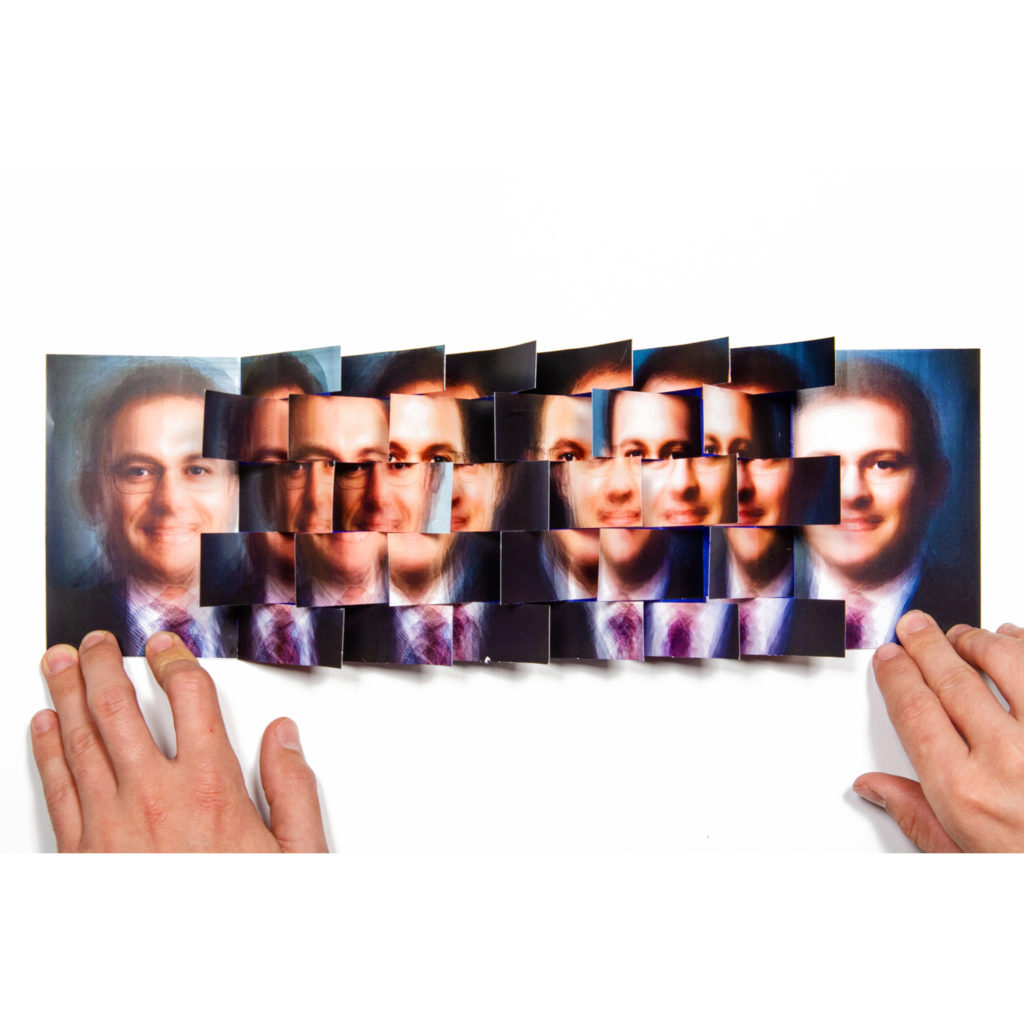
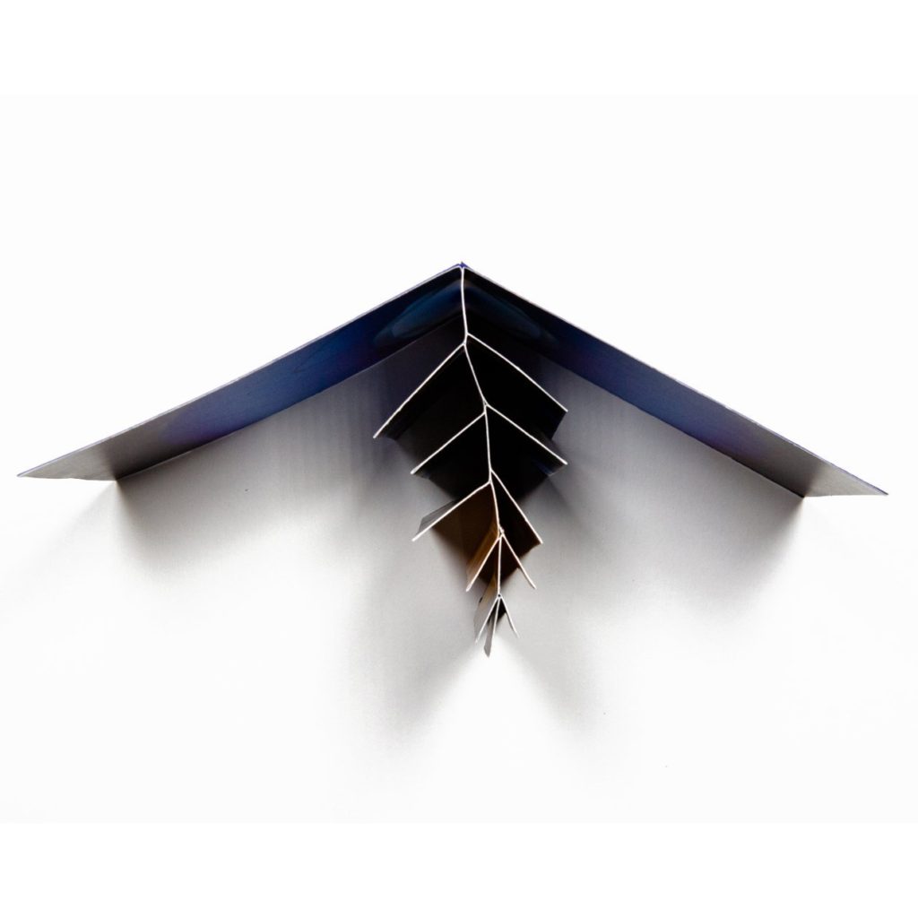
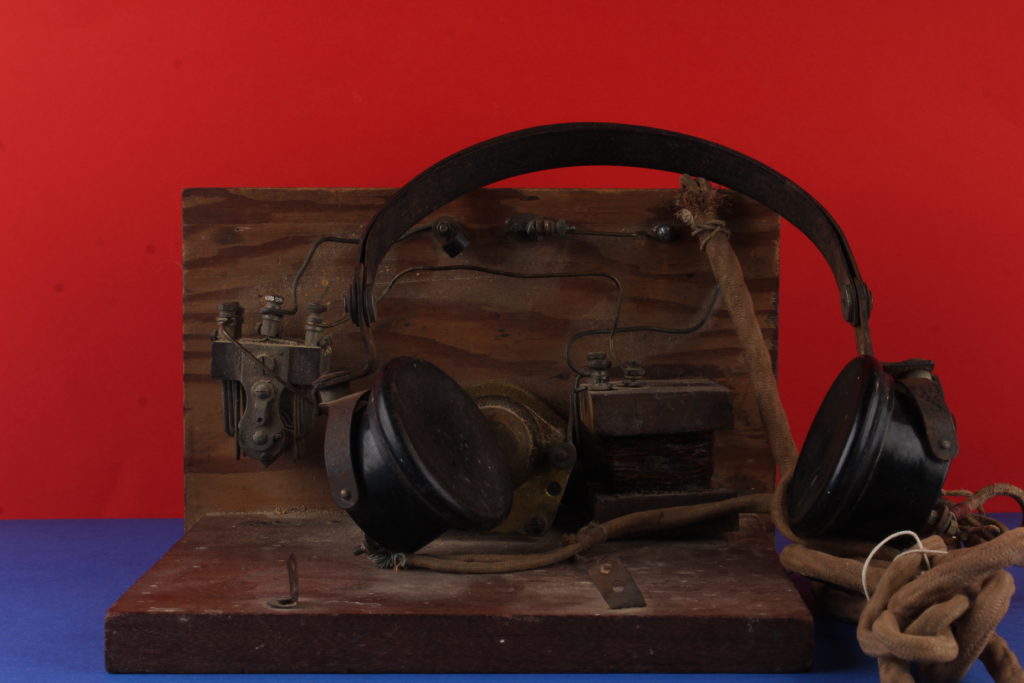
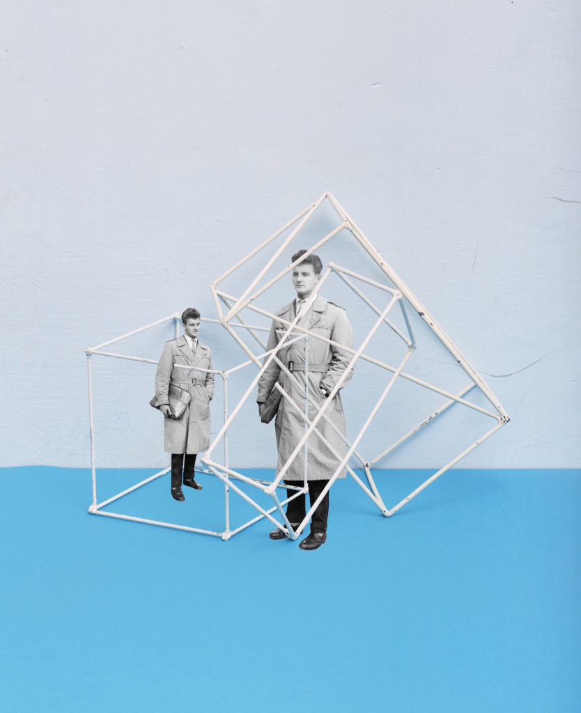
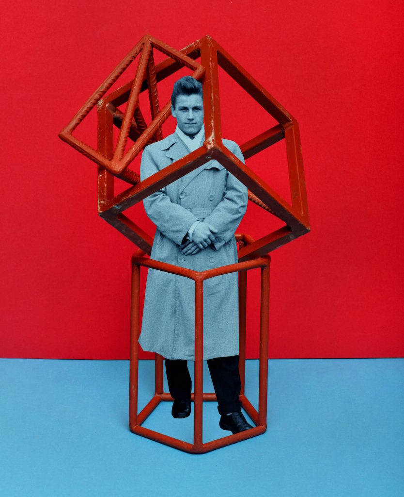
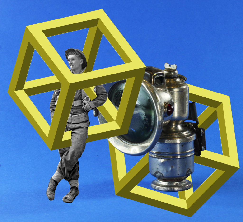
This montage overall was a much bigger success than the previous as I think the overall colour scheme and layout is much more harmonious and is overall more clean cut. I used the same process as I did last time but this time focusing on a much more simple shape, a 3D cube. This was the most time consuming part of the overall process as it required a lot of time to create the geometry which can be seen in the image.

CRITICAL ANALYSIS:

VISUAL:

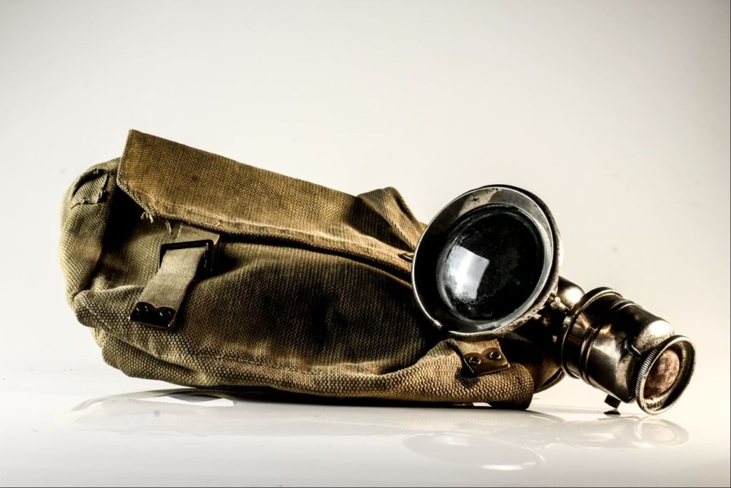
In terms the visual aspects o my second montage, the overall piece works vey harmoniously. The combination of the more rounded and organic shapes of the bike light and the soldiers gear is nicely contrasted with the perfect symmetry of the cubes which more together to become the focal point of the image. The bright lime colour which I used to fill in the cubes is the first thing which the viewer is drawn to. the cubes snake through the soldiers legs and body, disappearing to reveal his face which again very much becomes another focal point of the image as it is very central. One of the most successful things about this image is the colour combination between the bright sky blue, lime green cubes and the monochromatic nature of the bike light and image of the soldier. The high contrast of the image means that the bike light is extremely 3D, having very intense shadows and highlights. There is also a very clear sense of pattern and repetition within this image with the cubes which cover the majority of the image. Even though there’s a distinct lack of depth within this image, the overlapping of the cubes creates dimension, bringing the bike light to the foreground of the image.

TECHNICAL:

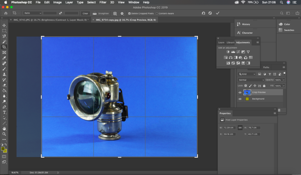
In terms of the technical aspects of this image, the preparation and editing process was very lengthy. The images were taken inside the studio, in which we utilised a very professional set up with multiple light sources and even a specially designed table for still life. In order to create the base images, I used various items from the jersey archives to set up on the tables and photograph. I really focused on using the correct lighting set up to illuminate the objects effectively and with the intent of making the images look as professional as possible. The camera setting for the images are as follows: Camera setting: Manual Mode 
ISO: 100
White Balance: Daylight
Aperture: F/16
Shutter: 0.5 sec to 0.8 sec (depending on reflection of each object)
Lights in room switched off to avoid reflections. As we a very bright 3 point lighting system, the ISO of the camera was only set to 100 as anything more than this would mean that the images would have been over exposed. The most challenging part of the creation of this montage was the editing. I started off by firstly using the spot healing tool. Typically used on the face to remove blemishes, I used this tool in order to get rid of the imperfections which could be seen on the background as they were a huge distraction for me.

CONCEPTUAL:

Still life photography is a genre of photography used for the depiction of inanimate subject matter, typically a small group of objects. It is the application of photography to the still life artistic style. An example is food photography.This genre gives the photographer more leeway in the arrangement of design elements within a composition compared to other photographic genres, such as landscape or portrait photography. Lighting and framing are important aspects of still life photography composition.Popular still life images include groups of flowers, food, and desk space, but still life photography is not limited to those 3 categories. Typically, still life’s are not close up to the subject nor far away, but at a very medium angle. The art in still life photography is often in the choice of objects that are being arranged and the lighting rather than the skill of the photographer.

CONTEXTUAL:

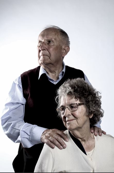
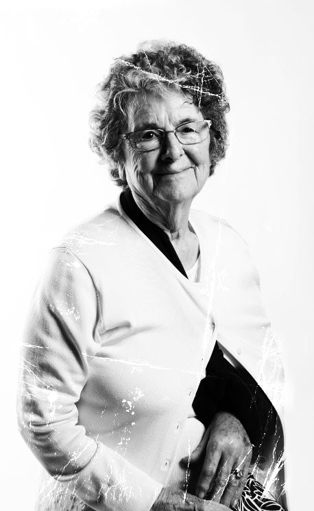
Even though the exact photographers who captured the occupation images are unknown, there are a variety of images which have been collected and stored in archives all across Jersey. Whether that be personal or public, there is a variety of imagery which captures the Jersey occupation. Another archival facility is the Channel Islands Occupation Society (Jersey branch) was set up in 1971 with the intention of investigating the period of the German Occupation of the Channel Islands and to maintain and preserve sites of special interest such as the German fortifications in the Island. Subsequently the Society has been placed in charge of the maintenance of a number of bunkers and has undertaken substantial research into the Occupation period in the Channel Islands.

EDITING PROCESS:

The editing process of these images were extremely difficult especially for my second piece which involved the use of geometric shapes. In order to draw these shapes, I decided to refer to a drawing I made in real life to serve as a guide. I created 4 hollow rectangle shapes which I assembled and cut away the extra lines within them using the eraser tool. It was a lengthy and time consuming process yet the end results were very impressive as the geometry of them is almost perfect. the editing process goes as follows:

  • adjusting the brightness, contrast and saturation of the image
  • using spot healing tool to get rid of imperfections on the backdrop
  • cropping the image
  • using the magic wand tool in order to cut out the soldier fro his backdrop
  • in a separate document, using a sketch as a guid, drawing 4 hollow rectangles and assembling these in a 3D formation
  • cut away extra lines with eraser tool
  • fill the rectangle using paint bucket tool, making the tone gradually darker to emphasise the 3D shape
  • copy and paste the soldier and rectangles onto the image
  • arrange and turn down the opacity of the rectangles
  • using the eraser tool, cut away at the rectangles so as it appears that they are snaking around the soldier and lamp.
croppping the image
using the eraser tool, cutting away small sections of the square

Zine lab: Portraits and objects

Your second zine must be a combination of portraits and objects that either convey a sense of a story, or absence of a narrative. Your sequencing and juxtaposition of images require careful consideration of the relationship between forms, shapes, colour, meaning (symbolic, political, social, cultural.)

For your second zine try out a different design. Below are 10 different zine design. See also Zine Guide by Lewis Bush for more instructions about how to make your zine

Zine 1: Beak
The beak structure is a super simple zine structure which is made from a single sheet of paper, it forms a small booklet but the neat part is the way the structure can be opened up to reveal a single large image. This one consists of a series of digital manipulations of Donald Trump’s super weird official presidential portrait, but then also opens out to form a large poster.

Zine 2: Accordion
The accordion structure is also one you can make from a single sheet of paper, and it unfolds in a slightly unpredictable way which makes it a nice structure for zines with narratives about journeys, mazes, and so on. This one uses a series of photographs taken in a gothic Victorian cemetery which unfurls into a narrative about walking surrounded by symbols of death.

Zine 3: Spring 
Another one that can be made from just a single sheet is the spring structure. It’s a more complex form of accordion structure, but one which also has some interesting internal spaces for images or text which are a little more hidden. You can also paste several together to make longer versions. In this case I used the structure with some photographs taken as part of a documentary project on Canvey Island, a very flat place with enormous skies, it made sense to use a panoramic concertina like this to show them off.

Zine 4: Single section
The single section zine, pretty widely known as it’s basically the same as a booklet. The structure is widely producible but has a lot of possibilities. In this case I used it for a publication consisting of satellite images of major sites and industries which were once publicly owned but have since been sold off and privatised. Opening to A3 size it really lets the detail in the images shine.

Zine 5: Fold-out
The fold out zine combines the possibilities of a single section zine with a nice surprise in the middle in the form of a large fold out. In this case I used it to contain a small project made using FSA photographs ‘killed’ by Roy Stryker, the FSA’s director, who went through a phase of hole punching photographs he didn’t like. To match the subject matter better I’ve also done a hand cut out on the front cover.

Zine 6: Dos a Dos
The dos a dos zine contains two single section zines within one cover, facing them in opposite directions, it’s a neat structure for combining two sets of material which you really want a viewer to experience separately, rather than in a sequence where one follows another. For this one I’ve combined two very different sets of imagery about my native London, one about the city’s history, and the other about it’s possible future.

Zine 7: Multi-section
The multi-section zine is somewhere between the dos a dos zine and a t blown book. A couple of folds in the cover allow you to bind in three (or potentially even more) clusters of pages, which can function nicely as distinct chapters. In this case I’ve used the three different types of imagery featured in my project Shadows of the State, which documents spy radio stations.

Zine 8: Zine in a Zine
A zine in a zine is basically a single section zine combining different paper sizes, which can be distributed in a variety of ways, either creating a smaller publication within a bigger one, or creating hidden flaps which is what I’ve done in this case. These are a series of photographs taken during walks in mid-Wales, the wider images contain smaller flaps which open to reveal closer details.

Zine 9. Flag
The flag book is a creation of book artist Heidi Kyle. It’s one of the most complex in the guide but can lead to some remarkable results. It uses a series of small flaps to create a sort of cascading wall of paper, great for making otherwise perhaps rather dull images more surprising. For this one I’ve used a series of composite portraits created from thousands of corporate portraits. The flag book structure seemed to add something to the already slightly shimmering, edgeless quality of the composite images.

Zine 10: Fishbone
The fishbone folder is another Heidi Kyle invention, it’s structure looks something like a fish skeleton with a series of pages getting smaller and smaller towards the middle of the zine. For this attempt I’ve used a single large macro image taken of an old lens, the folds break up the image in a way which makes it less immediately obvious what it is, so I’ve added an image of the side of the lens as a sort of cover and clue to the contents.

Week 8: 21 Oct – 4 Nov (incl H-Term)
Zine-lab: Portraits and Objects

Complete the following blog posts

1. RESEARCH: Zines and newspaper design made by artists and photographer that will provide visual stimulus for your page designs. 

  • Produce a mood board 

For inspiration see zines/ books by Lorenzo Vitturi (Dalston Anatomy), Sam Ivin (Lingering Ghosts) Rita Puig-Serra Costa (Where Mimosa Bloom)-, Laurence Aëgerter (Photographic Treatment), Batia Suter (Radical Grammar)

2. DESIGN: Plan how you want your zine to look and feel, in terms of 

  • Format, size and orientation
  • Design and layout
  • Rhythm and sequencing
  • Narrative and visual concept 
  • Title and cover
  • Images and text
  • Use of other design elements or inserts: archives, montages, graphics, typography

3. EXPERIMENTING: Show variation of designs

  • Create 3 examples of alternative layouts for your zine using Adobe InDesign and complete a visual blog post that clearly shows your decision making and design process using print-screens or save each page-spread as a  JPEG.
  • Make sure you annotate!

4. PRESENTING: Print, fold and bind final zine and hand in for assessment.

DEADLINE: FRI 25 Oct
All Blogposts by Mon 4 Nov (first day after H-Term)

WWII objects studio photography

During school and lessons I went into the studio and set up some objects ready for a photo shoot. This was fun and interesting as the objects I was handling were old therefore the texture was different to an object from this year.

I photographed a wide variety of photos from old newspapers and magazines to a helmet and a crystal radio set.

I did 3 photo shoots within the studio, one with papers and documents, one with the objects, and a third photo shoot with the objects but with a colored background.

Here are some of the photos from my document photo shoot.

I really like this photo as it has two different versions of the JEP, which shows the contrast between the two with the texture, color and size.
I also really enjoy this photo as it is just one magazine taking the main frame with the golden V being slightly lit up with the flash from the lights that were set up.

Now here are a couple photos from my object shoot.

I think that this is my favorite photo from this shoot as it shows the age of the helmet, with the rough texture on the surface and the same with the ration box. I like the way I balanced and angled the helmet and the box, as it shows the depth of the objects and creativity.
I am really pleased with the outcome of this photo as the light behind really emphasizes the crystal radio set. I like that the color of the radio is dull and simplistic but creates such a dramatic effect which really draws your attention to it.
The photo is so clear that you can see a layer of dust on the radio, which shows how old this object is.

Here is my final set of images from my object shoot but with a color background.

I really like the outcome of this photo as it has both soft and sharp edges, with the edge of the bandage tins and the metal container along with the edge where the color changes being soft. Whereas the metal objects provide a sharp line and shape. With having two metal shapes the lines overlap and go past each other it creates a 3D look with nice dimensions.
I also like the way that this image turned out, with the the bright colored background really exaggerating the crystal radio set. What I like about this photo, is that you can see the age of this piece of equipment.
I like this photo as it has a mix of light and dark areas, with nothing being too over or under exposed within the photo.

Zine Layout Idea

For my zine layout, I want to incorporate text into my photos to give it a simple and minimalist aesthetic.

Final Idea

For my front page I wanted to place this image of a door to symbolise opening up to the zine and stepping and entering into the zine.

My narrative for my zine is age and decay, so throughout my zine, it will show images of fortifications that are aging and decaying. I also wanted to touch upon the hard work and torture for the workers who worked on these bunkers.

I decided to use German in my title because it ties in with the German occupation and it stands out. The title means “Stages of Decay”, as my zine is filled with photos of decayed fortifications.

Additionally, I put the words decay and forced to show the conditions and abuse of the workers and also the decay of the fortifications. I also wanted to put an image of the workers next to a fortification to show what they have made.

Moreover, I put the names of the counties where the slave workers were from in order to show the severity and how may different countries and people that suffered.

Lastly, I wanted to put an image of the war tunnels at the end of my zine to symbolise the end of there journey and almost showing a way to get out of the abuse the workers suffered.

Artist Research – Rafal Milach

Rafal Milach:

Rafal Milach was born in 1978, in Poland. In 2003 he graduated from Katowice with a degree in Fine Art, soon after he co-founded Sputnik photos, which was a series which documented the transition of the post-Soviet states. Milach has a strong connection with capturing photographs which uphold a strong political viewpoint, which is shown in many of his photographic series. Travelling, allows Milach to capture different cultures and gives him an understanding of their political situation which may spark an idea for another photographic series. In addition, he has published many photographic books and zines to showcase his work, as well as having his work show in five exhibitions.

I will be exploring the photographic series ‘The First March of Gentlemen’ which was created in 2017. Contextually, The photographic series captures the town of Września and the towns children strike, which was a protest of Polish children and parents against the Germanization (the spread of the German language culture and people within a city) of the town. there were many demonstrations by Citizens of Poland, a civic movement engaged in pro-democracy and anti-fascist actions, opposed to the political changes brought about by the government led by the Law and Justice (PiS) party.

“This delineates a fictitious narrative that can be read as a metaphor, commenting on the social and political tensions of the present day.”

This direct quote from Milach represents the artistic aim and conceptual representation within the photographic imagery. It suggests that he wanted to create a narrative which holds metaphorical symbolism by creating collages of illustrations of the children’s strike and objects associated with this and characters who lived during the communist era in Września, taken by a local photographer at the time Ryszard Szczepaniak. This conceptually represents the social and political issues which were relevant during that time, but still can be applied in some areas in today’s society, making the project relevant.

“The ‘Gentlemen’ is just a figure of speech. It’s not a gender-related thing, it’s just a representation of some activated unit. To me it was rather a metaphor of being in some sort of bubble where you don’t really have to act because you are comfortable.”

Above is a quote taken from a recent interview with Milach where he explains the purpose of his book. It explains why the book is titled in such way and the importance of the title to the conceptual and contextual representations, which clearly showcase the political and social tension with the communist era.

The image above is one of my favourite photographs from the series, we are presented with a man entrapped in geometric shapes in the centre of the frame. The geometric shapes are object taken from schools in Września, to contextually show how the German’s changed the education system to be like Germany’s, which illuminates how nothing has been changed. The figure itself seem authoritative and most likely has some connection with the political system within the town, the creates a conceptual representation that politics have entrapped citizens of the town and will not do anything about it. The photograph is presented as a portrait photograph taken at a straight on angle and in colour. The background of the photograph is red and blue, which are not complementary colours, which uphold the pejorative representations within the imagery. Due to the background being plain it allows the subject and objects, in the centre, to be the main focus point, ensuring we gain the conceptual message. The photograph presents the formal elements of colour, space and shape through the positioning of the object and subject, and the sense of confinement through the entrapment. The overall composition works in telling the narrative, and is similar in every page of the photo book.

Technically, the camera settings are basic, due to the photograph being an artificial still life montage, which documents the Września children crisis. The lighting used is artificial, likely to be two flash heads either side of the frame which go off at the same time, due to the lack of shadows and the whole frame being lit. On top of this, the ISO is likely to be low due to no intended noise and the shutter speed being quick (1/250) due to no intended blur when capturing the photograph. In addition, the frame showcases a clear white balance accuracy as the colour are strong and almost vibrant, allowing the conceptual meaning to be almost in your face when viewing the image. The aperture is likely to be on F16 allowing the whole frame to be in focus, reducing depth of field, and allowing enough light in to capture the montage sufficiently.

To conclude, I think that the work of Milach is successful due to the nature of using a photomontage to showcase documentary photography. He clearly showcases his conceptual representations due to the clear link with personal and historical context within the imagery. The composition is well thought out, through the colour schemes to the positioning, allowing an affecting and intriguing response for viewers. In addition, the camera settings have been used effectively to produce high quality photographs.

Zine: Sequencing and Narrative

After finalizing the editing for all of the photographs I took over the course of the project, and reducing my selection of images to the ones that I wanted to use as final images, I was left with the below images:

These would be the images I would use in my zine, and I felt like these images could all be linked together using a narrative. My first thought was that the contrast between the portraits (clearly taken in modern time) and the images of the archival, old objects would work to add to a narrative that represented the reflection between the present individuals who still deal with the trauma of the occupation, and the reality that the occupation is still a very important and present part of the history of Jersey (as clearly the objects have been looked after and archived to preserve them and their importance). I decided to develop a narrative that would help to link between the past and present, and show the differences and similarities that could still be found within past and present representations of war and occupation if they are actively sought out.

The first 2 images I decided on to place side by side were a portrait and a photo-montage. I feel that placing these 2 images together shows a contrast between the bold colours on the right, and the dulled, somber colours of the left. I specifically placed these images together due to their contrasting colours which would draw attention of the viewer, but also the fact that the subjects of both images are looking in the same direction, showing a connection between the two images, and drawing attention to the fact that the subjects of both images, although presented very differently, still hold experiences of war and trauma that they deal with in their own way. I made these the first images to immediately draw attention to the similarities between old and new.

I then began sequencing the next images, to show a subtle decent into a set of images that focused more on the historical aspect of the war, drawing attention to archival images and photo-montage representations of how war influenced those involved in it. I did this by placing an image of a single subject that has been edited to look slightly ripped. I did this to show a decent, as if tearing away the present to reveal the past reality of the war and occupation. I then placed a series of objects and photo-montages, progressively becoming darker and bolder in colour as well as theme, in order to represent the growing despair and hopelessness of the occupation.

As seen in the gallery of images above, the sequence moves from lighter, studio photography of objects, towards more raw, darker tones images of objects in the environment in which they would have been found during the occupation. I did this to emphasize the reality, in which archival objects themselves struggle to tell the full story, unless the reality and truth of the occupation itself is considered, and the objects are seen in their real, frightening and more disturbing setting.

I decided to use this image as my final image. I feel like the tones of this image encapsulate the sorrow of the war, as the contrasting black and whites present a stark and harsh contrast, with the subjects presenting neutral faces (rather than happy). I used this as my final image to bring attention back to the present, where individuals present during the Occupation still deal with the negative memories of the Occupation, and I feel that this image reflects the dark struggles that the subjects still deal with every day.