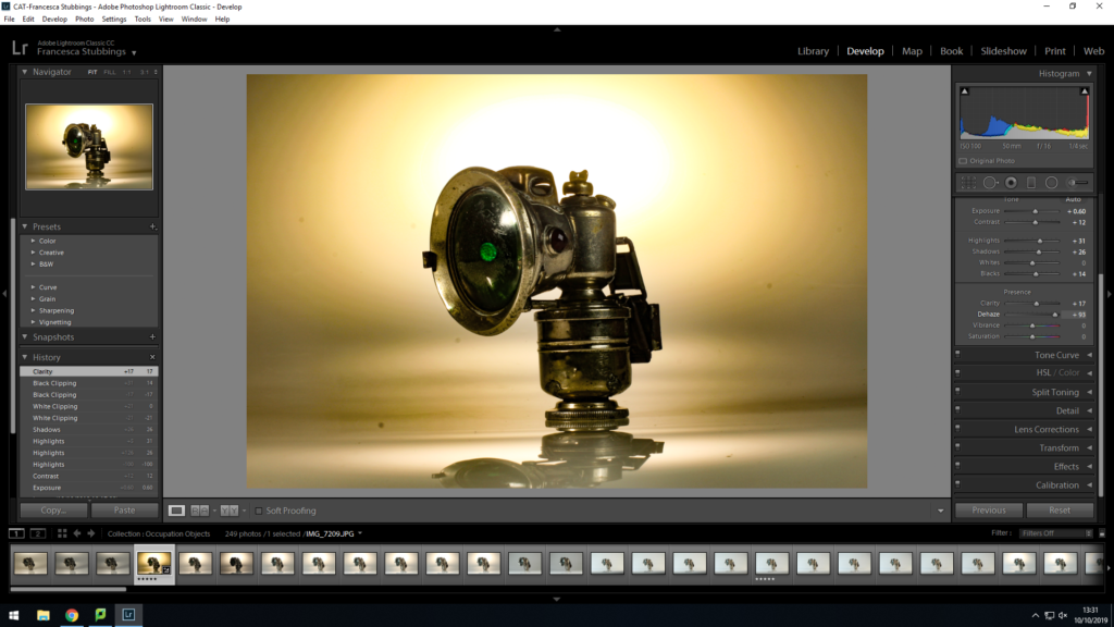
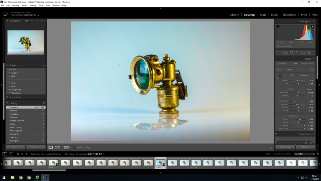
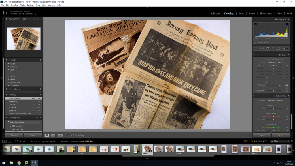
I imported my still life images into lightroom. I create a new collection set inside my main folder of occupation and war. This is so that my images can be categorized and organised. Once imported I then began to go through my images applying a star rating so when viewing all my images, I would know which were my best and worst by a glance. After giving them a rating I then selected each 5 star image and changed it to develop mode, as this allows me to edit the image. With these first few images I experimented with changing the exposure and editing the colors within them, such as making blue or orange stronger within the image. I also increased the grain of the image as this made the features on the object more detailed and visible.
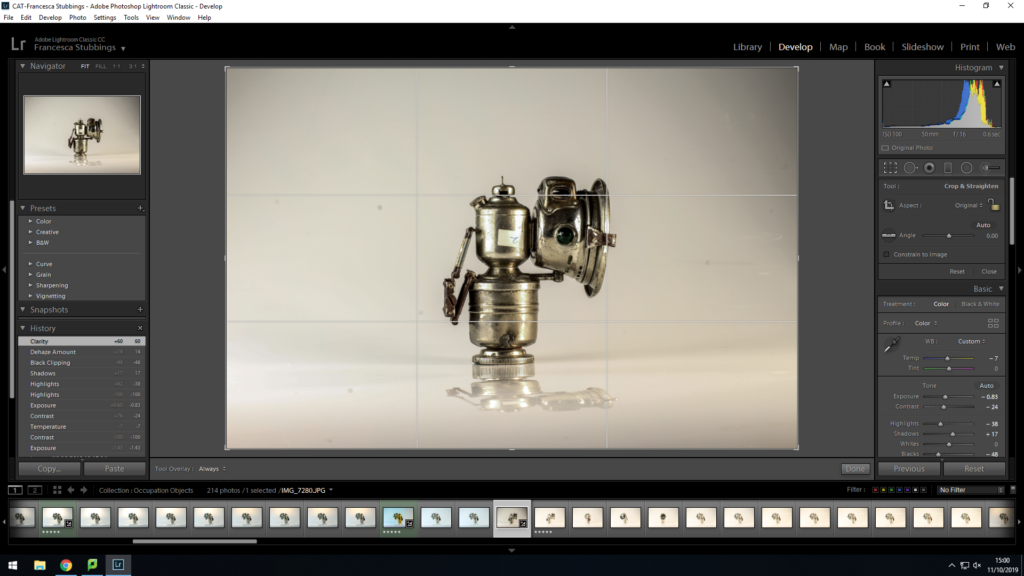
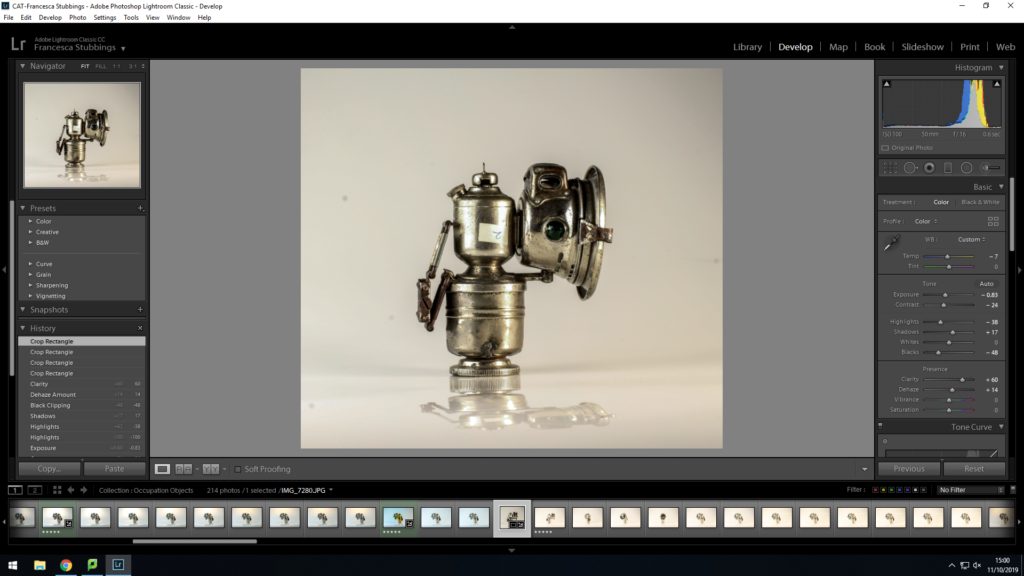
Along with changing the different settings to make the images I have be less over exposed and have more contrast, etc I then used the crop tools on some of the images. I did this because in certain images the object wasn’t in the center to cropping of a side of the image then put the object in the middle. However, like the image above there was too much background and surroundings of the image which took focus off the main object, so cropping off most of the background made the object the main focus which in these images was what I wanted. This is because my main focus was to show parts of the occupation which was left.
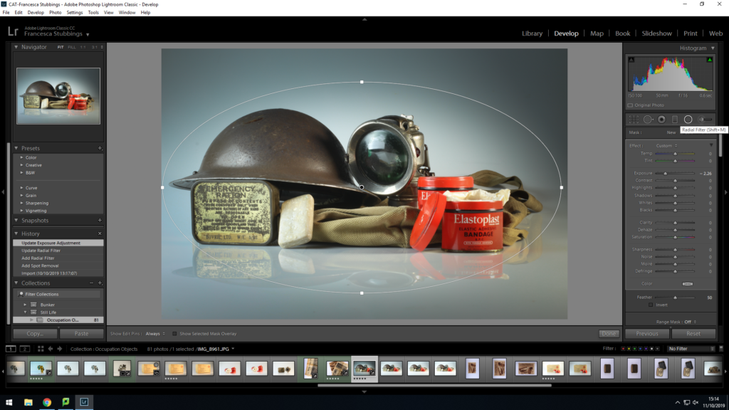
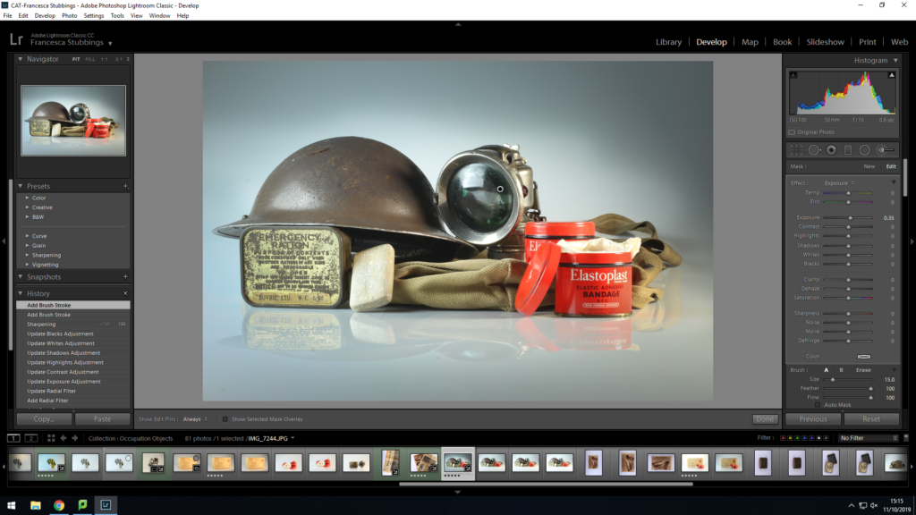
As I carried on experimenting with my images I used the ‘Radial Filter’. This is where you draw a circle/oval around a certain part of the image and from then all the changes you make to the image effect everything outside of the circle. I believe this works well with still life images because it allows you to highlight the object you are focusing on, it can sometimes look as if the objects are glowing when its surroundings are increasingly darker from the background and the objects. It can make an image more interesting to look at by giving it different exposures within the same image, instead of it all being one tone.
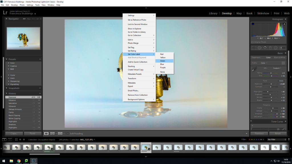
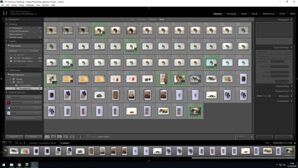
Once edited all my images, I then right clicked on the images and selected add a color filter to it (green) this is so I could determine which images where complete and ready to export. Visually this was easier for my to work with as I could select a color for the images I wanted to not use, use or was indecisive of. This makes it easier for me to export later on
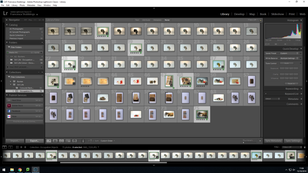
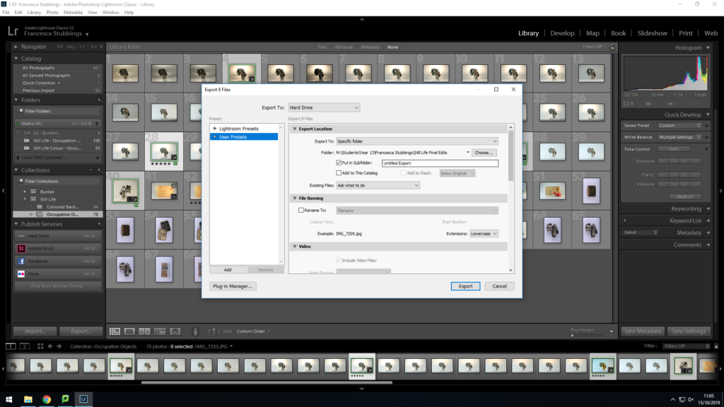
Once I have selected the images I want to use for my final pieces I will go down to the left hand corner and click on ‘export’, this will then come up with how I want to export the image, where I want the images to be saved to, etc. I will transfer them as a JPEG this is so they can be uploaded onto the blog and be used on in-design. My images will remain in lightroom as they are, if I decide I want to go back and adjust them I can and then re-export them.
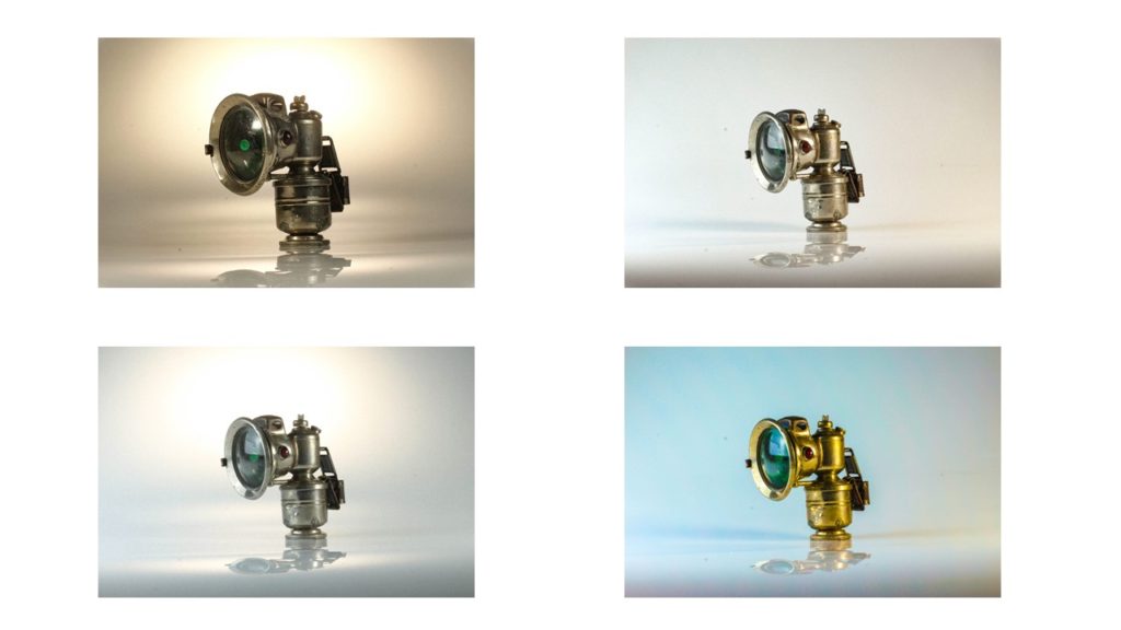
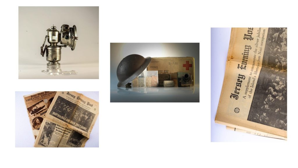
Overall I like how my images have turned out. I have experimented with how bright the lighting is within the images. In the photos of the lamps I have changed the coloring of the light making some of it more blue, grey or yellow this gives the images which gives the object a different background and feel for the image. The different lighting can make the object look a lot older and worn out or in well kept shape, but I prefer the image where the object looks older as you can see through the features on the object the ‘struggles’ it went through when belonging to someone which could be a representation of that individuals life during the occupation. In the images of the newspaper the paper is more yellow, which gives it an older look, along with the grain on the image makes the paper look more worn out. Finally, my image with different objects in it, the darkness in the corner lightens into the middle of the image, which acts as a highlight for the images, this naturally draws attention to the objects in the images. The darkness could’ve lighten a bit earlier as in the top left hand corner there is too much darkness over the helmet which results in you not rally being able to see the full detail which eliminates the point of the image as these images are there to show historical objects from the occupation and people want to see the detail and marks on them as it adds personalty and emotion to the image.
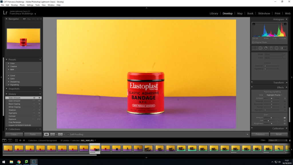
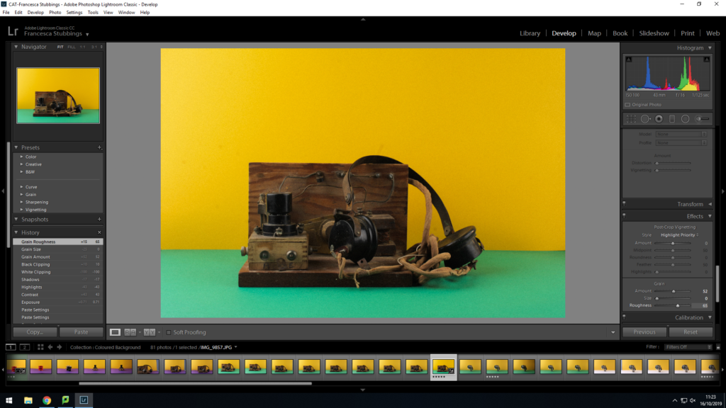
I then went back into the studio a second time this time with more ideas. I decided to photograph some of the same objects again but except this time using colored background, this adds something else to the image, making it catch the human eye more. I used a standard 50mm lens on a tripod, I had two light coming in from either side. I placed a piece of colored paper on the wall behind and one on the table, then placing the object in the middle of the paper. When photographing the images I sometimes slightly zoomed in or out of the image to make sure I could capture what I wanted to, to tell the story of the occupation. A problem I had was when changing the colored paper in and out I sometimes didn’t put the bottom piece close enough to the wall which resulted in the table being on show in the image, and making sure the object was in the middle but this could be fixed in lightroom by cropping.
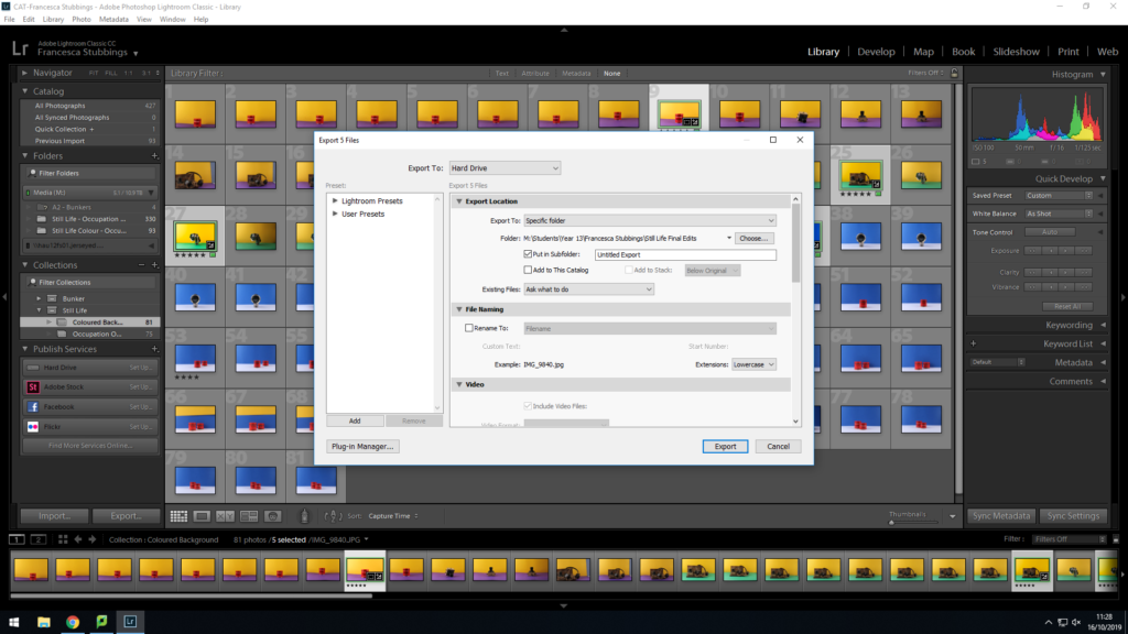
Again, after I had finished editing my images I selected my final pieces so they could be exported as a JPEG. This is so they could be uploaded to the blog and used in Photoshop when creating a montage.
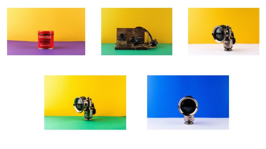
Overall, when shooting with the colored paper, I found it difficult to make sure the paper was lined up straight to create that straight horizontal line, in some of the images I took you could see part of the table/wall but this was easily rectified as I could just re-position the camera and alter the zoom. The colored background makes the images more interesting and appealing to look at, as bright bold colors draw attention of the human eye. The colors also make the object I’m photographing stand out and you are able to see more detail of the object.
