
After taking a series of images using the studio layout, I began to combine multiple elements to create photo-montages. In the initial studio photograph, I took inspiration from Rafal Milach’s “The First March of Gentlemen”, and used contrasting card colours to provide the background for the objects. I used one colour as a back wall, and a it’s complimentary colour as the ground colour in order to create an obvious separation between the 2. I then took a photograph of a series of objects taken from the Jersey archives, and for one of the images I made use of a number of tiny figurines. I then used Photoshop to create a montage out of these original images, and a series of archive images, taken during WW2.

I produced this first image after taking an initial photograph of the objects and figurines, and then used Photoshop to edit in the faded outlines of the soldiers. I did this to try and create a representation of the memories of the war (represented by the faded soldiers) in contrast to the present day (represented by the figurines of the elderly people). I produced this image to represent the reality of many individuals who survived occupation and war, as they now all live with constant memories and reminders of the experiences they survived during the war.
I reduced the opacity of the eraser tool to create the faded effect on the soldiers (which I had separated from the background by using a different layer) 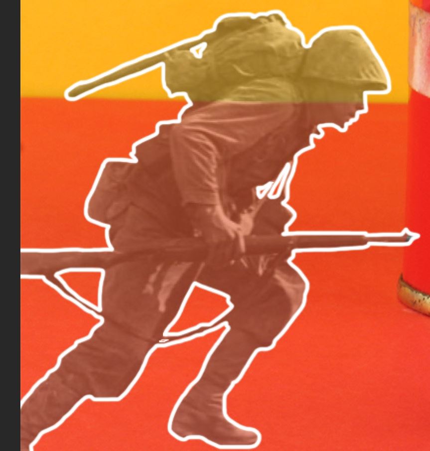
After reducing the opacity of the soldiers, I then outlined each one in white, in order to separate them from the background and make them more eye catching. 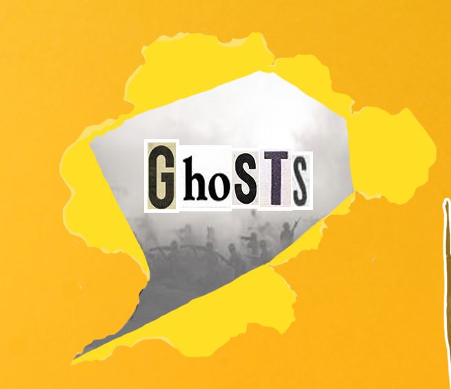
I then added a text detail in order to sum up the meaning of the image. I did this by using a rip-effect stock image and editing it to match the colour of the background, and so it looks like the text is ripping through the image. 
I then adjusted the contrast of the image, in order to make the bold colours stand out more, reflecting Rafal Milach’s own style of work.
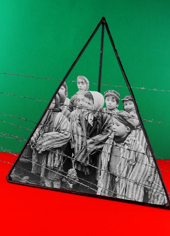
For my second photo-montage, I made use of 2 complimentary colours in the background, and photographed a pyramid maths object (taking inspiration from Rafal Milach). I then used an archived image of children in a concentration camp, and edited the image so it looked like the children were trapped inside of the object. I did this to reflect the horrors that many children faced during the war, while also contrasting this with the use of an object used in school, which is supposed to be a safe environment for children.

In order to fit the image of the children into the pyramid, I skewed the image and altered the perspective to fit the angles of the pyramid itself. 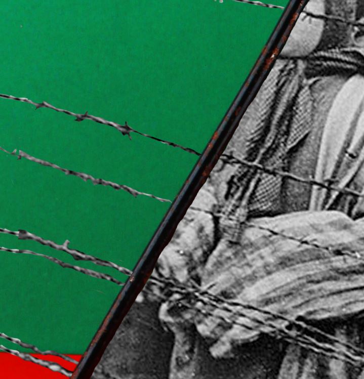
I then cut out the parts of the image that did no fit in the pyramid, but left the barbed wire in, while erasing the area where the wire crossed the pyramid in order to make the effect that the wire crosses on the inside of the object, which I feel is a small but effective detail. 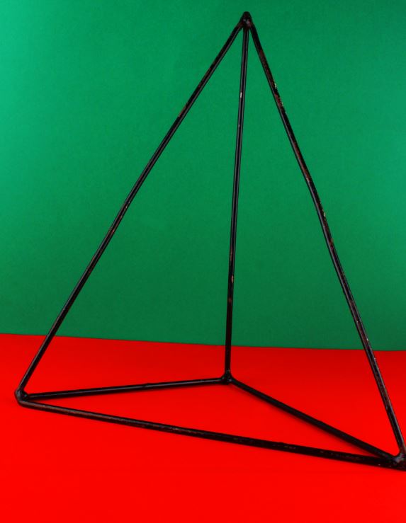
This was the original image before adding in the archival image. I heightened the contrast of this image to make the colours contrast even more.
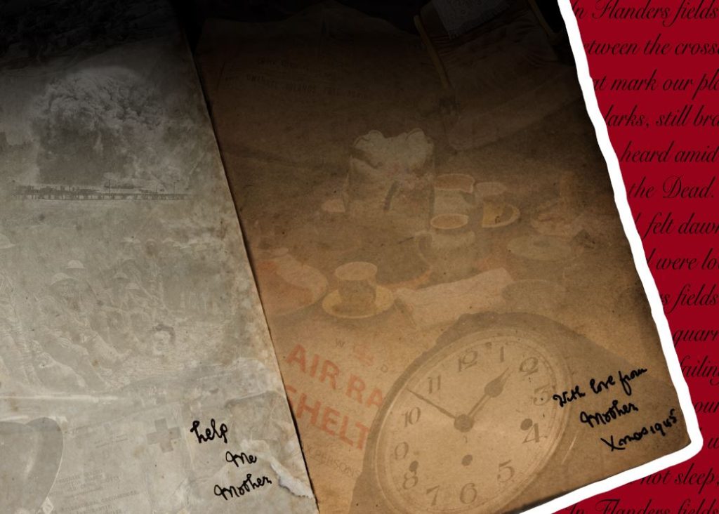
For the above image, I took a more experimental approach. I took inspiration from the note within the original book, saying “with love from mother, Xmas 1945”. I created a contrast between the 2 sides of the book, with the memories from home on the right, and the horrors of the trenches on the left. I did this to uncover the reality of war, and the differences between experiences of different people during WW2.

I used a number of layers to add the objects and scenes onto the pages of each book. I then merged the boarders of these images together and overlapped them, and reduced the opacity significantly. 
This piece of text was added to contrast the text on the other side of the page. I created this text by cutting and pasting letters found on the original text, and then going over all of the letters with black. 
Finally, I added a poem to the background in order to add to the atmosphere of war and suffering, and made the background red to coincide with the work of Rafal Malik.