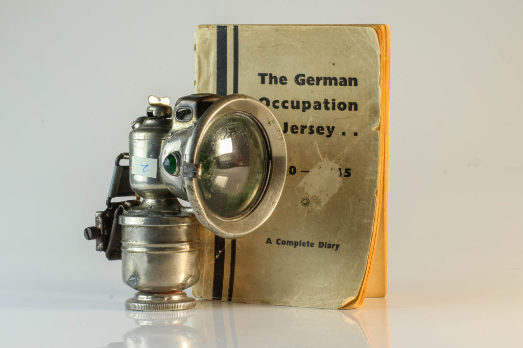
For this photo shoot, I took photos of objects from the second world war in the studio with white backgrounds and coloured backgrounds. I used studio lighting with three main lights and a trigger flash on the coloured background photos.
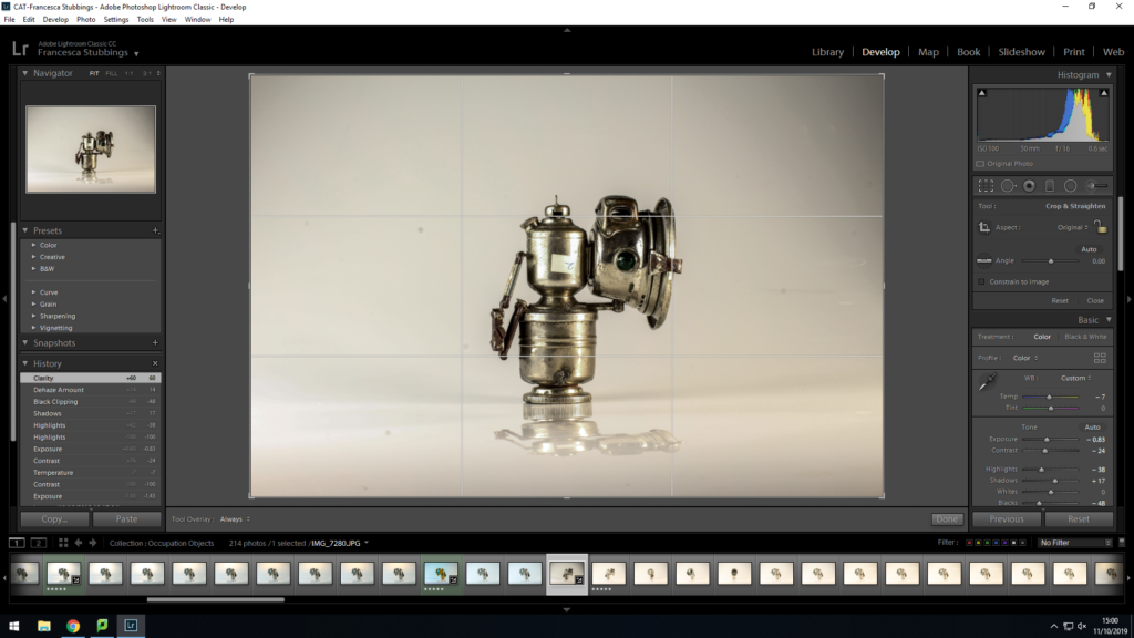
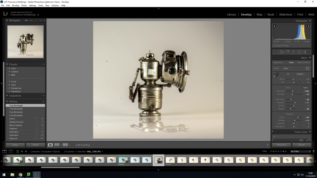
I edited these images in light room by using the automatic editing and just adjusting some of the setting such as exposure, shadows and brightness/contrast. I then got rid of imperfections on photo shop as there were bits of dust on the lens of the camera.
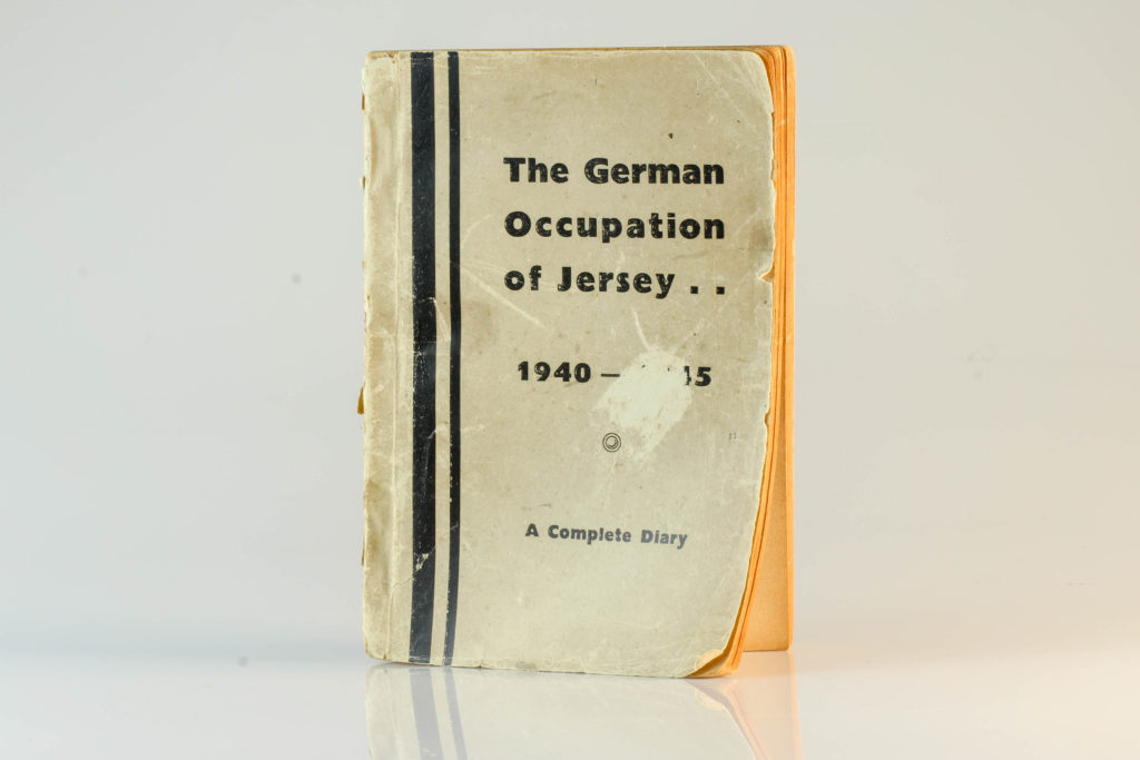
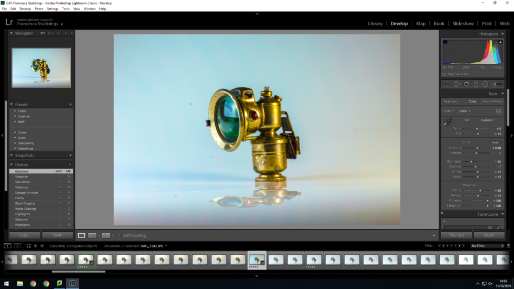
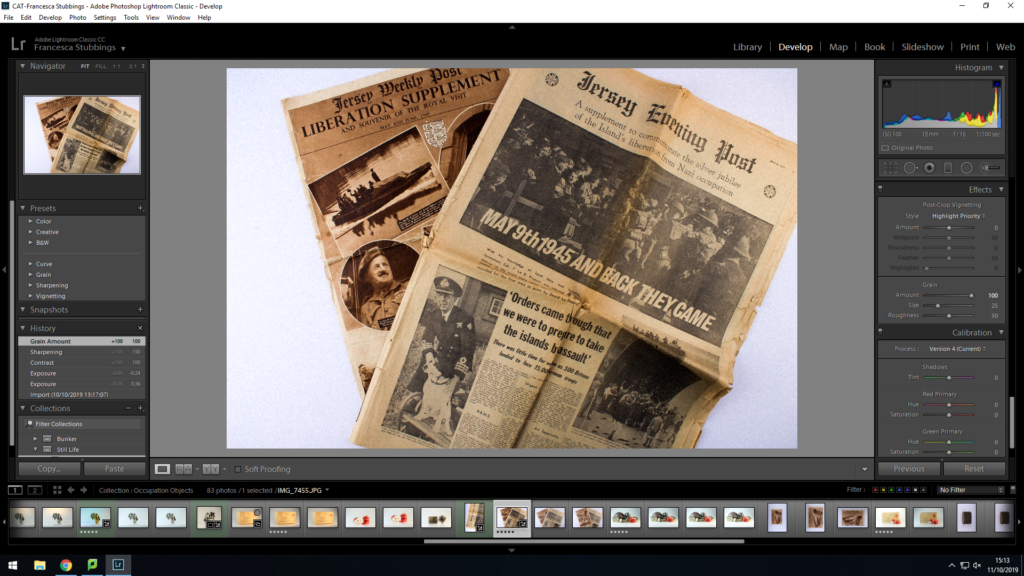
For these images I also edited them on light room. Again I used the automatic editing setting and just adjusted some of the settings such as exposure, shadows and brightness/contrast. I also edited one photo in black and white to enhance the aesthetic of the image and portray the photo as if it was old. There were also imperfections on the images so I edited them out with photo shop.
Step by Step of How I Edited the Photos:
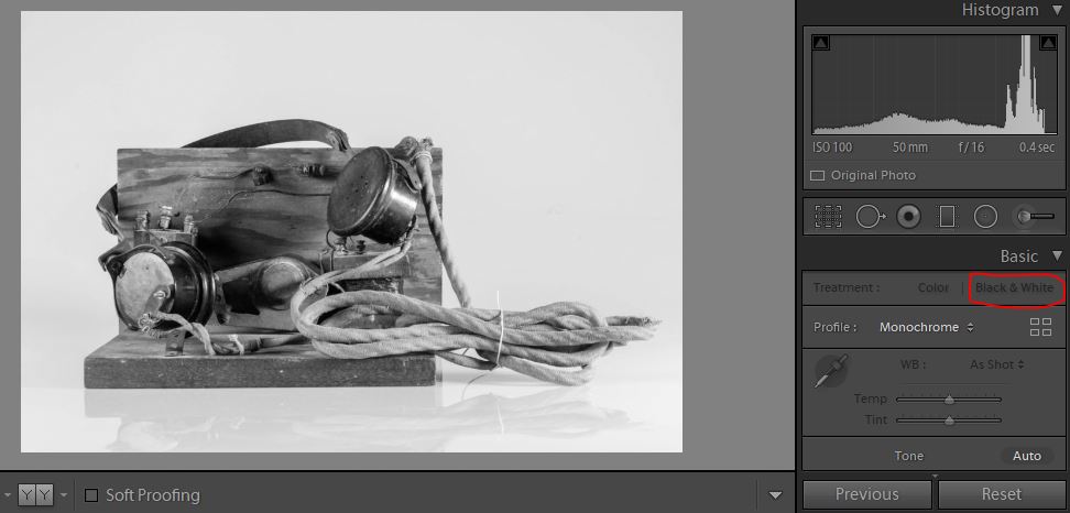
Firstly I used the black and white option in the develop section in light room classic cc.
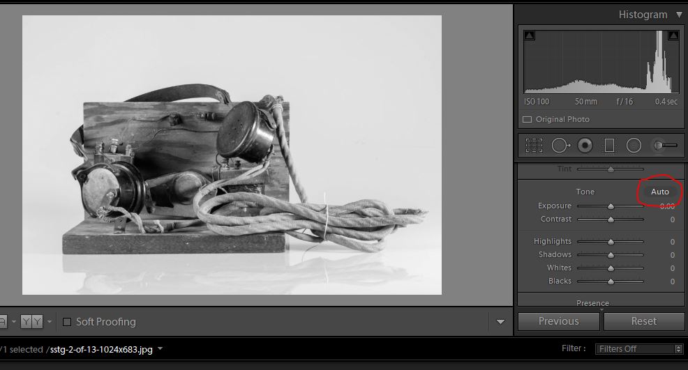
Next, I then used the auto option to get a overall edit of the photo.
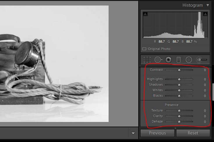
I then adjusted some of the settings such as contrast, brightness, highlights and shadows.
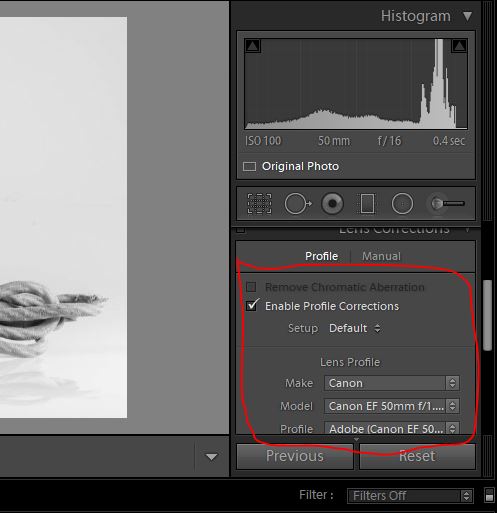
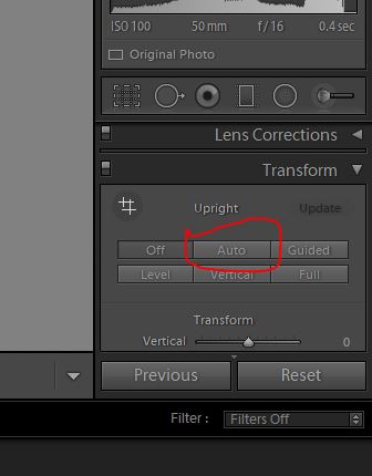
I then used the lens corrections tool, then ticked the enable profile corrections then set the make to a canon camera.
Additionally, I then went onto the transform tool and pressed the auto tool to straighten the image.
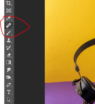
For the next image I used the same editing method but didn’t use the black and white option but used the colour option. I had to edit the image on photo shop as there were some imperfections on the images.
Here I used the spot healing tool to get rid of the imperfections in the image.
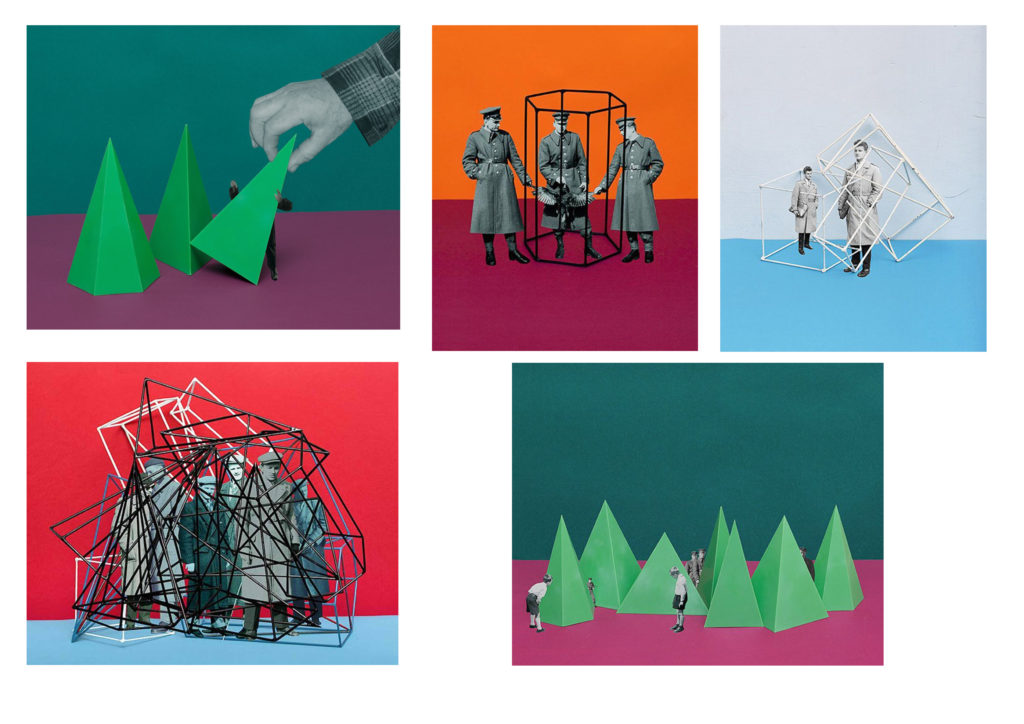
Milach uses archival imagery from 1950’s and 60’s to retell the children’s strike in Poland; with a more playful narrative with the inclusion of colourful backgrounds and geometric shapes.
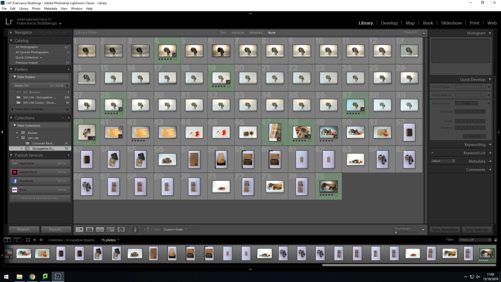
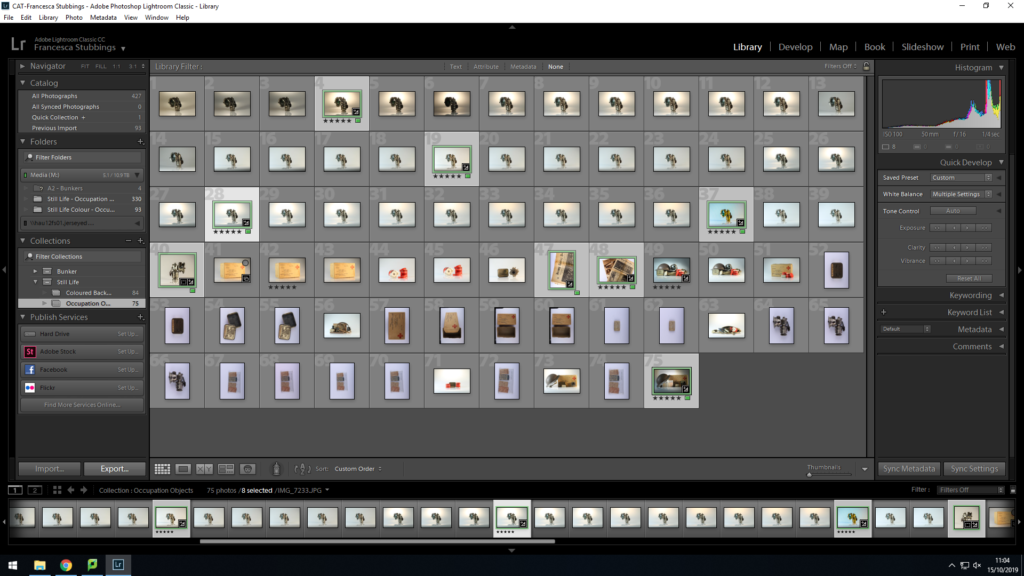
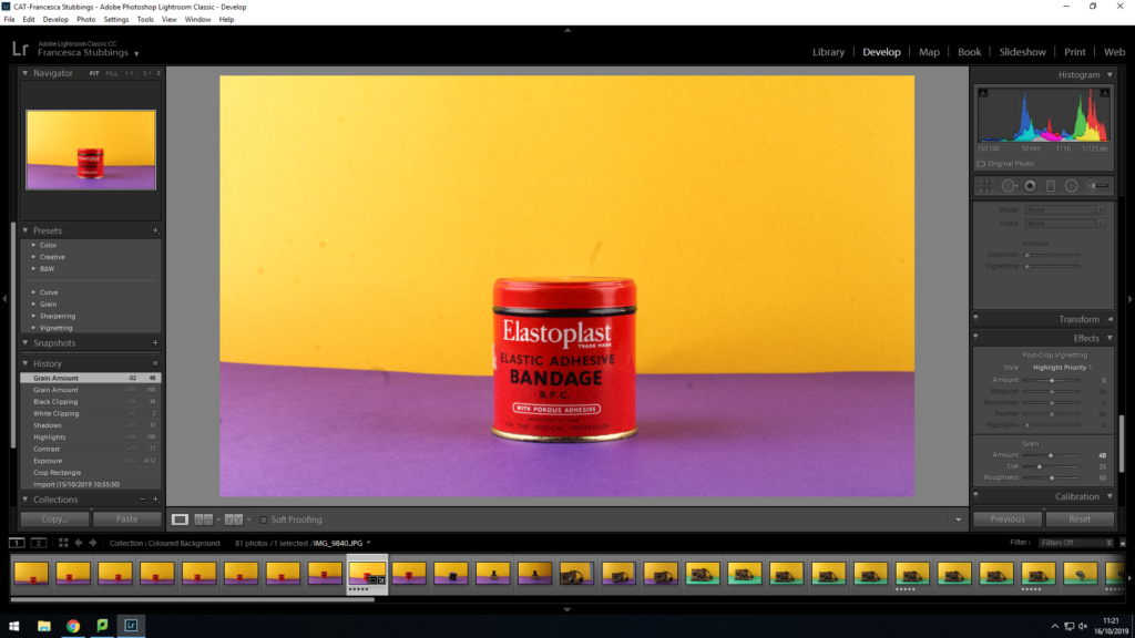
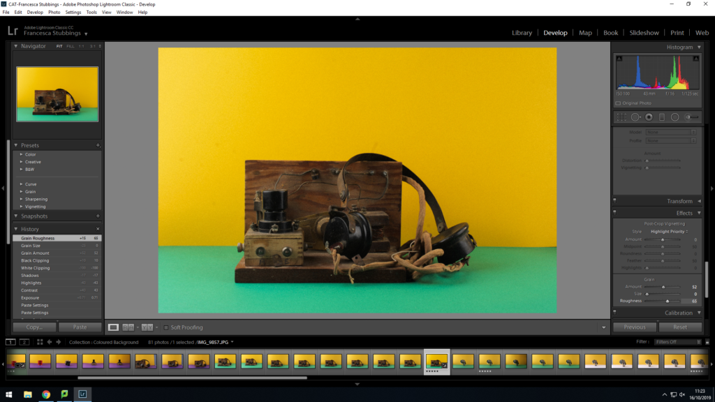
I imported my still life images into lightroom. I create a new collection set inside my main folder of occupation and war. This is so that my images can be categorized and organised. Once imported I then began to go through my images applying a star rating so when viewing all my images, I would know which were my best and worst by a glance. After giving them a rating I then selected each 5 star image and changed it to develop mode, as this allows me to edit the image. With these first few images I experimented with changing the exposure and editing the colors within them, such as making blue or orange stronger within the image. I also increased the grain of the image as this made the features on the object more detailed and visible.
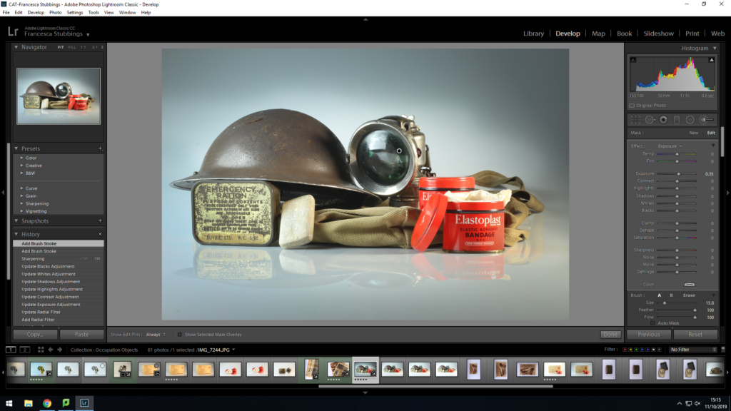
Along with changing the different settings to make the images I have be less over exposed and have more contrast, etc I then used the crop tools on some of the images. I did this because in certain images the object wasn’t in the center to cropping of a side of the image then put the object in the middle. However, like the image above there was too much background and surroundings of the image which took focus off the main object, so cropping off most of the background made the object the main focus which in these images was what I wanted. This is because my main focus was to show parts of the occupation which was left.
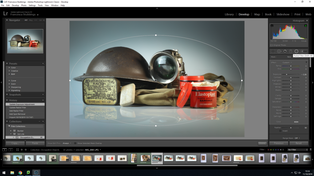
As I carried on experimenting with my images I used the ‘Radial Filter’. This is where you draw a circle/oval around a certain part of the image and from then all the changes you make to the image effect everything outside of the circle. I believe this works well with still life images because it allows you to highlight the object you are focusing on, it can sometimes look as if the objects are glowing when its surroundings are increasingly darker from the background and the objects. It can make an image more interesting to look at by giving it different exposures within the same image, instead of it all being one tone.
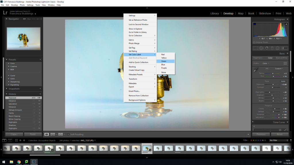
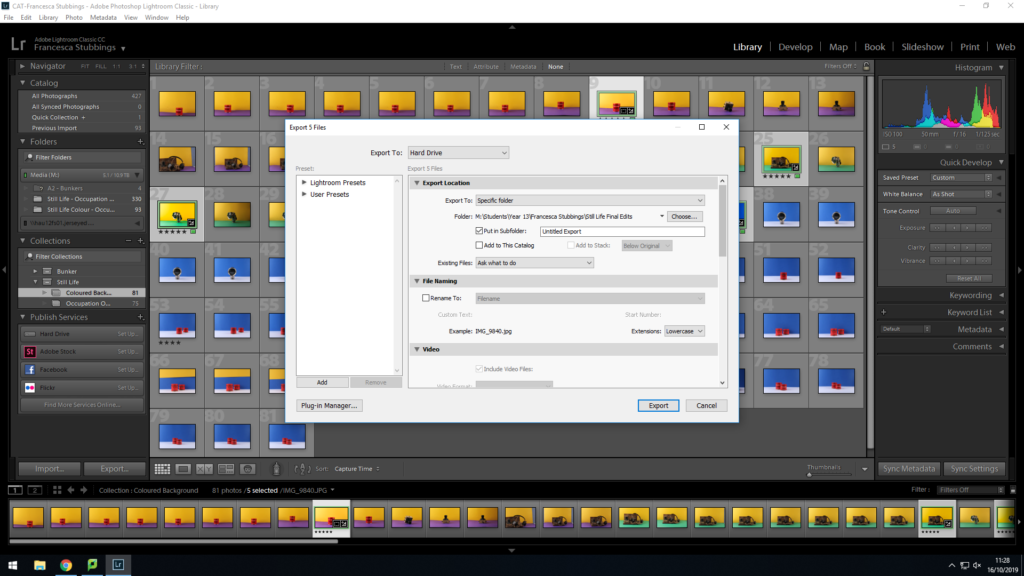
Once edited all my images, I then right clicked on the images and selected add a color filter to it (green) this is so I could determine which images where complete and ready to export. Visually this was easier for my to work with as I could select a color for the images I wanted to not use, use or was indecisive of. This makes it easier for me to export later on
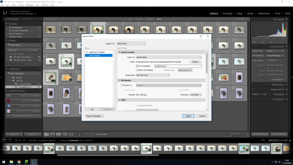
Once I have selected the images I want to use for my final pieces I will go down to the left hand corner and click on ‘export’, this will then come up with how I want to export the image, where I want the images to be saved to, etc. I will transfer them as a JPEG this is so they can be uploaded onto the blog and be used on in-design. My images will remain in lightroom as they are, if I decide I want to go back and adjust them I can and then re-export them.
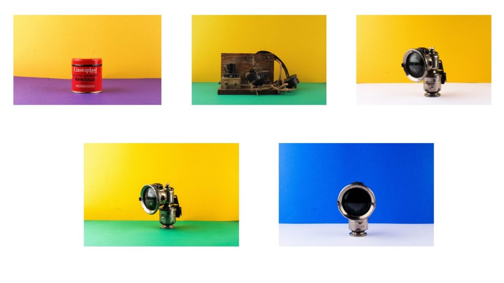
Final ImagesFinal Images
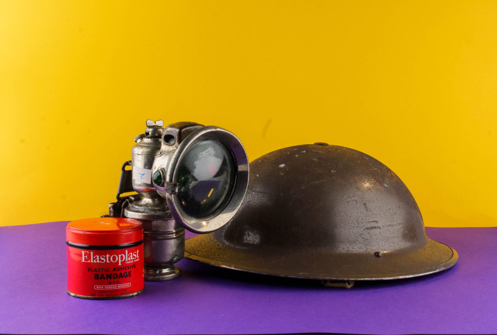
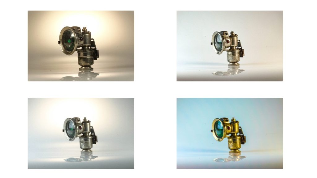
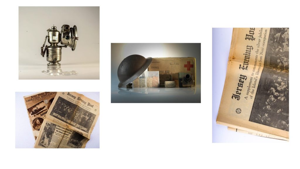
Overall I like how my images have turned out. I have experimented with how bright the lighting is within the images. In the photos of the lamps I have changed the coloring of the light making some of it more blue, grey or yellow this gives the images which gives the object a different background and feel for the image. The different lighting can make the object look a lot older and worn out or in well kept shape, but I prefer the image where the object looks older as you can see through the features on the object the ‘struggles’ it went through when belonging to someone which could be a representation of that individuals life during the occupation. In the images of the newspaper the paper is more yellow, which gives it an older look, along with the grain on the image makes the paper look more worn out. Finally, my image with different objects in it, the darkness in the corner lightens into the middle of the image, which acts as a highlight for the images, this naturally draws attention to the objects in the images. The darkness could’ve lighten a bit earlier as in the top left hand corner there is too much darkness over the helmet which results in you not rally being able to see the full detail which eliminates the point of the image as these images are there to show historical objects from the occupation and people want to see the detail and marks on them as it adds personalty and emotion to the image.
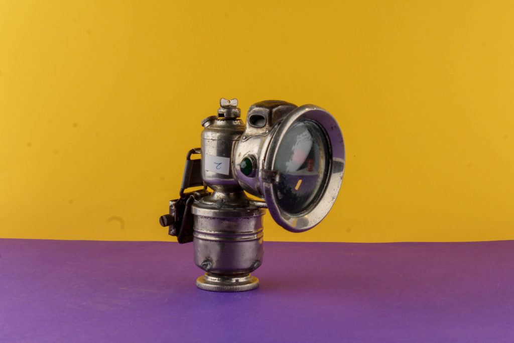
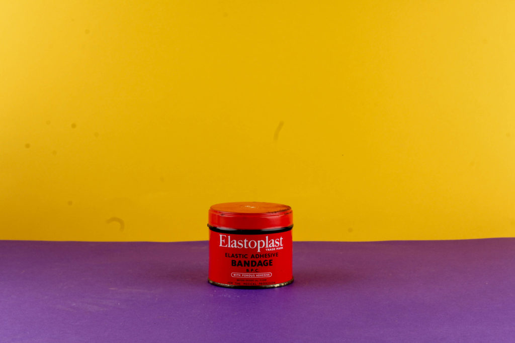
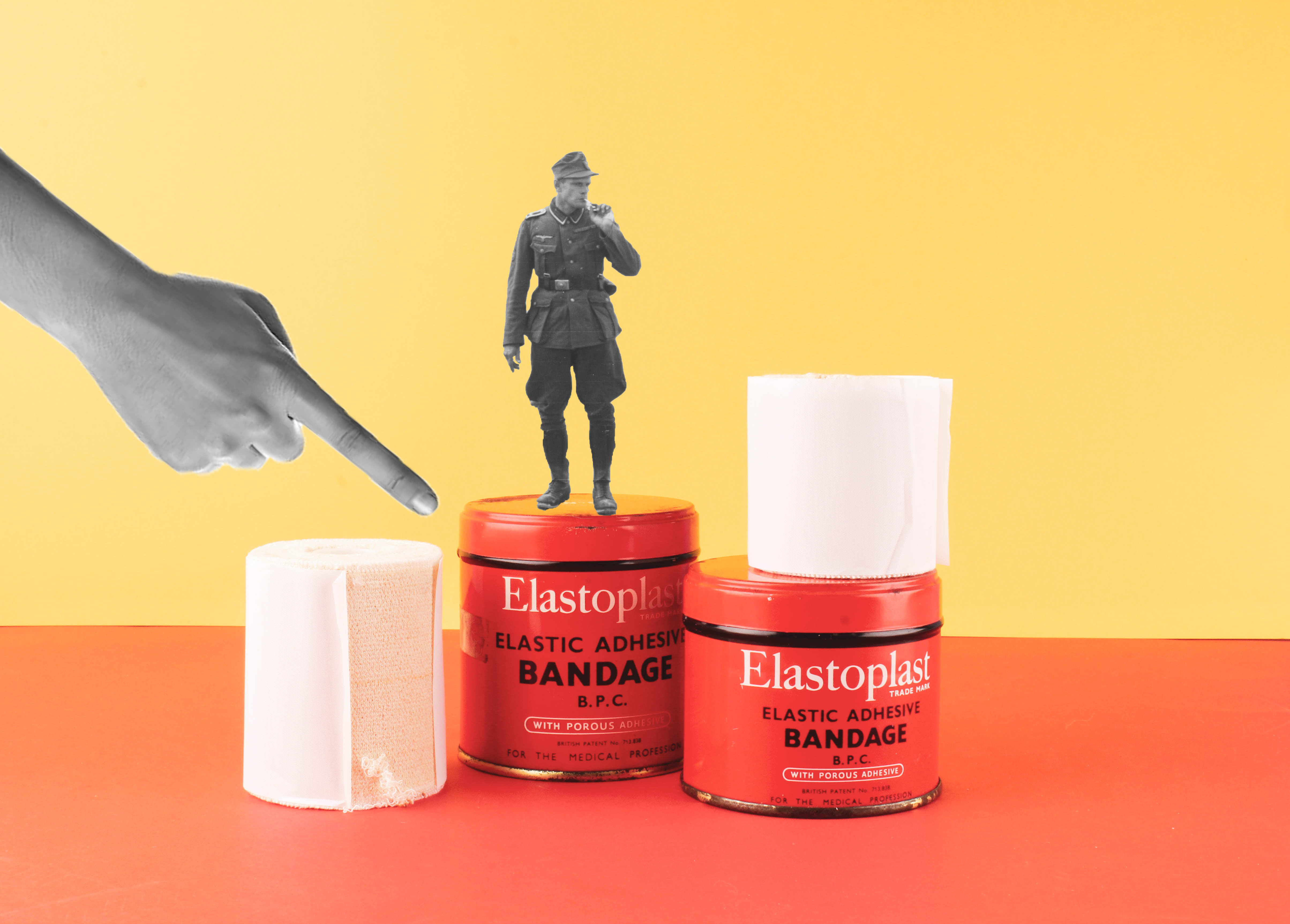
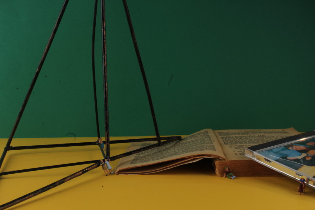
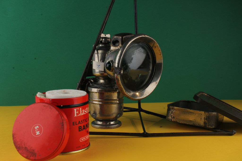
I then went back into the studio a second time this time with more ideas. I decided to photograph some of the same objects again but except this time using colored background, this adds something else to the image, making it catch the human eye more. I used a standard 50mm lens on a tripod, I had two light coming in from either side. I placed a piece of colored paper on the wall behind and one on the table, then placing the object in the middle of the paper. When photographing the images I sometimes slightly zoomed in or out of the image to make sure I could capture what I wanted to, to tell the story of the occupation. A problem I had was when changing the colored paper in and out I sometimes didn’t put the bottom piece close enough to the wall which resulted in the table being on show in the image, and making sure the object was in the middle but this could be fixed in lightroom by cropping.
Again, after I had finished editing my images I selected my final pieces so they could be exported as a JPEG. This is so they could be uploaded to the blog and used in Photoshop when creating a montage.
Final Images
Overall, when shooting with the colored paper, I found it difficult to make sure the paper was lined up straight to create that straight horizontal line, in some of the images I took you could see part of the table/wall but this was easily rectified as I could just re-position the camera and alter the zoom. The colored background makes the images more interesting and appealing to look at, as bright bold colors draw attention of the human eye. The colors also make the object I’m photographing stand out and you are able to see more detail of the object.
In The First March of Gentlemen, Rafal Milach creates a narrative composed of real stories. He retells the historical childrens strike in Wrzenia in Poland from the early 20th Century, through collaged archive photographs from the 1950s and 1960. He has created a narrative to be read as a playful metaphor for the social and political tensions of the present.
When western Poland was under German occupation, over 100 students of the Catholic People’s School took part in a strike against the German influence on their education. The Germans aim was to remove the Polish language from their teachings.
Milach detached the figures from Szczepaniak’s photographs, both literally and figuratively, from their original context and placed them onto bright, candy coloured backgrounds. The design is “like a toy, like a candy – something nice to look at and to touch.” The figures are caged in geometric shapes, which as the book progresses, increasingly constrict and restrain them. The figures remain oblivious to their imprisonment. Ania Nałęcka-Milach, the designer of the book, created the physical object to reference the size and colour scheme of children’s school exercise books, as a camouflage for the serious subject matter.
In order to create these photomontages, I edited my still life Occupation objects on photoshop. These 4 outcomes are inspired by Rafal Milach, a photographer who created montages with figures caged in geometric shapes to retell the historical children strike in Wrzenia in Poland. His vivid colour scheme and “toy and candy” design has inspired me to further explore my editing skills on photoshop.
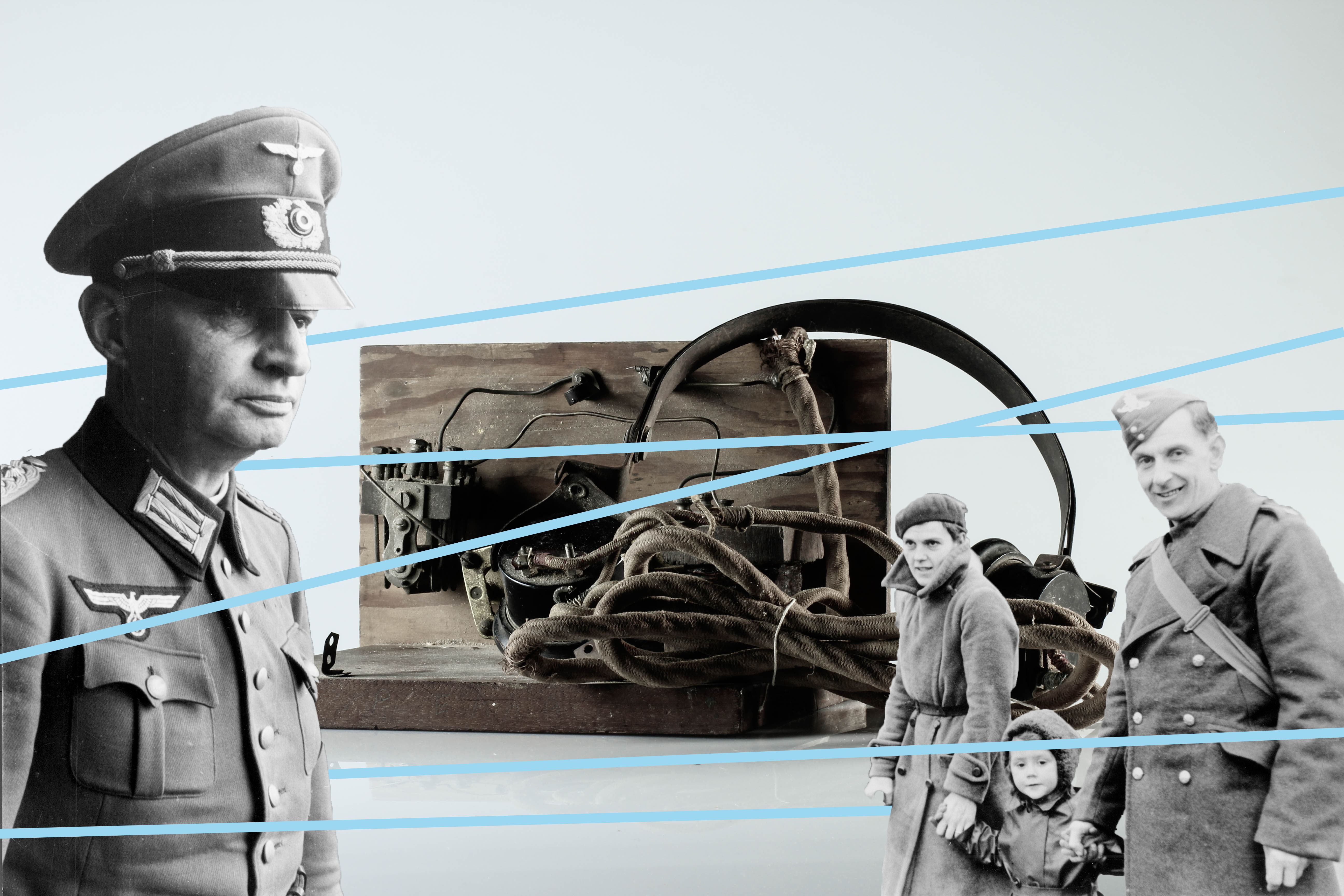
To create these several designs, I used archival images of German soldier from société jersiaise. The quick selection tool on photoshop allowed me to cut out the soldiers from their original photo and place it onto the still life photographs. Before using the line tool, I adjusted the figures using the transformation tool to change the size and placement. What I enjoyed the most about editing these photomontages was adding geometrical shapes onto the images to have the same contextual meaning as Milach’s book. The figures are restrained and caged by these lines to convey the restrictions the German’s introduced into Jersey when it was Occupied.
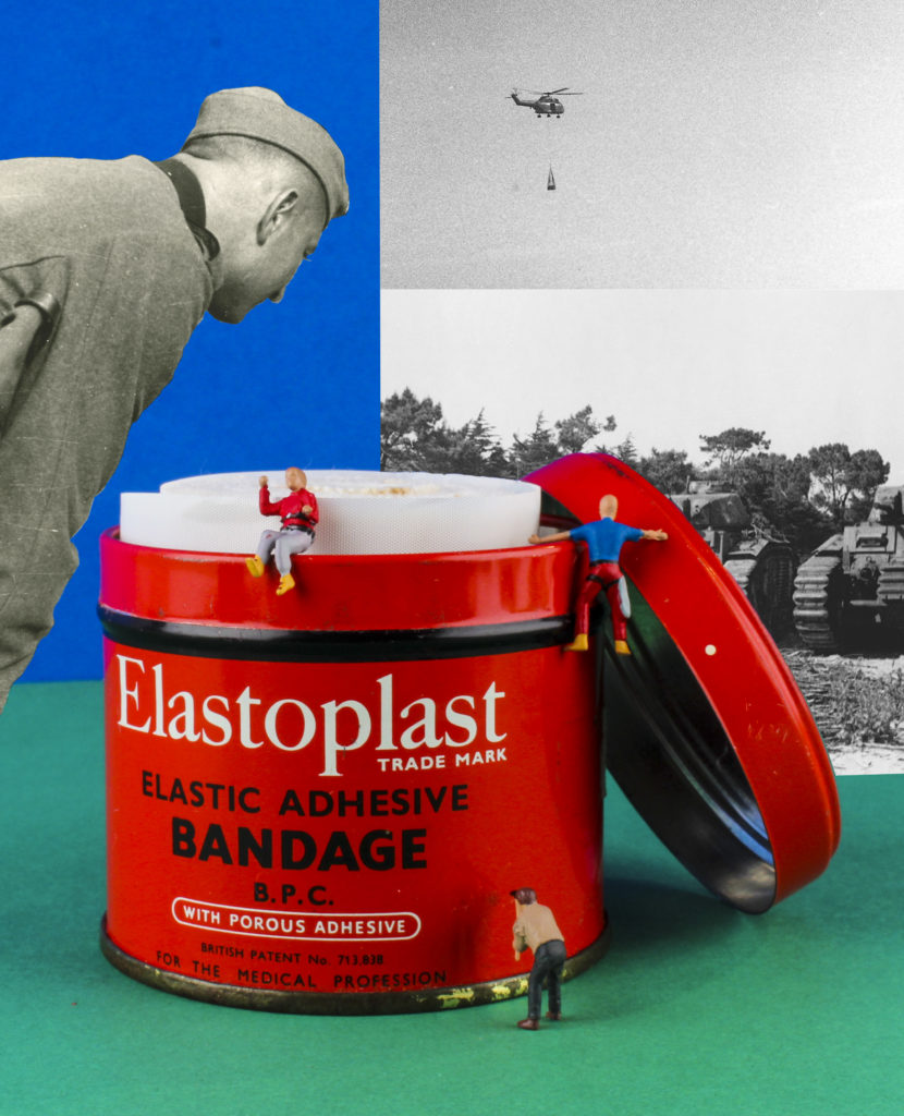
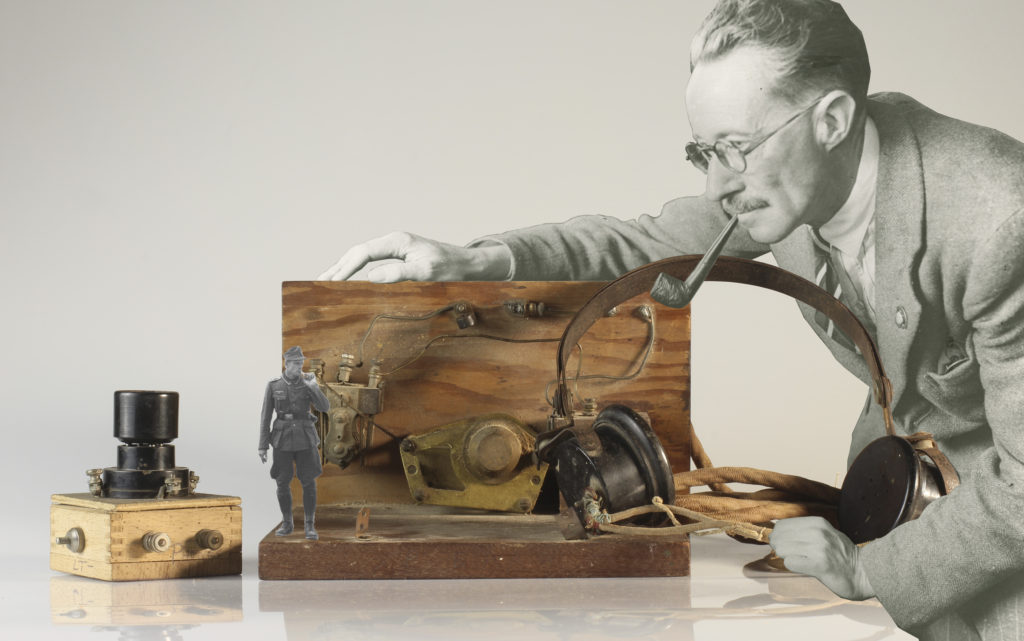
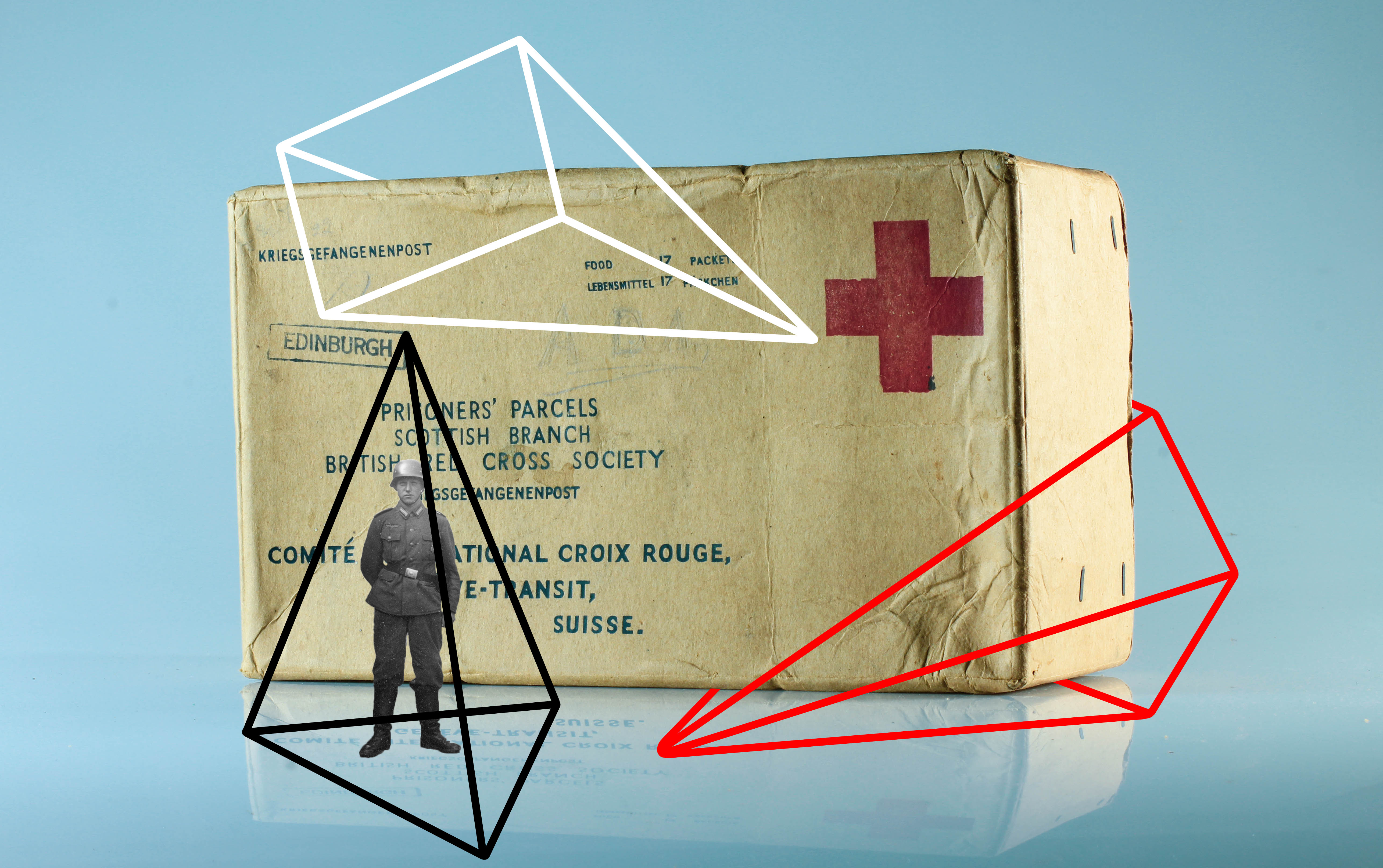
After taking a series of images using the studio layout, I began to combine multiple elements to create photo-montages. In the initial studio photograph, I took inspiration from Rafal Milach’s “The First March of Gentlemen”, and used contrasting card colours to provide the background for the objects. I used one colour as a back wall, and a it’s complimentary colour as the ground colour in order to create an obvious separation between the 2. I then took a photograph of a series of objects taken from the Jersey archives, and for one of the images I made use of a number of tiny figurines. I then used Photoshop to create a montage out of these original images, and a series of archive images, taken during WW2.
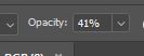
I produced this first image after taking an initial photograph of the objects and figurines, and then used Photoshop to edit in the faded outlines of the soldiers. I did this to try and create a representation of the memories of the war (represented by the faded soldiers) in contrast to the present day (represented by the figurines of the elderly people). I produced this image to represent the reality of many individuals who survived occupation and war, as they now all live with constant memories and reminders of the experiences they survived during the war.
I reduced the opacity of the eraser tool to create the faded effect on the soldiers (which I had separated from the background by using a different layer)
After reducing the opacity of the soldiers, I then outlined each one in white, in order to separate them from the background and make them more eye catching.
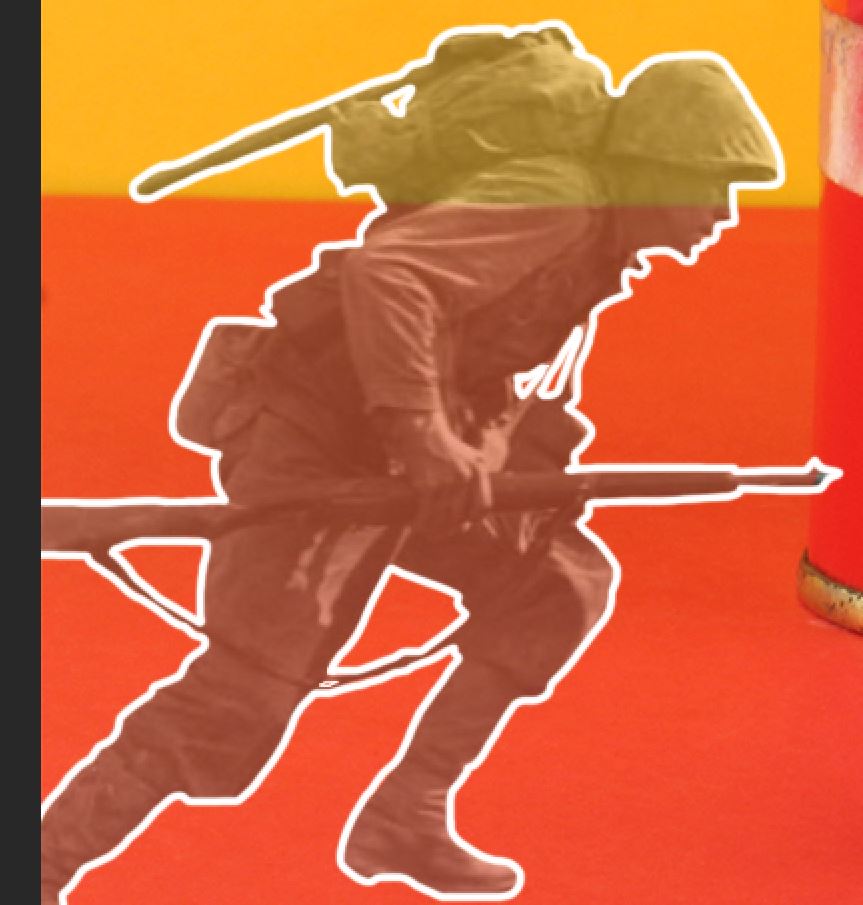
I then added a text detail in order to sum up the meaning of the image. I did this by using a rip-effect stock image and editing it to match the colour of the background, and so it looks like the text is ripping through the image.
I then adjusted the contrast of the image, in order to make the bold colours stand out more, reflecting Rafal Milach’s own style of work.
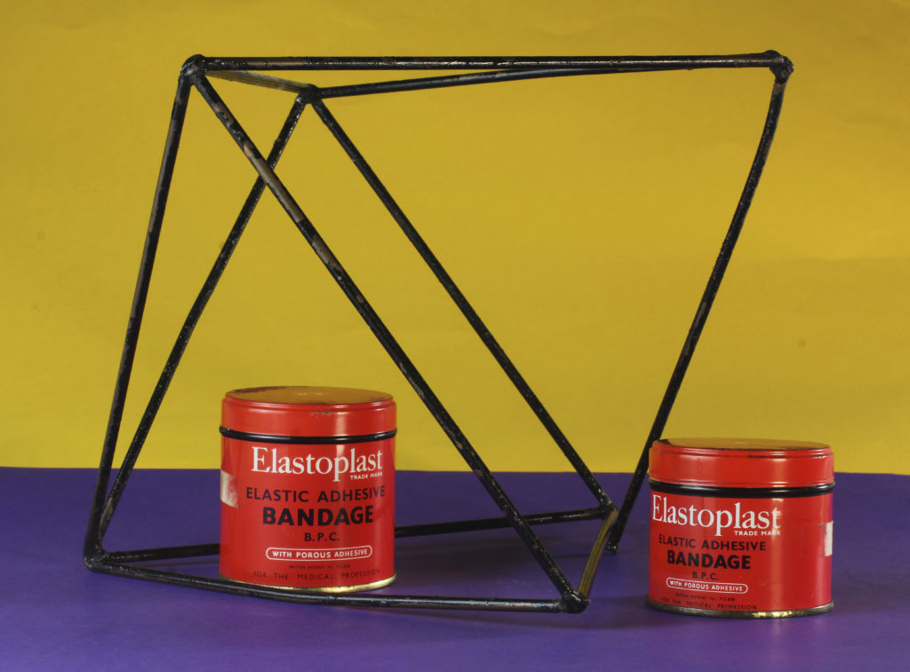
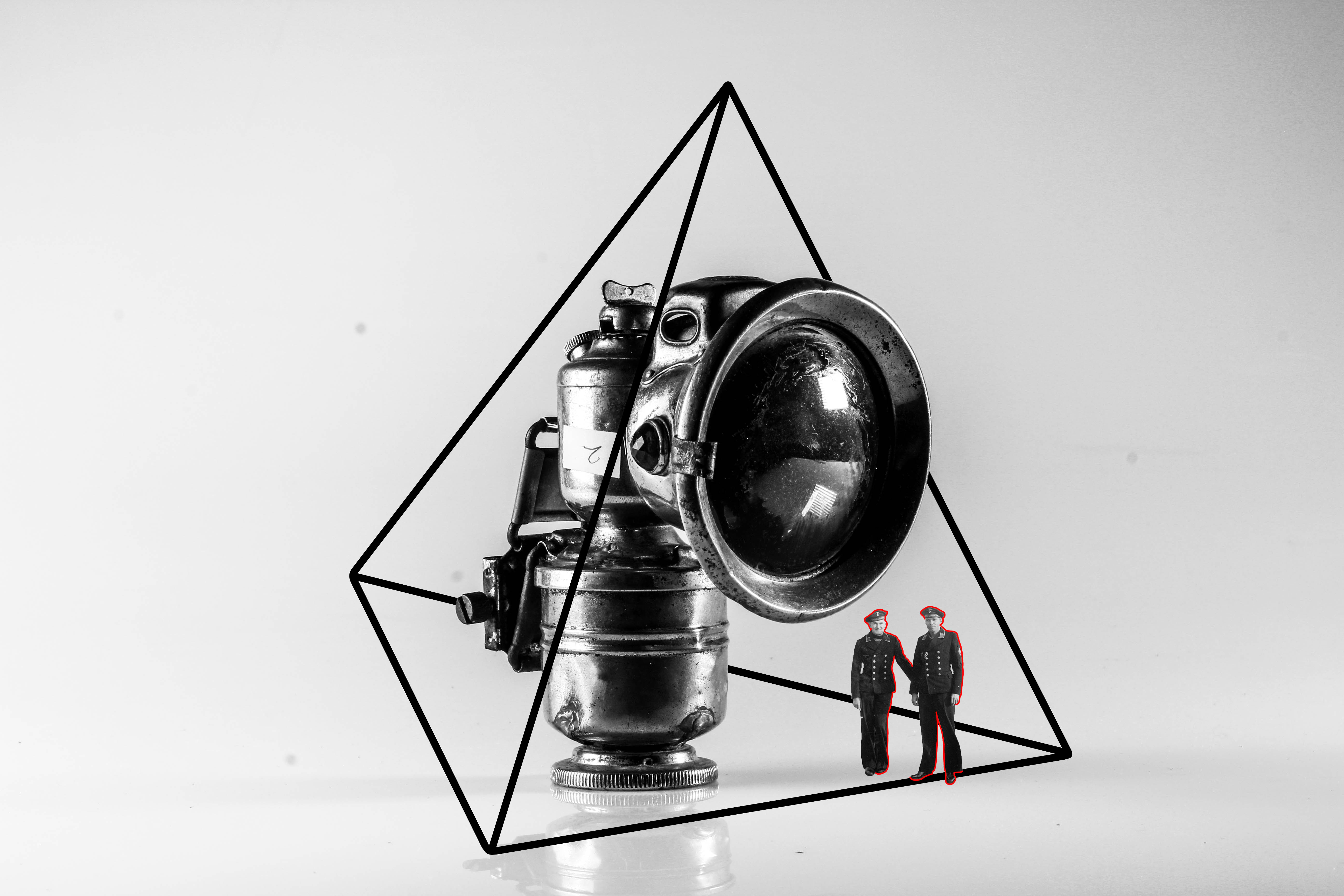
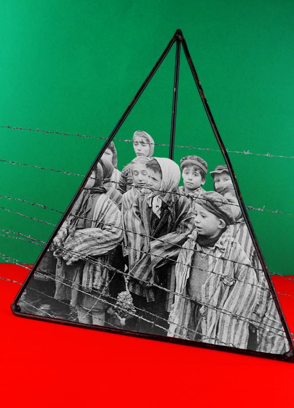
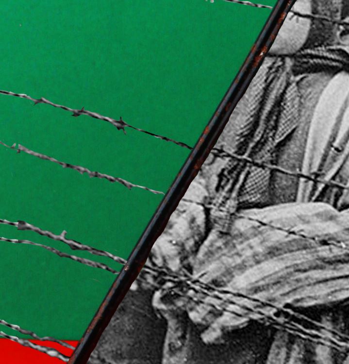
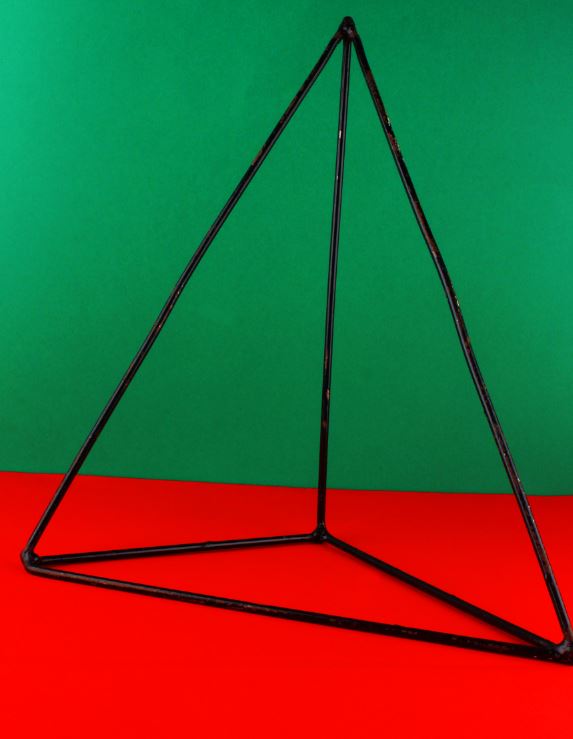
For my second photo-montage, I made use of 2 complimentary colours in the background, and photographed a pyramid maths object (taking inspiration from Rafal Milach). I then used an archived image of children in a concentration camp, and edited the image so it looked like the children were trapped inside of the object. I did this to reflect the horrors that many children faced during the war, while also contrasting this with the use of an object used in school, which is supposed to be a safe environment for children.
In order to fit the image of the children into the pyramid, I skewed the image and altered the perspective to fit the angles of the pyramid itself.
I then cut out the parts of the image that did no fit in the pyramid, but left the barbed wire in, while erasing the area where the wire crossed the pyramid in order to make the effect that the wire crosses on the inside of the object, which I feel is a small but effective detail.
This was the original image before adding in the archival image. I heightened the contrast of this image to make the colours contrast even more.
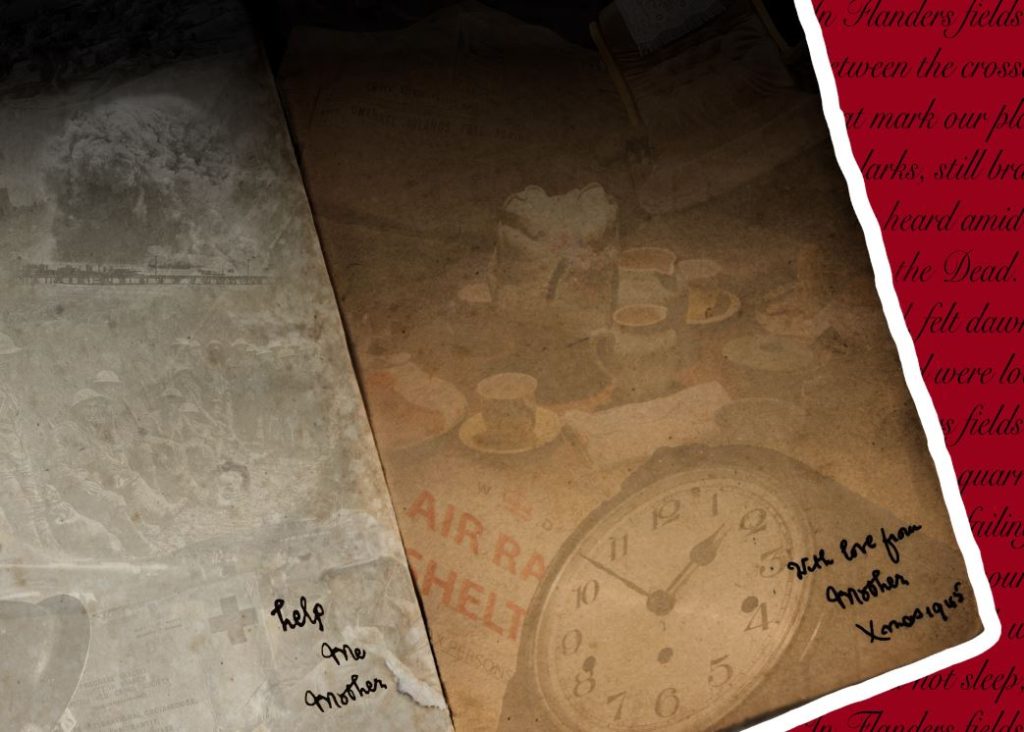
For the above image, I took a more experimental approach. I took inspiration from the note within the original book, saying “with love from mother, Xmas 1945”. I created a contrast between the 2 sides of the book, with the memories from home on the right, and the horrors of the trenches on the left. I did this to uncover the reality of war, and the differences between experiences of different people during WW2.
I used a number of layers to add the objects and scenes onto the pages of each book. I then merged the boarders of these images together and overlapped them, and reduced the opacity significantly.
This piece of text was added to contrast the text on the other side of the page. I created this text by cutting and pasting letters found on the original text, and then going over all of the letters with black.
Finally, I added a poem to the background in order to add to the atmosphere of war and suffering, and made the background red to coincide with the work of Rafal Malik.
These are my outcomes from the editing in camera as well as on Lightroom in the photomontage. I feel these outcomes have worked well and I am happy with the way they have turned out that I feel some could be used in my newspaper and final zine. The outcomes have come in response to Rafal Milach I feel I have been able to create successful outcomes in response to his work with experimenting with the coloured backgrounds, seeing what colours worked together and seeing what colours worked well with each other to create good effects in camera. I have enjoyed trying to work with creating and composing arrangements against the coloured backgrounds as I feel it adds something to the photographs and makes them more interesting to look at. I will be happy to experiment and use these in my final zine as I feel that the are successful outcomes. Something that I feel could have gone better were maybe being getting the lighting slightly better or the horizontal line straighter as I found slight difficulty in getting them connected correctly to create a perfectly straight line. Using the small figured people in the photographs helped to add to the effect I believe in the meaning of the photographs as well as in response to Rafal Milach, I think this helped to tell more of a story and created for a better, more interesting photograph rather than just composing with the objects it added a bit more meaning to the photographs portraying where the objects where from.
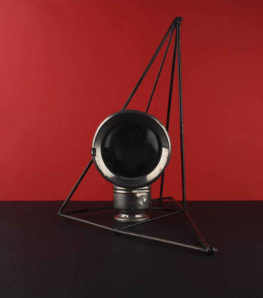
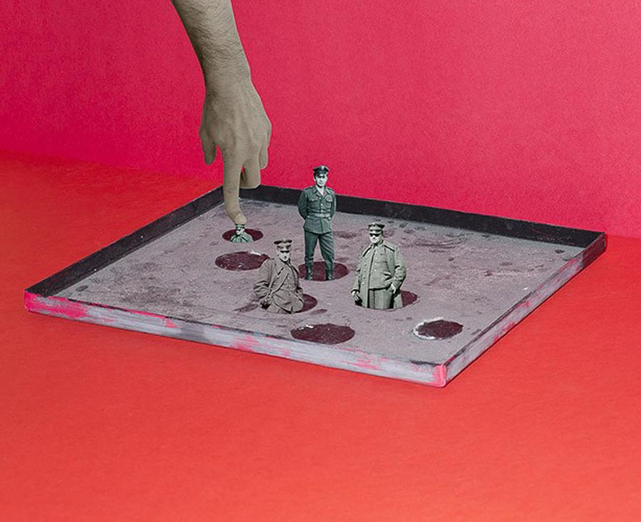
Below shows two examples of my in camera working with the photomontage. On the right I have worked and started to experiment with the use of the geometric shape blocks and the archival material. I have developed a few lot of photographs that incorporate the use of the shapes on the coloured backgrounds as well as the white backgrounds. Being influenced by Rafal Milach I tried to enclose some of the objects almost in the shapes and the cages however I did this in-camera rather than in later editing, but I will want to experiment with using archival images and incorporating them into my photographs. On the left shows my other experiments when I was working with the figures as well as the geometric shapes this is another version of incorporating the people and other aspects into the photographs in response to Milach.
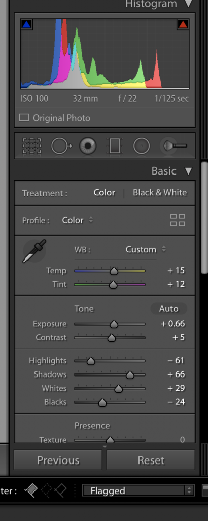
Lightroom Editing
In lightroom I have been working in just updating contrasts and exposures as well as tints to work an enhance the photographs. I have not worked in photoshop as I have wanted to work mainly in camera working for this experiment with the small figures and the coloured backgrounds as well as the geometric shapes. I have worked with the brightness and contrasts of the photographs to enhance the coloured backgrounds I have used to work with the objects in front and help where there may have been some shadowing or dark patches from lighting angles which is the majority of the working I have produced in Lightroom rather than working in photoshop or the camera to particularly edit the photographs.