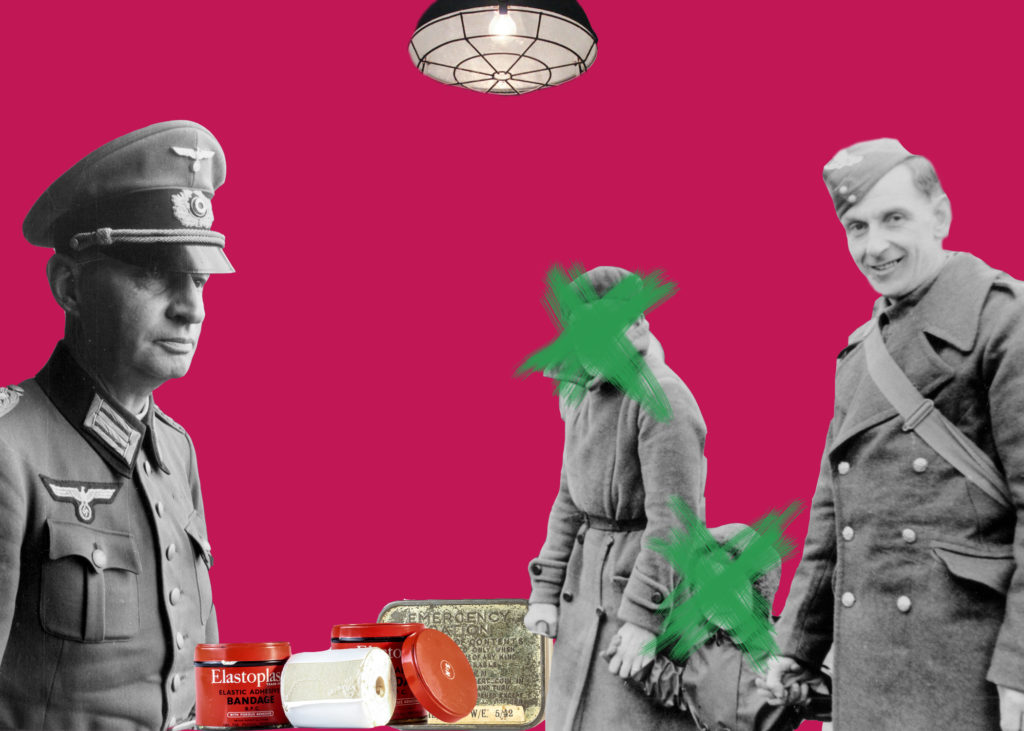
I experimented with montage inspired by Rafal Milach by using photoshop. I used a combination of archival images, my images taken in the studio of occupation objects and images I took in the Jersey War Tunnels.
Making The Montage

I added a very childish 'candy' coloured backround which I took inspiration from Milach, and then I just cut and moved the images into places I like. I like the combination of black and white images with the coloured images. At first I added all the people and the plasters and ration tin, however I didn't like all of the negative space up at the top so I searched through my war tunnels and thought adding a light would create more of an aptmosphere.
Extension
I like how my montage turned out however, I want to further extend my photomontage and make it multi-media. I like how Milach's book had a string to wrap around the book, so I want to incorperate string within my piece. I also want to produce another copy but add paint into the montage. I feel like painting over the faces to make the people anomynous could make the image more interesting. It can also represent the many people who were involved in the war, even if it was day-to-day, but aren't recognised because of how it affected everyone, there were only a few specific individuals that were recogniseable because of the war.
The Painted Montage

I chose to paint the picture in photoshop. I chose a brush stroke that resembled a mor rough looking paint brush stroke to make it look more realistic. I also chose the paint colour to be green as it is a complimentary colour to the pink on the colour wheel. I chose to only paint on the female faces as the males are both obviously soldiers. The mother may have been involved with the soldiers but I wasn't sure so I decided to hide her face benteath the paint. I do like how the image turned out, however I feel that something is missing between the soldier on the left and the woman. I don't like how much negative space there is between so next time I could either extend how far the paint goes or I could make the background two-tones to make it more dynamic.
The Sewed Montage

For this montage, I wanted to sew around the individuals to fill out some of the negative space. I decided that I wanted to sew what looked like cages around the figures to connote the almost invisible cages of war. I also decided that each figure should have a certain colour for their cage as the war affected everyones lives in a unique way, however the 'leading officer' on the left also features the colours of the individuals as he has more reign and control over the other people, meaning that he has influence on their cages. The officer has his own colour though, blue, as the war also has a cage on him. On the way to school it was raining and my piece got very wet. This affected some of the image especially the corners, however I don't mind how it frayed the corners, it gives the image a slightly more aged and used feel. I also like how I didnt sew traditional cage shapes, this reflects how the individuals cages are all unique and affected them all in different ways. Next time I would purchase some different coloured string such as green as it goes along well with the background's colour wheel.
Montage Food Stamp

I liked the coloured background of the previous montages I had created, however I feel like it can get repetitive and I wanted to created a background that had a bit more meaning to the war. In the studio, I had taken a photograph of four food stamps that the Jersey Archives had lended to us. I still wanted to feature people in my montage as the war was about the beliefs of individuals and nations. The war was people based and I wanted to keep my montages people based. I therefore chose to cut around an image I took of two war survivers: Hedley and Joyce. I also chose to cut around two archival images: a doctor and a woman from a wealthy class. I wanted to feature people both from the past of the war and people from the present from the war to display how although the war is over, it still lives on. With the food stamps, I cut out all of them individually, duplicated the layers multiple times and layered them around the background until I thought it looked aesthetically pleasing. Overall I like how the montage turned out, however, next time I will enlarfe the image of all of the individuals, especially the doctor and the 'posh' woman to fill in some of the space at the top.
