still life photography

PHOTOSHOOT PLANNING:

HOW: In order to do this photo shoot, a little bit of planning and preparation had to go into it beforehand as the correct setup was essential in order to create the images. I used a one point lighting system and black fabric in order to create the base for the items.

WHERE: I stationed the items on top of a fairly tall table as I found it would be much more beneficial if the items were at eye level as most still life imagery is captured from this level.

WHY: In order to explore history and a variety of visual arts, still life was an interesting topic to research and find out about as it is a very classical art form which spans hundreds of years into the past.

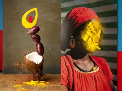
WHAT: In order to create the images I used items which would fit the theme of still life best, using pottery, vegetables, and silverware. Although there is a clear lack of variety, I used what I had at the time to create these images.

WHEN: I took these images at night as it was crucial to create chiaroscuro lighting within the images, this could only be done if there was one light source and a completely dark background.

EDITING:

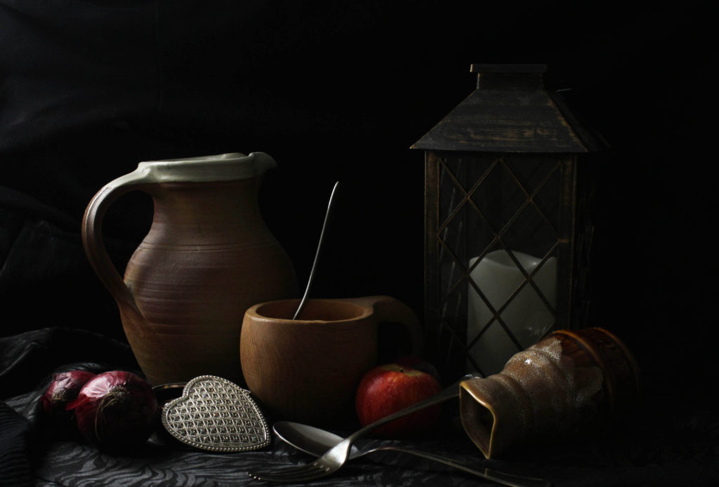
For most of the images the best approach to editing the images was to do a couple simple adjustments. Firstly, in order to make them professional and neat I decided to crop them a fair amount as during the set up process, the black fabric which I used was not wide enough to cover the entirety of the screen, leaving white edges which disturbed away from the actual still life. I also adjusted the tilt shift on the images as it was crucial that the still life is situated on a horizontal surface. I then drastically increased the contrast of the images as one of the key elements of still life is the drastic change from highlights to shadows therefore it was necessary to bring this down. I lastly also increased the saturation of the images as I was keen to make the yellow and red apples in the image a focal point.

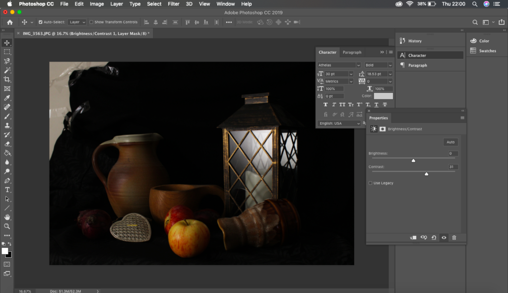
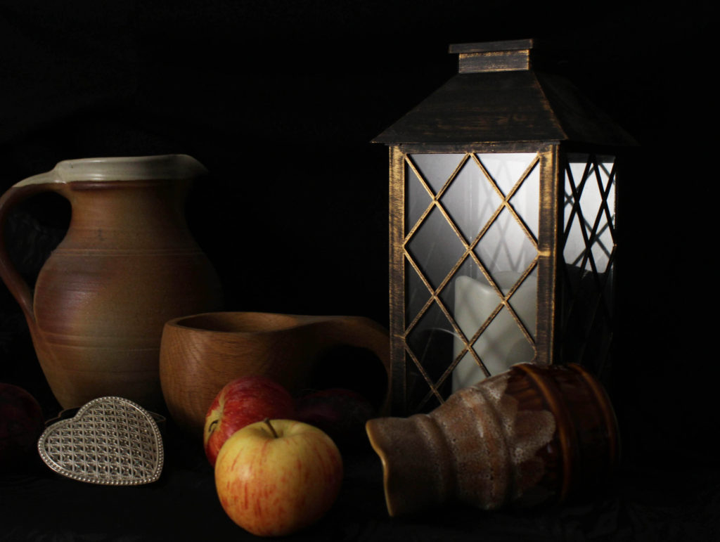
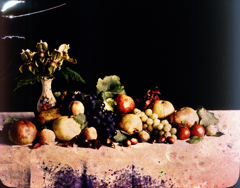
This image is a good example of how a simple increase in contrast, saturation and cropping can make an image look a lot more professional and much more believable that this is an actual still life set up.

SUCCESSFUL IMAGES:

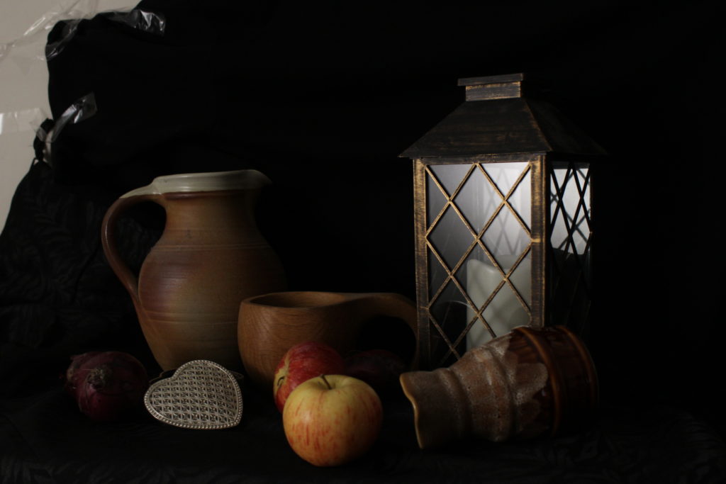
MOST SUCCESSFUL IMAGE:

IMAGE ANALYSIS:

VISUAL:

In terms of the visual aspects of the image, it is extremely impactful in various aspects. Firstly the contrast between the backdrop and the highlights is very intense. I used chiaroscuro lighting in order to achieve this effect by only using one light source, this created a very effective recreation of traditional still life imagery. The deep and dark black backdrop is very indicative of the style as the majority of still life imagery displays this as well. One of the focal -points of the image is the apples which are centered in the bottom half of the image, the bright red and yellow makes them extremely noticeable among the muted color scheme of the other objects. There is no set arrangement with the other objects and they appear to be just left as they have been there, used and left. There is no real sense of depth within the image as the black background merges the layers of the image together almost into one.

TECHNICAL:

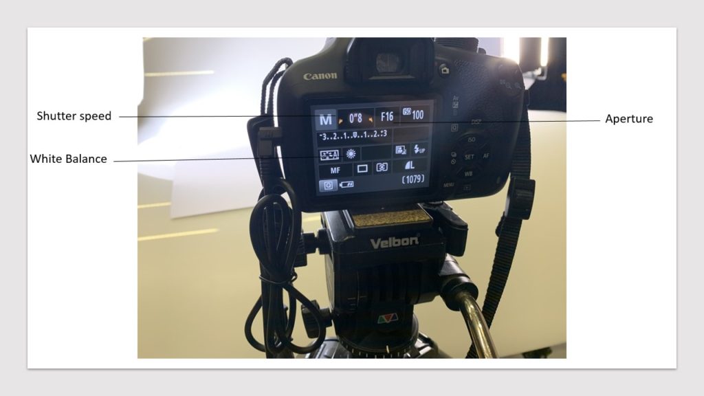
In terms of the technical set up of the still life, I had to put in a bit of thought into how and where to do it at the time. Firstly it was essential that I did this during night time as I needed a dark surrounding in order to create the chiaroscuro lighting which can be seen in the image above. I also had to set up a one point light system which in order to create the chiaroscuro lighting, it also gave it the authentic still life feel which I was going for. In terms of the camera setting, I used the manual setting on my camera as it was a fairly dark environment and needed ti increase the exposure to a certain level in order to avoid an under exposed image. I needed to also increase the aperture to let in as much light as possible into the camera. The most important part of this photo shoot was definitely the composition of the items within the still life. The arrangement and items which I chose, very much fit the still life concept in terms of being historically appropriate.

CONCEPTUAL:

When creating this still life imagery, the main concept which I was trying to convey was the period specific features of still life, recreating them with photography instead of other artistic mediums. All of the composition rules come into play here; that’s why still life shots are so valuable as a learning tool. You have the rule of thirds, leading lines, diagonals, geometric shapes, and visual weight (determined by either the object’s size or color). Every subject of every still life photo has some sort of appealing feature. It might be the shape, or possibly its color. Sometimes it is the object’s function, its texture and so forth. There is something interesting.

CONTEXTUAL:

Still life photography is a genre of photography used for the depiction of inanimate subject matter, typically a small group of objects. It is the application of photography to the still life artistic style. An example is food photography.This genre gives the photographer more leeway in the arrangement of design elements within a composition compared to other photographic genres, such as landscape or portrait photography. Lighting and framing are important aspects of still life photography composition.Popular still life images include groups of flowers, food, and desk space, but still life photography is not limited to those 3 categories. Typically, still life’s are not close up to the subject nor far away, but at a very medium angle. The art in still life photography is often in the choice of objects that are being arranged and the lighting rather than the skill of the photographer.

My montage’s

I experimented with montage inspired by Rafal Milach by using photoshop. I used a combination of archival images, my images taken in the studio of occupation objects and images I took in the Jersey War Tunnels.

Making The Montage

I added a very childish 'candy' coloured backround which I took inspiration from Milach, and then I just cut and moved the images into places I like. I like the combination of black and white images with the coloured images. At first I added all the people and the plasters and ration tin, however I didn't like all of the negative space up at the top so I searched through my war tunnels and thought adding a light would create more of an aptmosphere.

Extension

I like how my montage turned out however, I want to further extend my photomontage and make it multi-media. I like how Milach's book had a string to wrap around the book, so I want to incorperate string within my piece. I also want to produce another copy but add paint into the montage. I feel like painting over the faces to make the people anomynous could make the image more interesting. It can also represent the many people who were involved in the war, even if it was day-to-day, but aren't recognised because of how it affected everyone, there were only a few specific individuals that were recogniseable because of the war.

The Painted Montage

I chose to paint the picture in photoshop. I chose a brush stroke that resembled a mor rough looking paint brush stroke to make it look more realistic. I also chose the paint colour to be green as it is a complimentary colour to the pink on the colour wheel. I chose to only paint on the female faces as the males are both obviously soldiers. The mother may have been involved with the soldiers but I wasn't sure so I decided to hide her face benteath the paint. I do like how the image turned out, however I feel that something is missing between the soldier on the left and the woman. I don't like how much negative space there is between so next time I could either extend how far the paint goes or I could make the background two-tones to make it more dynamic.

The Sewed Montage

For this montage, I wanted to sew around the individuals to fill out some of the negative space. I decided that I wanted to sew what looked like cages around the figures to connote the almost invisible cages of war. I also decided that each figure should have a certain colour for their cage as the war affected everyones lives in a unique way, however the 'leading officer' on the left also features the colours of the individuals as he has more reign and control over the other people, meaning that he has influence on their cages. The officer has his own colour though, blue, as the war also has a cage on him. On the way to school it was raining and my piece got very wet. This affected some of the image especially the corners, however I don't mind how it frayed the corners, it gives the image a slightly more aged and used feel. I also like how I didnt sew traditional cage shapes, this reflects how the individuals cages are all unique and affected them all in different ways. Next time I would purchase some different coloured string such as green as it goes along well with the background's colour wheel.

Montage Food Stamp

I liked the coloured background of the previous montages I had created, however I feel like it can get repetitive and I wanted to created a background that had a bit more meaning to the war. In the studio, I had taken a photograph of four food stamps that the Jersey Archives had lended to us. I still wanted to feature people in my montage as the war was about the beliefs of individuals and nations. The war was people based and I wanted to keep my montages people based. I therefore chose to cut around an image I took of two war survivers: Hedley and Joyce. I also chose to cut around two archival images: a doctor and a woman from a wealthy class. I wanted to feature people both from the past of the war and people from the present from the war to display how although the war is over, it still lives on. With the food stamps, I cut out all of them individually, duplicated the layers multiple times and layered them around the background until I thought it looked aesthetically pleasing. Overall I like how the montage turned out, however, next time I will enlarfe the image of all of the individuals, especially the doctor and the 'posh' woman to fill in some of the space at the top.

Occupation VS Liberation – Classical Photographer

Francis Foot:

“Francis Foot was born in 1885, the son of Francois Foot (1847-1918) and Louisa Hunt (1843-1934). Francois was a china and Glass dealer in Dumaresq Street, at a time when the area was one of the more affluent in St Helier. His son started his working life as a gas fitter. However, he soon became fascinated by photography and the early phonographs and gramophone records and realised that he could earn a living from them.

So the family took on a second shop in Pitt Street, where Francis worked as a photographer, while his father and mother sold gramophones, records and other wares in Dumaresq Street. After his father’s death, Francis concentrated the business in Pitt Street.

Francis married Margaret Vernon shortly before the First World War and the couple had four children, George (1914- ), Stanley (1915- ), Dora (1917- ) and Reg (1920- ).”
https://www.theislandwiki.org/index.php/Francis_Foot

Analysing Image:

Francis Foot

Technical:

This images was taken with natural lighting as this photo was taken a long time ago. It is difficult to establish the aperture and shutter speed as this photo was taken a very long time ago and a different camera was used.

Conceptual:

This photo was taken at the beach, with Francis’ two kids George and Stanley playing in the sand. The idea behind this photo is to show the kids whilst they are having fun and enjoying their time.

Contextual:

Additionally, this photo was taken in a environmental photo style. It could also be taken to document the two boys lives and to keep memories.

Visual:

This image is in black and white which gives a vintage feel to the photo. The under exposure and sharpness of this photo shows that it is an old photo and that it was taken a long time go.

Still-Life: Contextual Studies

Origin and Definition of Still Life:

“A still life (also known by its French title, nature morte) painting is a piece that features an arrangement of inanimate objects as its subject. Usually, these items are set on a table and often include organic objects like fruits and flowers and household items like glassware and textiles.

The term “still life” is derived from the Dutch word stilleven, which gained prominence during the 16th century. While it was during this time that the still life gained recognition as a genre, its roots date back to ancient times.

The earliest known still life paintings were created by the Egyptians in the 15th century BCE. Funerary paintings of food—including crops, fish, and meat—have been discovered in ancient burial sites. The most famous ancient Egyptian still-life was discovered in the Tomb of Menna, a site whose walls were adorned with exceptionally detailed scenes of everyday life.

Ancient Greeks and Romans also created similar depictions of inanimate objects. While they mostly reserved still life subject matter for mosaics, they also employed it for frescoes, like Still Life with Glass Bowl of Fruit and Vases, a 1st-century wall painting from Pompeii.

Northern Renaissance artists popularized still life iconography with their flower paintings. These pieces typically showcase colorful flora “from different countries and even different continents in one vase and at one moment of blooming” (Metropolitan Museum of Art) and often do not feature other subject matter. These paintings rose to prominence in the early 17th century, when Northern Renaissance artists grew increasingly interested in creating realistic studies of everyday items.

Dutch Golden Age artists took this interest in detailed floral art a step further with their vanitas paintings. Vanitas paintings are inspired by memento mori, a genre of painting whose Latin name translates to “remember that you have to die.” Like memento mori depictions, these pieces often pair cut flowers with objects like human skulls, waning candles, and overturned hourglasses to comment on the fleeting nature of life.

Unlike memento mori art, however, vanitas paintings “also include other symbols such as musical instruments, wine and books to remind us explicitly of the vanity of worldly pleasures and goods” (Tate).”
https://mymodernmet.com/what-is-still-life-painting-definition/

Analysis of Key Image:

Image result for Still Life with a Turkey Pie
Still Life with a Turkey Pie – Pieter Claesz

In this painting, you can see luxurious products and Asian objects spread across a table. The theme of Asian items are implicit, as many now would not be a able to tell they were originated from Asia. Some examples of Asian items are the ingredients in savoury pies, which contain cinnamon, mace, cloves and ginger.

The Asian items suggest that there is a sense of wealth as they have been imported over and usually imported things back then were very expensive and hard to get. Also the amount of food can suggest wealth as lower class could not afford this much food.

There is a melancholy feel to this photo becasue of the use of dark and neatural tones and colours. This could imply a sense of sadness and loneliness. Also, the turkey could suggest that they are feeding a large family.

Emile F. Guiton – Autochromes:

The Autochromne process was invented by two brothers on the 10th of June 1907 by Louis and August Lumière. To an invited audience of 600 the brothers demonstrated their newest invention, the first combined system additive colour screen process.

Autochrome involved covering a glass plate with a thin wash of tiny potato starch grains dyed red, green, and blue, which then creates a filter. A thin layer of emulsion was added over that and when the plate was flipped and exposed to light, the resulting image could be developed into a transparency. https://www.nationalgeographic.com/news/2015/01/150131-pictures-autochrome-color-photography-history-people-culture/

Additionally, autocrhome was made by passing transparent starch grains through a series of sieves to isolate grains between ten and fifteen microns thick. Next, microscopic starch grains were then separated into batches, then dyed red, green and violet, mixed together and spread over a glass plate coated with a sticky varnish. Next, charcoal powder was spread over the plate to fill in any gaps between the coloured starch grains. A roller with over five tons per square centimeter of pressure was applied in order to spread the grains and flatten them out and then the plate was coated with a panchromatic photographic emulsion.

Examples of Emile’s work:

Emile F. Guiton
Emile F. Guiton
Emile F. Guiton
Emile F. Guiton
Emile F. Guiton

Lorenzo Vitturi:

“Lorenzo Vitturi (b. 1980, Italy) is a photographer and sculptor based in London. Formerly a cinema set painter, Vitturi has brought this experience into his photographic practice, which revolves around site-specific interventions at the intersection of photography, sculpture and performance. In Vitturi’s process, photography in conceived as a space of transformation, where different disciplines merge together to represent the complexities of changing urban environments. 

Vitturi’s latest solo exhibitions have taken place at FOAM Museum in Amsterdam, The Photographers’ Gallery in London, at Contact Photography Festival in Toronto, and at the CNA in Luxembourg. Vitturi also participated to group exhibitions at MaXXI in Rome, at Centre Georges Pompidou in Paris, at La Triennale in Milan, at the Shanghai Art Museum and at K11 Art Space in Shanghai, and at BOZAR in Brussels. 

Following the presentation of Dalston Anatomy in 2013 as a book, multi-layered installations and performance, Vitturi’s latest photo-book ‘Money Must Be Made’ was published by SPBH Editions in September 2017.” https://www.flowersgallery.com/artists/view/lorenzo-vitturi

Examples of his work:

Lorenzo Vitturi
Image result for Lorenzo Vitturi
Lorenzo Vitturi
Image result for Lorenzo Vitturi
Lorenzo Vitturi
Image result for Lorenzo Vitturi
Lorenzo Vitturi

Irving penn – still life

Irving Penn was an American photographer known for fashion photography, portraits and mostly still life. He was born on June 16th 1917 and died October 7th 2009. Penn attended the Philadelphia Museum School of Industrial Art, where he studied painting, drawing and graphics. Penn first worked as a freelance designer for three years. After this he was invited to go join vogue magazine. He worked on the layout of the magazine before beginning photography. He then worked their until 1950. After this he began his own photography studio.

Penn’s still life images use a collection of lots of different things such as food and other objects. The imagery depicted within Penn’s still life images varies a lot, and usually has lots of different items that aren’t related.

The image above is using artificial lighting. It is placed in such a way so that shadows around the sides are completely removed and only shadows within the objects remain.

This image consists of lots of different items, from playing cards, to dice and chess pieces. These items add colour to the image and create an interesting look with the lighting reflecting off of them.