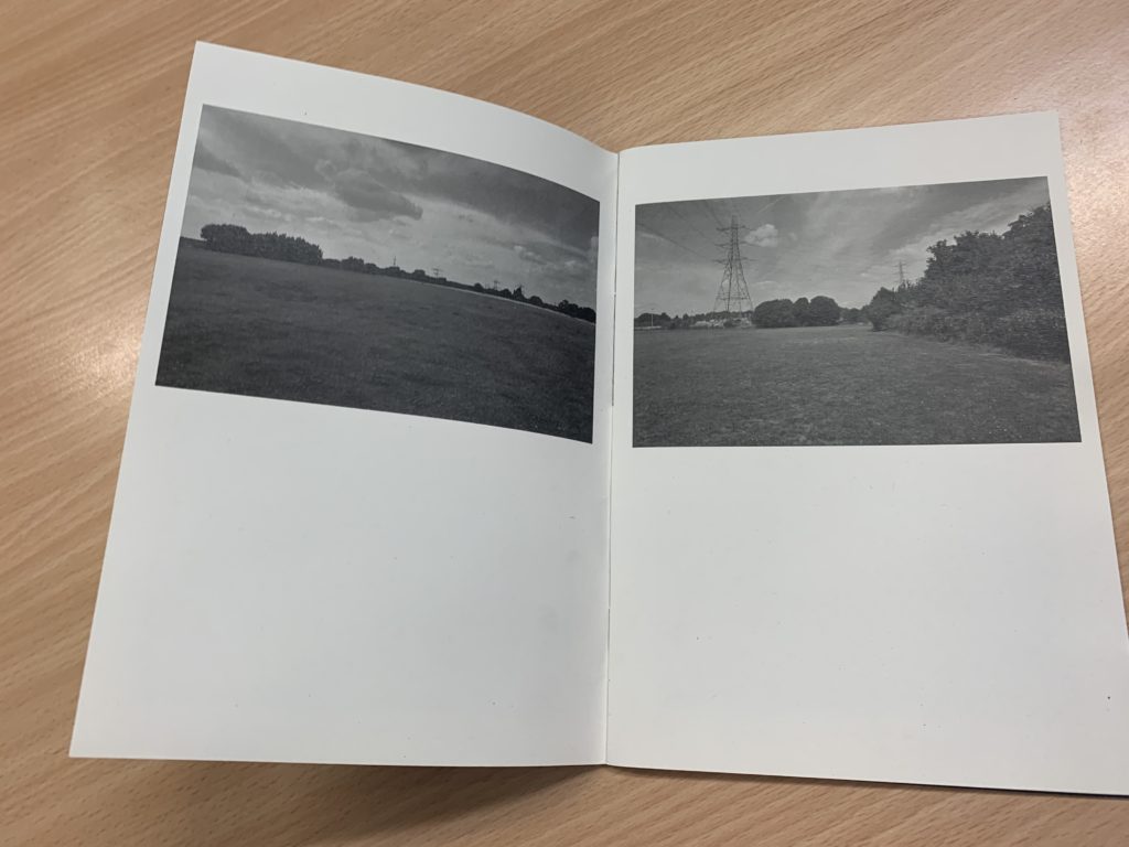
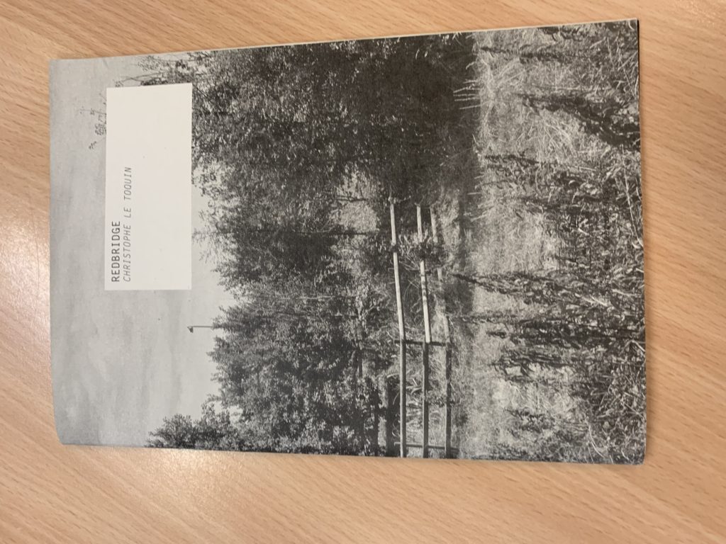
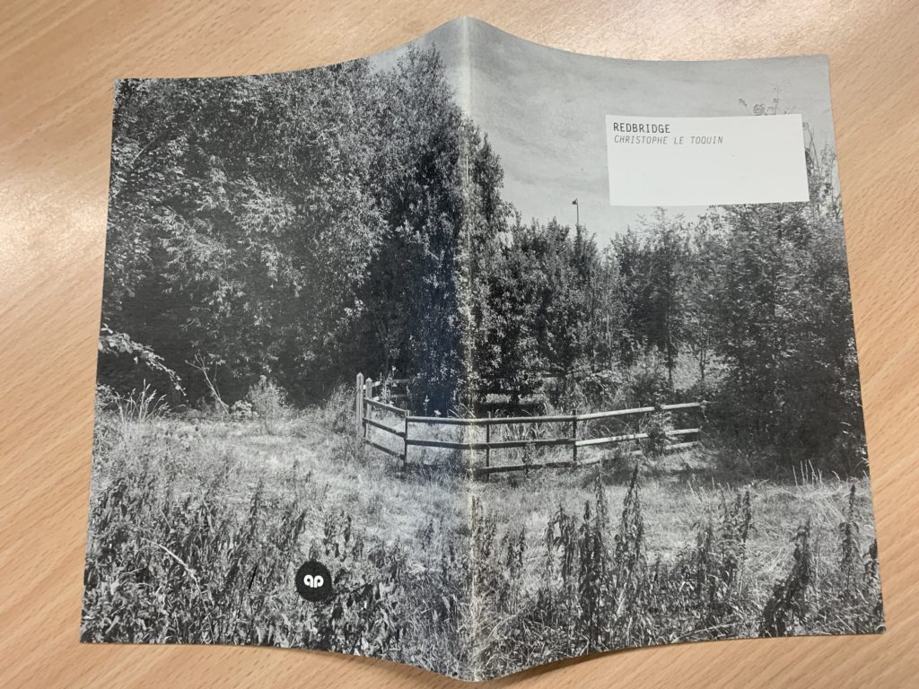
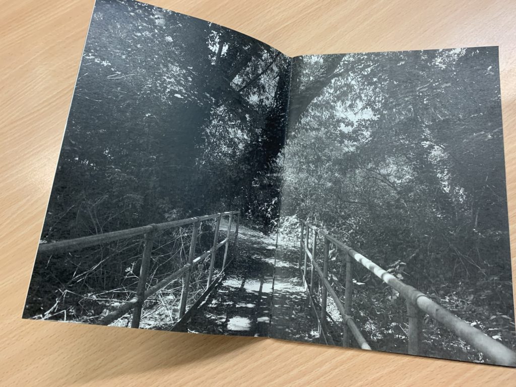
The zine I will be looking at is ‘Redbridge’ by Christophe Le Toquin. After looking through several physical zines, I liked the simplicity of this particular one. The images are laid out interestingly on the pages, juxtaposing each other and some being placed the same. The full bleed double page spreads let the images really show their content and it looks very appealing. The orientation is portrait which i think is ideal for this type of small A5 zine. There doesn’t seem to be a particular narrative or sequence to the images only that’s they’re mostly all the nature of the Redbridge area of London. The cover is a wrap around image which I quite like. The book is made up mostly images and little if not no text. There are no other design elements which i like, the book is kept simple.
My favourite page is where he has taken two photos and put them next to each other on different pages but it looks like its a panorama.


