First half:

Mini Zine:
Evaluation:

First half:
Mini Zine:
Evaluation:
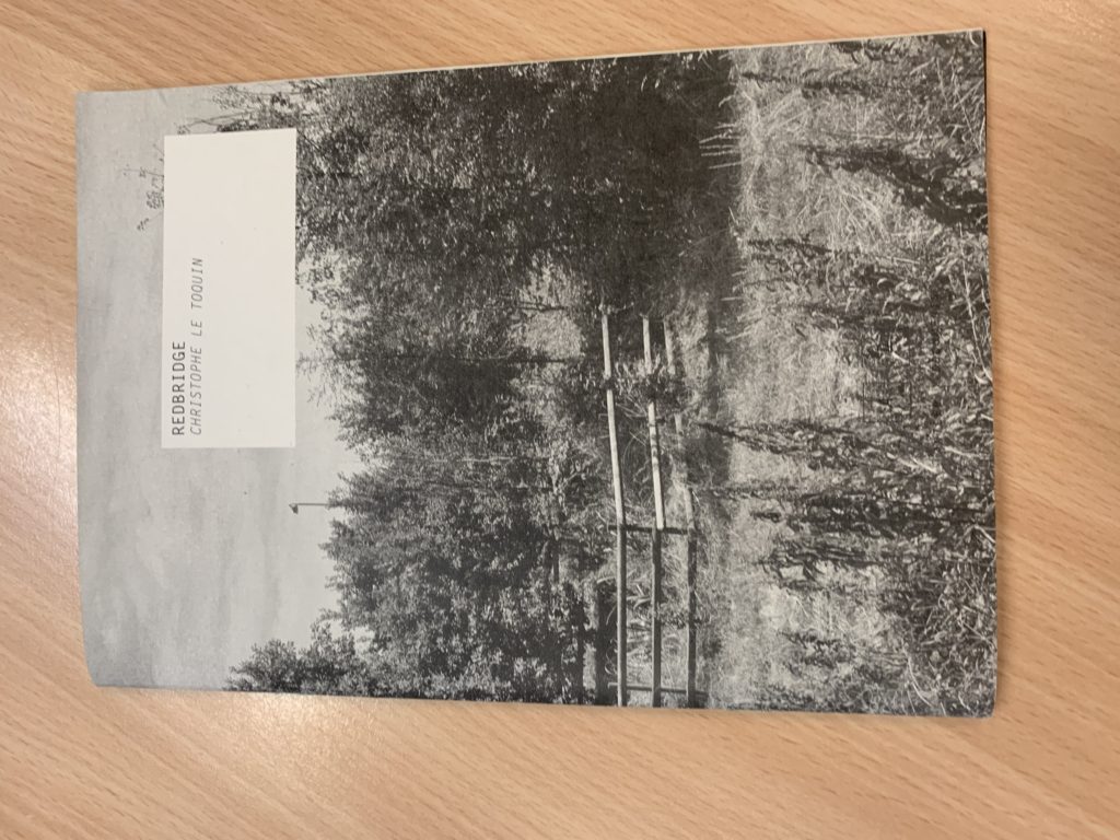
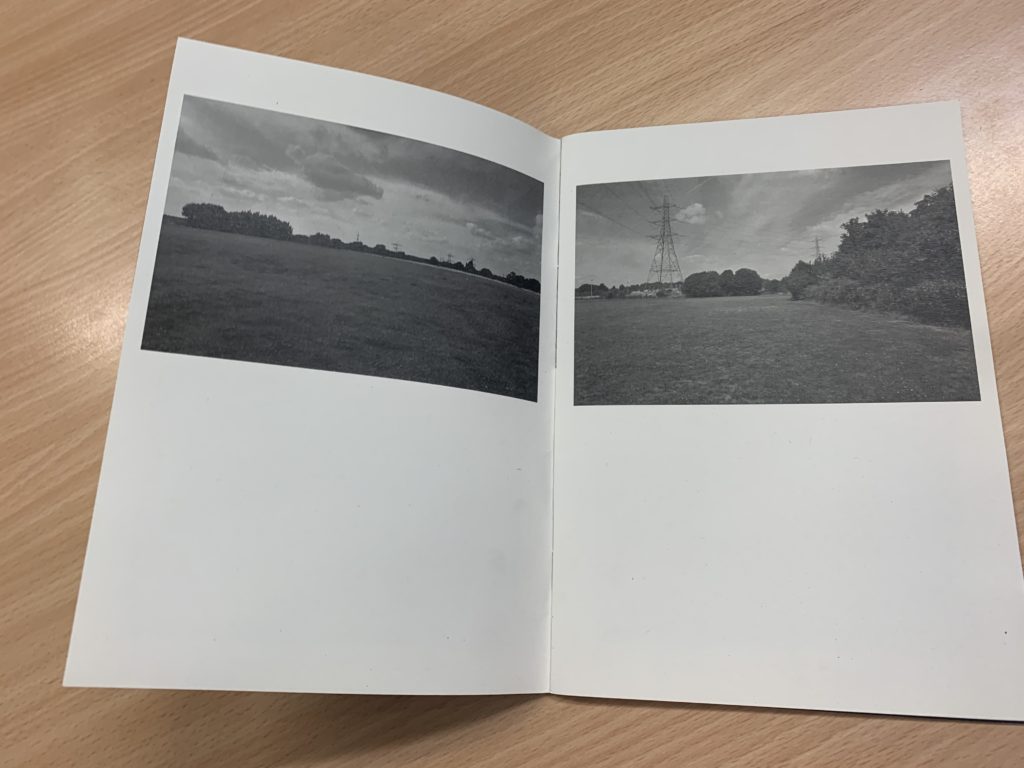
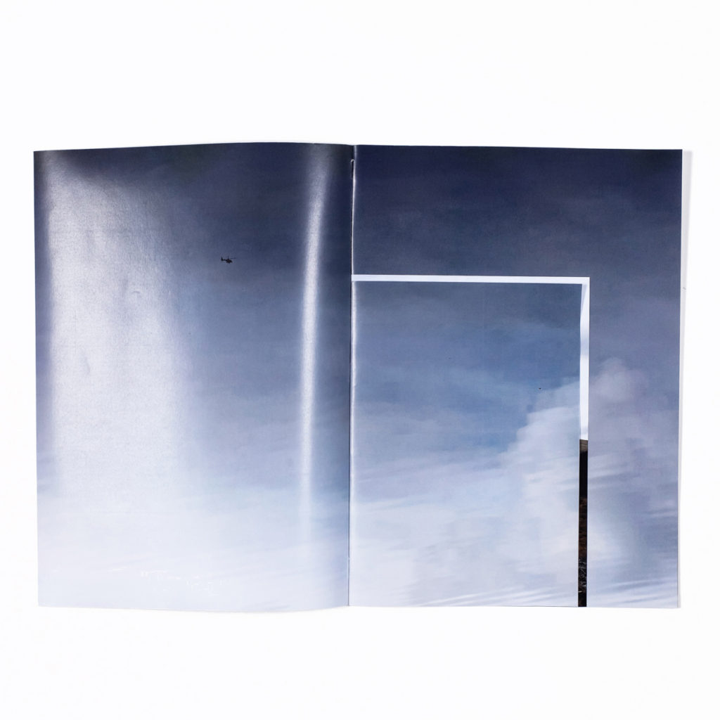
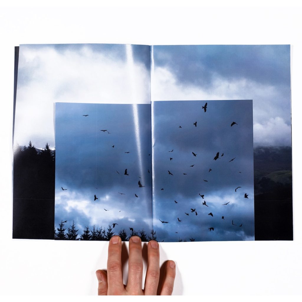
The zine I will be looking at is ‘Redbridge’ by Christophe Le Toquin. After looking through several physical zines, I liked the simplicity of this particular one. The images are laid out interestingly on the pages, juxtaposing each other and some being placed the same. The full bleed double page spreads let the images really show their content and it looks very appealing. The orientation is portrait which i think is ideal for this type of small A5 zine. There doesn’t seem to be a particular narrative or sequence to the images only that’s they’re mostly all the nature of the Redbridge area of London. The cover is a wrap around image which I quite like. The book is made up mostly images and little if not no text. There are no other design elements which i like, the book is kept simple.
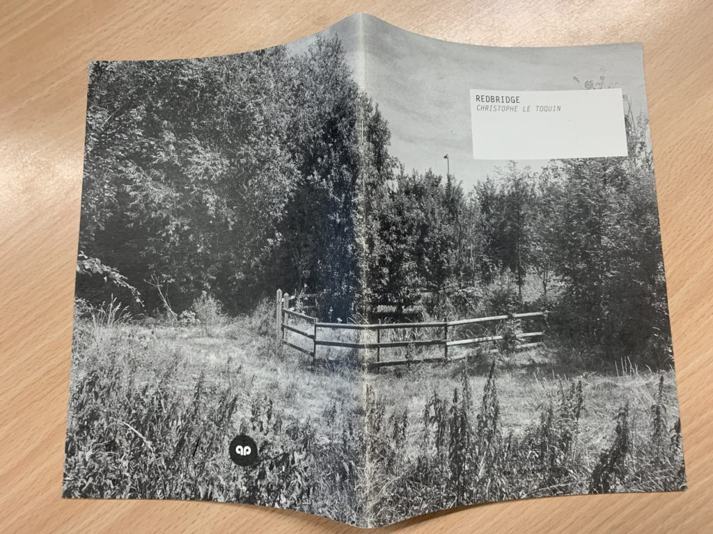
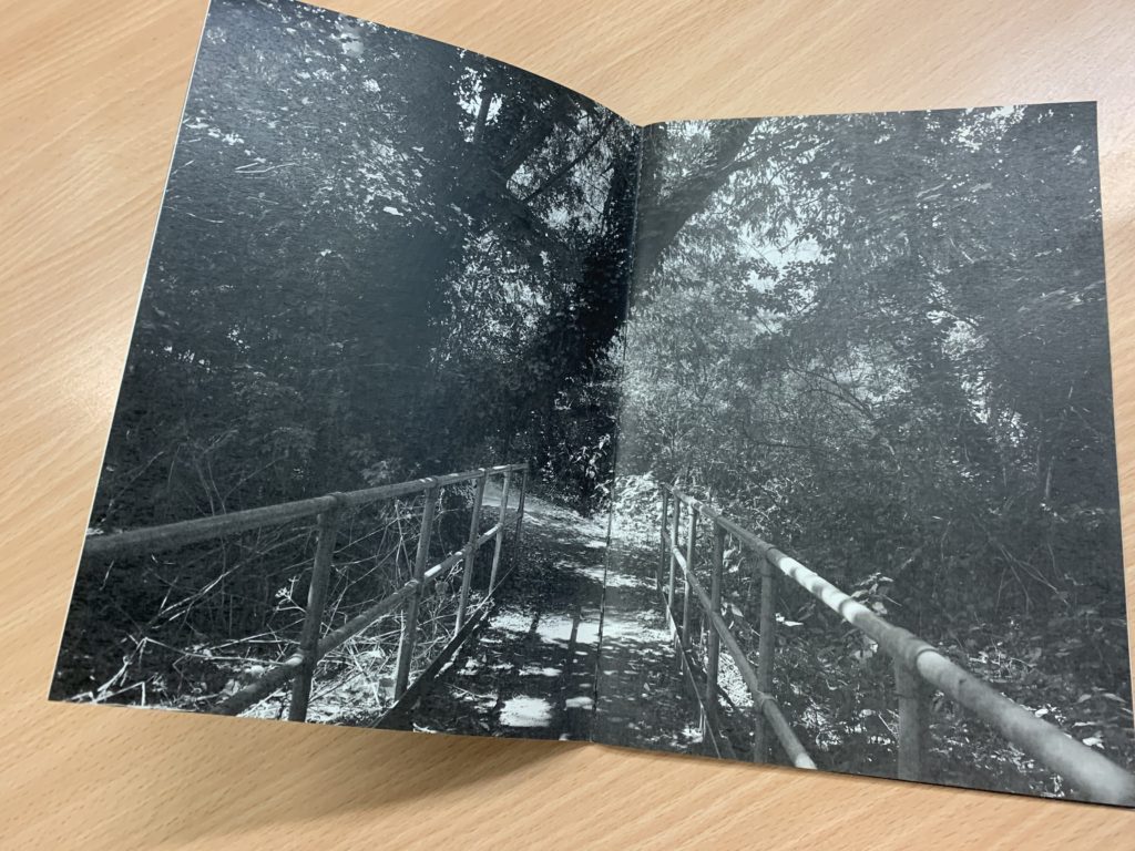

My favourite page is where he has taken two photos and put them next to each other on different pages but it looks like its a panorama.
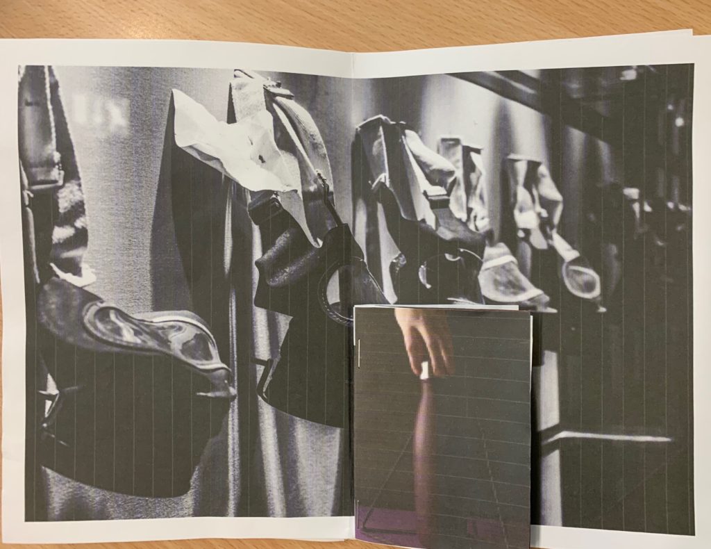
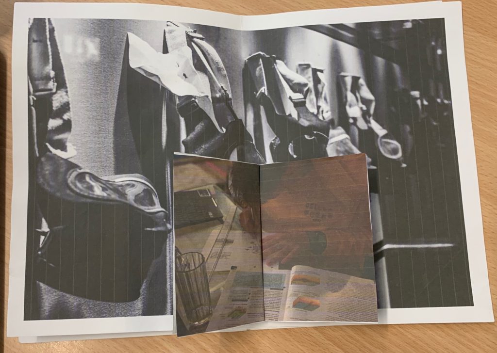
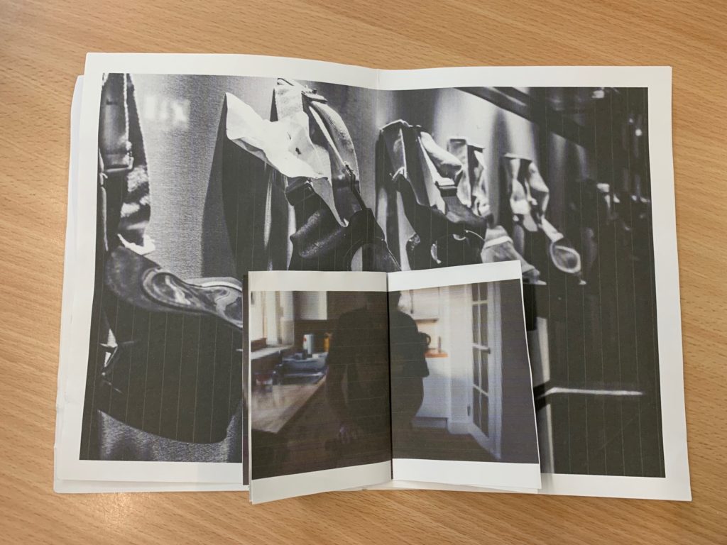
For my zine I have decided I want to do a Zine within a Zine. A Zine in a Zine is basically a single section Zine combining different paper sizes, which can be distributed in a variety of ways, either creating a smaller publication within a bigger one, or creating hidden flaps.


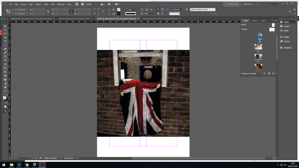
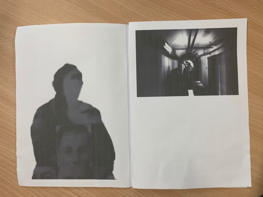
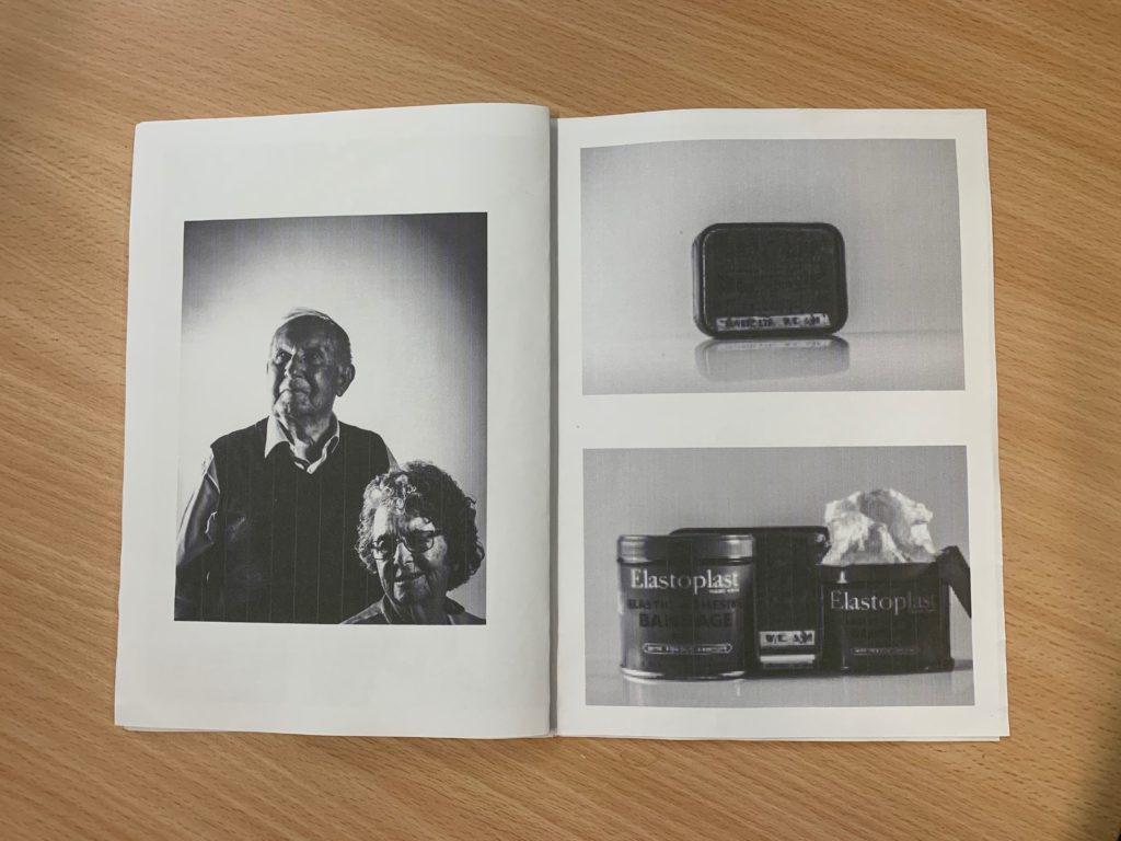
I want the larger zine to be about the past and the war objects and also my photos of Hedley and Joyce, and the smaller zine to be modern objects and photos of my friends in todays age. I want it to make people think about what the past went through so we can be where we are today.
Rafał Milach (born 1978) is a Polish visual artist and photographer. His work is about the transformation taking place in the former Eastern Bloc, for which he undertakes long-term project. He is a nominee member of Magnum Photos. Rafal Milach is a visual artist, photographer, and author of photo books. His work focuses on topics related to the transformation in the former Eastern Block. His works have been widely exhibited in Poland and worldwide, and can be found in the collections of the Centre for Contemporary Art Ujazdowski Castle in Warsaw, the ING Polish Art Foundation, Kiyosato, the Museum of Photographic Arts (Japan), and Brandts in Odense (Denmark).

I will be personally looking directly at Milach’s work ‘The First March of Gentlemen’ which was developed in 2017. The book is contextually produced surrounding the historical events around the town of Września and this came to be the starting point for reflection on the protest and disciplinary mechanisms. In the series of collages, the reality of the 1950s Poland ruled by the communists blends with the memory of the Września children strike from the beginning of the 20th century, which was a protest of Polish children and parents against the Germanization. This shift in time is not just a coincidence, as the problems which the project touches upon are universal, and may be seen as a metaphor for the contemporary social tensions.
“The initial idea of working with the archive was sustained, but the topic changed as I began looking for material that could occupy two spheres – discipline and pacification, and the sphere of freedom – and to bring these elements together in a series of collages.”
The above quote has been taken from an interview that Rafal Milach took part in with the British Journal of Photography, over the subject of ‘The First March of Gentlemen’, I found this quote useful to me while researching having used my own island’s archives as something to be used in my photographs and in montages. It intrigued me the way that he speaks about the subjects changing to go into a ‘sphere of freedom’ as the initial subject on looking is relating to a time of no freedom and occupation and I have just found it intriguing to see the way in which the photographer views and uses the archives as context before going in and looking at the book and photographs as a whole.
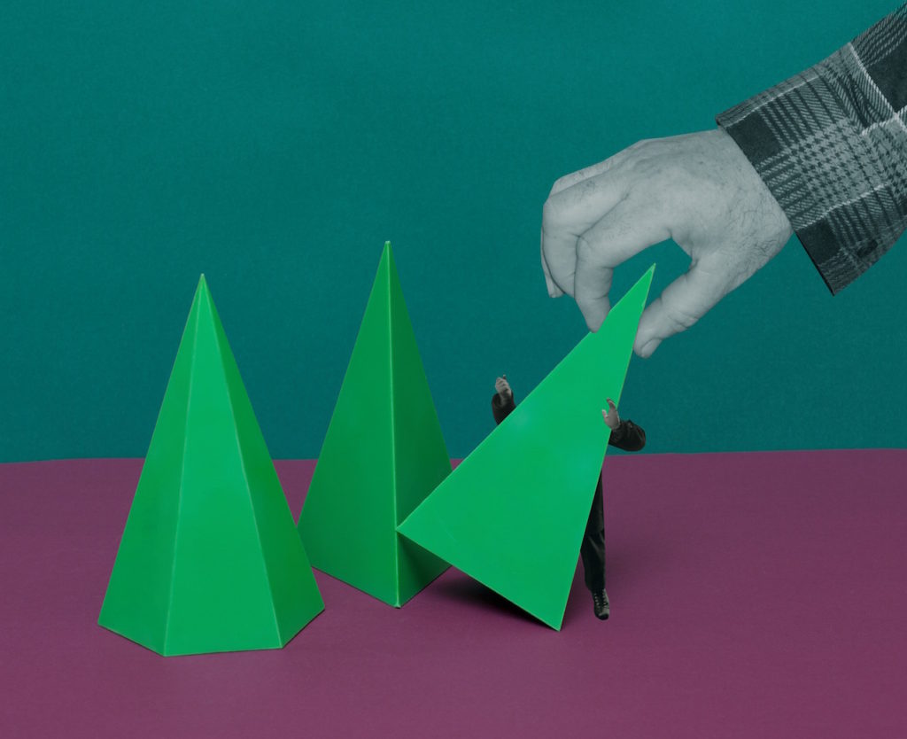
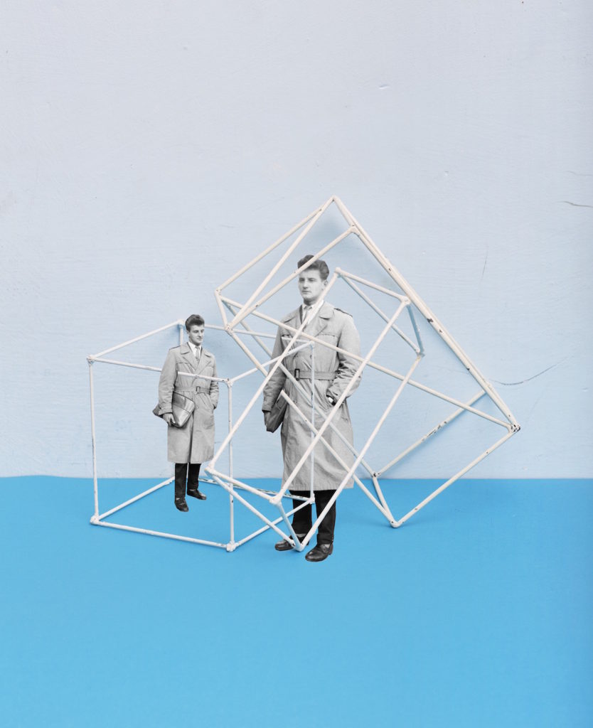
Below shows my chosen photograph of Rafal Milach’s series. When first looking at the photographs we can see the same man, produced twice with photomontage, encaged in two geometric tools. Contextually these shapes and objects were brought into and across schools to be used as teaching tools for subjects such as mathematics, in the case of the book, as you slowly move through the photo-book the figures used from the archives slowly become more entrapped and claustaphobed into these instruments. The figure in the photograph seems looking quite dapper, he stands with not much authority but not as a suppressed minority, however this stand of posture is all juxtaposed with the fact he is encaged in this structure metaphorically speaking it could be taken and seen as a sign of the freedom they had or the lack of. This photograph was not produced all in camera, it is montaged together meaning he subject is unaware of the cage around him.
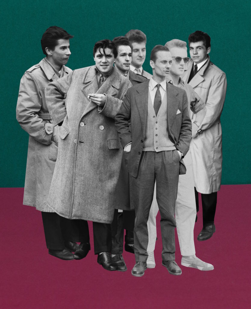
Milach found the archived photographs in the work of local amateur photographer Ryszard Szczepaniak, and his archive of images shot in Września during the 1950s and 1960s. He photographed people in formal street poses, many of them while on leave from the military, some of whom came from the Armia Ludowa, a communist partisan force set up by the Polish Workers’ Party while under German occupation during World War II. We can see from the photograph below and those alike in the mood board they pose well-dressed, whether in uniform or not, they are as Milach described them ‘dandy-esque’ figures.
Quite literally Milach has detached these figures from their photographs and their surroundings. He is placing them on brightly coloured backgrounds, a hint to child-like features, and he is displacing them on the page and contrasting them. This decision can be contextually backed by looking at what Milach speaks about when describing the figures. – “They were a poorer version of the glamour they probably knew from American films,” “This intrigued me… The photo shoots were somehow detaching the guys from the context of contempt in those days. The 1950s in Poland was a pretty oppressive time in terms of the communist regime, and these guys were just having fun in some remote areas within Września county… posing, staging shooting scenes… It was like being part of the system, but making a joke out of it.”
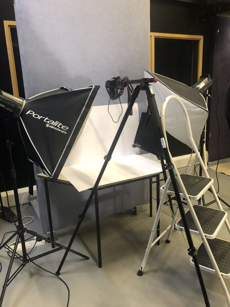
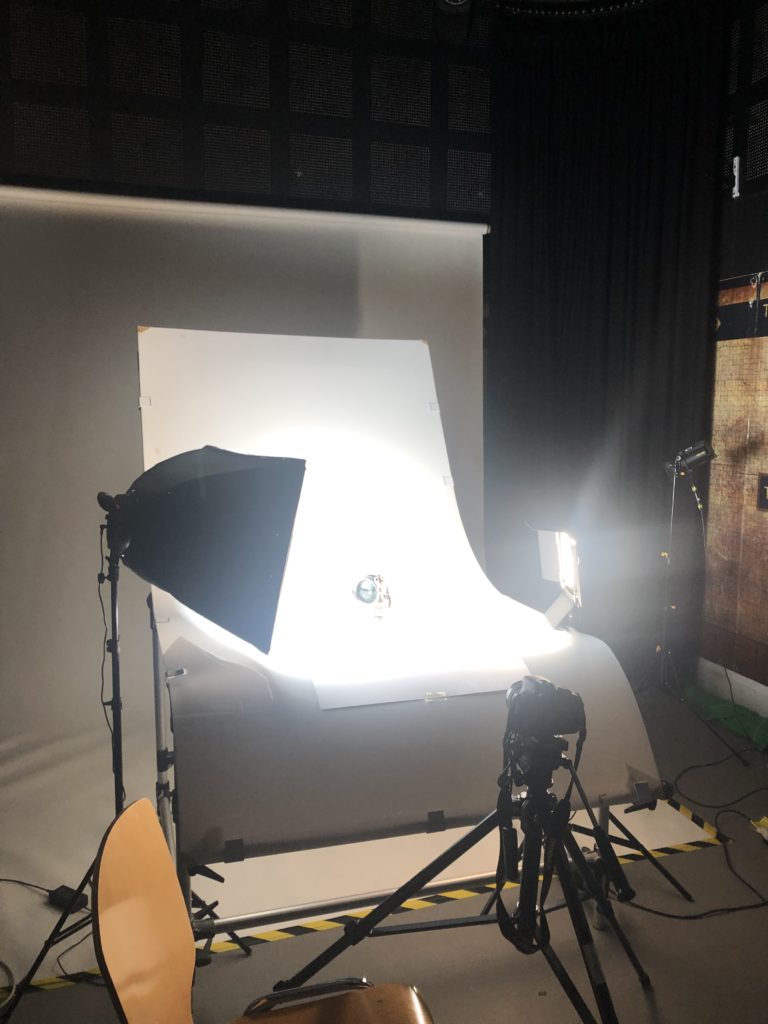
For looking at objects we went into the studio and used two different stations to produce a number of photographs. We used one with the camera directly on and the other shooting from above, using various lightings and attachments for us to be able to create our still life photographs.
The small set up uses one continuous light and two connected flash heads, this allows for a small shutter speed, aperture and ISO as we had the transmitter on the top of the camera connected to the flash heads. On the larger table set up, specifically for being able to take photographs of objects, 3D ones, we had a continuous light on, a back light and secondary (tungsten light) light source to eliminate shadows and create clearer images without grey shadows. (Set Up Pictured below)
For the shoot I planned to take photographs of the occupation archive objects that we had placed in the studio, I wanted to capture some regular ones and some with an abstract feel. After looking at Irving Penn with some of the photographs I will aim to create a sort of ‘lived in’ feel like the aspects I felt from looking at Penn’s work such as After Dinner Games – New York 1947.
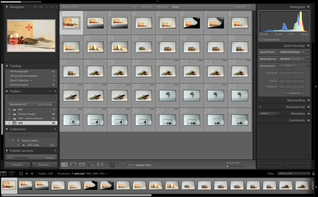
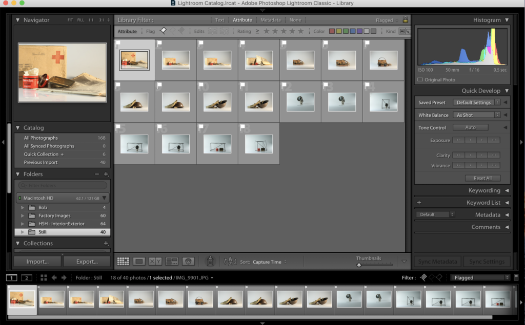
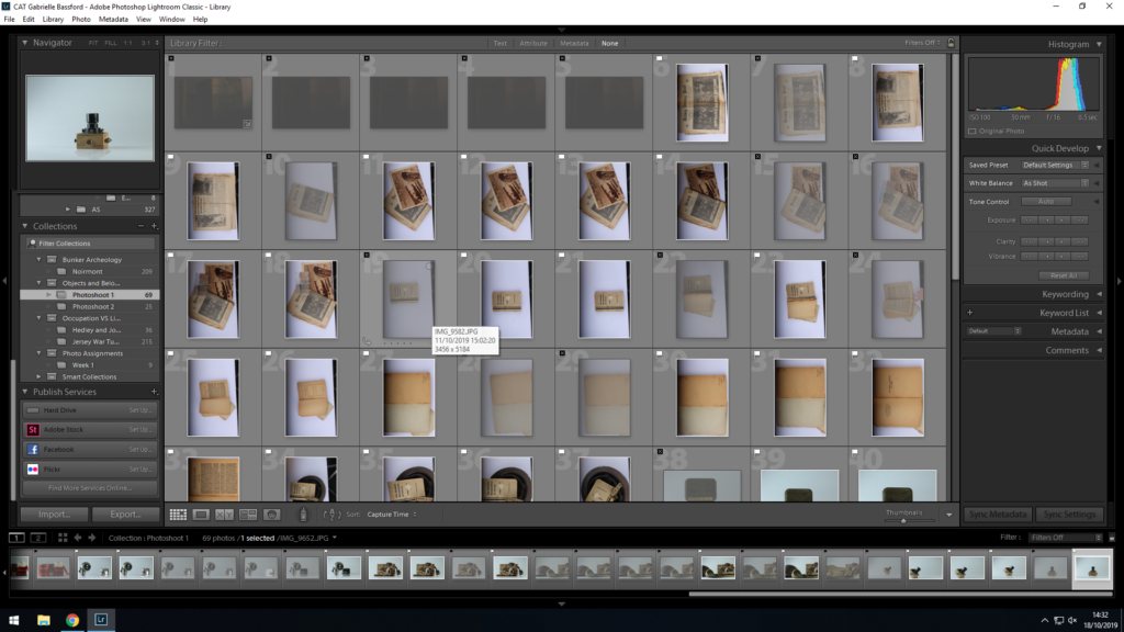
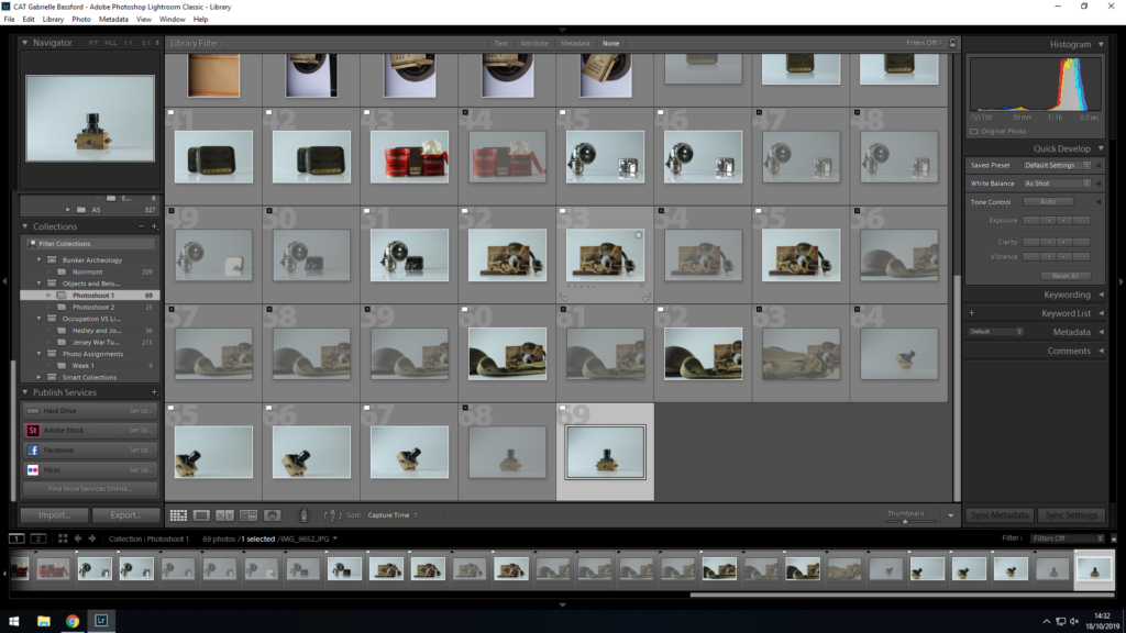
Below shows my contact sheets of the photoshoots produced in the studio, my original lot of photographs and as well my flagged, chopped set of photographs ones that I will look to go through and edit in the future and develop further in Lightroom and maybe Photoshop.
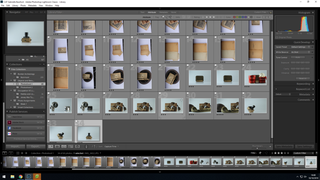
For my editing for these set of photographs I decided to look into keeping it simple. I looked at editing contrasts and temperatures as well as looking at what Lightroom suggested for white-balances to then see what I could do further to enhance the photographs rather than change them completely, I worked into around 4 of my photographs to create as final outcomes from this photoshoot. I worked mainly in Lightroom instead of photoshop as I feel this would be better for enhancing rather than manipulating the photographs. For some of my photographs I cropped the image into a square to position the objects in the centre of the photograph as some of them were slightly to the right of the photograph or there was a slight shadow in the side and a way I found effective to remove this problem if both were involved to crop the photograph down to a square to have the clear lighting and the centred photograph.
I chose to edit four of my cut down photographs as these were the ones I felt had the best composition to look at in the photographs. I chose two of my original trials of the objects just on the table and laid out, trying the Irving Penn “lived in” style that I had taken from the research and looked into. My second two came from my experimenting with shape and placing, looking at how I can incorporate archival objects into archival teaching methods, cubes and shapes used in maths etc. Below shows some of my editing process with the cropping and enhancing of the photographs in Lightroom.


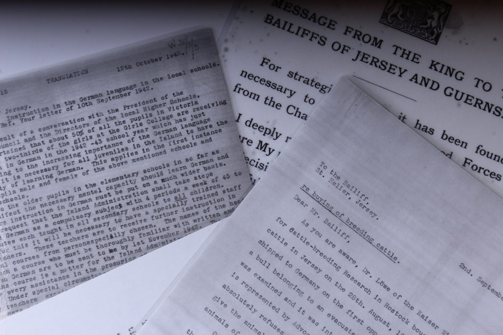
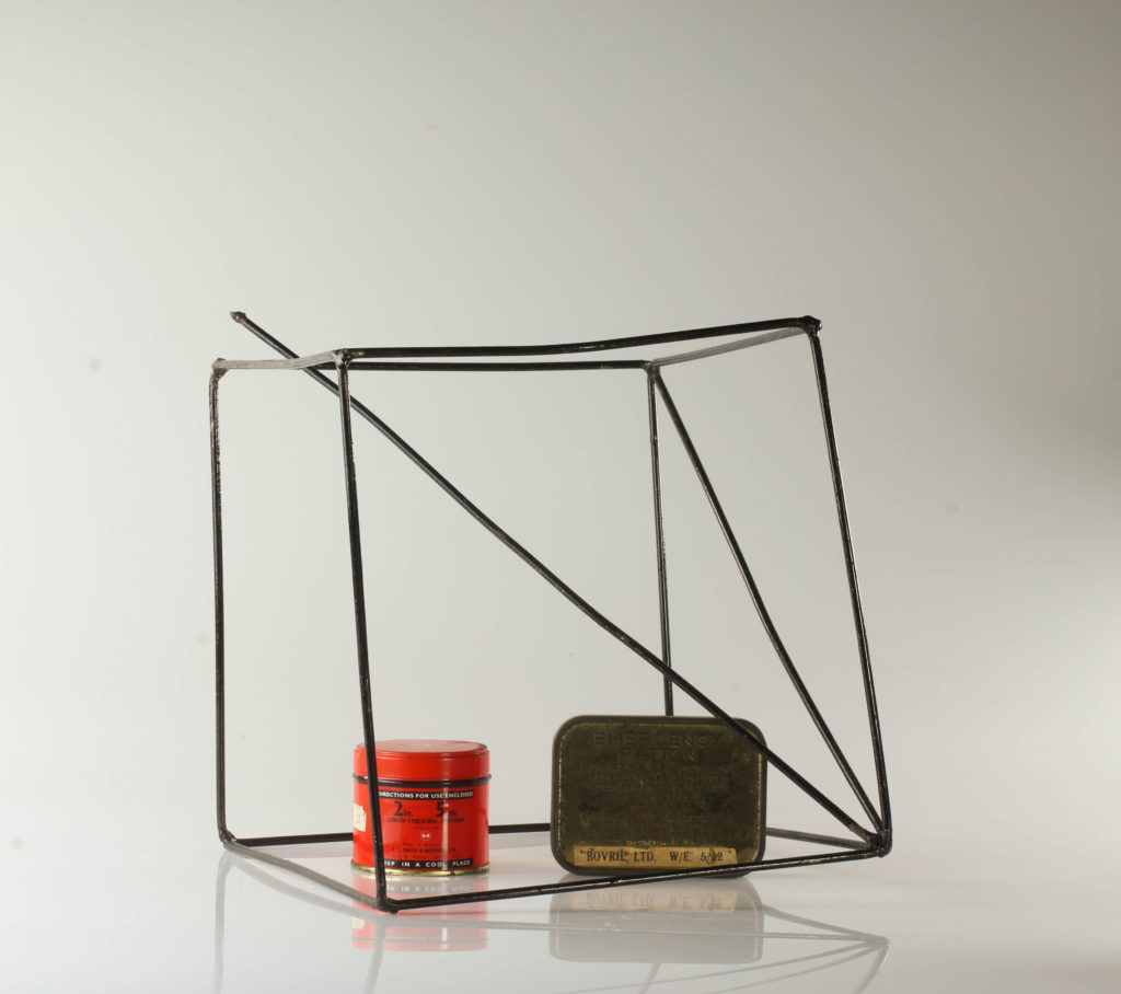
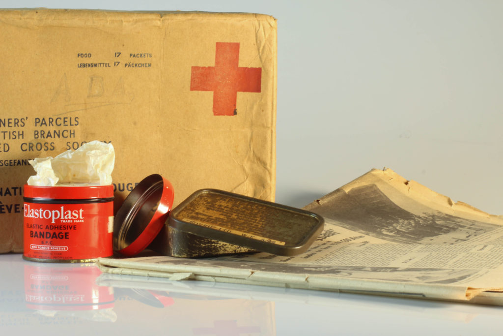
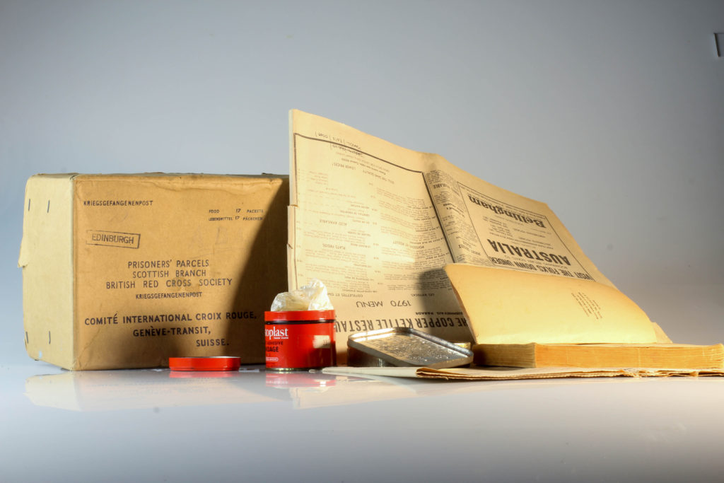
Below I have some of my outcomes from my studio photoshoots that I have produced through editing and working in Lightroom as well as working in camera. One of my favourite outcomes from this photoshoot is the one taken from above of the letters, not much editing I felt was needed for this photograph as it already is quite dark and in black and white which I feel creates a good effect for the photographs, the letters that I were taking photographs of were some personal ones as well as formal ones, sent from Bailiffs to England and vice versa at the start of the war, overall I felt taking these from above in collection with each other help to create a better more powerful image. For my other photographs I experimented with the use of other objects upright on the objects table. I experimented with incorporating unknown objects made out of wire to create some abstract photographs with some form and shape, I feel these made for interesting photographs, I tried to place the archival objects in the gaps between the wires to create lines and shapes which were interesting the eye, while in Lightroom I just experimented with editing the contrasts and brightnesses as well as exposures to enhance the photographs rather than edit them completely like I would in photoshop. For the last of my outcomes in this photoshoot I had collections of the archival objects all placed together to create what could seem like a scene or to create an idea of what was used and what life looked like during the occupied period, I found experimenting with these a little difficult due to the shadows created and getting the right lighting however I do feel that they are still good outcomes as to experiment with object photography which I had been yet to try yet.

“I myself have always stood in the awe of the camera. I recognize it for the instrument it is, part Stradivarius, part scalpel.”
Irving Penn was an American photographer known for his portraits and fashion photography alongside still life’s. He has a book titled ‘Still Life: Irving Penn Photographs 1938-2000’ – This book gathers Penn’s work in the still life genre, so central to his art, from 1938 until 2001. It opens with an introduction by John Szarkowski, who places Penn within the larger context of artists working in still life. Penn oversaw the design and production. – Published by Bulfinch Press, Boston, 200
At a time when photography was primarily understood as a means of communication, he approached it with an artist’s eye and expanded the creative potential of the medium, both in his professional and personal work. Penn’s preference for photographing in the controlled environment of a studio, where he could trim away anything that was not essential to his compositions and hone in on his subjects.
I have previously taken some time to look into Irving Penn studio portrait photograph and look into his style of working and found it very interesting and informative and eventually worked very well with outcomes for studio portraits, which is why I have chosen to look at Penn for still life photography of objects as well.
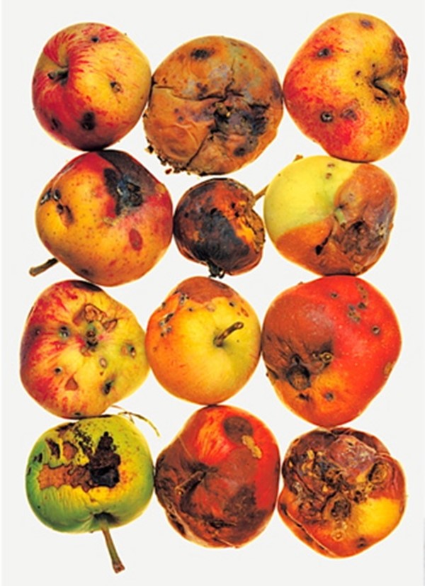


I enjoy Irving Penn’s work as I find it pleasing to the eye and I like the way that some of the photographs look less staged, like somebody has been using the cutlery or using the ruler and then Penn has taken a photograph how it has been left and this is something that I like about the images and how they are presented. I also like how some show repetition with the apples they are all laid out 3 by 4 and is something I would like to try and experiment with when I look at making my own still life photographs.
Image Analysis:
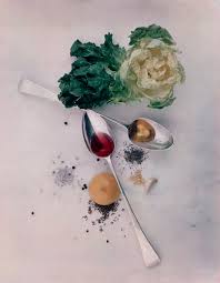
Below shows the photograph I have chosen to edit and look into in more depth. This photograph is called ‘After Dinner Games’ and was taken in New York in 1947. The photograph shows a variety of objects placed on a table. Unlike some other still life photographs I have seen where there is no horizon line, in this image we can clearly see the line where the table cloth ends and the wall begins, I feel this generates a more ‘lived-in’ feel as it is less artificially placed. The objects have been arranged to seem as though people have been using them and this is how they have been left, we can see drink and ash stains on the cloth as well which adds to less synthetic feel to the photograph. The image has fairly white light suggesting that is probably artificial rather than natural light which I feel tends to be more warm and yellow, there is a slight shadow falling to the right of the photograph from the underneath of the card, the dice and the chess piece suggesting the light is mainly coming from the left side of the photograph. I enjoy the composition of this photograph with how all of the objects are linking together and aren’t just laid out separately, I feel it creates a really interesting photograph that is pleasing to look at and creates and idea or story of what could have been happening if this photograph was taken in a real life situation.
Martin Parr and Francis Foot are quite different in the ways they both took images in the wars, for example Francis foot took images in the first world war, whereas Martin Parr to images in jersey of the celebration of the liberation of jersey.
Theses two artists have different techniques they use to take images, for example, Martin Parr used very close ups and theses shots were in detail and uses colour however Francis Foot took images in black and white, but also his images were more of portraiture and landscapes.
Martin Parr techniques used are that he chooses bright colours within his images but also as you look at the images you can see the detail at the front of the image which is then blurred out by the back of the image.
Francis foots photographs are all in black and white therefore different to Martins Parr, All of Francis Foots images are all in the same distance and are not close up, the detail is all the same.


Final Images: