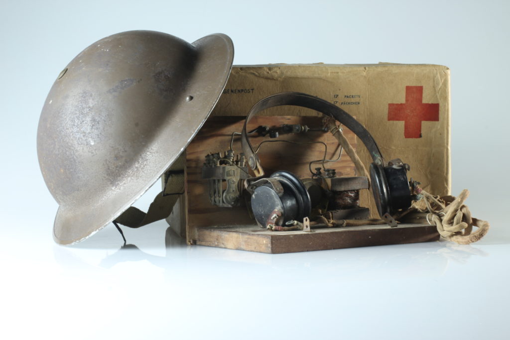
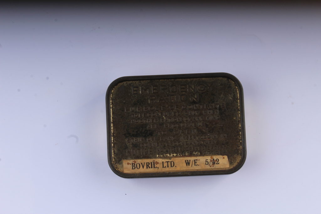
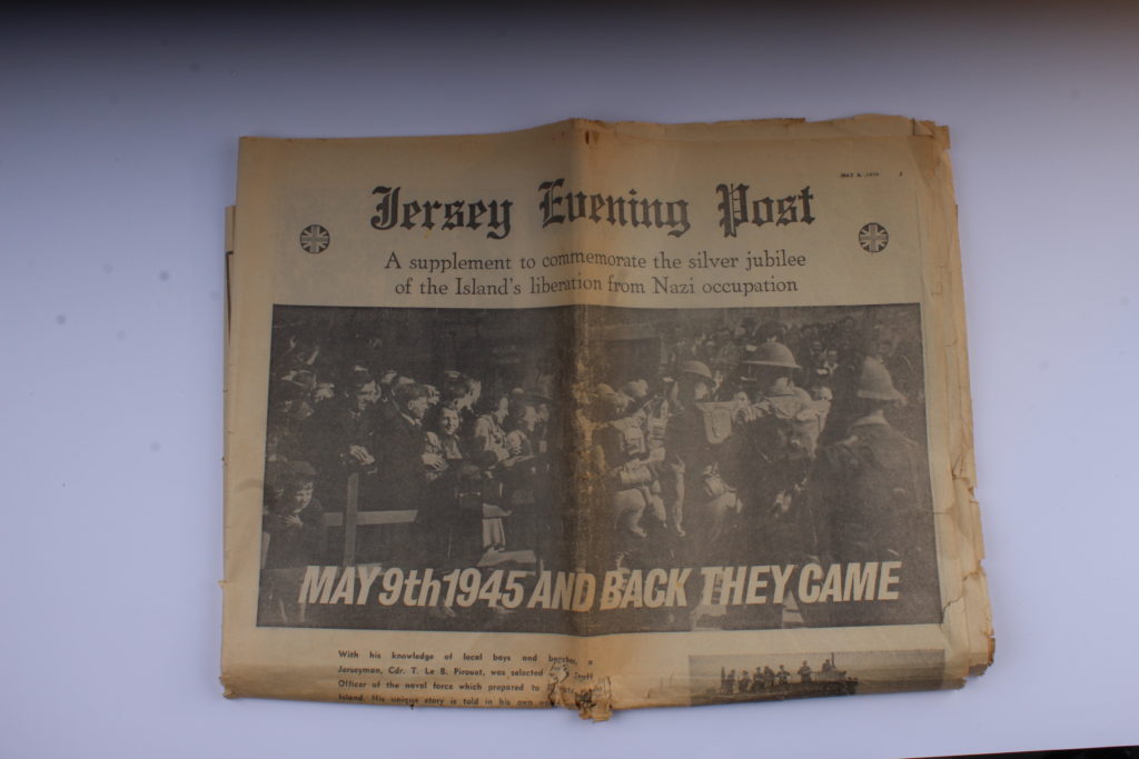
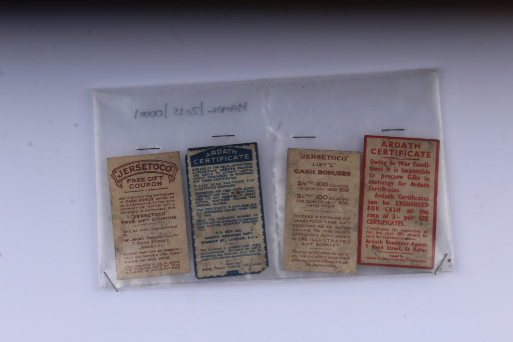
We managed to get some objects from the war from the Jersey Archive. This included stuff such as a war helmet, tins of bandages, a red cross package, a bar of soap, coupons and much more. We decided to take still life images of these in the studio with two types of lighting – Continuous lighting and flash lighting.
Continuous lighting is what it’s name suggests – lighting which doesn’t change. With this lighting we paired it with an infinity board to make the objects look secluded and in an area bigger than it actually is.
Flash lighting is when the lighting flashes as the image is taken. This is done by putting a sensor on the camera so it can time when to turn the lights on. This type of lighting was more used with a birds eye view angle – the camera was put on a special stand which positions it looking down at the subject from above.
Light room work :
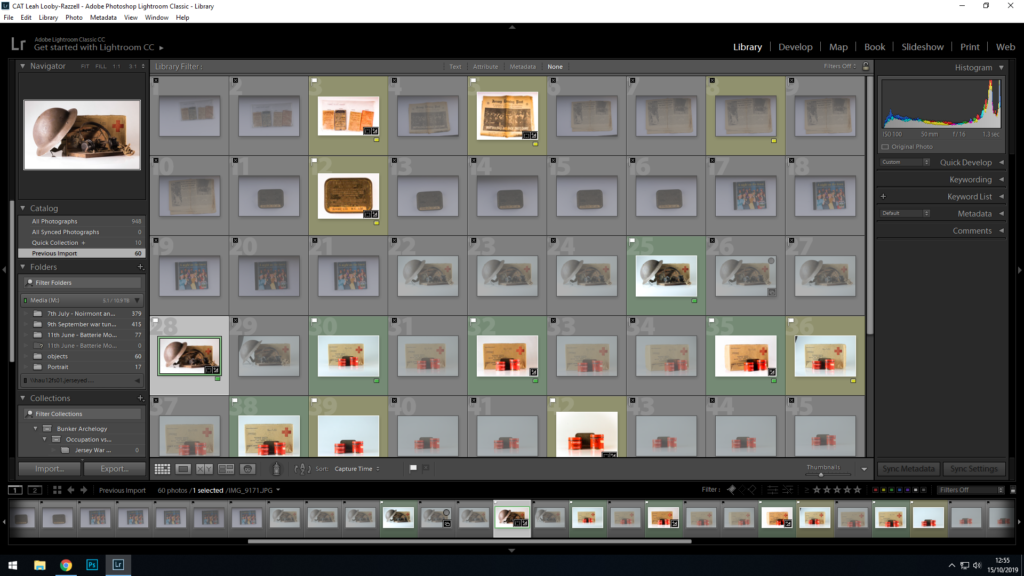
Originally I had taken 60 still life images in total of the objects, and from there i uploaded them onto light room and sorted through them, flagging the ones I wanted to use.
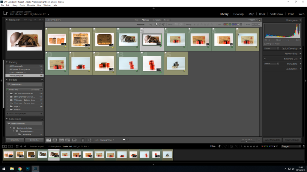
After flagging my wanted images I was left with 15 images to choose from. I went and colour coded each image. Yellow means that there’s a chance I might use the image, green means that I will defiantly be using the image for my blog.
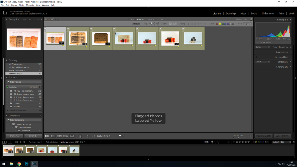
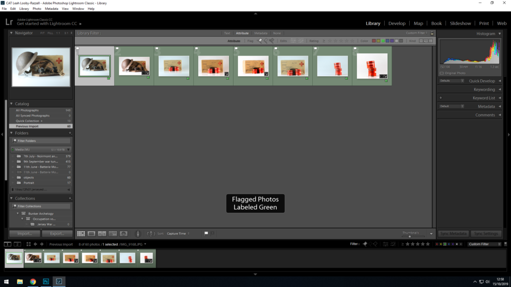
Chosen images:
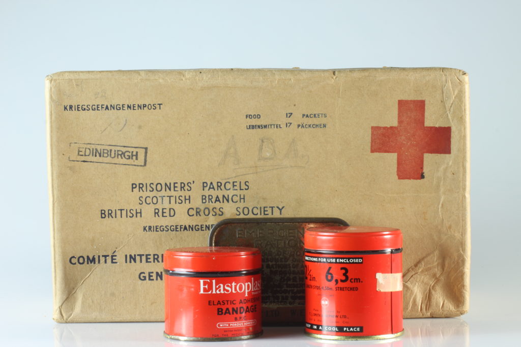
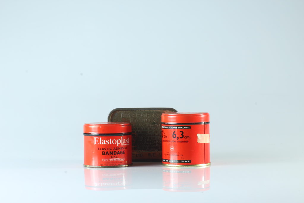
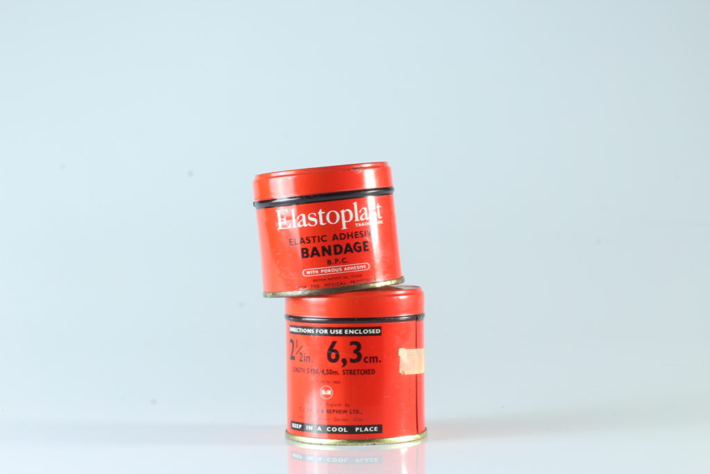
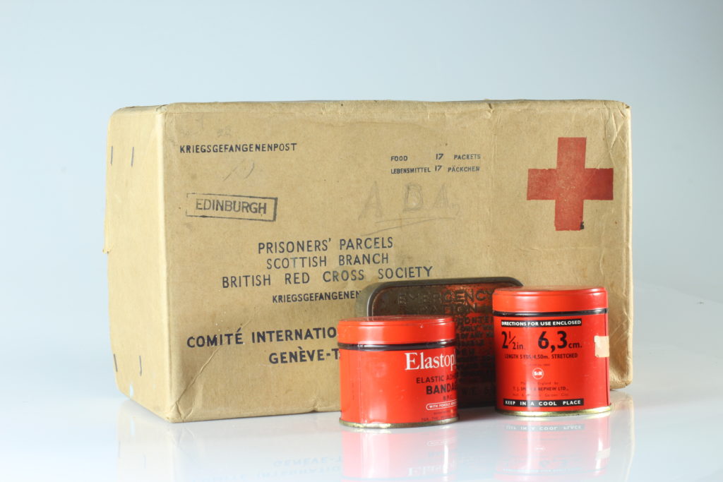
Edited images:
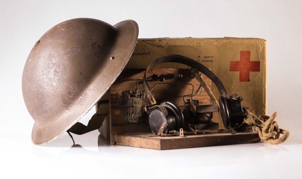
Temp : +19 —————————– Luminance:
Tint : + 36 —————————— Red = +100
Exposure = +0.24 ———————- Orange = + 20
Contrast = +67 ————————- Yellow = – 100
Highlights = +100 ———————- Green = + 100
Shadows = +88 ————————- Aqua = + 100
Whites = +55 —————————- Blue = + 100
Blacks = -67 —————————— Purple = – 100
Clarity = +7 ——————————- Magenta = + 100
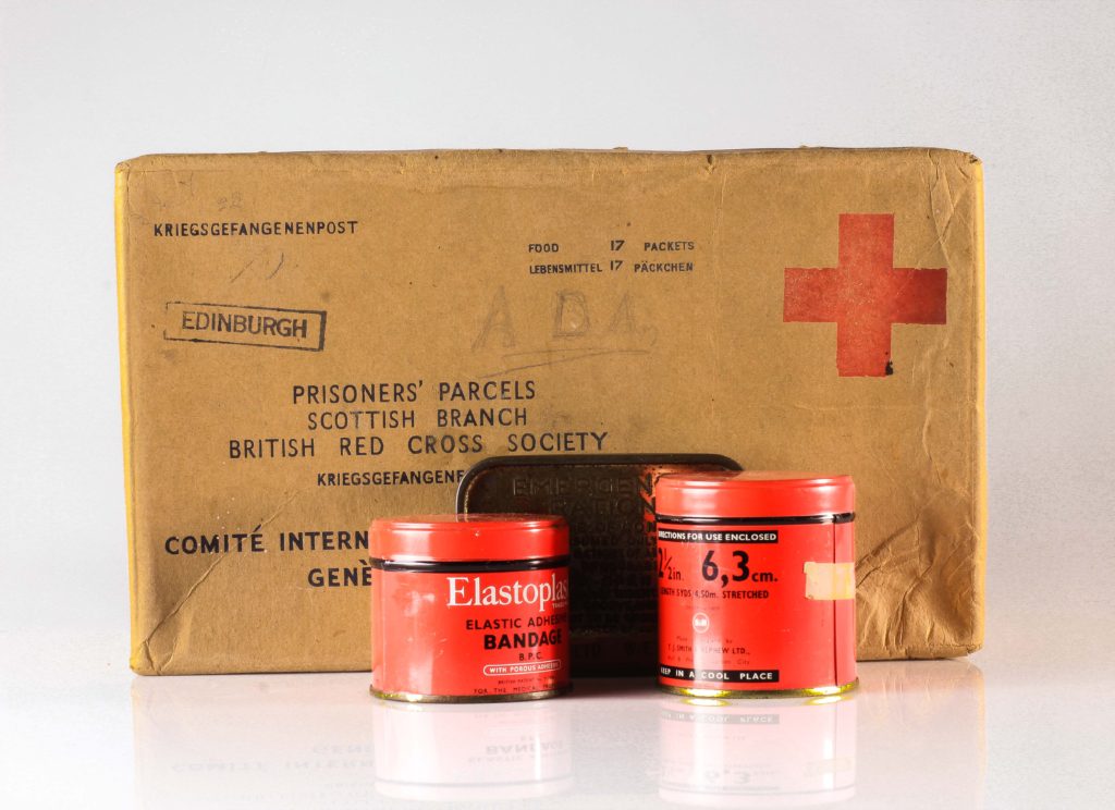
Temp : +19 —————————– Luminance:
Tint : + 36 —————————— Red = +100
Exposure = +0.24 ———————- Orange = + 24
Contrast = +29 ————————- Yellow = – 78
Highlights = +7 ———————- Green = + 100
Shadows = -33 ————————- Aqua = + 100
Whites = -26 —————————- Blue = + 100
Blacks = +26 —————————— Purple = + 100
Clarity = +26 ——————————- Magenta = + 100
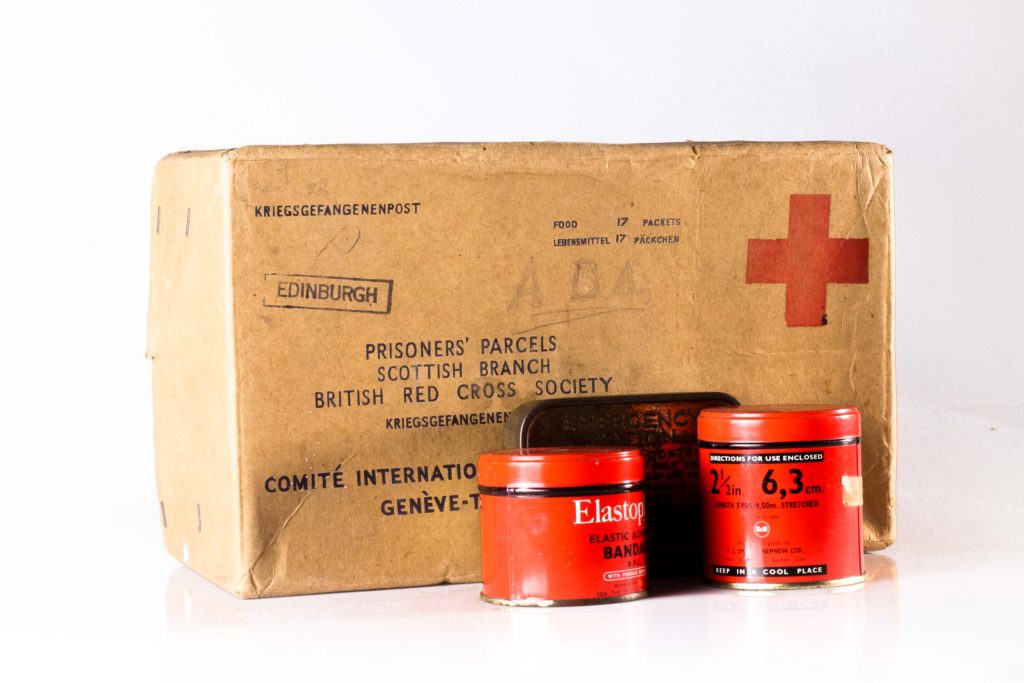
Temp : +12 —————————– Luminance:
Tint : +38 —————————— Red = +64
Exposure = +0.12 ———————- Orange = -44
Contrast = +60 ————————- Yellow = +33
Highlights = +21 ———————- Green = + 100
Shadows = -57 ————————- Aqua = + 100
Whites = +10 —————————- Blue = + 100
Blacks = –43 —————————— Purple = + 100
Clarity = +7 ——————————- Magenta = + 100
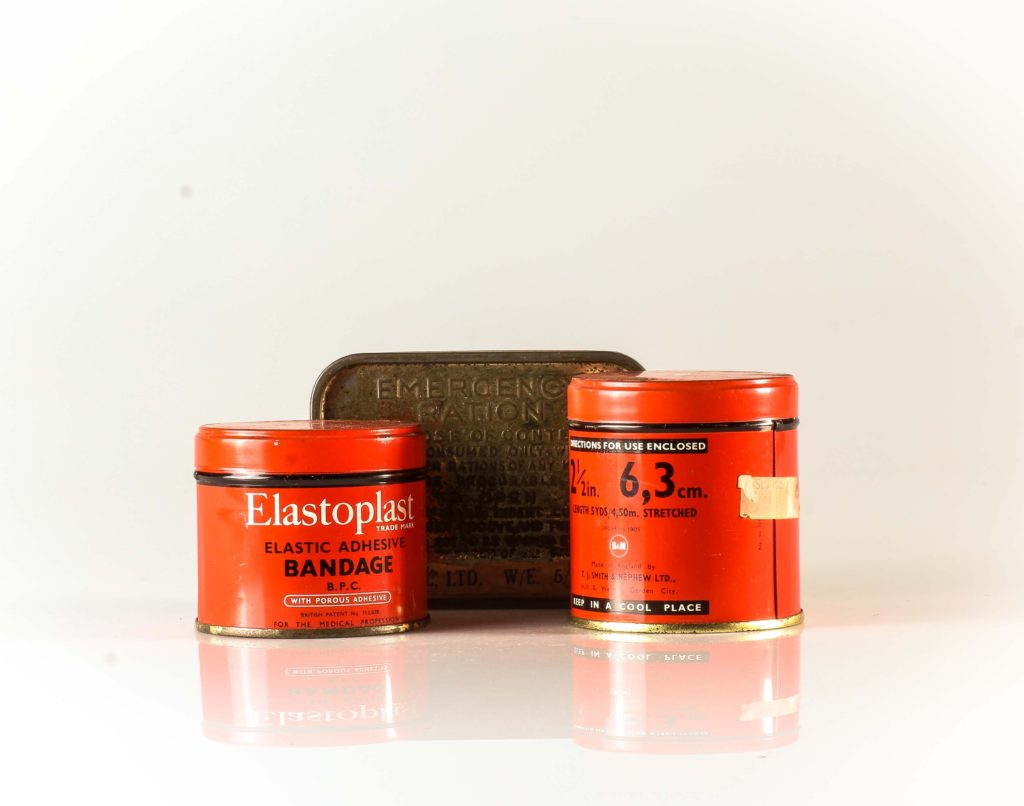
Temp : +29 —————————– Luminance:
Tint : + 26 —————————— Red = +100
Exposure = -0.60 ———————- Orange = + 20
Contrast = +24 ————————- Yellow = – 100
Highlights = +17 ———————- Green = + 100
Shadows = +21 ————————- Aqua = + 100
Whites = +36 —————————- Blue = + 100
Blacks = -24 —————————— Purple = + 100
Clarity = +33 ——————————- Magenta = + 100
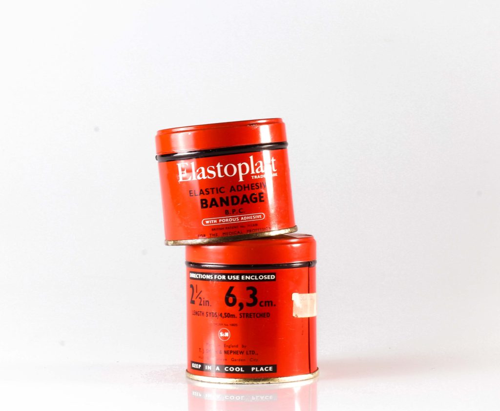
Temp : +17 —————————– Luminance:
Tint : + 33 —————————— Red = – 22
Exposure = +0.48 ———————- Orange = + 2
Contrast = +43 ————————- Yellow = + 64
Highlights = +36 ———————- Green = – 7
Shadows = +2 ————————- Aqua = 0
Whites = +33 —————————- Blue = + 100
Blacks = +5 —————————— Purple = + 100
Clarity = +10 ——————————- Magenta = + 100
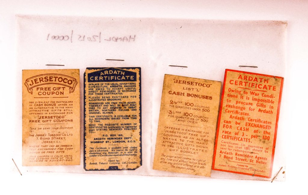
Temp : +29 —————————– Luminance:
Tint : + 26 —————————— Red = +100
Exposure = +0.24 ———————- Orange = + 20
Contrast = +67 ————————- Yellow = – 100
Highlights = +100 ———————- Green = + 100
Shadows = +88 ————————- Aqua = + 100
Whites = +55 —————————- Blue = + 100
Blacks = -67 —————————— Purple = – 100
Clarity = +7 ——————————- Magenta = + 100
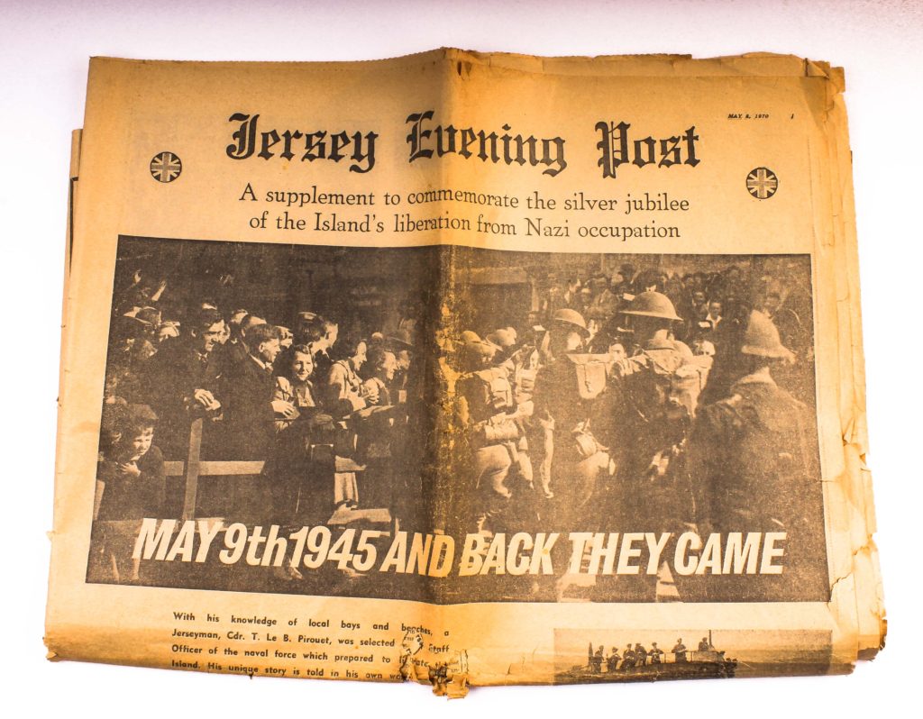
Temp : +19 —————————– Luminance:
Tint : + 14 —————————— Red = +100
Exposure = +0.36 ———————- Orange = – 22
Contrast = +36 ————————- Yellow = + 7
Highlights = +100 ———————- Green = + 100
Shadows = +45 ————————- Aqua = + 100
Whites = +64 —————————- Blue = + 100
Blacks = + 14 —————————— Purple = + 100
Clarity = +31 ——————————- Magenta = + 100
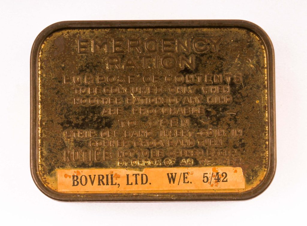
Temp : +31 —————————– Luminance:
Tint : + 26 —————————— Red = +100
Exposure = +0.83 ———————- Orange = – 20
Contrast = +52 ————————- Yellow = – 40
Highlights = +100 ———————- Green = + 100
Shadows = +45 ————————- Aqua = + 100
Whites = -33 —————————- Blue = + 100
Blacks = –38 —————————— Purple = + 100
Clarity = 0 ——————————- Magenta = + 100
In a lot of these images I was going for a warm tone. In the images of the coupons and newspaper, this warm tone brought out the yellowing of the aging paper. I also tried getting the objects to stand out against the background, to be bright and focused so it’s the only thing that the viewer can concentrate on. I also liked the look of the reflections on the floor, caused by the infinity board. It makes it look like the objects are in fact on something and aren’t floating in space, but it also doesn’t take much attention away from the object itself.
For the continuous light, my settings on my camera were:
Camera setting: Manual Mode
ISO: 100
White Balance: Daylight
Aperture: F/16
Shutter: 0.5 sec to 0.8 sec
For the flashing light, my setting on my camera were :
Camera setting: Manual Mode
ISO: 100
White Balance: Daylight
Aperture: F/16
Shutter: 1/125-1/200
Flash heads set to power output: 2.0
