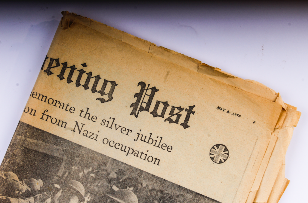
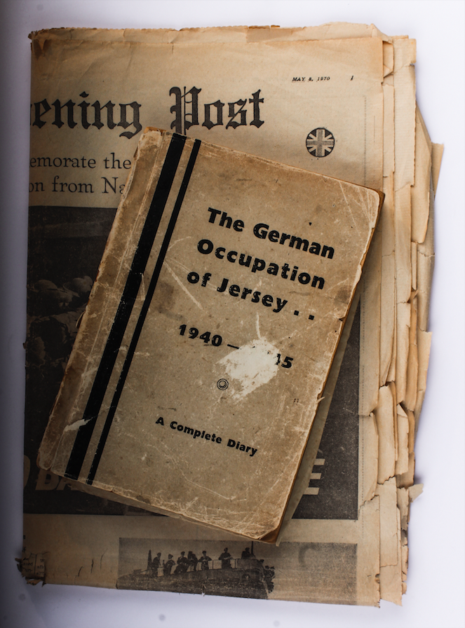
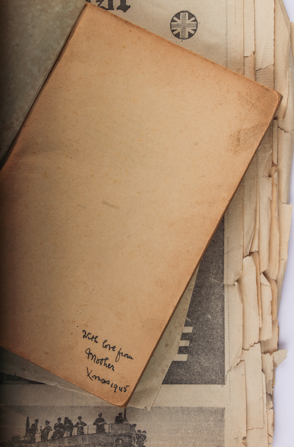
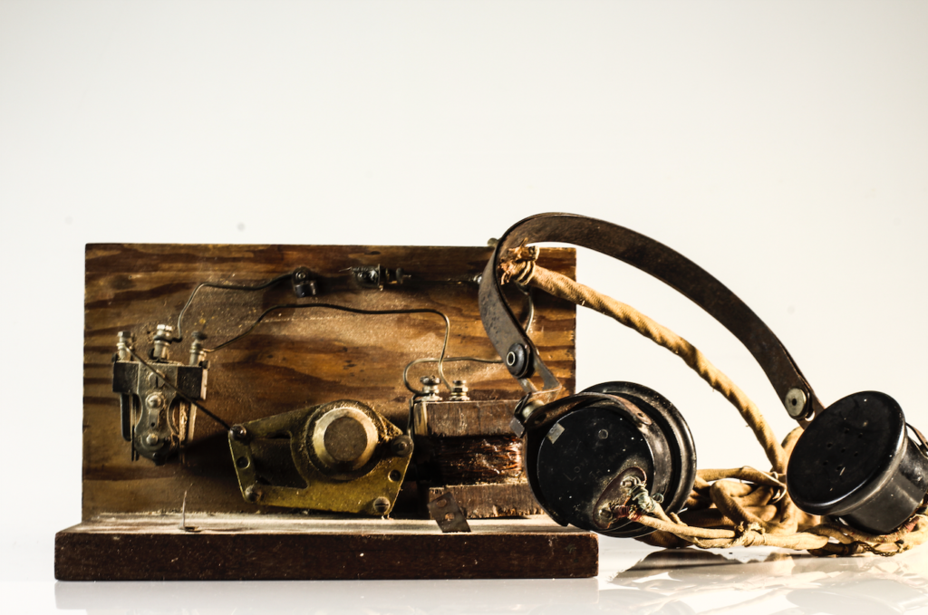
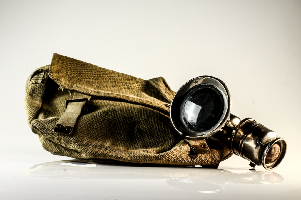
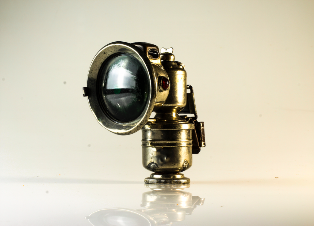
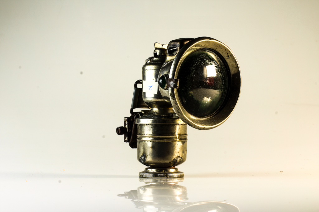
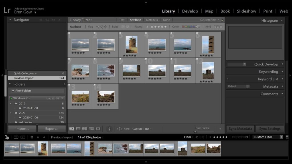
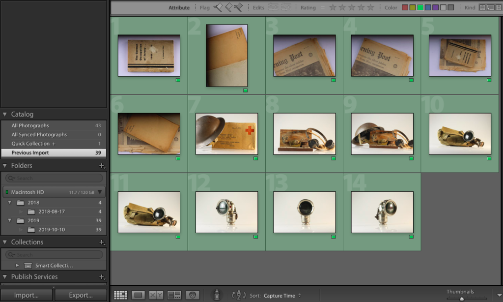
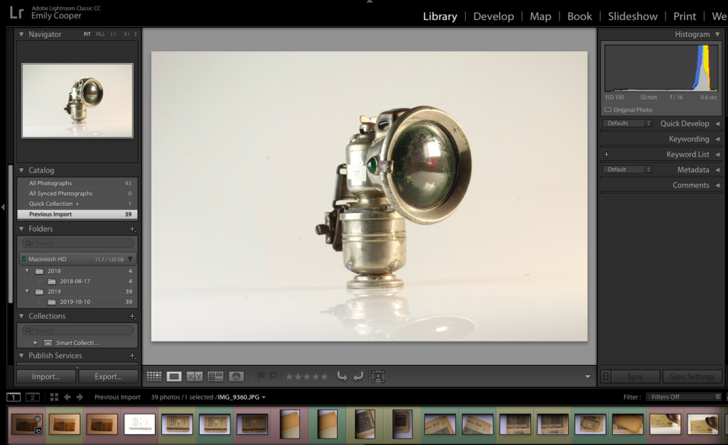
Once I was confident with my understanding of the lights and layout of the studio, I could begin taking photographs of the archival objects that were loaned from the Jersey Archives. I made use of the cameras already attached to the tripods but used my own SD card. After taking a series of images, I came out with the below series (unedited):


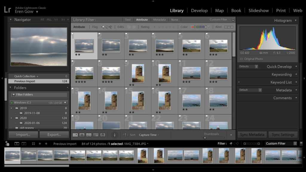
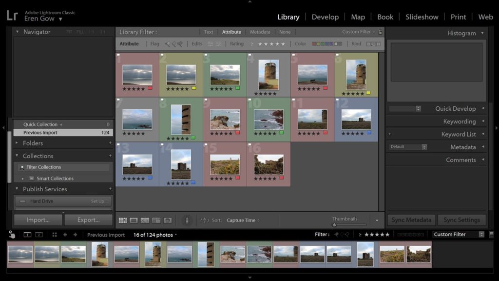
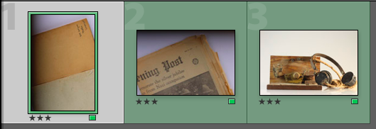
As some of the images were either overexposed, underexposed, or had the wrong composition, I uploaded the images into Light-room, and used the colour option to highlight which images I wanted to use, and which images I would reject. The following screenshot is the collection of all of my images after they had been colour coded:
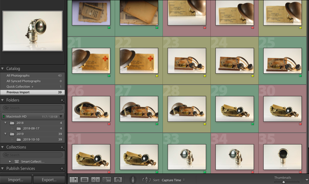
Green: Final images
Yellow: Possible final images (need more editing)
Red: Rejected images
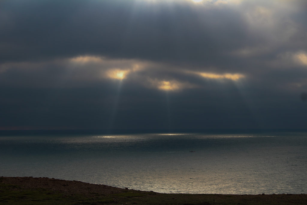
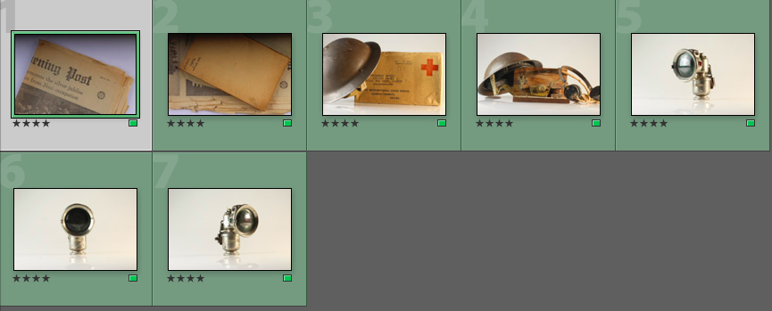
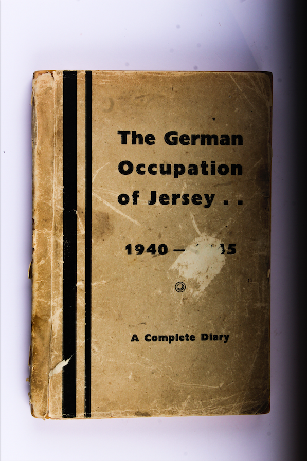
Out of the images I uploaded to Light-room, I only decided to edit 14 of my best (those highlighted green). The final 14 images can be seen below:
As a further method of rating each image, I decided to rate each of the green images /5 in order to record which images I felt would work best, and which ones I felt needed the most editing during the development stage:
I then began the development process, in which I would edit the images that I had labelled green. I used the Light-room editing software, as I find it more detailed and specific than the Photo-shop software. I found that editing the colour gradients and contrasts of my images would be the most important part of this process, along with altering the orientation of some of the images so that the objects lay parallel to the bottom of the image frame.
This is the layout I used for the editing process of my images
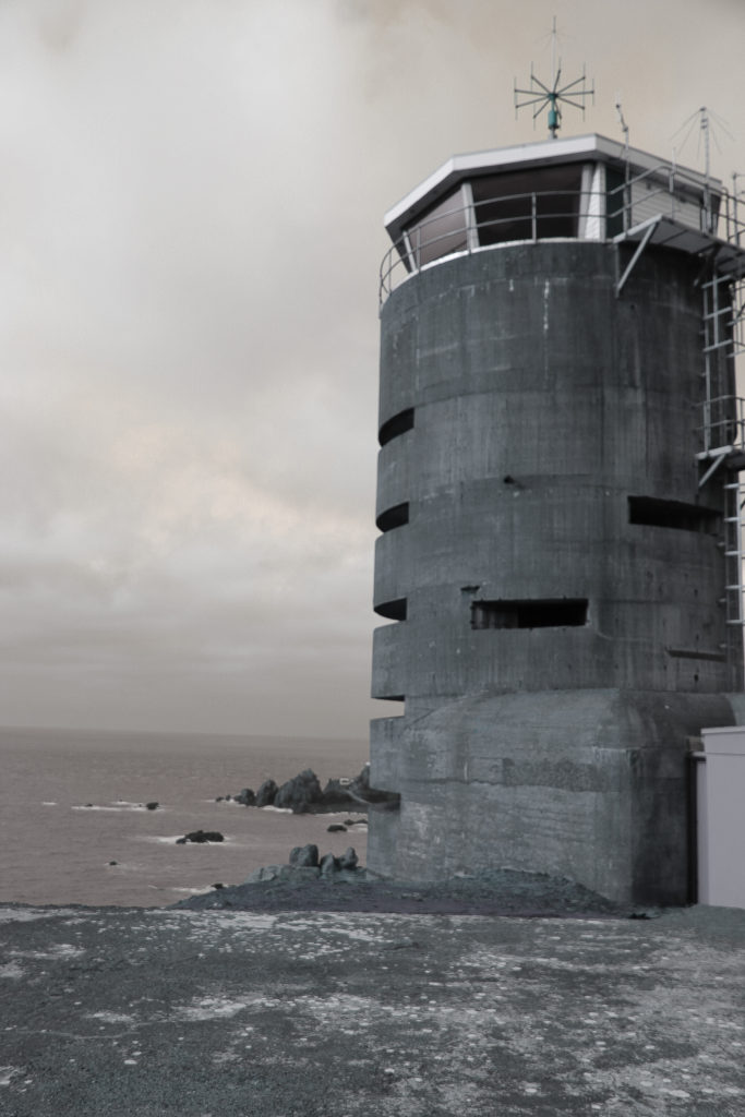
For many of the images, I increased the contrast of the colours in order to produce bolder outlines and harsher colours. I felt that this helped to make the images appear more sharp and clinical, and gave harsher outlines and contrast in the colours and shadows. I decided to do this as I feel this harsh, sharp appearance reflects the atmosphere of the occupation, as the occupation of Jersey can be seen as a harsh and cruel event that made the lives of the occupants of the island much harder.
This is an example of the outcome of an image that I increased the contrast on. 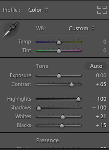
I also increased the highlights of this image in order to bring out the contrasting lighter colours, and I reduced the shadows to get rid of the darker effect to the right of the image, caused by a lack of studio light.
Furthermore, I decided to increase the clarity of some of my images. I found that by raising the clarity, the clarity of every small damaged area/detail was emphasized, making the objects of each image look more worn and used. I decided to use this on a range of occasions to emphasize the time difference between now and the occupation, and to emphasize that, although these objects represent a time man years ago, the implications of this event is no less relevant.
Here is an example of an image in which the clarity is heightened, and the vibrance is lowered 
I also decided to lower the vibrance of some images, as I found that this reduced the vibrance of the colours, and therefore provided a much more bleak image (which reflects the mood of the occupation more)
I also adjusted the orientation of some of my images, as the way the tripod was set out meant that the camera took some of the images at a slight angle, meaning the lines of the objects were not parallel to the bottom lie of the image frame. I found this to be a small issue which could have reduced the viewers focus on the subject itself, as their attention may instead have been drawn to the conflicting angles at the bottom of the image. I altered this using the crop option found on the tool bar at the side of the screen, and simply rotated the image until the lines were parallel:
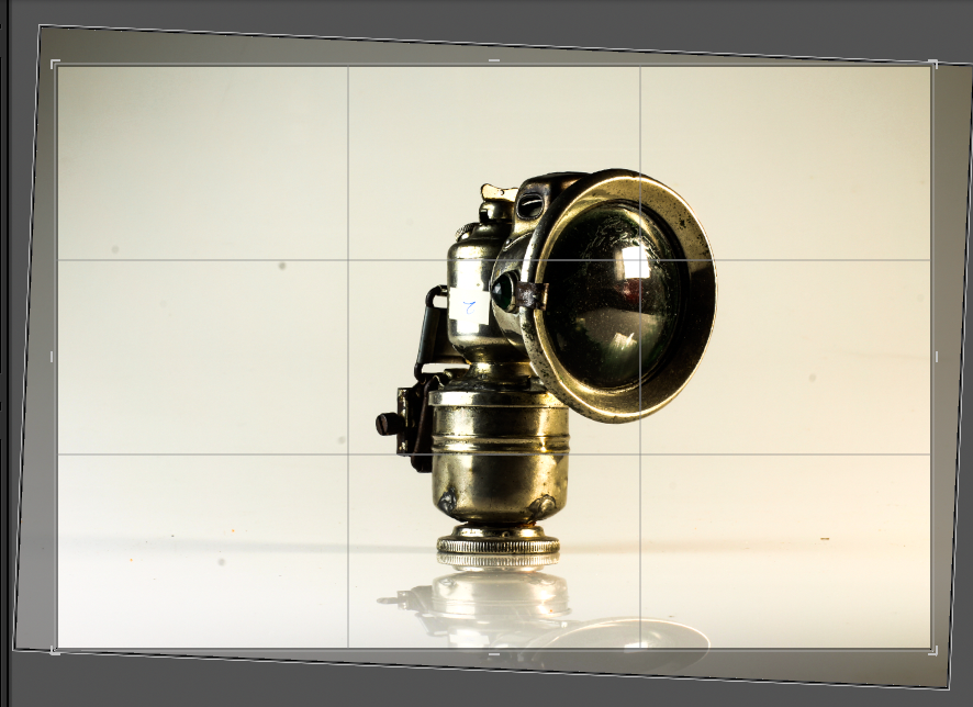
Here, I had to rotate the image so that the object did not appear to be at an angle 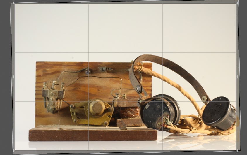
I rotated this image so that the base line of the object was parallel to the bottom of the frame
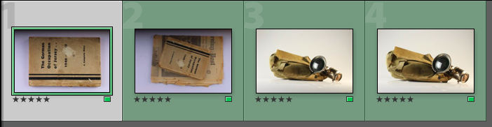
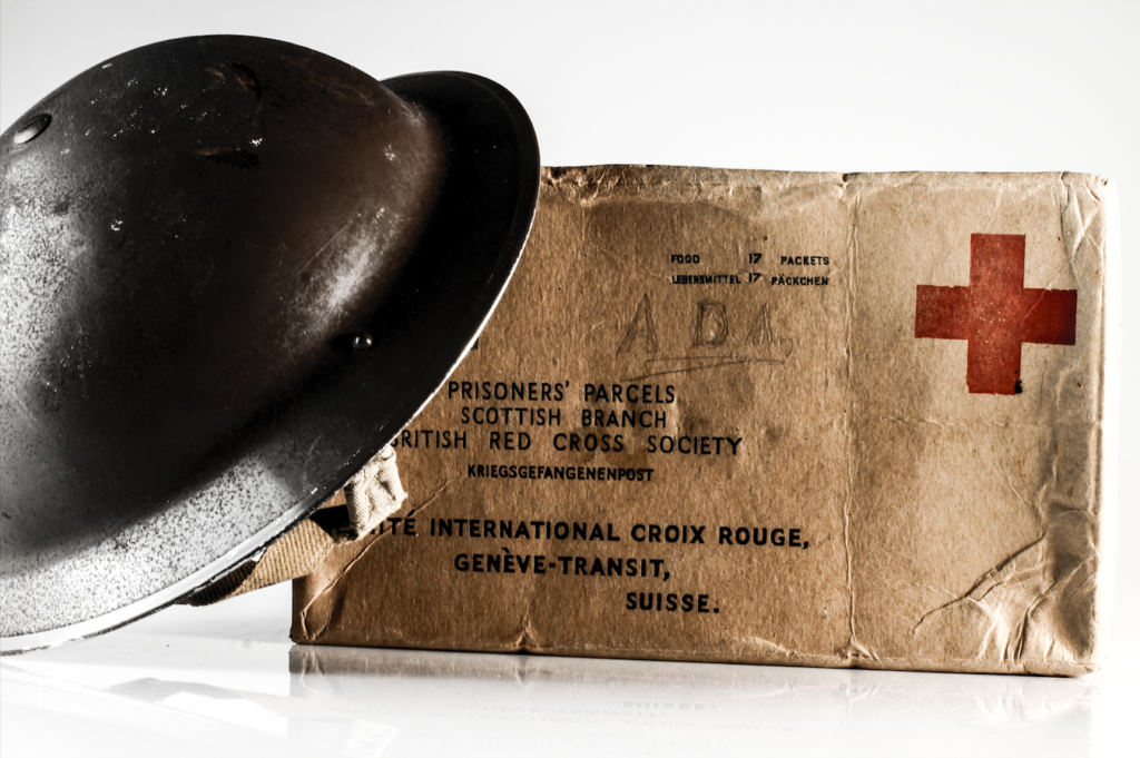
After the editing process, I was able to save the below images as my final images: